
Ecommerce website design inspiration
160 captured website collections tagged Shopping. This broad catalogue is not a verified list of complete online stores.
Compare campaign routes, merchandising and product detail layouts, with six reviewed notes and honest capture limitations below the gallery.
Filter
Exact colour
















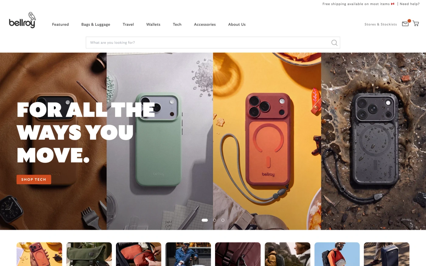


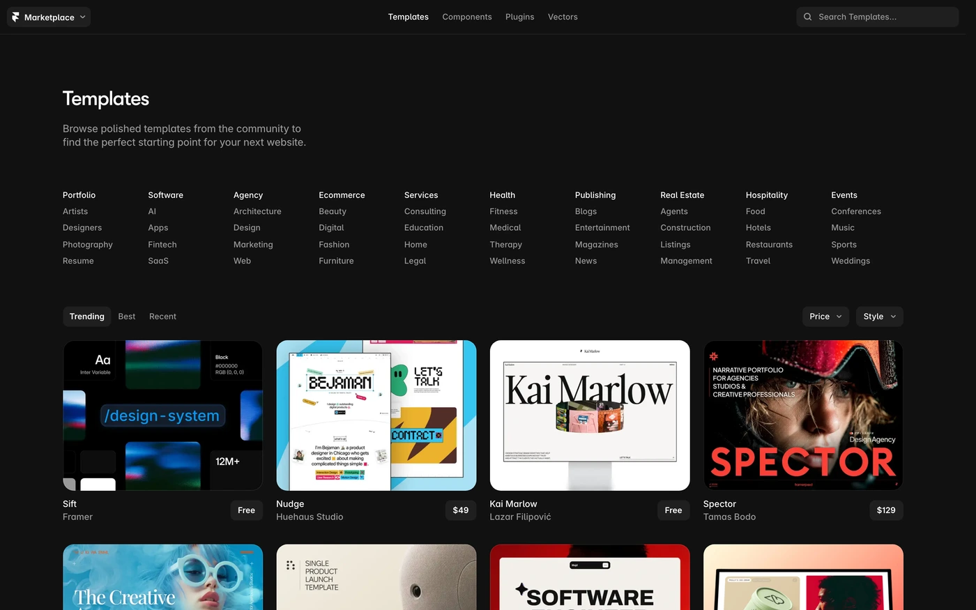

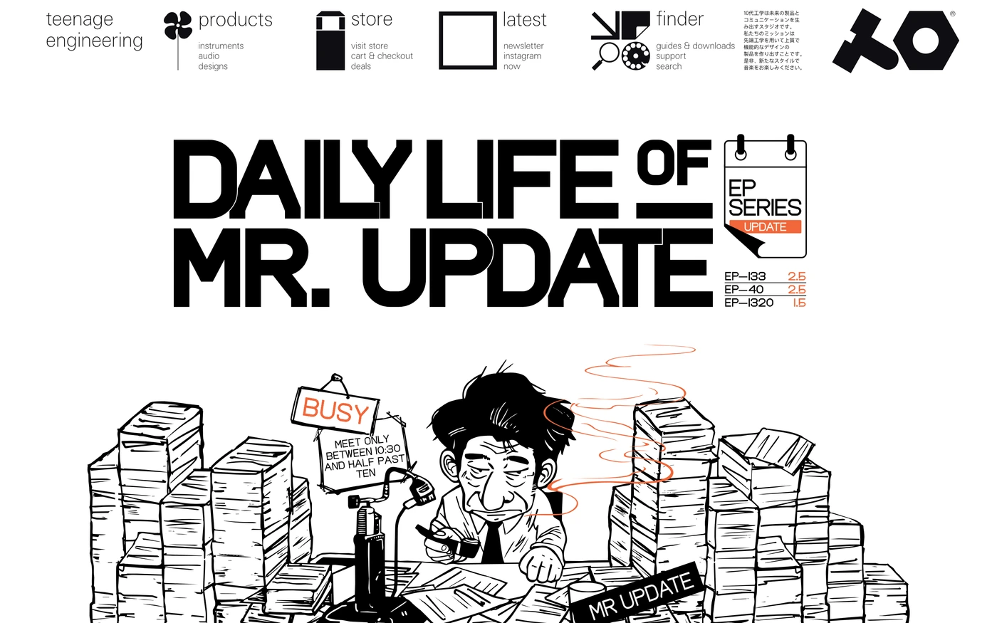





























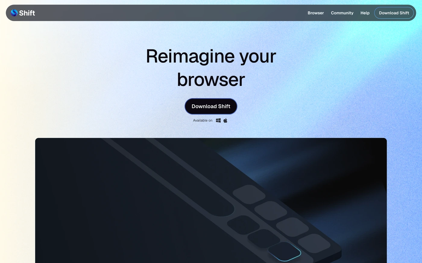



Six reviewed storefront and product-page references
Four homepage sections and two actual product-page opening views. These are desktop captures, not verified mobile layouts or checkout journeys. Notes reviewed ; collection dates are shown separately, not invented inner-page timestamps.
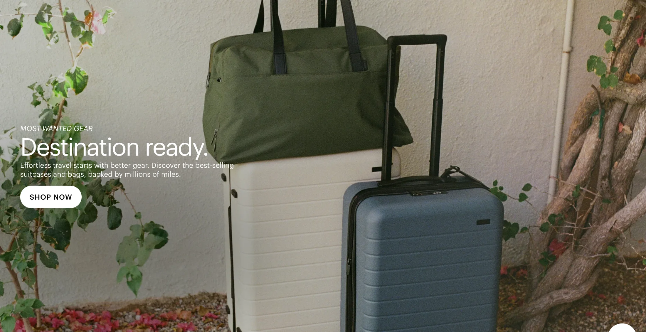
Away
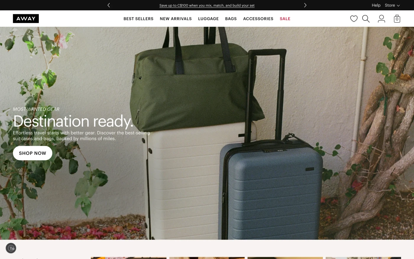
Connect a campaign image to a clear shopping route
- What the capture shows
- A suitcase and travel bag fill the image while a short headline, supporting sentence and one shopping action occupy the left. The photograph supplies context without a product comparison table.
- What to adapt and test
- Make the campaign destination clear, preserve readable copy through responsive crops, and use licensed photography that explains your offer.
- Limits of the reference
- The still does not show the destination, product stock or a completed purchase. Source product and popularity claims are not verified current facts.
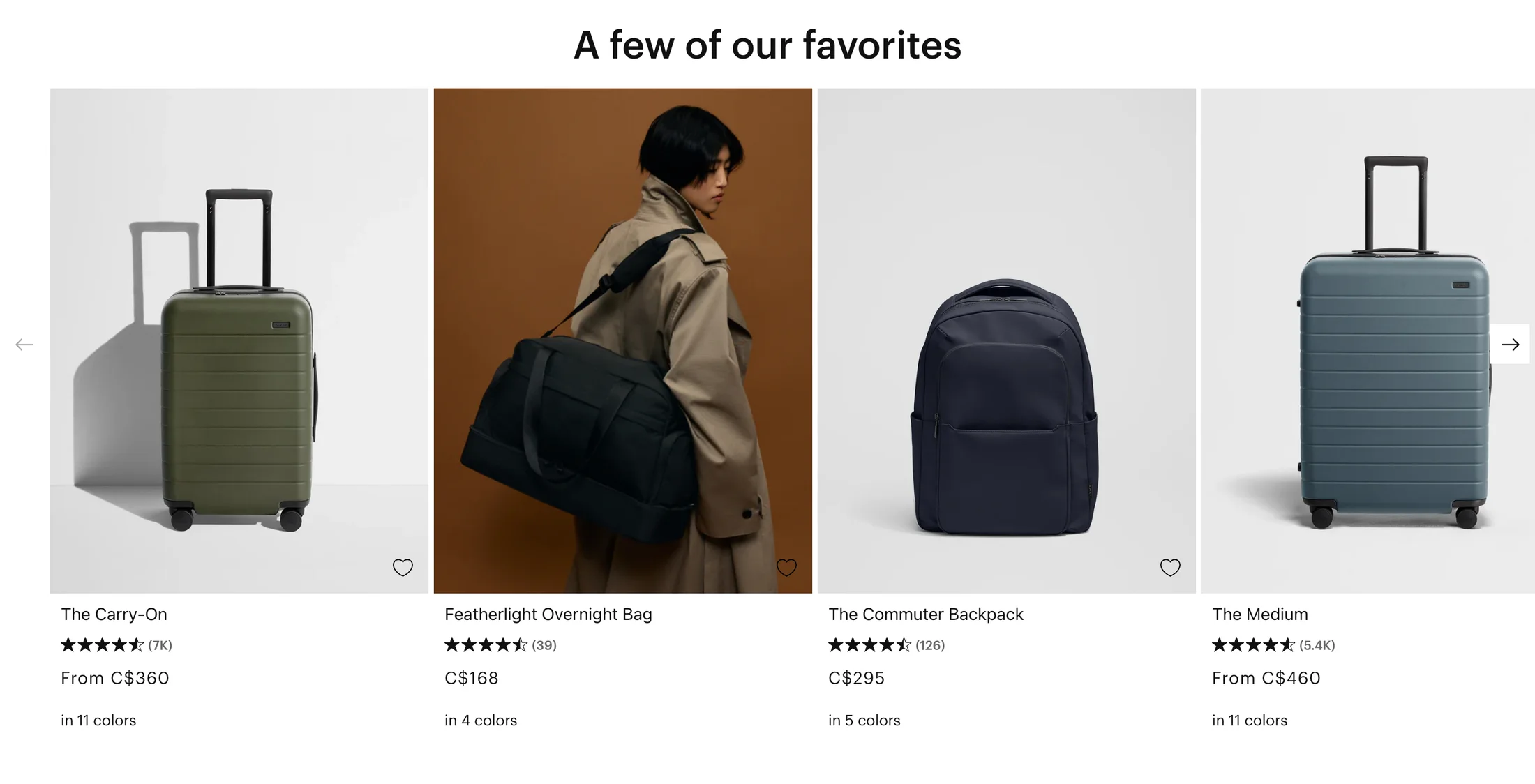
Away
Keep decision details beside each product card
- What the capture shows
- Product images are paired with names, star rows and counts, prices, colour counts and wishlist icons. Some prices use a from qualifier and a C$ prefix.
- What to adapt and test
- Keep the card identity, starting-price qualifier and variant context together. Distinguish the product destination from a save action and explain which variant sets the starting price.
- Limits of the reference
- Reviews, prices, colours and wishlist behavior are historical visible content, not verified current availability or working controls.
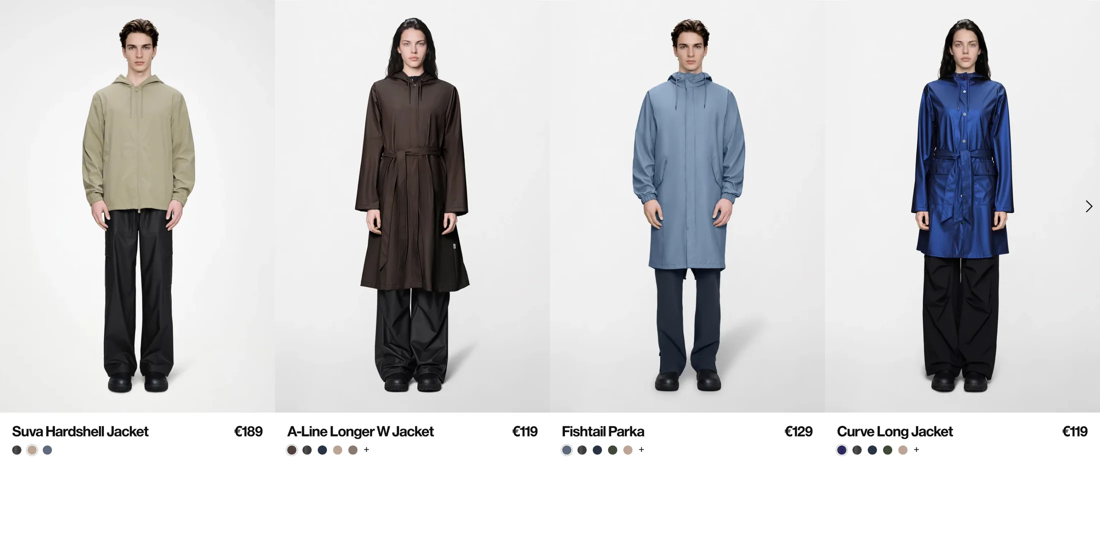
Rains
Keep variants understandable in a compact catalogue
- What the capture shows
- Consistent full-body photography makes silhouette comparisons possible. Product names, euro prices and colour swatches sit directly below; some swatch rows end with a plus indicator.
- What to adapt and test
- Use consistent image framing and accessible variant names rather than colour alone. Define what a swatch or more-options control changes, and test keyboard and unavailable states.
- Limits of the reference
- No swatch interaction, narrow-screen layout or current inventory is demonstrated. The euro display is not a current US price quote.
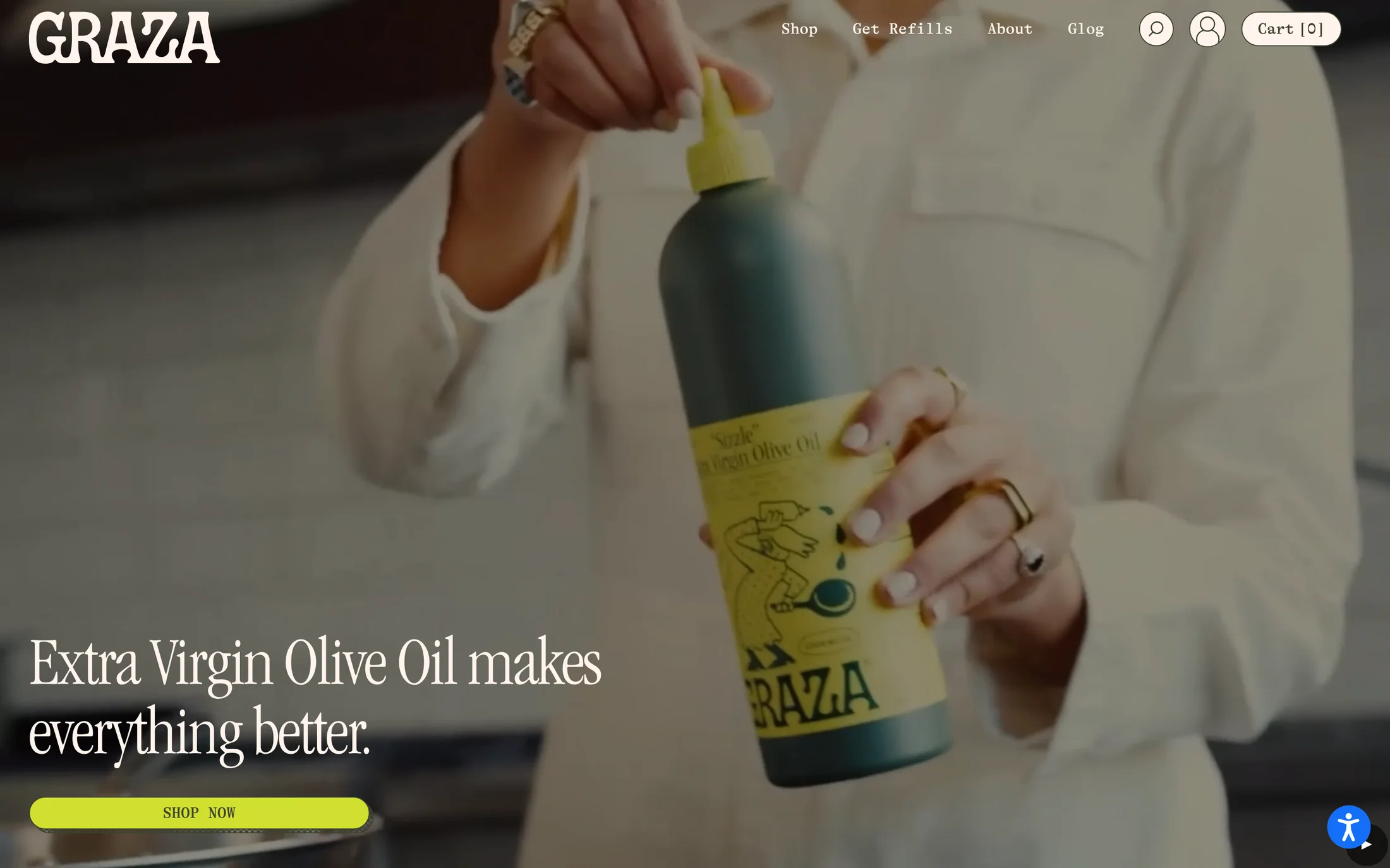
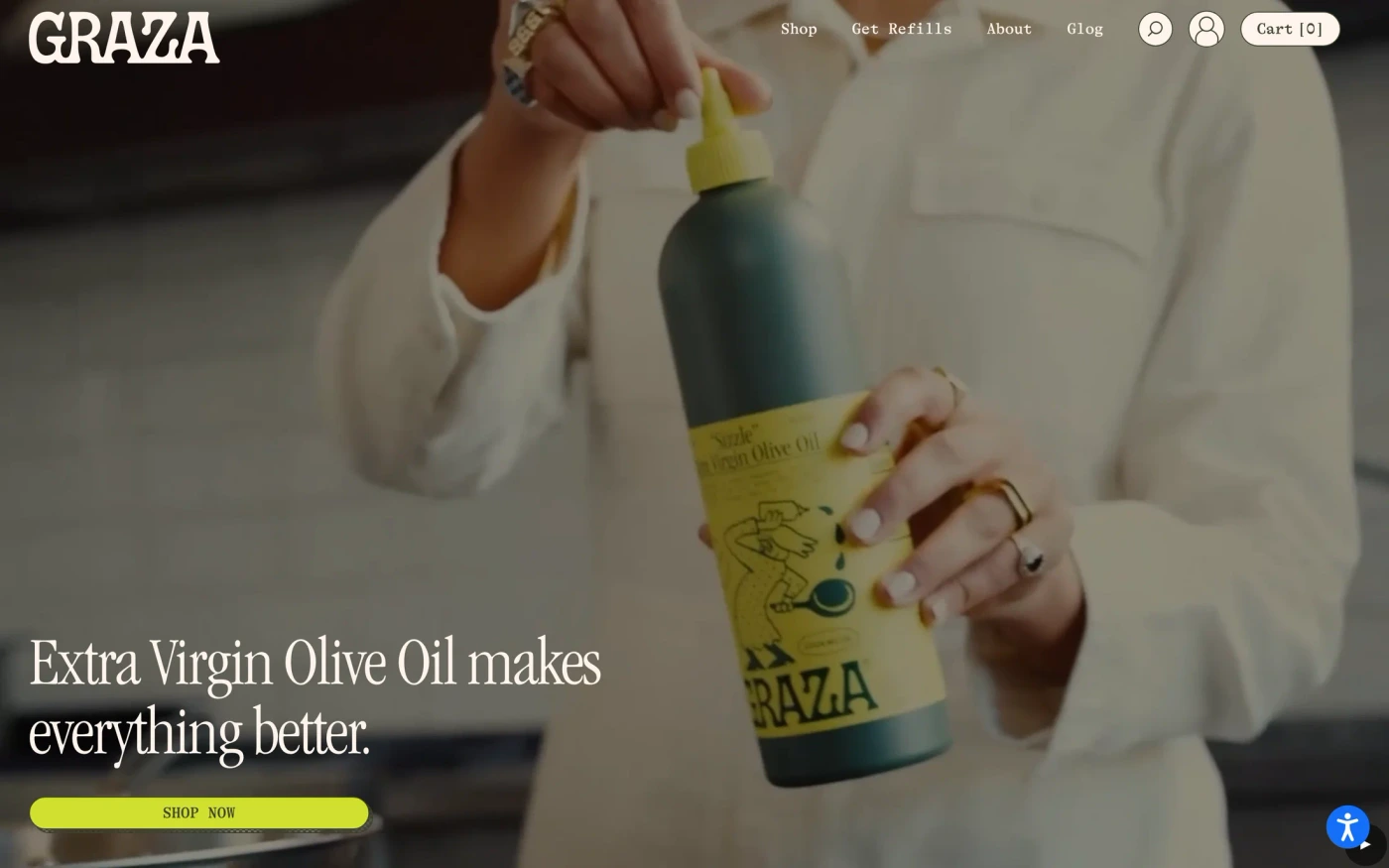
Graza
Show the product in use while keeping navigation available
- What the capture shows
- The product is shown being poured, with large copy and a bright shopping action over the image. Shop, refill, account and cart routes remain visible in the header.
- What to adapt and test
- Use a relevant product-use image to explain context, and keep purchasing and returning-customer routes recognizable. Verify text contrast across the real media and offer a static fallback for motion.
- Limits of the reference
- The capture does not establish video playback, cart behavior or accessibility. A visible accessibility widget is not evidence of conformance, and source product claims are not independently verified.
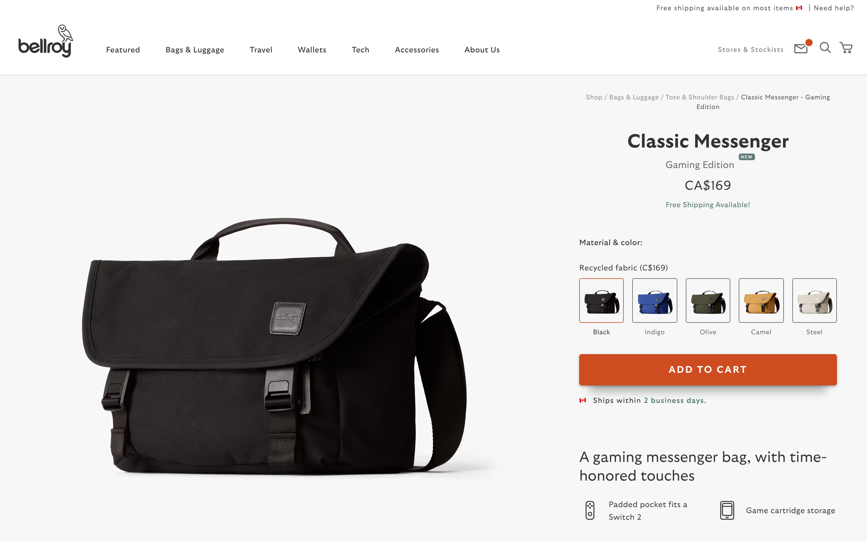
Bellroy
Group the selected variant, price and next action
- What the capture shows
- A large product image sits beside a title, Canadian-dollar price, material/colour selection and a cart action. Black is outlined in the thumbnail row, and shipping text is positioned near the action.
- What to adapt and test
- Keep the selected option, price and action together. Give image-based choices readable names, expose selected state to assistive technology, and explain delivery conditions without making unsupported promises.
- Limits of the reference
- Only the opening viewport is reviewed. Cart success, stock, shipping eligibility, keyboard behavior and the rest of checkout are not verified.
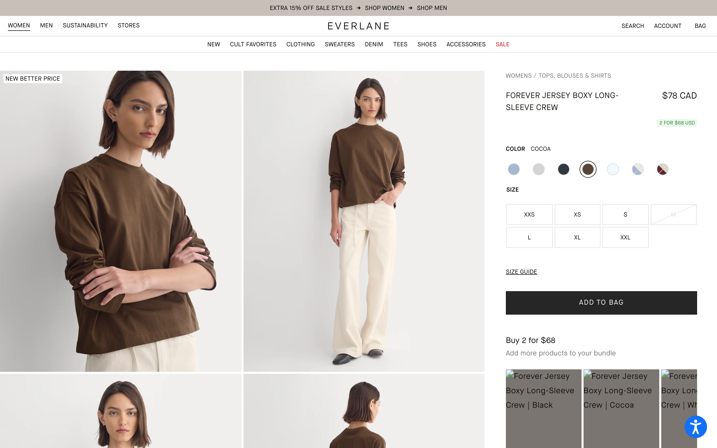
Everlane
Check variant availability and localized price consistency
- What the capture shows
- Product photography sits beside colour choices, size buttons, a size guide and a bag action. One size has a diagonal unavailable-style treatment. The main price is CAD, a promotion uses USD, and the lower bundle thumbnails contain broken images.
- What to adapt and test
- Test consistent currency and offer wording across the whole purchase panel. Make unavailable choices explicit and provide useful loading/error states for cross-sell imagery instead of leaving broken tiles.
- Limits of the reference
- This is a qualified layout reference, not a clean storefront QA result. The marked size is not verified live stock, and no variant change, promotion, cart action or checkout was tested.
A practical ecommerce website checklist
- Choose the task before the visual pattern: discovery, comparison, variant selection, cart or checkout.
- Keep product imagery, price qualifiers, currency and selected options consistent across cards and detail panels.
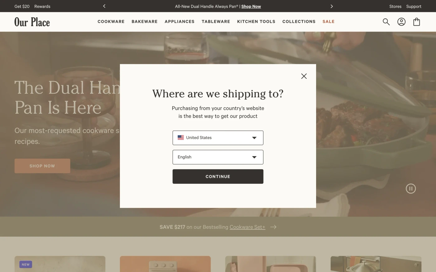
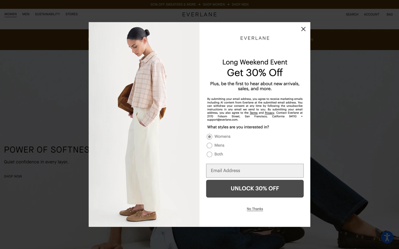
- Test real loading, error, unavailable and changed-price states. Avoid blocking the first useful view with an unsolicited modal.
- Publish only shipping, return, review and availability claims your own store can support.
- Use the original checkout pattern and demo for transaction-state ideas, not as a recorded source-store purchase.
- Connect campaign copy to hero examples and CTA references; test keyboard use and narrow screens in your own implementation.
Brief an original storefront
An editorial starting point, not a native-builder validation. The landing-page guide covers wider page structure.
Create an original storefront using my approved products and licensed assets.
Keep names, price qualifiers, currency and variants consistent.
Use accessible option labels and clear unavailable, loading and error states.
Connect real product, cart and checkout destinations; do not invent a backend.
Use only approved stock, shipping, return, review and promotional claims.
Test 320px, 390px, desktop and keyboard paths with real content.
Report what was tested and what remains unverified. Do not clone source assets.
About Shopping website references
Shopping has 160 captures in the library, cut into 3,644 sections, and ranks 7 of 18 categories by size.
Features appears on 85% of captures, then footer (68%) and showcase (56%).
Less common here: integrations, team, and pricing, on 2, 4, and 6 captures.
Most captures are short, averaging 23 sections (from 0 to 70).
The biggest captures here are Athletic Greens (70), Shift (69), Arnold Clark (58), Alkemy Market (53), reMarkable (52), and CarEdge (50).
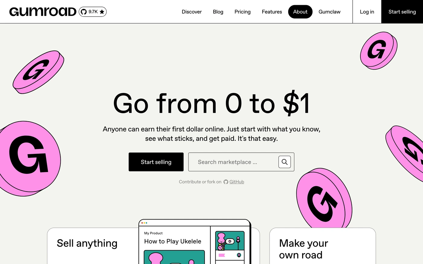
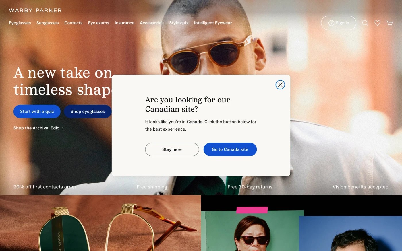
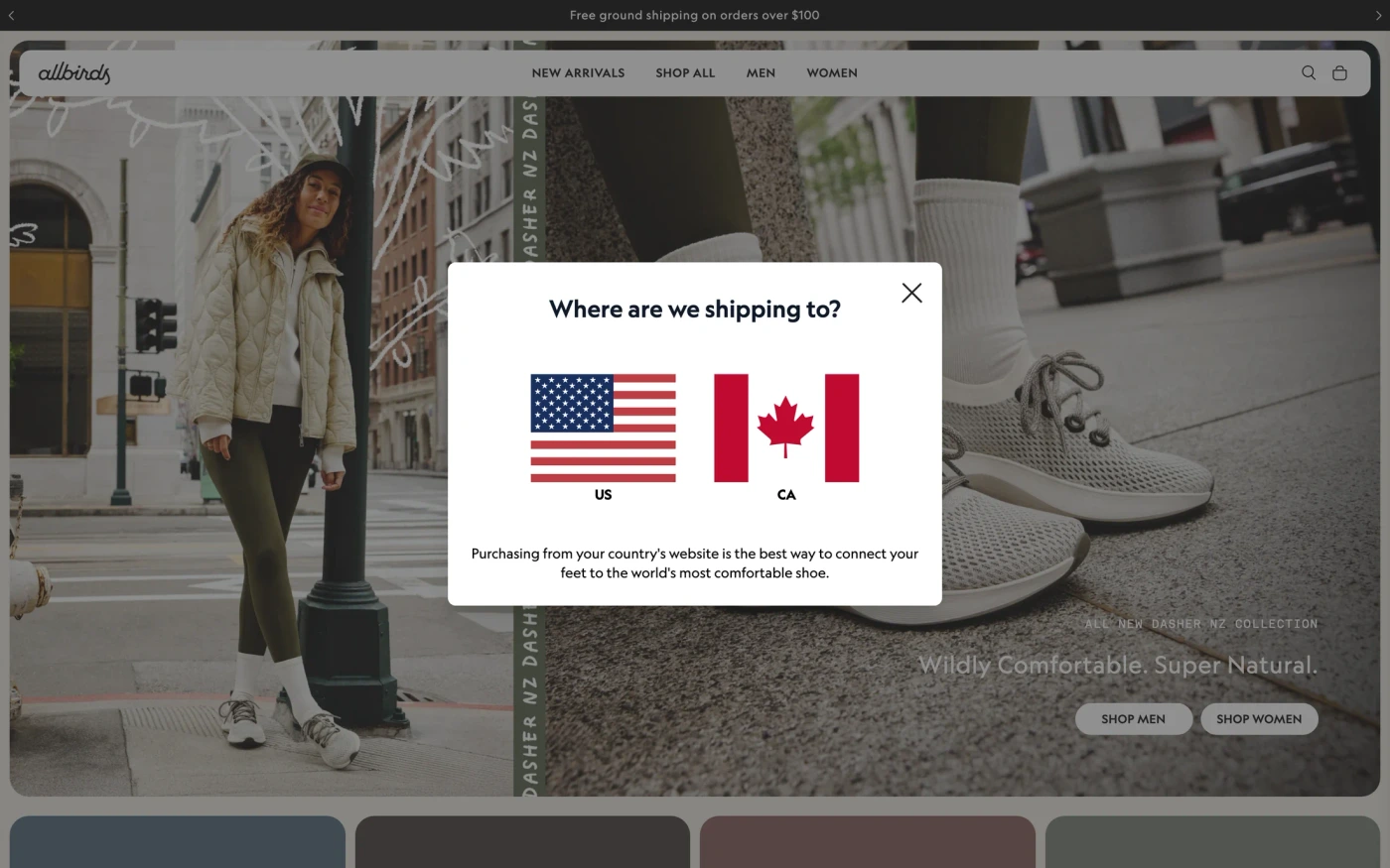
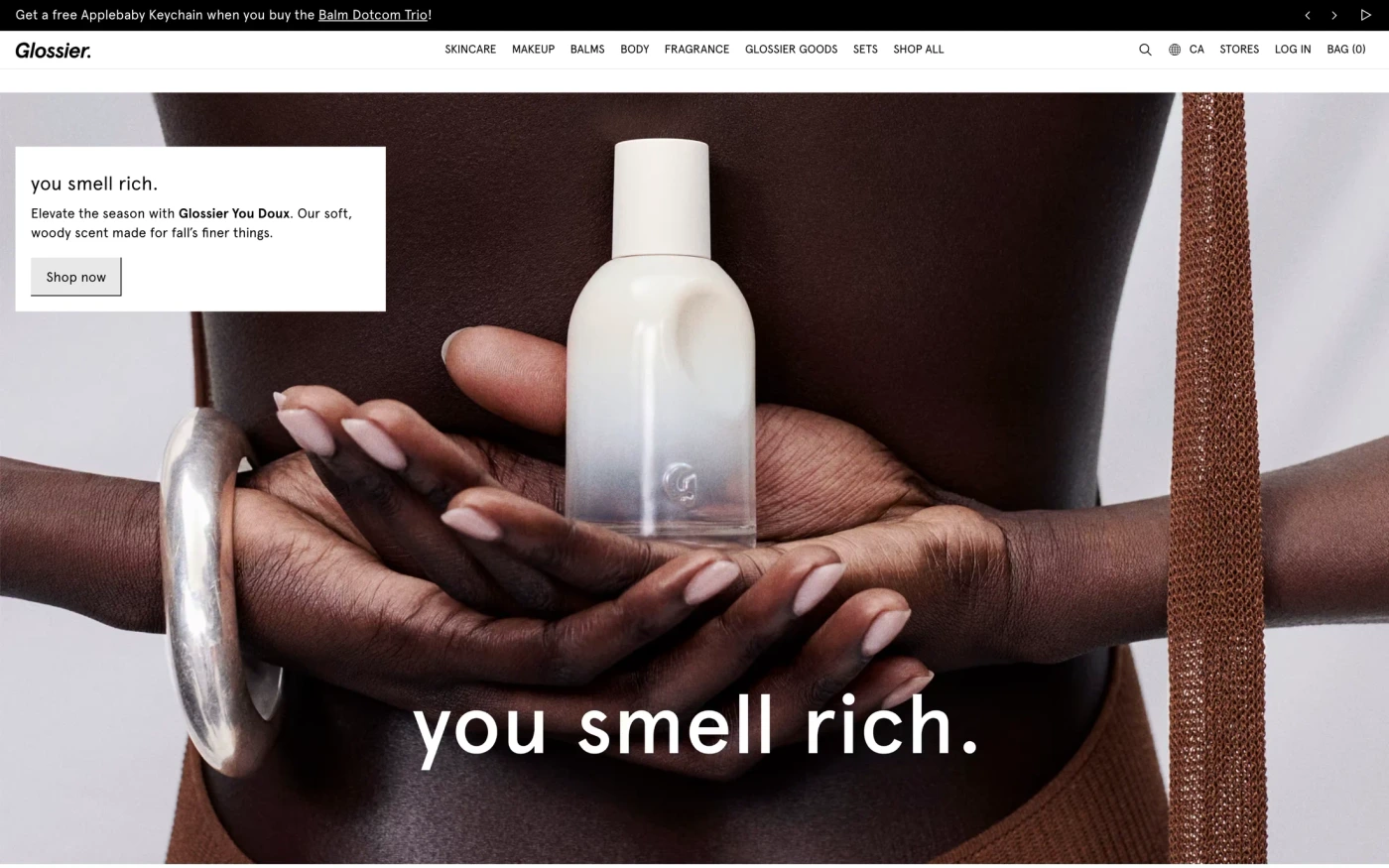
Gumroad keeps to 29 sections, led by content, with ABC Favorit headings in a light style. Allbirds keeps to 18 sections, led by content, with Geograph headings in a light style. Glossier keeps to 12 sections, led by content, with Apercu headings in a light style. Warby Parker is long (43 sections, mainly content), with Font Ivory Ll headings in a light style.
Headings draw on many families, among them Circular (3), Poppins (3), Apercu (2), and Graphik (2).
Body copy varies more: Poppins, Suisse Intl, and Inter.
Dark styles are the exception: 6 of 160 styled captures.
Neutral is the most used palette, in 84 captures.
138 captures keep inner pages, and 156 include a phone-size screenshot.
The captures were taken between September 2026 and September 2026.
Across the group there are 133 heading families and 17 section types.
Featured here: Gumroad (29 sections) and Nothing (21 sections).
Featured ecommerce website sites with their fonts
Ecommerce website inspiration — FAQ
What makes ecommerce website inspiration useful?
Choose references for a real task: finding a category, comparing products, choosing a variant or understanding the next action. A campaign, a product-card row and a product detail page supply different evidence. Screenshots do not prove higher sales or a successful purchase.
Are all Shopping catalogue entries online stores?
Shopping is a broad existing catalogue tag, not a certification of an ecommerce business or complete purchase flow. The gallery retains its original membership. The six notes below identify four storefront sections and two product-page first views that were visually inspected.
How does a homepage differ from a product page?
A homepage helps visitors discover an offer or category; a product page explains one item, its options and the next step. Bellroy and Everlane provide actual product-page opening views here, not homepage cards relabeled as product detail pages. The remaining page and cart journey are not demonstrated.
What should product cards and variant choices communicate?
Keep the product name, imagery, price qualifier and option context together. Use meaningful labels for colour and size, show selected and unavailable states, and test what an option changes. A screenshot of swatches is not evidence of working keyboard or cart behavior.
Which trust and checkout details should I review?
Show accurate delivery, return and payment information for your own store. Explain validation, loading, errors and the state after a cart action. Source shipping, review, discount and inventory claims here are historical and unverified. The linked original checkout demo is a design example, not a source merchant's recorded transaction.
Can I copy these designs or treat their offers as current?
Use the structure as inspiration and supply your own licensed imagery, branding, approved copy and tested behavior. Captured assets belong to their owners. Prices, currency, offers and availability can change, and neither conversion uplift nor current commercial terms are established by this review.
Captured screenshots and brand assets belong to their respective owners.