
Design agency website inspiration
290 captured collections tagged Design & Agency. This broad catalogue includes creative tools and portfolios, not only agencies.
Compare positioning, project evidence and routes to an enquiry, with four reviewed homepage sections and two project-page opening views below the gallery.
Filter
Exact colour




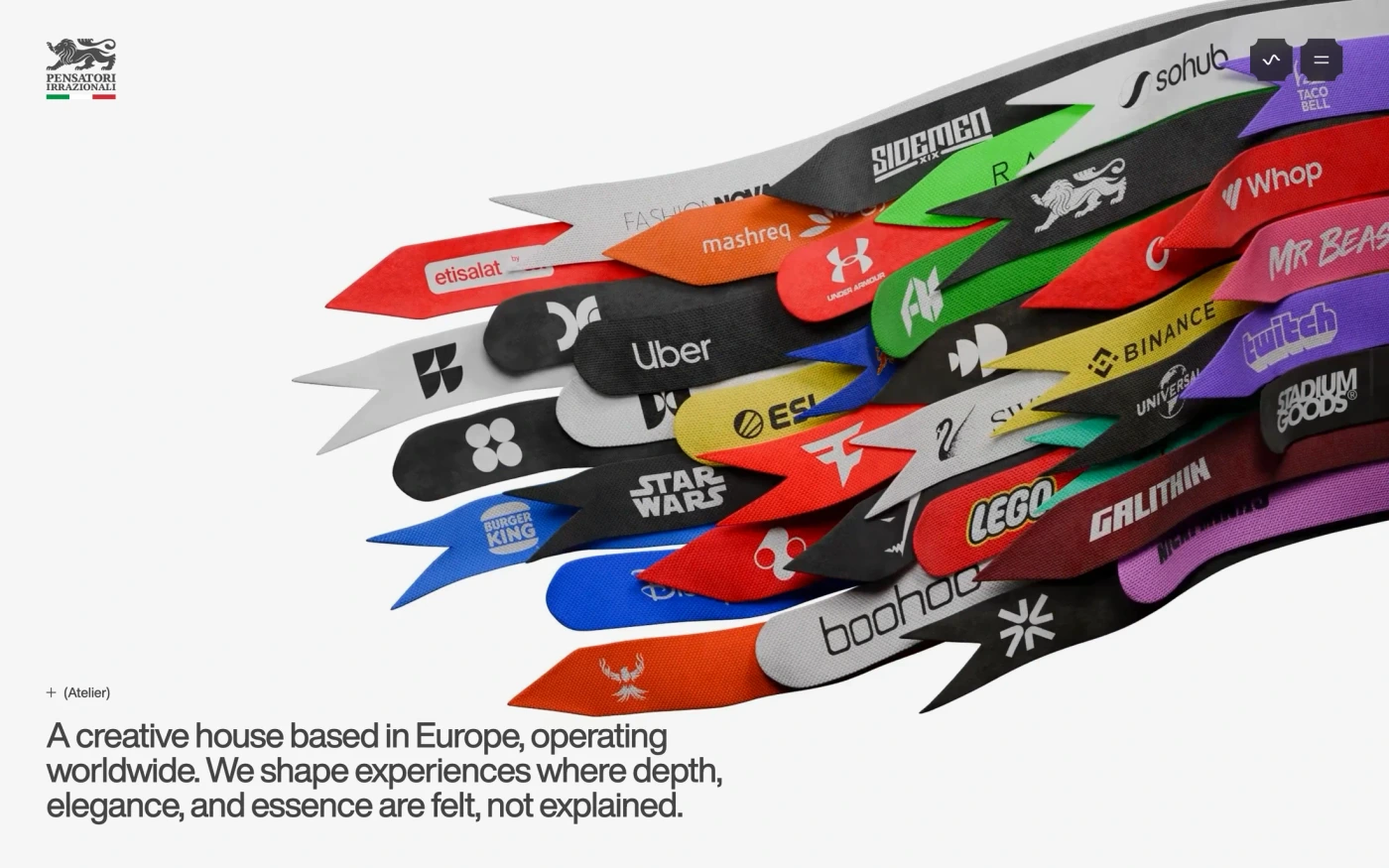

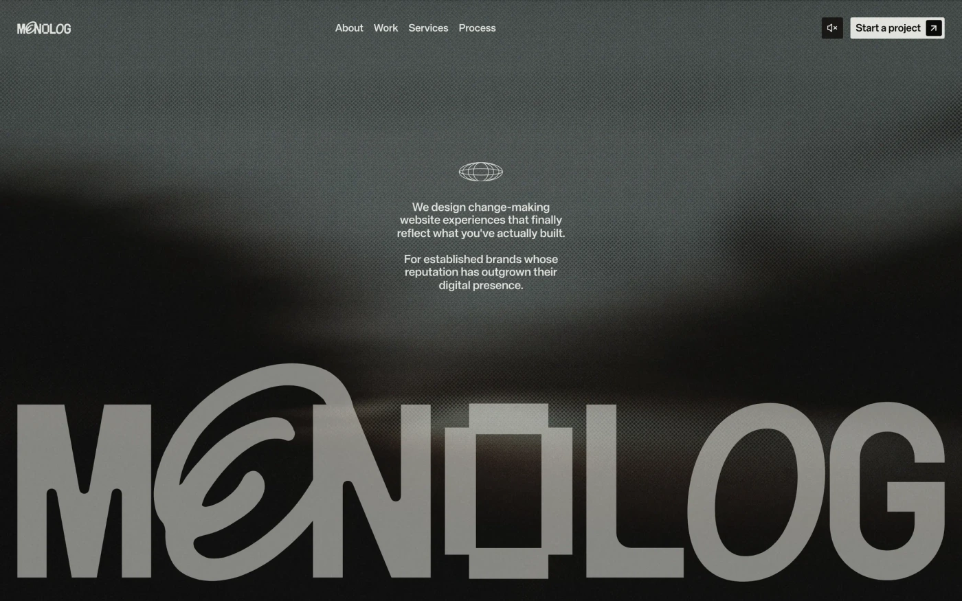

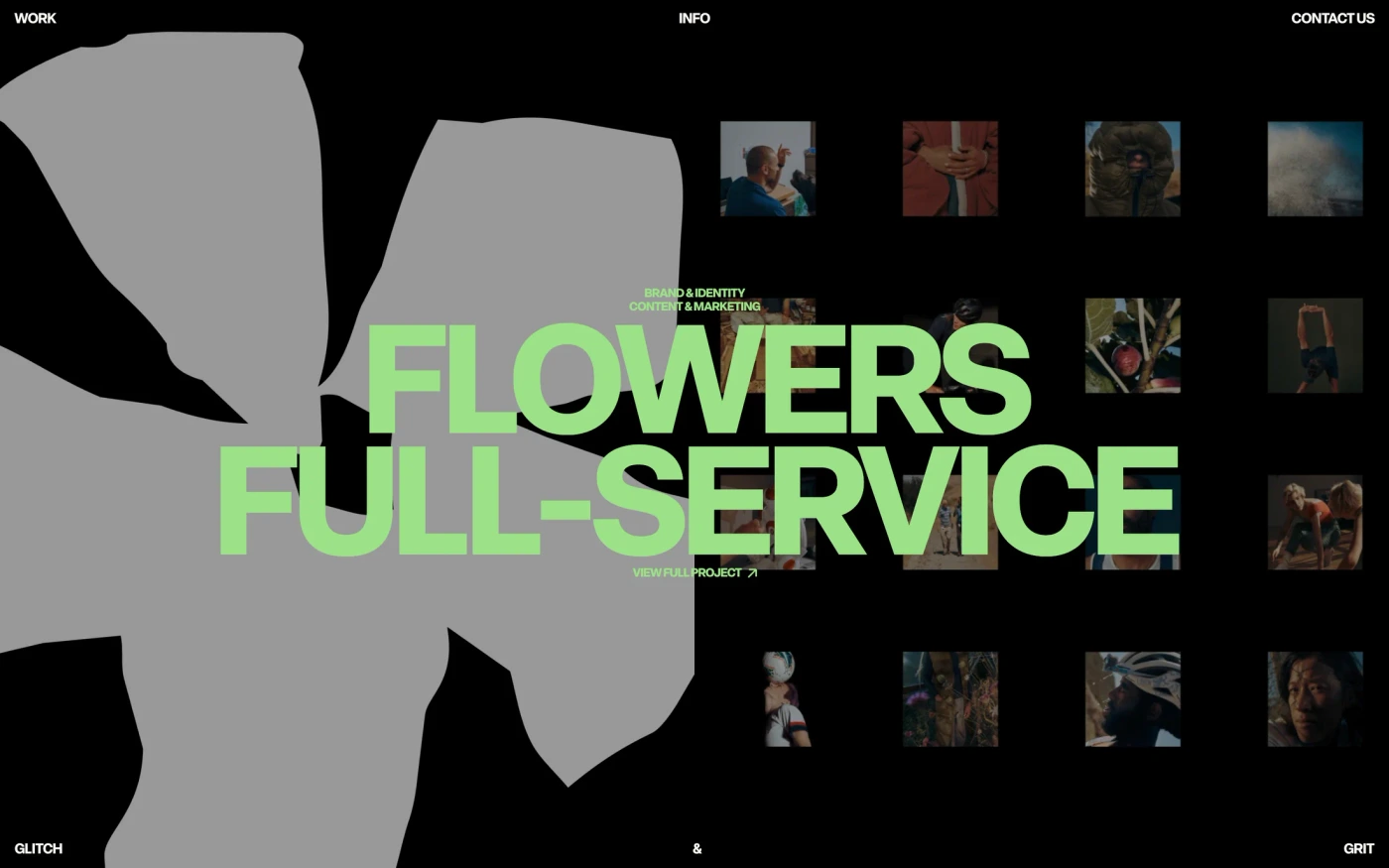









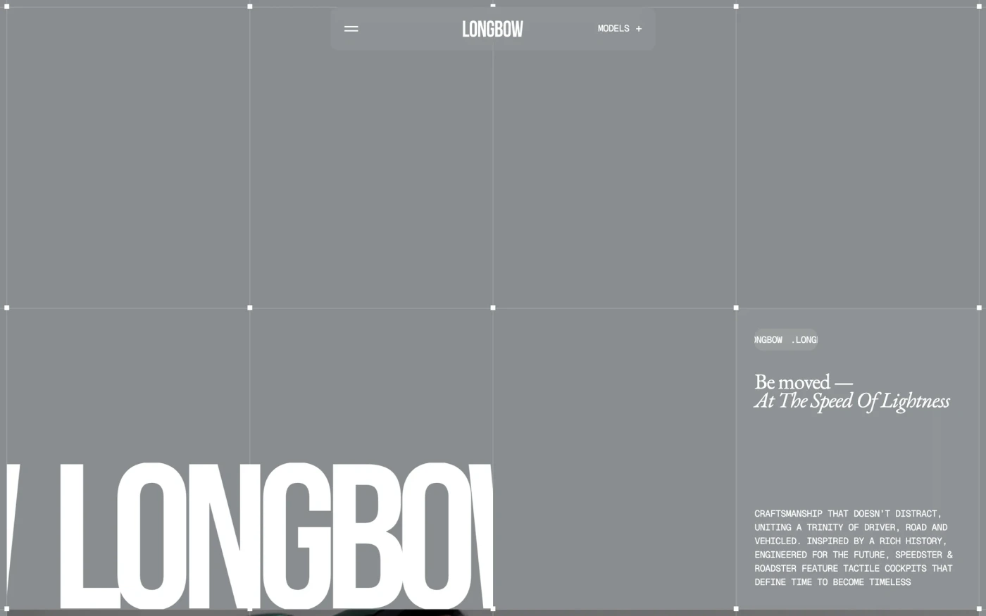
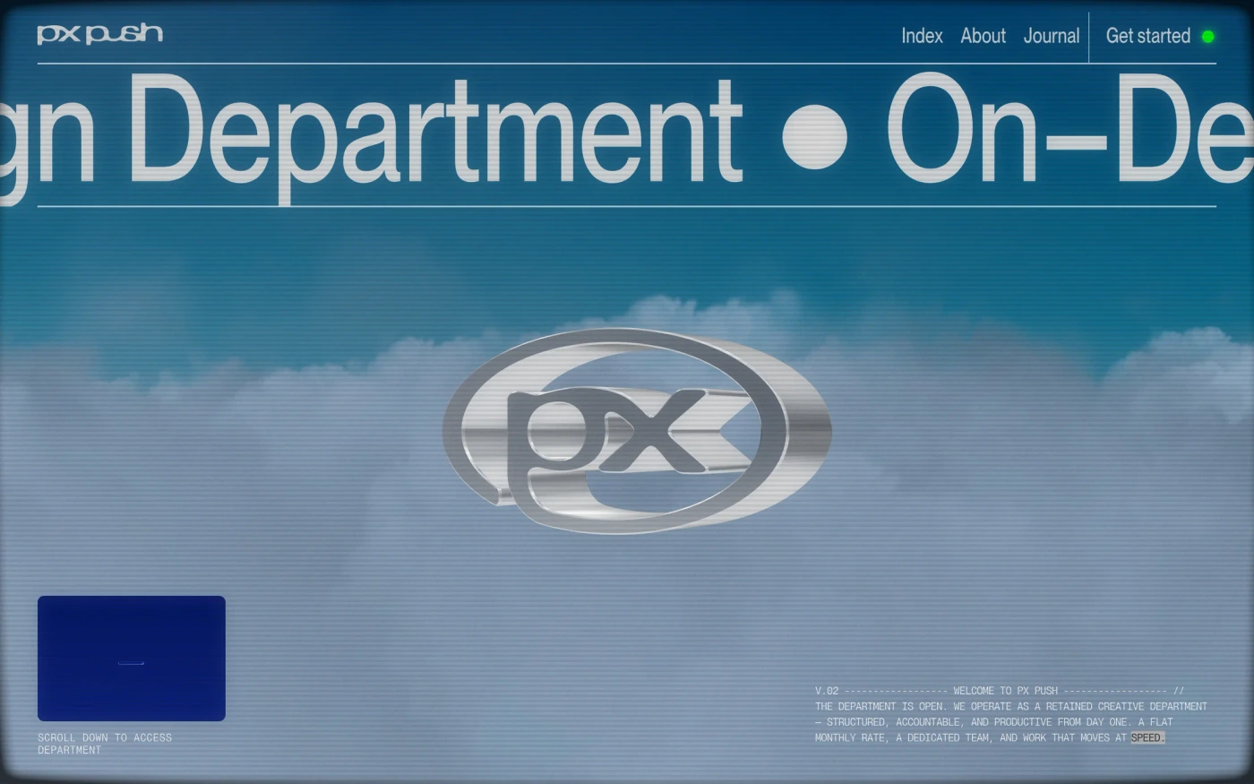

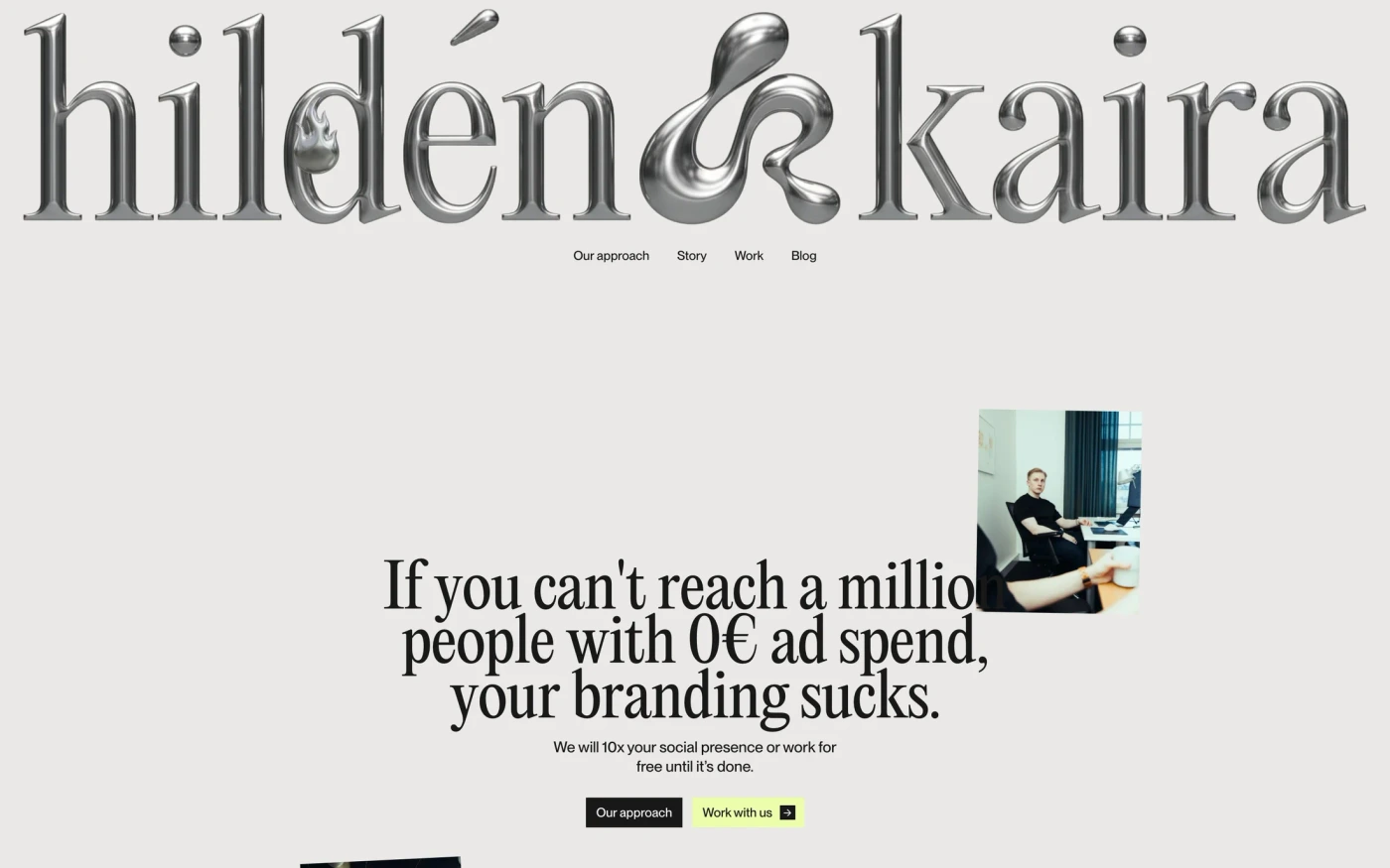

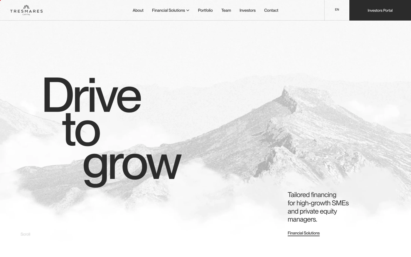

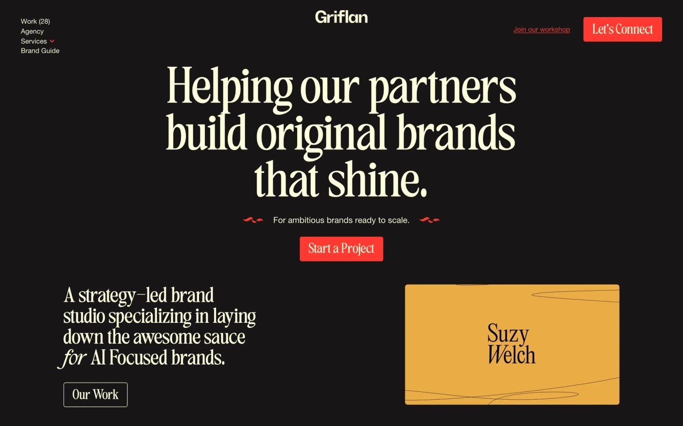














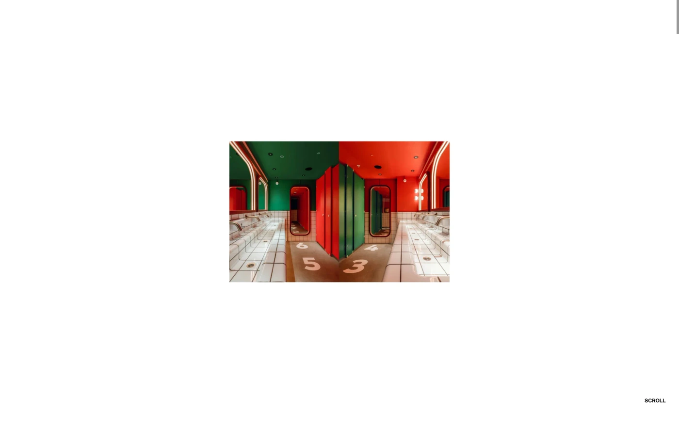

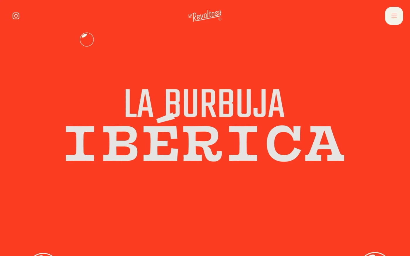
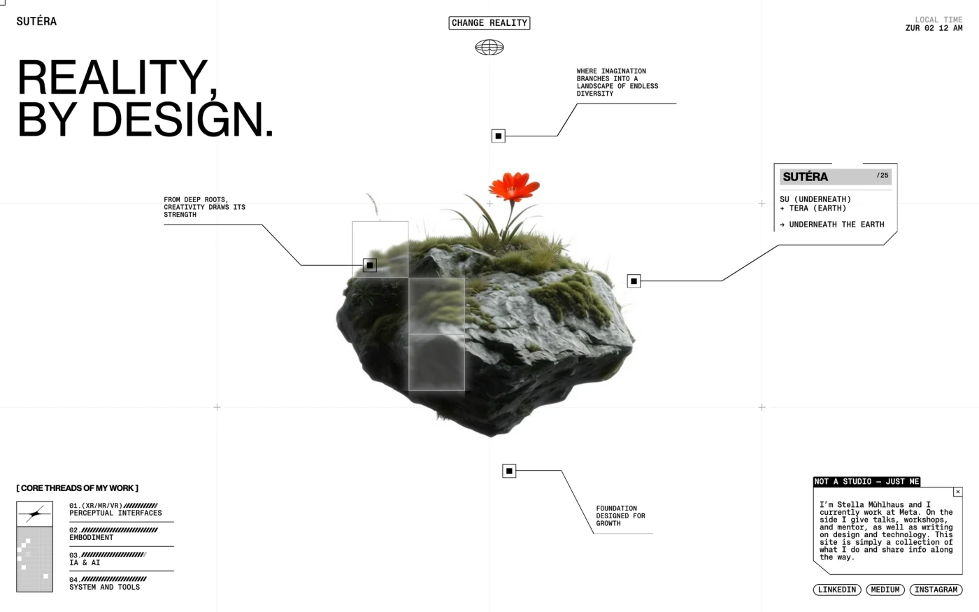








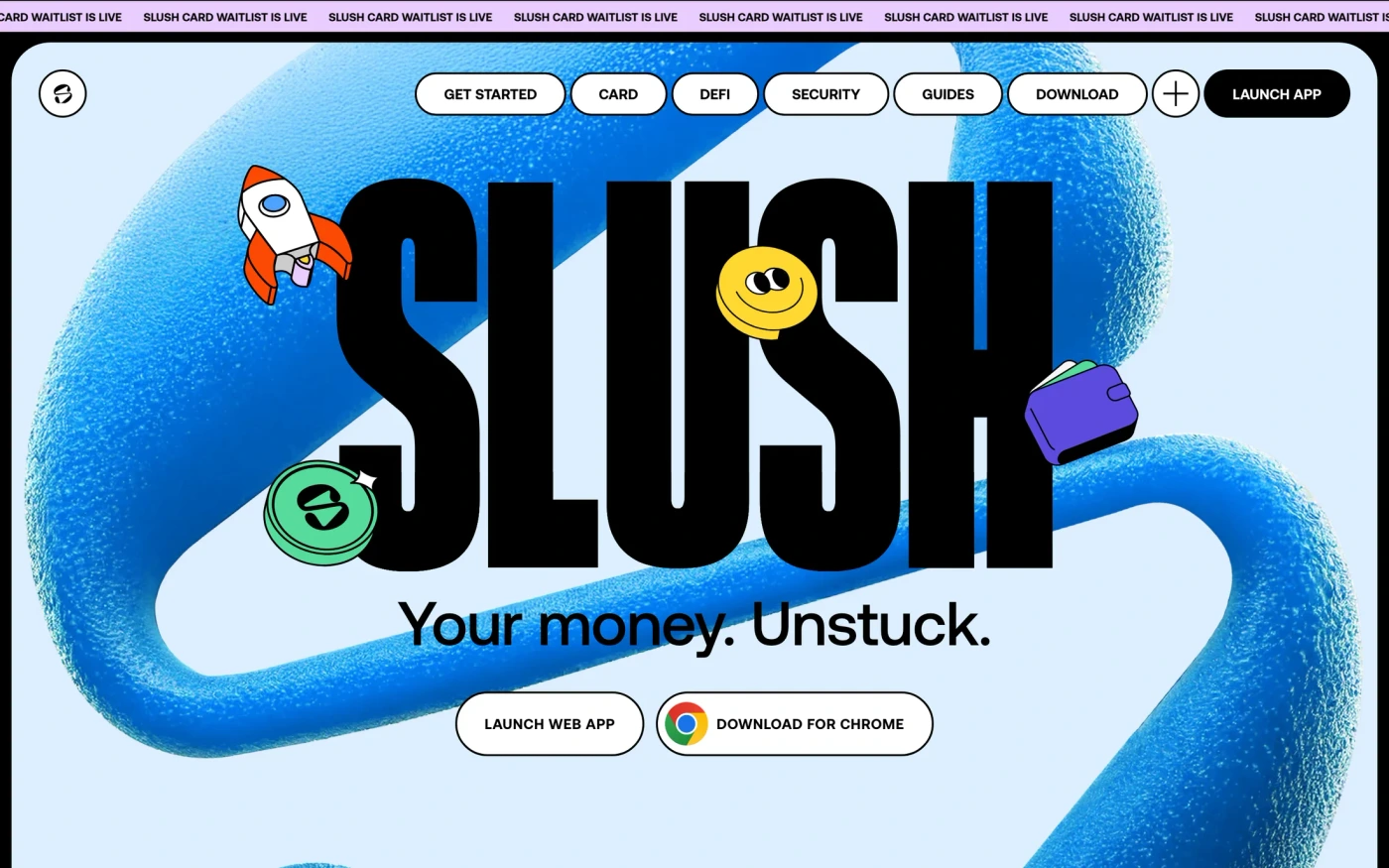

Six reviewed agency website references
Four homepage sections and two actual project-page opening views. These desktop stills do not verify mobile layouts, animations, full case studies or enquiry flows. Notes reviewed ; collection dates are shown separately.
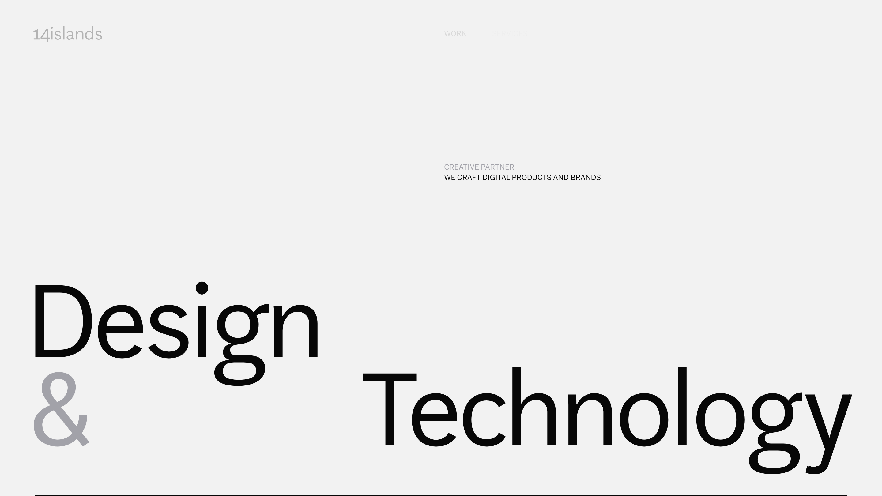
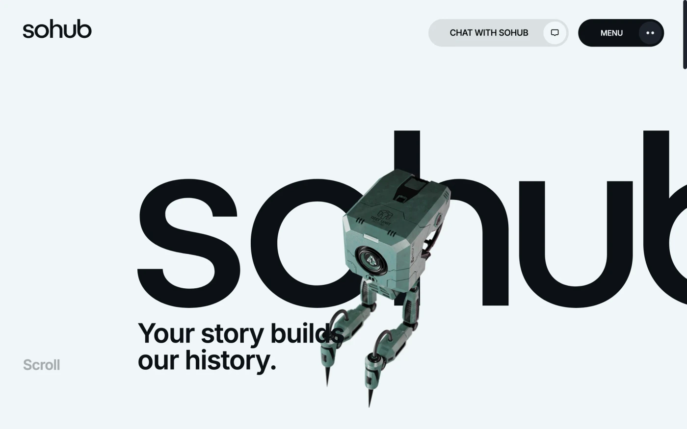
14islands
Make the practice recognizable before the visual flourish
- What the capture shows
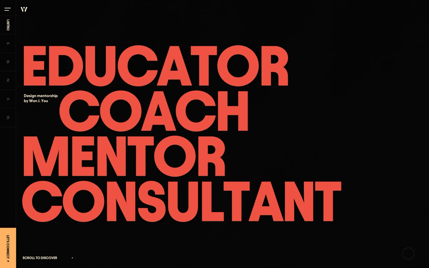
- A short practice statement sits above very large design-and-technology typography. Work and Services appear in the top navigation, although some header labels are faint in the still.
- What to adapt and test
- State what your studio does in readable text before asking visitors to interpret an expressive layout. Keep work, services and contact routes identifiable at narrow widths and with keyboard focus.
- Limits of the reference
- This is one desktop still, not evidence of animation, mobile navigation or accessible contrast. The large lettering does not establish the agency's process or client results.
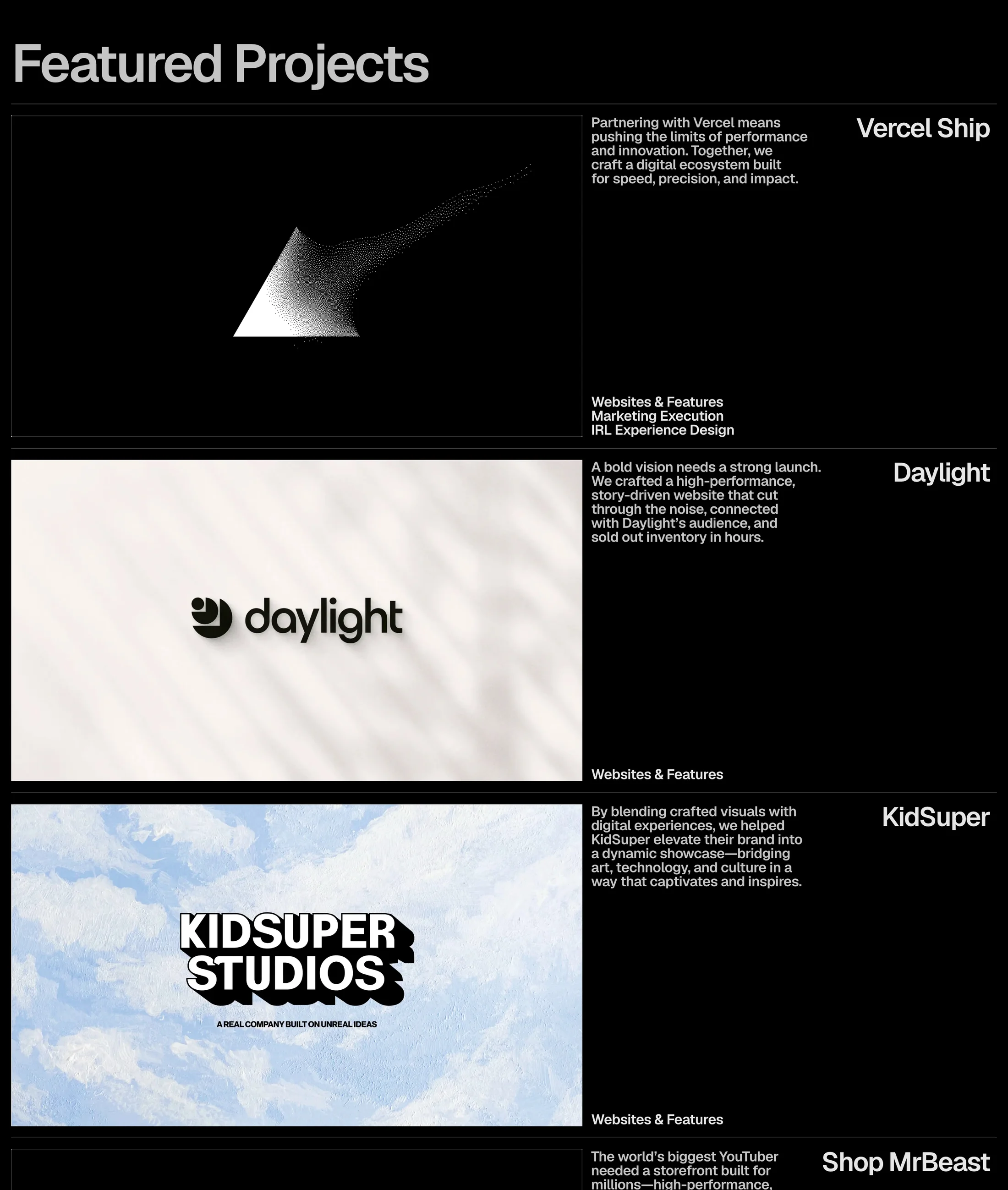
Basement
Keep the project, explanation and scope together
- What the capture shows
- Project visuals occupy the left while names, short descriptions and scope labels sit on the right. Repeated horizontal separators make the different projects easy to distinguish.
- What to adapt and test
- Pair each approved project image with the client's name, your actual contribution and a route to a fuller study. Make partner responsibilities explicit rather than presenting a client logo as the whole story.
- Limits of the reference
- These are homepage project summaries, not complete case studies. Client, performance and sell-through statements are source claims, not independently verified outcomes or evidence that the layout converts better.
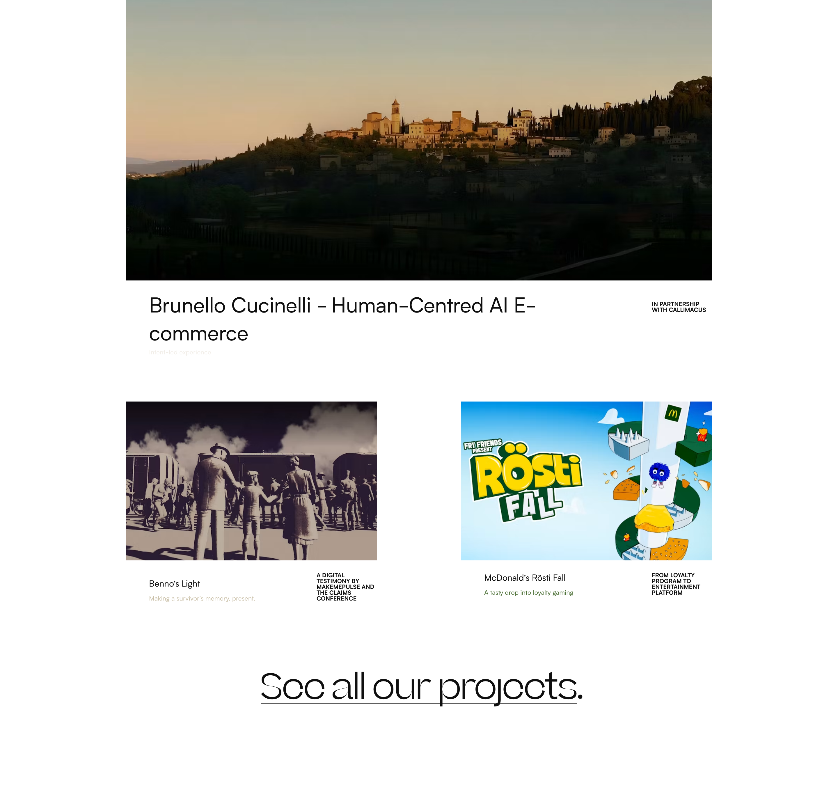
Makemepulse
Make collaboration and project destinations visible
- What the capture shows
- A large featured image leads into two smaller project entries. Captions identify the projects, a partnership credit sits beside the featured entry, and a prominent link points to the wider project collection.
- What to adapt and test
- Use image scale to establish priority while keeping project names and collaborator credits close to the work. Give each project a descriptive destination instead of relying on a showreel alone.
- Limits of the reference
- The still does not demonstrate video playback or working project interactions. Source descriptions of AI, entertainment and project impact are not a native-tool test or independently measured results.
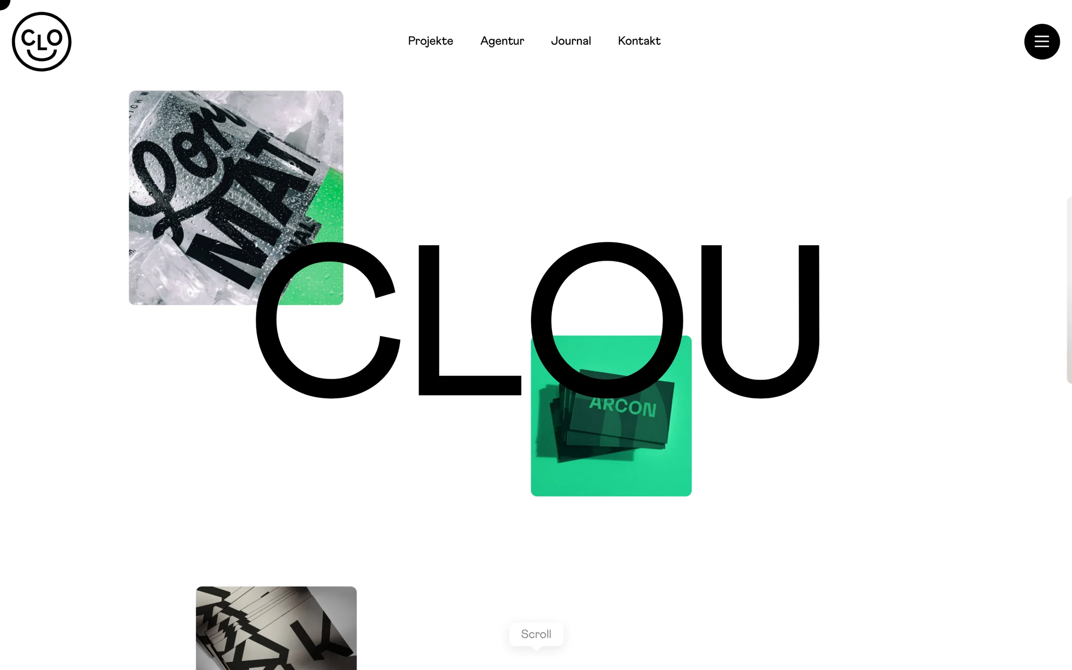
Clou
Keep clear routes beside an expressive identity
- What the capture shows
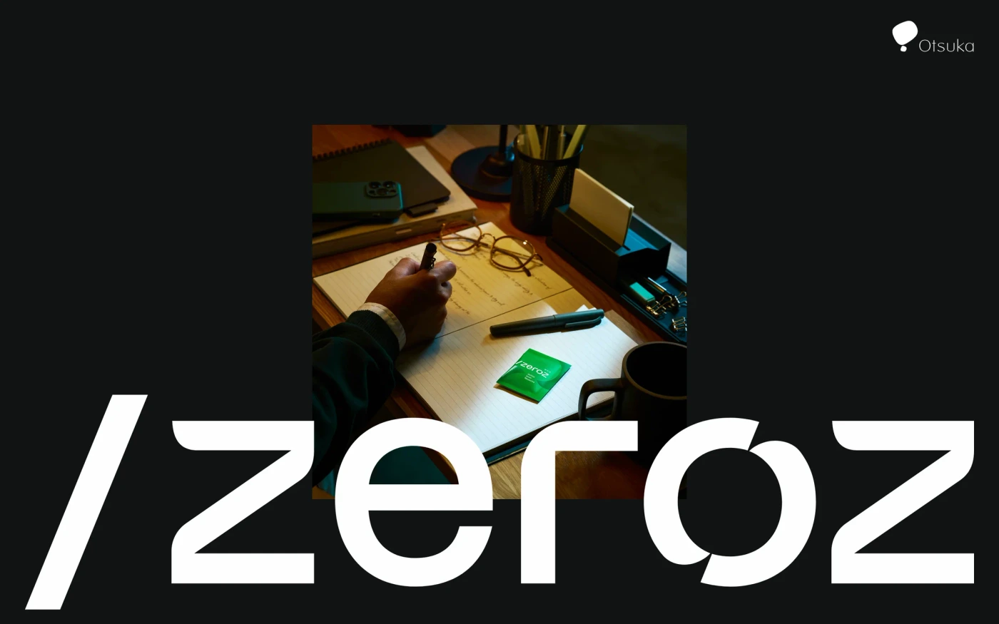
- Large brand lettering overlaps differently sized project-image tiles. The top navigation labels projects, the agency, the journal and contact separately, with an additional menu control at the right.
- What to adapt and test
- Let an expressive composition carry identity while maintaining straightforward routes to work, capabilities and an enquiry. Use meaningful image descriptions and keep essential navigation available without animation.
- Limits of the reference
- A still cannot establish hover behavior, menu contents or responsive ordering. Project imagery and oversized identity text alone do not explain services, project roles or commercial outcomes.
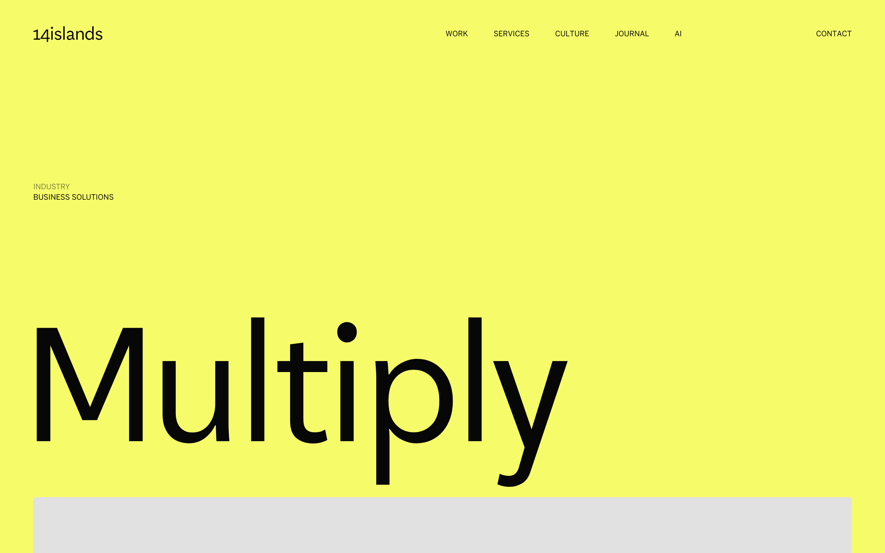
14islands
Introduce the project before the long-form explanation
- What the capture shows
- The opening view names Multiply and its business-solutions category on a yellow field. Global work, services, culture, journal and contact routes remain visible above the project title.
- What to adapt and test
- Give a study a clear client or project name and context, then explain the brief, your role, decisions, deliverables and approved evidence in the content that follows. Separate your team's work from collaborators' work.
- Limits of the reference
- Only the opening view is captured here. It does not show the full study, a client testimonial, delivered mobile layouts or measured results. The catalogue's automatic product tag is not a certification of page type.
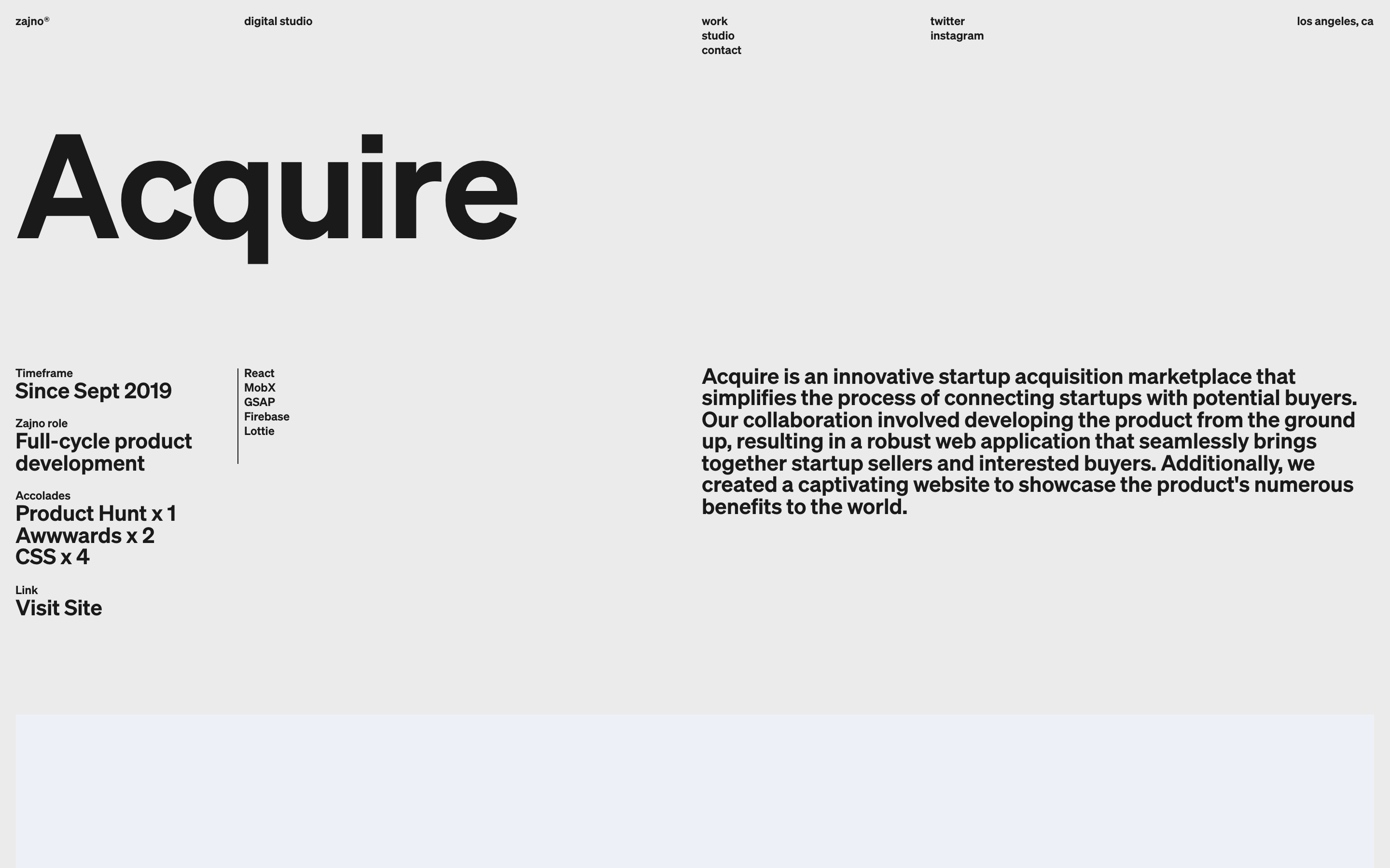
Zajno
Make project responsibilities explicit
- What the capture shows
- The project title is followed by an information column for timeframe, the studio's role and technologies, beside a wider explanatory paragraph. An awards list and a destination link are also visible.
- What to adapt and test
- Describe your actual contribution and project boundaries near the introduction. Explain what the team designed or built in plain language; use technologies and recognitions only when relevant and verifiable.
- Limits of the reference
- Technologies, awards, dates and project claims are historical source content, not independently audited current facts. The opening view is not the complete project journey or evidence of conversion uplift.
An agency website and case-study checklist
- State your practice, audience and service scope in readable words before adding an expressive visual treatment.
- Link selected work to actual studies. Explain the brief, responsibilities and deliverables, with client-approved evidence and collaborator credits.
- Show only awards, testimonials and results you can substantiate. A screenshot or logo wall is not an independent audit.
- Keep work, services and enquiry routes understandable at 320px and with keyboard navigation. Provide static media fallbacks and reduced-motion behavior.
- Use about-page examples for practice context and contact-page references for enquiry structure; test a real success and error path.
- Compare hero sections, calls to action and portfolio websites as adjacent references, not interchangeable evidence.
Brief an original agency website
An editorial starting point, not a native-builder validation. The landing-page prompt guide covers wider page structure.
Create an original studio website using my approved brand and licensed assets.
Explain our practice, audience and real service scope in plain language.
Link selected work to real case studies with our role, collaborators and deliverables.
Use only approved client, testimonial, award and outcome claims.
Keep work, services and contact navigation clear without hover or animation.
Provide static WebGL/video fallbacks and respect reduced motion.
Use the configured enquiry endpoint; do not invent a backend or claim messages were sent.
Test 320px, 390px, desktop, keyboard and pending/success/error form states.
Report what was tested and what remains unverified. Do not clone source assets.
About Design & Agency website references
Design & Agency is one of the largest groups: 290 captures, cut into 3,227 sections, ranking 2 of 18 categories.
Statement appears on 57% of captures, then features (49%) and hero (47%).
Less common here: integrations, how it works, and pricing, on 3, 8, and 10 captures.
Most captures are short, averaging 11 sections (from 0 to 58).
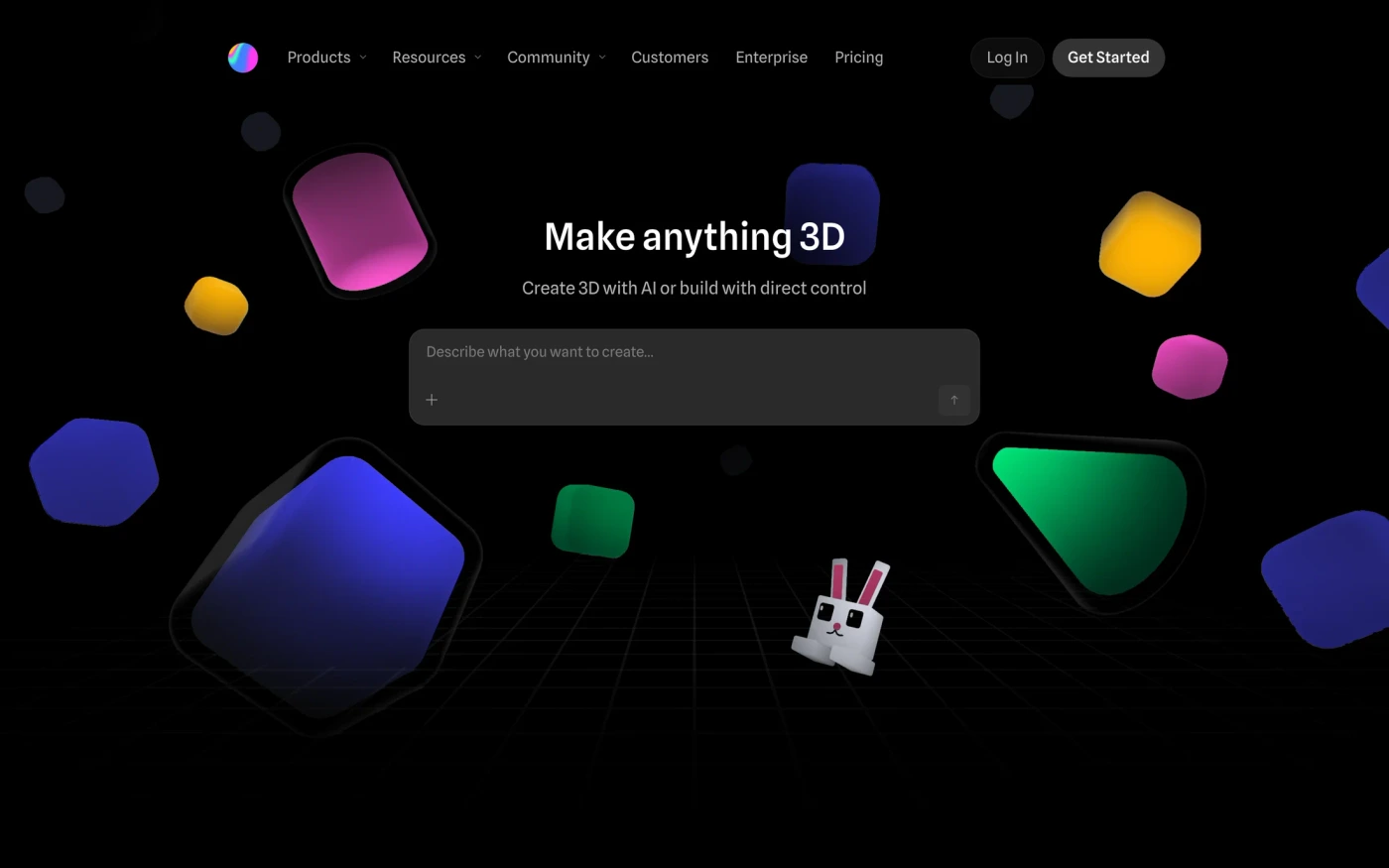
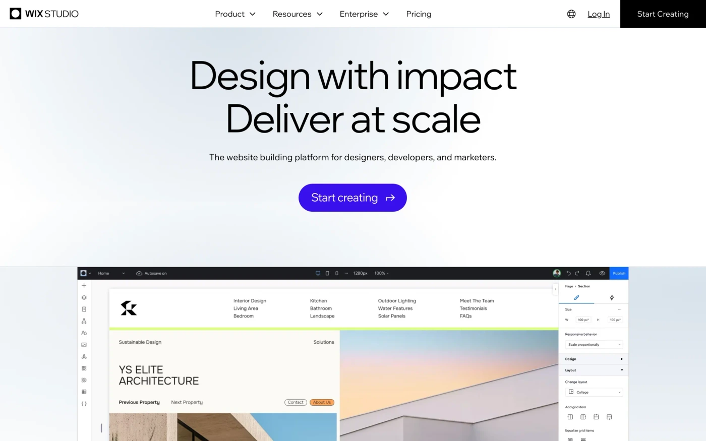
The biggest captures here are Bit (58), Wix Studio (54), Luminaireauthentik (52), Mallardandclaret (45), Mindmarket (41), and Spline (40).
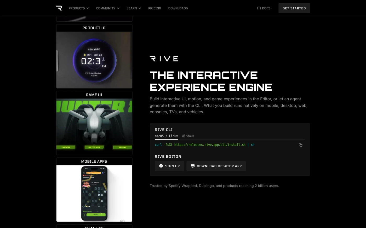
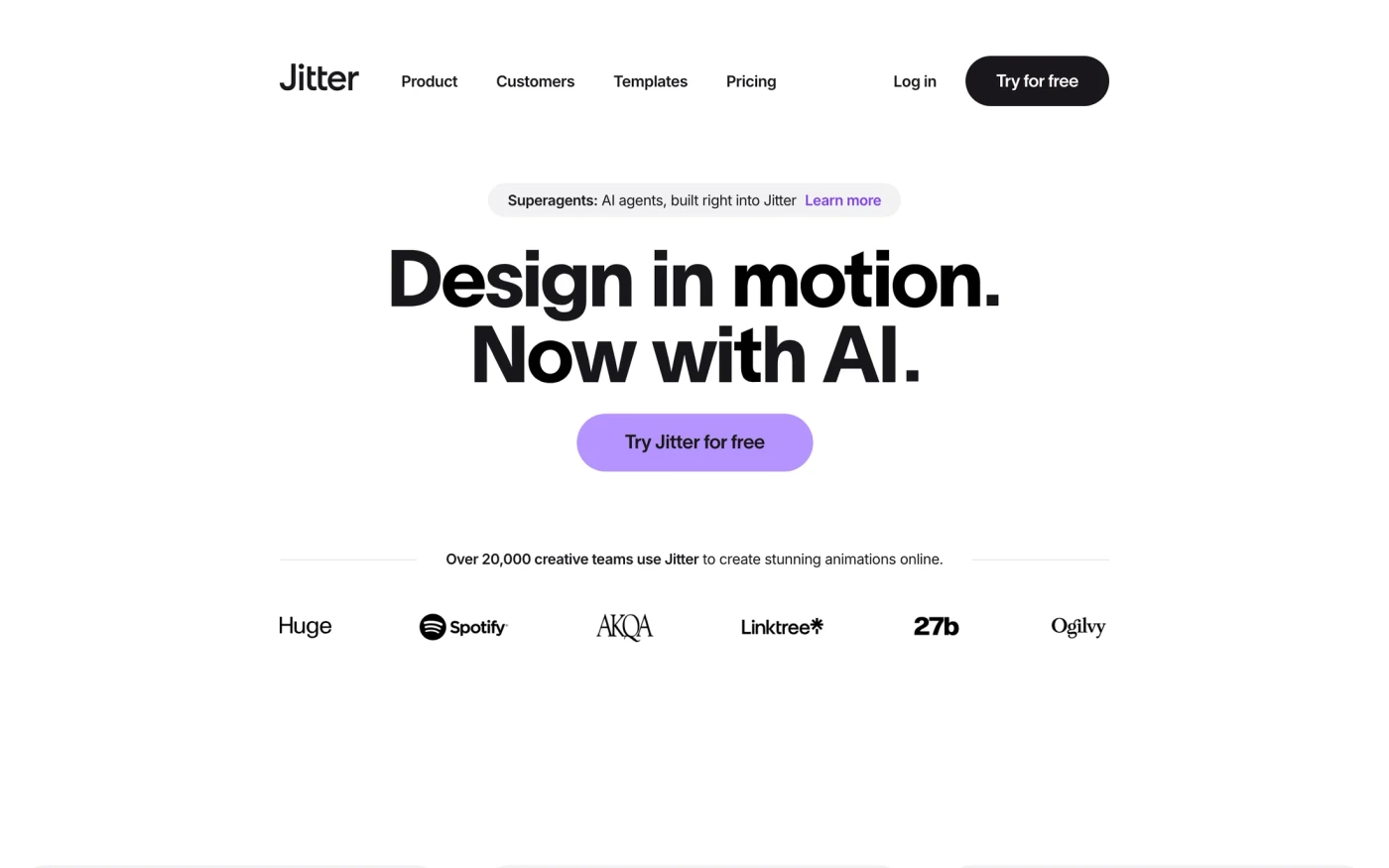
Rive keeps to 21 sections, led by content, with Orbitron headings in a dark style. Spline is long (40 sections, mainly content), with Spline Sans headings in a dark style. Jitter is long (30 sections, mainly content), with Inter headings in a light style. Wix Studio is long (54 sections, mainly content), with Wix madefor display v2 headings in a light style.
Headings draw on many families, among them PP Neue Montreal (7), Inter (6), Geist (5), and Aeonik (5).
Body copy varies more: Inter, PP Neue Montreal, and PPNeue Montreal.
Light styles lead with 196 captures, against 94 dark ones.
Neutral is the most used palette, in 174 captures.
210 captures keep inner pages, and 286 include a phone-size screenshot.
The captures were taken between September 2026 and September 2026.
Across the group there are 186 heading families and 17 section types.
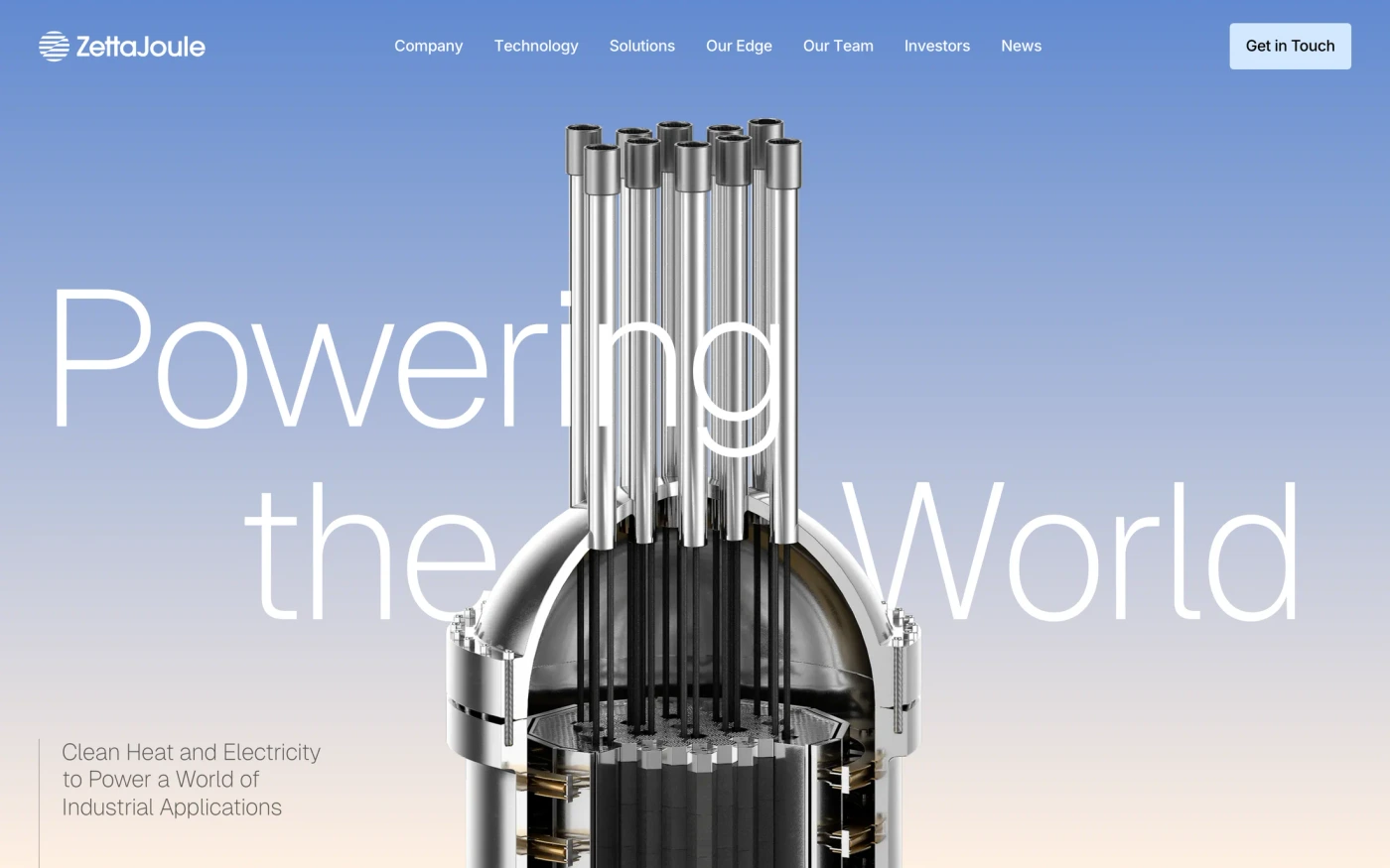
Featured here: Spline (40 sections) and Zetta Joule (35 sections).
Featured design agency website sites with their fonts
Agency website inspiration — FAQ
What makes agency website inspiration useful?
Study how a studio explains its practice, names project responsibilities, presents work and gives visitors a next step. Compare a positioning statement, a project shelf and a project-page opening as different references. Screenshots do not prove commercial results or that a layout performs better.
Are all Design & Agency catalogue entries agencies?
No. This broad existing tag also includes creative tools, portfolios and other websites. The gallery preserves its original membership; it is not a verified directory of 290 agencies. The six notes identify specific studio captures that were visually inspected.
What should an agency case study include?
Explain the project context, your team's role, constraints, decisions, deliverables and approved evidence. Attribute collaborators and keep outcome claims verifiable. The Multiply and Acquire references here are actual project-page opening views, not full studies or independently audited client results.
How should an agency explain services and positioning?
Use understandable service labels and state who the work is for. Connect each capability to relevant approved project evidence. Keep work, services and contact routes recognizable even when the brand uses expressive typography or motion; a screenshot of a link is not proof of a usable navigation journey.
What should I test before publishing an agency website?
Test narrow screens, keyboard navigation, image loading, reduced motion and the enquiry's validation, pending, success and error states. Provide a useful static fallback for WebGL or video. One inspected Merci-Michel capture showed a WebGL error and was excluded from these annotations; it is not evidence that the current live site always fails.
Can I use these agency designs as a template?
Use the structure as inspiration with your own branding, approved client copy and licensed assets. Captured designs belong to their owners. The original brief below is an editorial starting point, not a tested output from Cursor, v0 or another builder. Generated website prompts use the signed-in design allowance; API/MCP build tools require Pro.
Captured screenshots and brand assets belong to their respective owners.