


Website Hero Section Examples

1,576 real hero sections from 1576 captured websites

Explore website hero examples and hero section inspiration across industries. Below the gallery: six reviewed headline, CTA and imagery patterns, two actual mobile captures and an original implementation brief.

Filter

Colour family

Exact colour

Matched by perceptual (OKLab) distance to each palette and the colours measured in the capture.

Background

Six reviewed hero section examples

Different heroes do different jobs: start a form, separate sales from self-serve, explain a creative product, initiate a download, introduce a campaign collection or distinguish new and returning visitors. These notes describe the captures, not conversion results.

Notes reviewed . Screenshots and brand assets belong to their respective owners.

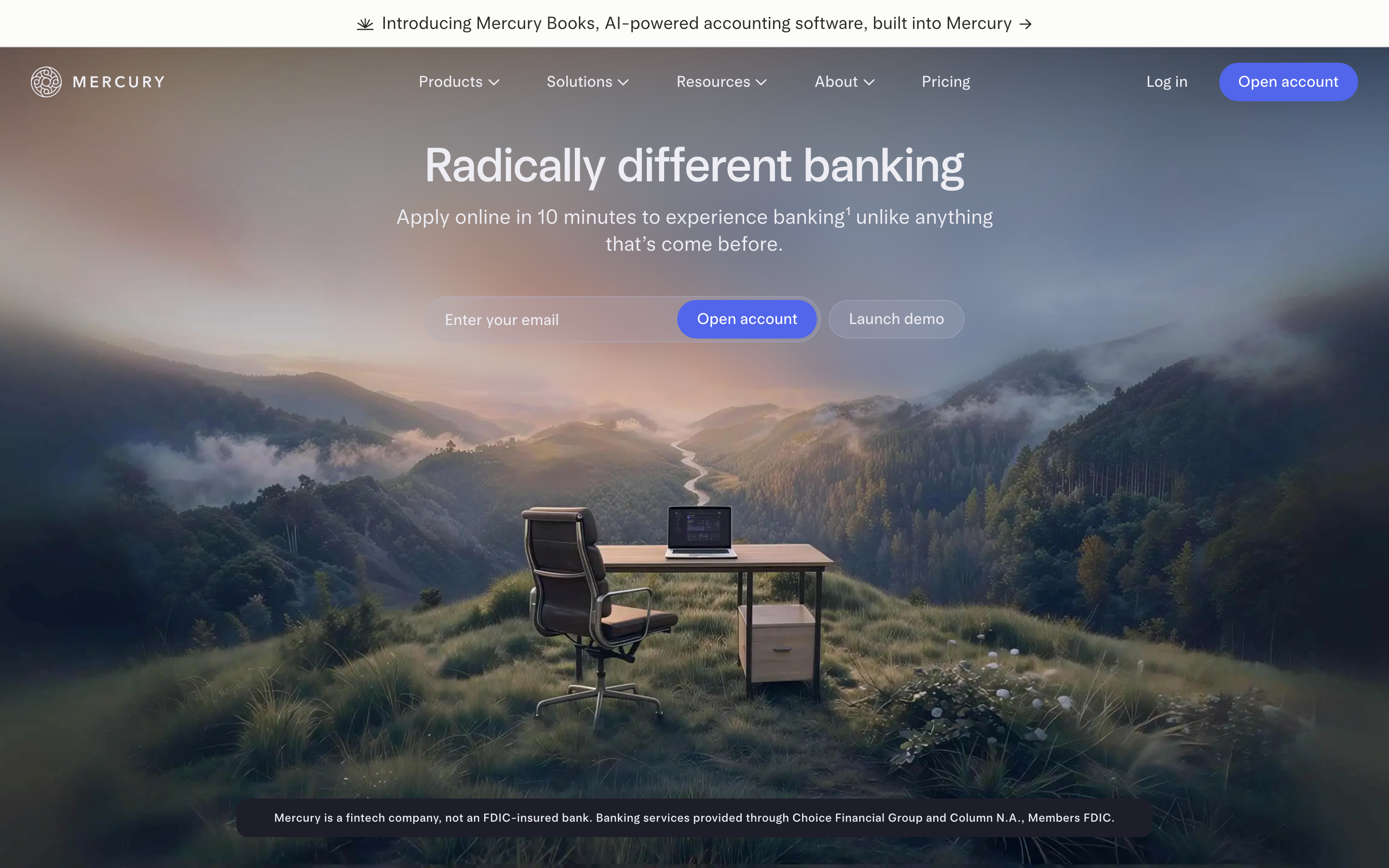
Mercury hero with a centered banking headline, email form and two actions over a landscape image
Desktop capture · · Mercury collection

01 / Mercury

Pair a headline with an immediate form action

What the capture shows
A centered headline and supporting sentence lead into an email field, a prominent account-opening action and a quieter demo action. The landscape photograph leaves room for the text, with disclosure copy in a dark band below.
What to adapt and test
Give the main action a clear destination and keep the secondary route distinct. If the hero starts a form, specify labels, validation, keyboard behavior and retained input; the still does not demonstrate any of those states.
Limits of the reference
This is a historical visual reference, not a verified banking offer. Write your own claims and disclosures, and test text contrast against the actual image or video frames.
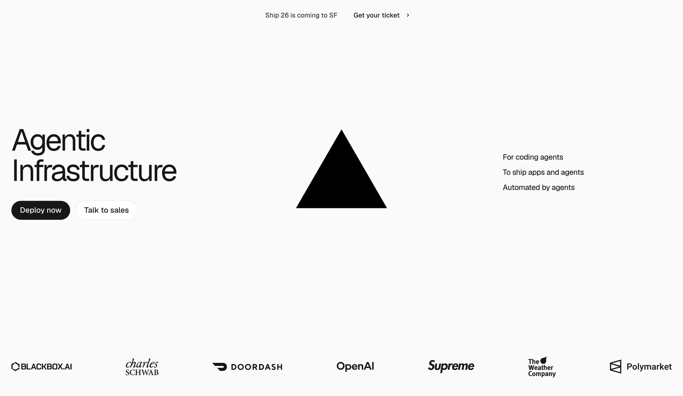
Vercel hero with a large headline on the left, a central triangle and deployment and sales actions
Desktop capture · · Vercel collection

02 / Vercel

Separate self-serve and sales routes

What the capture shows
The headline and two actions occupy the left, a triangular mark anchors the center, and short audience statements sit at the right. The deployment action is filled; the sales route is outlined. A customer-logo row is visible below.
What to adapt and test
Distinguish getting started from talking to a team when those are real alternatives. Use supporting text to explain an abstract headline, and keep the choice understandable when columns stack.
Limits of the reference
The capture does not test deployment, drag-and-drop, logo permissions or the effect of the layout on conversions. Use only logos and claims you are entitled to publish.
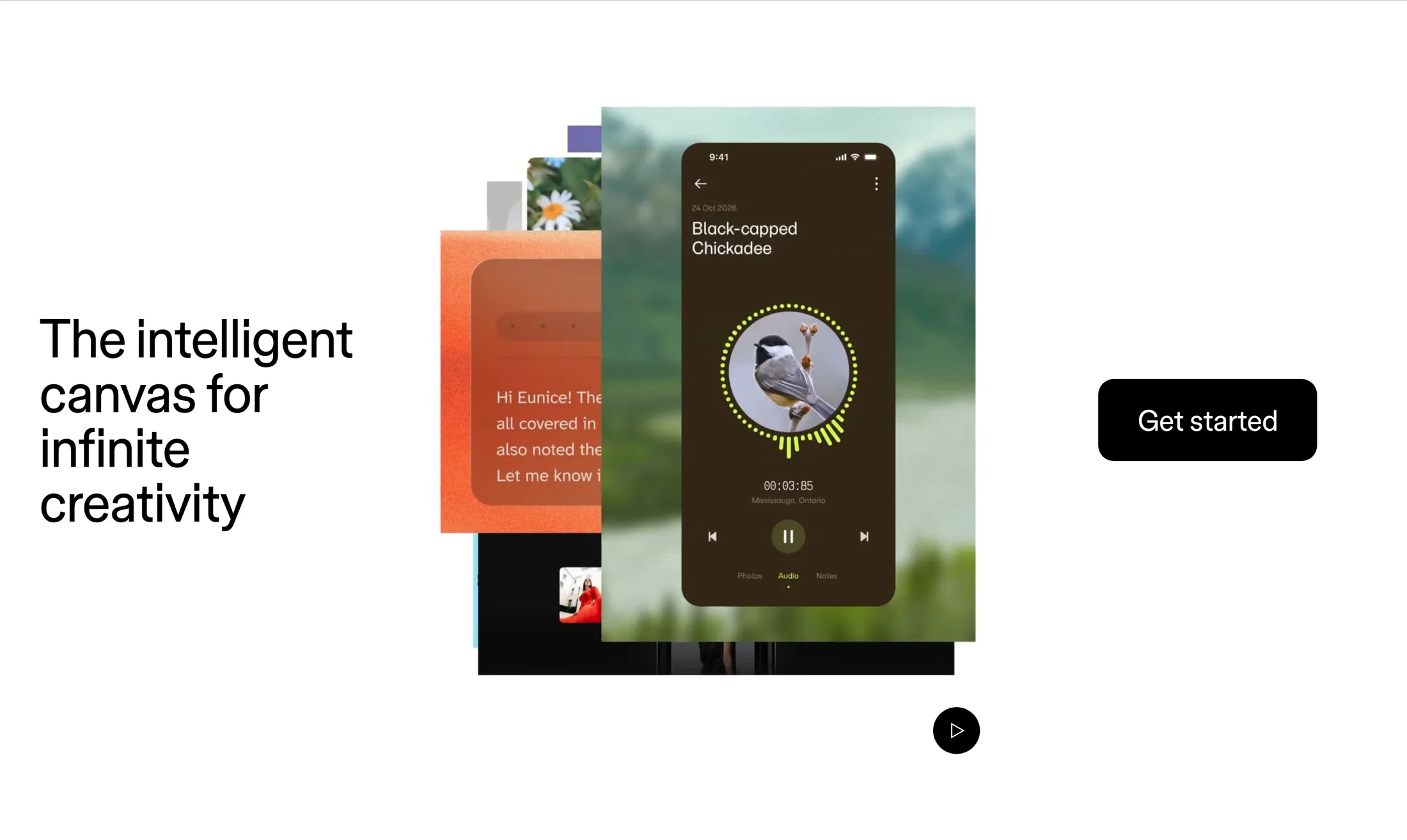
Figma hero with a large headline, a layered interface collage, a Get started action and a play control
Desktop capture · · Figma collection

03 / Figma

Let the visual demonstrate the creative promise

What the capture shows
A headline, a layered collage of interface imagery and a large start action divide the wide composition into three parts. A separate play control appears below the central visual.
What to adapt and test
Choose imagery that explains the product rather than filling space. Give video or interactive media a clear purpose and a useful static fallback; preserve the main action when the composition narrows.
Limits of the reference
A visible play control does not establish playback, keyboard access or reduced-motion support. The illustration and interface assets remain the source owner's work.
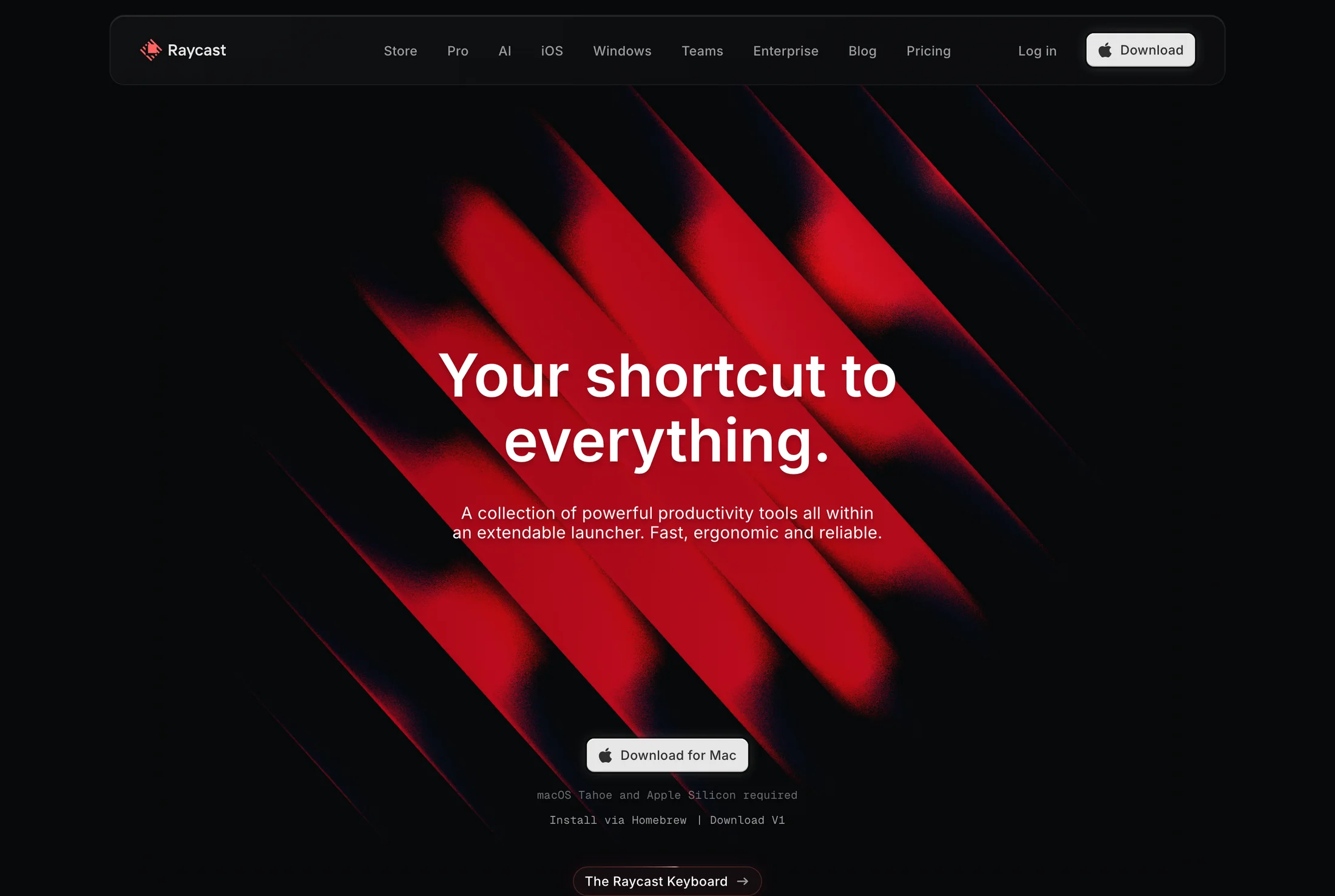
Raycast hero with a centered productivity headline, red abstract artwork and a Mac download action
Desktop capture · · Raycast collection

04 / Raycast

Put the product action and its requirements together

What the capture shows
The headline and supporting text sit over red abstract artwork on a dark background. The main action names a Mac download, with platform requirements and alternative installation text immediately below.
What to adapt and test
Name the consequence of the CTA. If the next step is a download, place relevant platform and installation information nearby instead of relying on a generic start label.
Limits of the reference
The reference shows historical compatibility copy, not current system requirements. Inspect the complete artwork for text contrast and verify your own download and fallback paths.
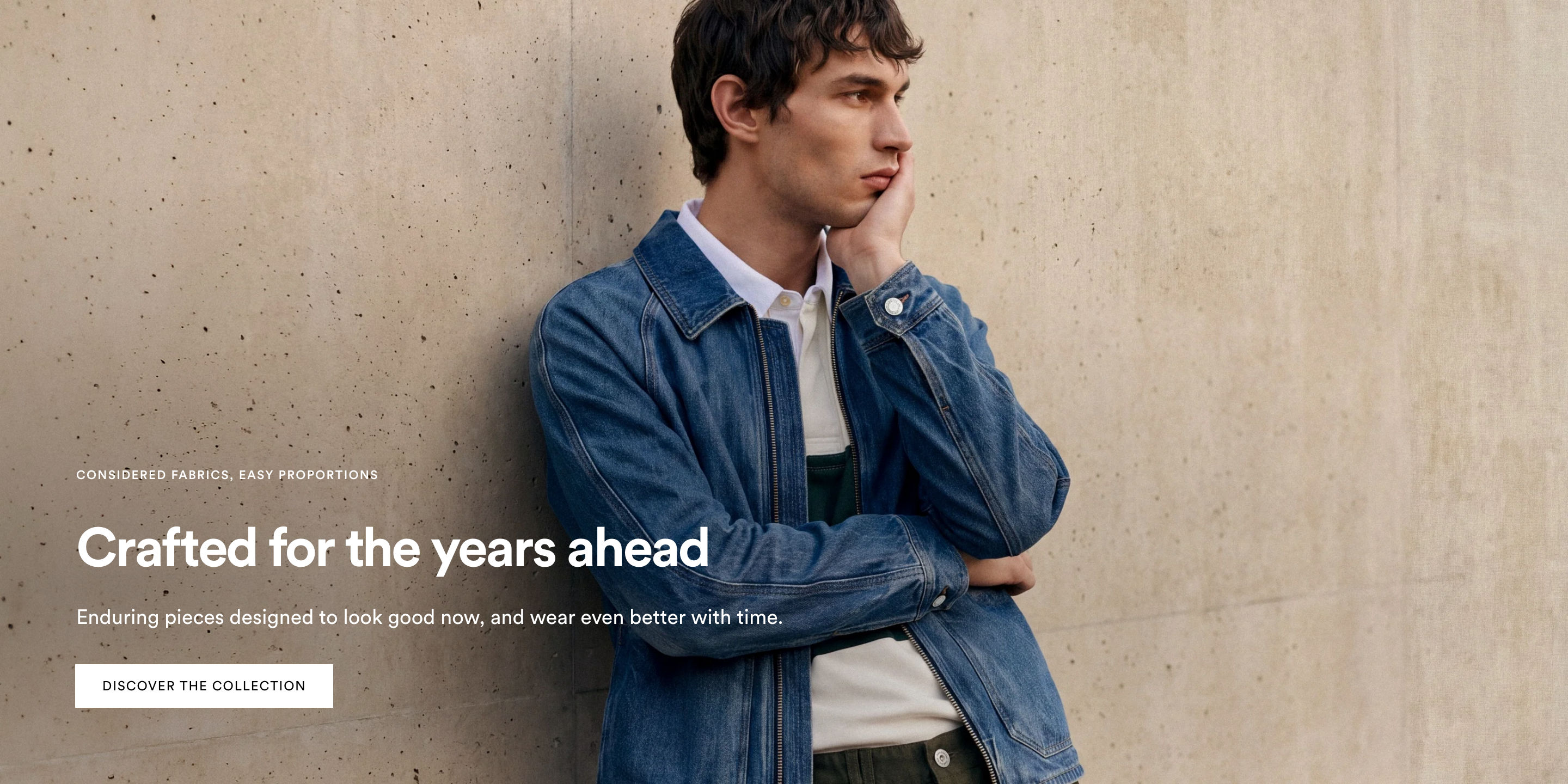
Frank And Oak hero with a full-width fashion photograph, lower-left white campaign copy and a collection action
Desktop capture · · Frank And Oak collection

05 / Frank And Oak

Give a campaign one clear collection route

What the capture shows
A fashion photograph fills the composition. An eyebrow, large headline and supporting sentence sit at the lower left, followed by one light collection action. The subject remains prominent beside and behind the copy.
What to adapt and test
Use one campaign route when it matches the visitor's task. Plan image crops around both the subject and the copy area, and check contrast across the actual photo rather than treating white text as automatically legible.
Limits of the reference
Only the desktop capture is reviewed here; a narrow-screen crop or collection destination is not demonstrated. Use your own licensed photography and approved claims rather than copying this campaign.
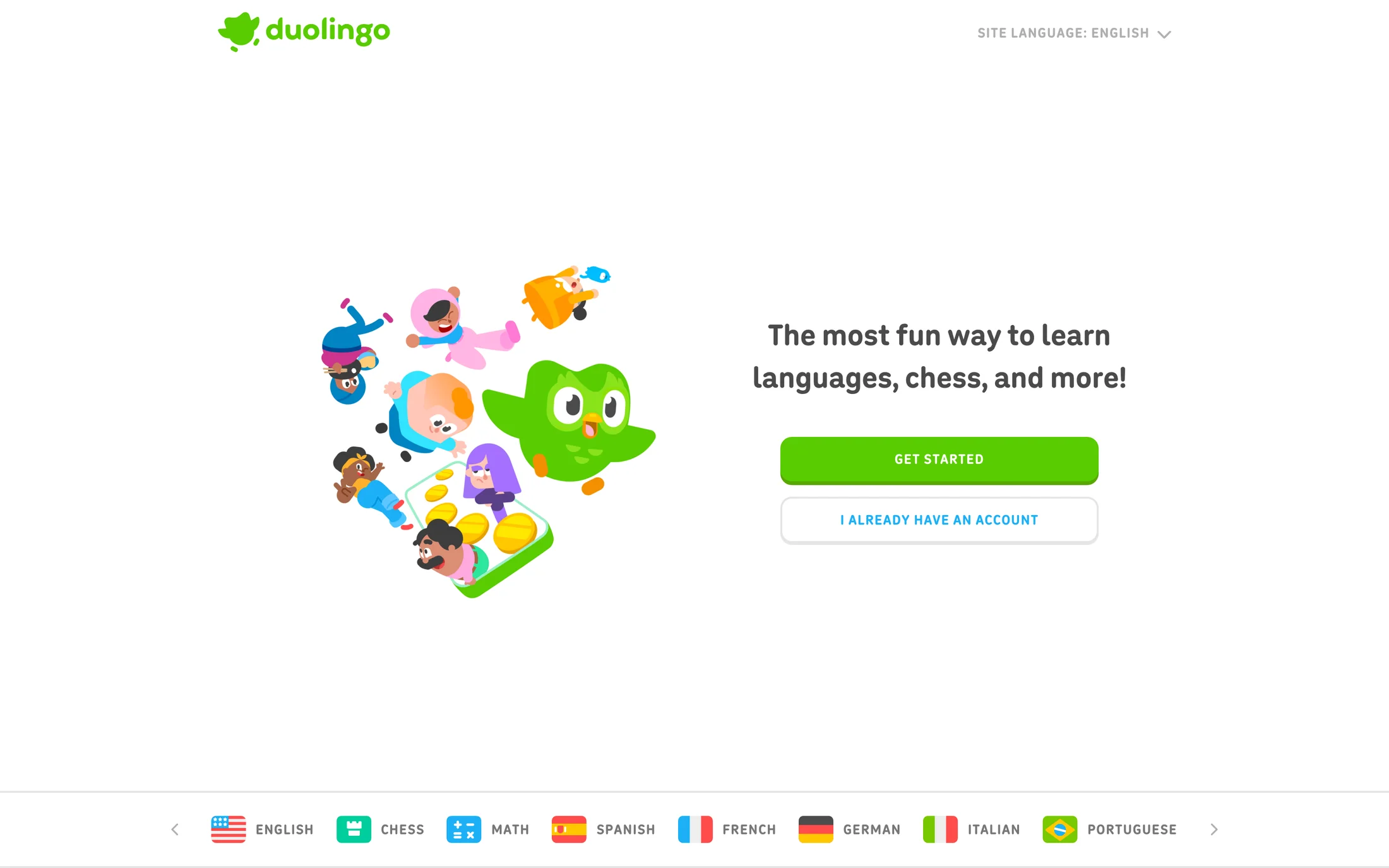
Duolingo website hero with character artwork beside a learning headline, a Get started action and a returning-account action
Desktop capture · · Duolingo collection

06 / Duolingo

Distinguish a new visitor from a returning account

What the capture shows
Character artwork occupies the left half, with a headline and two stacked actions on the right. The filled start action and outlined returning-account route remain distinct. A subject and language strip appears along the bottom of the desktop capture.
What to adapt and test
Make the returning-user route easy to recognize when the primary goal is acquisition. Decide whether the illustration explains the experience or delays the task, and test the vertical spacing on small screens.
Limits of the reference
These are marketing-website captures, not native app onboarding or proof of a completed sign-in. The screenshot's learning claim and availability are not verified; use your own artwork and approved copy.

Mobile hero section design: two actual captures

Review the action order, form width and panel sequence as well as the headline. These are existing mobile captures, not desktop images placed inside phone frames.

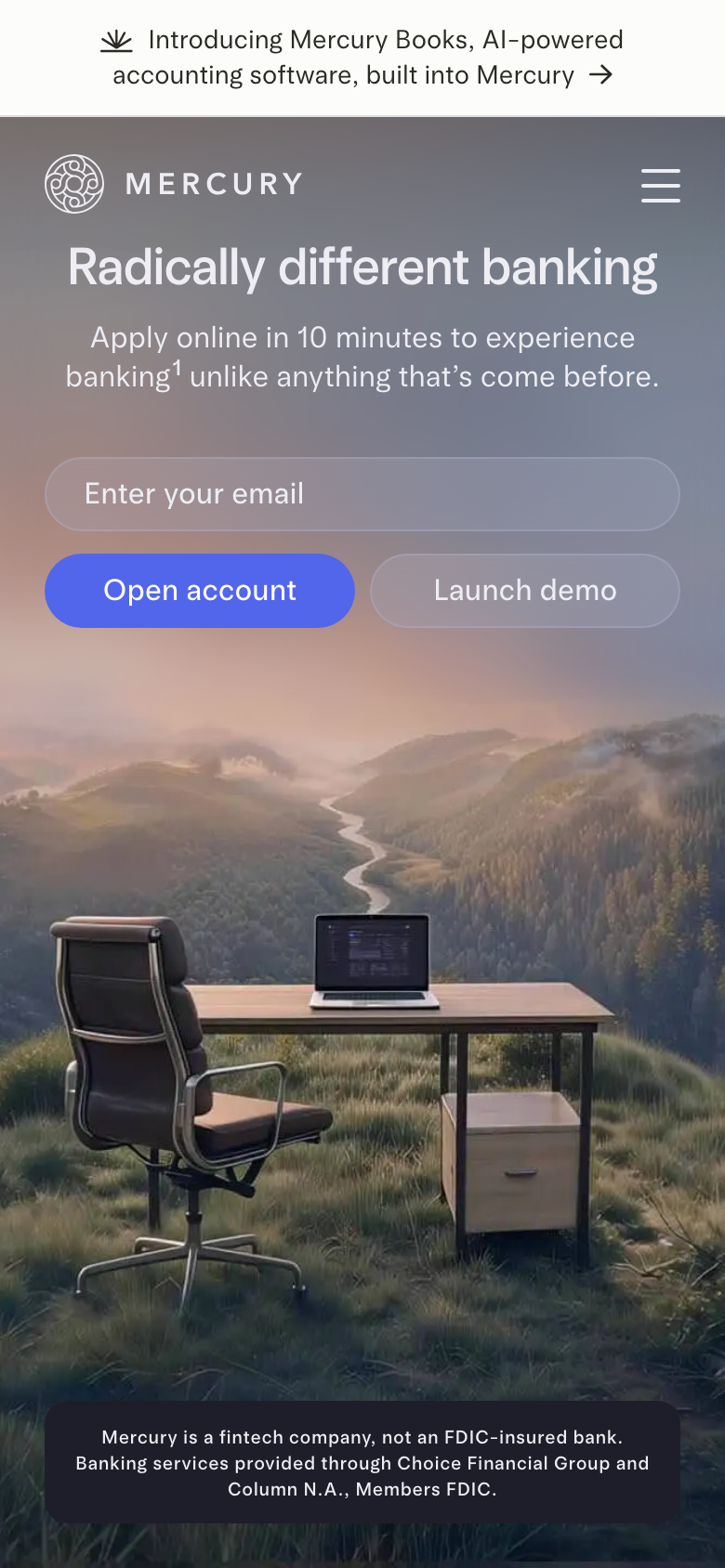
Mercury mobile capture with an email field above two actions and a disclosure band below the landscape image

Mercury: desktop and mobile observations

The email field occupies its own row above the two actions. Navigation condenses to a menu control, while the disclosure remains visible below the landscape. This capture does not show the keyboard-open or validation state.

Collection captured . Open the source collection

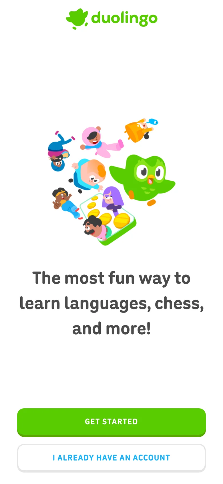
Duolingo mobile website capture with character artwork above the wrapped headline and two stacked account actions

Duolingo: desktop and mobile observations

The illustration appears above the headline, followed by the filled start action and outlined returning-account action. Generous vertical gaps and headline wrapping shape this captured viewport. The still does not establish scroll behavior, animation or the destination after either action.

Collection captured . Open the source collection

A practical hero design checklist

  • Make the headline specific to an audience and task; check long copy at the narrowest viewport.
  • Define the consequence of each action. Compare CTA section examples when the hero and next section need different routes.
  • Use imagery to explain the product or campaign, with licensed assets, reliable loading and meaningful cropping.
  • Choose readable font pairings and test the palette against all media frames, not just a favorable still.
  • Check the surrounding landing page: a hero alone cannot establish the complete narrative or outcome.
  • Test keyboard focus, mobile forms, failure states, motion controls and real action destinations in your implementation.

An original brief for your own website hero

Select and copy this brief, then supply your audience, copy, destinations and assets. It is an editorial starting point, not a newly executed or validated builder output. See the hero prompt guide or landing-page brief for the wider workflow.

Create an original website hero for my product.
Audience and task: use the audience and problem I supply; ask if missing.
Copy: use my approved headline and supporting sentence. Do not invent claims,
customer logos, prices, compatibility requirements or testimonials.
Actions: use my real primary destination and, only if useful, a distinct
secondary route. Label each action by its consequence. Do not ship dead links.
Reference: borrow the reviewed hierarchy, not the owner's assets or wording.
Assets: use my licensed imagery and brand fonts/colours. If an asset is missing,
identify it before implementation; do not substitute a misleading product UI.
Responsive layout: check 320px, 390px and desktop; preserve readable headline
wrapping, action order, disclosures and meaningful image cropping.
Behavior: specify keyboard focus and reduced-motion behavior. For forms, test
labels, invalid input, submission errors and retained values. For moving media,
provide usable controls and a static fallback. Do not invent a working backend.
Acceptance: verify real destinations, loaded assets, contrast, keyboard use
and no horizontal overflow. Report checks performed and anything unverified.

More section types

Festival graphics

Website Hero Section — FAQ

What is a website hero section?

It is the opening section that introduces a page's purpose and helps a visitor choose a next step. A hero can combine a headline, supporting copy, an action and relevant imagery, but the right structure depends on the task rather than a fixed template.

How do I choose a hero headline and call to action?

State the audience, the problem or outcome, and the next step in understandable language. A start, demo, sales enquiry, download and story link are different destinations. Keep the main route distinct and use a secondary action only when it supports a real alternative.

Does a hero section need an image or video?

Use media when it explains the product, sets useful context or demonstrates an experience. Product imagery, interface examples and a static composition can serve different jobs. A video or carousel also needs tested controls and a useful fallback; a screenshot of its controls is not proof of their behavior.

How should hero section design change on mobile?

Check headline wrapping, action order, form width, image cropping, navigation and disclosures at a narrow viewport. This page includes actual Mercury and Duolingo website mobile captures, not simulated phone mockups or native app screens. Still captures show the layout, not keyboard-open states, working controls or a completed journey.

Are these proven high-converting hero examples?

No conversion uplift or source-site accessibility result is established by this review. The notes describe captured interfaces and suggest what to test. App offers, logos, compatibility text and medical or financial claims in the screenshots remain historical source content, not endorsements or verified current facts.

How can I adapt a hero reference with an AI prompt?

Specify your audience, approved copy, real action destinations, brand assets, responsive behavior and acceptance checks. Use your own implementation and assets rather than requesting a clone. The original brief on this page is an editorial starting point, not a newly validated output from an AI builder.

Library updated