
Education Website Inspiration
Real design inspiration from 109 education websites · 2,979 curated sections



Education sites structure the journey: courses, outcomes, instructor credibility and clear enrolment steps. Captured from live products — not mockups — with extracted color palettes, fonts, and AI-ready build prompts.
Filter
Exact colour





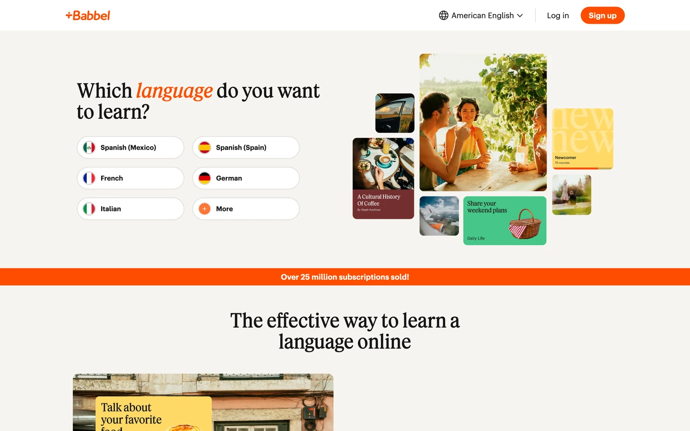
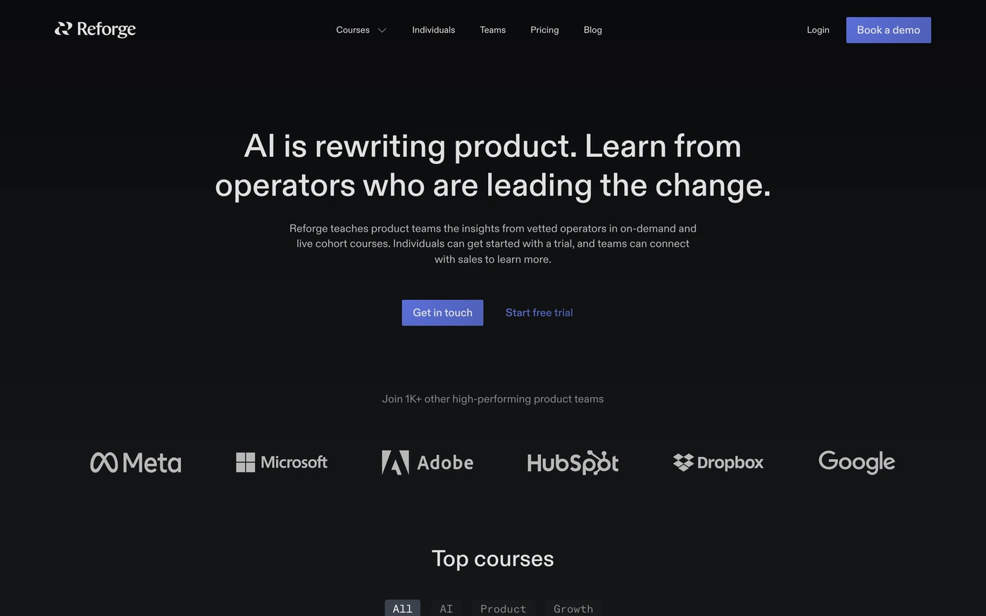

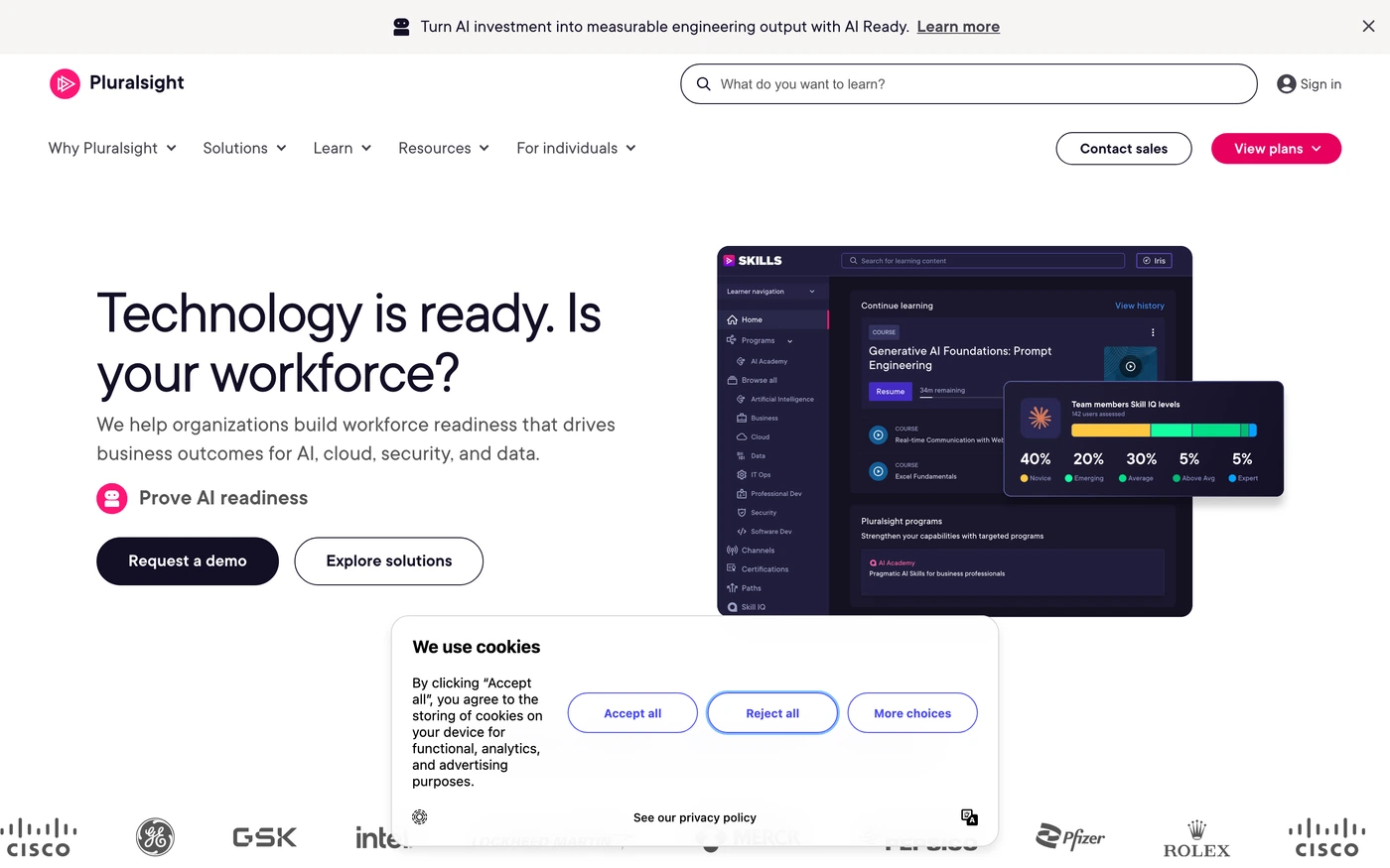

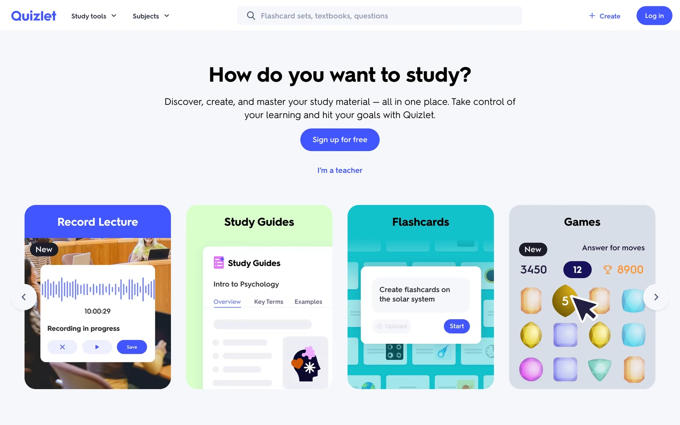



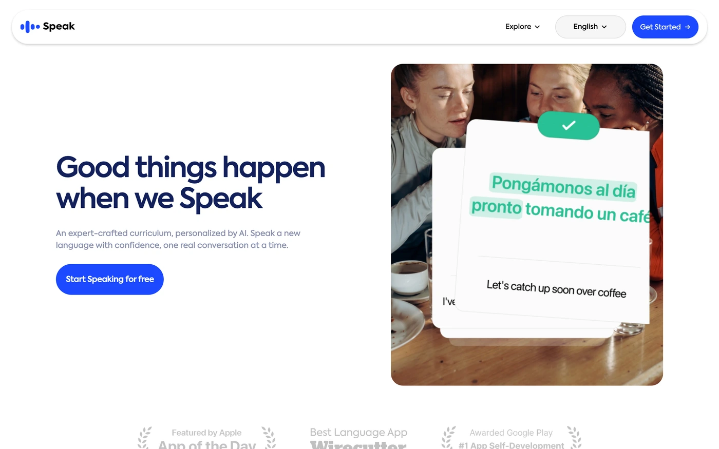

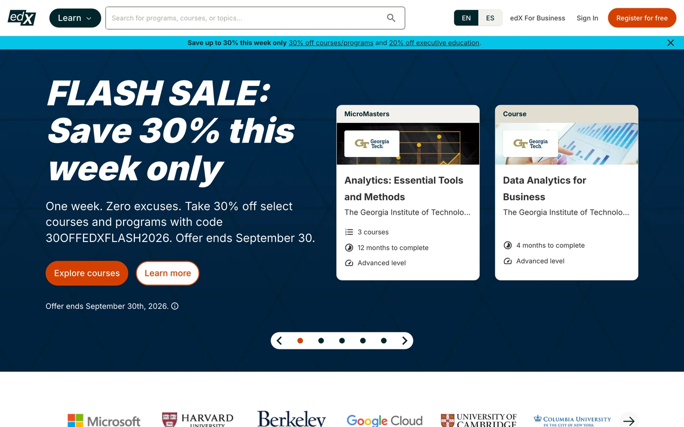

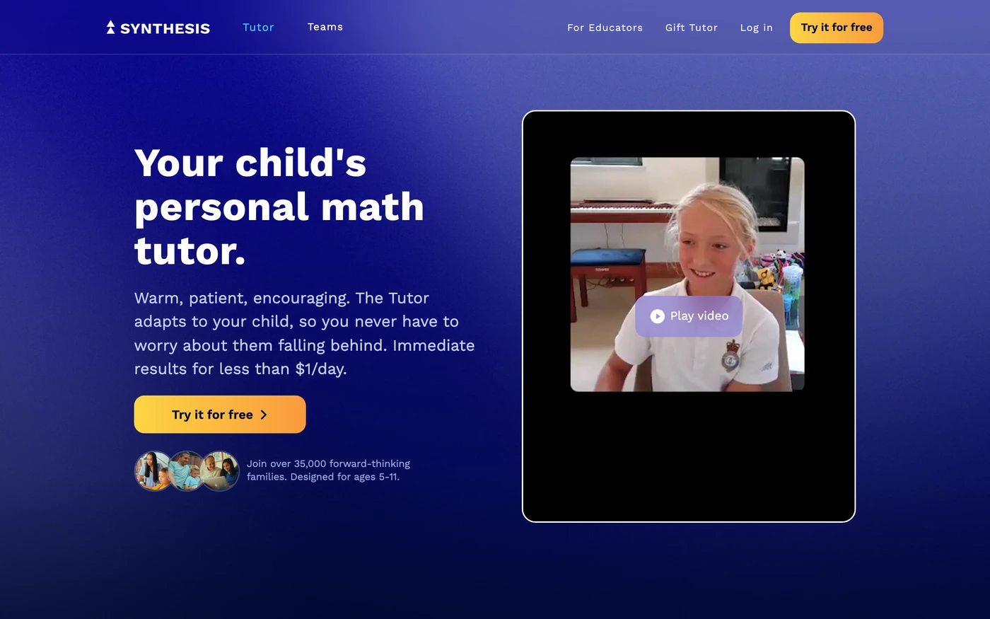

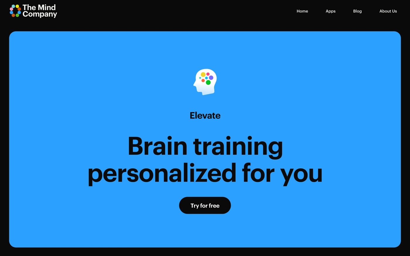

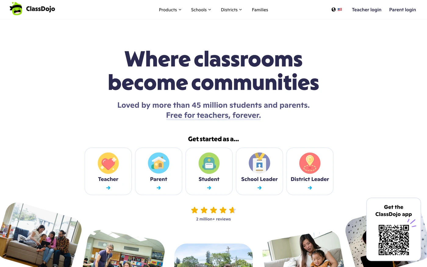

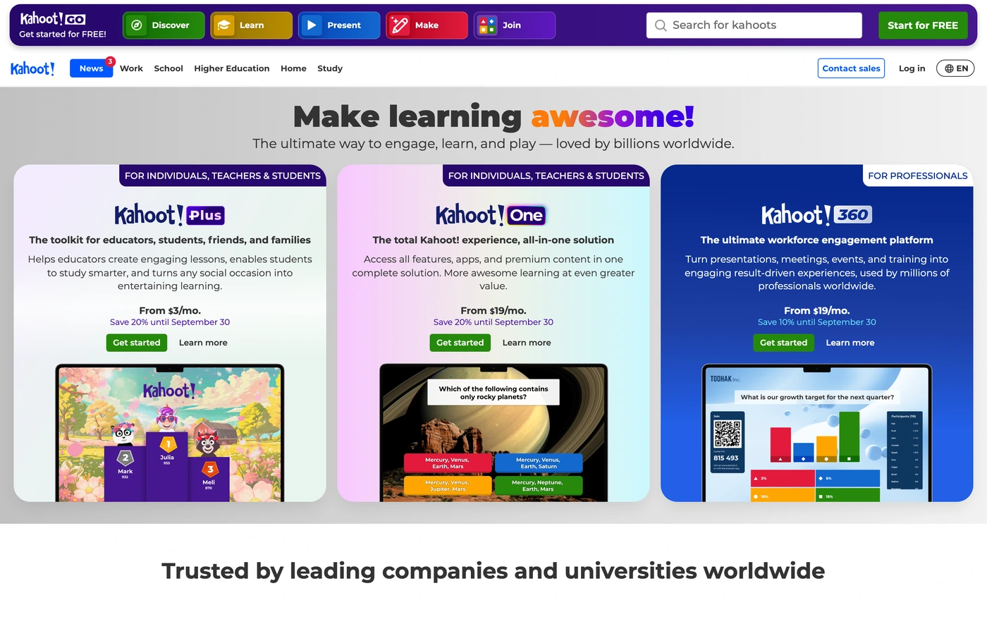

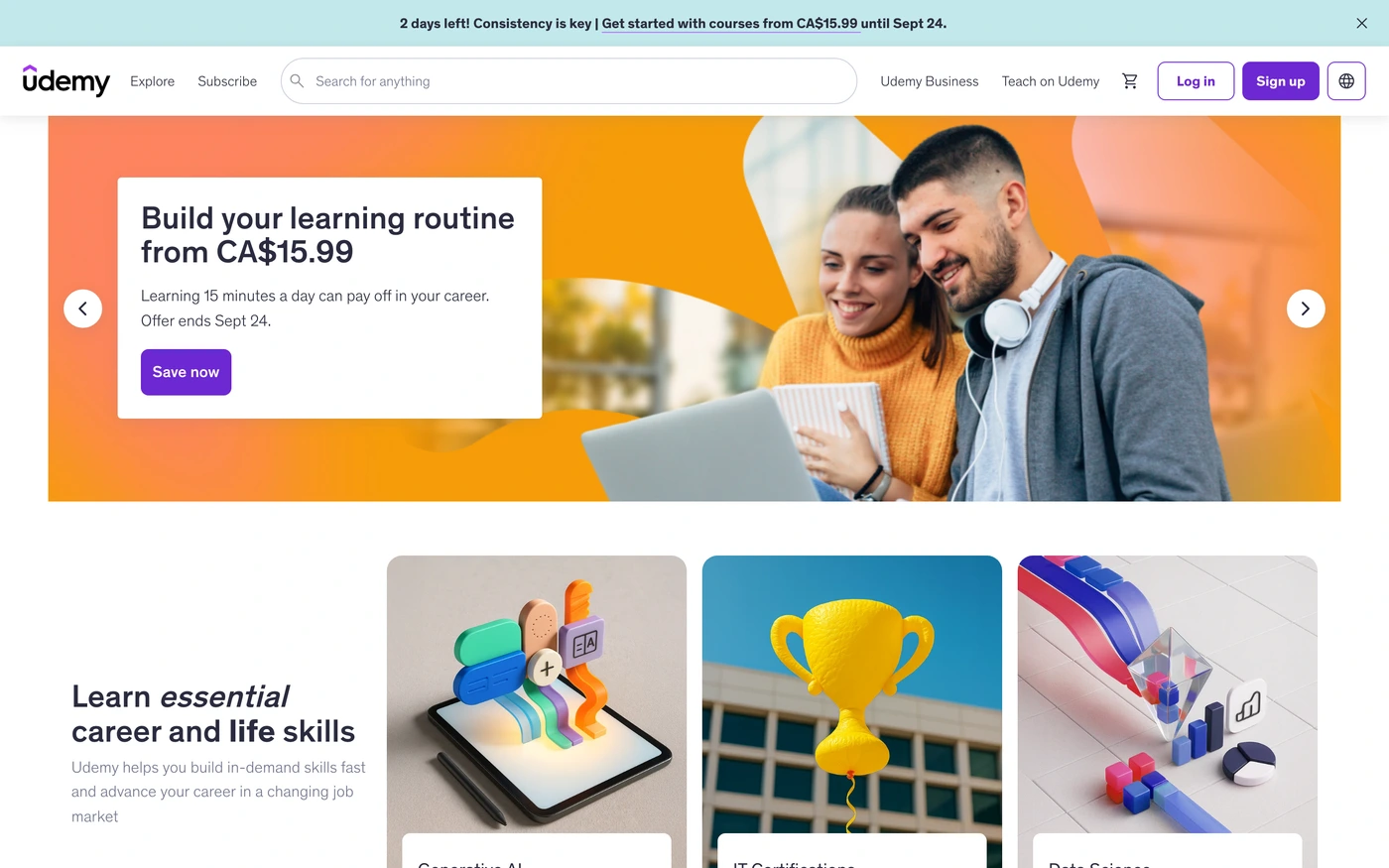





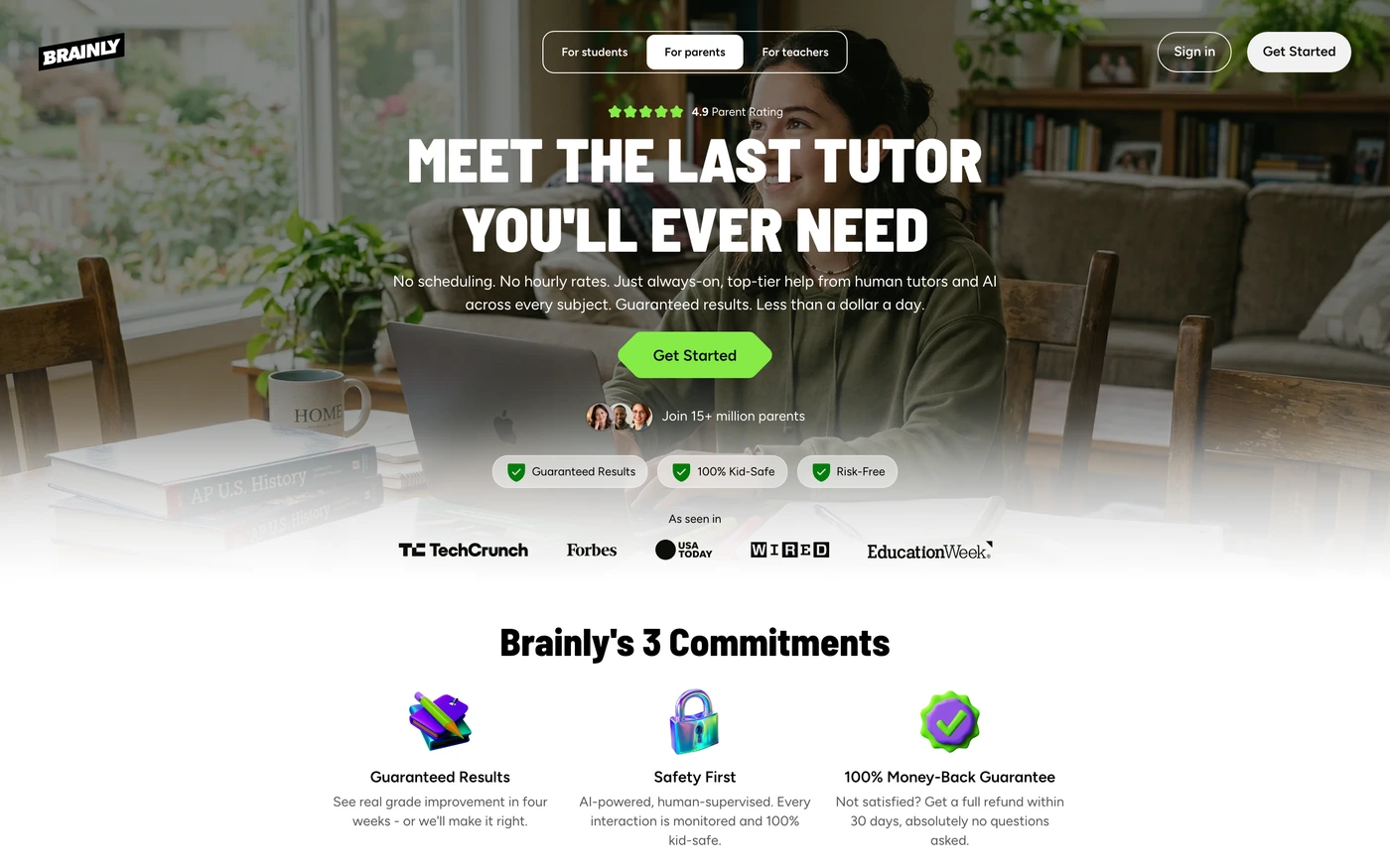
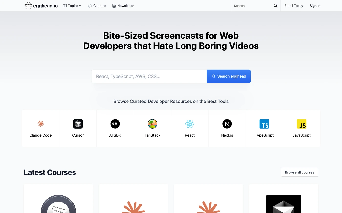

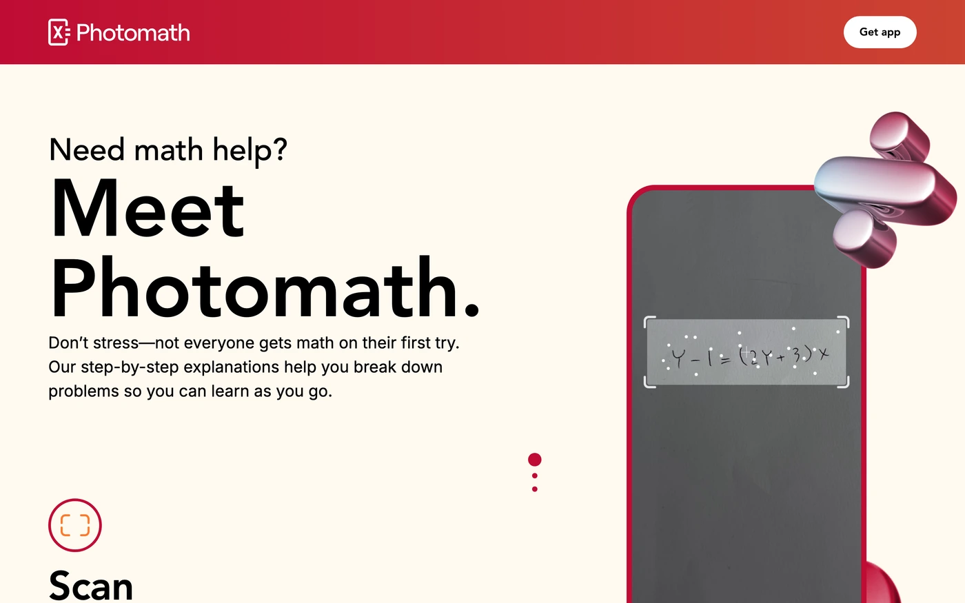
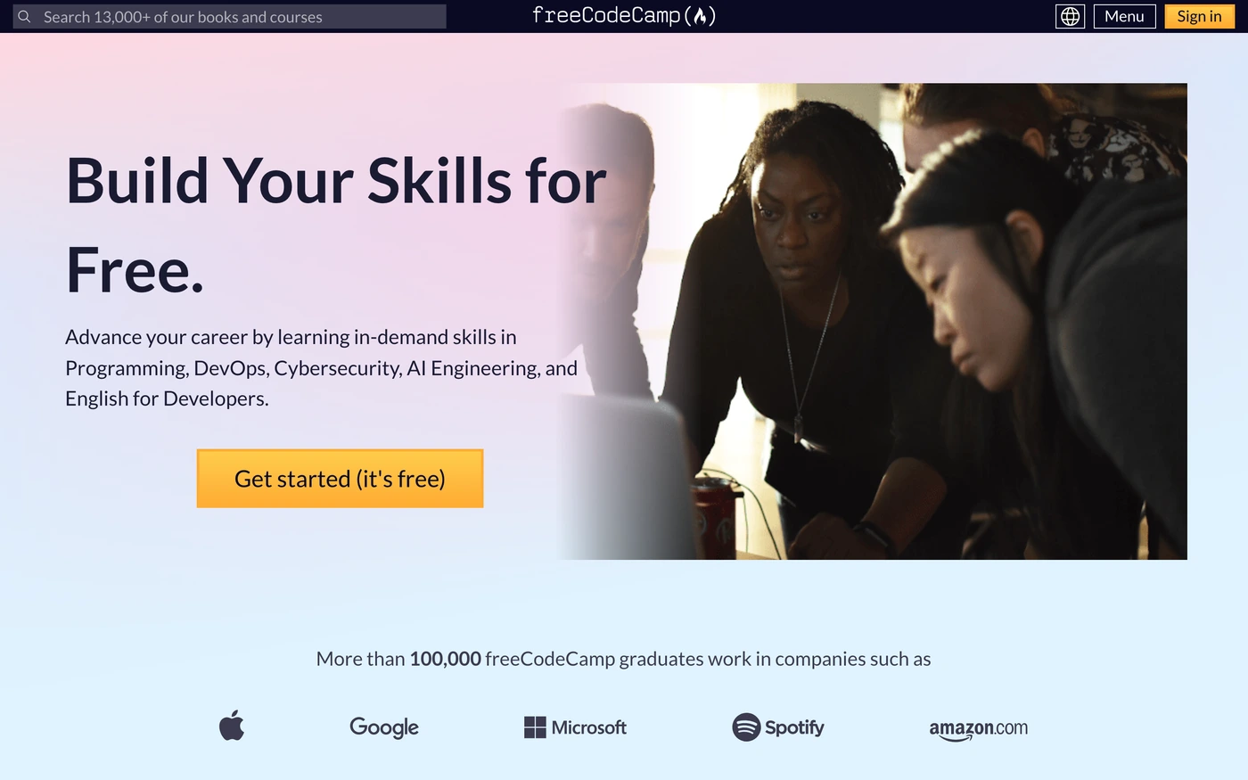

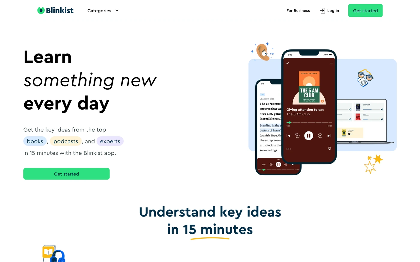

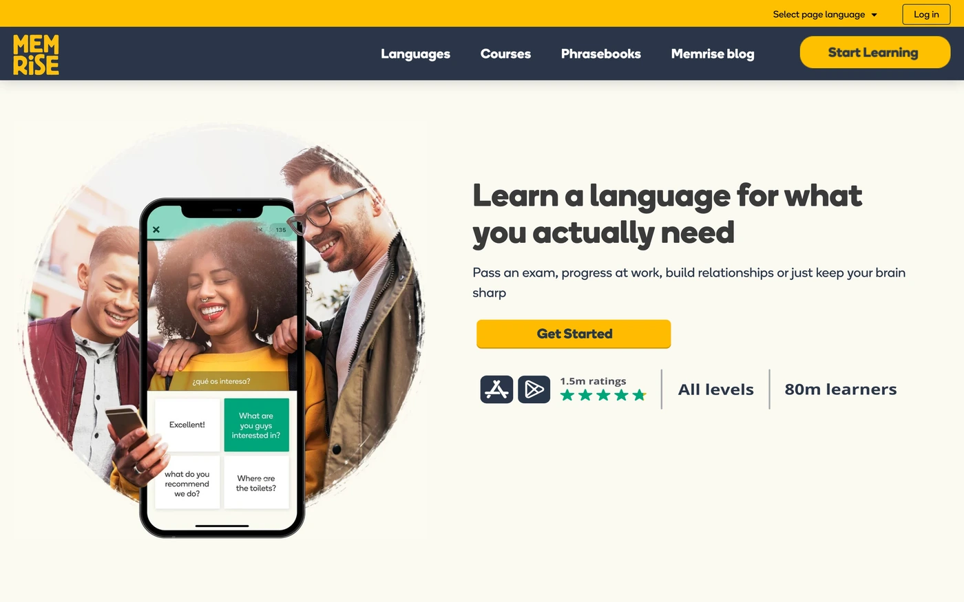





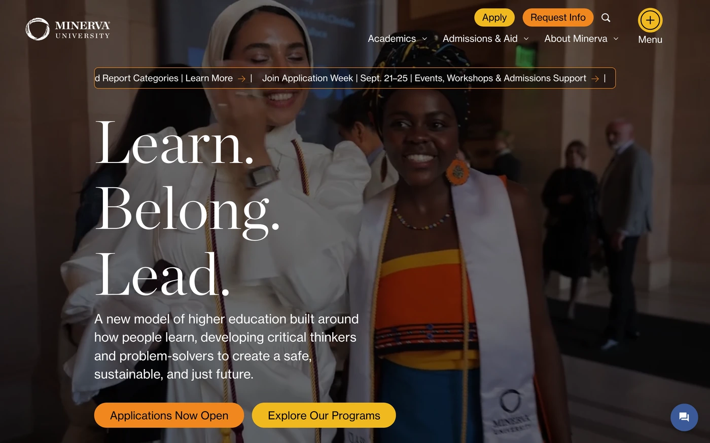

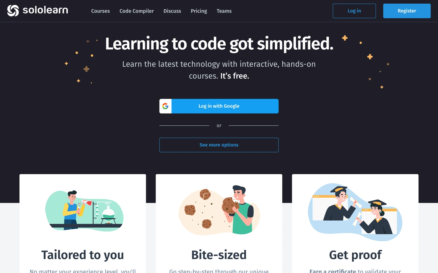

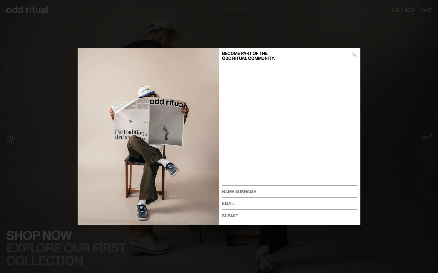

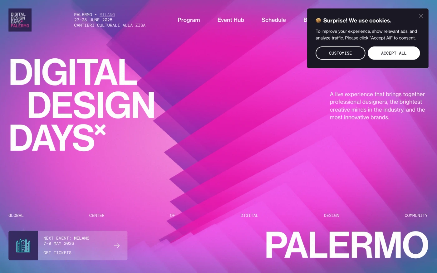







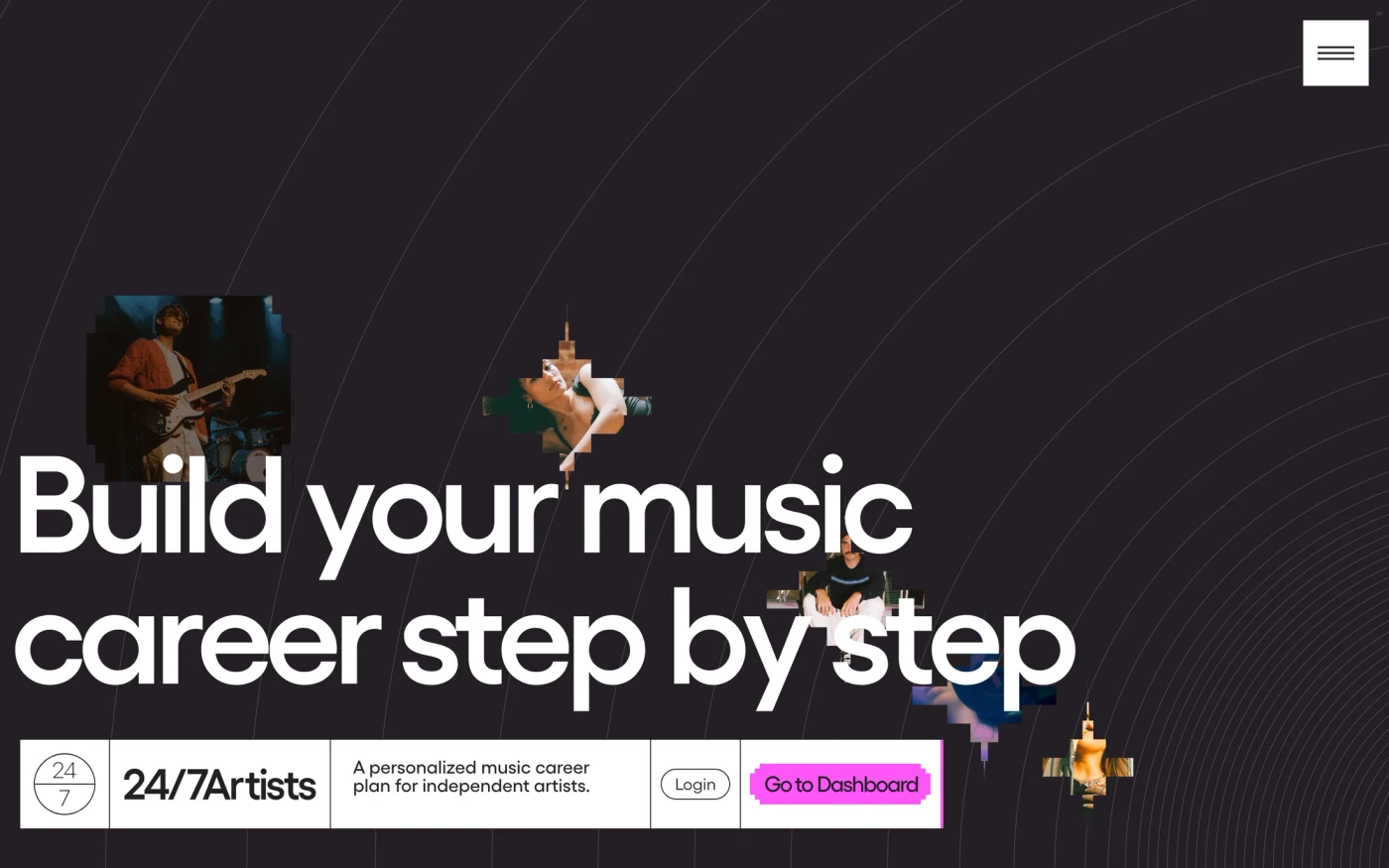

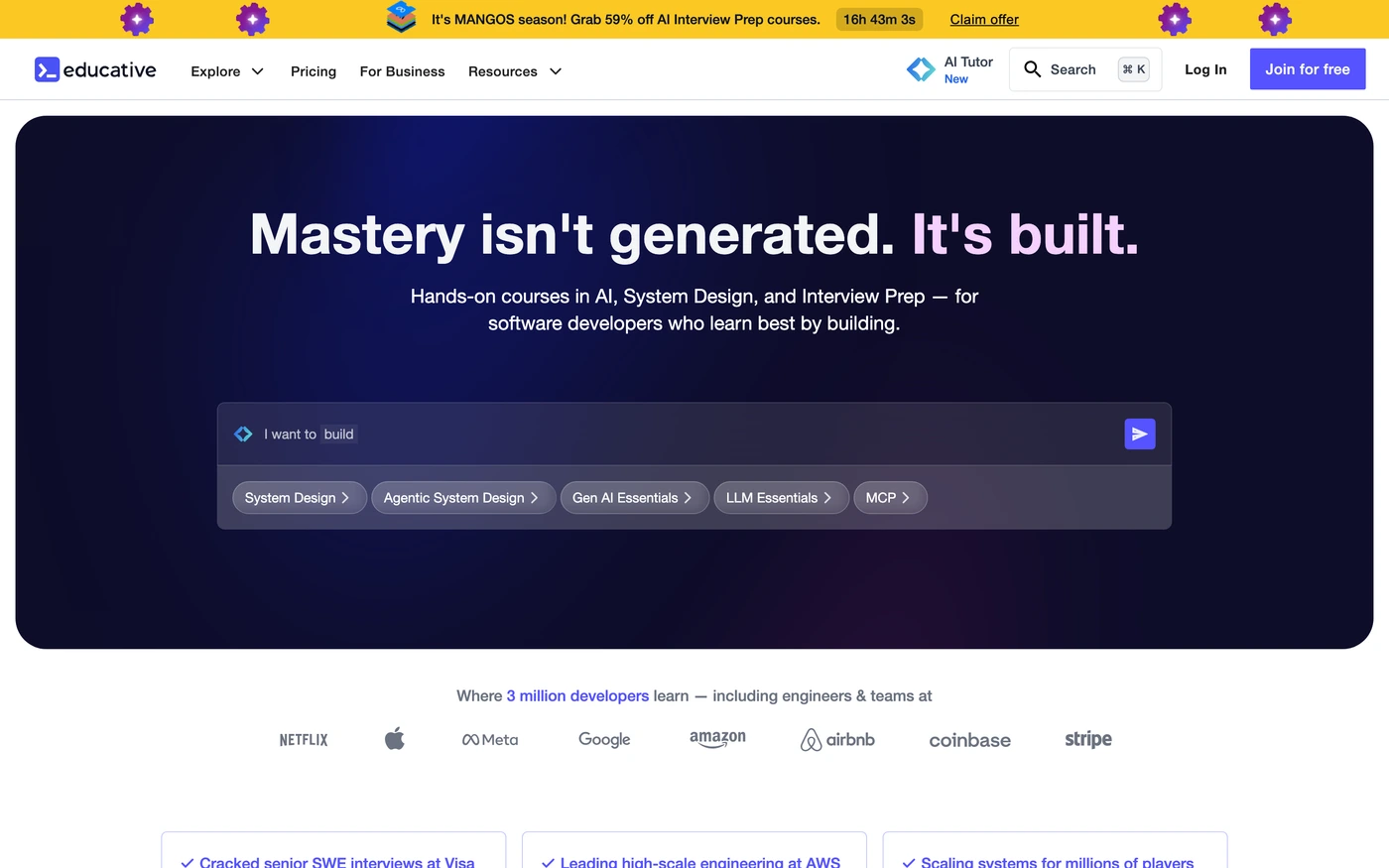

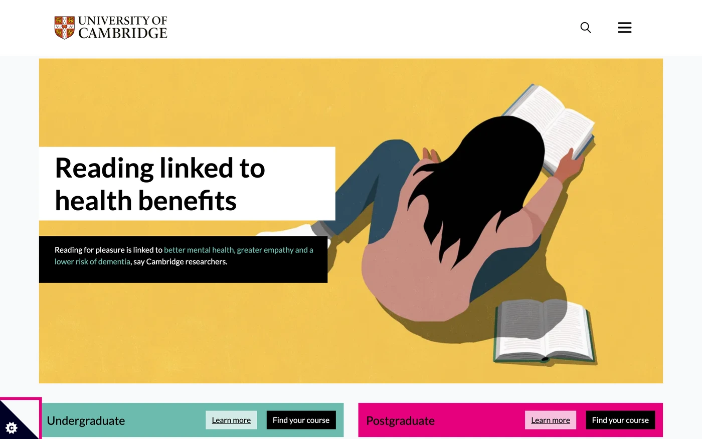

About Education website references
Education has 109 captures in the library, cut into 2,979 sections, and ranks 12 of 18 categories by size.
Nearly every capture has a features section; footer and hero come next, at 71% and 65%.
Section types seldom seen: integrations, team, and how it works, on 1, 10, and 12 captures.
Most captures are short, averaging 27 sections (from 0 to 73).
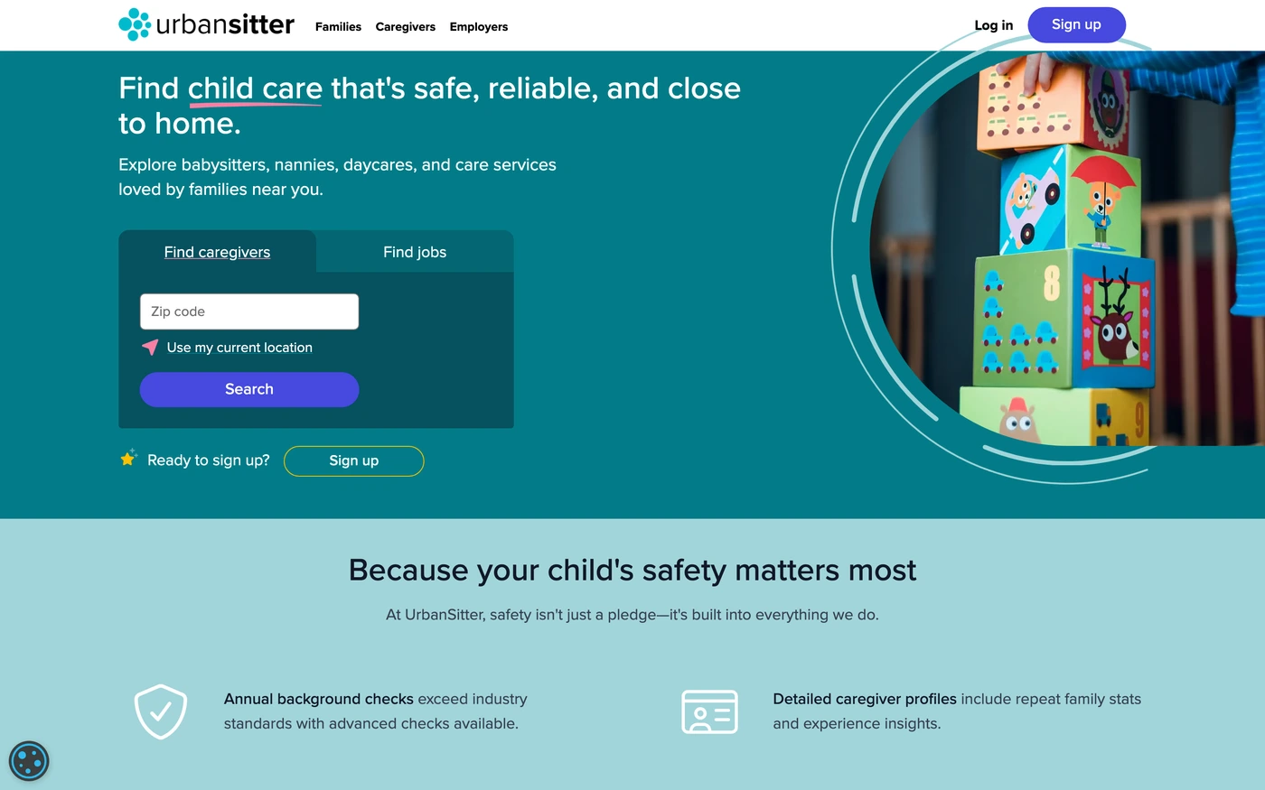
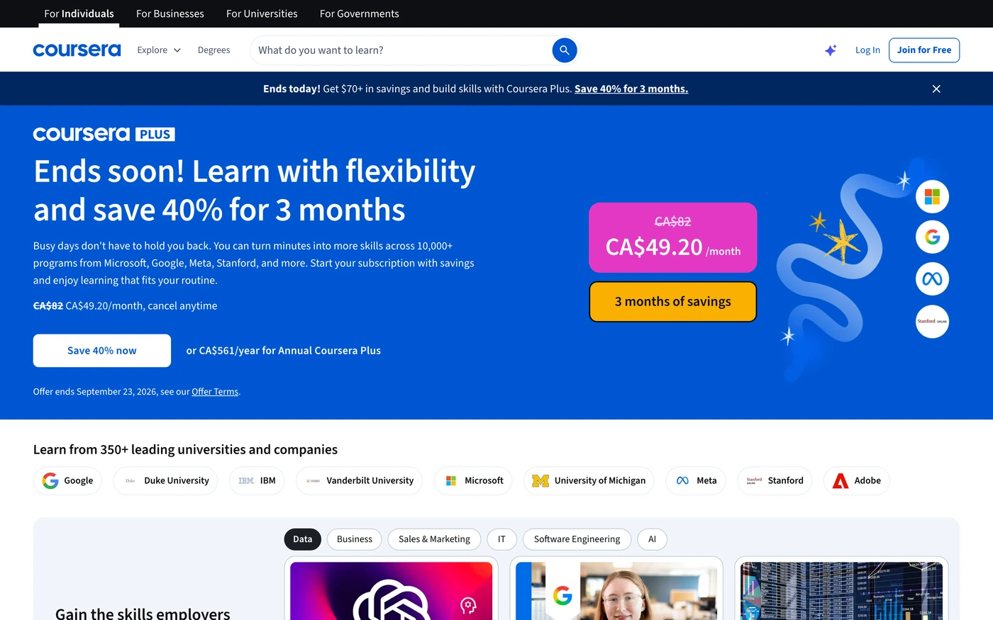
Top by section count: DataCamp (73), Synthesis (63), edX (61), Coursera (59), Wonderschool (55), and Care.com (53).
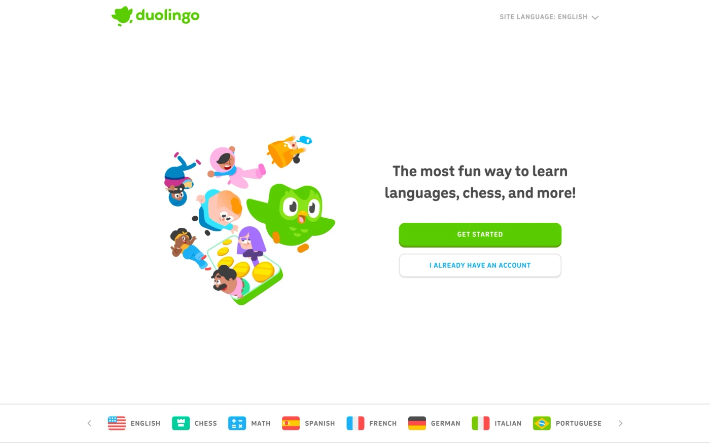
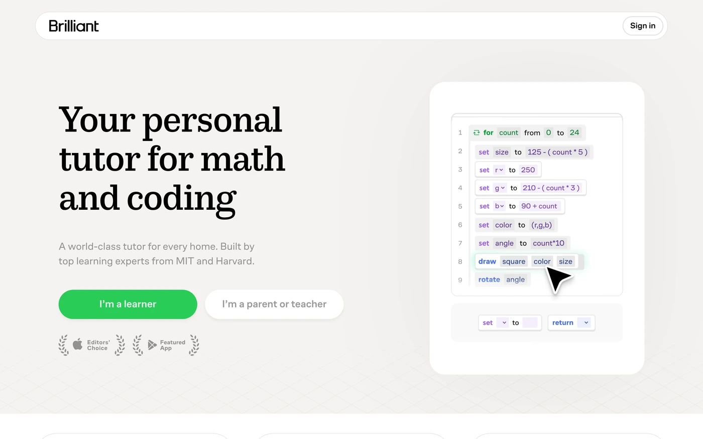
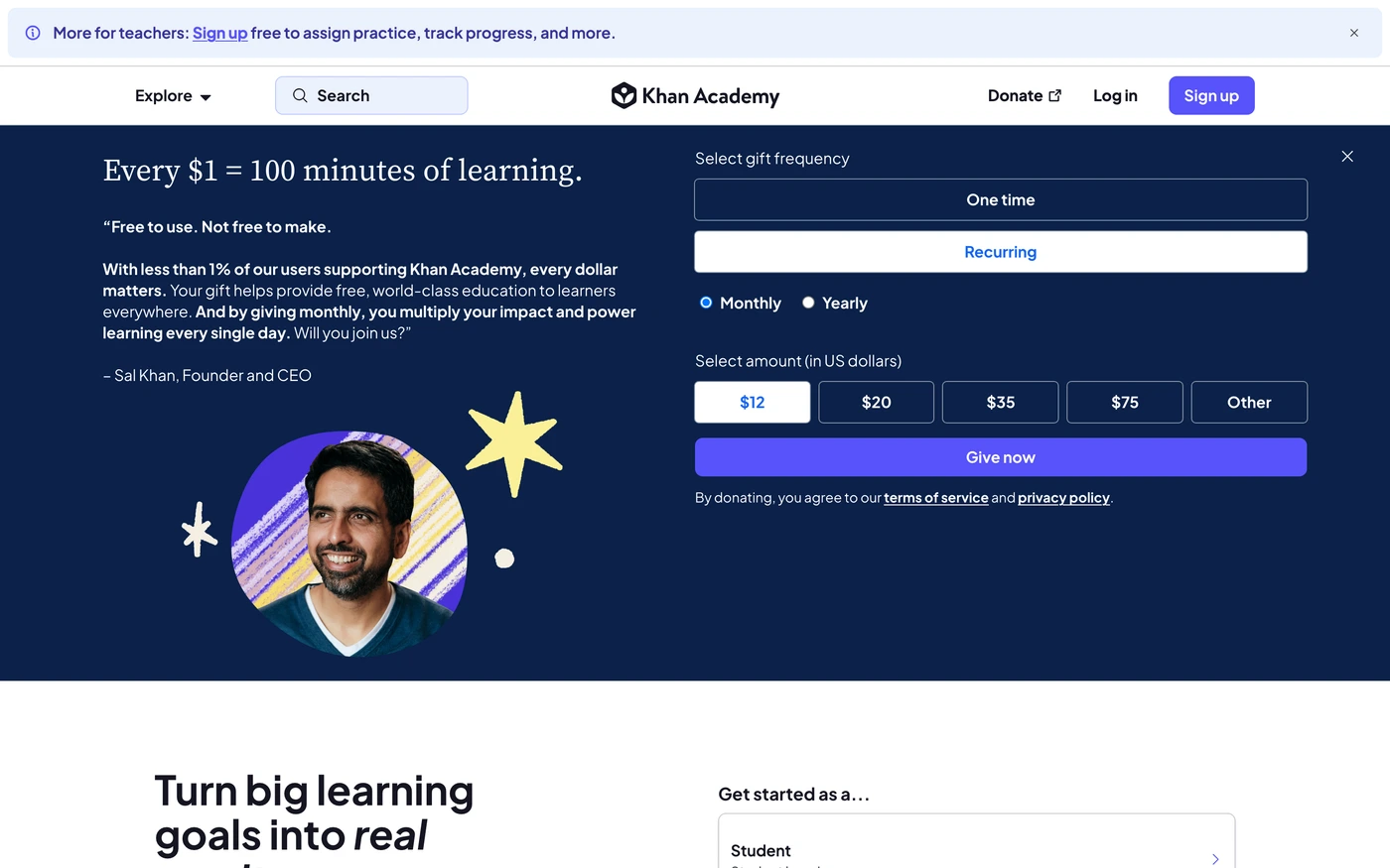
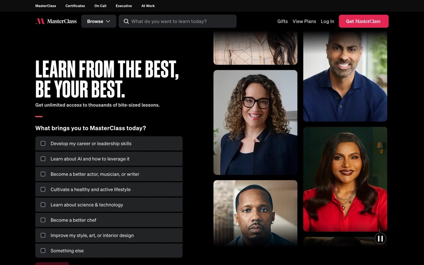
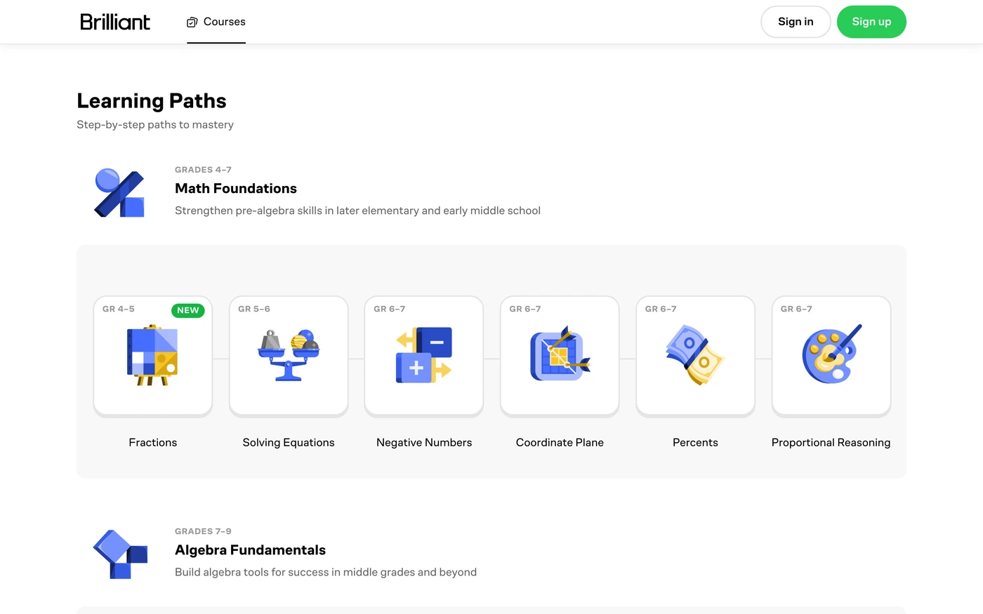
Duolingo keeps to 24 sections, led by features, with Duolingo sans headings in a light style. MasterClass is long (35 sections, mainly content), with Sohne Schmal headings in a dark style. Brilliant is long (43 sections, mainly features), with Co Fo Robert headings in a light style. Khan Academy keeps to 16 sections, led by content, with Plus Jakarta Sans headings in a light style.
Headings draw on many families, among them Graphik (4), Lato (3), Source Sans Pro (2), and Inter (2).
Body copy varies more: Graphik, Inter, and Lato.
Light styles lead with 95 captures, against 14 dark ones.
The palettes cluster around blue, neutral, and red.
Almost all of them keep inner pages, and 107 include a phone-size screenshot.
The captures were taken between September 2026 and September 2026.
Across the group there are 87 heading families and 17 section types.
Featured here: MasterClass (35 sections) and Brilliant (43 sections).
Education design: what 109 real sites have in common
Use these education design examples as a starting point for a new site, a redesign, or a client pitch. Study how Duolingo, MasterClass and Brilliant structure their homepages, compare section types side by side, and filter by style to match your brand.
Best education website sections: what to include
Every $education website template here is cut into sections, so we can count them. 71 of 109 education websites open with a dedicated hero, and 77 include footer, 71 include hero and 62 include statement. 16 publish a pricing table on the homepage (15%) — a useful benchmark if you're deciding what to show above the fold on your own education website. Browse each section type on its own: education website features examples, education website footer examples, education website hero examples, education website statement examples, education website blog examples.
Education Website fonts and colours
Light education website designs dominate (87% light vs 13% dark), which tells you what visitors in this category expect. The most popular education website fonts for headings are Graphik (4), Lato (3) and Source Sans Pro (2). The most common education website colour accents are blue (38), neutral (21) and red (15). Every template lists its exact fonts and hex palette. Filter the grid for a dark education website design or a minimal education website design to see only one approach.
Education Website layout and page length
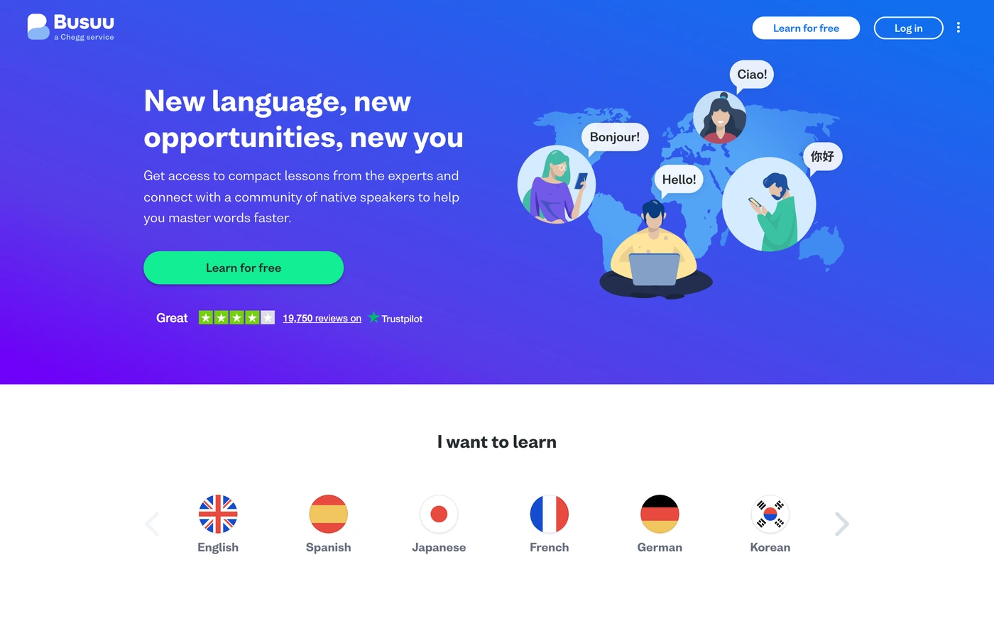
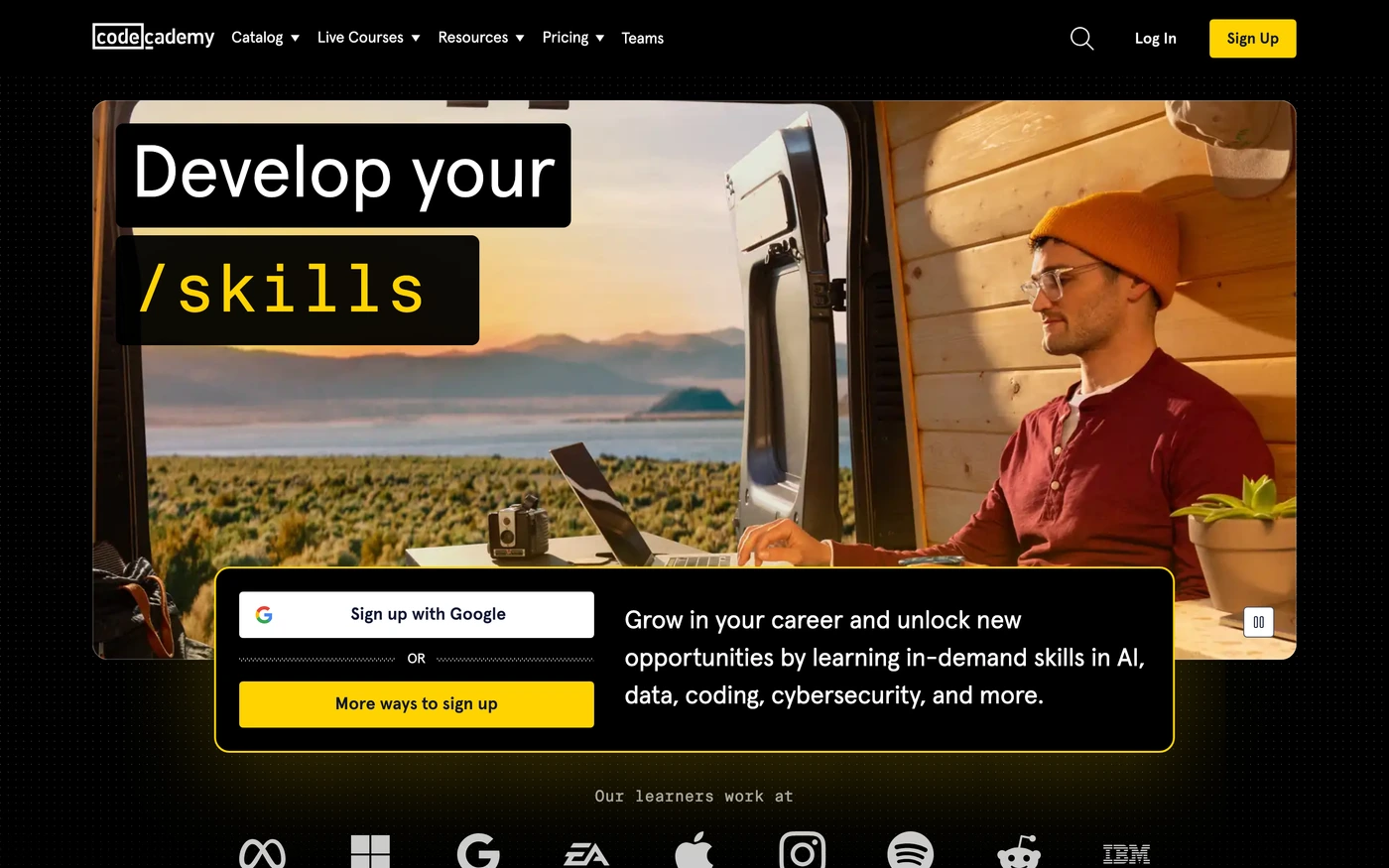
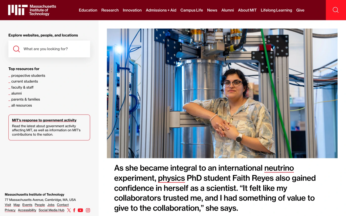
The average education website layout here runs 27.3 sections and about 7,684px tall at desktop width — roughly 9 screens of scrolling. Codecademy is the longest education website at 11,000px, while MIT makes its case in 2,860px. Open any education website template to scroll the full-page capture and see exactly where each section falls, then plan your own page length against the category norm.
Education Website testimonials, trust signals and calls to action
34 education websites show testimonials and 30 show a customer logo cloud, and 30 answer objections with an FAQ. 42 of 109 (39%) close with a dedicated call-to-action section that repeats the hero's offer — a good signal for how hard a education website sells on the homepage. Compare education website testimonial examples and education website call-to-action examples to see how each product phrases its close.
How to use a education website template from this page
Pick the education website example whose structure fits your offer, then open it to see every section in order. Copy the build prompt for the hero and features into your editor or AI tool, swap in your palette from the extracted hex values, and keep the section order — it's the part that took the original team the longest to get right. Use Compare to weigh two education website designs side by side, or start from a brief and let the library rank education website inspiration for you. Looking for a different vertical? See all website templates by industry.
More website templates by industry
Festival graphics
Featured education website sites with their fonts
Education Website templates — FAQ
What is a education website template on UI Discovery?
A education website template here is a real, live education site — Duolingo, MasterClass and Brilliant among them — captured in full at retina size and cut into its individual sections. Alongside the screenshots you get the site's colour palette as hex values, its heading and body fonts, the extracted copy, and an original build prompt written for that layout. Rather than downloading a theme, you use it as a reference to rebuild the structure for your own brand in Figma, Framer, Webflow or code, which keeps you out of licensing trouble and produces something that is actually yours.
What makes a good education website design?
Education sites structure the journey: courses, outcomes, instructor credibility and clear enrolment steps. In the 109 education websites here, 71 open with a dedicated hero and 77 include footer and 71 include hero, so those are the sections worth studying first. The strongest examples share a clear value proposition above the fold, real product imagery rather than stock illustration, and a single primary action repeated at the end of the page.
Which sections do education websites use most?
Across the 109 education websites in the library, features (102 of 109 sites), footer (77 of 109 sites), hero (71 of 109 sites) and statement (62 of 109 sites) appear most often. 16 sites (15%) publish a pricing table directly on the homepage, which is a useful benchmark when you are deciding whether to show prices early. Every section is captured on its own page, so you can compare the same section — say, the hero — across every education product side by side.
Which fonts and colours are popular on education websites?
87% of these education websites use a light theme and 13% a dark one, which tells you what visitors in this category are used to. For headings, Graphik (4), Lato (3) and Source Sans Pro (2) come up most often; geometric and grotesque sans-serifs dominate, with serifs used for a more editorial feel. The most common accent hues are blue (38), neutral (21) and red (15). Every reference lists its exact fonts and full hex palette, so you can match the category norm or deliberately break from it.
How do I use these education website design examples?
Open any site to see the full page at actual size, then click a section to copy its palette, fonts and build prompt. Paste the prompt into Cursor, Claude, v0 or your editor of choice and swap in your own copy and colours. You can save sections to a board to build a moodboard, use Compare to weigh two education websites side by side, or connect the UI Discovery MCP server so your coding agent can pull a real education pricing table or hero while it builds, without leaving the terminal.
Are the templates free to use?
Browsing the library is free, and every capture, palette and font list is visible without an account. The captured designs belong to their respective owners and are provided as reference and inspiration only — you should not copy a site's copy, logo or imagery. The palettes, extracted fonts, build prompts and downloadable templates that UI Discovery produces are original work and yours to use in commercial projects. See the pricing page for what Pro adds, such as full-resolution exports and unlimited boards.
How often are new sites added?
New education websites are captured and added weekly, and existing sites are re-captured when they ship a redesign, so the library reflects what these products look like now rather than a year ago. Each site shows its capture date, and older versions are kept so you can see how a homepage evolved. This page was last updated September 25, 2026.
Library updated