
Minimalist Ecommerce Website Design Examples
64 real sites · 1,277 sections


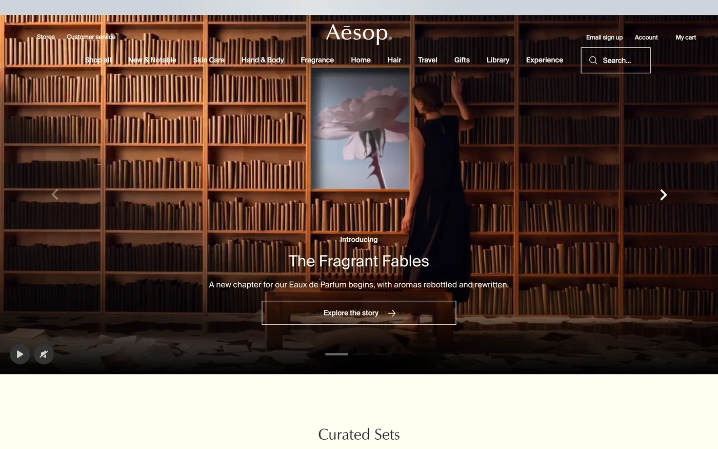
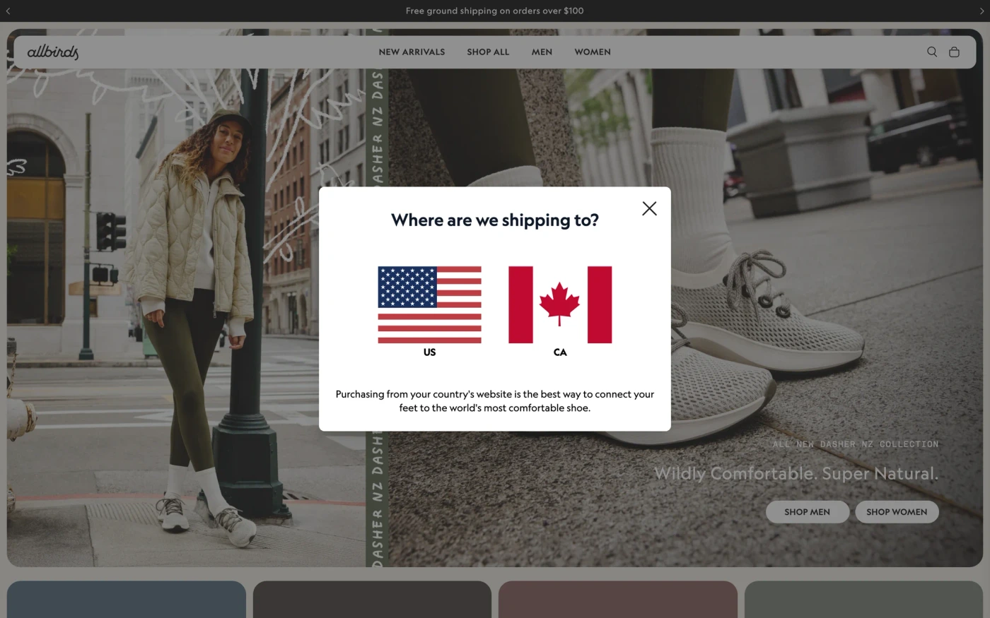
There are 64 minimalist ecommerce website designs here — live sites that are shopping sites that are tagged minimal from their captured layout and palette, including Allbirds, Glossier, Away, Aesop and Nothing — cut into 1,277 sections. 97% use a light theme and 3% a dark one; the most common headline fonts are Suisse Intl (2), Maison Neue (2) and Gotham (2). 35 of 64 open with a hero, 0 show pricing on the homepage and 5 carry testimonials.
At a glance
Live verified metrics- Sites
- 64
- Sections captured
- 1,277
- Light / dark
- 97% light · 3% dark
- Top heading fonts
- Suisse Intl (2), Maison Neue (2) and Gotham (2)
- Accent colours
- neutral 64
- Most common sections
- features (47), showcase (39), hero (35) and statement (21)
- Top industries
- Shopping (64)
- Award winners
- 4 of 64
Filter
Industry
Exact colour




































What makes a good minimalist ecommerce website design
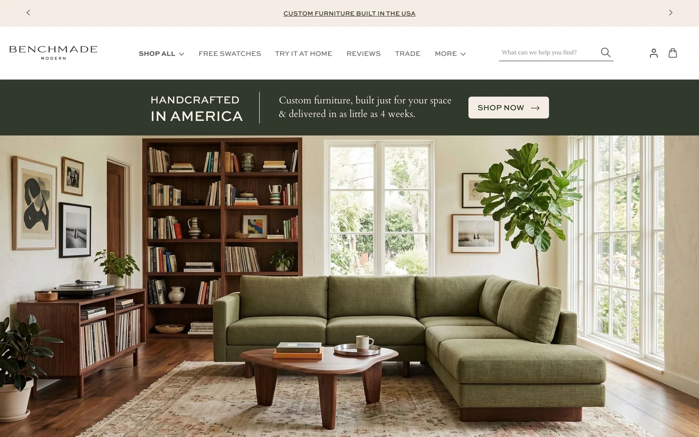
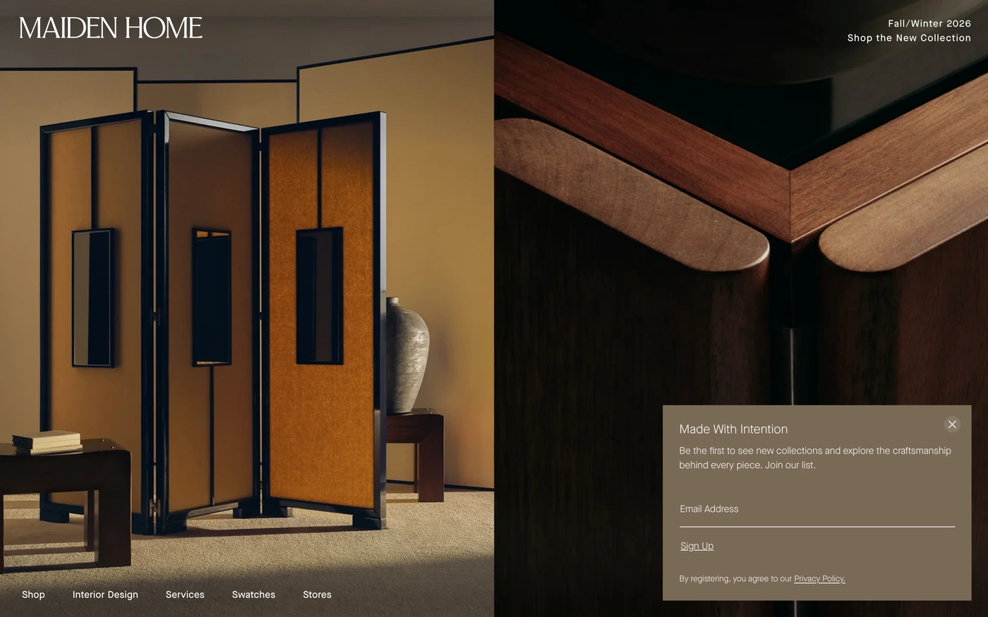
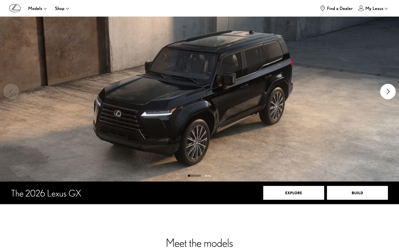
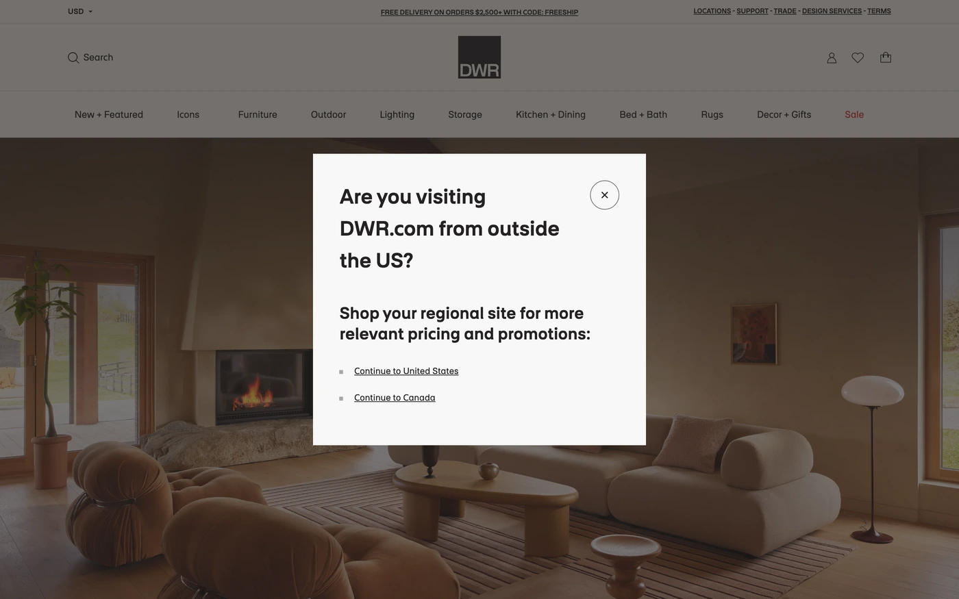
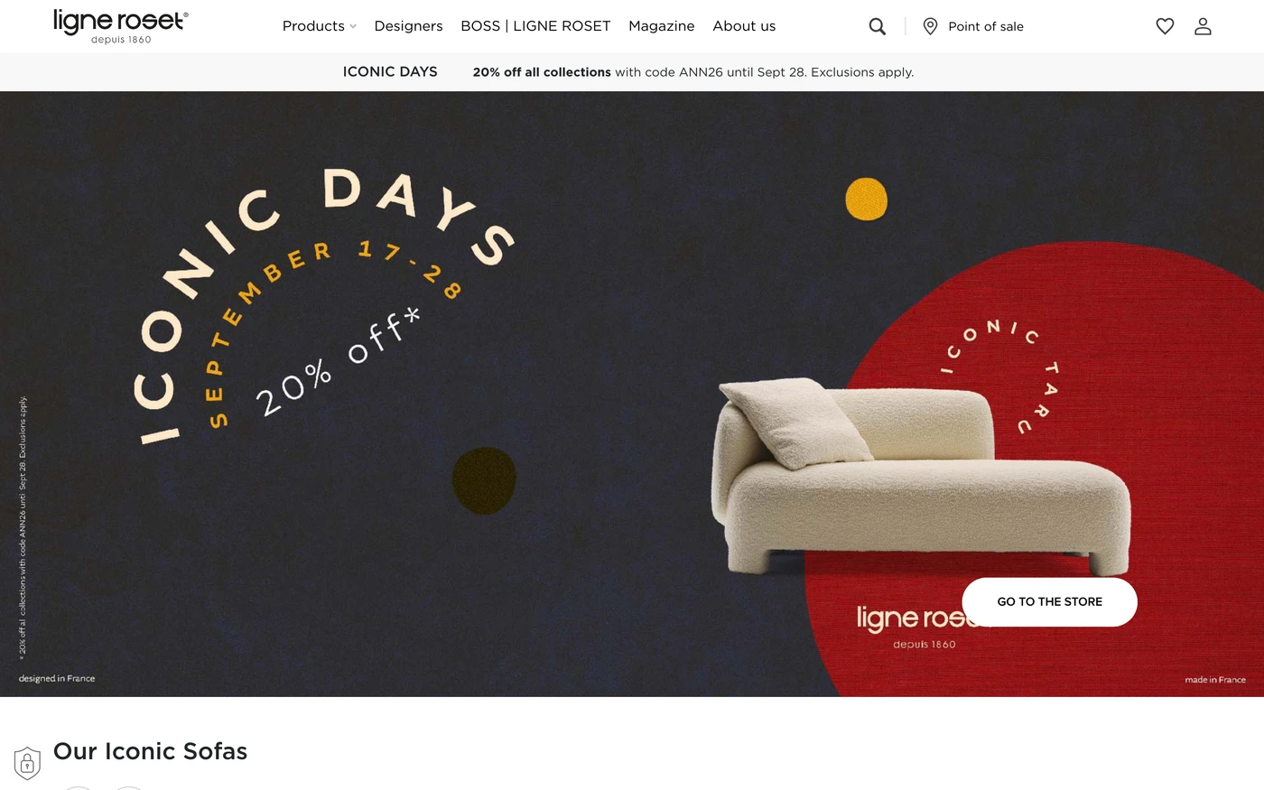
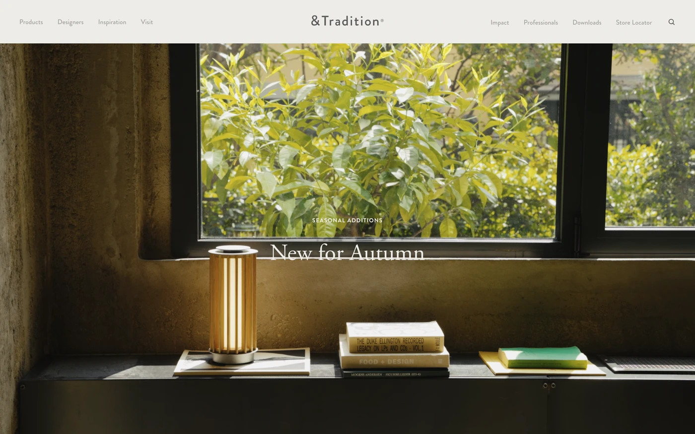
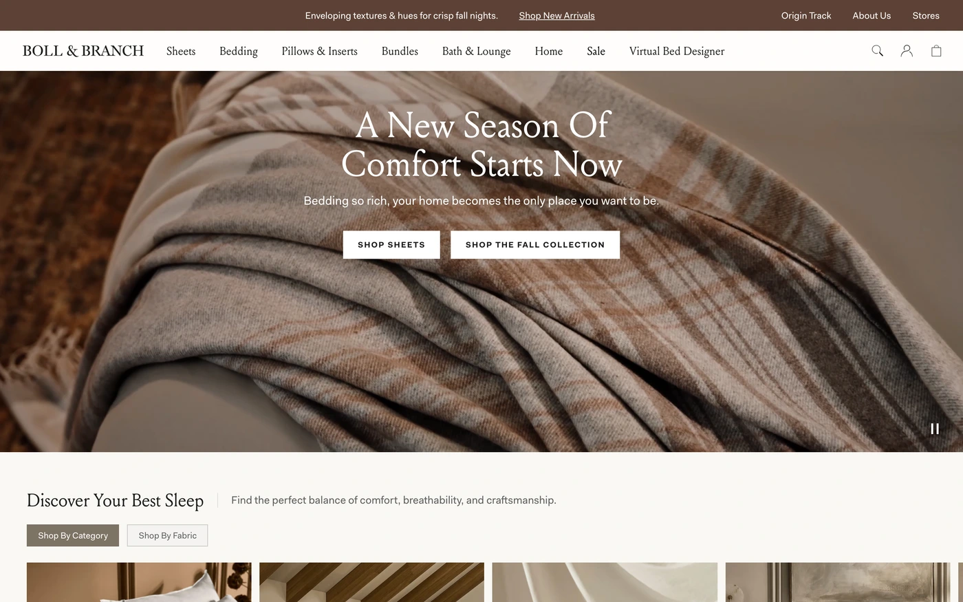
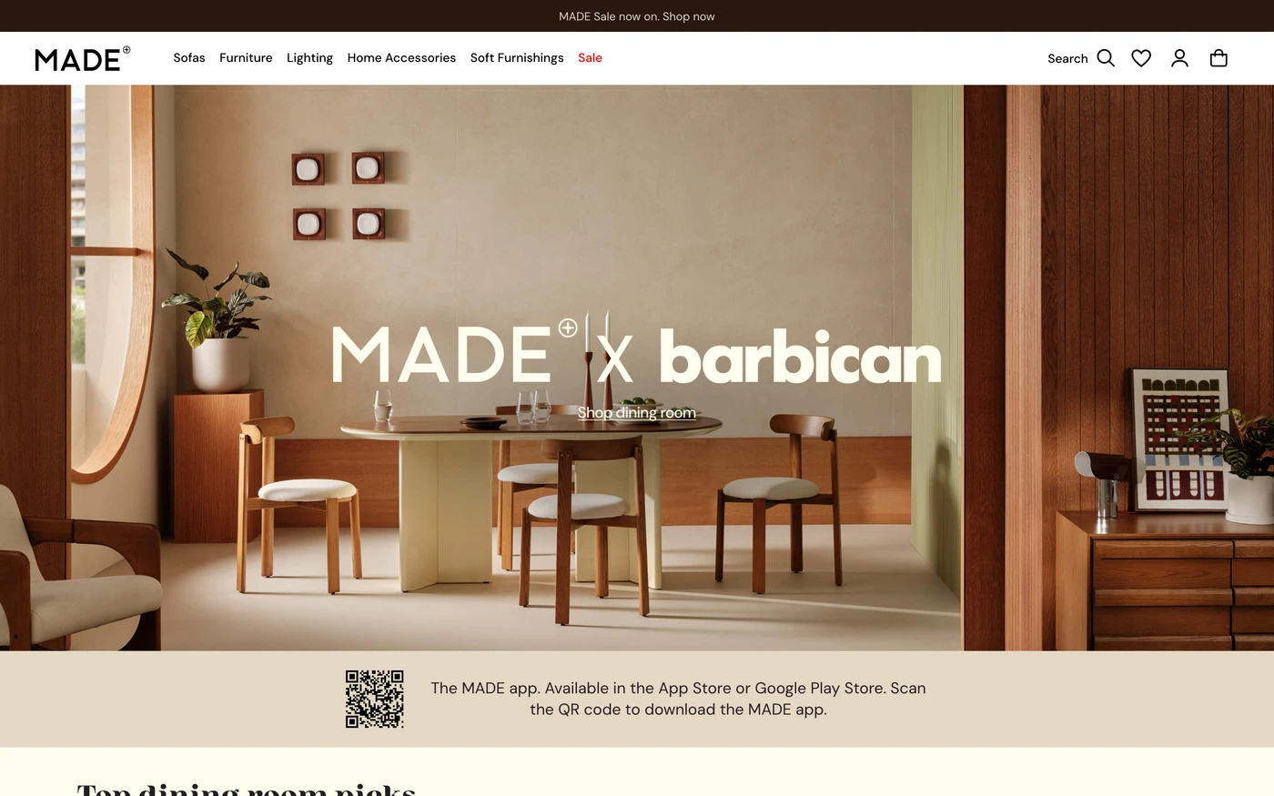
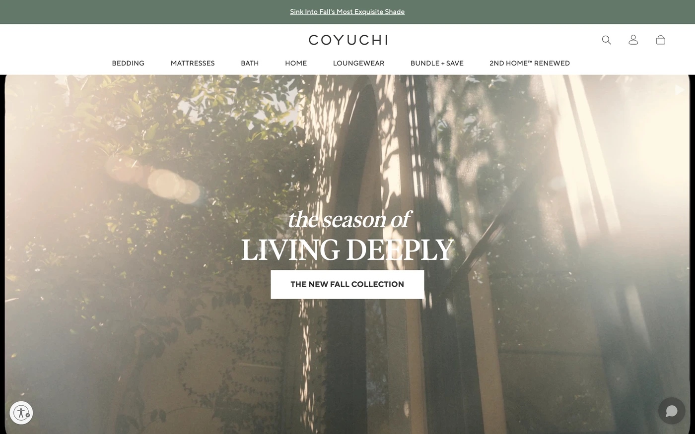
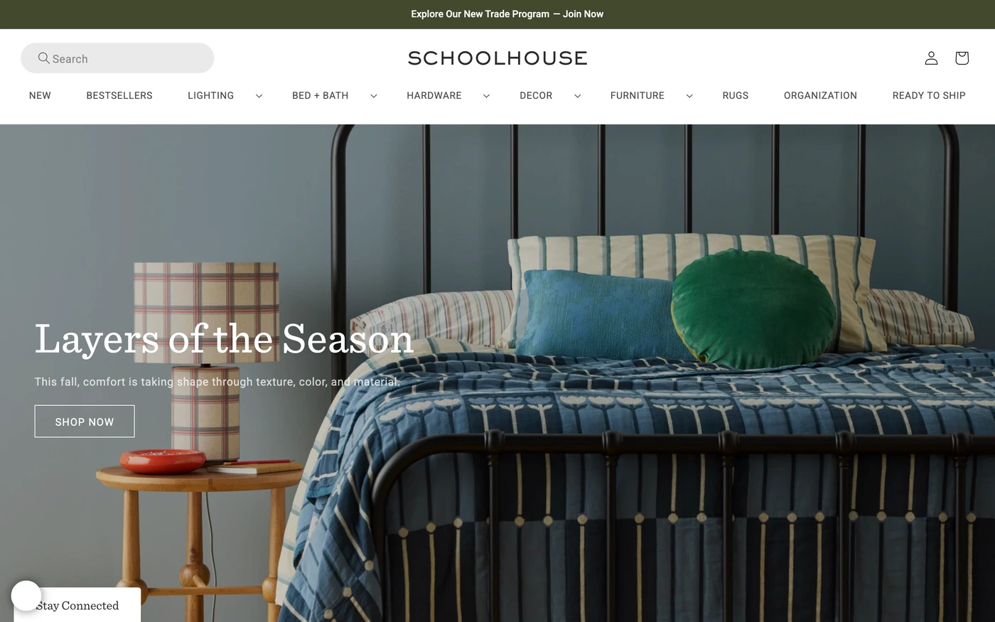
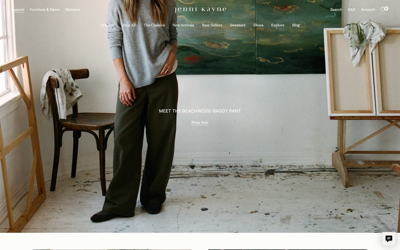
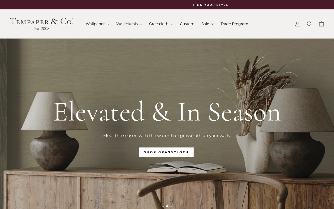
Minimal sites remove everything that doesn't earn its place: generous whitespace, a restrained palette, strong typography and one action per screen. Ecommerce homepages are merchandising surfaces: hero campaigns, product grids, social proof and a fast path to checkout.
What these 64 minimalist ecommerce websites have in common
Measured from the captures, not opinion — use it to plan a minimalist ecommerce website against what already works.
Sections they use
47 include features, 39 include showcase, 35 include hero and 21 include statement. 7 answer objections with an FAQ and 15 (23%) close with a dedicated call to action. Read top to bottom, the most common running order is hero → features → footer → showcase → call to action. Compare them side by side: features section examples, showcase section examples, hero section examples.
Type and colour
Light layouts lead (97% vs 3% dark). Headlines are most often set in Suisse Intl (2), Maison Neue (2) and Gotham (2). The most common accent hues are neutral (64). Every example lists its exact fonts and hex palette on its page.
Page length
The average homepage here is about 6,134px tall at desktop width — roughly 7 screens of scrolling, with Teenage Engineering the longest at 11,000px. Open any site to scroll the full-page capture and see where each section falls.
64 minimalist ecommerce website designs worth studying
- Nothing — “Here at Nothing, we’re building a world where tech is fun again. Remember a time where every new product made you excited? We’re bringing that back.” 21 sections, headlines in NType82, light theme, palette #040404 and #f4f4f4.
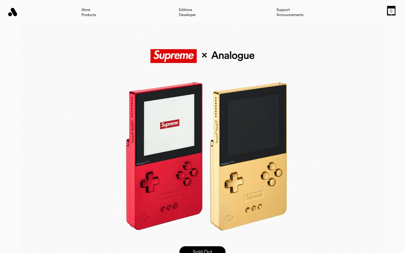
- Analogue — “We make products to celebrate and explore the history of video games with the respect it deserves.” 25 sections, headlines in Circular Xx, light theme, palette #ffffff and #000000; the homepage runs showcase → stats → statement → footer.
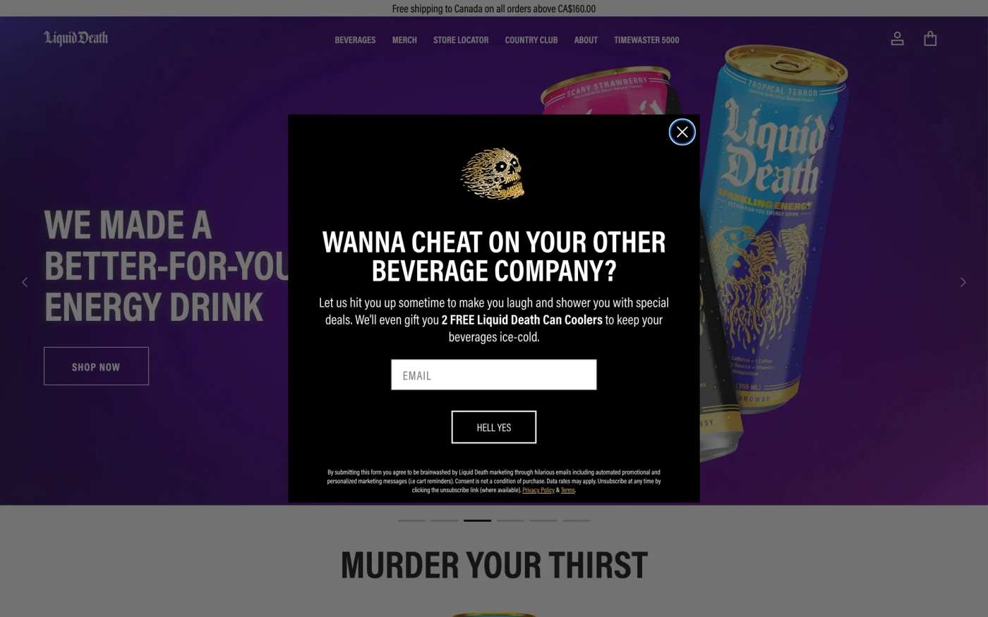
- Liquid Death — “A better-for-you beverage company with water, iced tea, and sparkling energy. Murder your thirst. Death to plastic bottles.” 15 sections, headlines in Acumin Pro, light theme, palette #000000 and #ffffff; the homepage runs hero → showcase → statement → features.
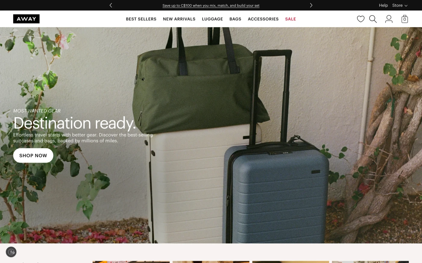
- Away — “Thoughtfully designed travel essentials that make every journey more seamless. Shop luggage, bags, and accessories built for modern travel.” 19 sections, headlines in Graphik, light theme, palette #111111 and #ffffff; the homepage runs hero → showcase → footer.
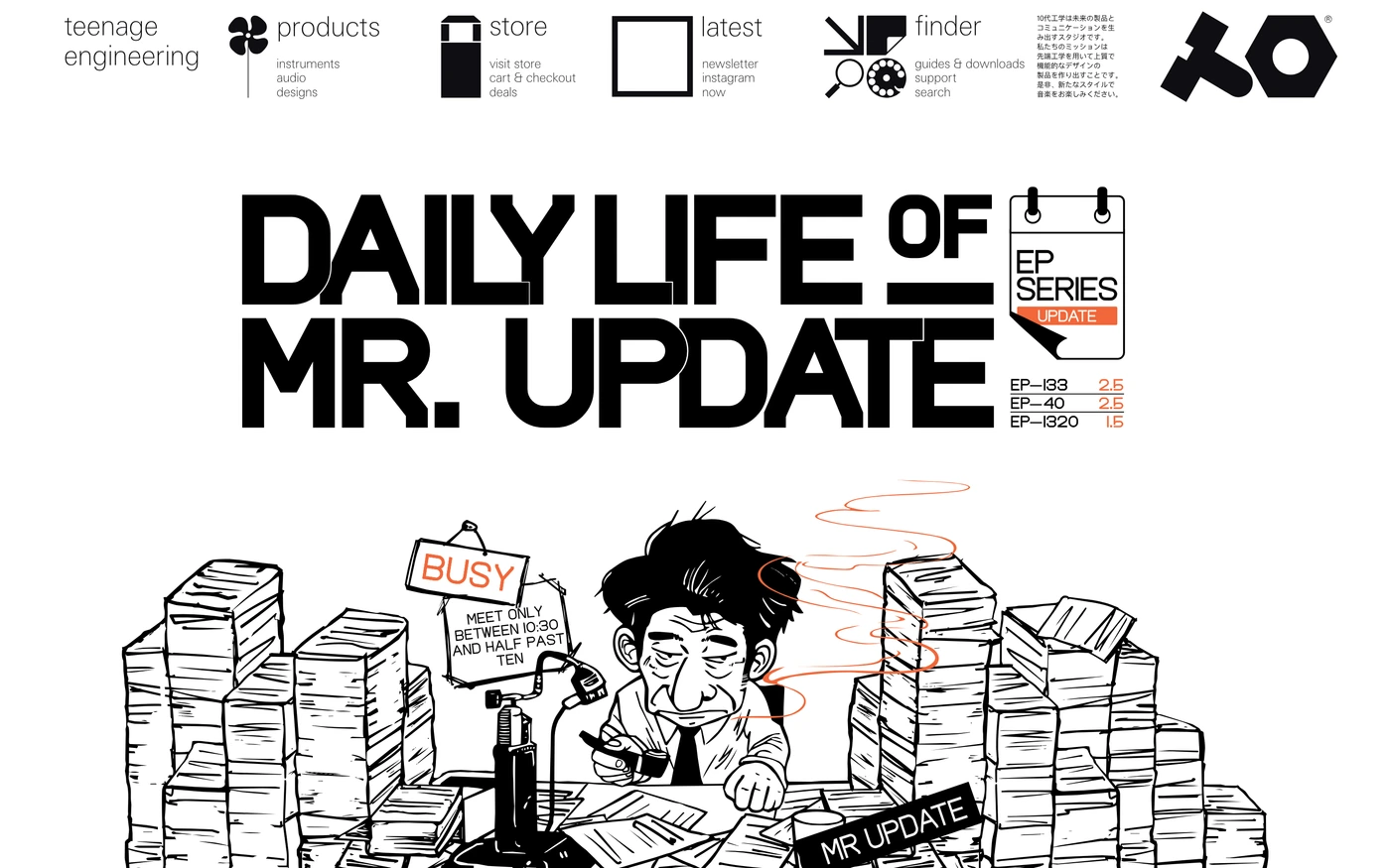
- Teenage Engineering — “teenage engineering creates high quality, well designed, electronic products for all people who love sound and music.” 10 sections, light theme, palette #ffffff and #f6f8f7.
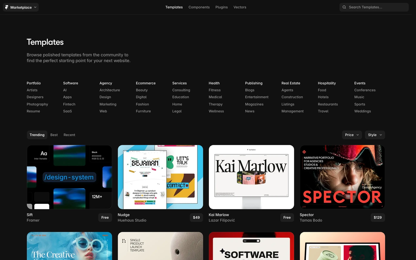
- Framer Sites — “Free and premium website templates for Framer, from portfolio sites to ecommerce stores. Responsive, easy to customize, and ready to publish in minutes.” 7 sections, headlines in Walsheim, dark theme, palette #111111 and #1f1f1f.
How to use these references for a minimalist ecommerce website
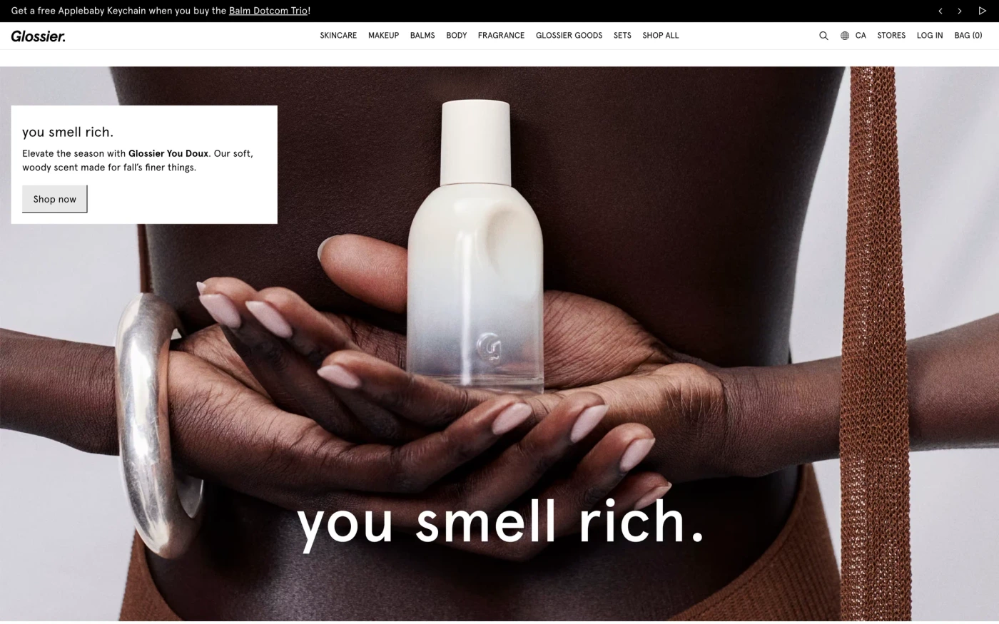
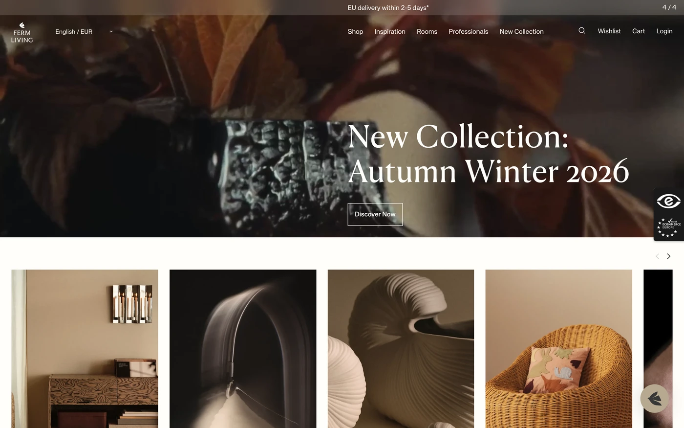
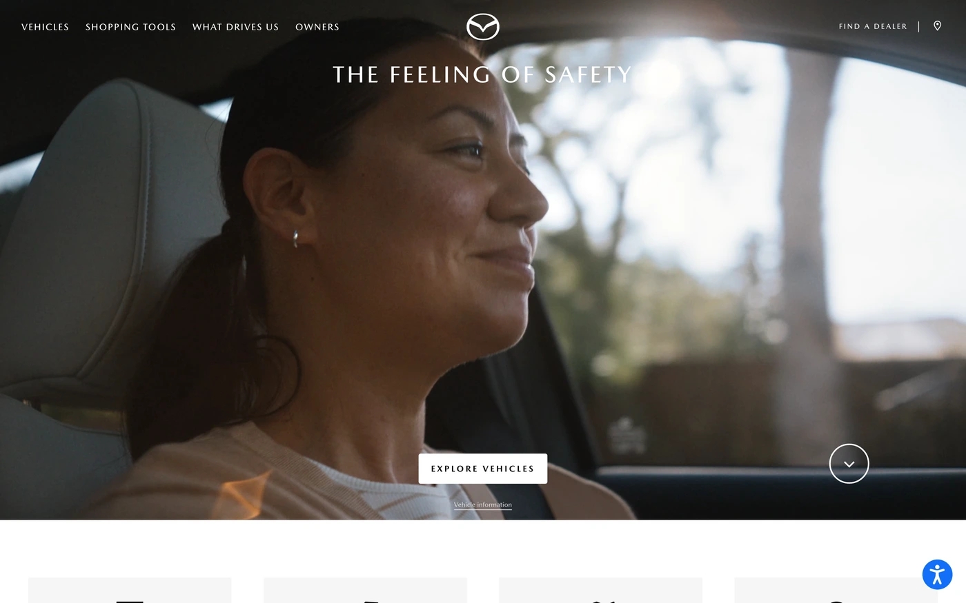
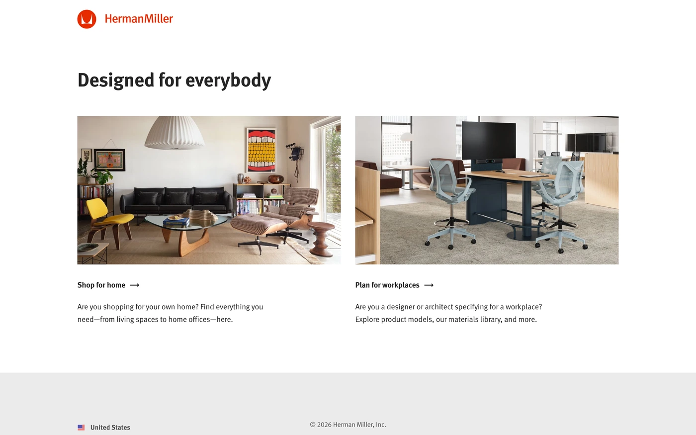
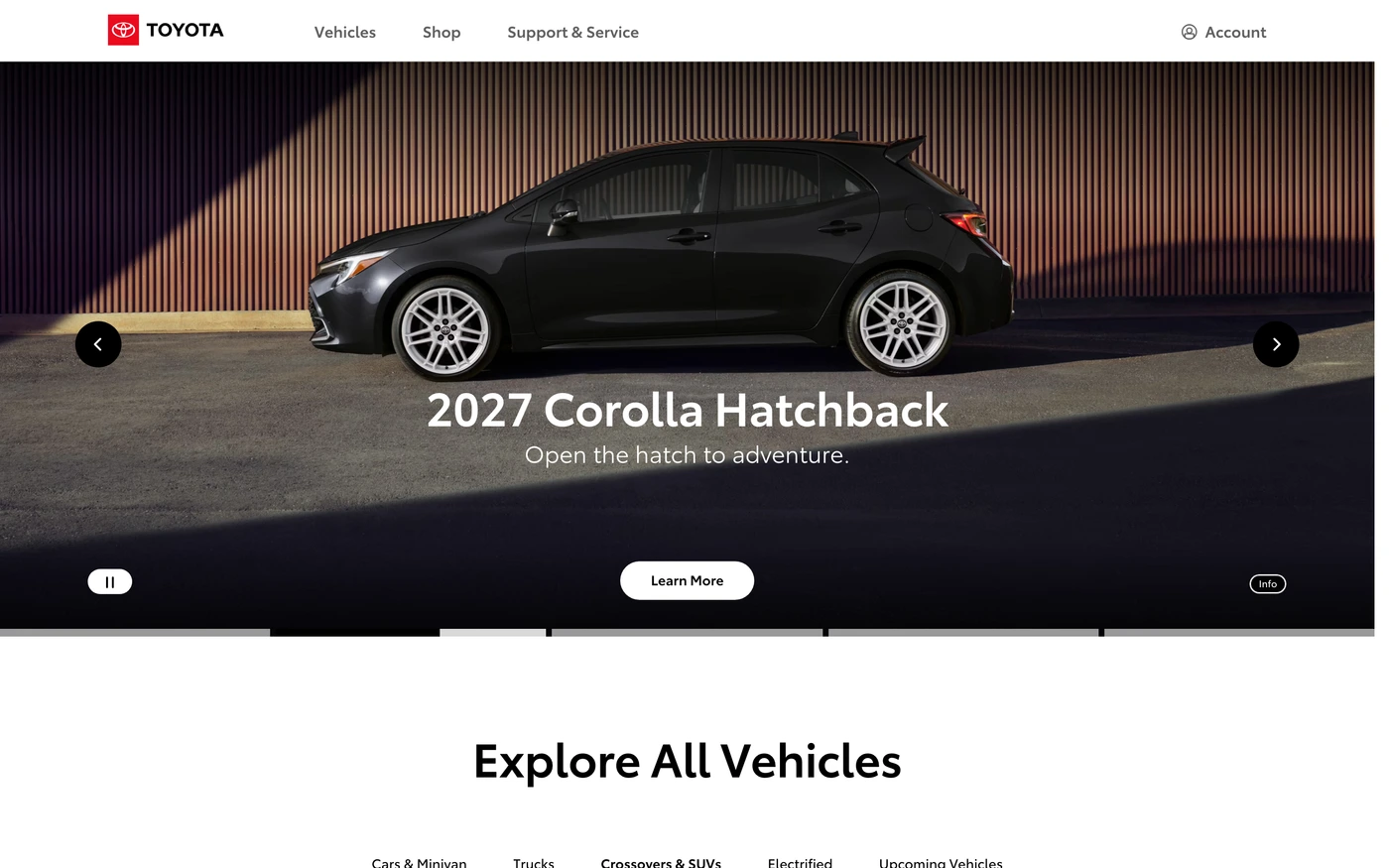
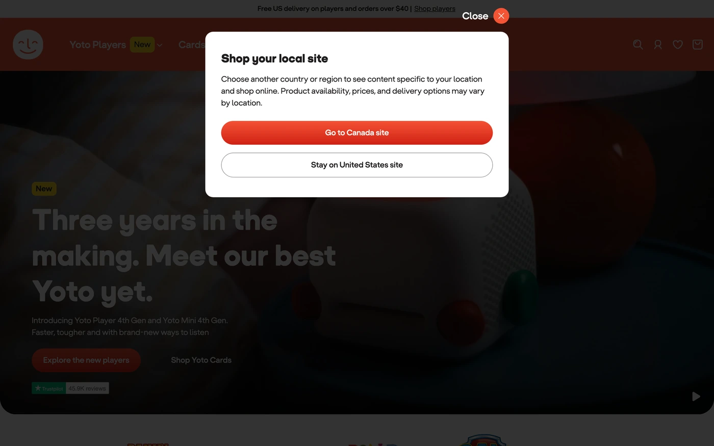
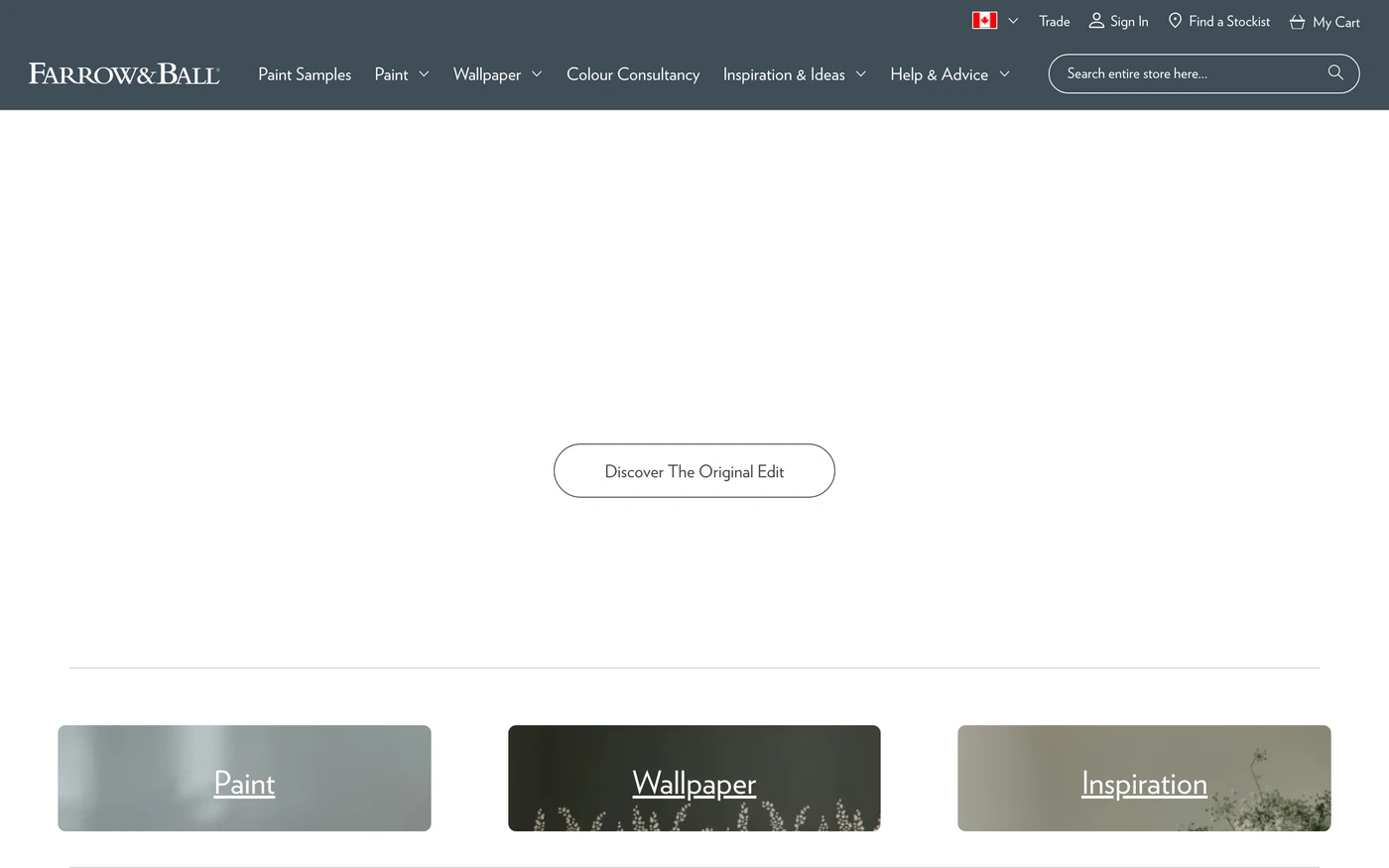
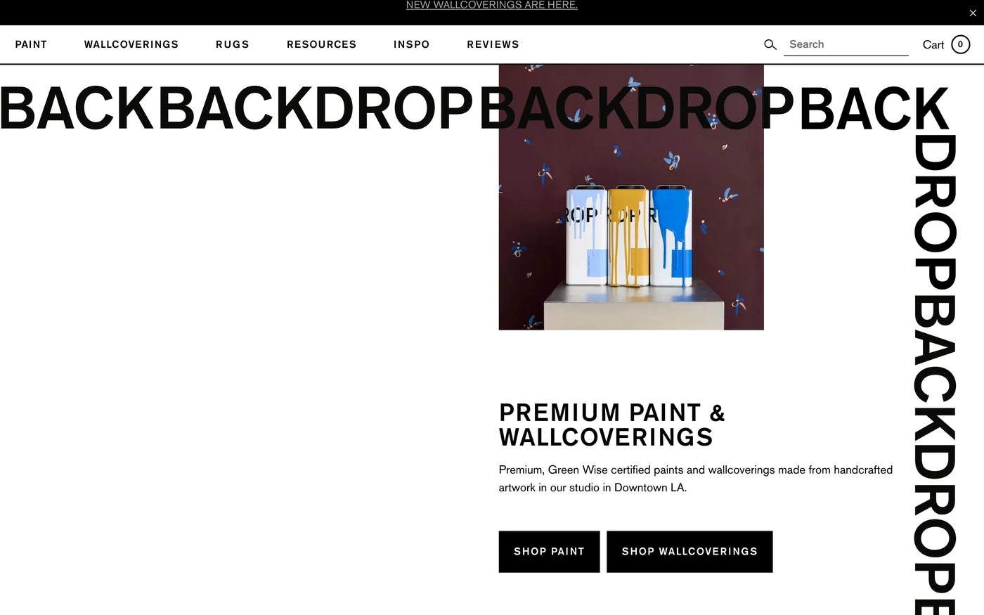
Minimal is not empty — make the type scale and spacing do the work, keep one accent colour, and let a single strong image or product shot carry each section. For a store, study how bestsellers, shipping promises and reviews sit alongside the product grid. Start with Allbirds, Glossier and Away, open each site at full size and compare their features and showcase sections; every reference carries its palette, fonts and a build prompt you can paste into your editor.
Featured minimalist ecommerce website examples with their fonts
Related searches
Browse all websites or the full A–Z of popular searches.
How this list is built: 64 sites from the UI Discovery library that are shopping sites that are tagged minimal from their captured layout and palette, matched on each product's own title, description and headline copy, captured styles, colours and fonts. Ordered by popularity.
Library updated