
Minimalist Finance Website Design Examples
21 real sites · 516 sections




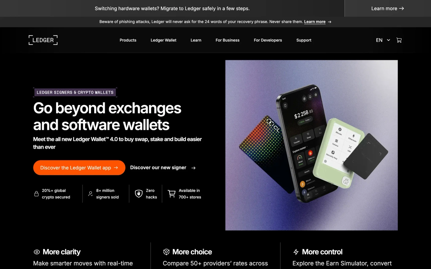
There are 21 minimalist finance website designs here — live sites that are finance sites that are tagged minimal from their captured layout and palette, including Revolut, Qonto, Chime, Carta and Ledger — cut into 516 sections. 71% use a light theme and 29% a dark one; the most common headline fonts are Neue Montreal (2), Aeonik Pro and Qonto Sans. 16 of 21 open with a hero, 3 show pricing on the homepage and 5 carry testimonials.
At a glance
Live verified metrics- Sites
- 21
- Sections captured
- 516
- Light / dark
- 71% light · 29% dark
- Top heading fonts
- Neue Montreal (2), Aeonik Pro and Qonto Sans
- Accent colours
- neutral 21
- Most common sections
- hero (16), features (16), statement (14) and blog (9)
- Top industries
- Finance (21)
- Award winners
- 4 of 21
Filter
Industry
Exact colour


















What makes a good minimalist finance website design
Minimal sites remove everything that doesn't earn its place: generous whitespace, a restrained palette, strong typography and one action per screen. Finance sites earn trust before they ask for a signup: clear numbers, regulatory copy and calm, high-contrast layouts.
What these 21 minimalist finance websites have in common
Measured from the captures, not opinion — use it to plan a minimalist finance website against what already works.
Sections they use
16 include hero, 16 include features, 14 include statement and 9 include blog. 6 answer objections with an FAQ and 5 (24%) close with a dedicated call to action. Read top to bottom, the most common running order is hero → features → footer → statement → testimonials. Compare them side by side: hero section examples, features section examples, statement section examples.
Type and colour
Light layouts lead (71% vs 29% dark). Headlines are most often set in Neue Montreal (2), Aeonik Pro and Qonto Sans. The most common accent hues are neutral (21). Every example lists its exact fonts and hex palette on its page.
Page length
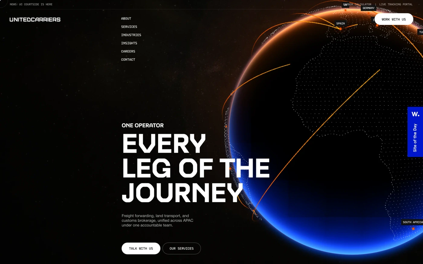
The average homepage here is about 7,232px tall at desktop width — roughly 8 screens of scrolling, with Unitedcarriers the longest at 11,000px. Open any site to scroll the full-page capture and see where each section falls.
21 minimalist finance website designs worth studying
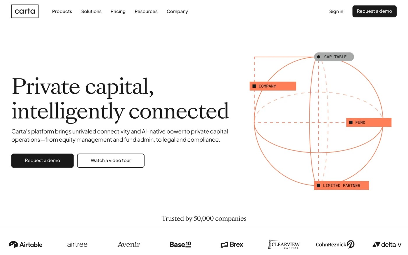
- Carta — “Carta’s ERP for private capital combines software and services to deliver connected clarity and control across equity, fund, and portfolio management.” 48 sections, headlines in Sang Bleu Versailles, light theme, palette #ffffff and #1a1a1a; the homepage runs hero → statement → features → call to action.
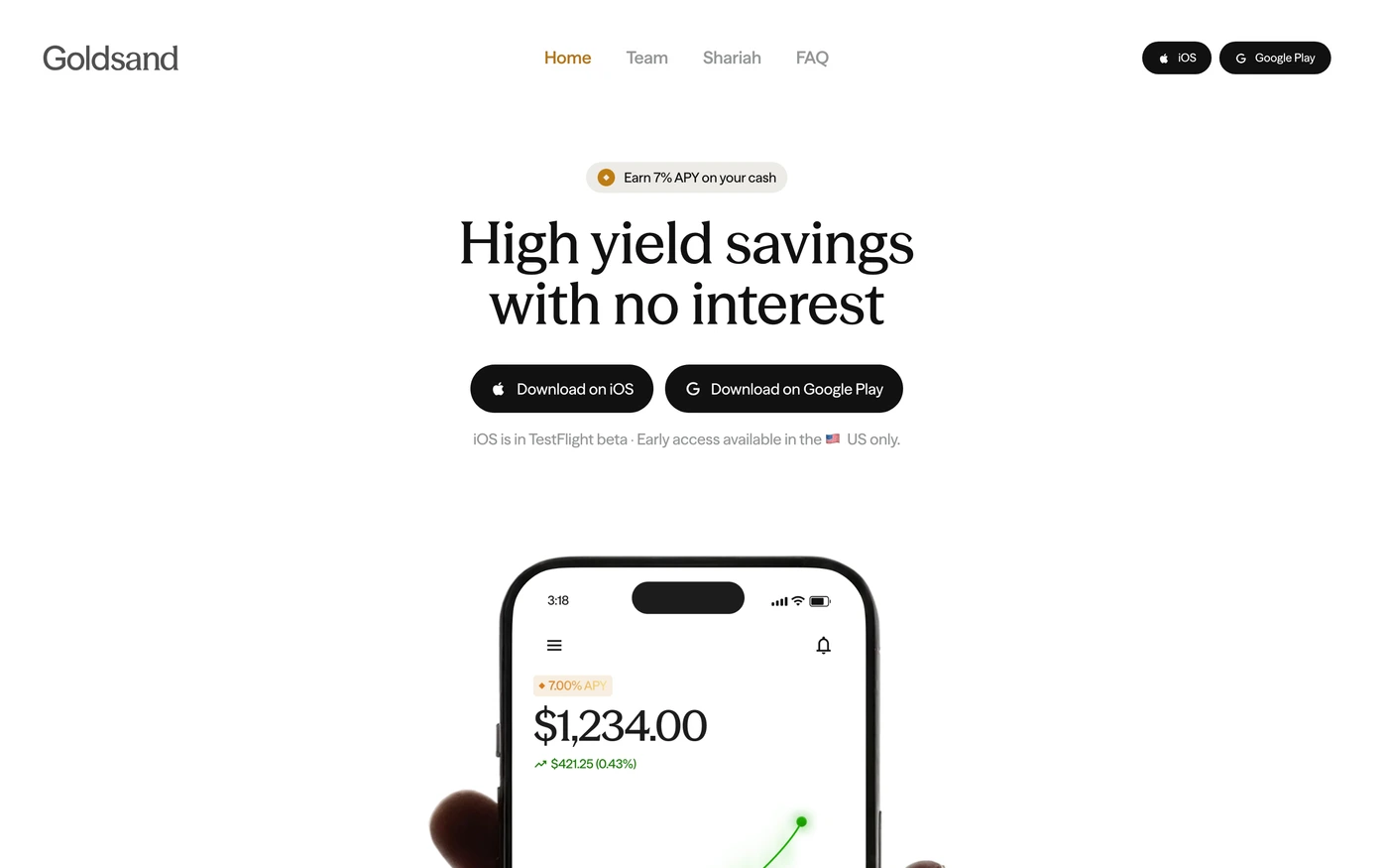
- Goldsand — “Earn up to 7% on your cash with Goldsand, a halal savings app built on profit-sharing, not interest. Stay liquid and withdraw anytime.” 8 sections, headlines in Season Mix, light theme, palette #111111 and #ffffff; the homepage runs hero → testimonials → statement.
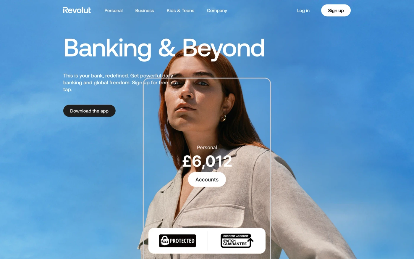
- Revolut — “Join 80+ million customers globally using Revolut to send money to 160+ countries, hold up-to 36 currencies in app, spend in 150+ currencies, and manage their money.” 37 sections, headlines in Aeonik Pro, light theme, palette #ffffff and #1f1f1f; the homepage runs hero → logo cloud → pricing.
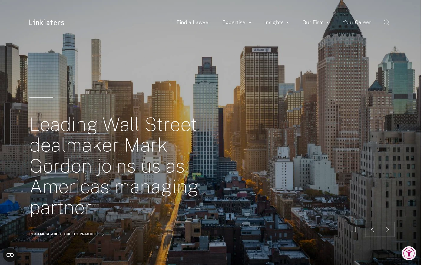
- Linklaters — “Linklaters is a global law firm focused on bringing legal certainty in a changing world.” 41 sections, headlines in Public Sans, light theme, palette #ffffff and #f1f1f1.
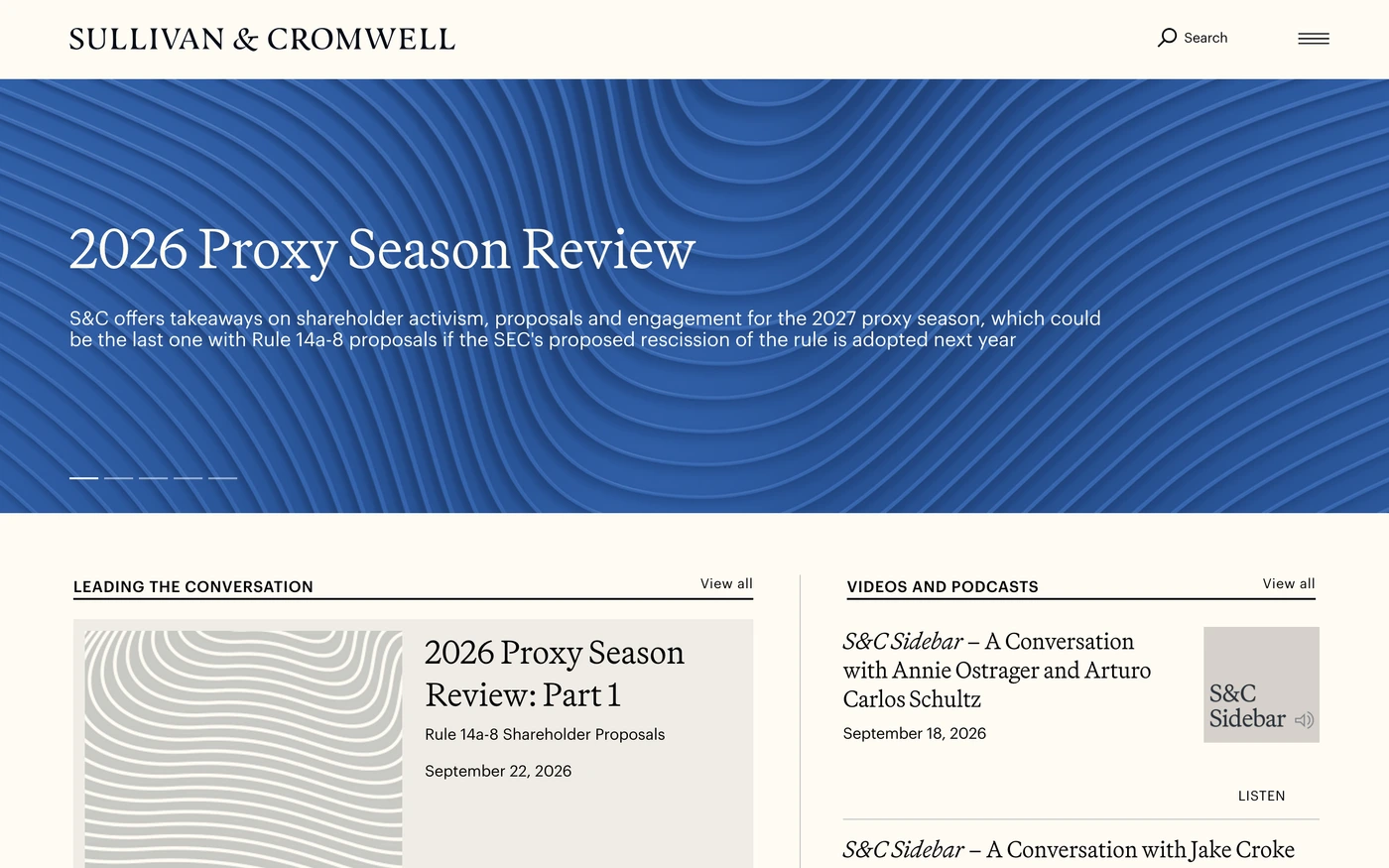
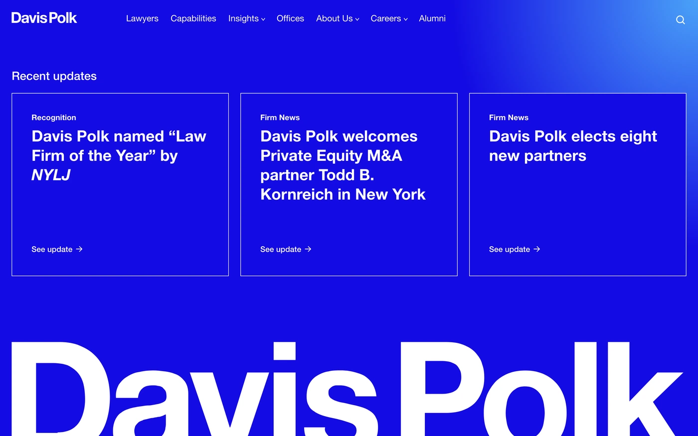
- Davis Polk — “In an unpredictable world, you need a trusted partner who understands your business. Davis Polk has the legal experience, industry knowledge and spirit of collaboration to help you…” 20 sections, headlines in Helvetica Neue, light theme, palette #ffffff and #000000; the homepage runs blog → statement → footer.
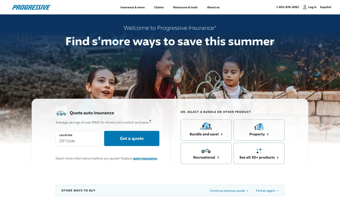
- Progressive — “Get an insurance quote in minutes from a top-rated company. Find 24/7 support and insurance for you, your family, and your belongings.” 28 sections, headlines in 96 Sans, light theme, palette #2d2d2d and #707070; the homepage runs stats → statement → features → footer.
How to use these references for a minimalist finance website
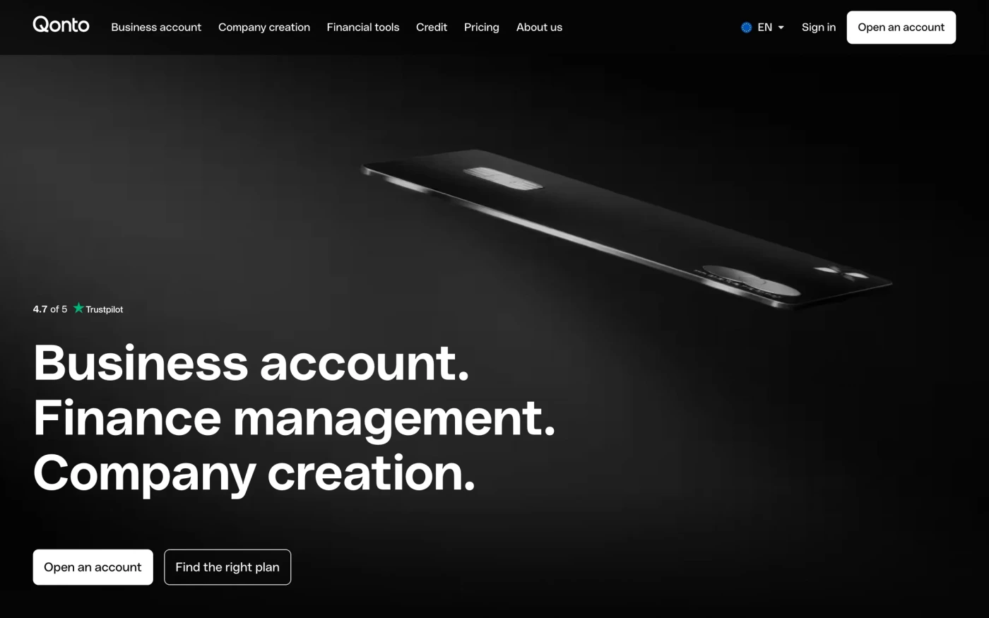
Minimal is not empty — make the type scale and spacing do the work, keep one accent colour, and let a single strong image or product shot carry each section. For a finance brand, watch where regulation, security and fees appear — trust signals placed next to the sign-up button. Start with Revolut, Qonto and Chime, open each site at full size and compare their hero and features sections; every reference carries its palette, fonts and a build prompt you can paste into your editor.
Featured minimalist finance website examples with their fonts
Related searches
Browse all websites or the full A–Z of popular searches.
How this list is built: 21 sites from the UI Discovery library that are finance sites that are tagged minimal from their captured layout and palette, matched on each product's own title, description and headline copy, captured styles, colours and fonts. Ordered by popularity.
Library updated