
Dark Finance Website Design Examples
14 real sites · 332 sections



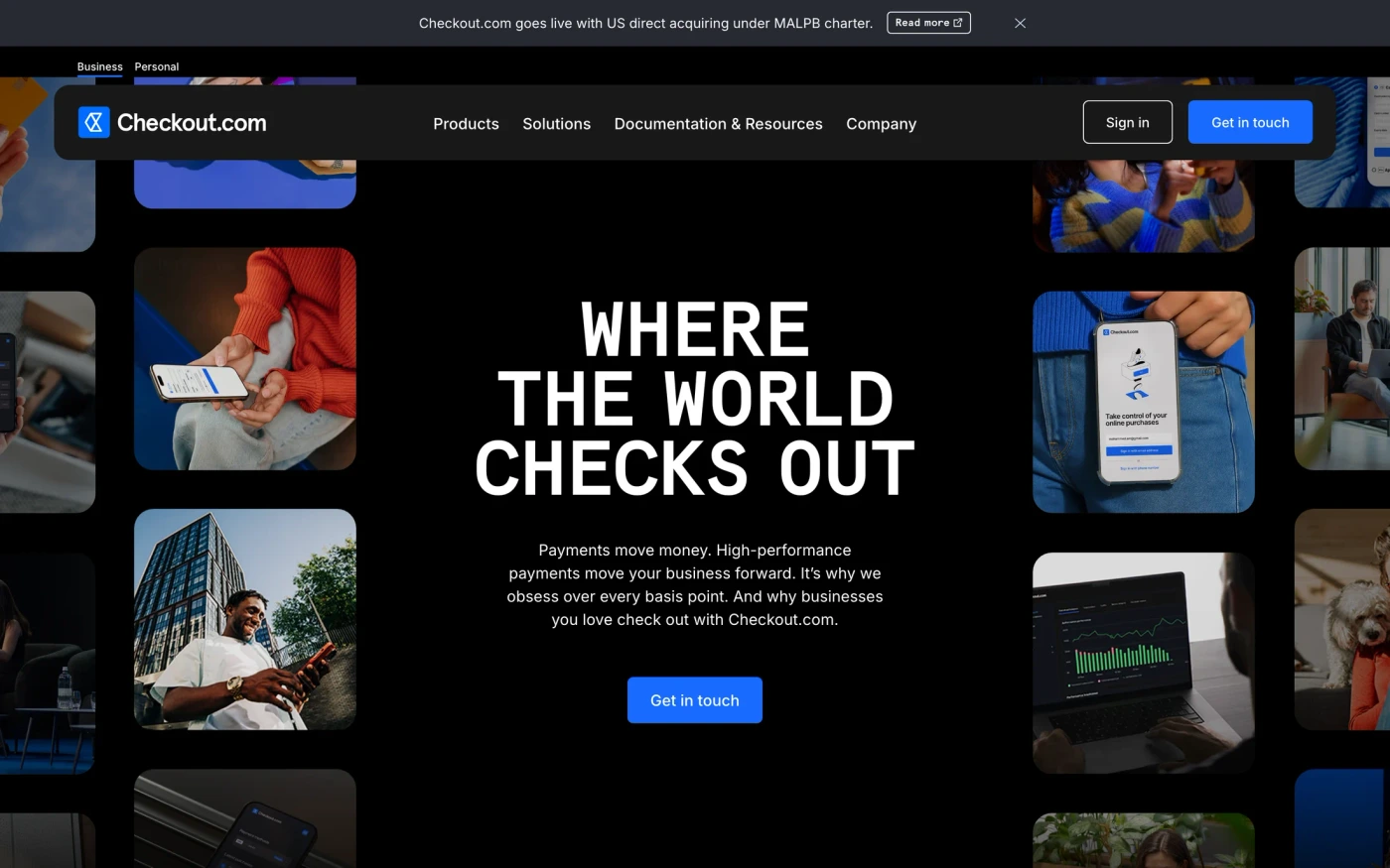
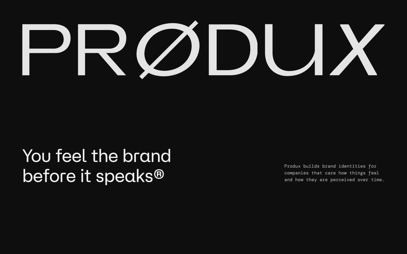
There are 14 dark finance website designs here — live sites that are finance sites that use a dark theme on their homepage, including Ramp, Robinhood, Affirm, Checkout.com and Produx — cut into 332 sections. 0% use a light theme and 100% a dark one; the most common headline fonts are Neue Montreal (2), Lausanne and Martina Plantijn. 12 of 14 open with a hero, 2 show pricing on the homepage and 4 carry testimonials.
At a glance
Live verified metrics- Sites
- 14
- Sections captured
- 332
- Light / dark
- 0% light · 100% dark
- Top heading fonts
- Neue Montreal (2), Lausanne and Martina Plantijn
- Accent colours
- neutral 9red 3green 1
- Most common sections
- hero (12), features (11), statement (9) and showcase (6)
- Top industries
- Finance (14)
- Award winners
- 4 of 14
Filter
Industry
Exact colour








What makes a good dark finance website design
Dark sites feel premium, technical or cinematic: light type on near-black, accent colour used sparingly, and product screenshots or video that glow against the background. Finance sites earn trust before they ask for a signup: clear numbers, regulatory copy and calm, high-contrast layouts.
What these 14 dark finance websites have in common
Measured from the captures, not opinion — use it to plan a dark finance website against what already works.
Sections they use
12 include hero, 11 include features, 9 include statement and 6 include showcase. 6 answer objections with an FAQ and 4 (29%) close with a dedicated call to action. Read top to bottom, the most common running order is hero → statement → features → faq → blog. Compare them side by side: hero section examples, features section examples, statement section examples.
Type and colour
Dark layouts lead (100% vs 0% light). Headlines are most often set in Neue Montreal (2), Lausanne and Martina Plantijn. The most common accent hues are neutral (9), red (3) and green (1). Every example lists its exact fonts and hex palette on its page.
Page length
The average homepage here is about 8,437px tall at desktop width — roughly 9 screens of scrolling, with Ramp the longest at 11,000px. Open any site to scroll the full-page capture and see where each section falls.
14 dark finance website designs worth studying
- Robinhood — “Trade 50+ crypto—all at low costs on Robinhood in Canada. Buy, sell, and hold BTC, ETH, USDC, LTC and more.” 9 sections, headlines in Martina Plantijn, dark theme, palette #000000 and #ccff00; the homepage runs hero → showcase → features → faq.
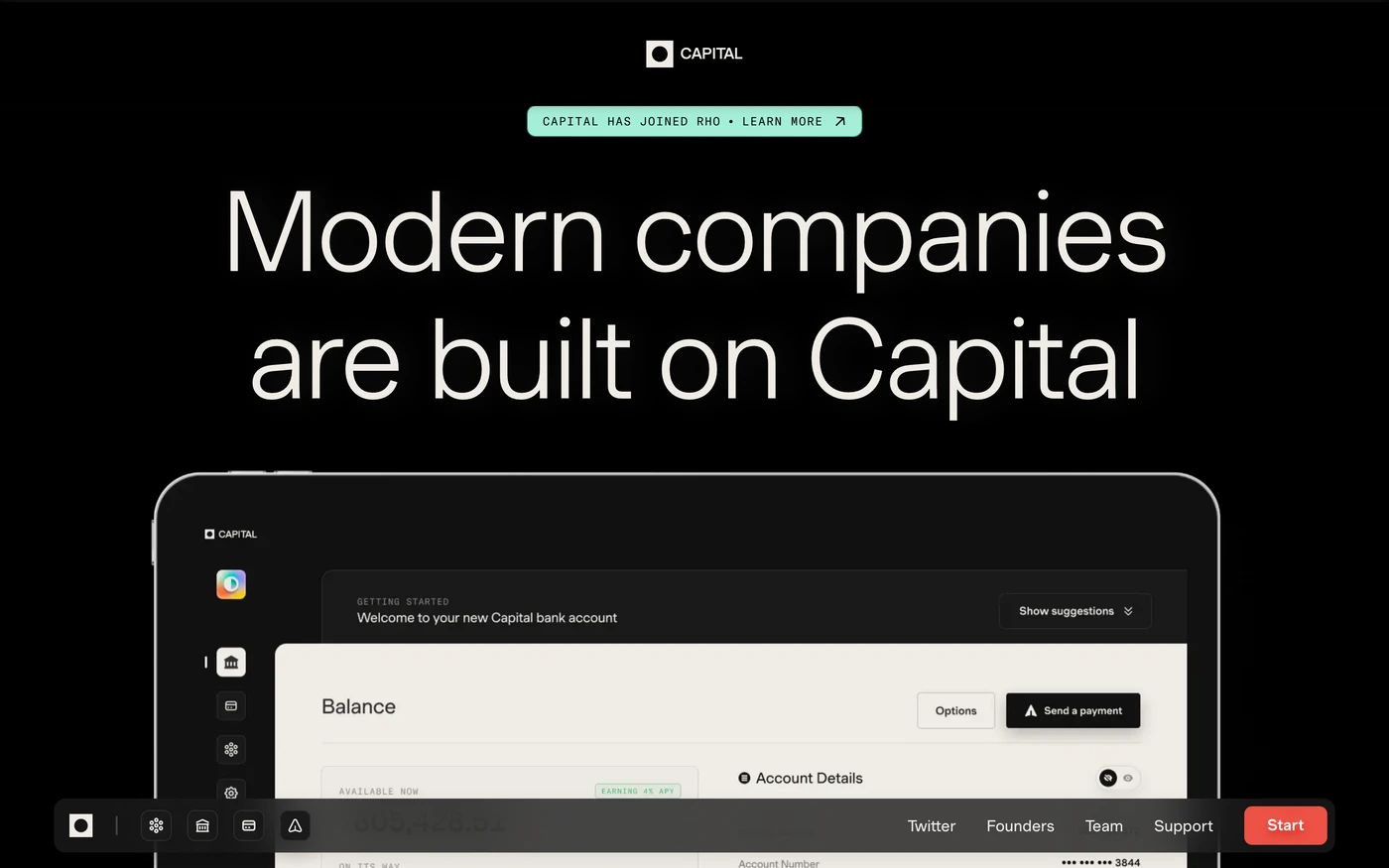
- Capital — “Raise, hold, spend, and send funds — all in one place.” 23 sections, headlines in Muoto, dark theme, palette #040503 and #efece6; the homepage runs hero → statement → features.
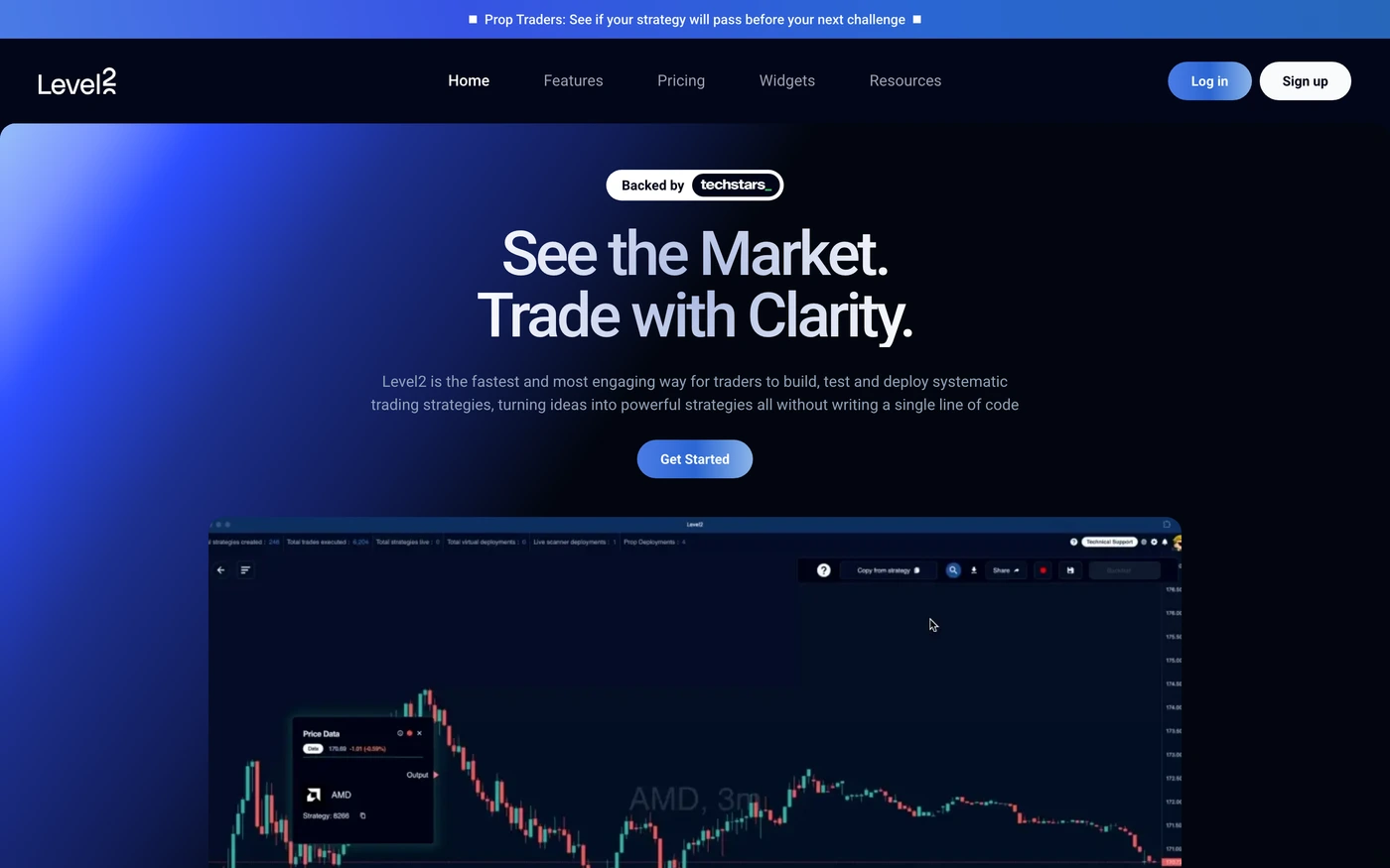
- Level2 — “Easily build fully automated trading strategies without any coding. Level2 empowers active traders with visual, no-code tools.” 16 sections, headlines in Roboto, dark theme, palette #020109 and #620001; the homepage runs hero → features → faq → footer.
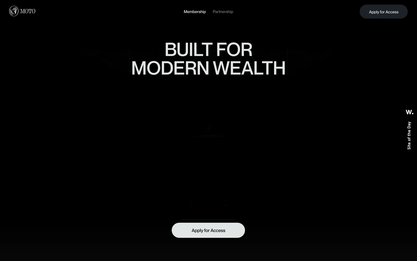
- Moto Card — “Visa Infinite card built for modern wealth. Zero FX fees globally, 24/7 concierge, exclusive access to hotels, dining & travel. $2,500/year membership.” 14 sections, headlines in Neuemontreal, dark theme, palette #080808 and #e1e5e5; the homepage runs hero → features → statement → features.
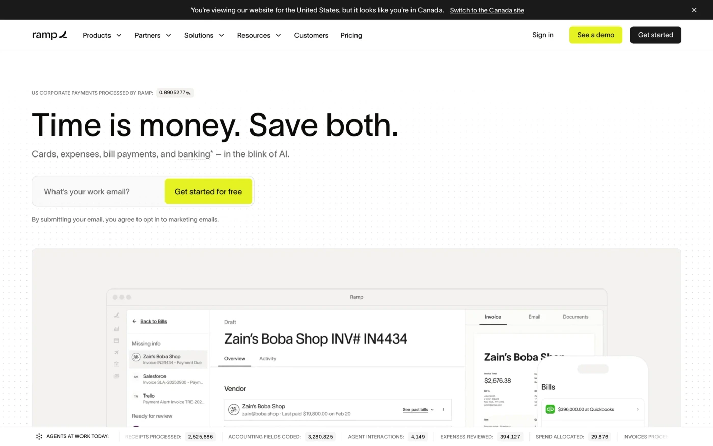
- Ramp — “Make expense management easy with Ramp's spend management platform. Combine global corporate cards, travel, expenses and accounts payable to automate finance operations and improve efficiency.” 64 sections, headlines in Lausanne, dark theme, palette #030001 and #640000; the homepage runs hero → statement → features.
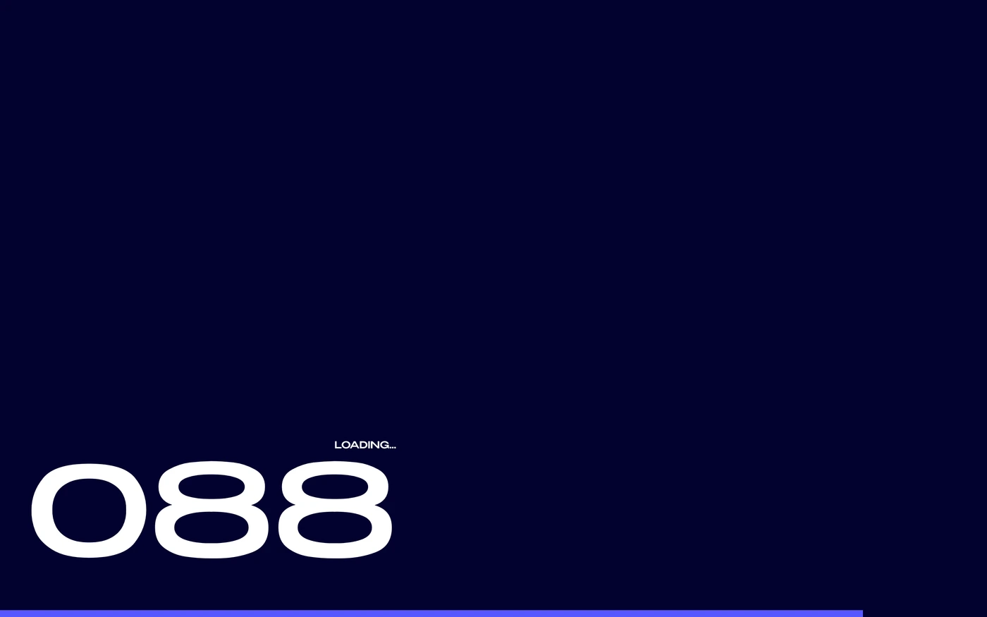
- Mirfundmerch — “Support children affected by war and create an auspicious future together” 13 sections, headlines in Benzin, dark theme, palette #02022f and #ffffff; the homepage runs hero → statement → showcase → statement.
How to use these references for a dark finance website
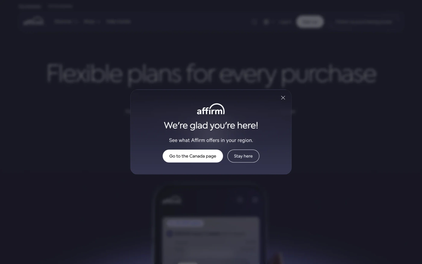
Avoid pure black and pure white; keep body text slightly off-white, check contrast on every accent colour and give images a subtle border so they don't dissolve into the page. For a finance brand, watch where regulation, security and fees appear — trust signals placed next to the sign-up button. Start with Ramp, Robinhood and Affirm, open each site at full size and compare their hero and features sections; every reference carries its palette, fonts and a build prompt you can paste into your editor.
Featured dark finance website examples with their fonts
Related searches
Browse all websites or the full A–Z of popular searches.
How this list is built: 14 sites from the UI Discovery library that are finance sites that use a dark theme on their homepage, matched on each product's own title, description and headline copy, captured styles, colours and fonts. Ordered by popularity.
Library updated