
Accessible website color palettes
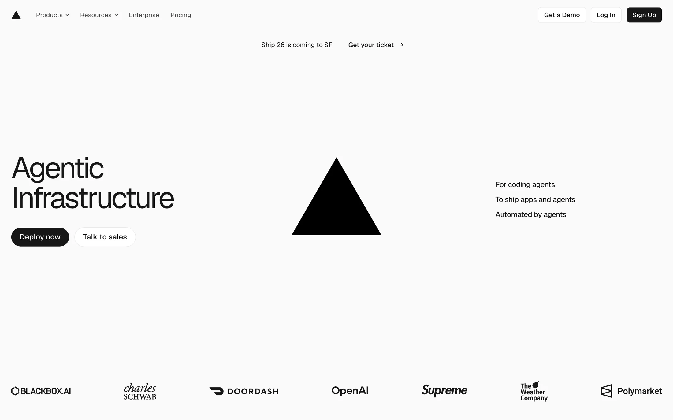
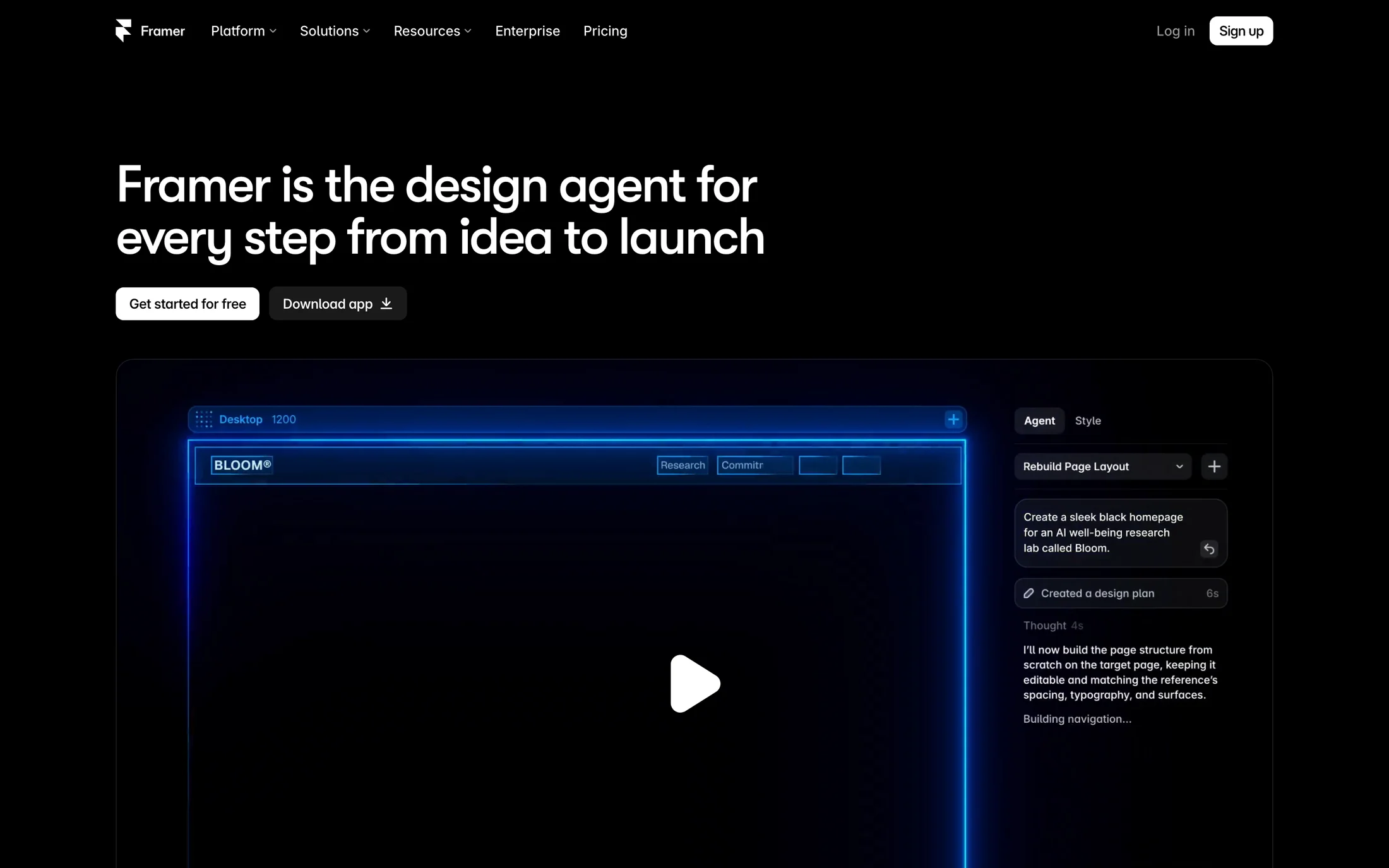
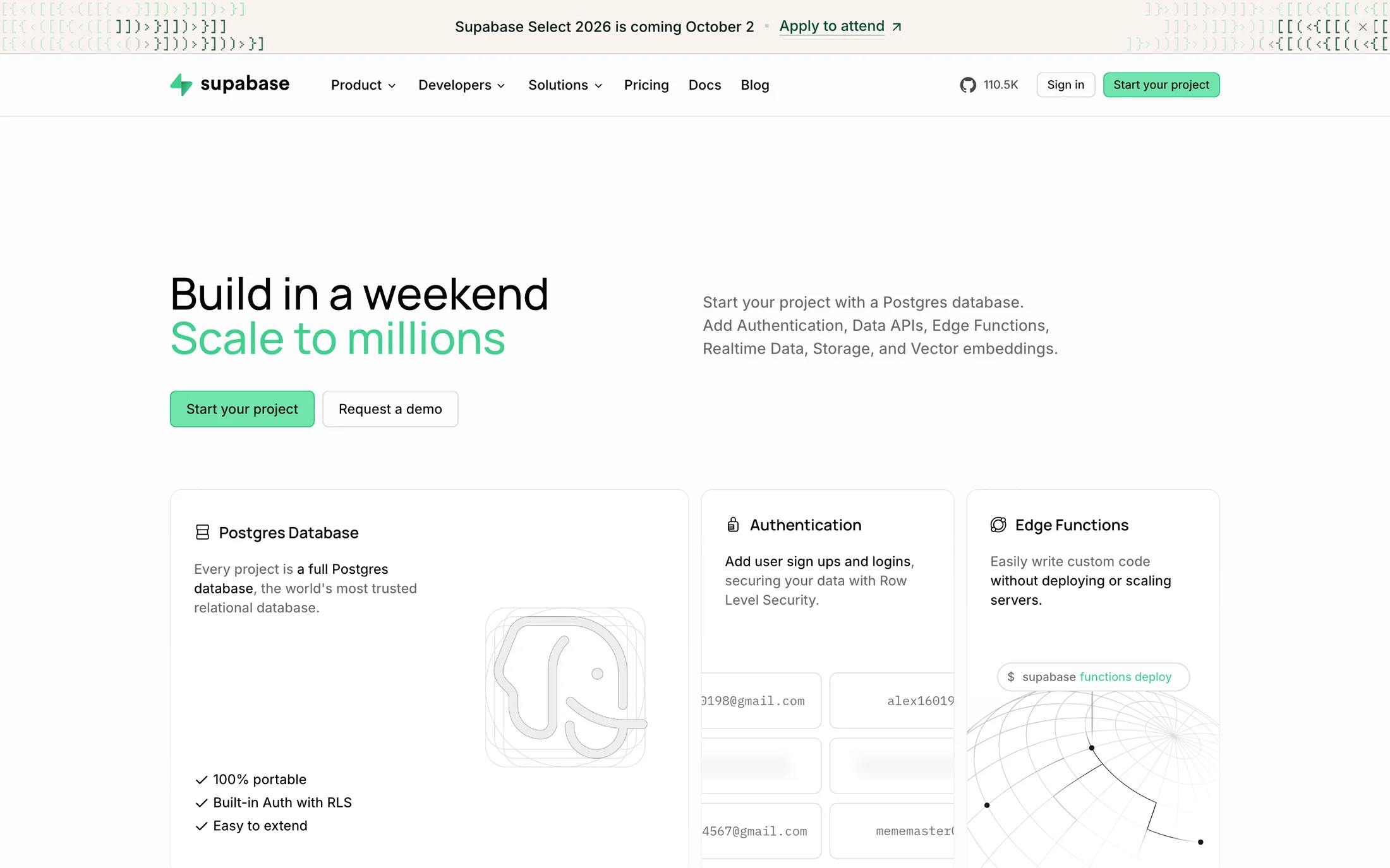
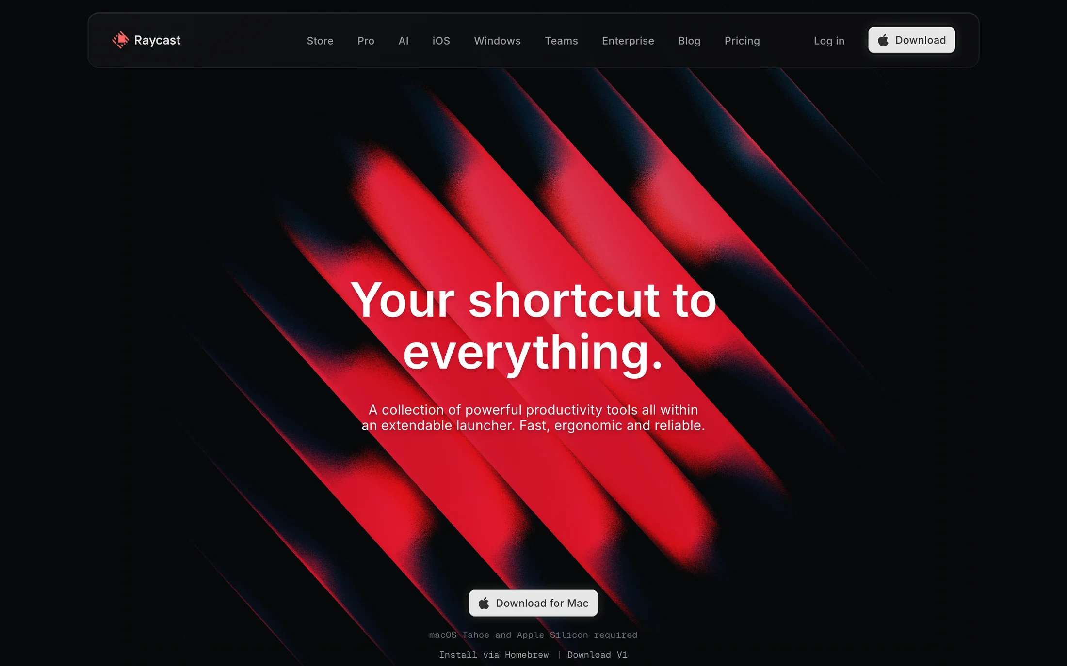
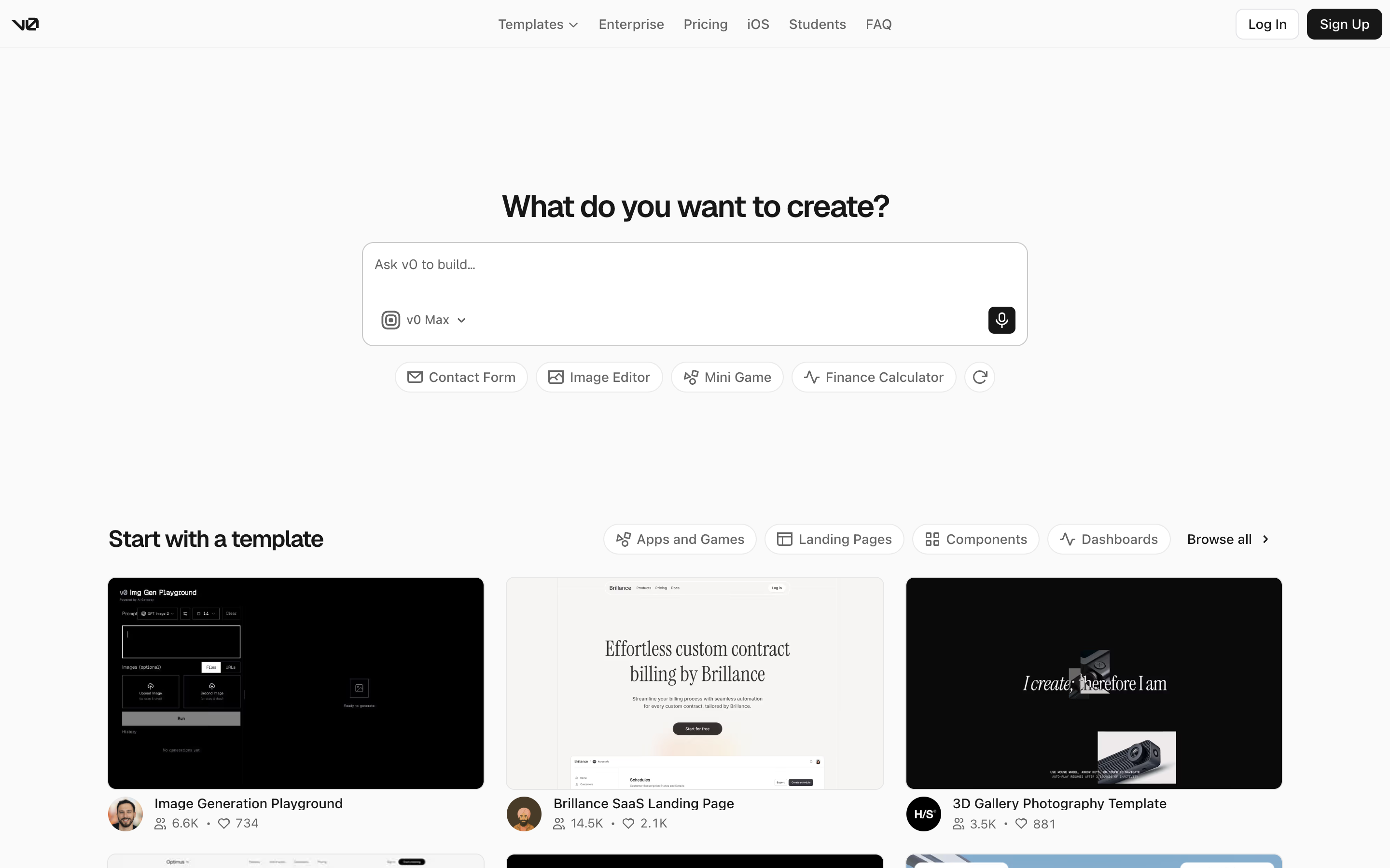
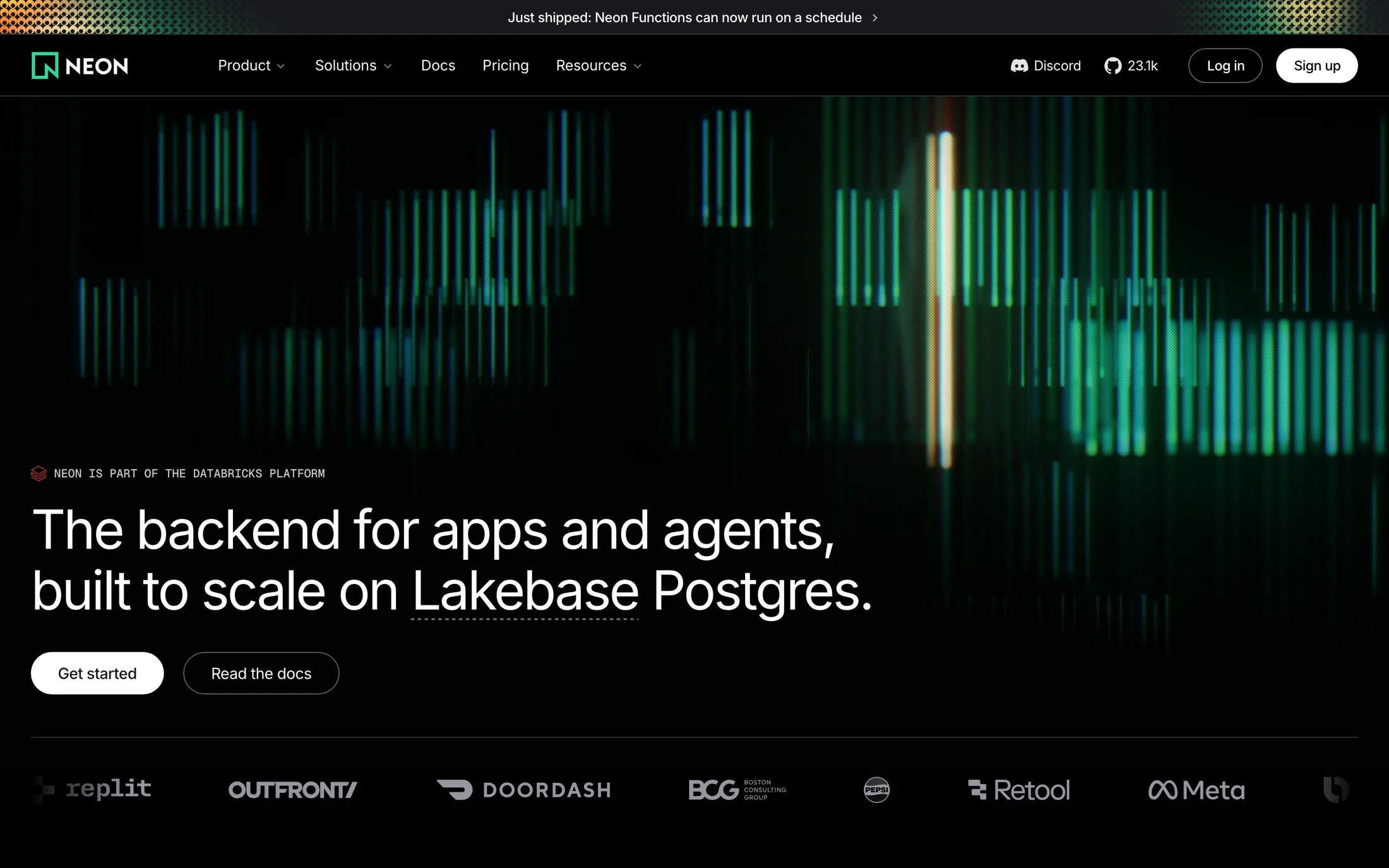
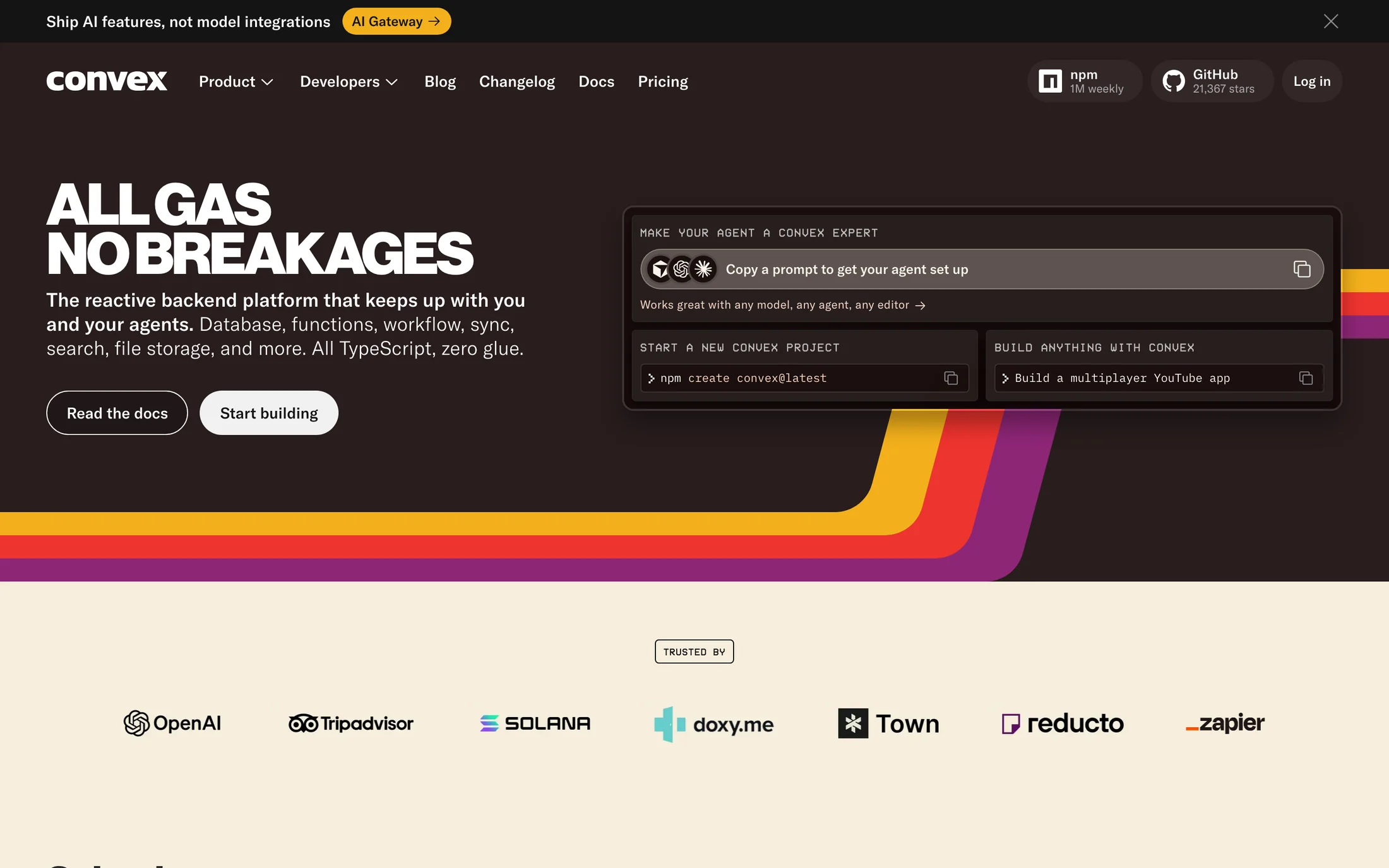
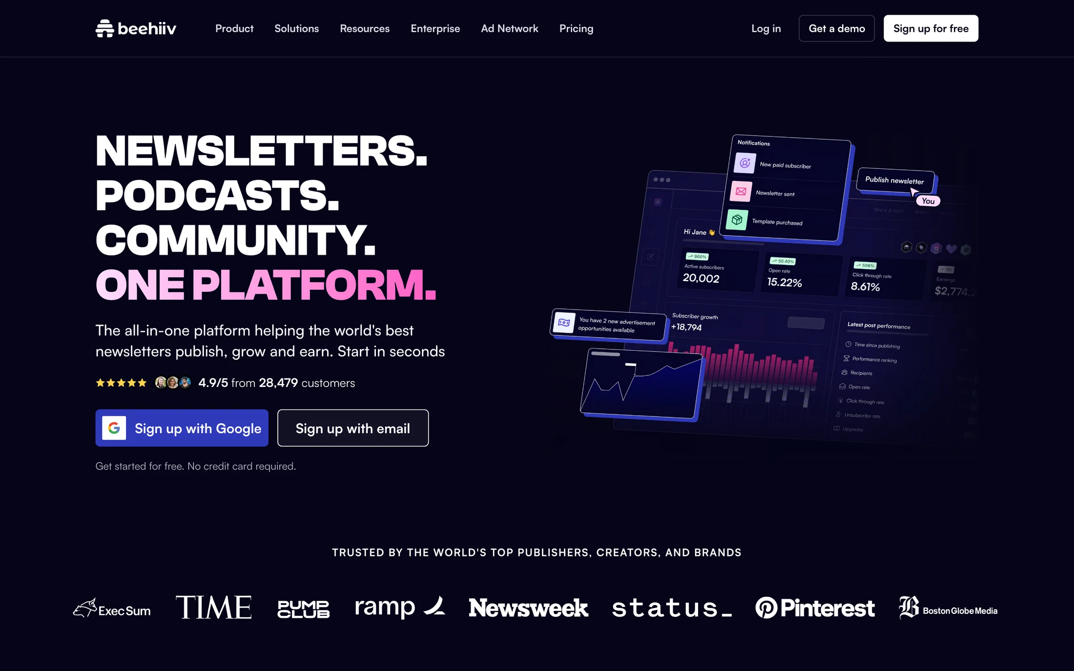
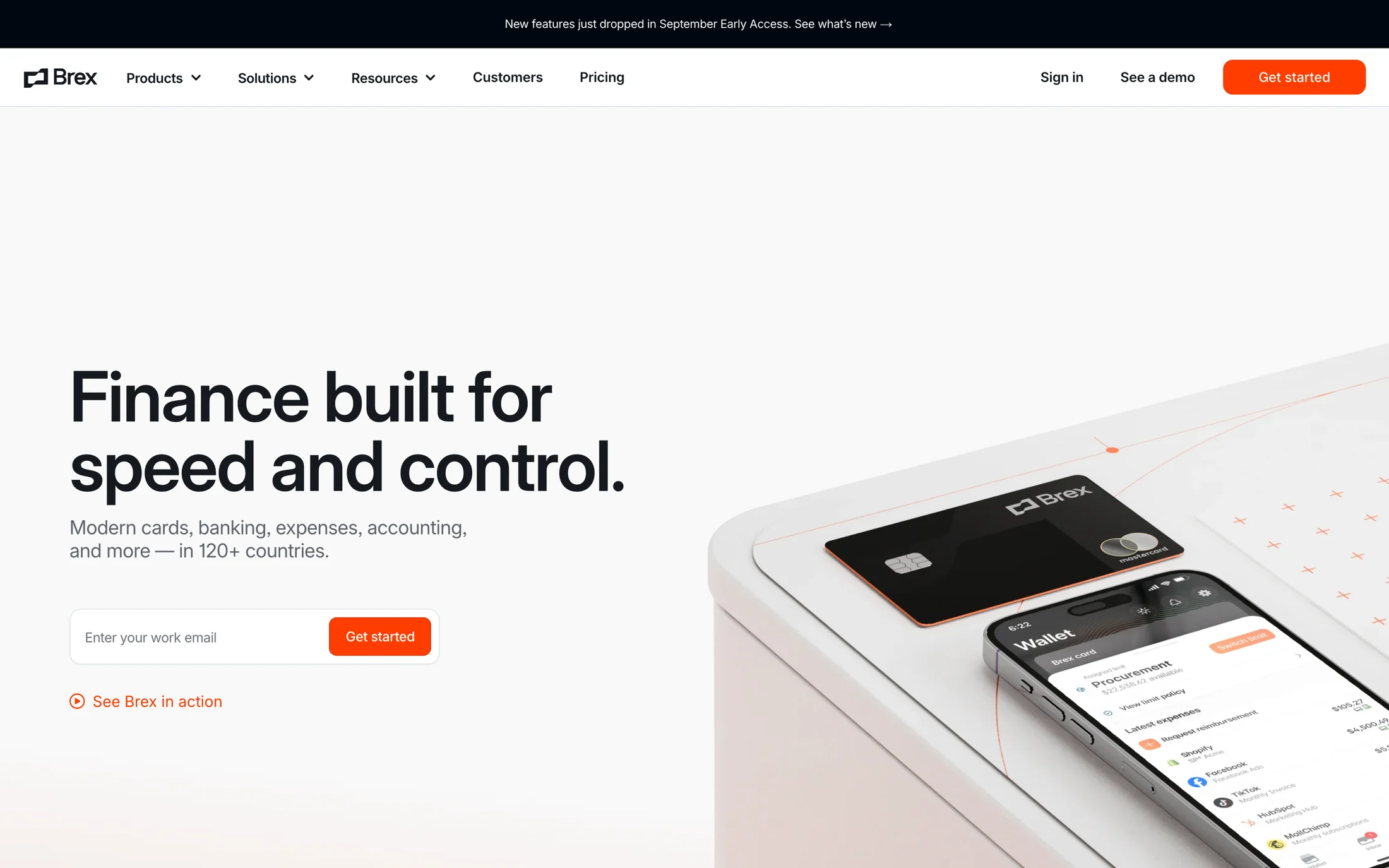
48 real website color schemes where the text colour reaches 7:1 (WCAG AAA) and the accent reaches 3:1 against the background. Ratios are computed from the captured palette's inferred background, text and accent roles; they are an estimate, not an audit of the live site.
Text 7:1+ · Accent 3:1+
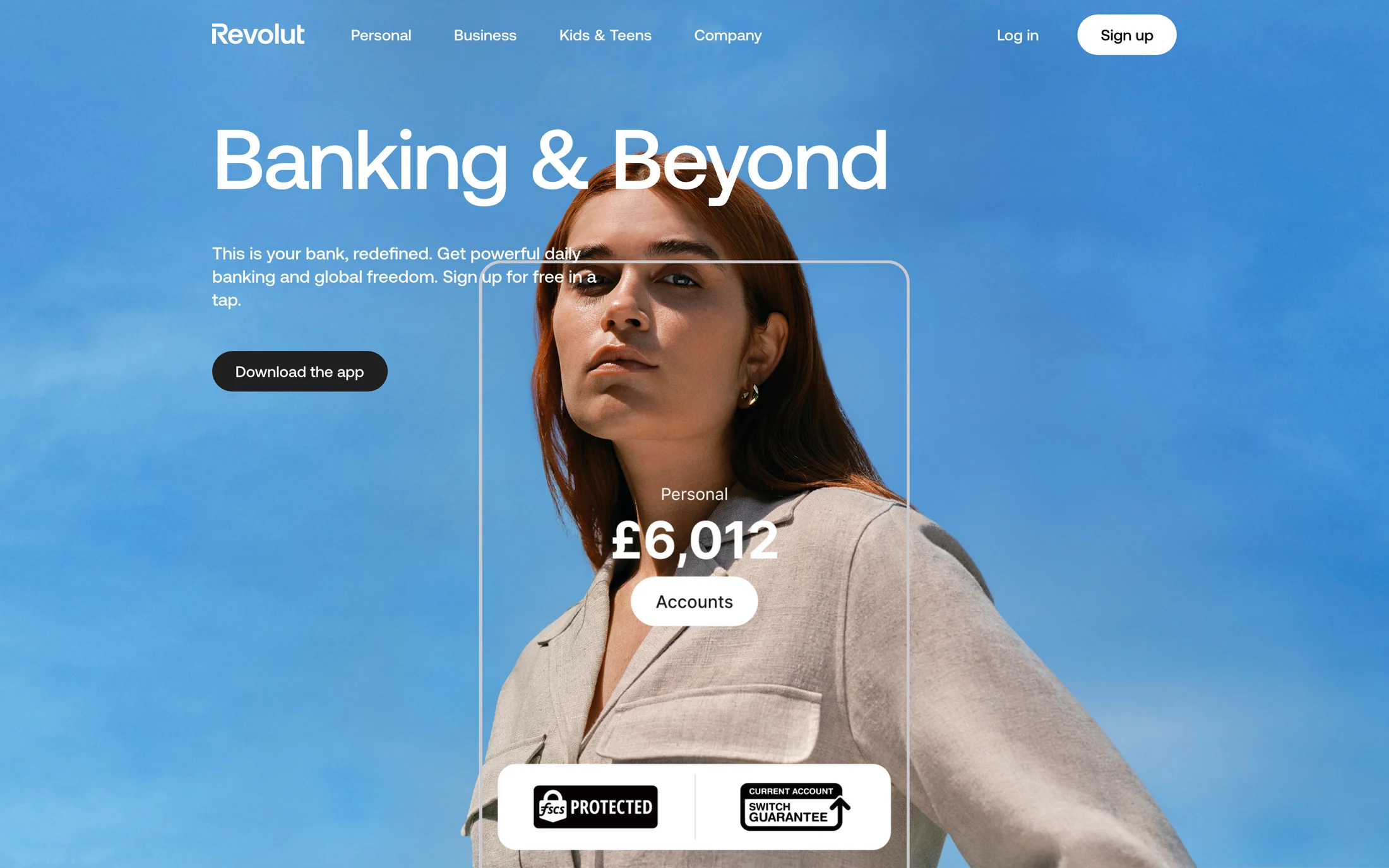
Light backgrounds

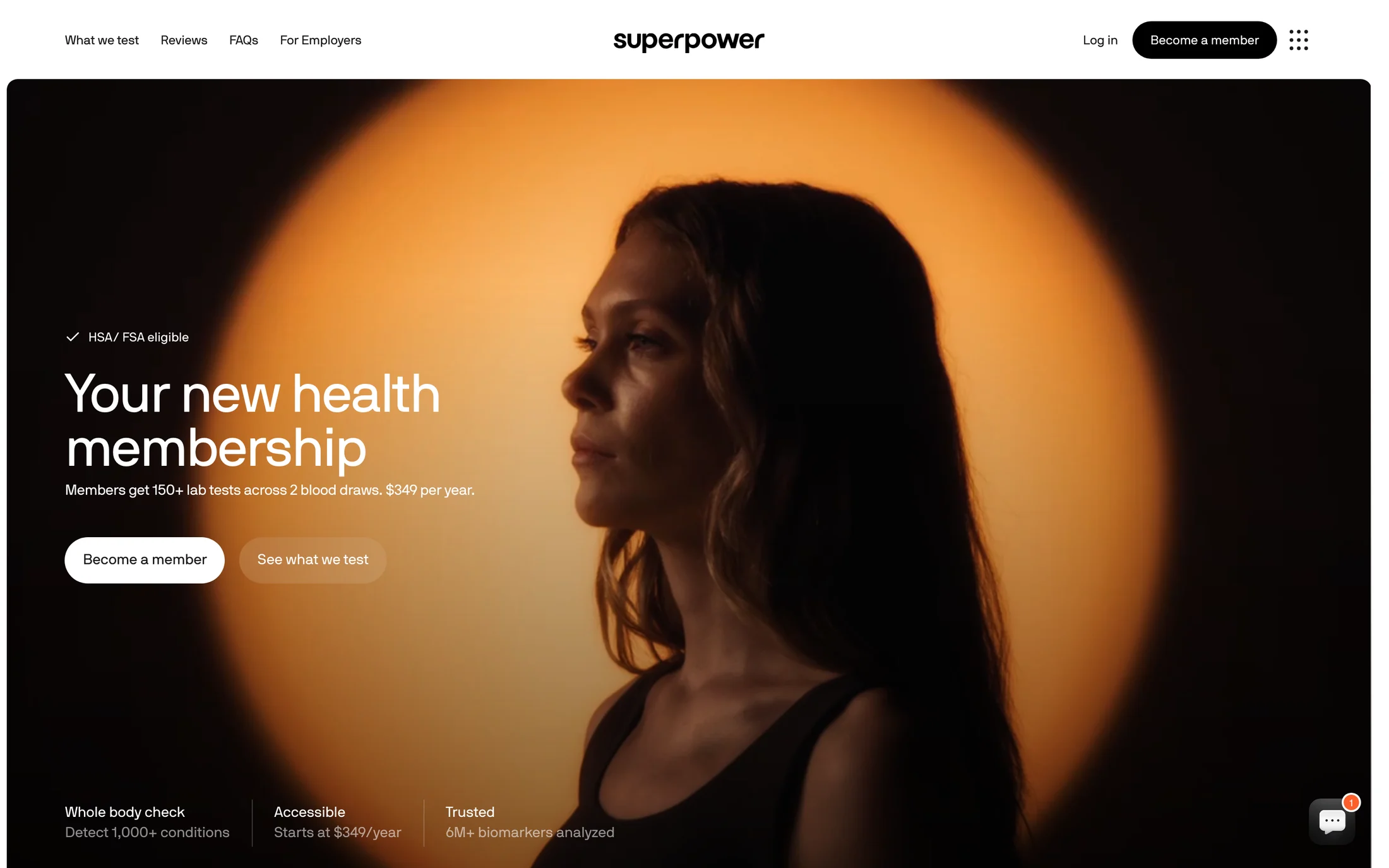
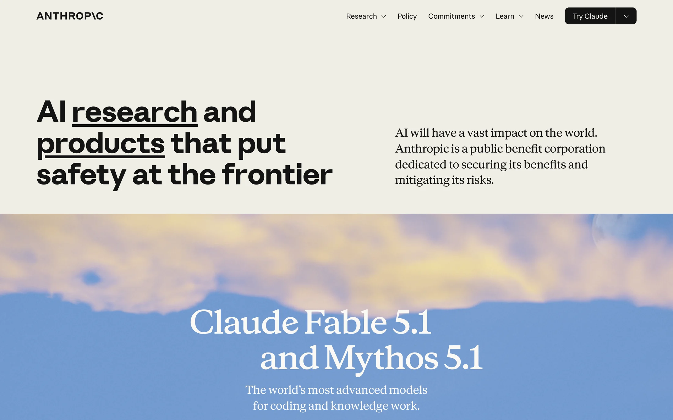
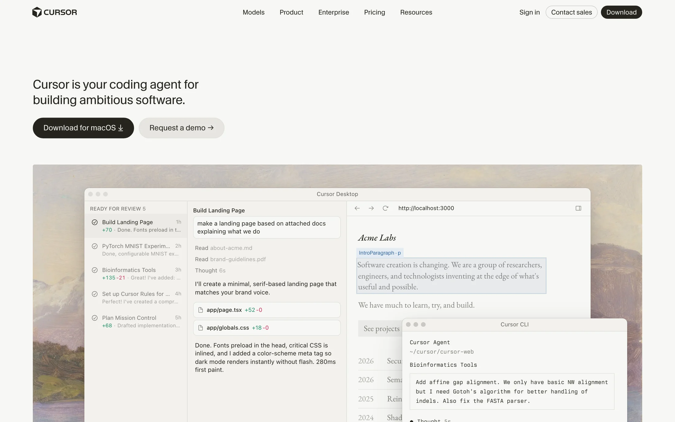
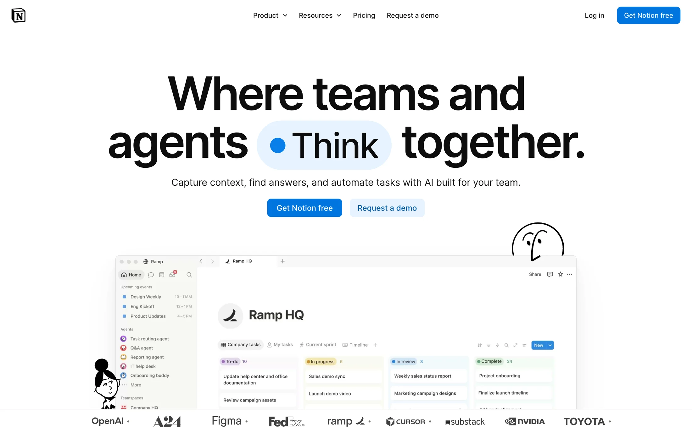
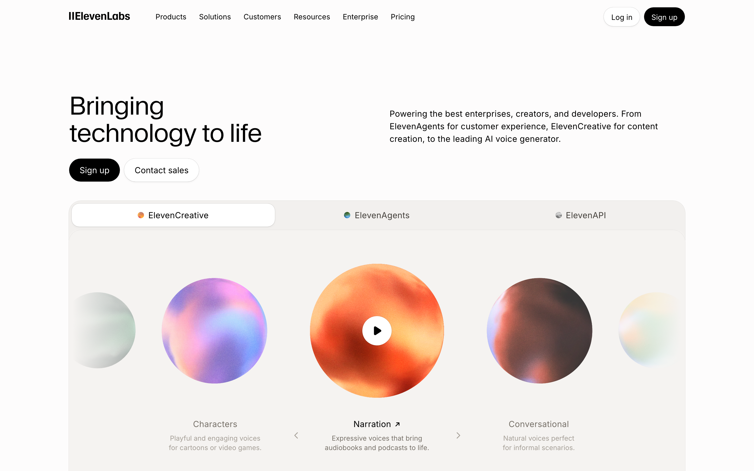
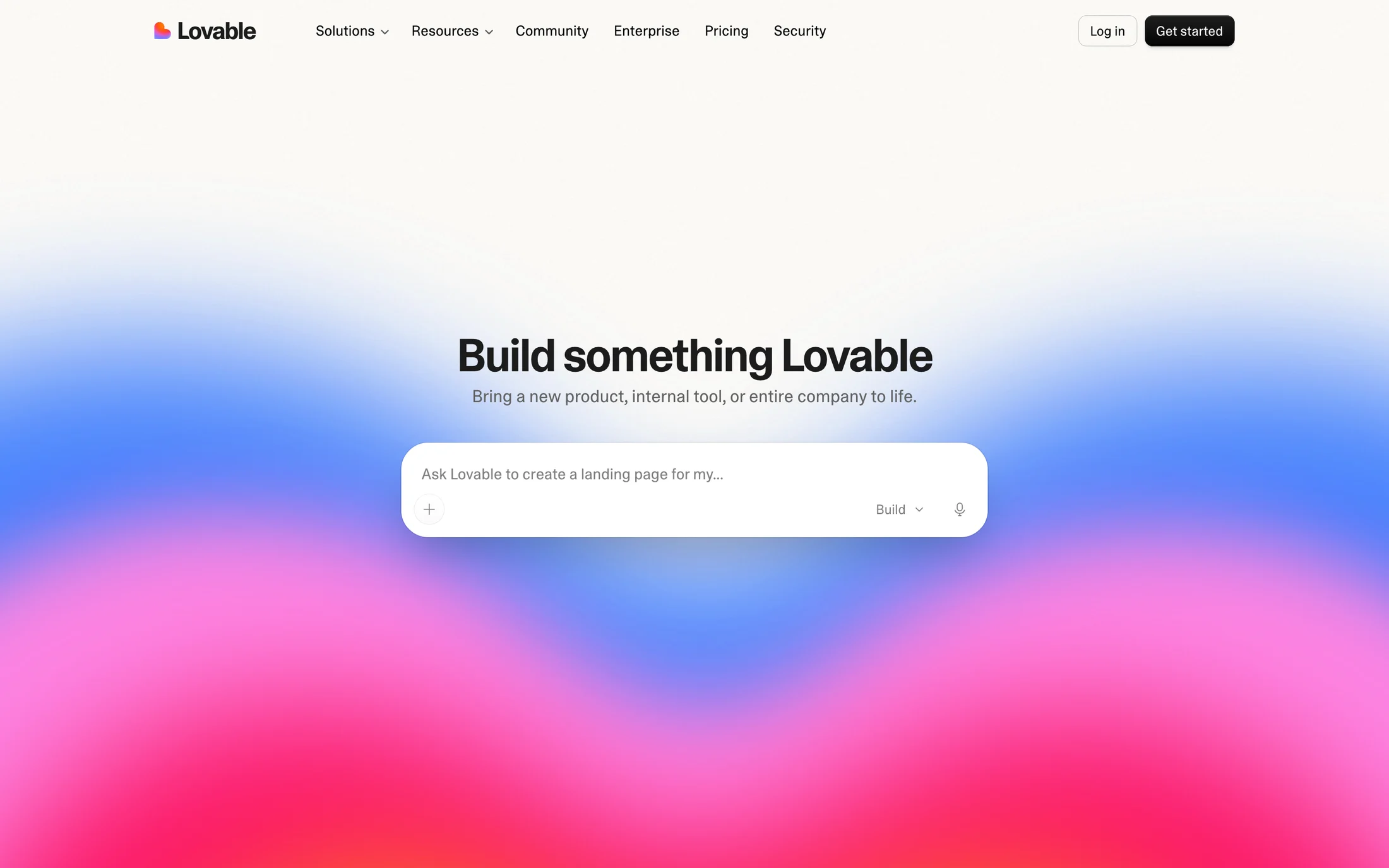
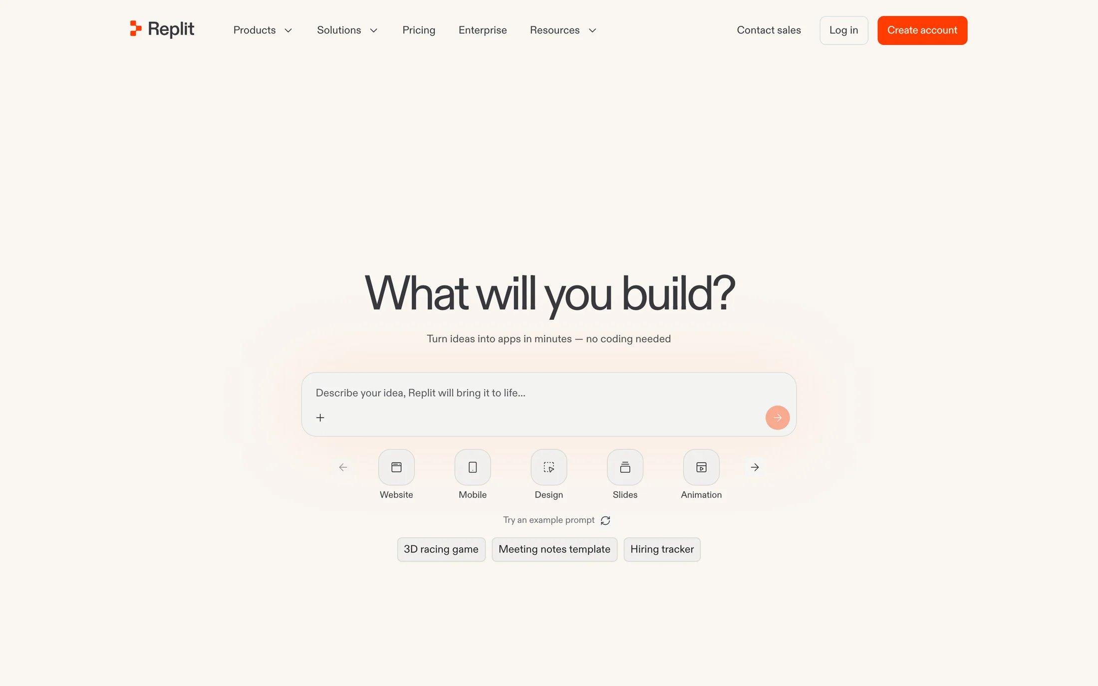


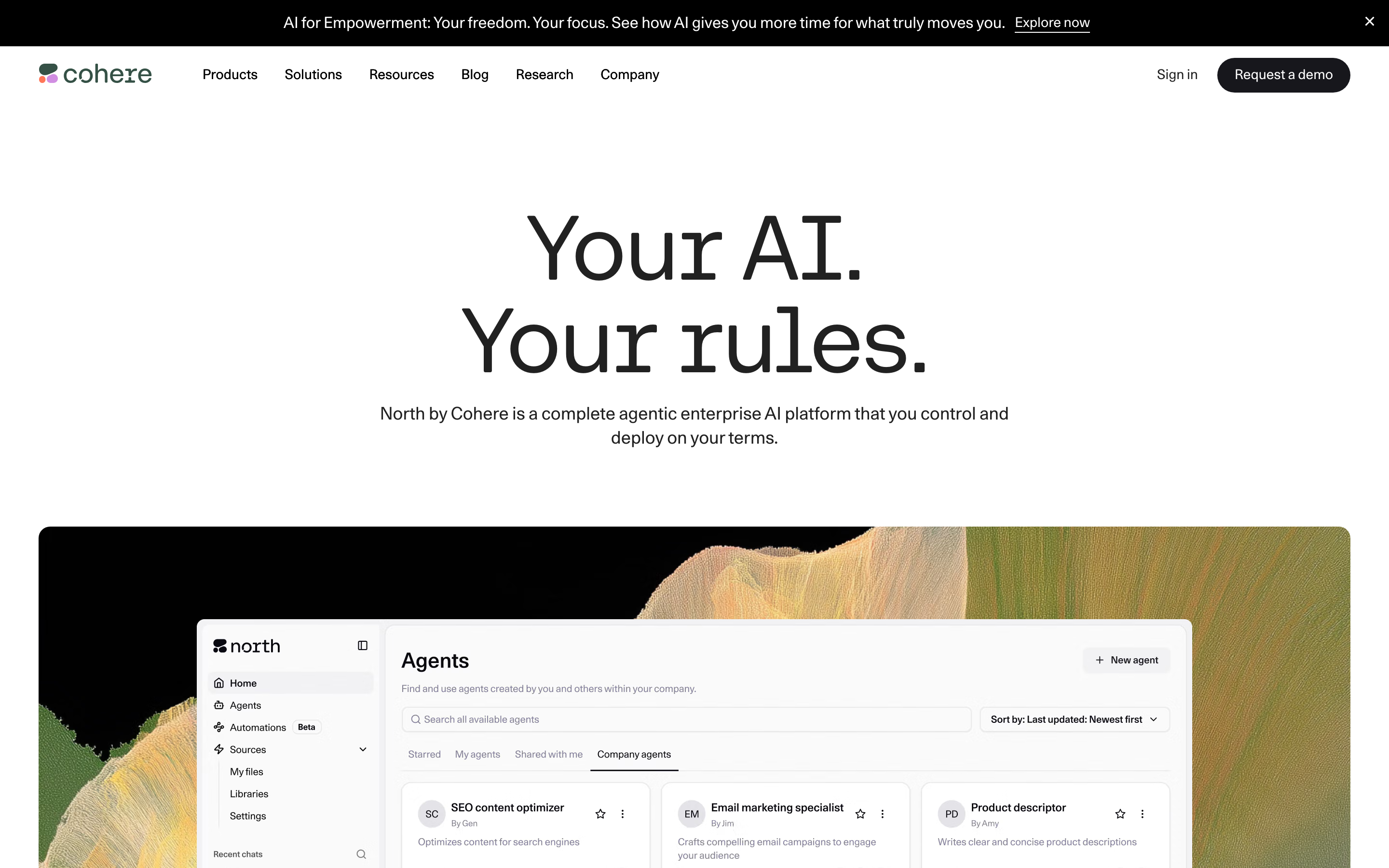

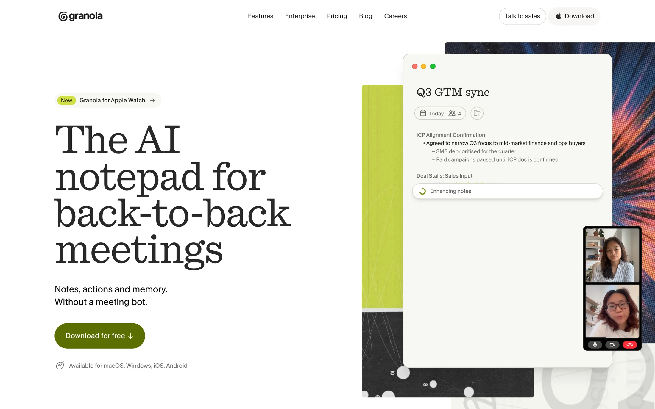


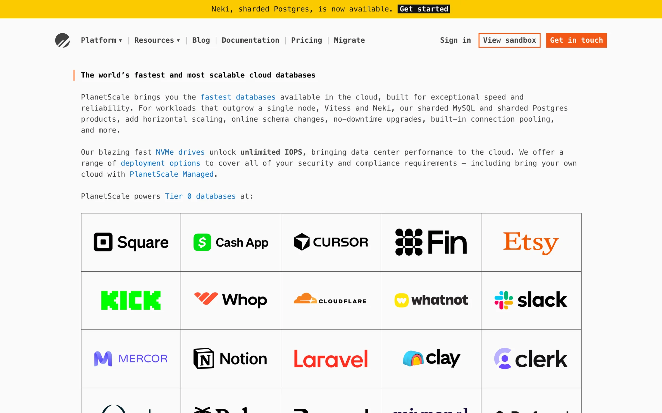
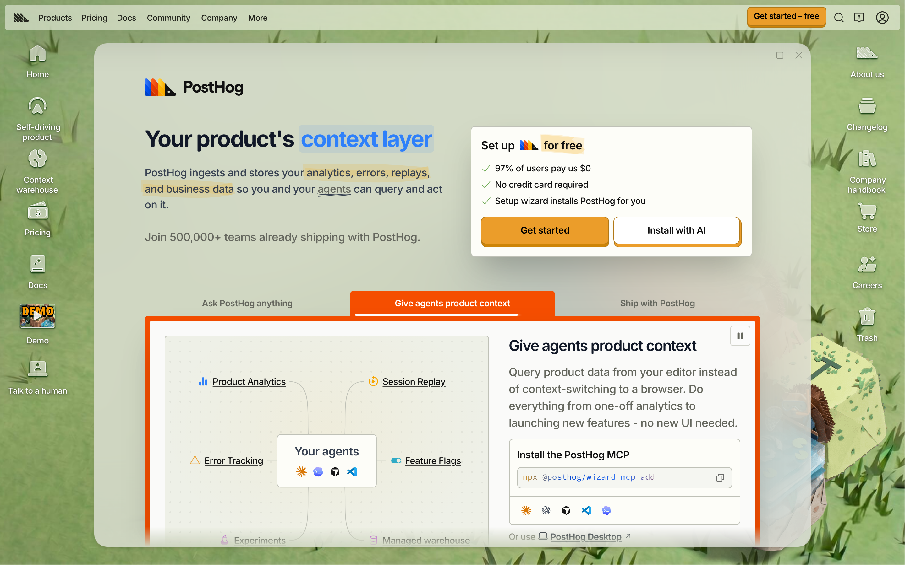
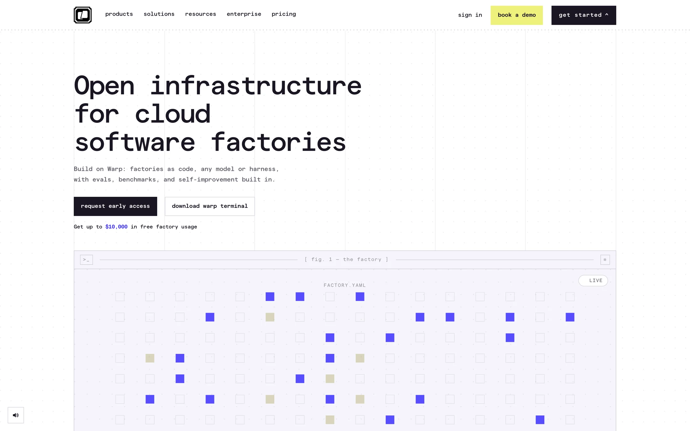
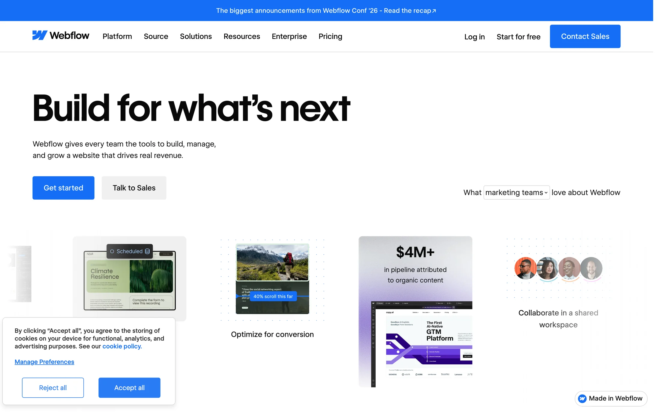

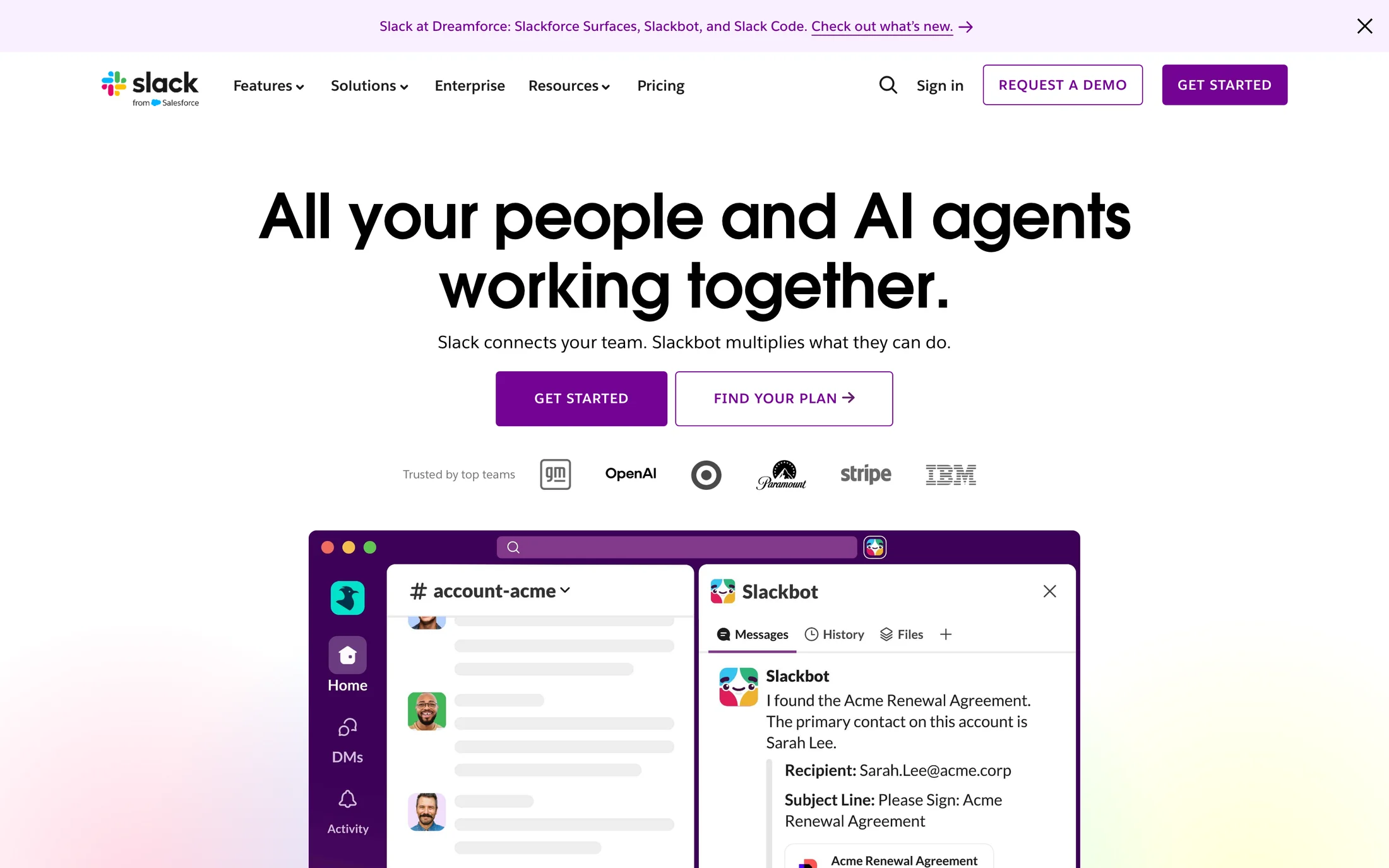

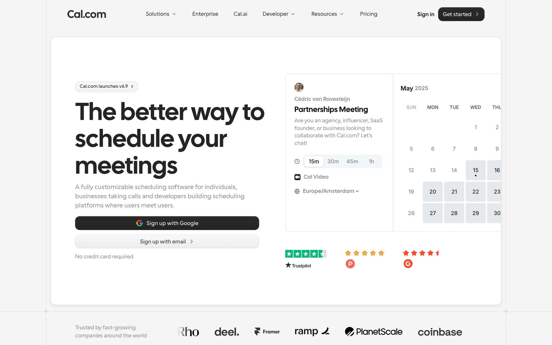
Text 7:1+ · Accent 3:1+
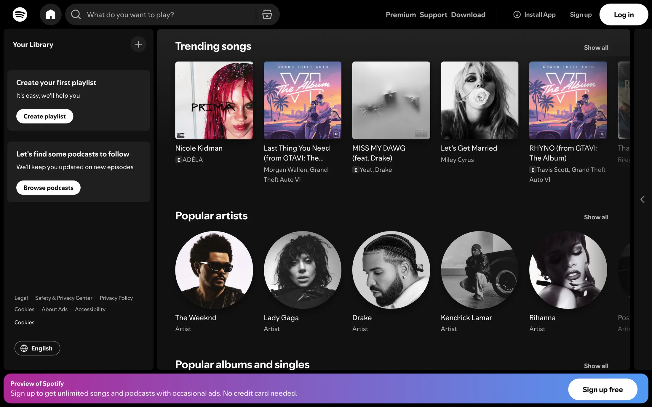
Dark backgrounds













How to read the contrast ratios
A ratio compares the relative luminance of two colours, from 1:1 (identical) to 21:1 (black on white). These thresholds come from WCAG 2.2.
What 4.5:1, 7:1 and 3:1 mean
4.5:1 is the AA minimum for body text, and 7:1 is the stricter AAA level. 3:1 is the minimum for large text and for the visible parts of buttons, inputs and icons. Compare these against the full website color scheme library, where palettes are grouped by hue rather than contrast. To test several colors from one palette together, use the palette accessibility checker. To build a palette from one brand color, use the accessible color palette generator, or follow the accessible color workflow to check, fix and export one.
Check hover, focus and disabled states
A palette that passes at rest can fail once a button lightens on hover or a link loses its underline. Test every interactive state, keep the focus ring at 3:1 against its surroundings, and make sure disabled controls are still recognisable. Pricing sections are a good stress test, with toggles, badges and several button styles on one surface.
Pair contrast with readable type
Thin weights and small sizes need more contrast than the minimum suggests. Choose a text face that holds up at body size with the font pairings guide, then recheck the ratio with your own colours before you ship.
More ways to browse
Collections
Copy a palette as CSS variablesAll website color schemesFree color contrast checkerWCAG color palette fixerCSS gradient generatorHEX to RGB converterImage color pickerImage to palette extractorDark palettesPastel palettesVibrant palettesColour trends
By colour
Blue palettesGreen palettesRed palettesOrange palettesYellow palettesPurple palettesPink palettesBlack palettes
By industry
AI palettesCrypto & Web3 palettesDeveloper Tools palettesProductivity palettesFinance palettesShopping palettesFashion & Beauty palettesHealth & Fitness palettesFood & Drink palettesTravel palettesReal Estate palettesEntertainment palettesEducation palettesMarketing palettesDesign & Agency palettesPortfolio palettesLifestyle palettesTechnology palettes
Accessible website color palettes — FAQ
What contrast ratio does WCAG require for text?
WCAG 2.2 asks for at least 4.5:1 for normal body text and 3:1 for large text at level AA. Level AAA raises those to 7:1 and 4.5:1. Every palette on this page has a text colour that reaches 7:1 against its background.
How are these contrast ratios measured?
Each captured palette is split into background, text and accent roles, using the background observed on the homepage when one was recorded. The ratios are calculated from those role colours with the WCAG relative luminance formula. They are an estimate from the palette, not an audit of the live site.
Does a passing palette make a website accessible?
No. Contrast is one requirement among many. Hover, focus and disabled states, text over images, font size, keyboard access and alternative text all need their own checks before a design can be called accessible.