
Minimalist Design Agency Website Design Examples
142 real sites · 1,331 sections



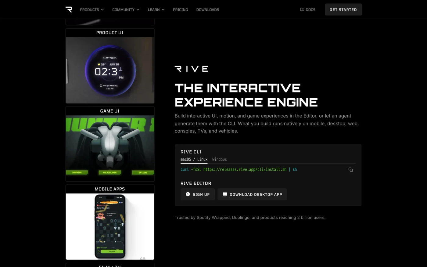
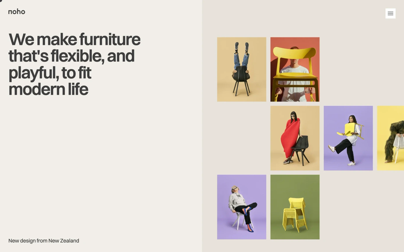
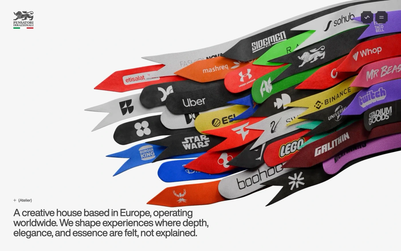
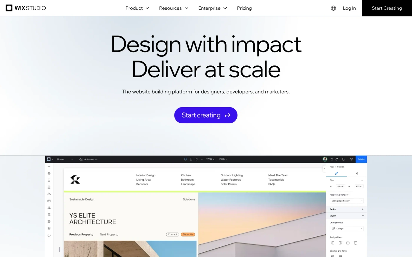
There are 142 minimalist design agency website designs here — live sites that are design & agency sites that are tagged minimal from their captured layout and palette, including Rive, Wix Studio, Pensatori Irrazionali, Noho and Go — cut into 1,331 sections. 68% use a light theme and 32% a dark one; the most common headline fonts are PP Neue Montreal (4), Geist (3) and Switzer (2). 60 of 142 open with a hero, 3 show pricing on the homepage and 8 carry testimonials.
At a glance
Live verified metrics- Sites
- 142
- Sections captured
- 1,331
- Light / dark
- 68% light · 32% dark
- Top heading fonts
- PP Neue Montreal (4), Geist (3) and Switzer (2)
- Accent colours
- neutral 142
- Most common sections
- statement (71), hero (60), features (56) and showcase (51)
- Top industries
- Design & Agency (142)
- Award winners
- 127 of 142
Filter
Industry
Exact colour






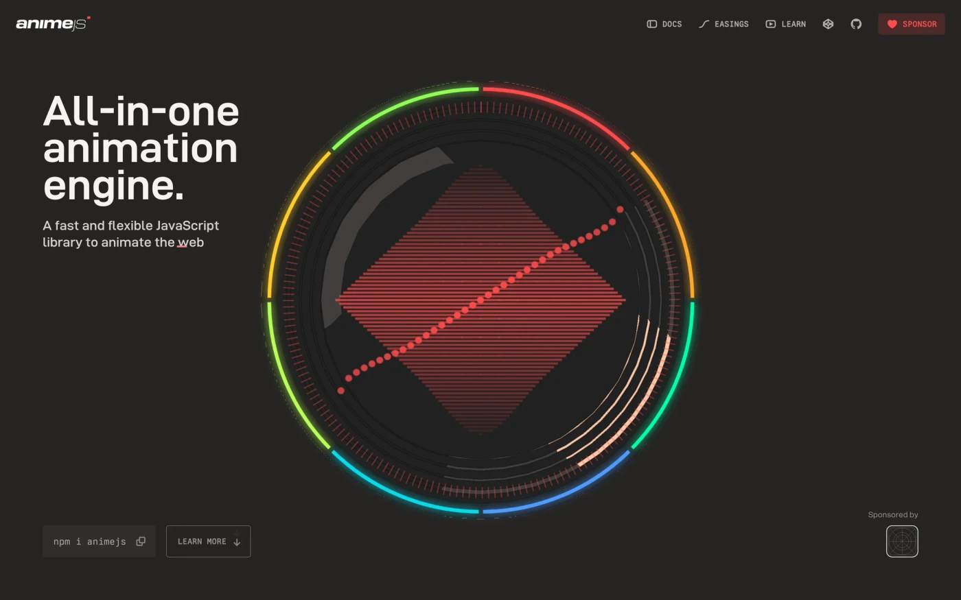

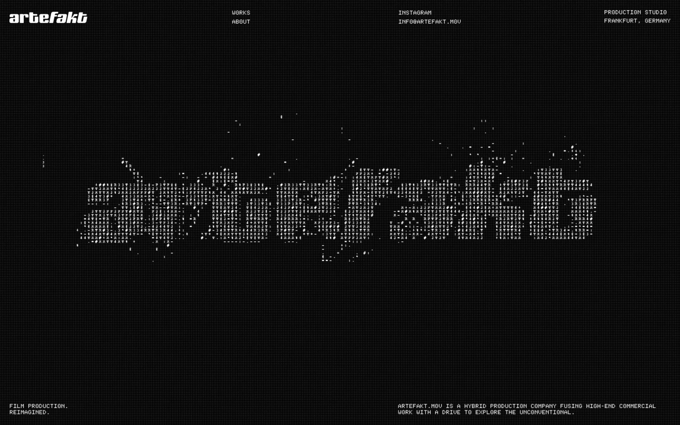



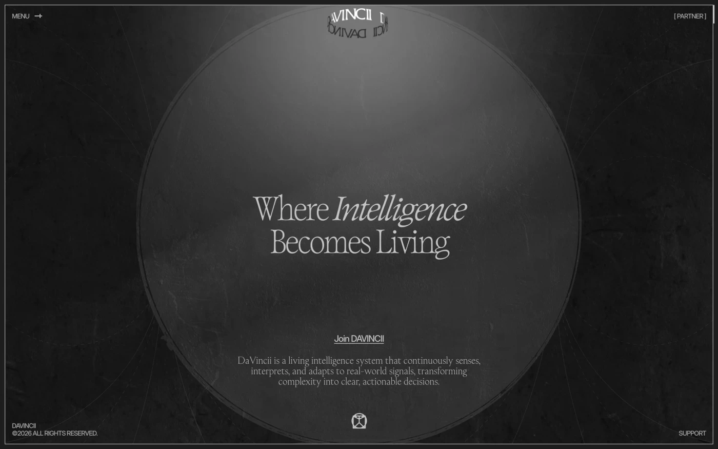
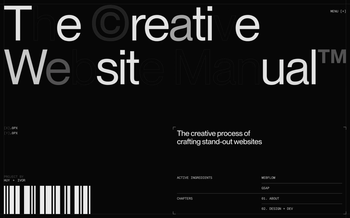


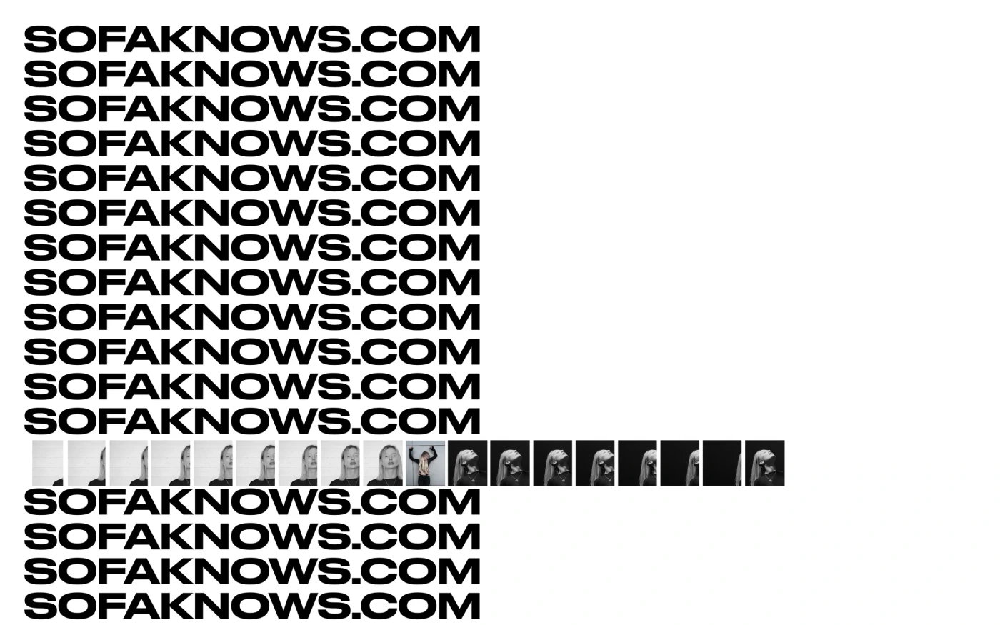
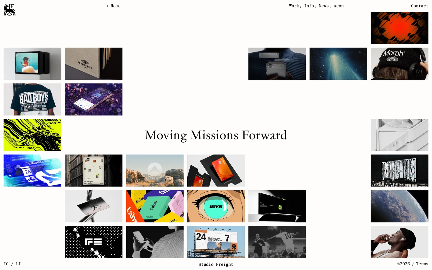

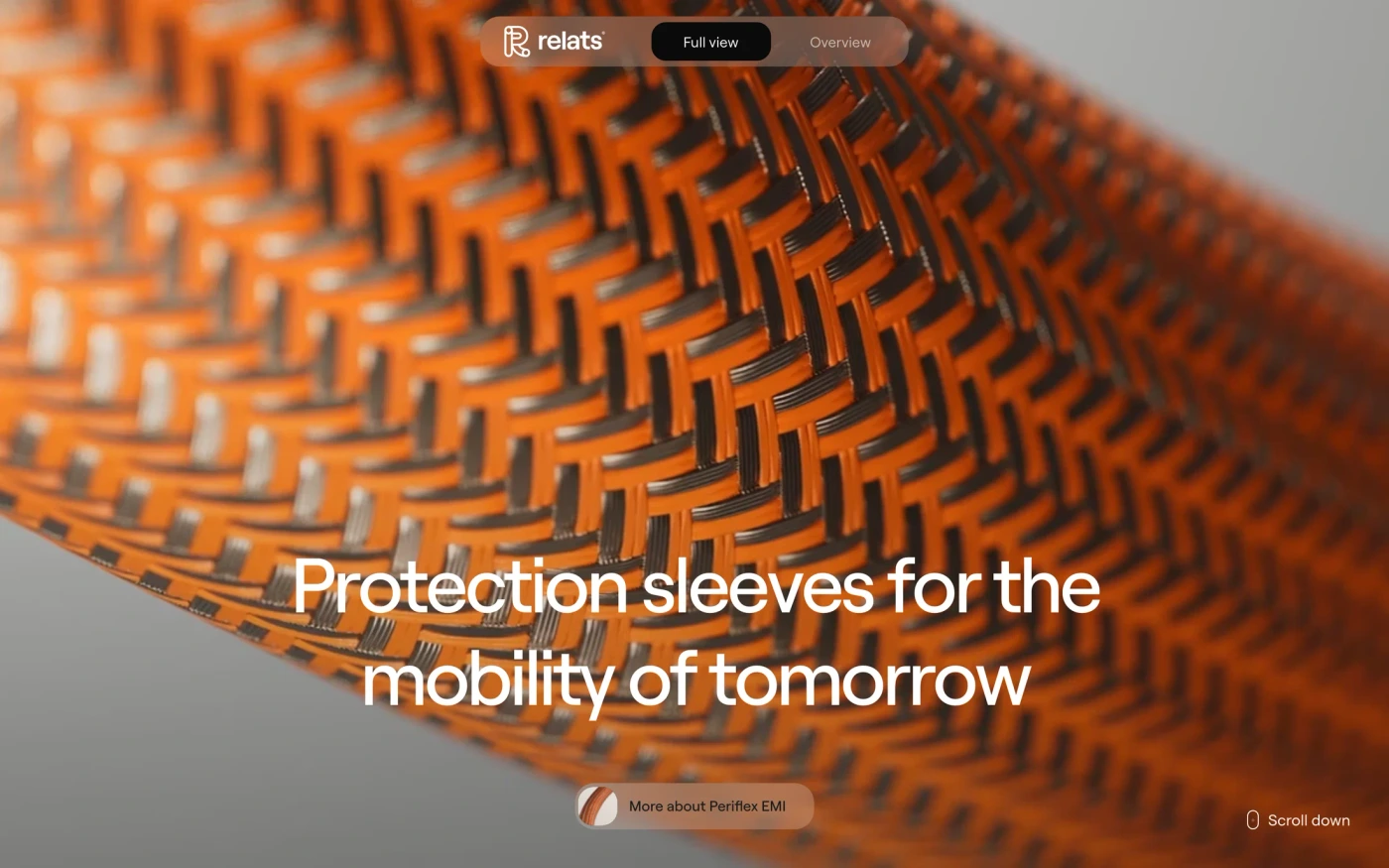
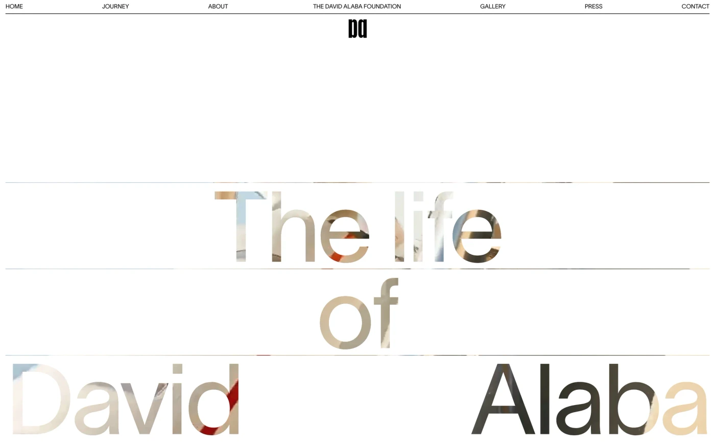




What makes a good minimalist design agency website design
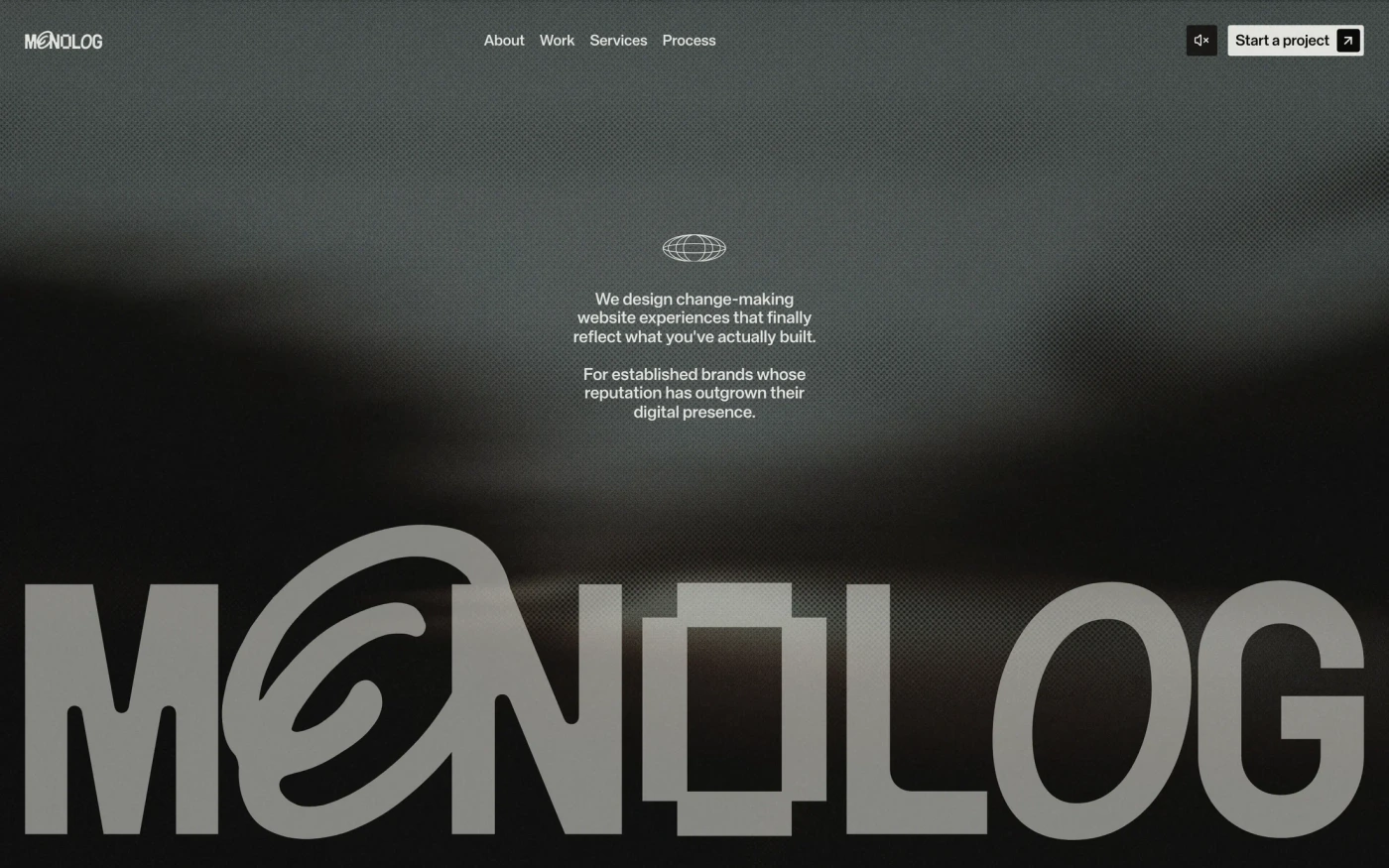
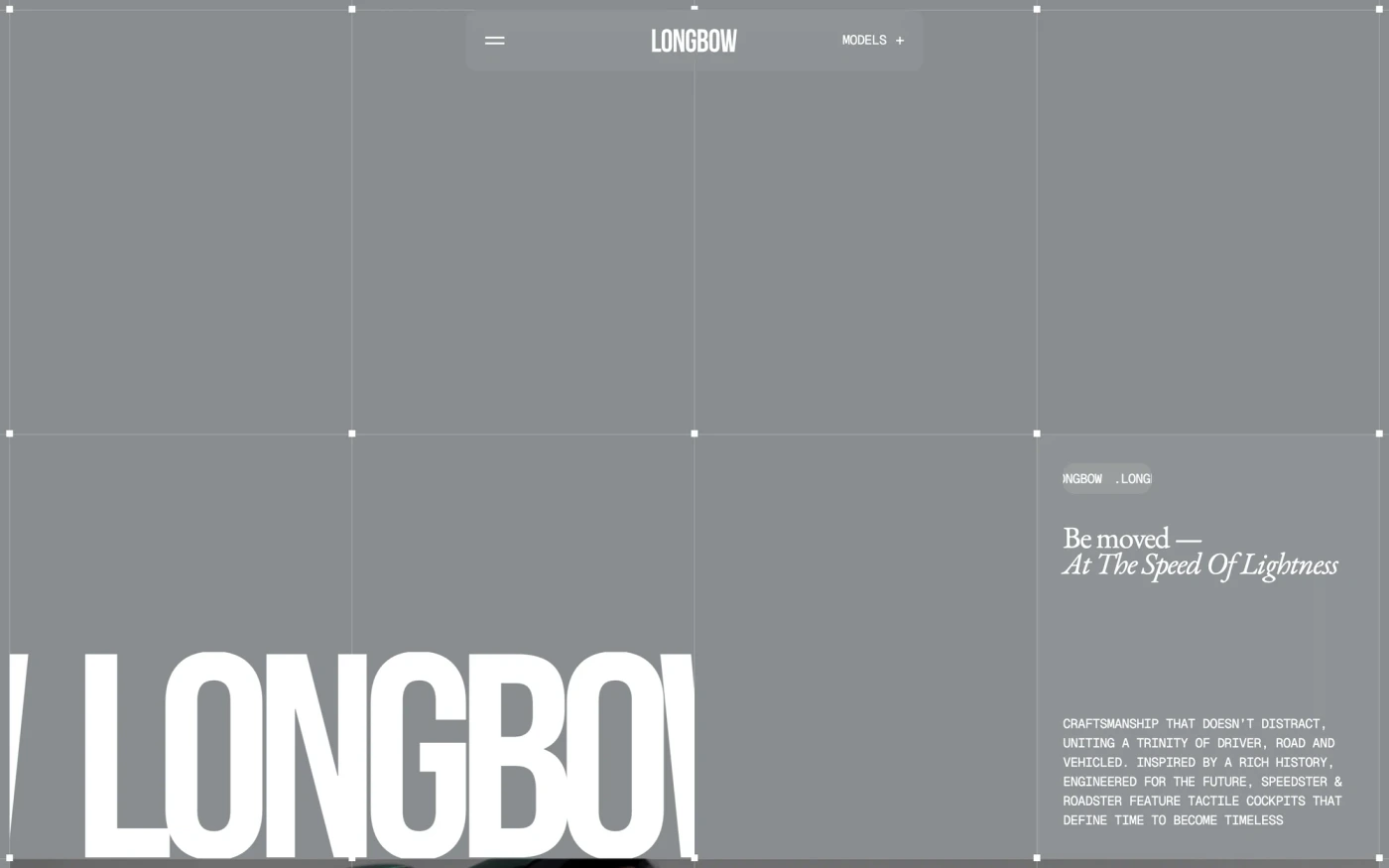
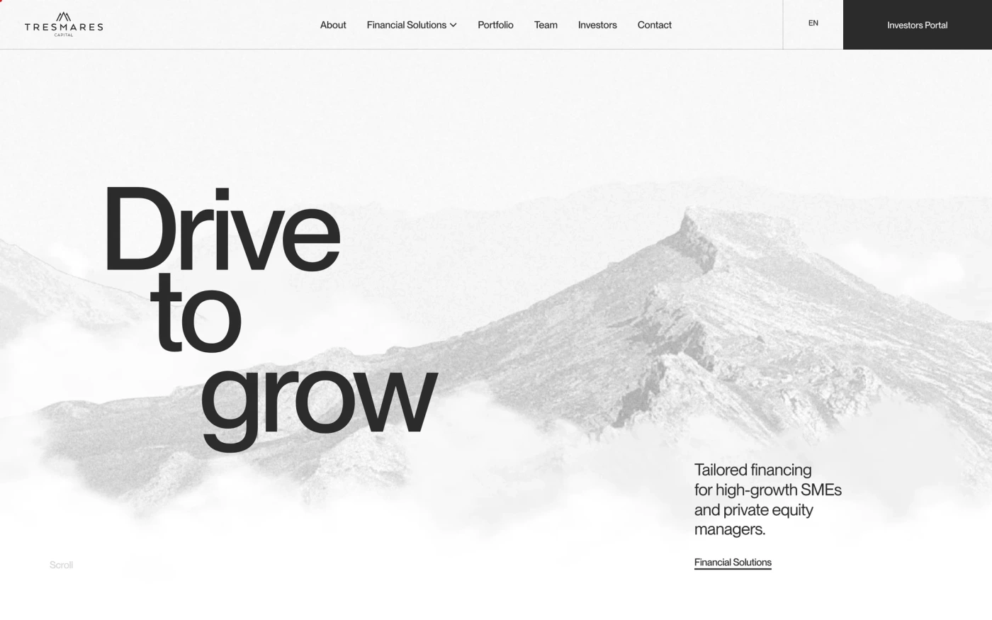
Minimal sites remove everything that doesn't earn its place: generous whitespace, a restrained palette, strong typography and one action per screen. Design studios treat the homepage as a portfolio: selected work, motion and a distinctive typographic voice.
What these 142 minimalist design agency websites have in common
Measured from the captures, not opinion — use it to plan a minimalist design agency website against what already works.
Sections they use
71 include statement, 60 include hero, 56 include features and 51 include showcase. 4 answer objections with an FAQ and 12 (8%) close with a dedicated call to action. Read top to bottom, the most common running order is hero → statement → features → showcase → footer. Compare them side by side: statement section examples, hero section examples, features section examples.
Type and colour
Light layouts lead (68% vs 32% dark). Headlines are most often set in PP Neue Montreal (4), Geist (3) and Switzer (2). The most common accent hues are neutral (142). Every example lists its exact fonts and hex palette on its page.
Page length
The average homepage here is about 6,331px tall at desktop width — roughly 7 screens of scrolling, with Wix Studio the longest at 11,000px. Open any site to scroll the full-page capture and see where each section falls.
142 minimalist design agency website designs worth studying
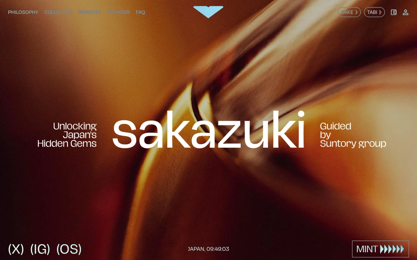
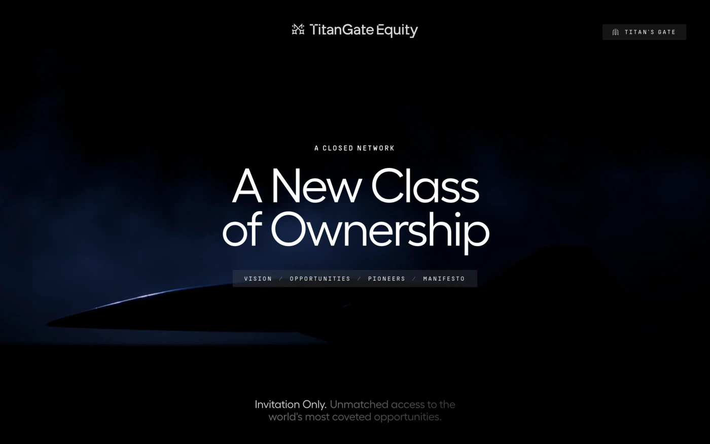
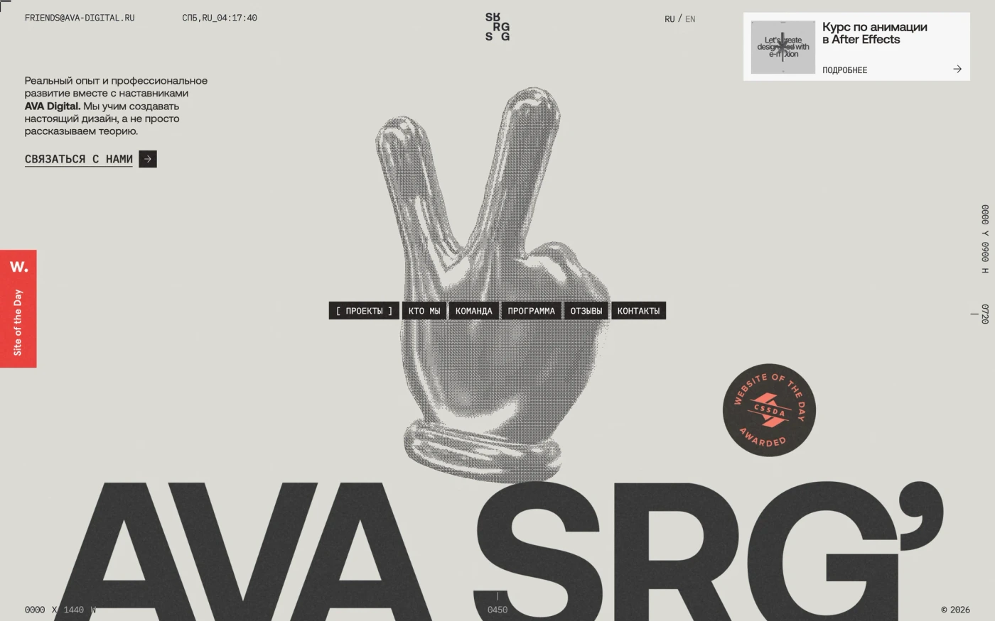
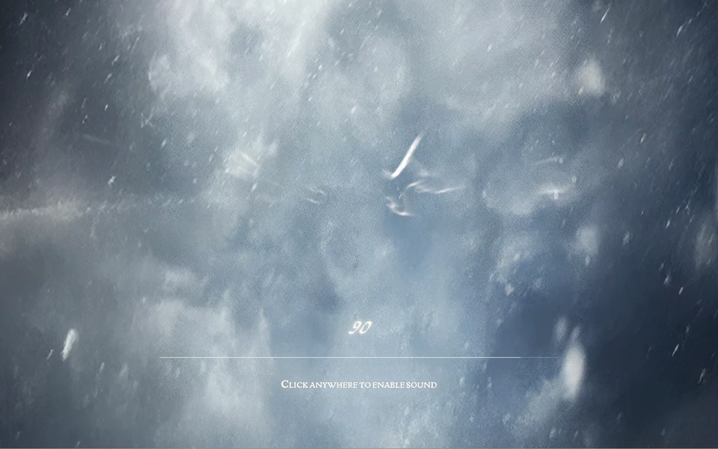
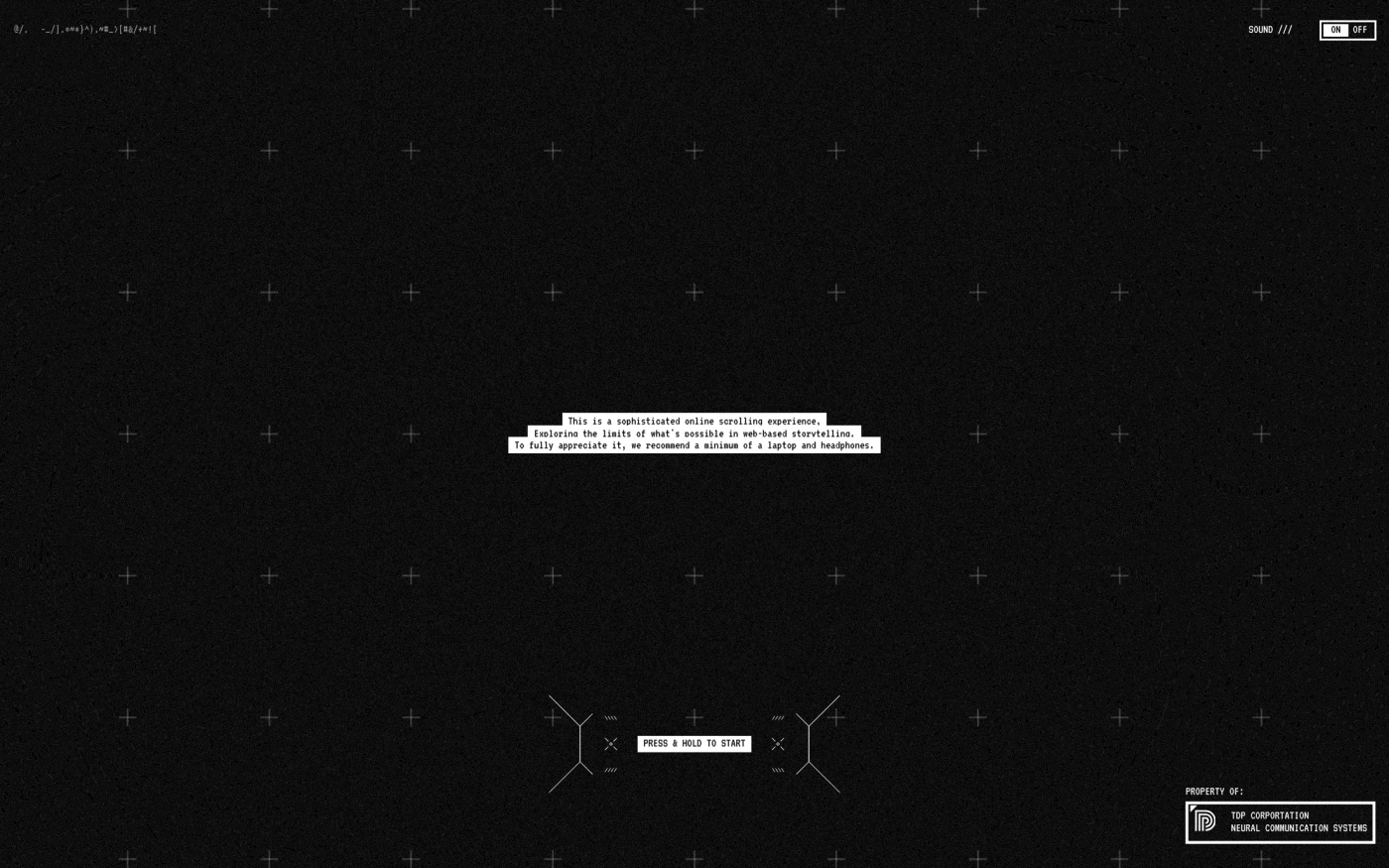
- Sakazuki — “Share a sakazuki, share your heart. Discover Japan's hidden artisans, rare cultural experiences, and meaningful connections through this exclusive membership guided by Suntory's 120-year tradition.” 12 sections, headlines in Hagrid, light theme, palette #000000 and #e1d6ce.
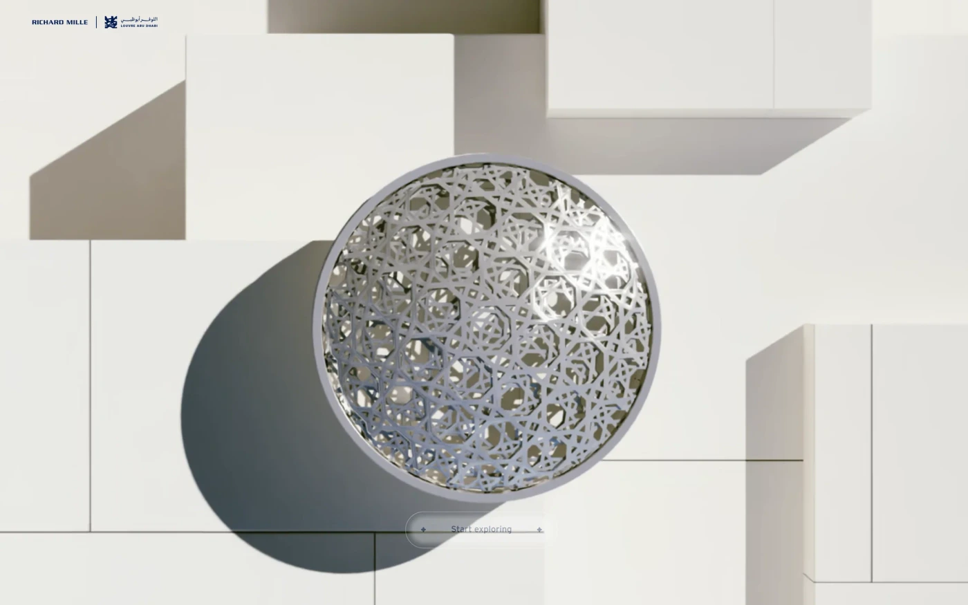
- Artprize Shadows — “The fifth edition of Art Here 2025 explored shadows beneath Louvre Abu Dhabi’s Dome, uniting 6 artworks by 7 artists in a journey through light and perception” 1 sections, light theme, palette #ffffff.
- Weekend Mm 2025 Gift Guide Production — “Weekend MaxMara Gift Guide 2025” 1 sections, light theme, palette #000000.
- Spark — “From a cold, creative-less city, a small idea emerges, growing louder and louder: The Spark.” 1 sections, headlines in Pp eiko, light theme, palette #ffffff and #000000.
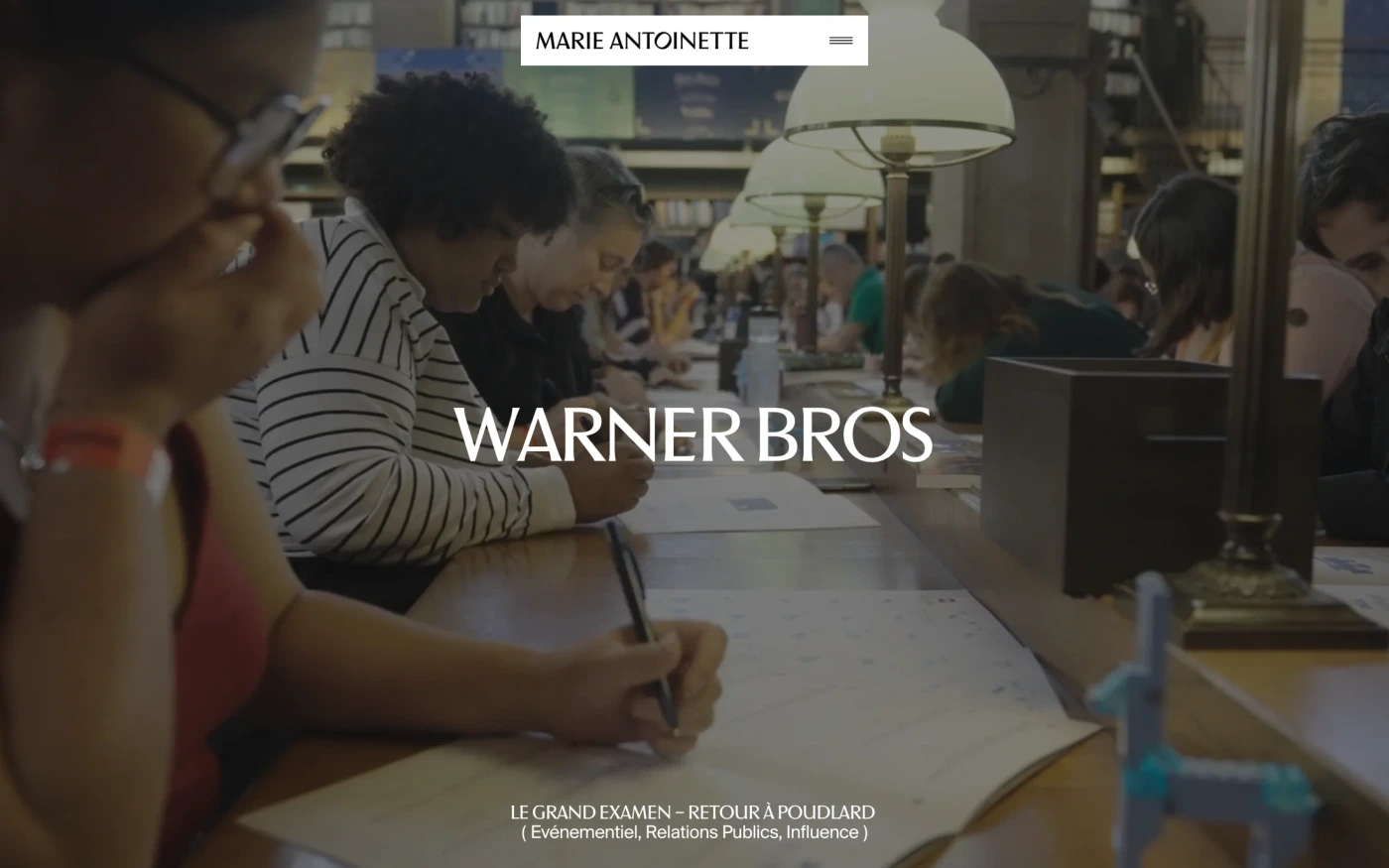
- Marie Antoinette — “Expertise en relations publiques, digital, événementiel et transformation de marque. Agence agile à Paris prête à donner audace et portée à vos projets” 12 sections, headlines in Suisse BPIntl, light theme, palette #f3f4f2 and #ffffff; the homepage runs showcase → features → statement → footer.
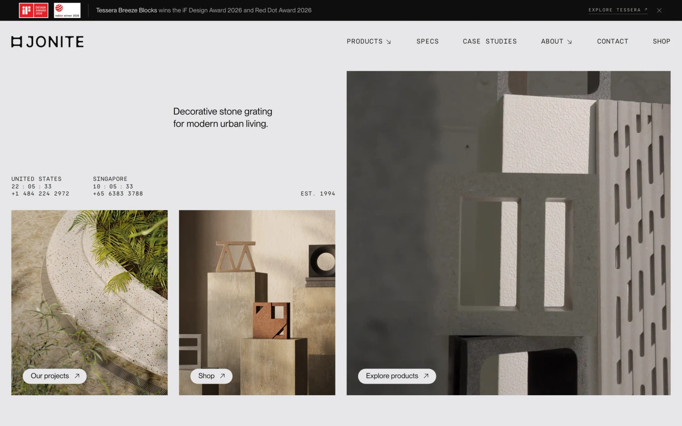
- Jonite — “Jonite products and designs come in a wide range of collections to bring a fresh vision to hardscapes and interiors. Learn more about our decorative stone…” 23 sections, headlines in PP Neue Montreal, light theme, palette #e6e7e8 and #0e0e0e; the homepage runs showcase → logo cloud → features.
How to use these references for a minimalist design agency website
Minimal is not empty — make the type scale and spacing do the work, keep one accent colour, and let a single strong image or product shot carry each section. For a studio or agency, notice how the work is presented large and the copy kept short. Start with Rive, Wix Studio and Pensatori Irrazionali, open each site at full size and compare their statement and hero sections; every reference carries its palette, fonts and a build prompt you can paste into your editor.
Featured minimalist design agency website examples with their fonts
Related searches
Browse all websites or the full A–Z of popular searches.
How this list is built: 142 sites from the UI Discovery library that are design & agency sites that are tagged minimal from their captured layout and palette, matched on each product's own title, description and headline copy, captured styles, colours and fonts. Ordered by popularity.
Library updated