
Dark Tech Startup Website Design Examples
23 real sites · 698 sections

There are 23 dark tech startup website designs here — live sites that are technology sites that use a dark theme on their homepage, including Hex, Basecamp, Vaulk, Rabbit and Playdate — cut into 698 sections. 0% use a light theme and 100% a dark one; the most common headline fonts are Suisse Intl (2), PP Formula Semi Extended and Graphik. 19 of 23 open with a hero, 5 show pricing on the homepage and 4 carry testimonials.
At a glance
Live verified metrics- Sites
- 23
- Sections captured
- 698
- Light / dark
- 0% light · 100% dark
- Top heading fonts
- Suisse Intl (2), PP Formula Semi Extended and Graphik
- Accent colours
- neutral 10blue 3orange 3
- Most common sections
- features (23), hero (19), statement (15) and blog (12)
- Top industries
- Technology (23)
- Award winners
- 1 of 23
Filter
Industry
Exact colour









What makes a good dark tech startup website design
Dark sites feel premium, technical or cinematic: light type on near-black, accent colour used sparingly, and product screenshots or video that glow against the background. Technology companies explain complex products simply — a crisp value prop, architecture diagrams and customer logos.
What these 23 dark tech startup websites have in common
Measured from the captures, not opinion — use it to plan a dark tech startup website against what already works.
Sections they use
23 include features, 19 include hero, 15 include statement and 12 include blog. 5 answer objections with an FAQ and 8 (35%) close with a dedicated call to action. Read top to bottom, the most common running order is hero → features → footer → showcase → faq. Compare them side by side: features section examples, hero section examples, statement section examples.
Type and colour
Dark layouts lead (100% vs 0% light). Headlines are most often set in Suisse Intl (2), PP Formula Semi Extended and Graphik. The most common accent hues are neutral (10), blue (3) and orange (3). Every example lists its exact fonts and hex palette on its page.
Page length
The average homepage here is about 8,843px tall at desktop width — roughly 10 screens of scrolling, with Vaulk the longest at 11,000px. Open any site to scroll the full-page capture and see where each section falls.
23 dark tech startup website designs worth studying
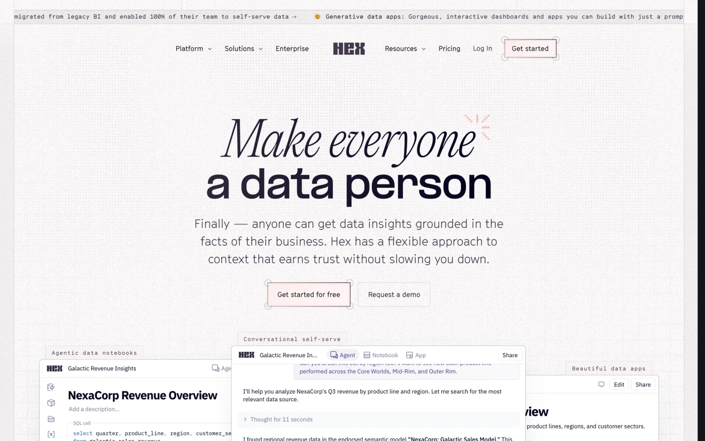
- Hex — “Finally — anyone can get data insights grounded in the facts of their business. Hex has a flexible approach to context that earns trust without slowing you down.” 68 sections, headlines in PP Formula Semi Extended, dark theme, palette #14141c and #31263b; the homepage runs hero → statement → features → testimonials.
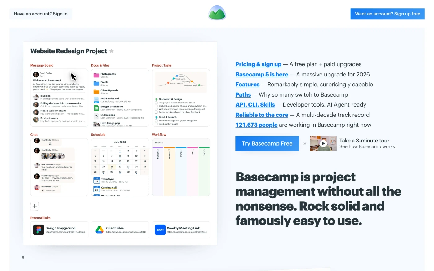
- Basecamp — “Trusted by millions, Basecamp puts everything you need to get work done in one place. It’s the calm, organized way to manage projects, work with clients, and communicate…” 34 sections, headlines in Graphik, dark theme, palette #010000 and #0000ea; the homepage runs testimonials → showcase → stats → call to action.
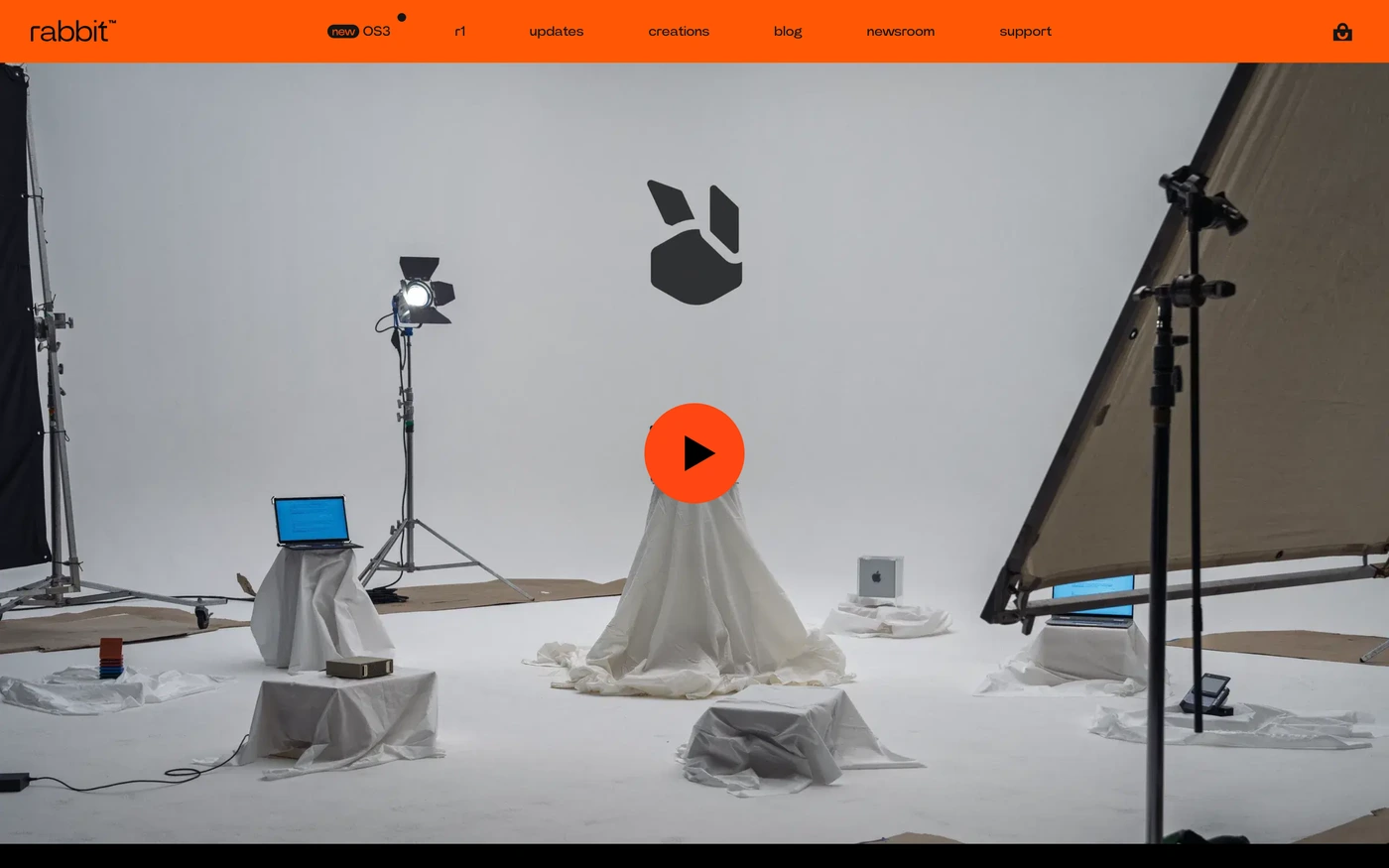
- Rabbit — “say what you want to make, find or finish. OS3 works through the steps — on the web, in Telegram, on r1, and on the computers you connect.” 27 sections, headlines in Power Grotesk Font, dark theme, palette #000000 and #ebe8e2; the homepage runs showcase → call to action → features → showcase.
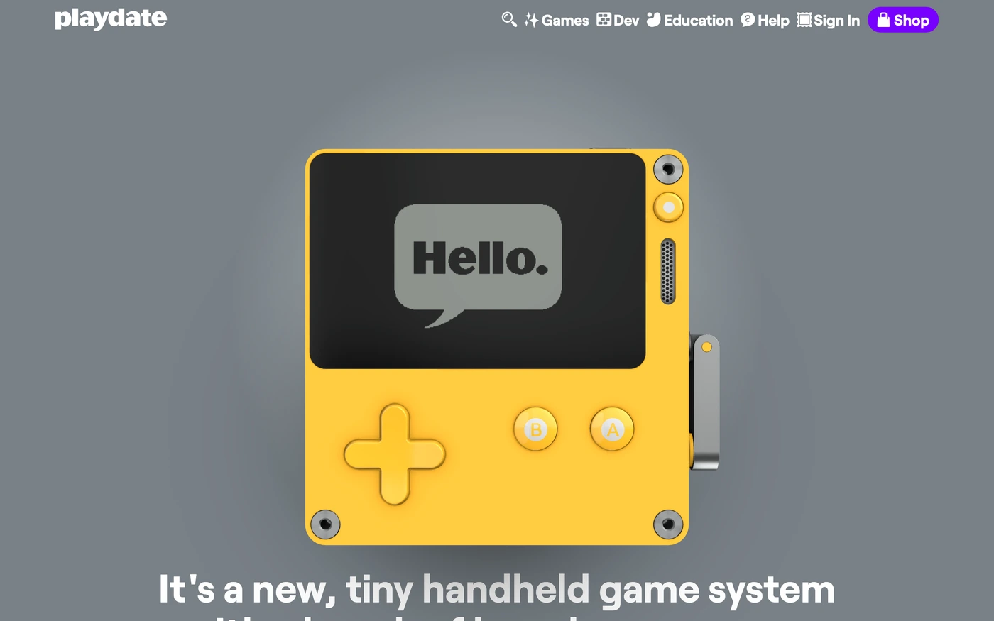
- Playdate — “It’s yellow. It fits in your pocket. There’s a crank. It comes with 24 free games to get you started. Say hi to Playdate from Panic.” 25 sections, headlines in Roobert, dark theme, palette #030001 and #030101; the homepage runs hero → features → call to action → showcase.
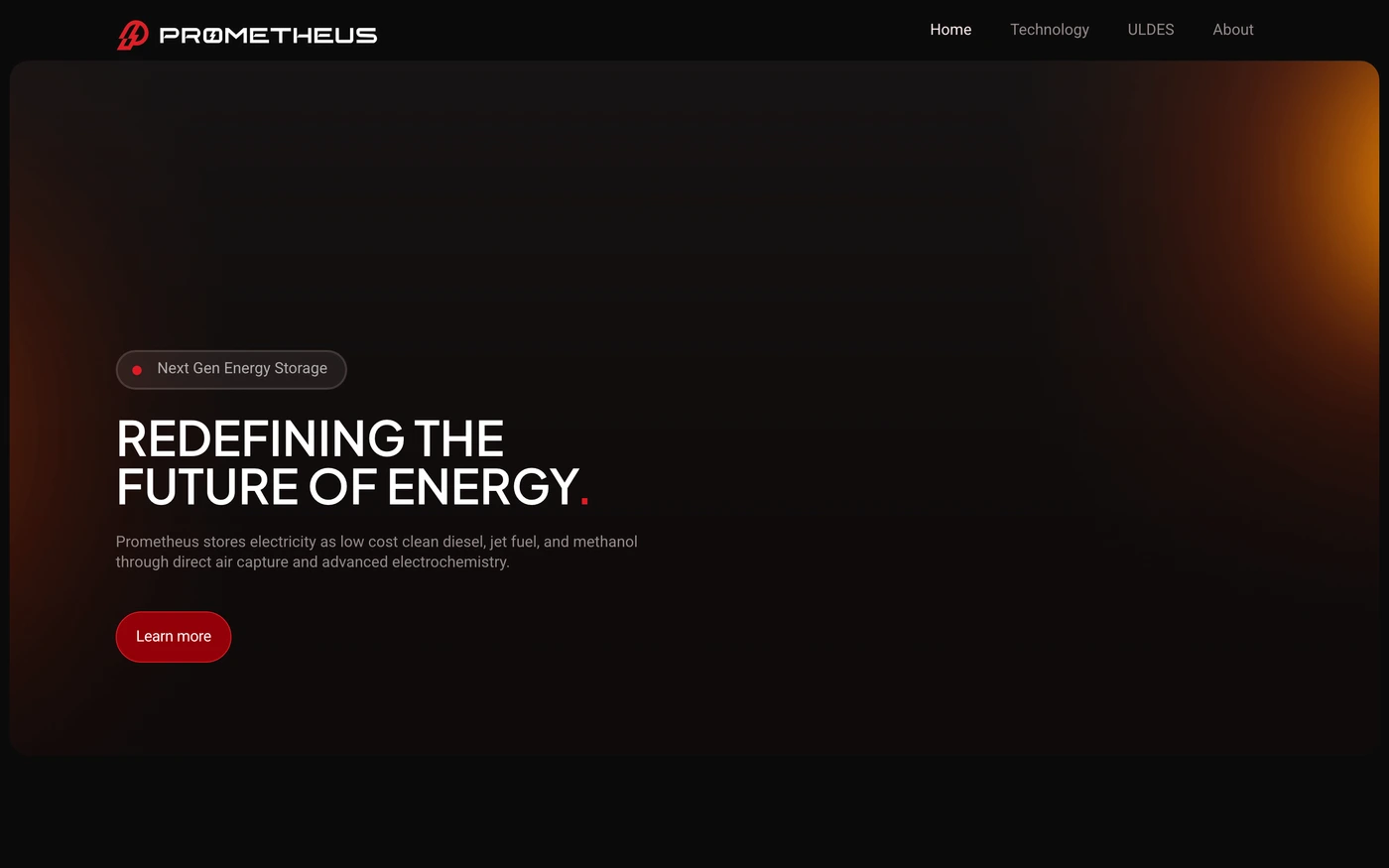
- Prometheus Fuels — “Prometheus produces carbon-neutral liquid fuels via direct air capture and hydrocarbon electrolysis — powering aviation, shipping, and data centers at fossil fuel prices.” 15 sections, headlines in Plus Jakarta Sans, dark theme, palette #0b0b0b and #ffffff; the homepage runs hero → statement → features → footer.
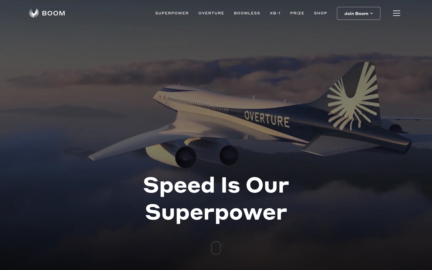
- Boom Supersonic — “Boom Supersonic is building Overture, the world's fastest airliner — designed and committed to industry-leading standards of speed, safety, and sustainability.” 26 sections, headlines in Styrene A, dark theme, palette #000000 and #ffffff; the homepage runs hero → features → blog → footer.
How to use these references for a dark tech startup website
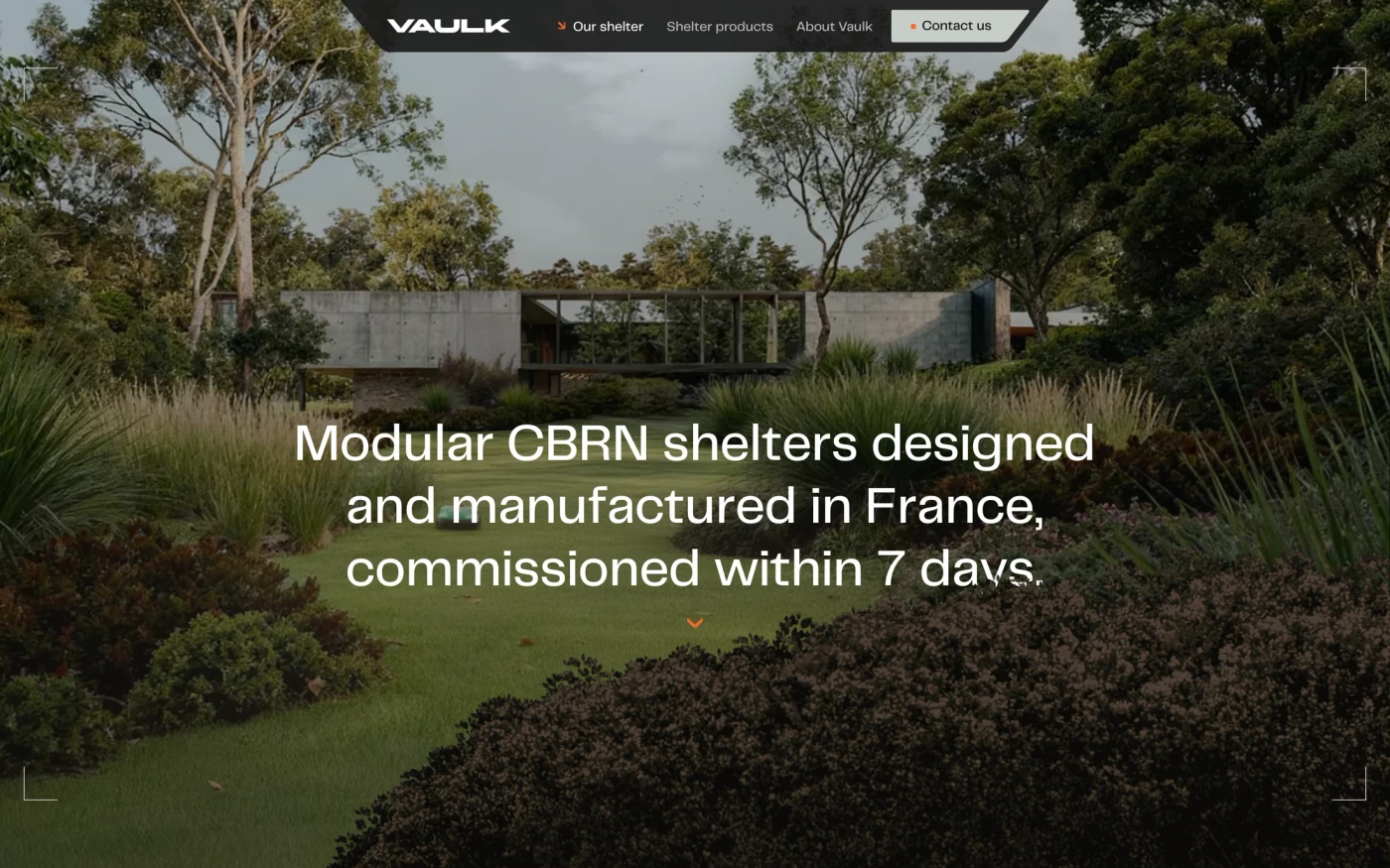
Avoid pure black and pure white; keep body text slightly off-white, check contrast on every accent colour and give images a subtle border so they don't dissolve into the page. For a technology company, note how complex products are reduced to one clear promise and a diagram. Start with Hex, Basecamp and Vaulk, open each site at full size and compare their features and hero sections; every reference carries its palette, fonts and a build prompt you can paste into your editor.
Featured dark tech startup website examples with their fonts
Related searches
Browse all websites or the full A–Z of popular searches.
How this list is built: 23 sites from the UI Discovery library that are technology sites that use a dark theme on their homepage, matched on each product's own title, description and headline copy, captured styles, colours and fonts. Ordered by popularity.
Library updated