
Pricing page examples
Effective pricing pages show the plan names, the price and billing unit, what each tier includes and one clear next action before asking anyone to compare every feature. Here are 34 real pricing sections from captured websites, grouped by the choices they present.
Pricing page patterns in real captured sections
Each group links to the section detail page and to the site it was captured from. Some pages appear in more than one group because they show more than one pattern. For the full catalog, browse every pricing section example.
Pricing pages with a free plan
14 of 34 captured pricing pages (41%). A free tier or free trial sits beside the paid plans, so visitors can start before they pay.
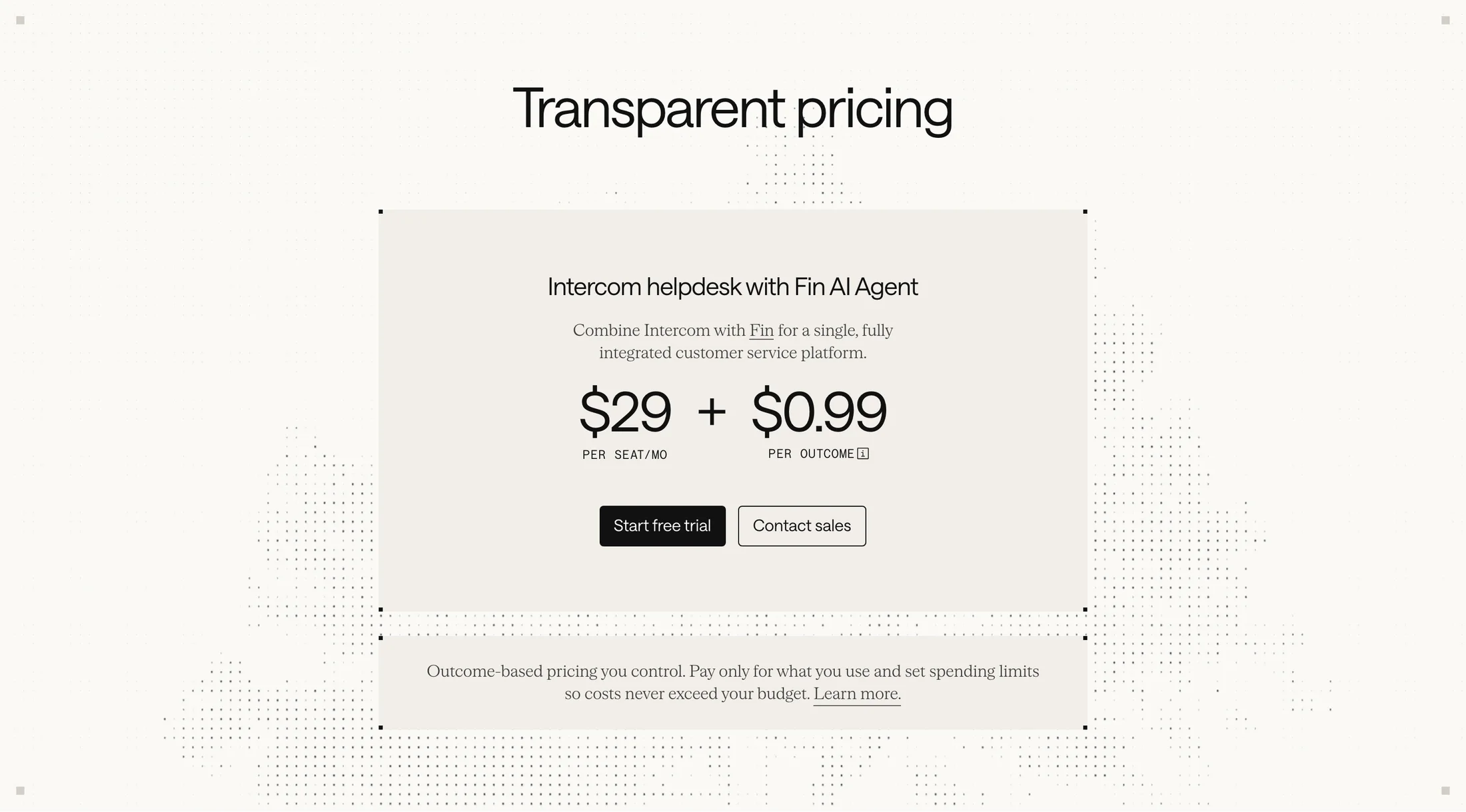 “Transparent pricing”Intercom source page
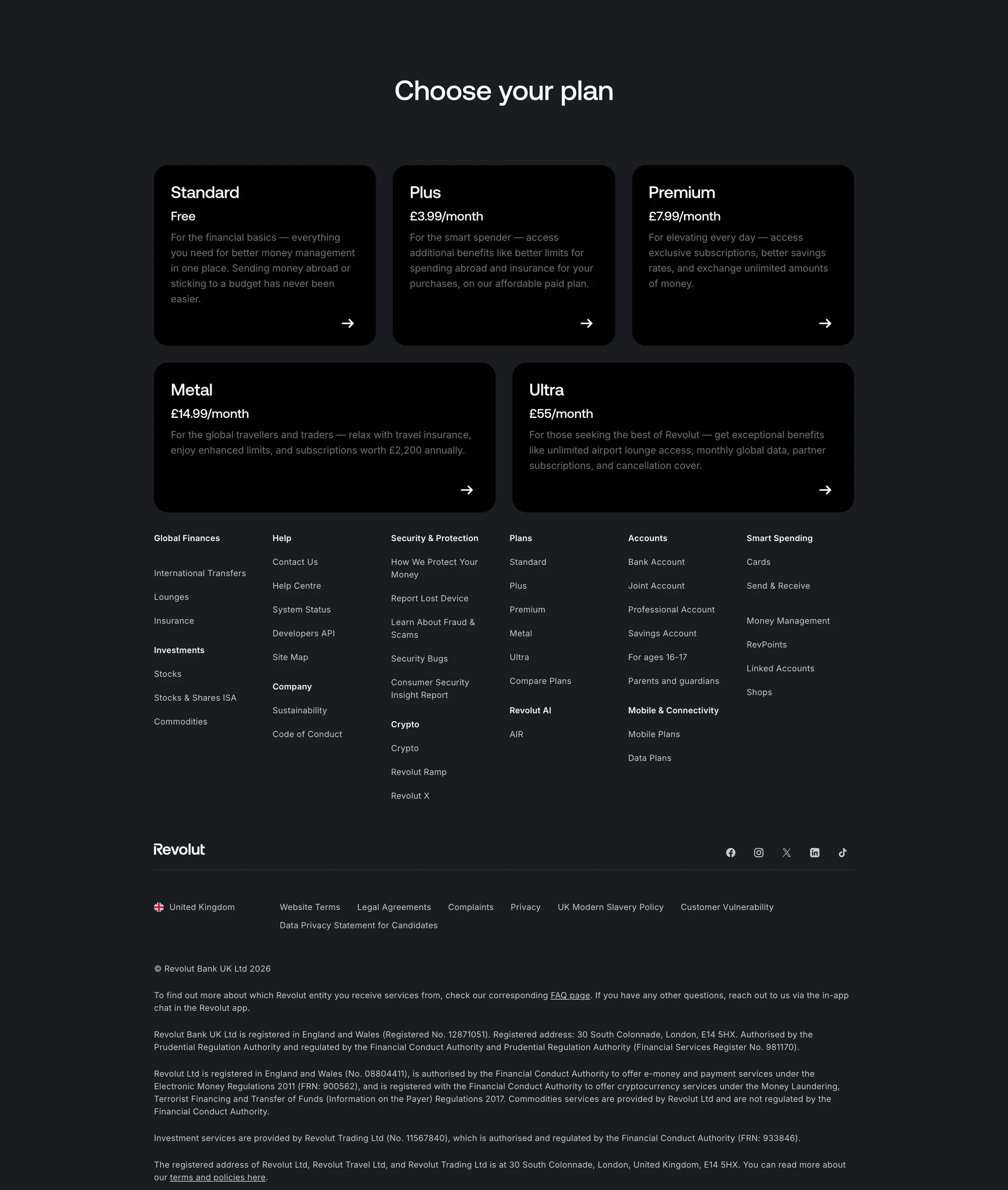 “Choose your plan”Revolut source page
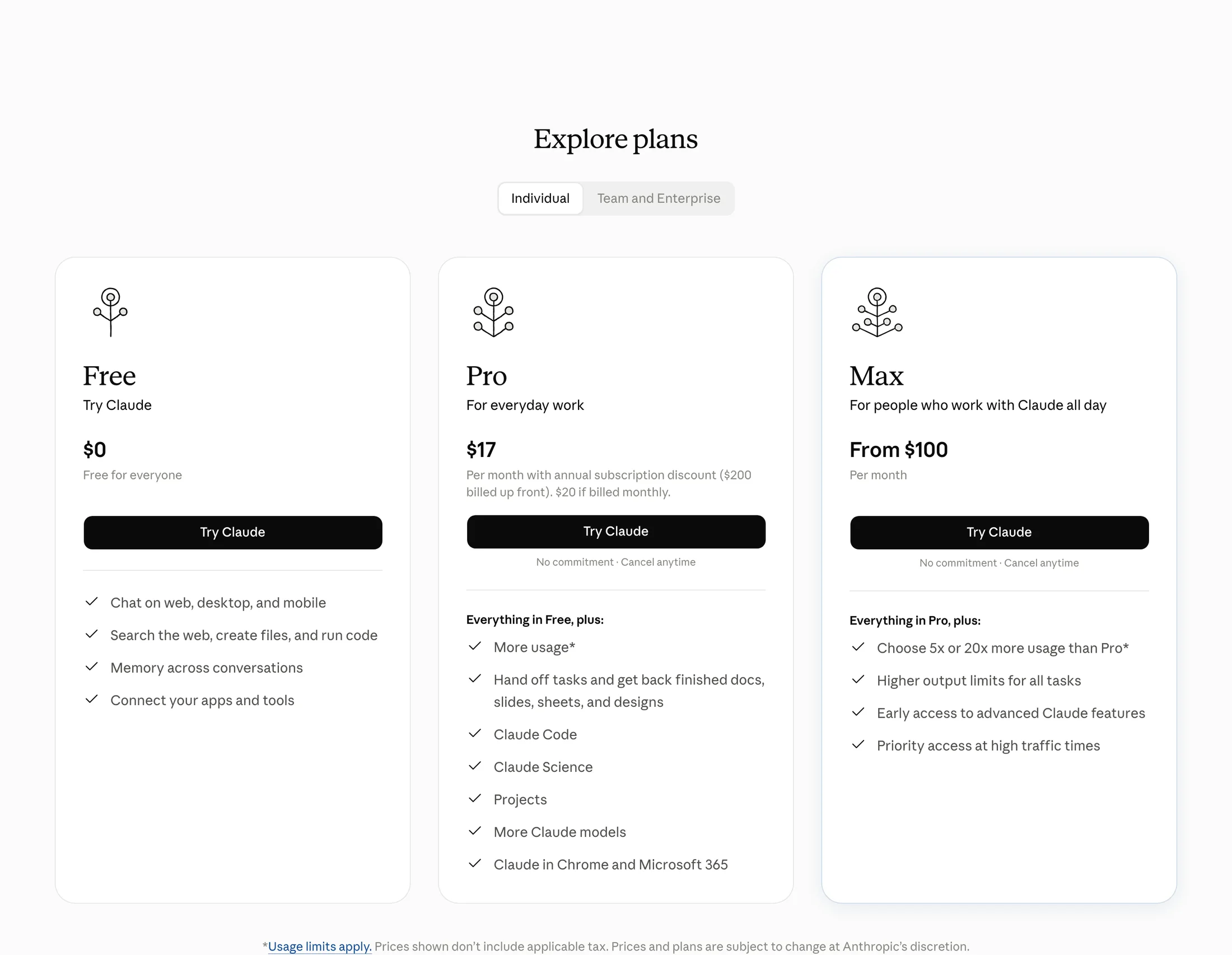 “Explore plans”Claude source page
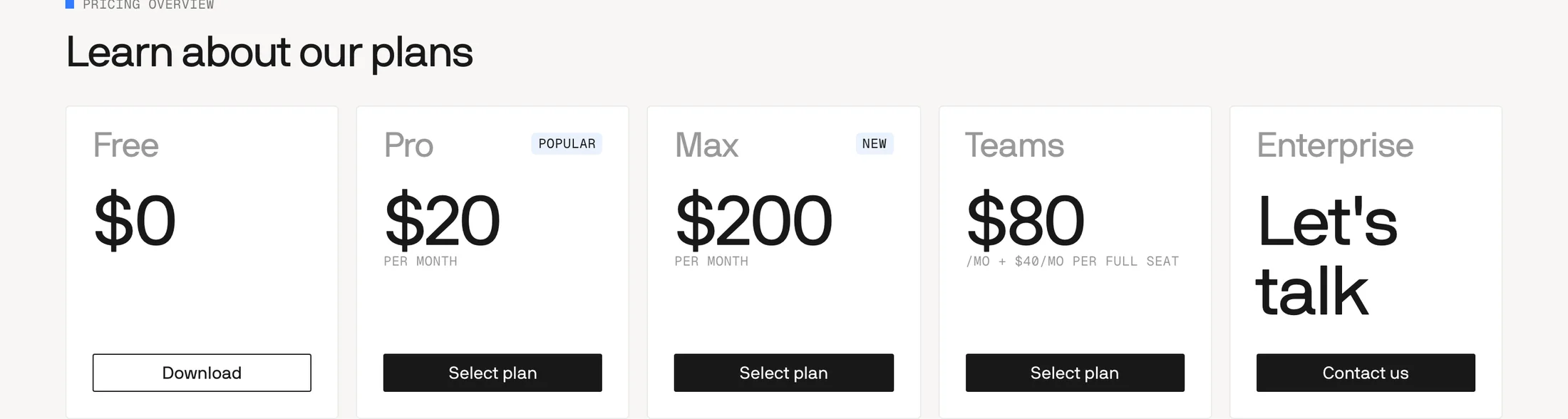 “Learn about our plans”Windsurf source page
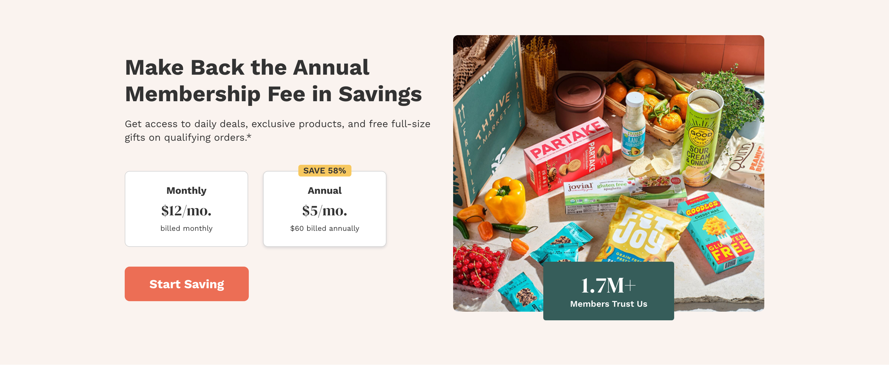 “Make Back the Annual Membership Fee in Savings”Thrive Market source page
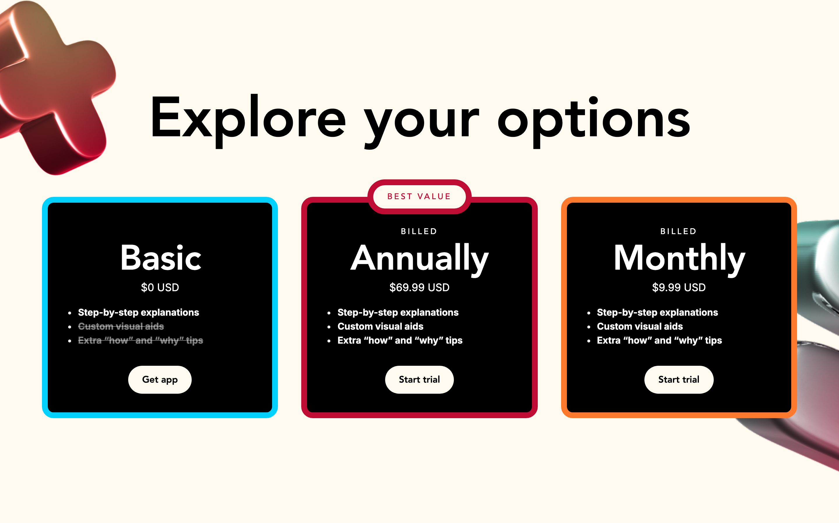 “Explore your options”Photomath source page
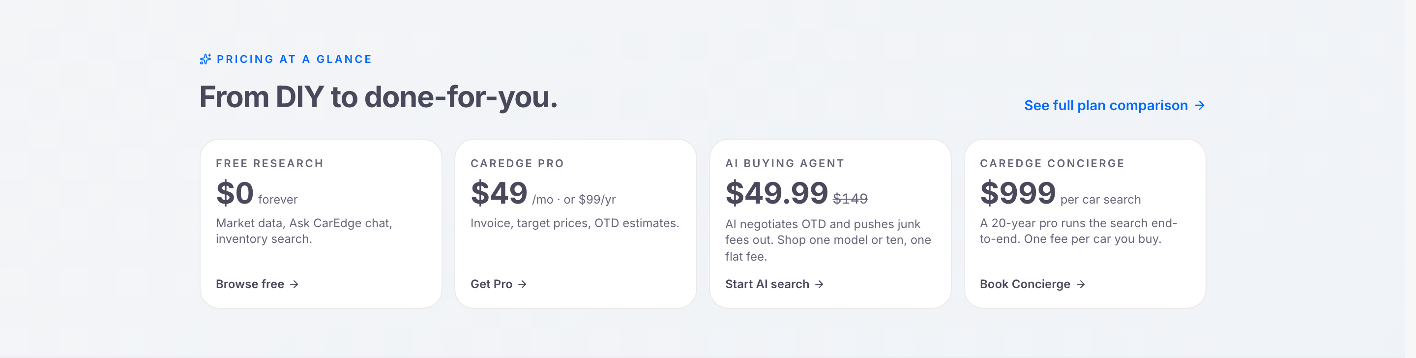 “From DIY to done-for-you.”CarEdge source page
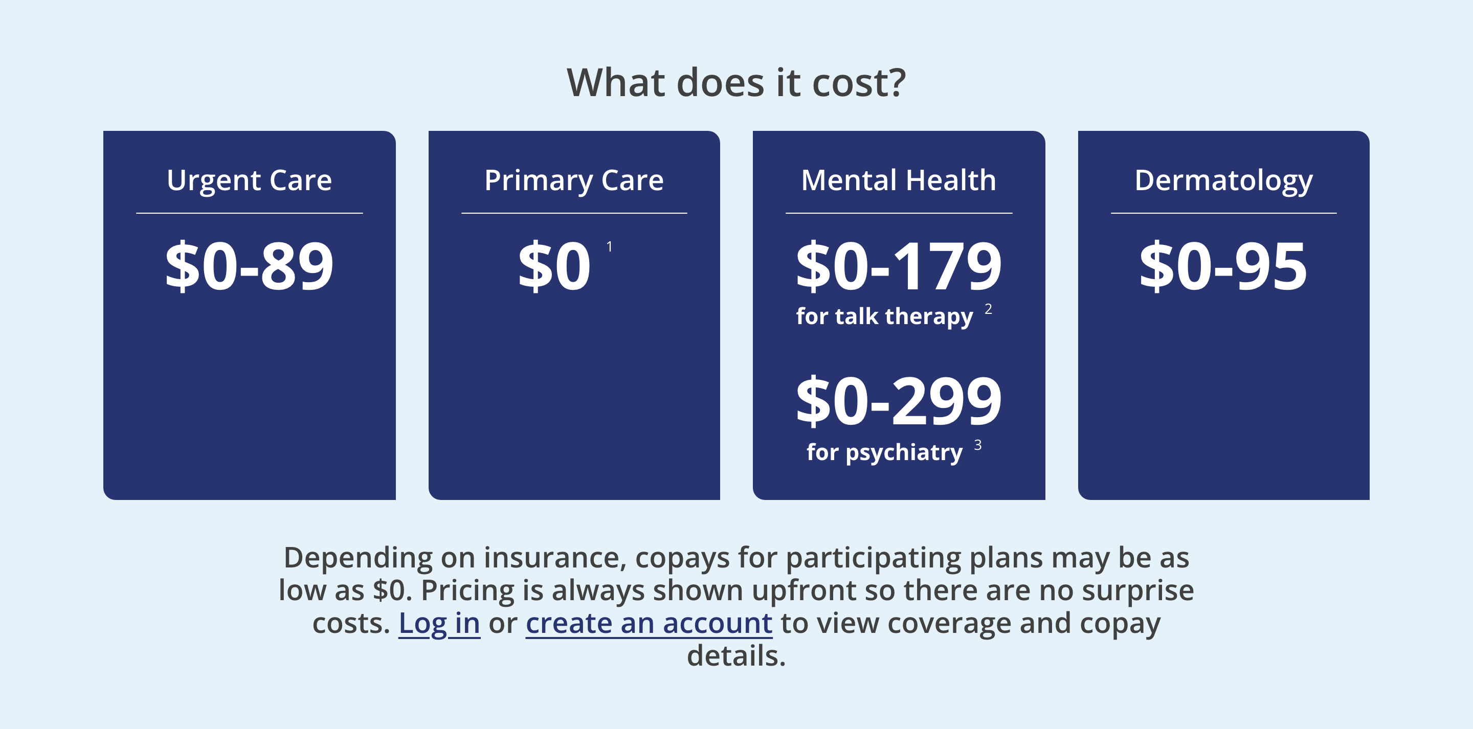 “What does it cost?”MDLIVE source page
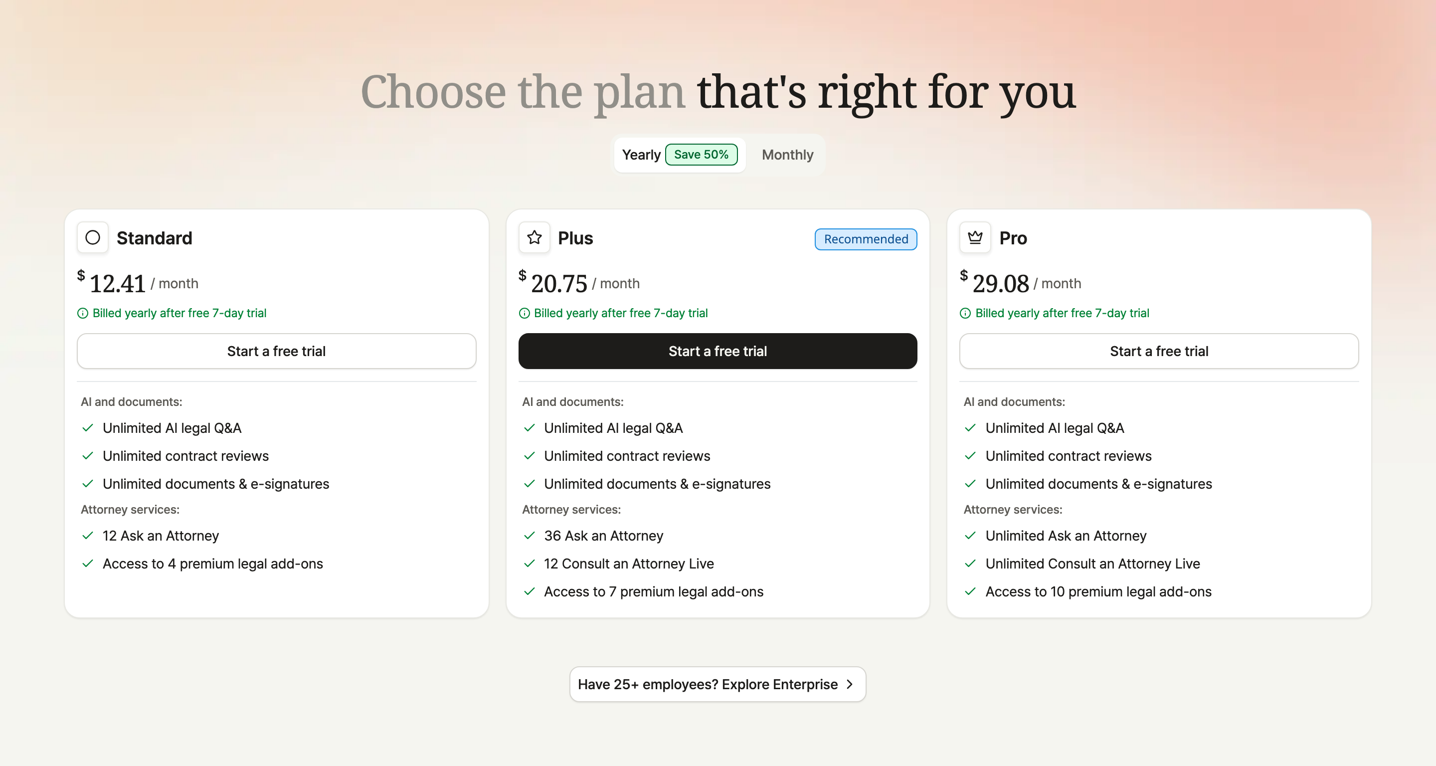 “Choose the plan that's right for you”Rocket Lawyer source page
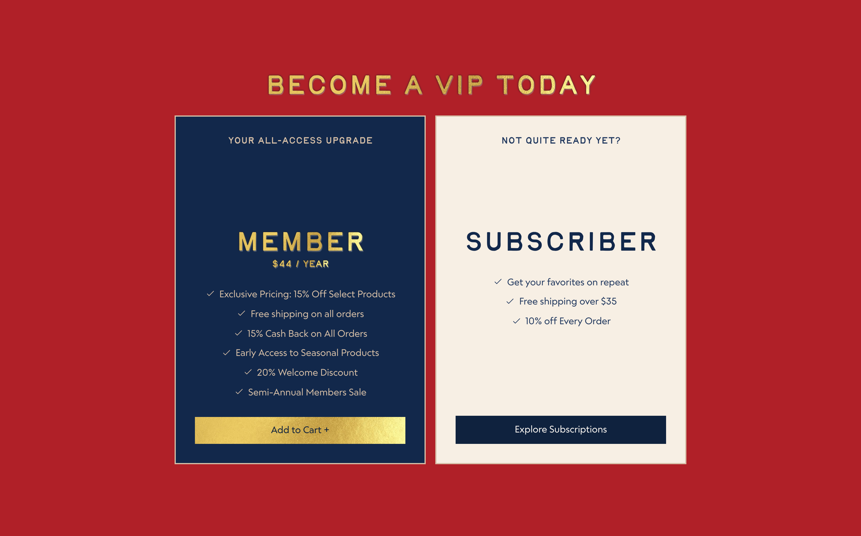 “BECOME A VIP TODAY”La Colombe source page
 “Less than $20/month”Sculpt Society source page
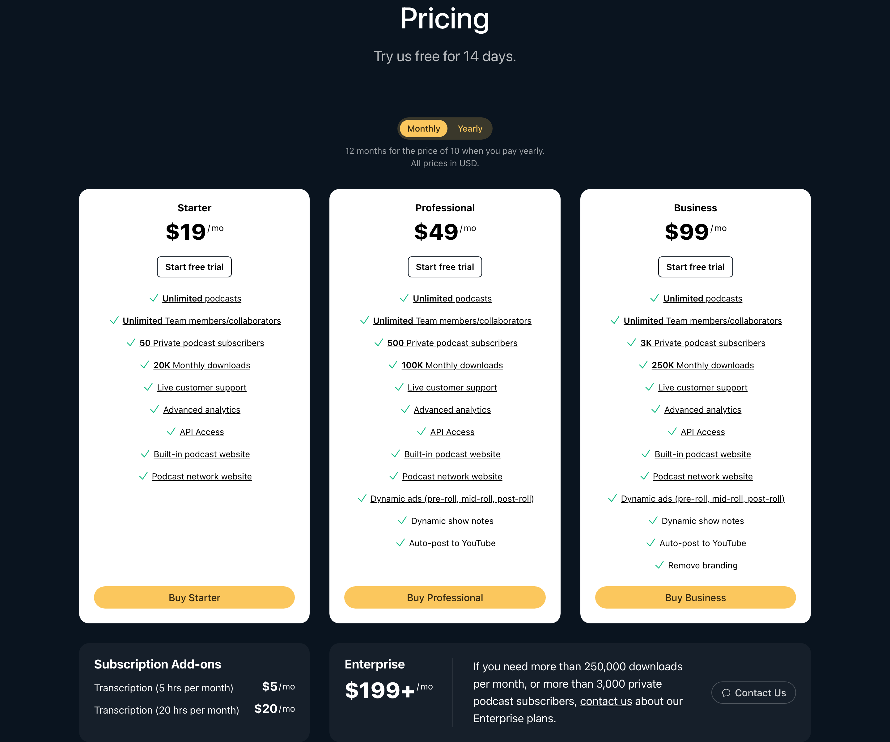 “Subscription Add-ons”Transistor source page
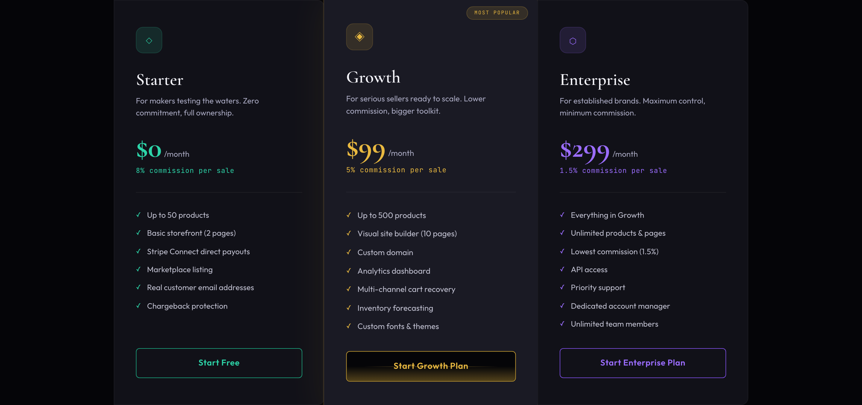 Pricing sectionAlkemy Market source page
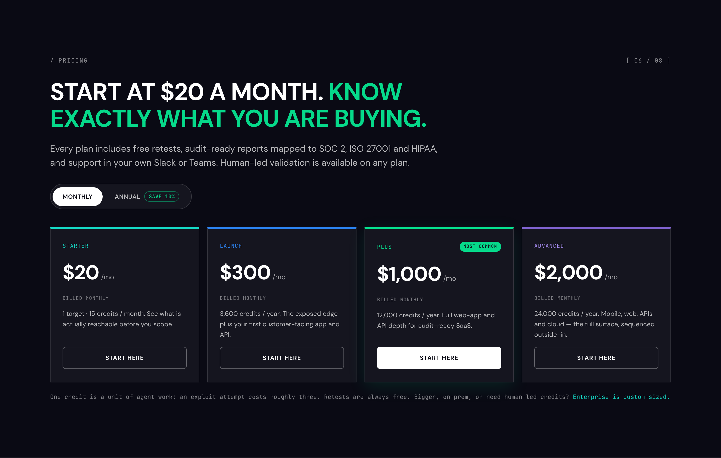 “START AT $20 A MONTH. KNOW EXACTLY WHAT YOU ARE BUYING.”Penti source page
Pricing pages with monthly and annual billing
7 of 34 captured pricing pages (21%). A monthly and annual switch makes the yearly saving visible next to the price.
- “Explore plans”Claude source page
- “Make Back the Annual Membership Fee in Savings”Thrive Market source page
- “Explore your options”Photomath source page
- “Choose the plan that's right for you”Rocket Lawyer source page
- “Less than $20/month”Sculpt Society source page
- “Subscription Add-ons”Transistor source page
- “START AT $20 A MONTH. KNOW EXACTLY WHAT YOU ARE BUYING.”Penti source page
Pricing pages with enterprise or custom plans
5 of 34 captured pricing pages (15%). A sales-led tier sits beside the self-serve plans for teams that need custom terms.

More pricing page examples
19 of 34 captured pricing pages (56%). These pages present their plans without a separate free tier, billing switch or enterprise tier.
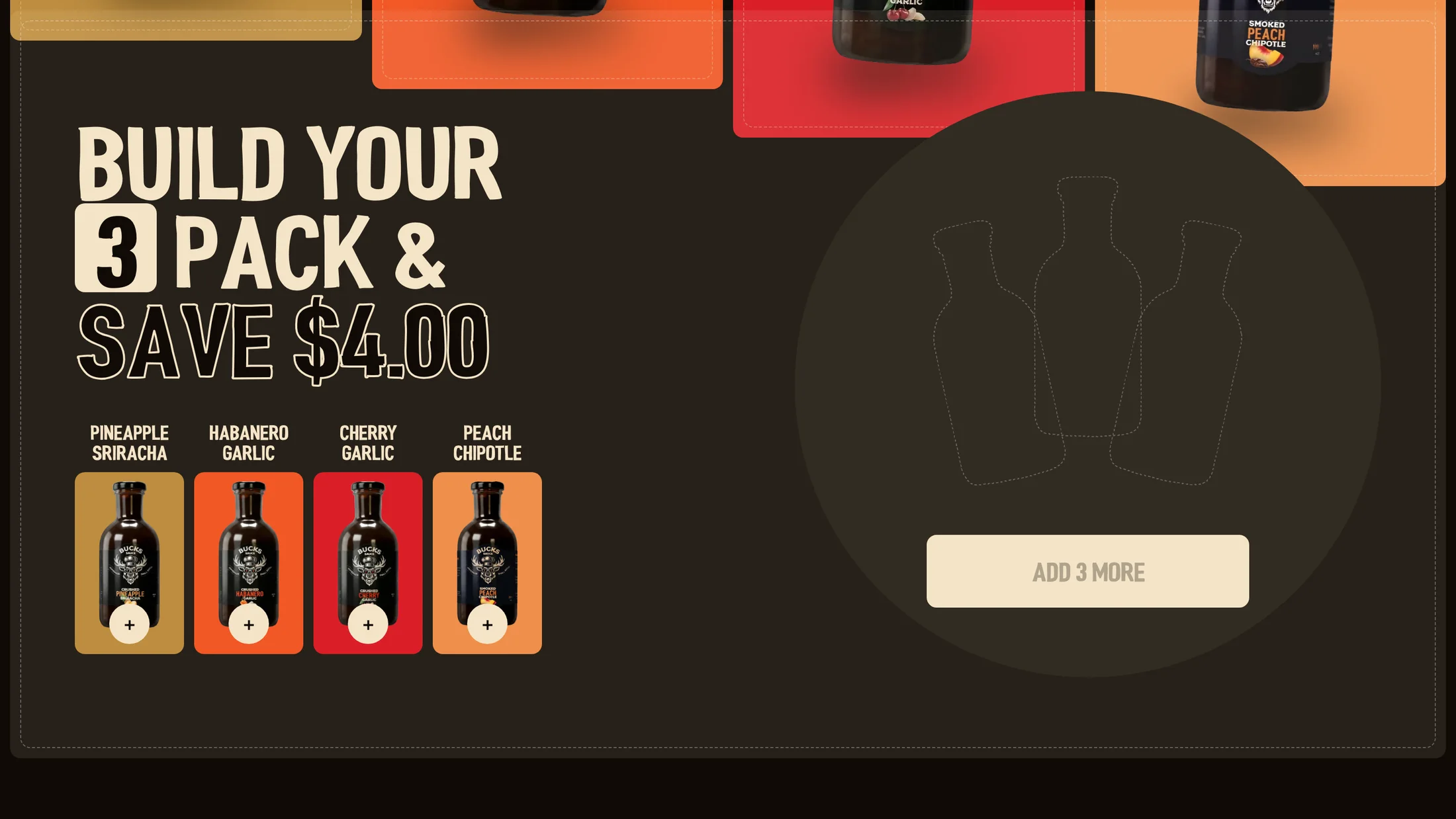 “BUILD YOUR 3 PACK & SAVE $4.00”Buckssauce source page
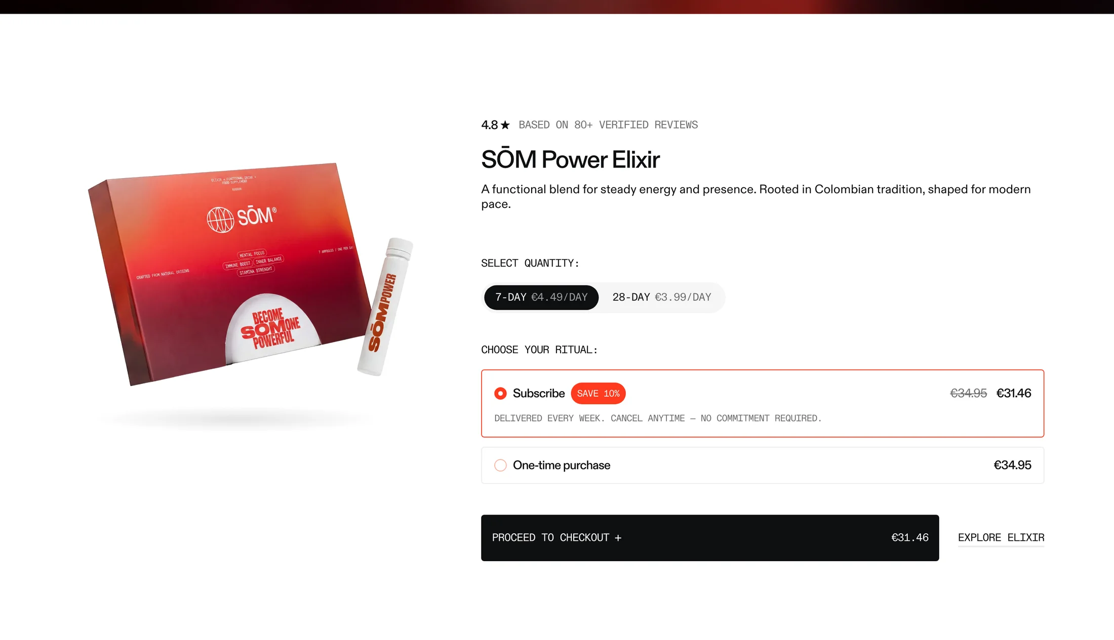 “SŌM Power Elixir”Drinksom source page
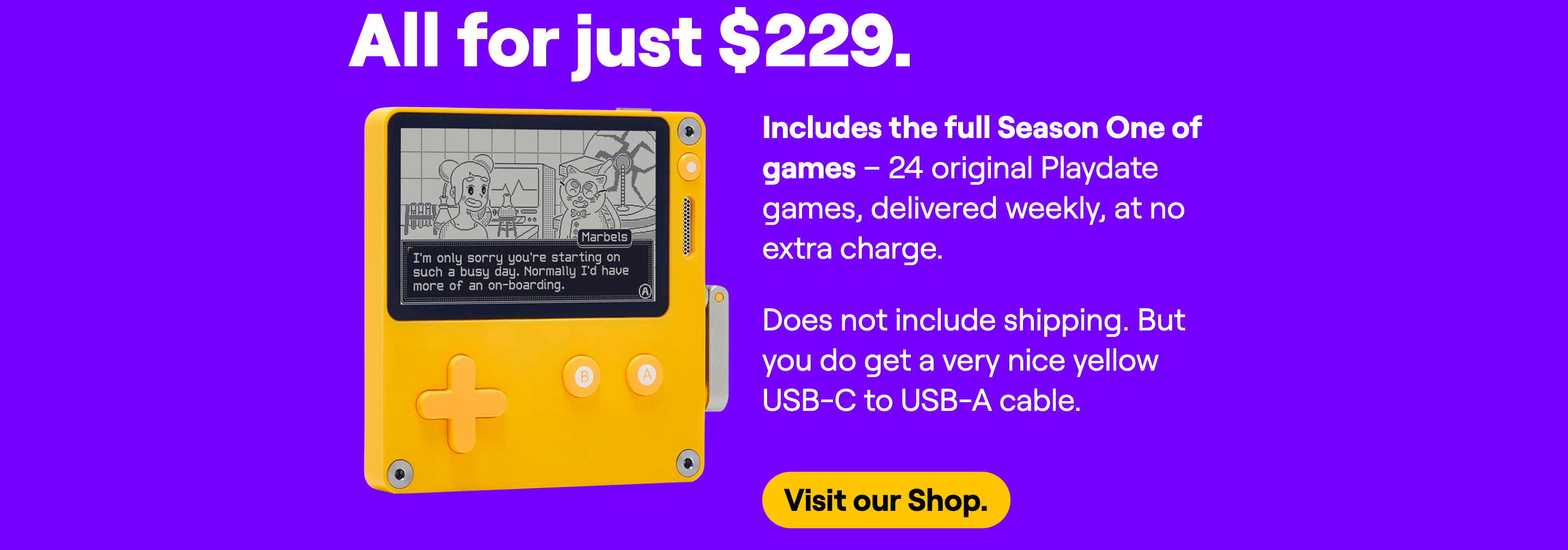 “All for just $229.”Playdate source page
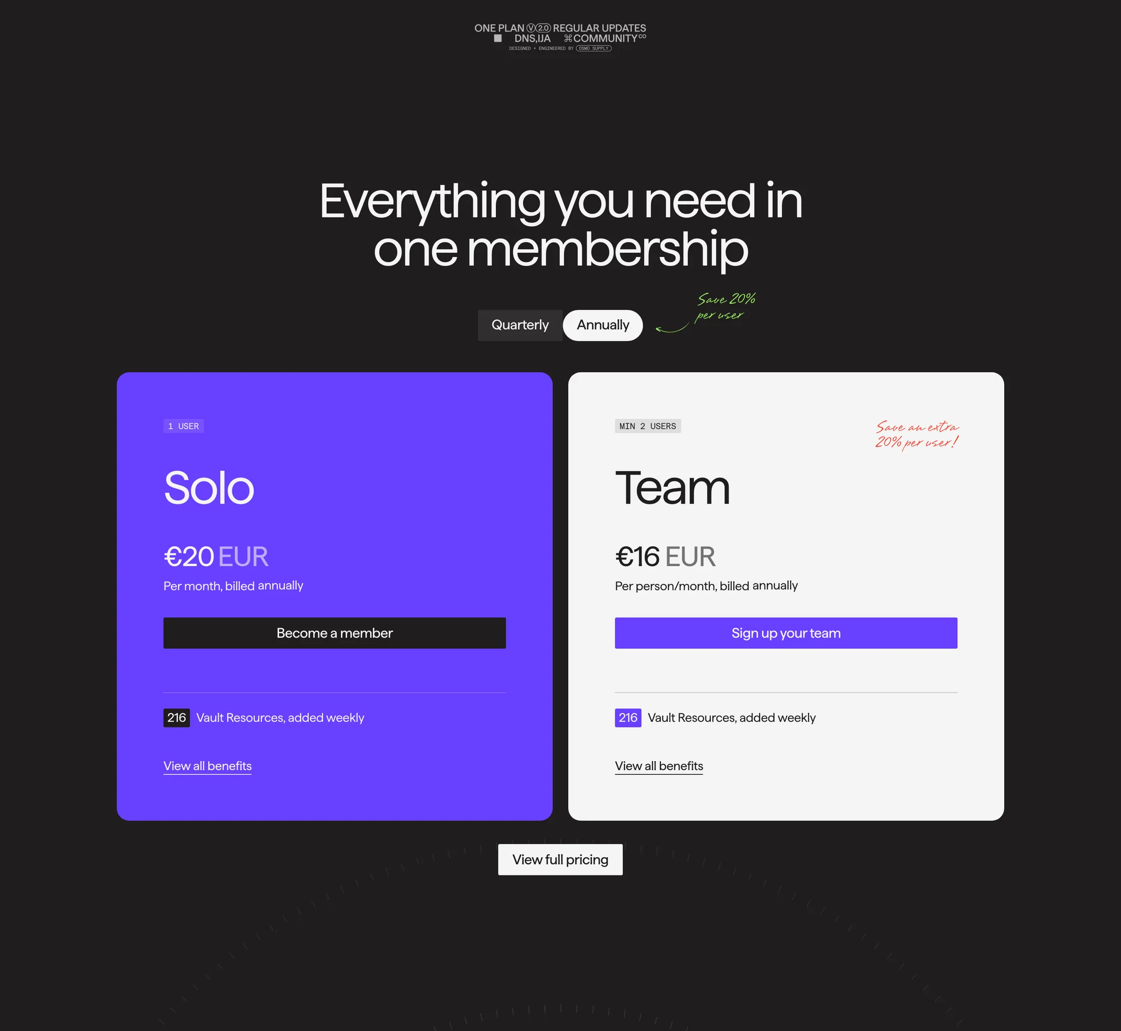 “Everything you need in one membership”Osmo source page
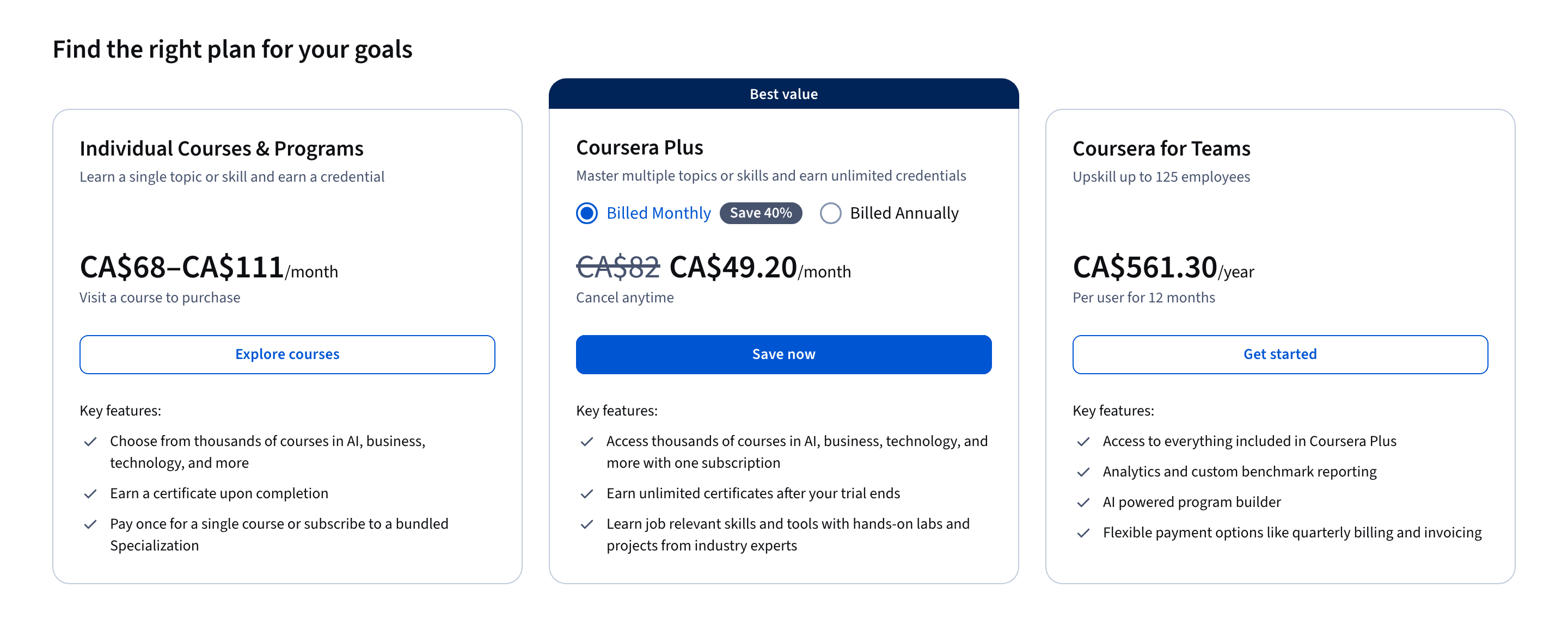 “Find the right plan for your goals”Coursera Plus source page
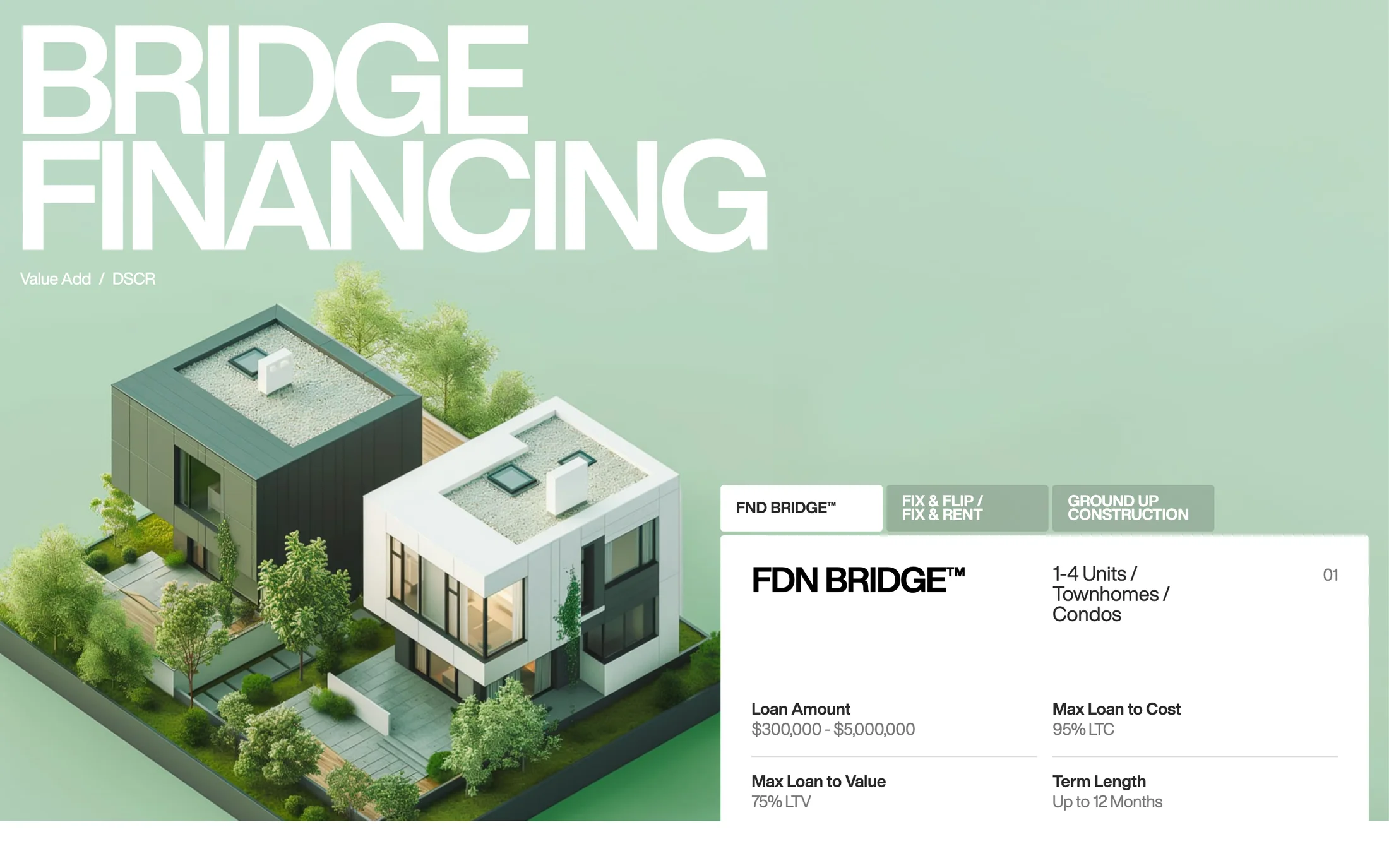 Pricing sectionThefoundation source page
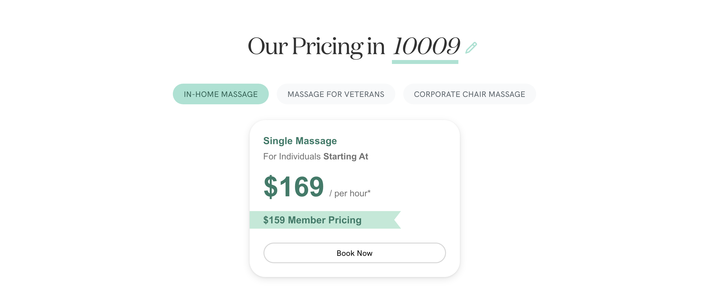 “Our Pricing in 10009”Zeel source page
 Pricing sectionGlowbar source page
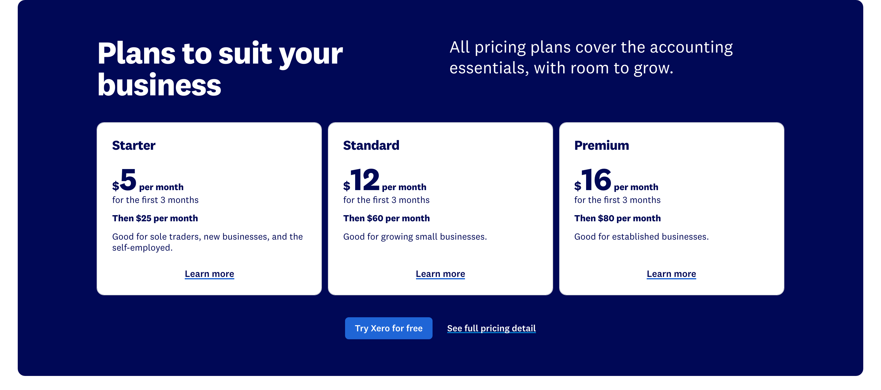 “Plans to suit your business”Xero source page
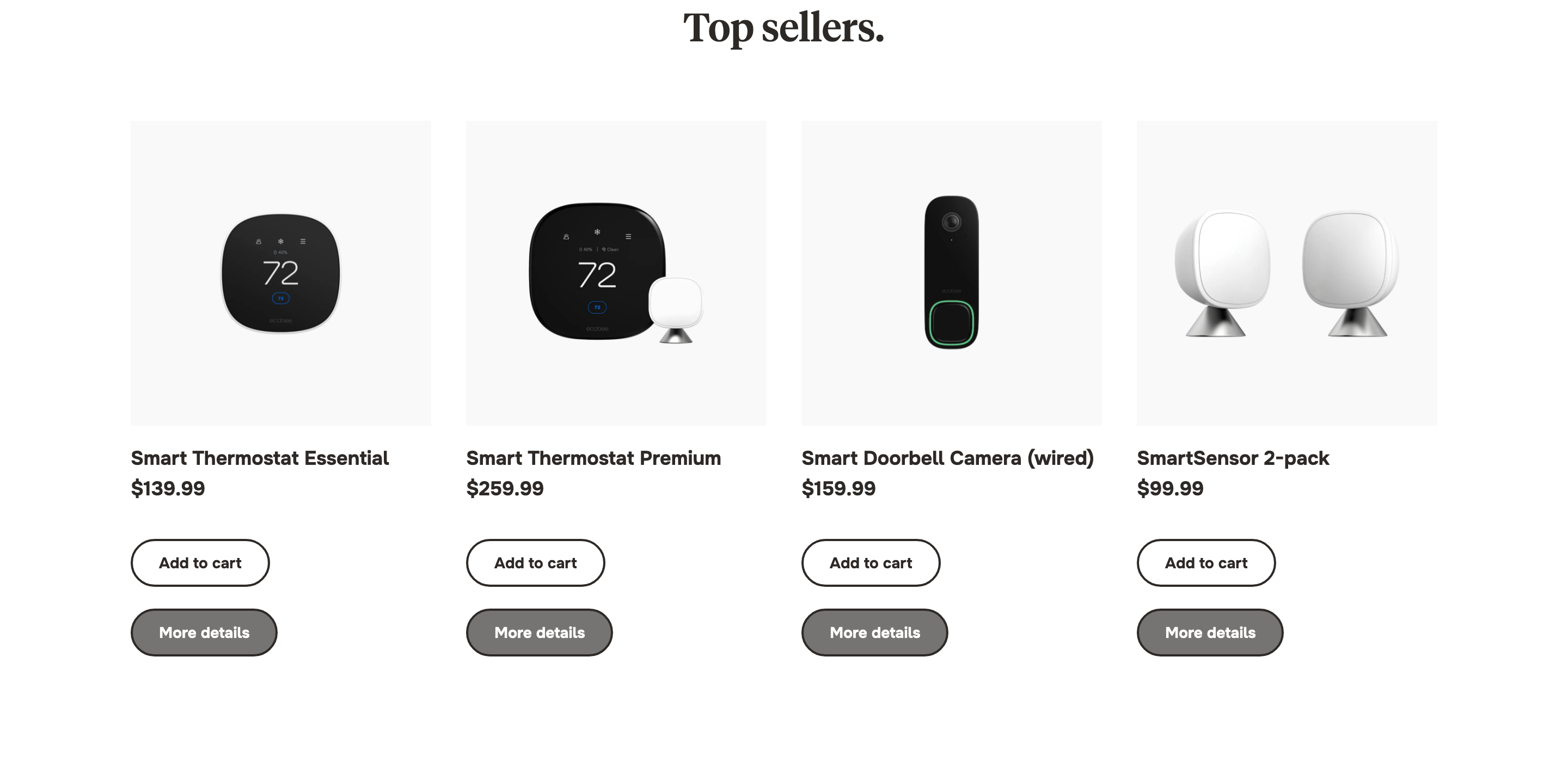 “Top sellers.”Ecobee source page
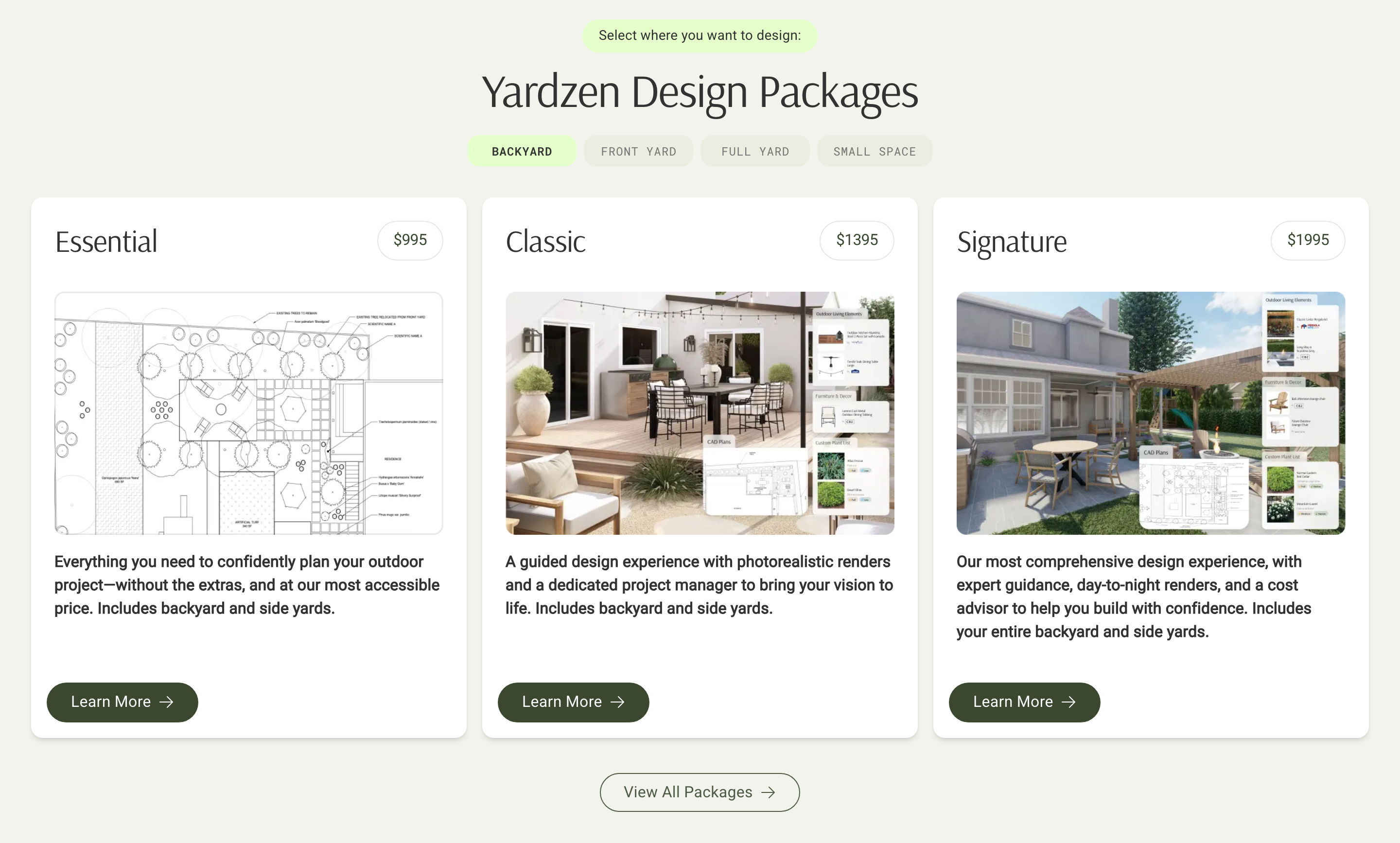 “Yardzen Design Packages”Yardzen source page
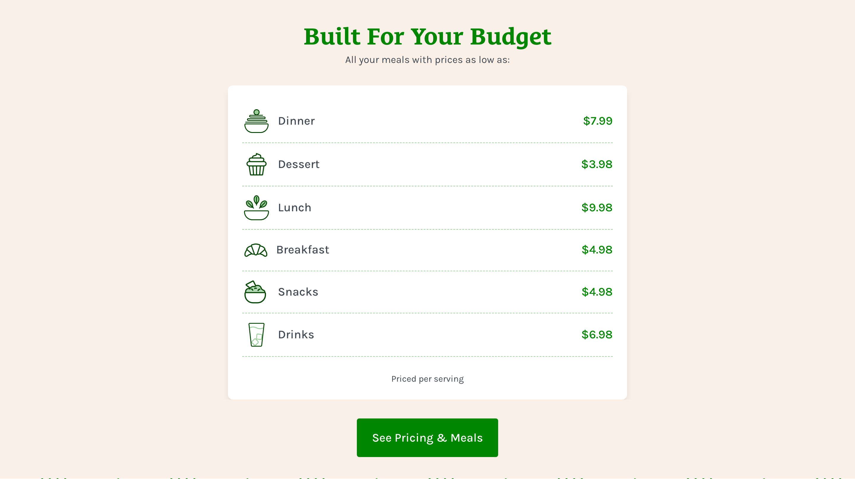 “Built For Your Budget”Home Chef source page
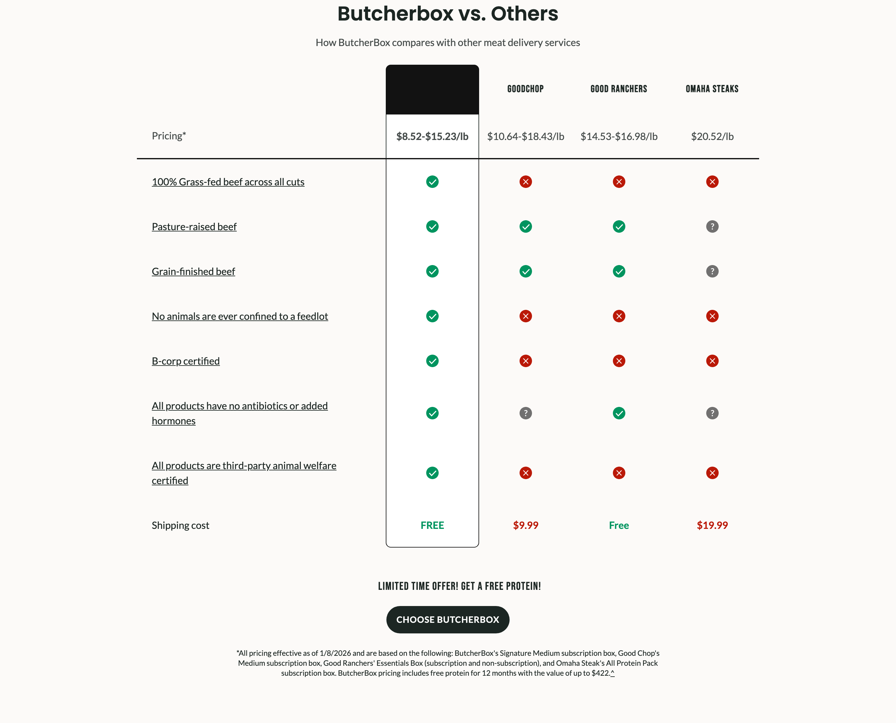 “Butcherbox vs. Others”Butcher Box source page
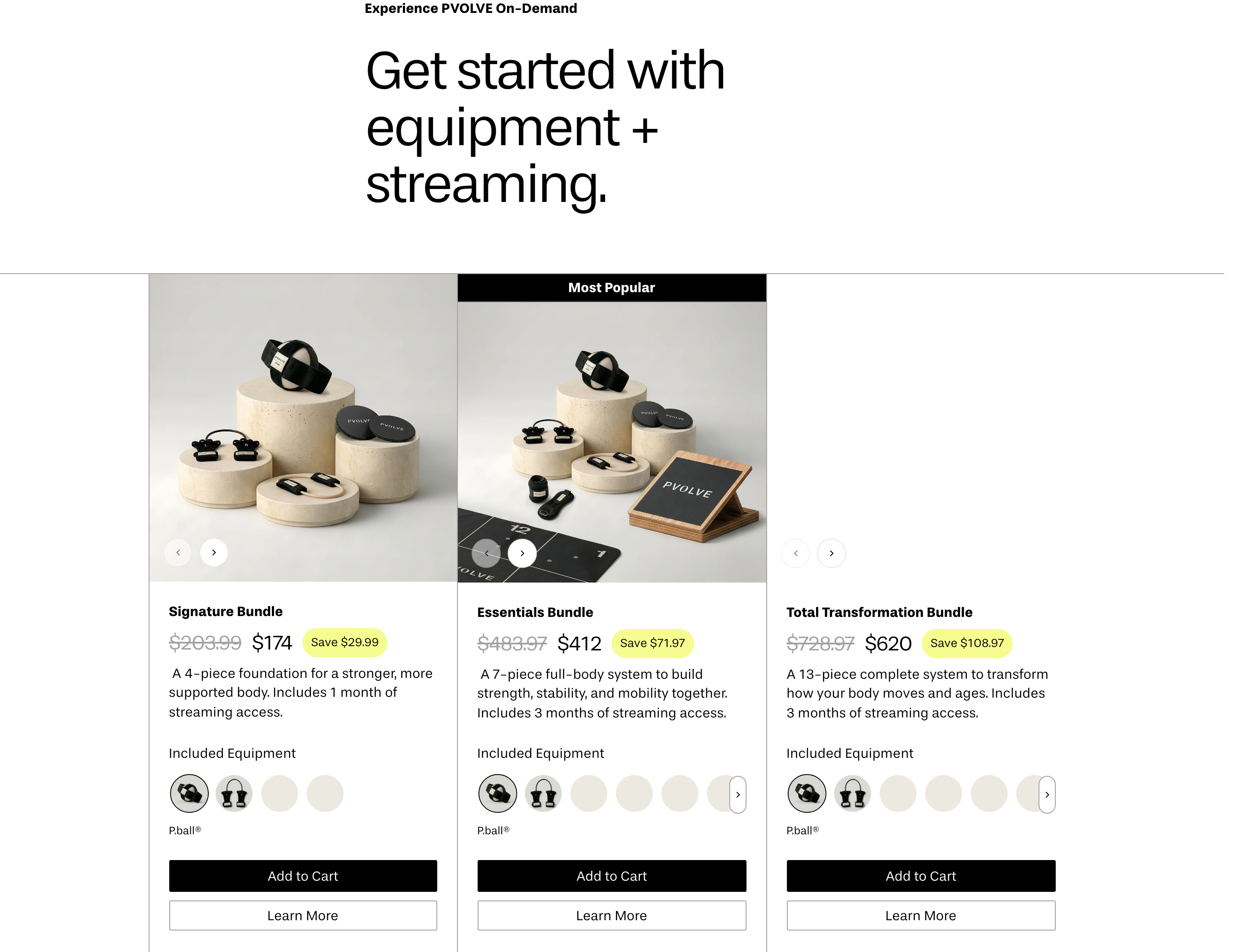 “Get started with equipment + streaming.”Pvolve source page
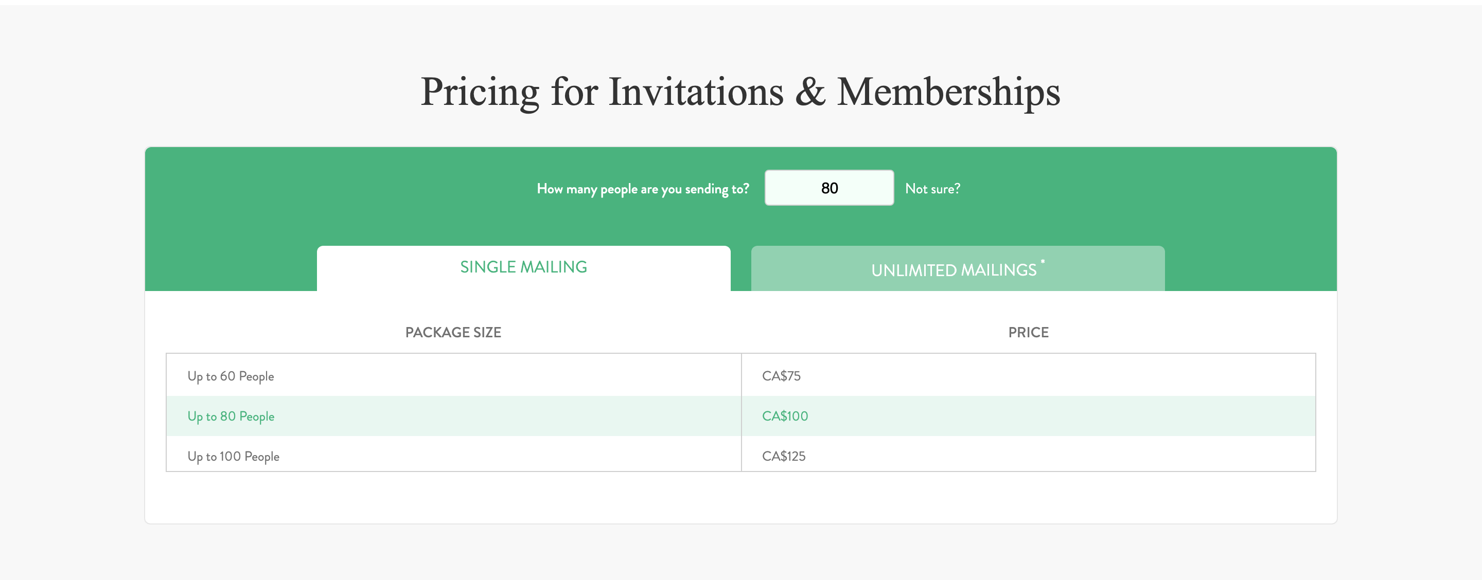 “Pricing for Invitations & Memberships”Greenvelope source page
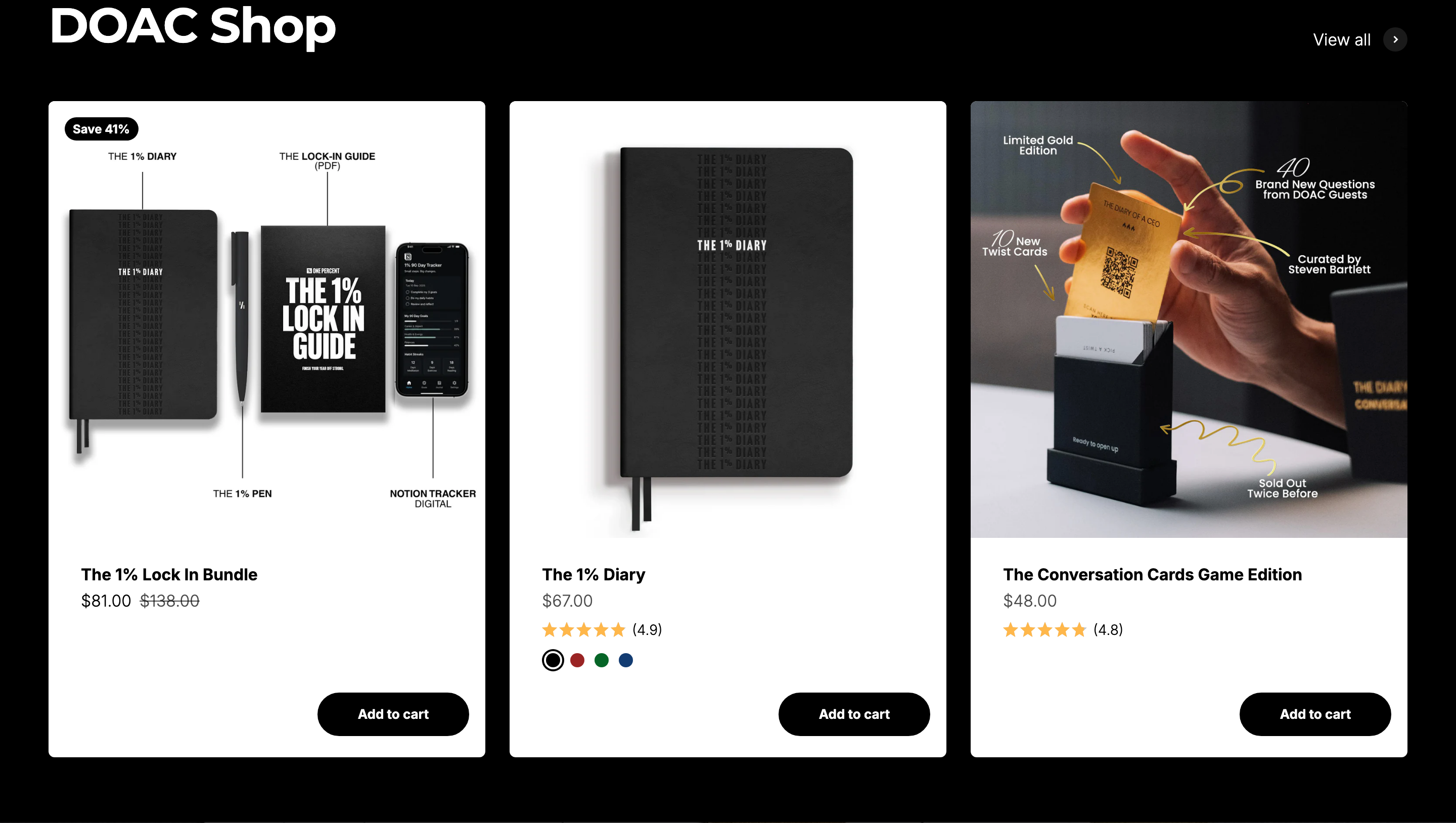 Pricing sectionDiary of a CEO source page
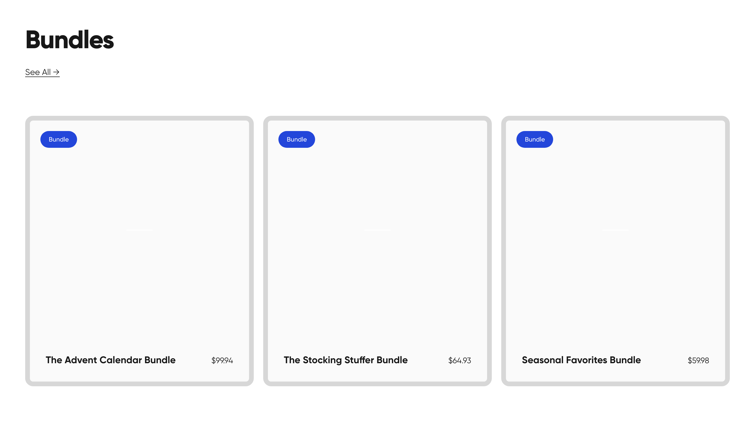 Pricing sectionMagna-Tiles source page
 “BUILD YOUR PLAN”Firsty source page
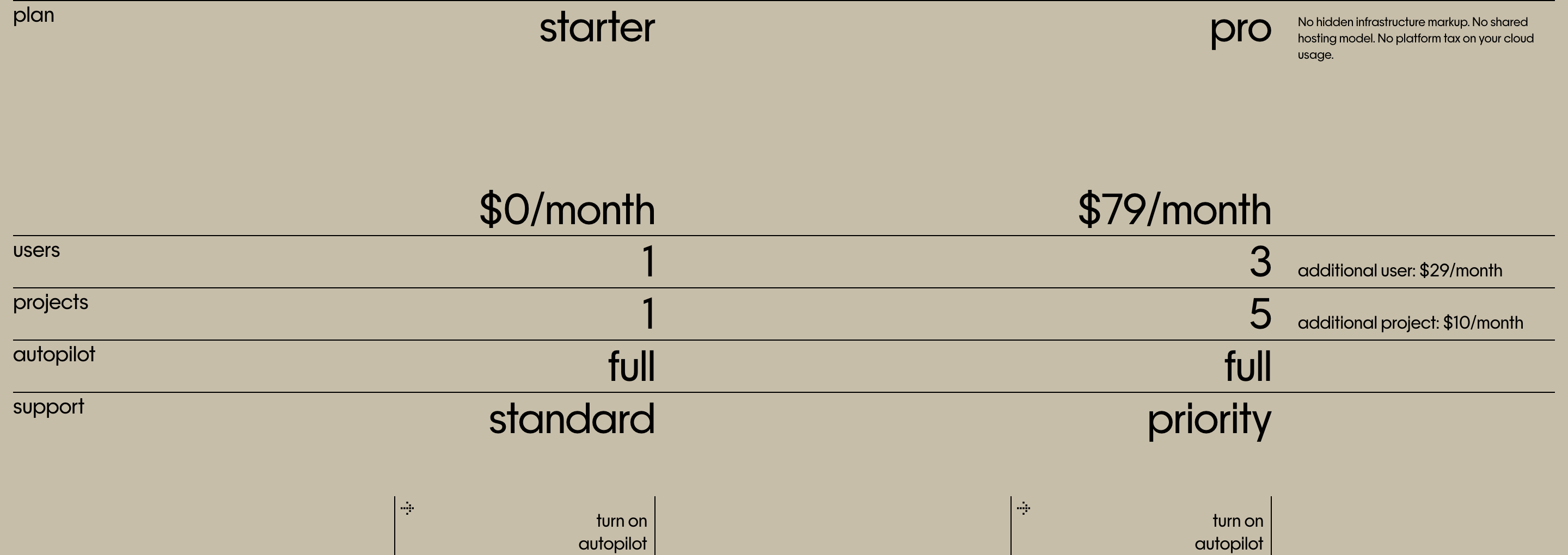 Pricing sectionmonolayer source page
What effective pricing pages show
A pricing page earns its place when a visitor can choose a plan without opening another tab.
Name the plan and the buyer
Each tier should say who it is for before it lists features. A free, team or enterprise label only helps when the page explains the difference in plain words.
Keep the price and billing unit together
Show the currency, the billing period and the amount actually charged. If annual billing is available, show the yearly total and the monthly equivalent rather than leaving the visitor to do the arithmetic.
Make the included allowances clear
Seats, usage limits and overage rules belong next to the price, not buried in the footer. Compare how real pages handle usage in the pricing section catalog.
End with one clear next action
A pricing page should point to the right next step for each plan: start free, buy now or talk to sales. Compare these choices with landing page CTA examples.
Pricing page examples: FAQ
What should a pricing page show?
An effective pricing page shows who each plan is for, the price and its billing unit, what each tier includes, and one clear next action. A free plan, annual billing switch and enterprise tier are optional, but the plan choice should be understandable before the full feature comparison.
How many pricing page examples are on this hub?
This hub groups 34 pricing sections captured from 34 different websites: pricing pages with a free plan (14), pricing pages with monthly and annual billing (7), pricing pages with enterprise or custom plans (5), more pricing page examples (19). A page can appear in more than one group when it shows more than one pattern.
What is the difference between monthly and annual billing?
Monthly billing charges for one month at a time. Annual billing charges once for a full year, often at a lower monthly equivalent, so the page should show the selected period, the amount actually charged and any saving. These captures show how real sites present that choice; they are not current offers.
Are these pricing examples current prices?
No. Each example is a captured pricing section reviewed for its visible layout, not a verified current price, a purchase recommendation or a measured conversion result. Currency, billing terms and included allowances change, so check the source site before making a buying decision.
Are the pricing sections real?
Yes. Every section comes from the UI Discovery catalog of captured website pages, one pricing section per site in this hub. Each card links to the section detail page and to the source site page so you can inspect the full capture.