
27 reviewed pages · Checked
Full SaaS pricing page captures
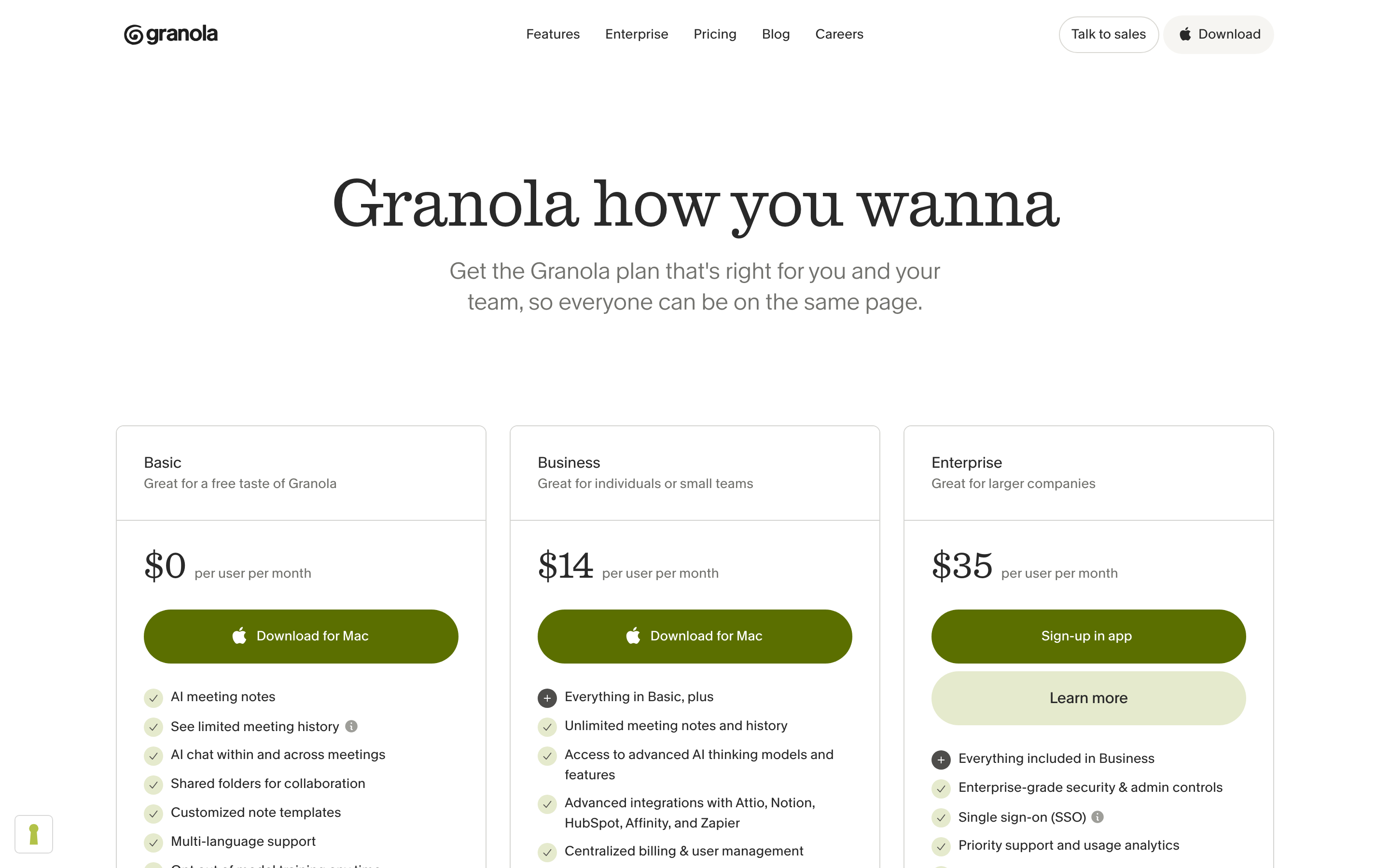
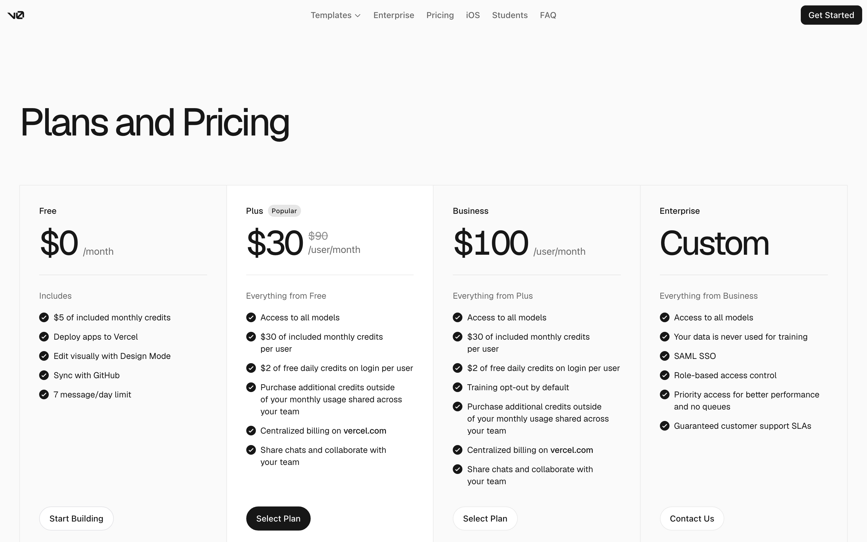
Real pricing pages from SaaS products, developer tools, fintech and creator platforms. Compare how each page frames value, separates plans, explains usage and moves a buyer toward the right next step.
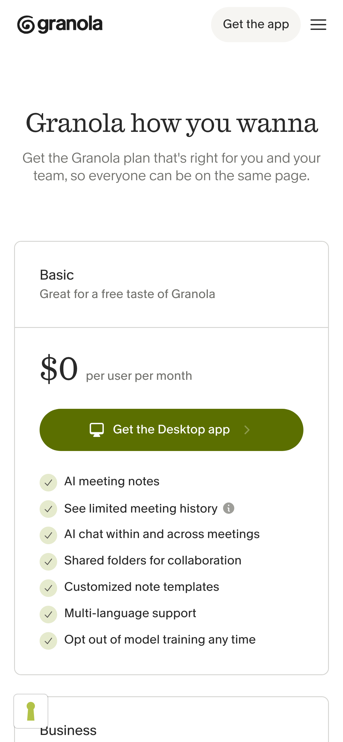
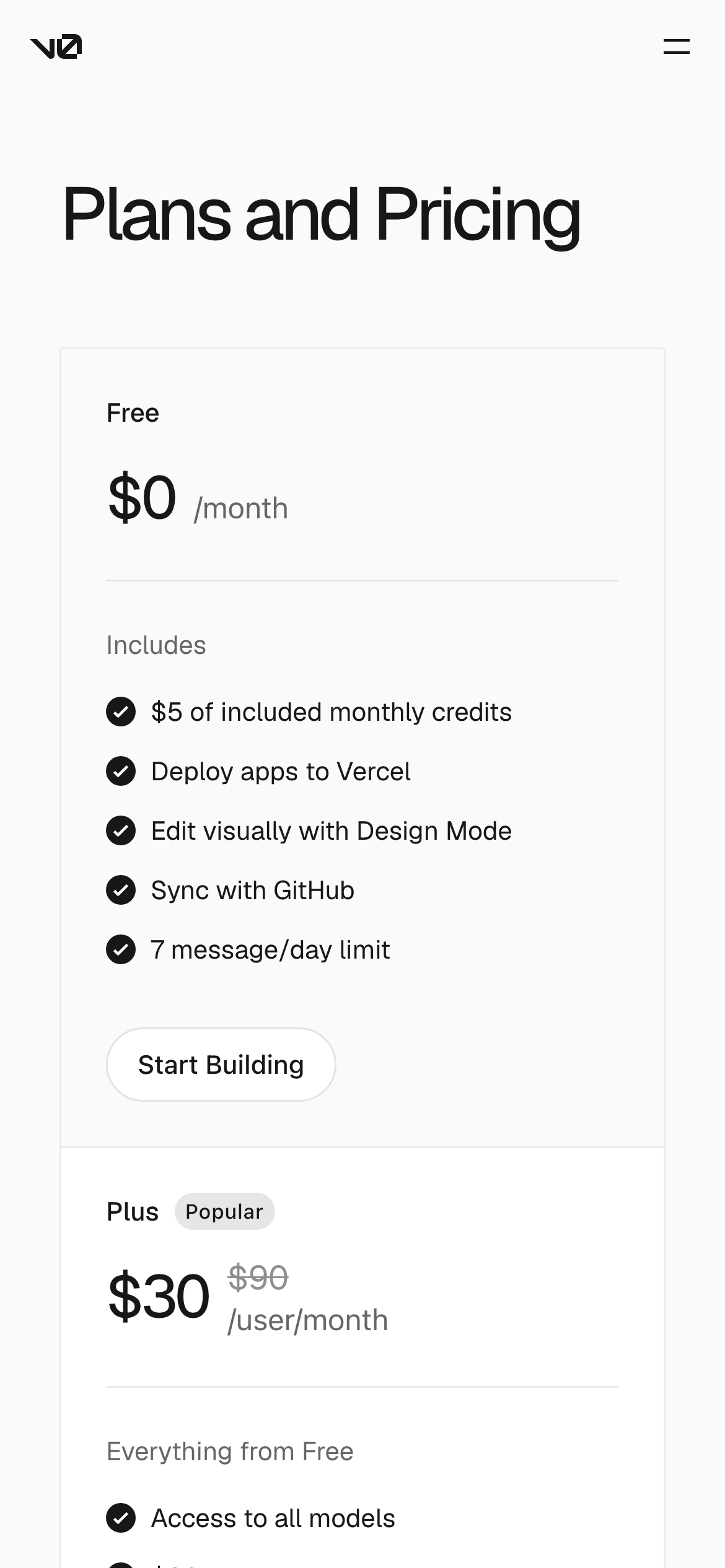
This gallery shows opening desktop and mobile views and links to wider site collections, not complete-page screenshots in one image. For newly reviewed table patterns, billing notes and an original demo, read the pricing page and table guide. Historical source prices are not verified current offers.
What we saw
4 patterns across 27 pages
- Make the plan decision legible
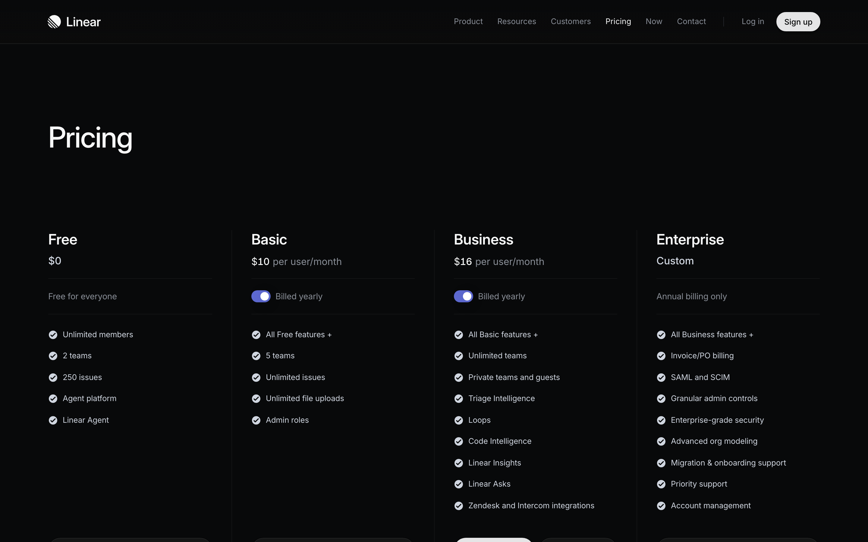
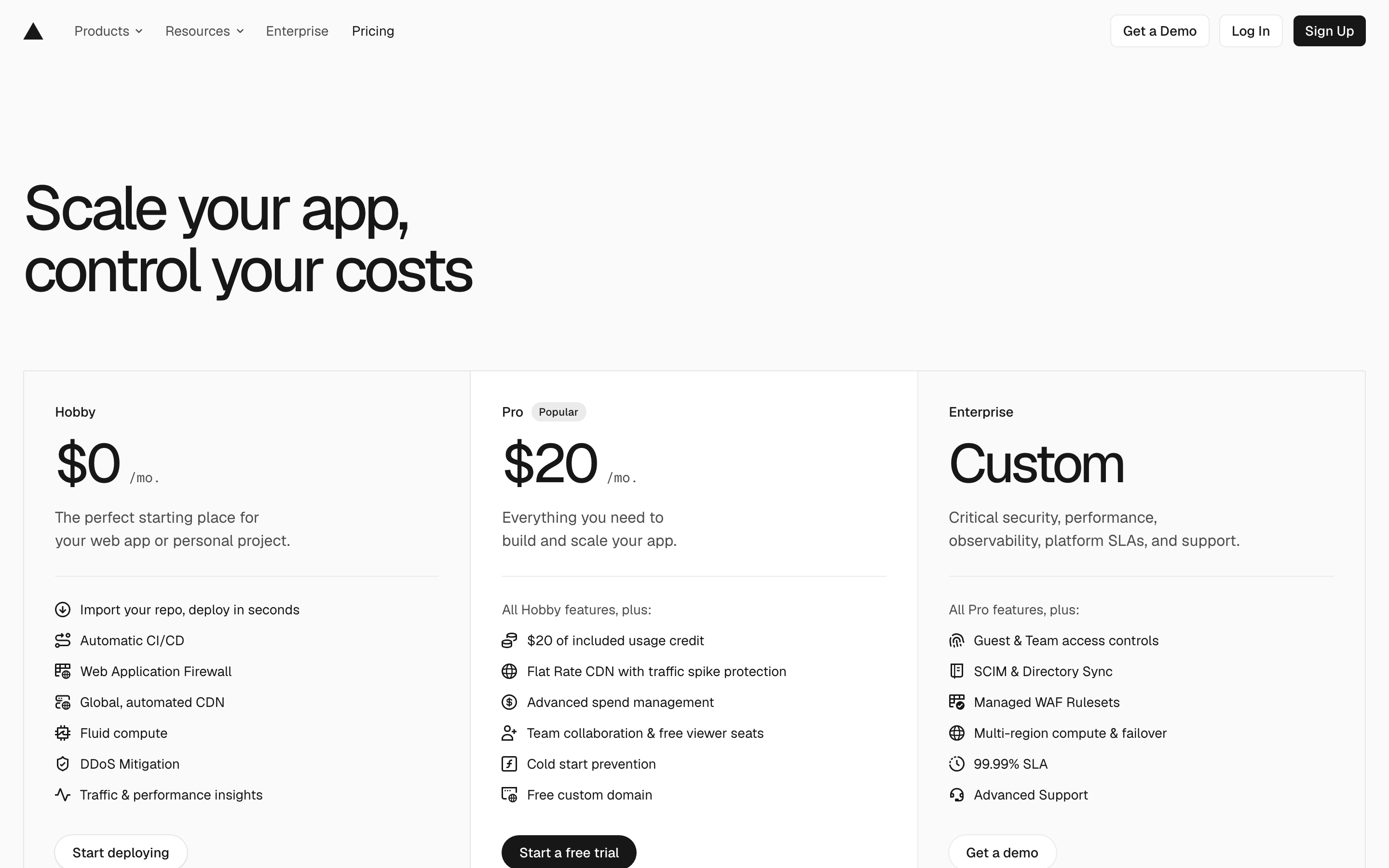
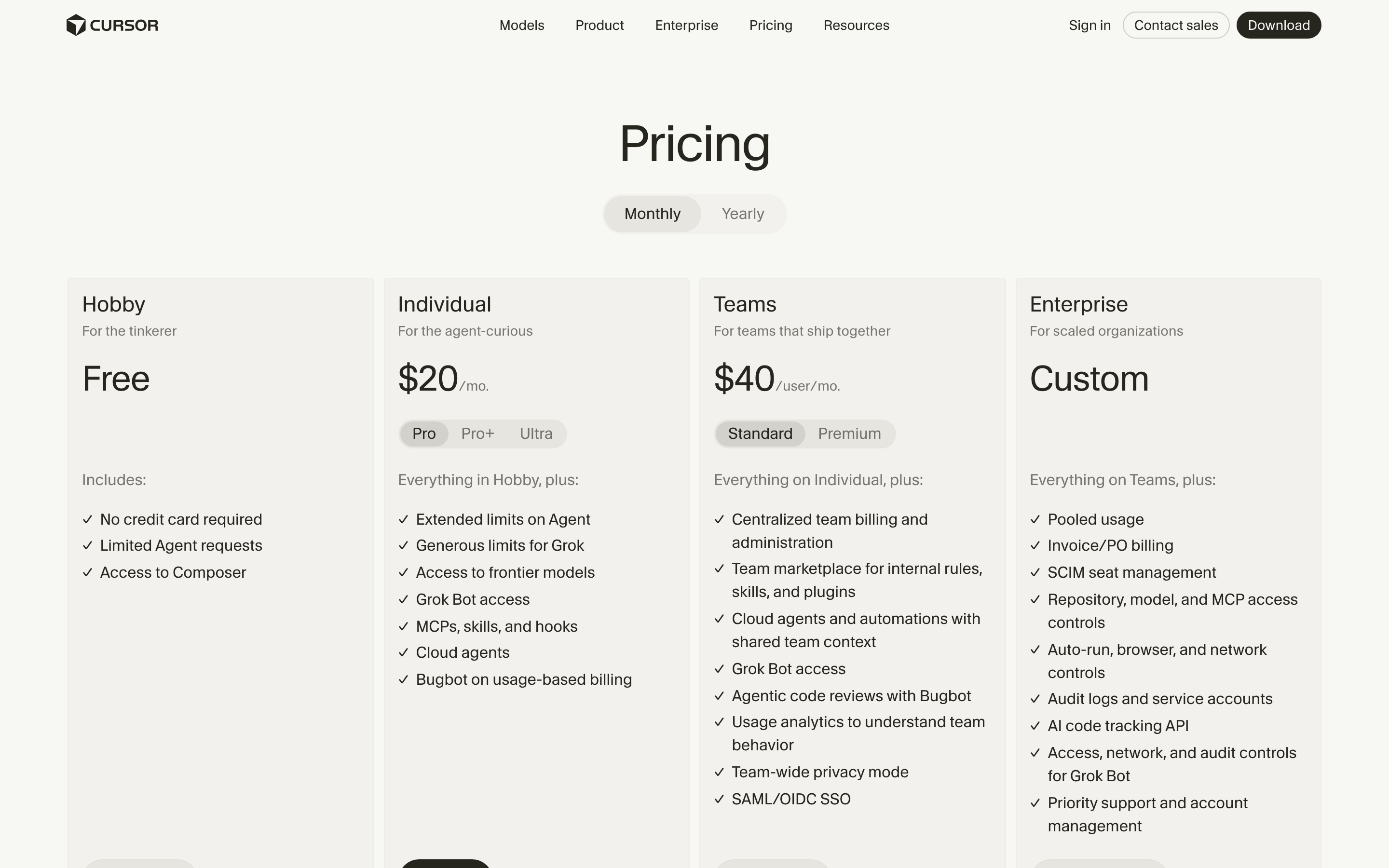
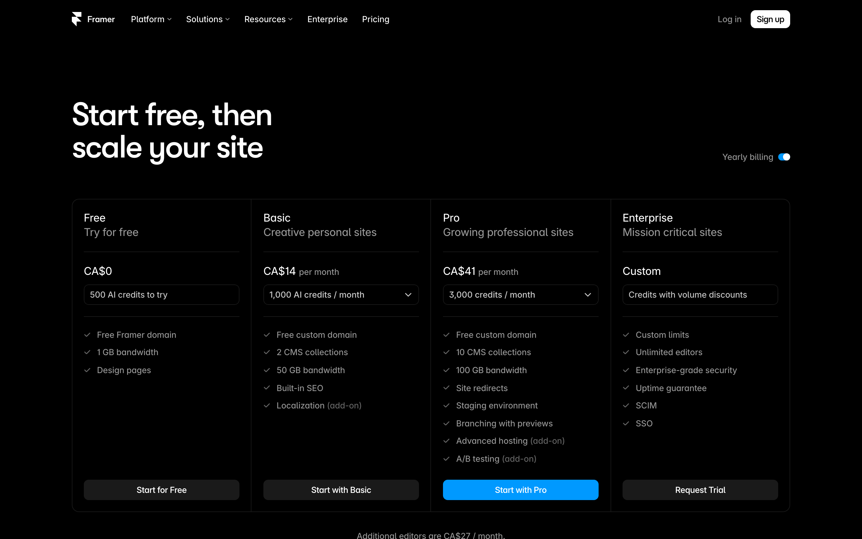
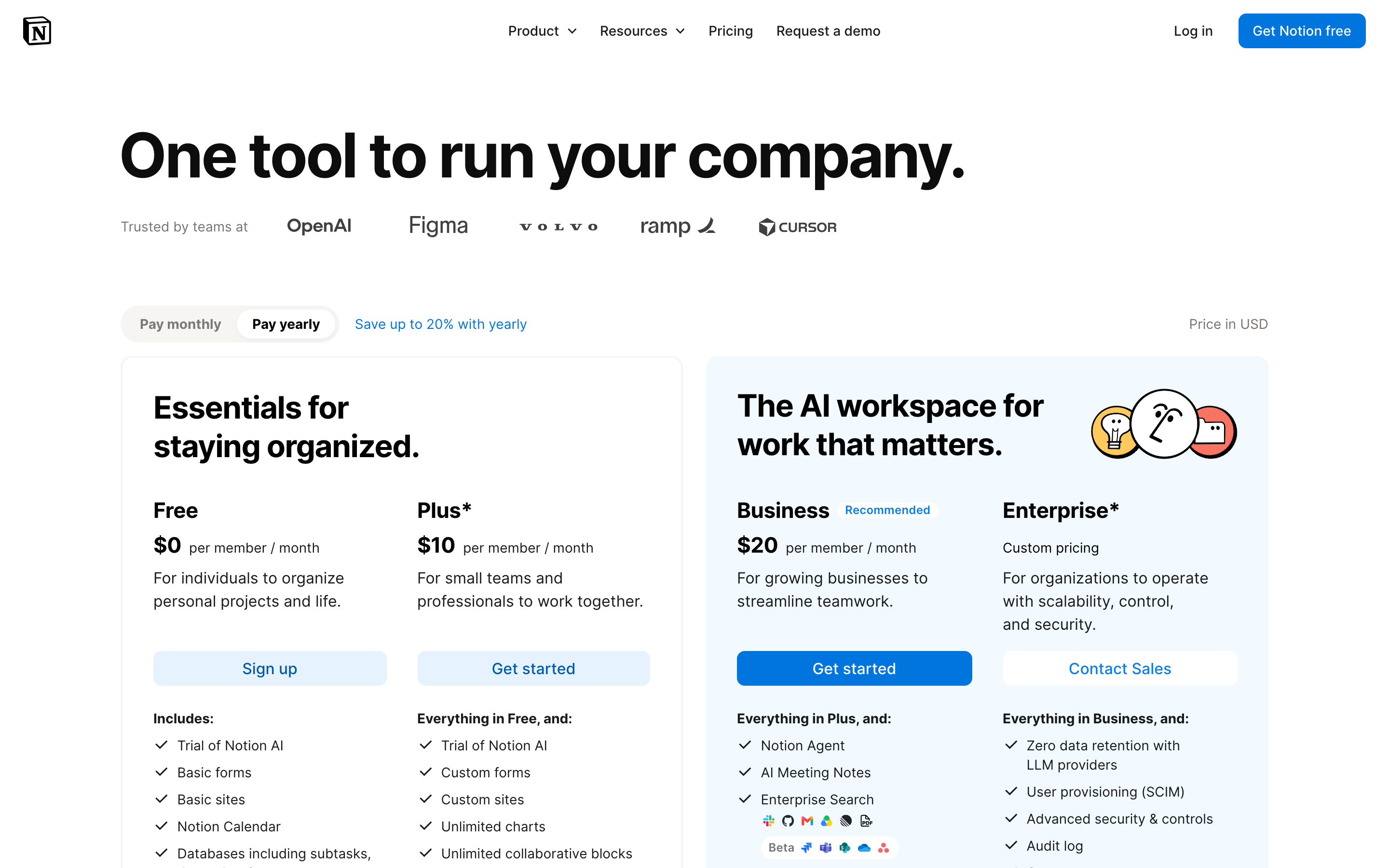
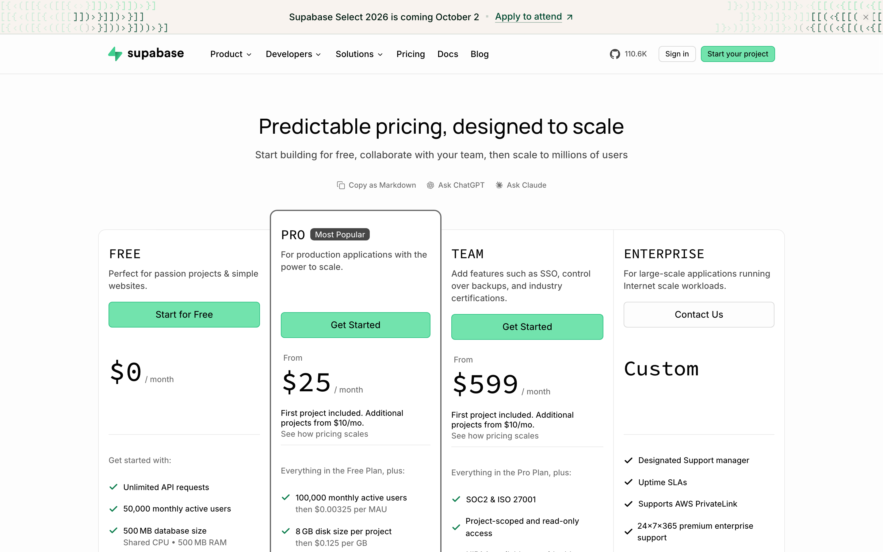
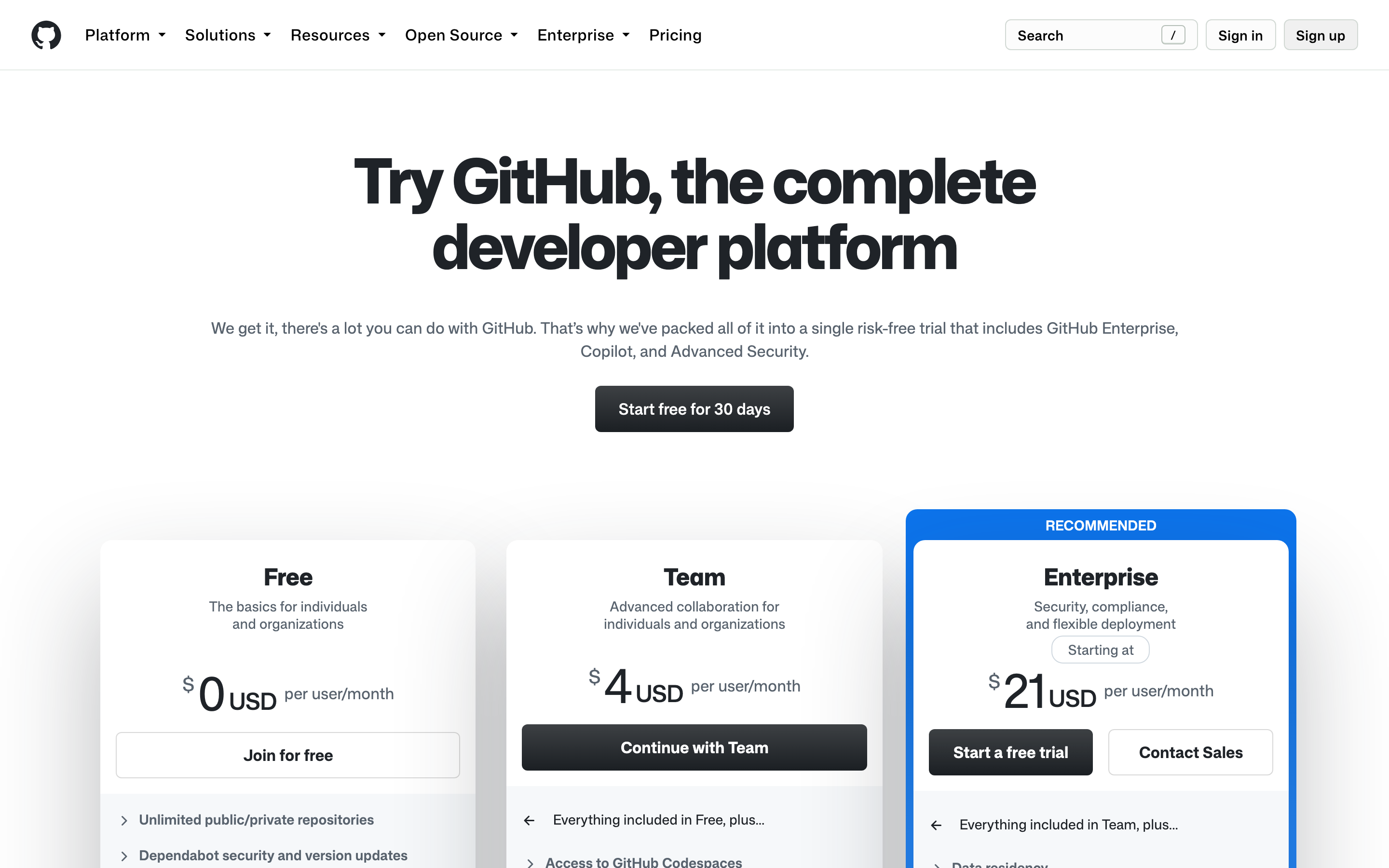
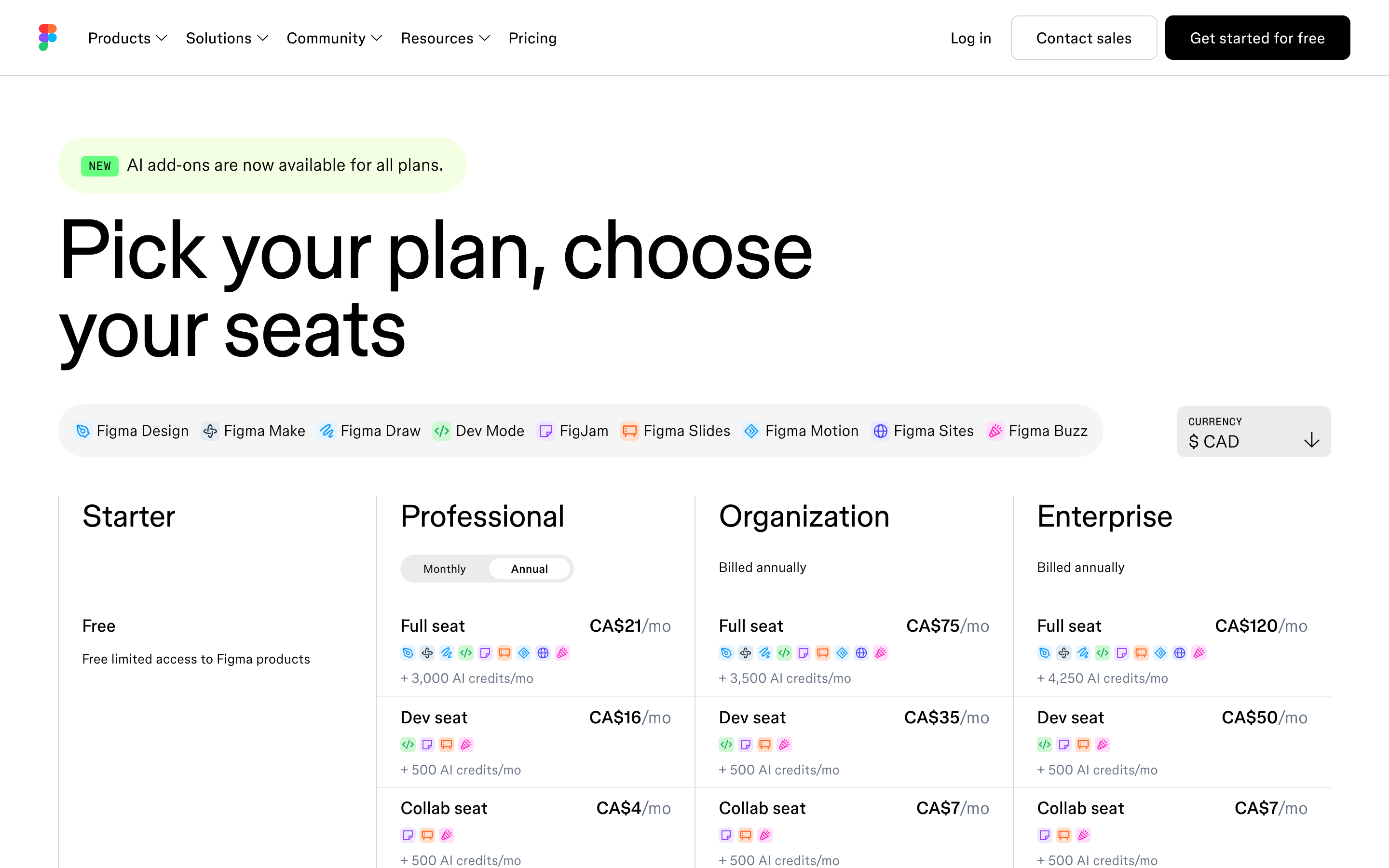
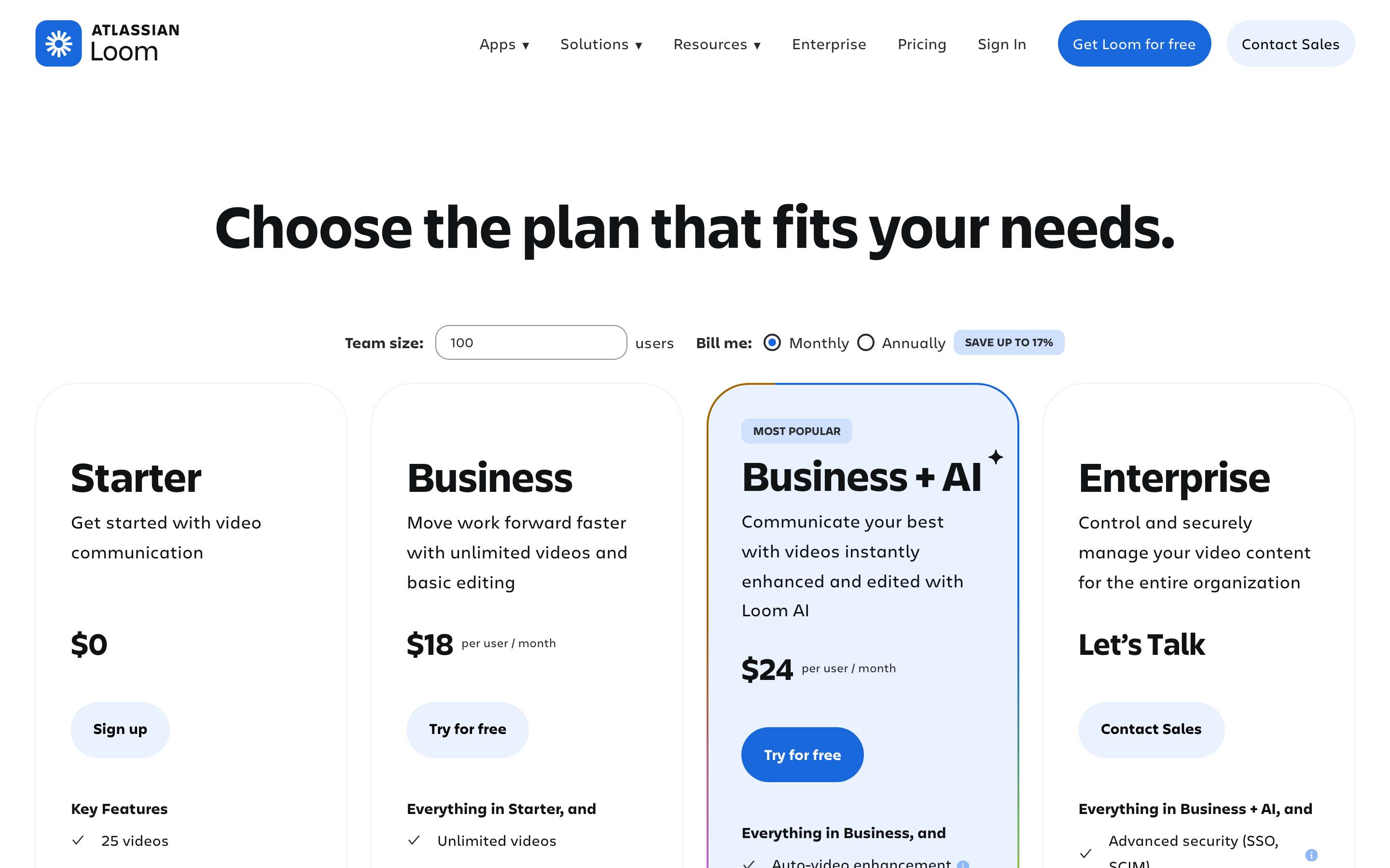
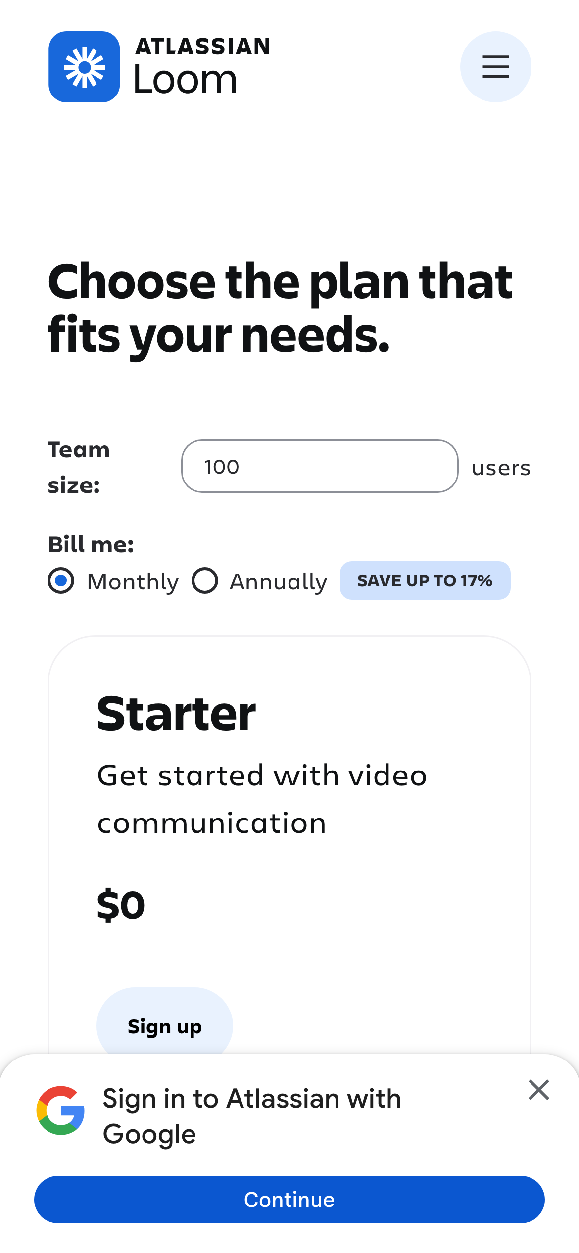
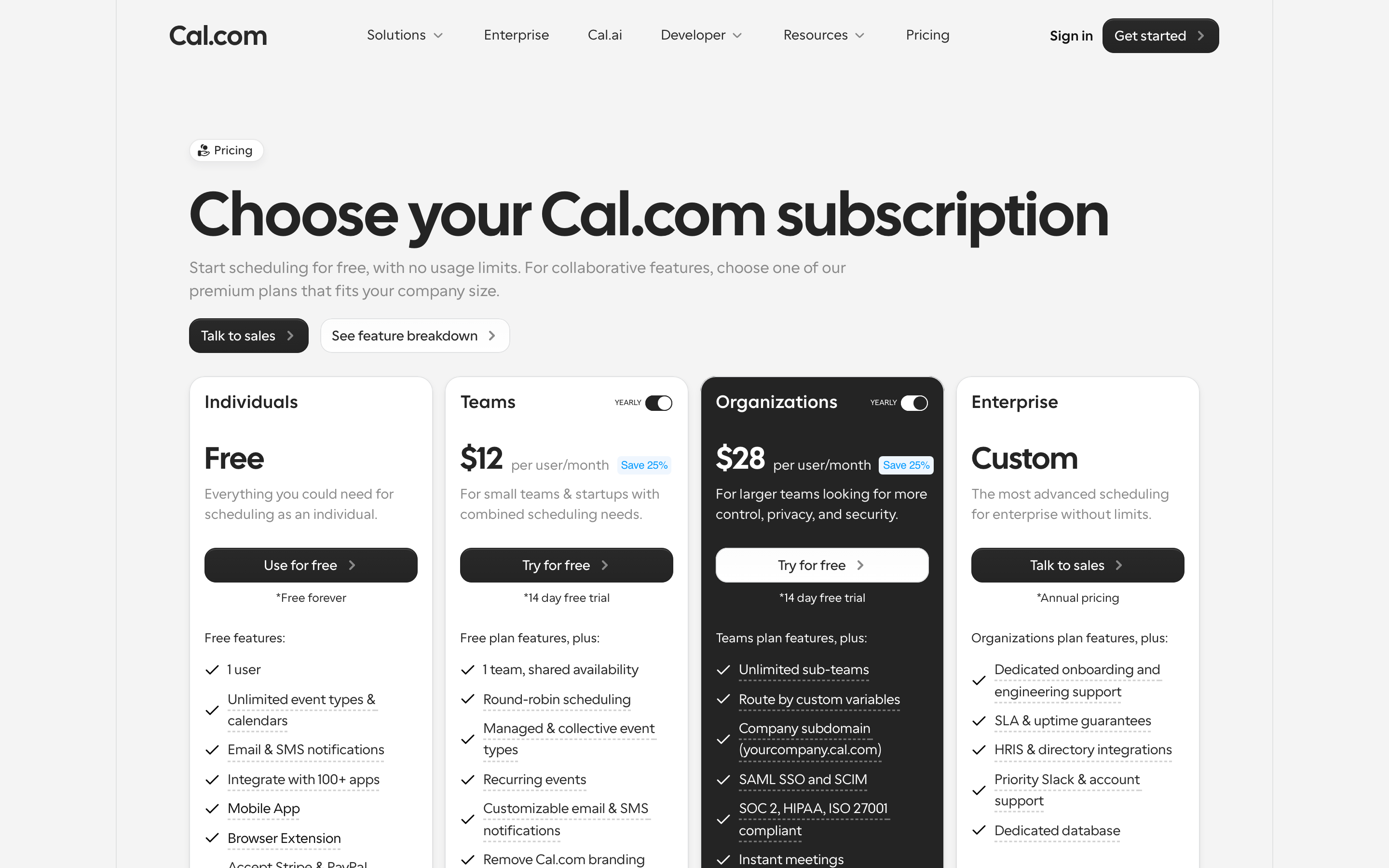
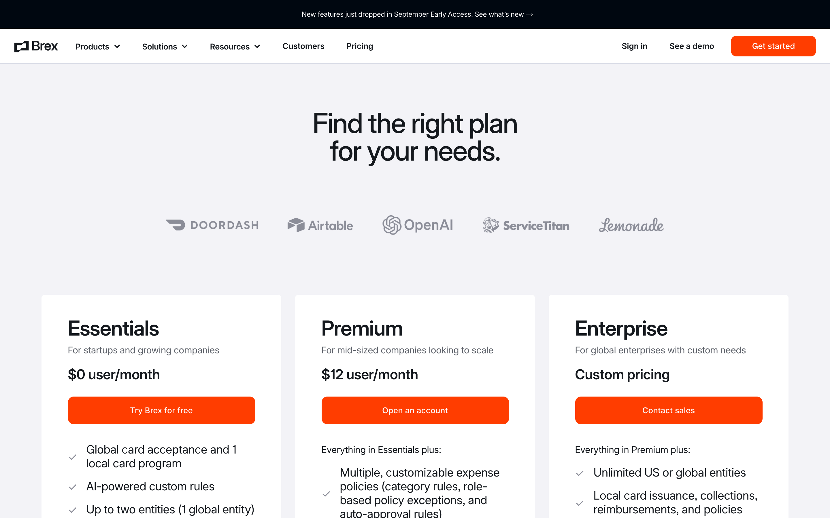
- The strongest pricing pages give each tier a clear job, then make the recommended plan visually distinct without hiding the cheaper or self-serve route. A buyer should understand the difference before reading every feature row. Examples: Linear, Vercel, Notion, Supabase, Figma, Loom.
- Pair price with the unit
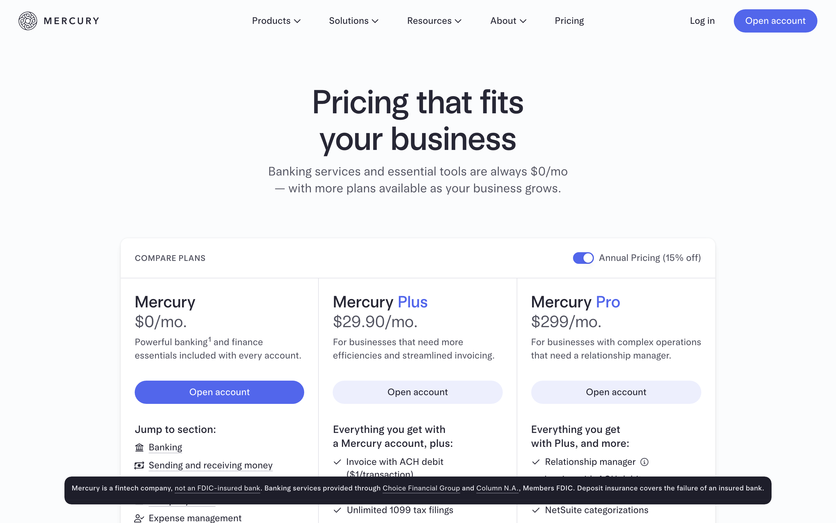
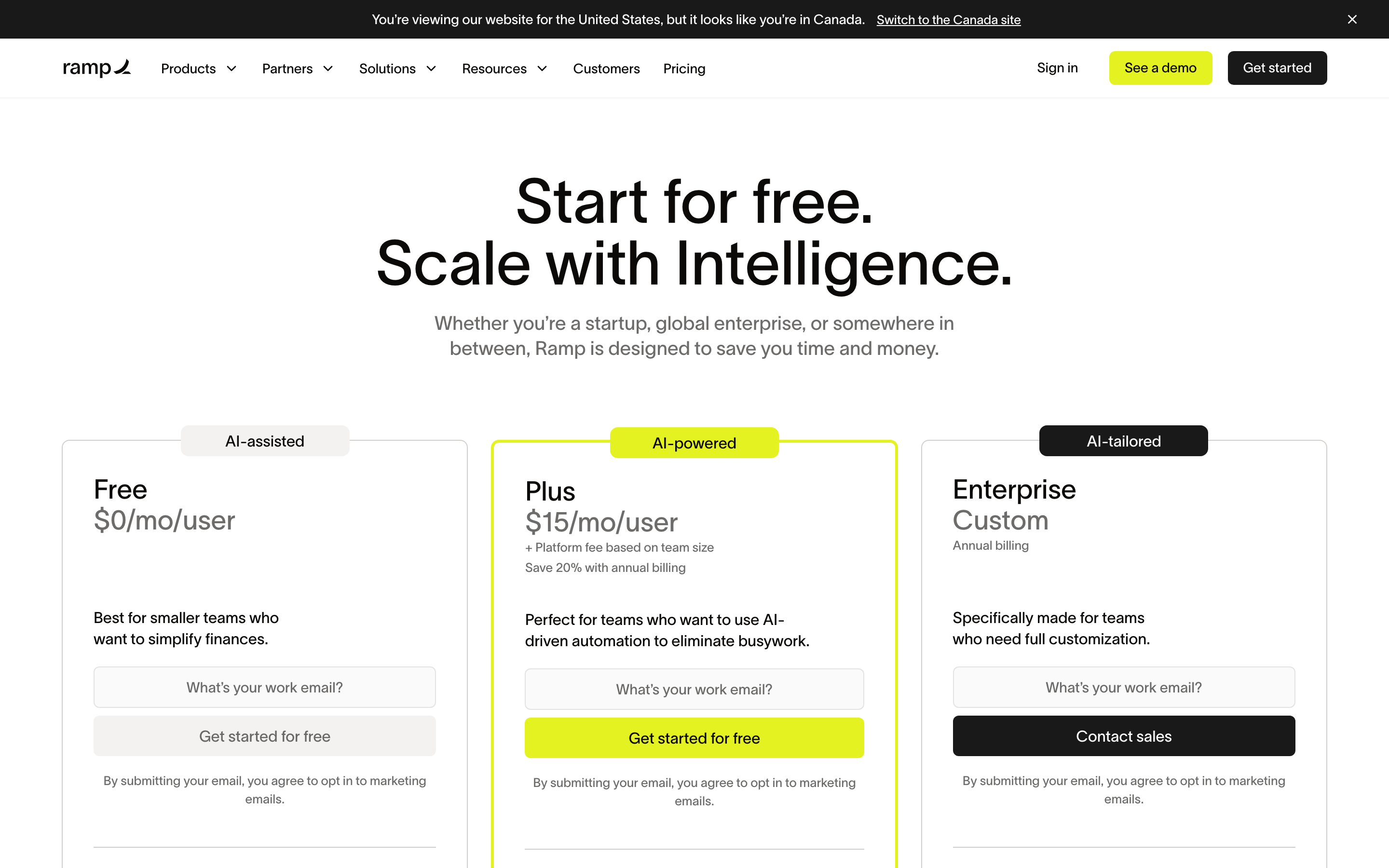
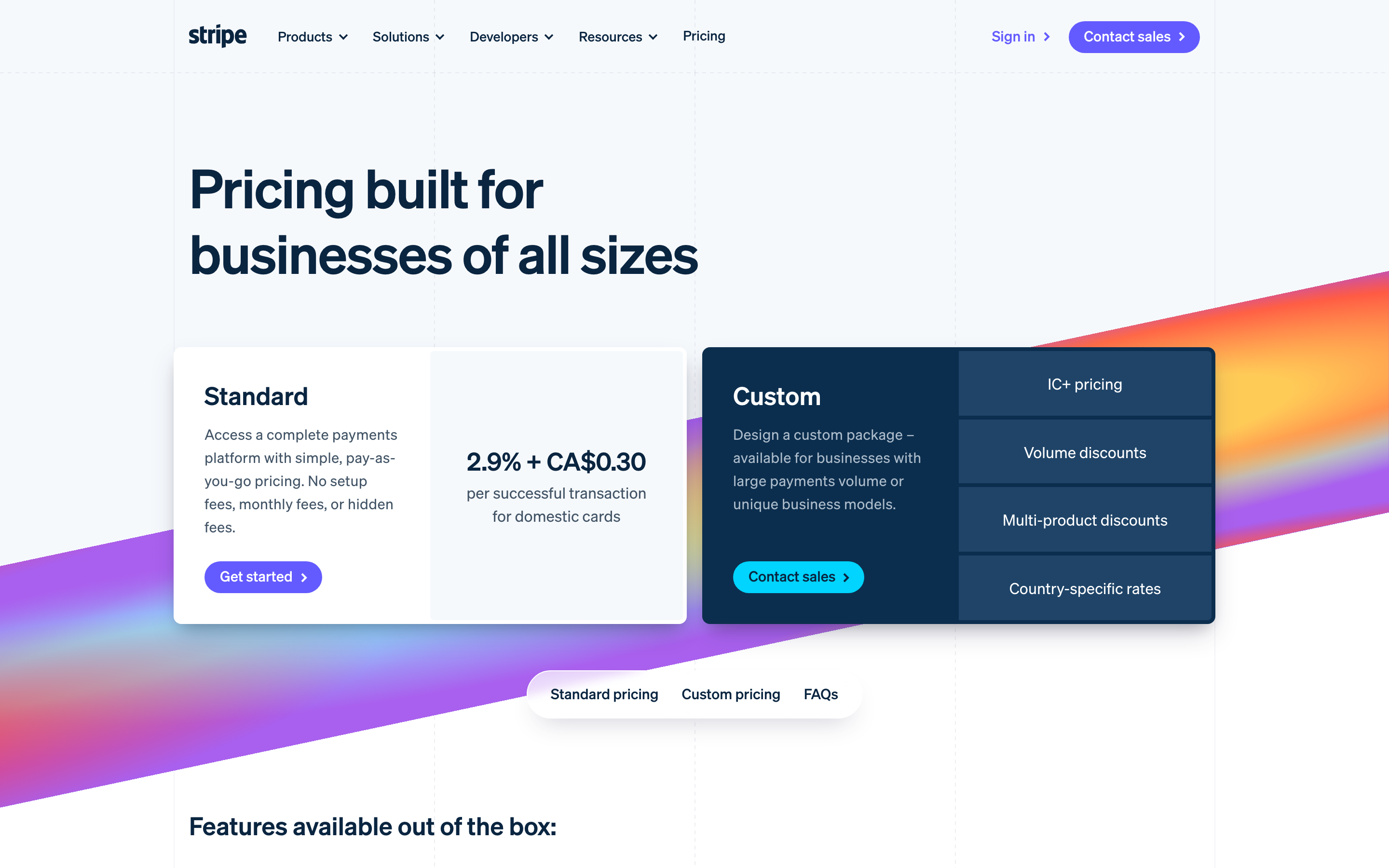
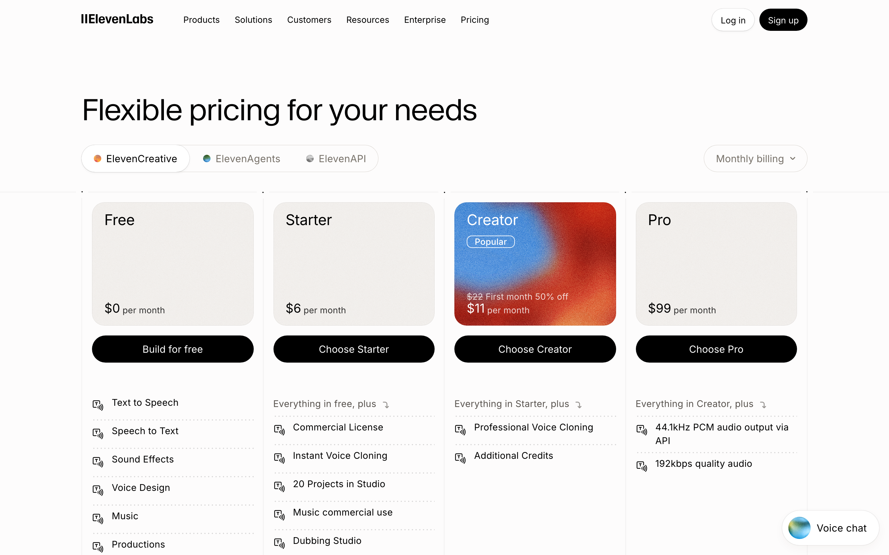
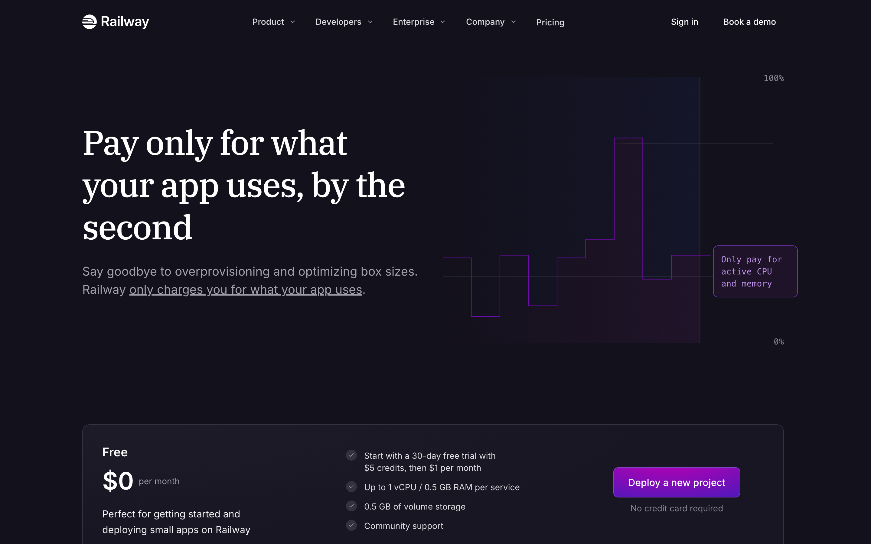
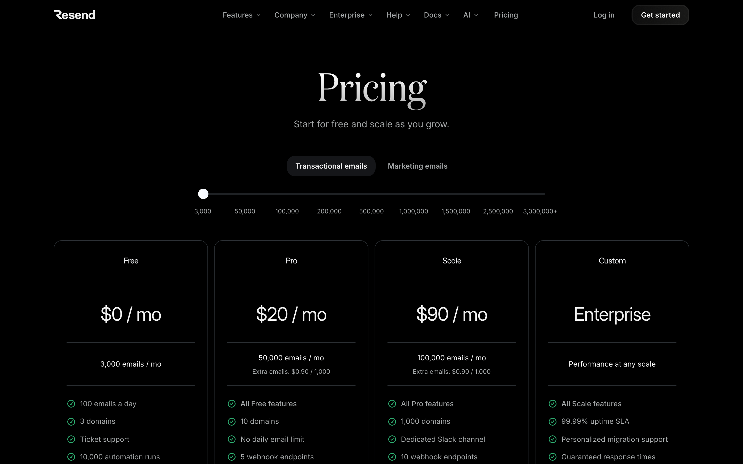
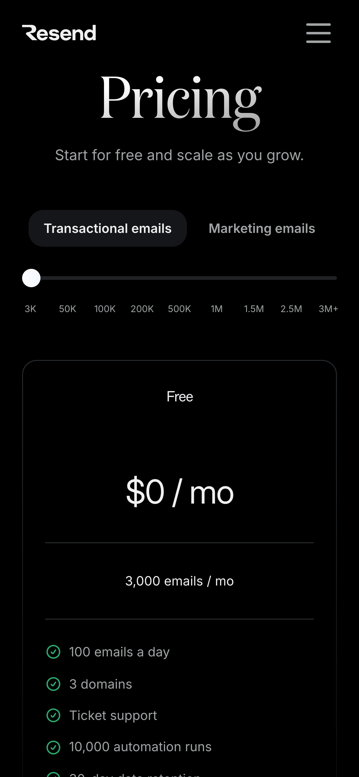
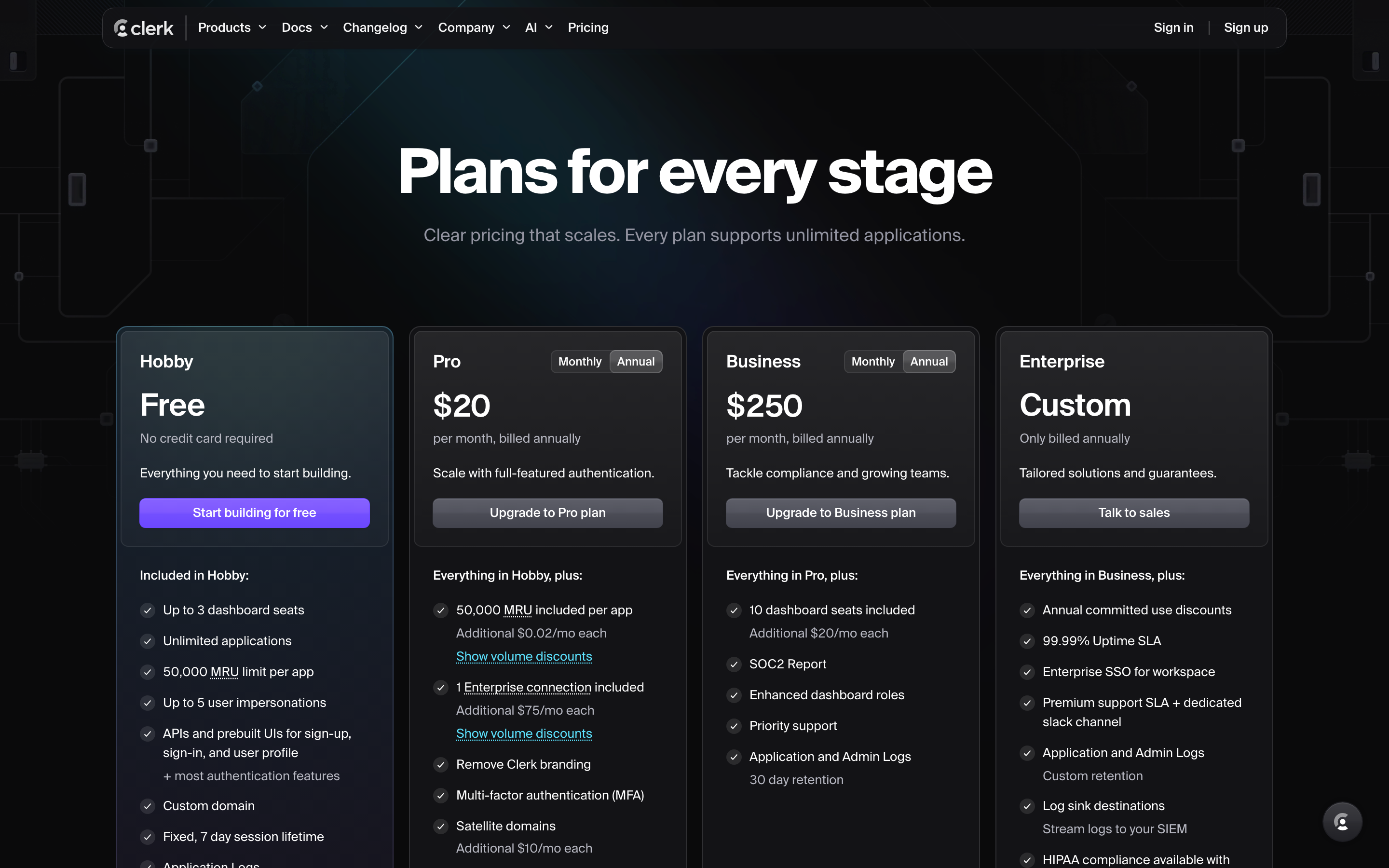
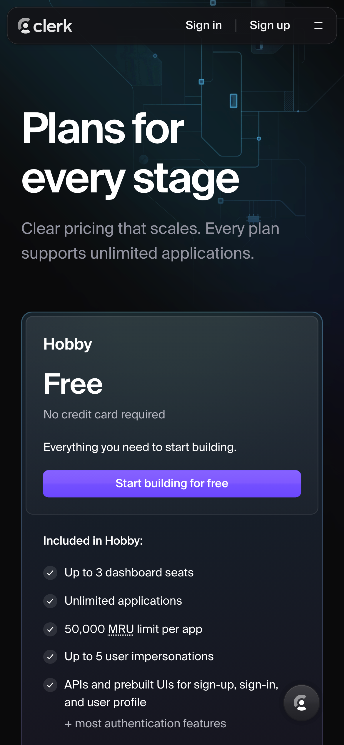
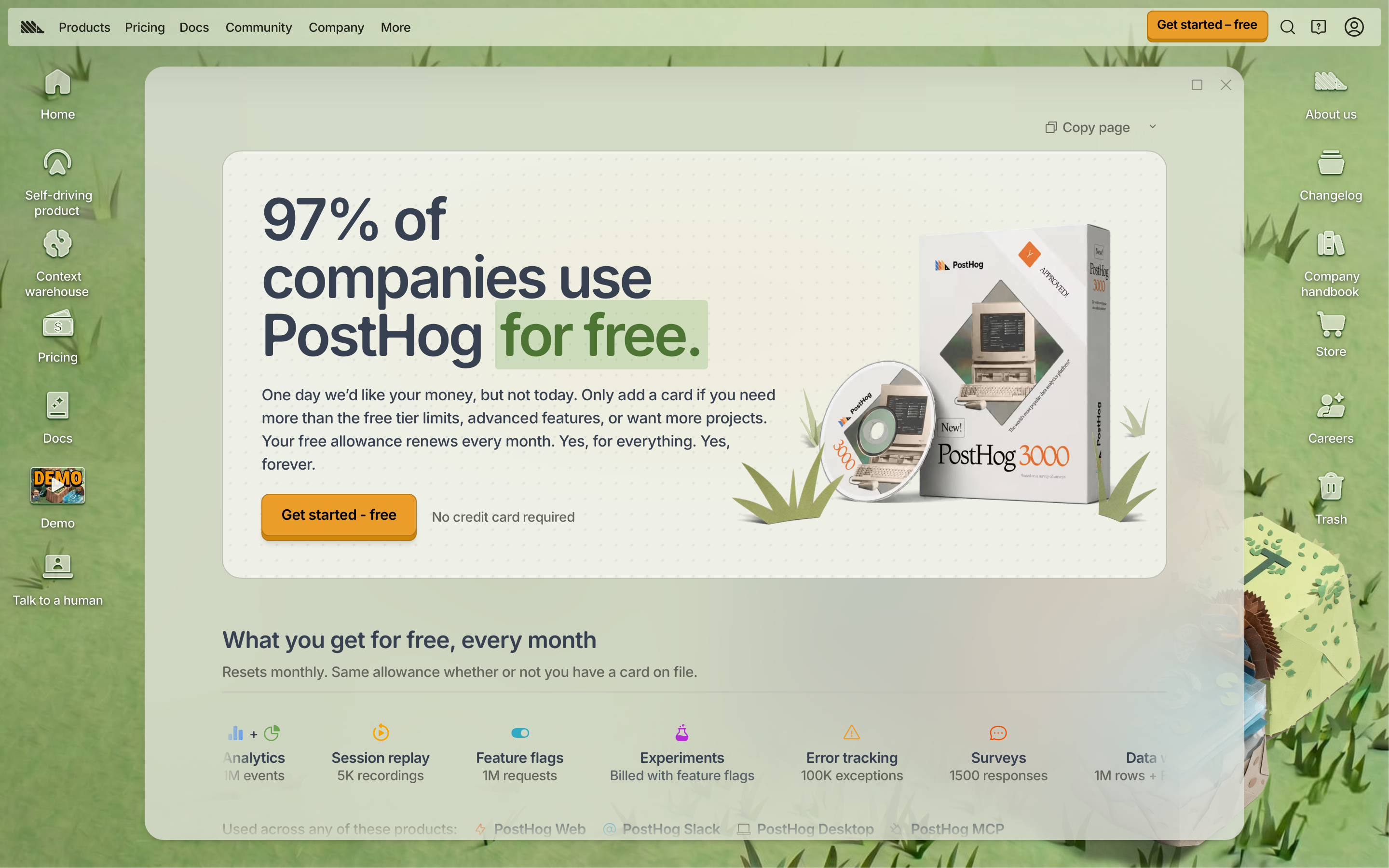
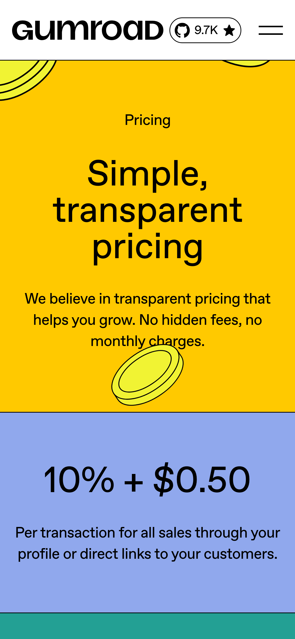
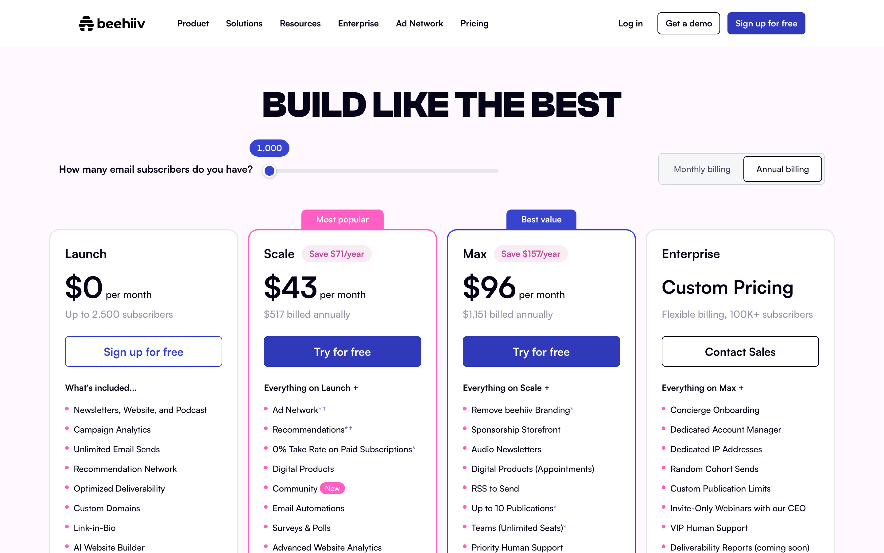
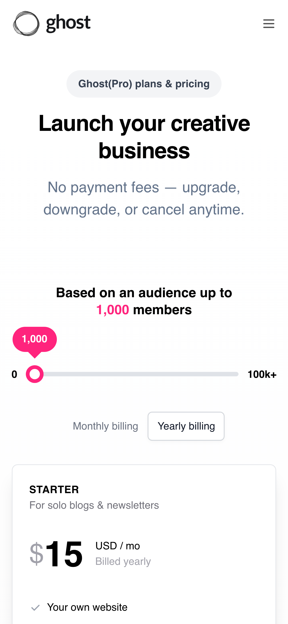
- Monthly price alone is not enough when plans scale by seat, usage, credits or transactions. The clearest pages put the billing unit, annual discount and important limits beside the number a buyer is comparing. Examples: Stripe, ElevenLabs, Resend, Clerk, PostHog, beehiiv.
All 27 examples
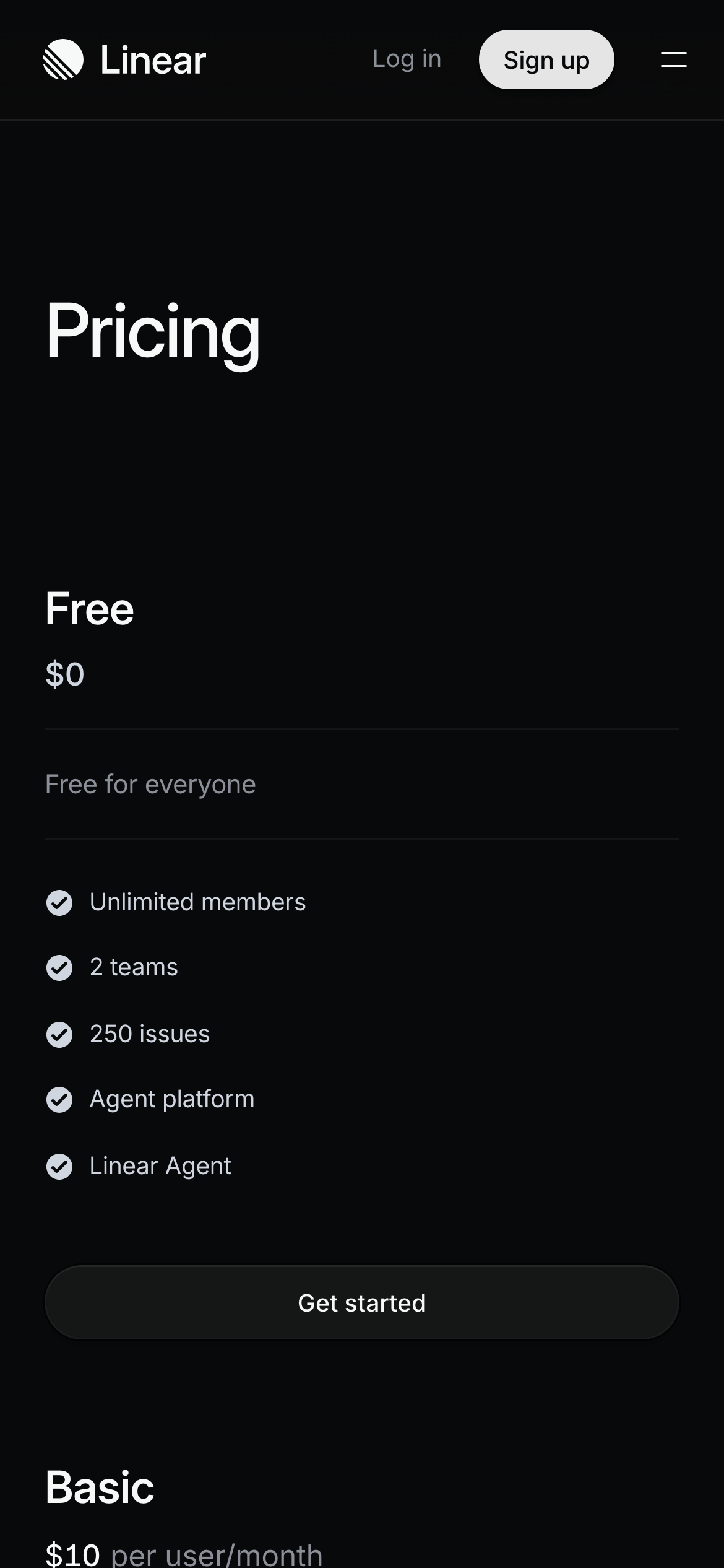
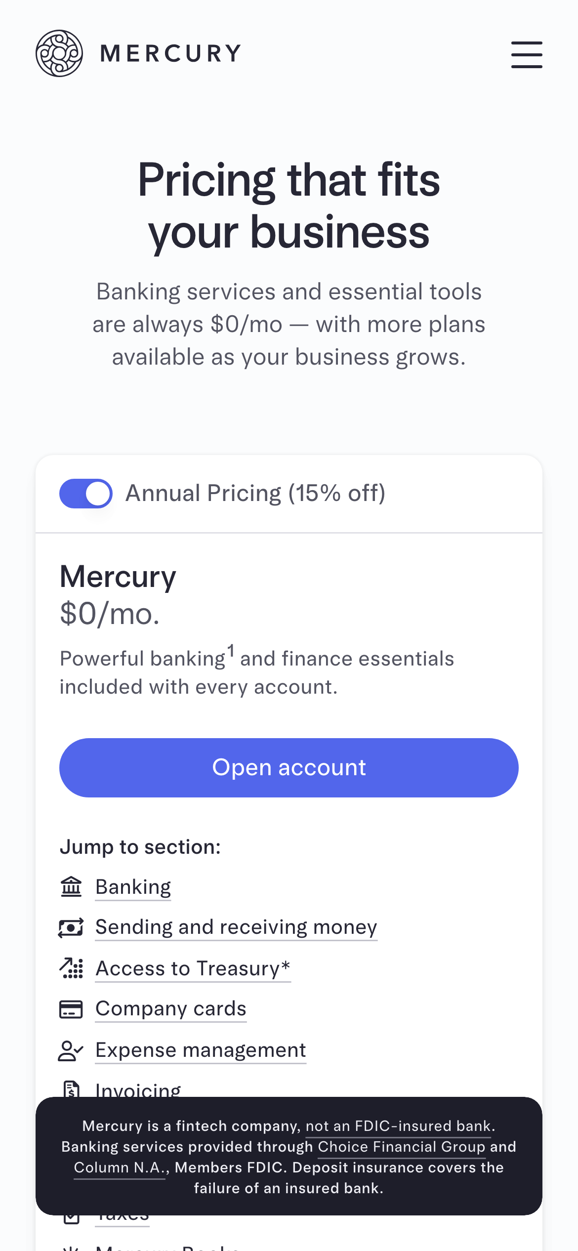
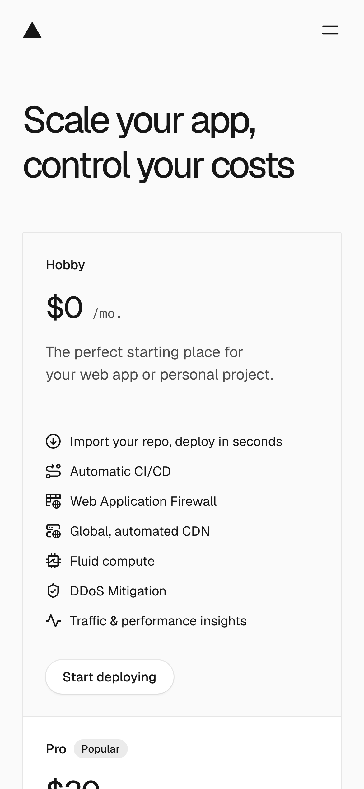
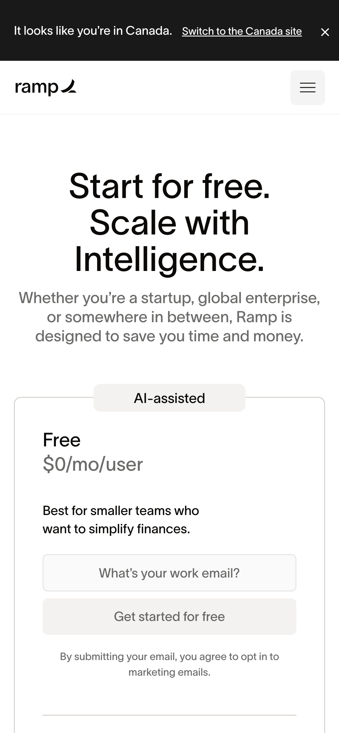
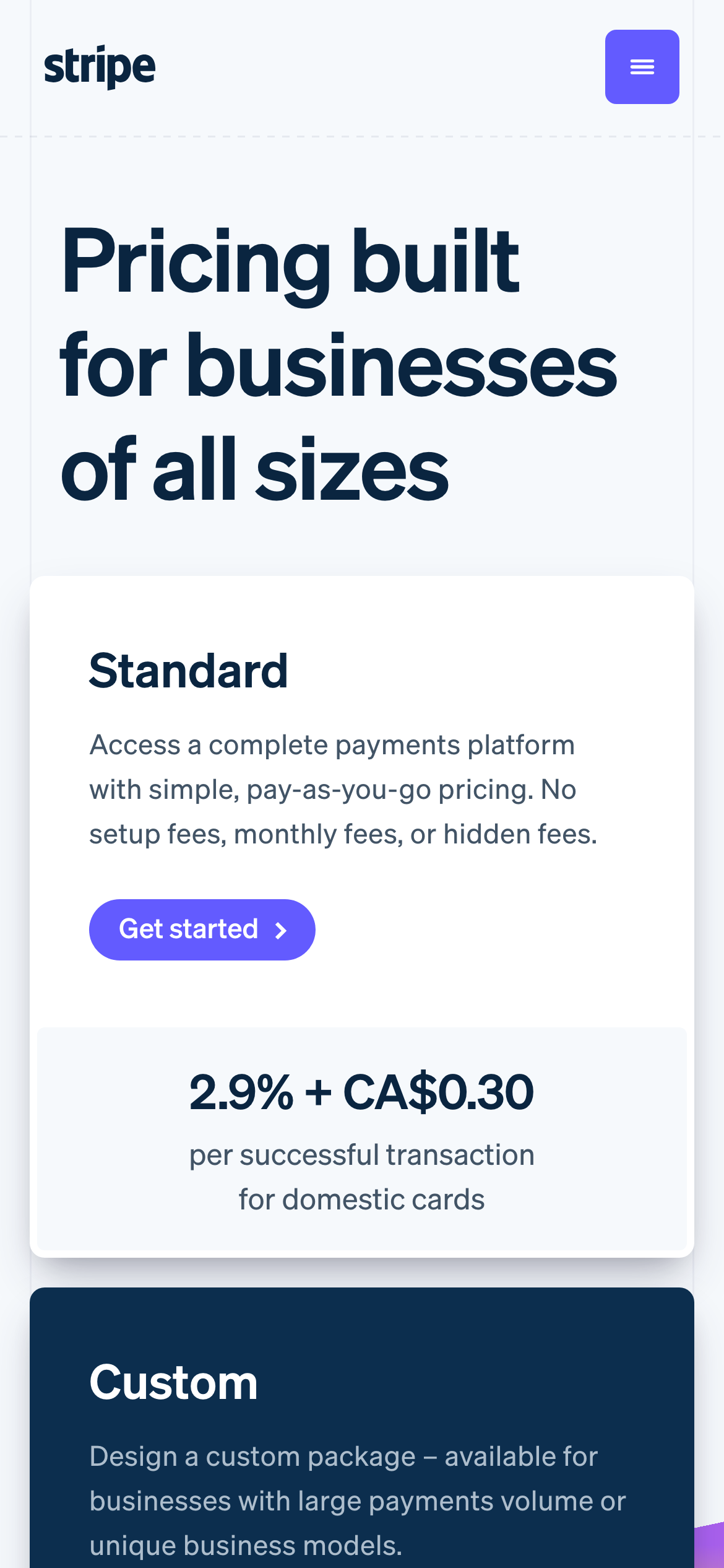
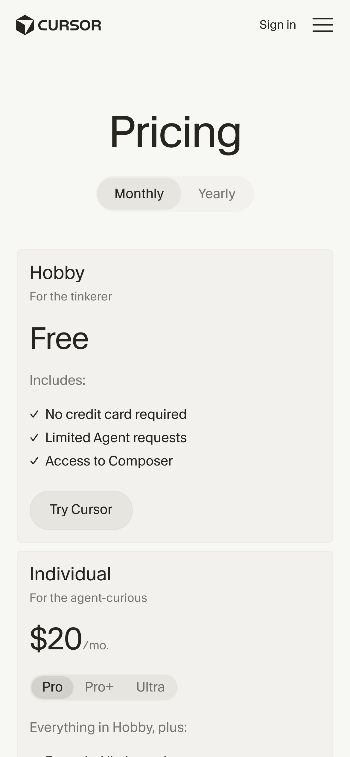
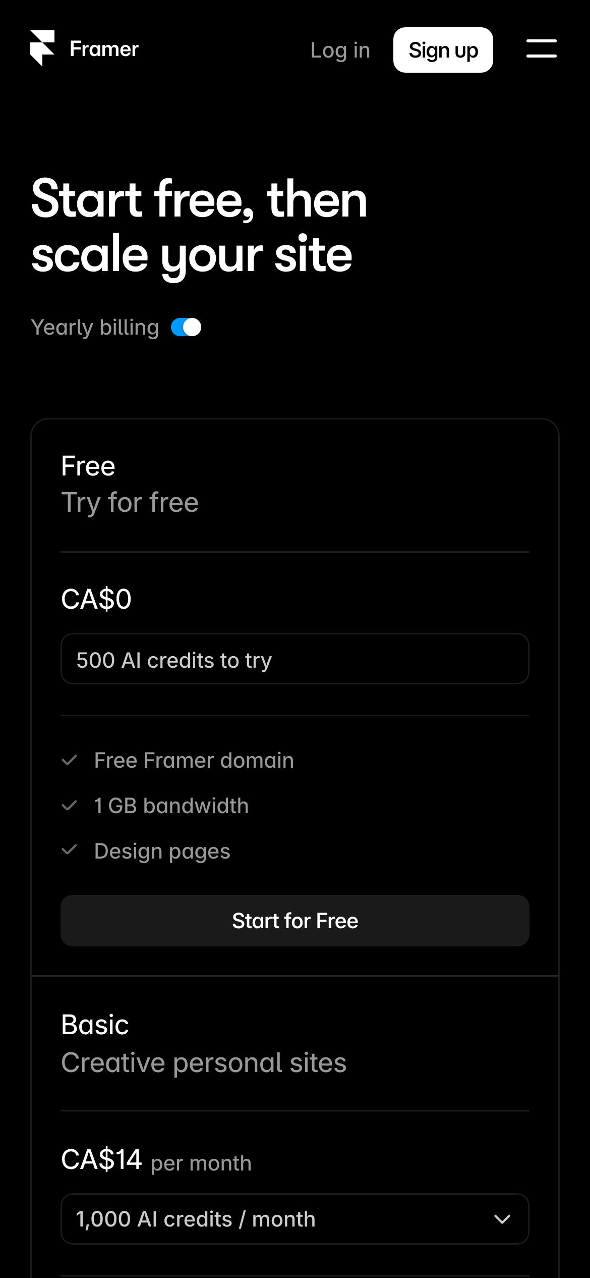
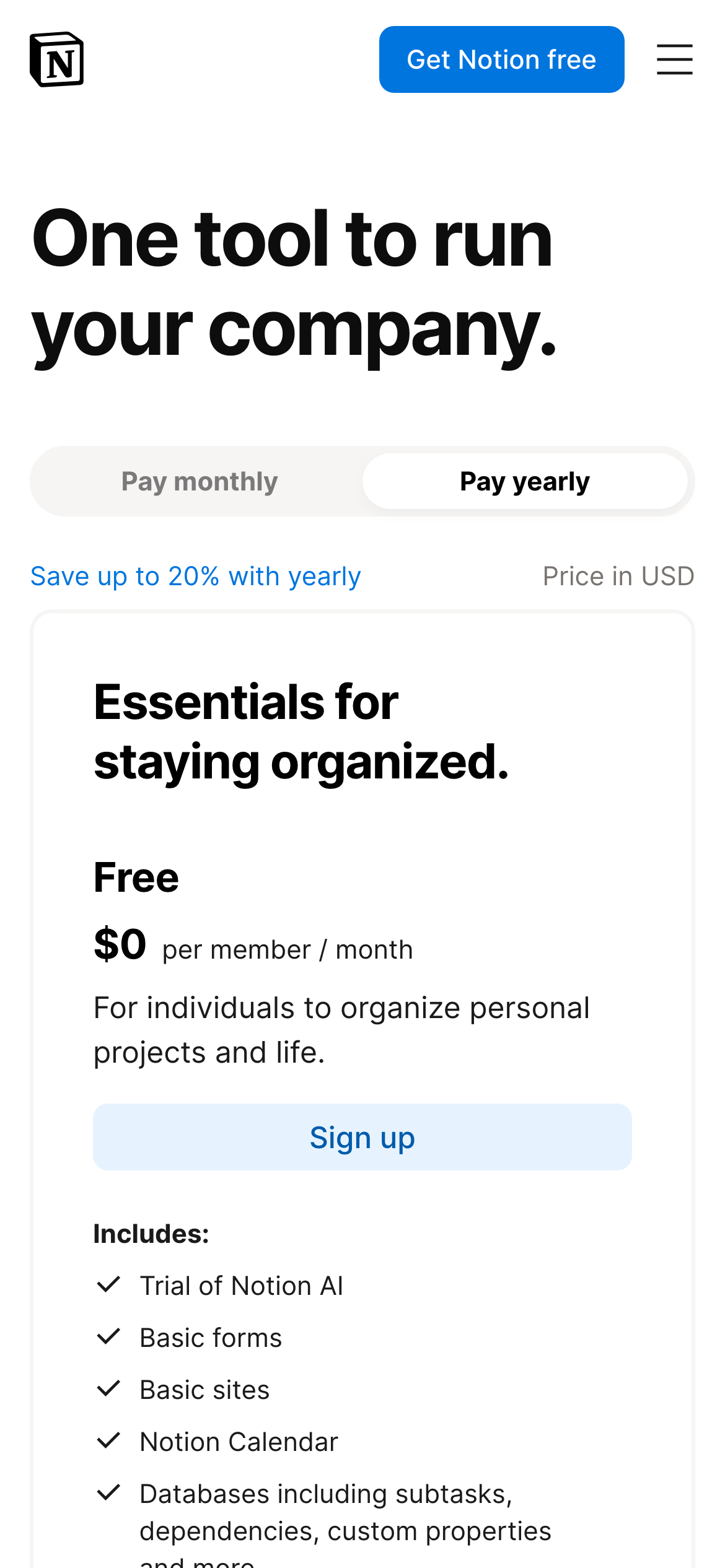
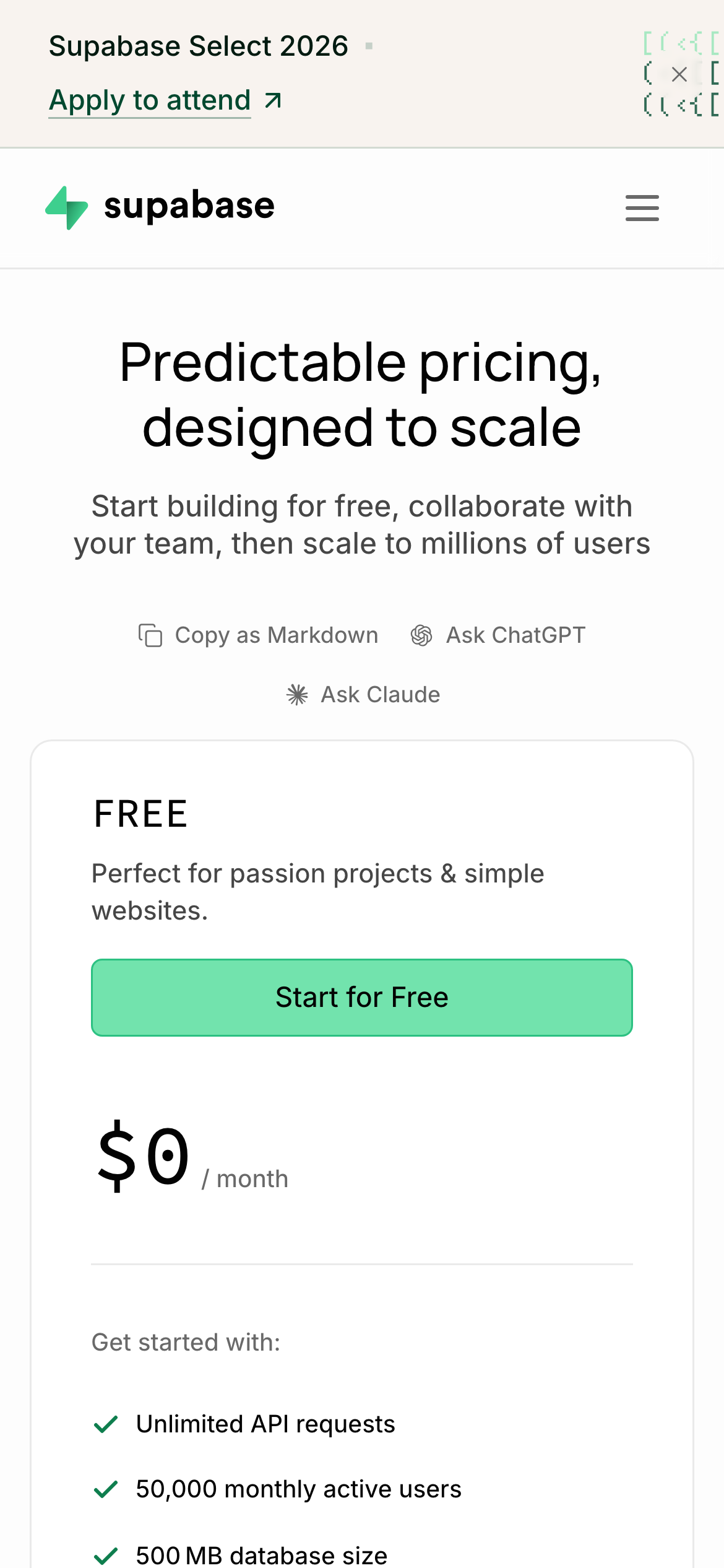
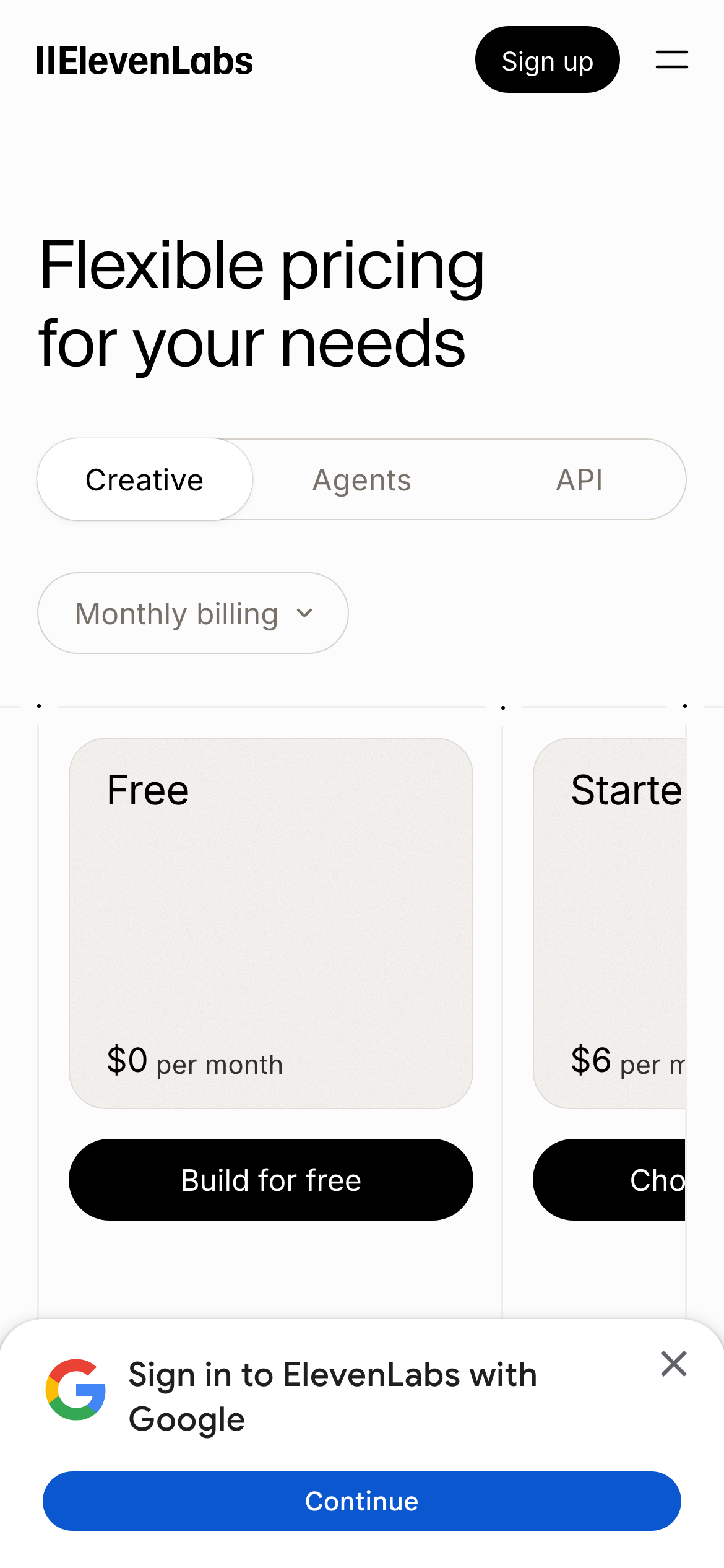
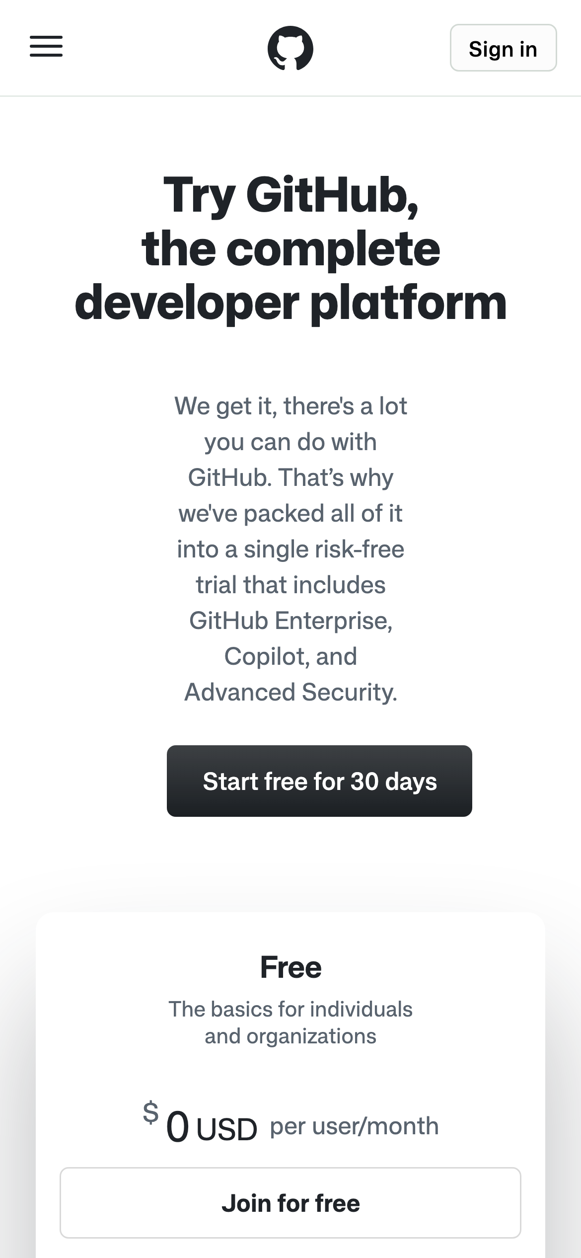
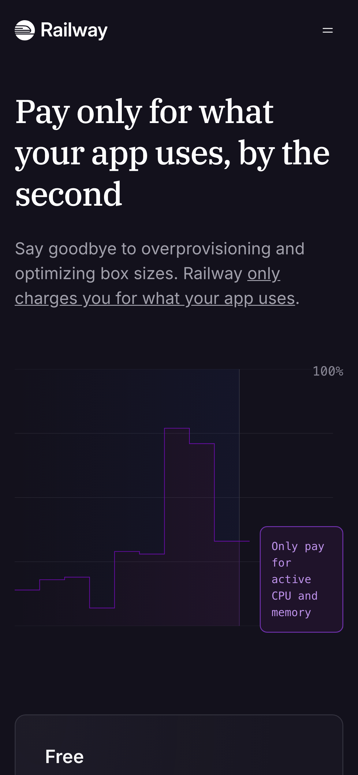
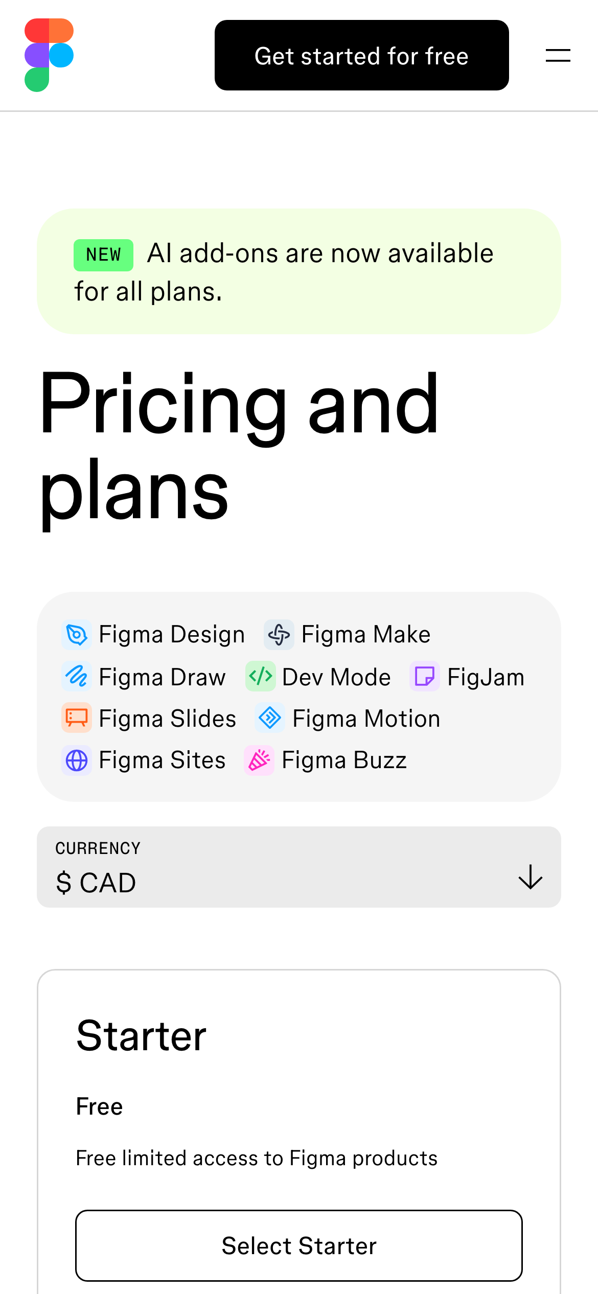
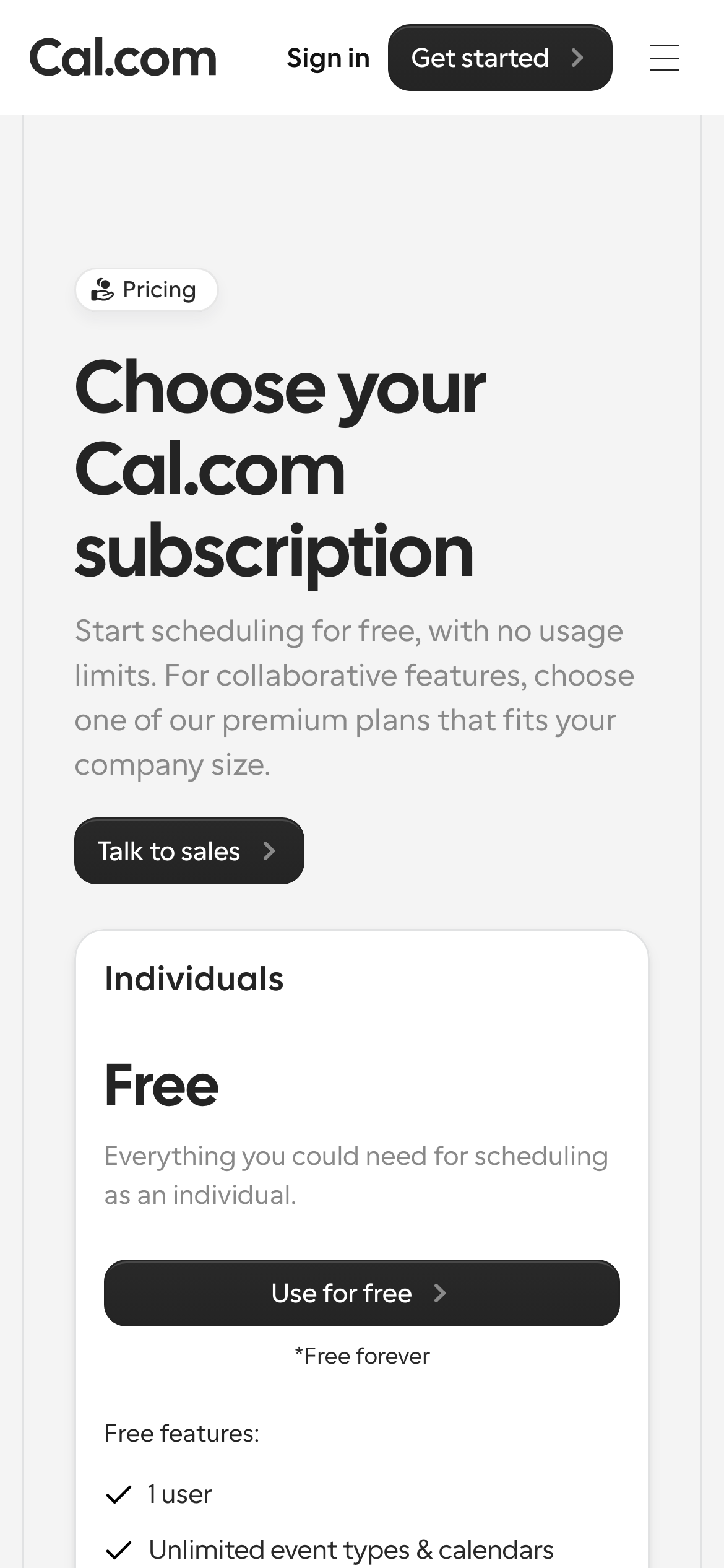
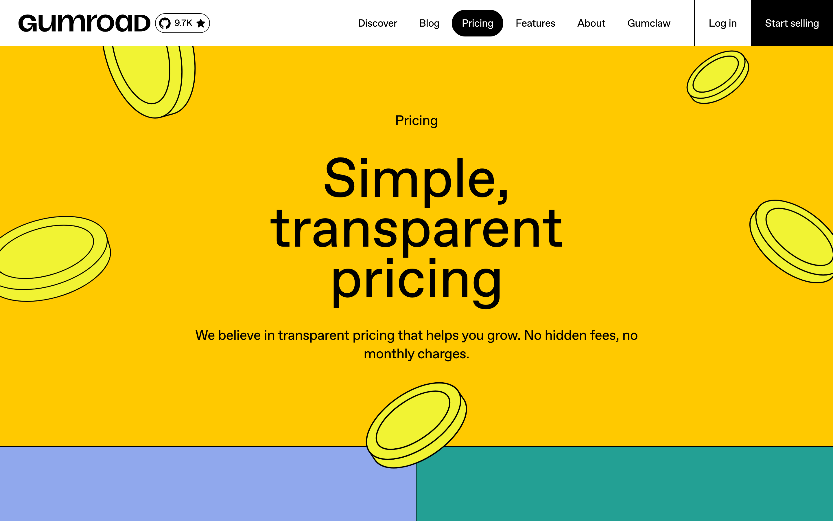
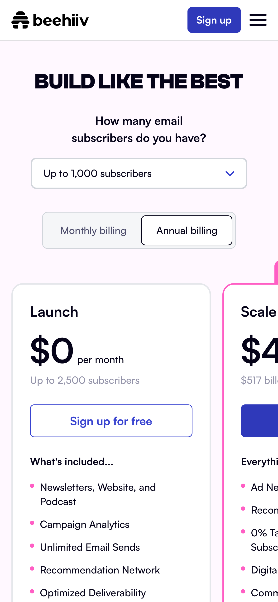
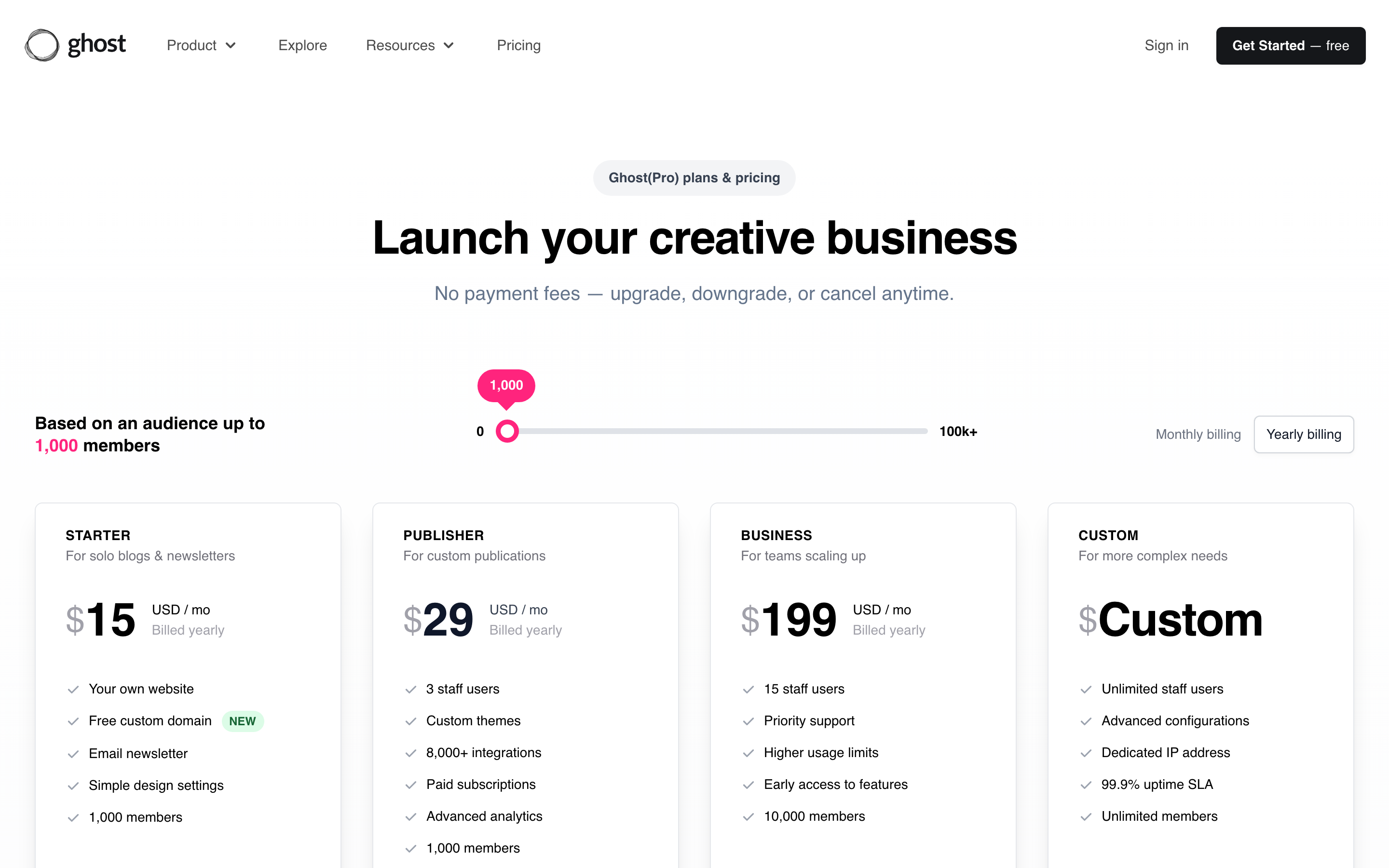
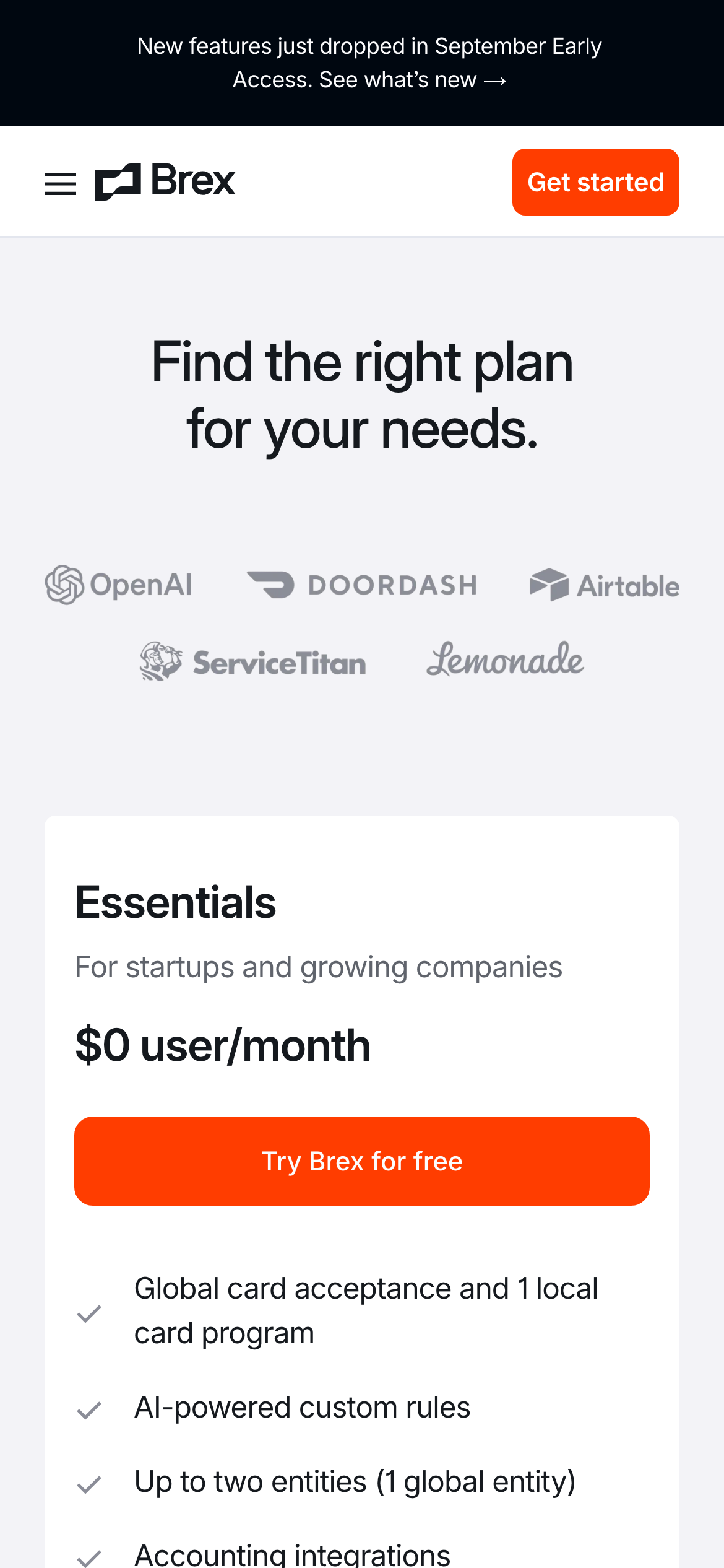
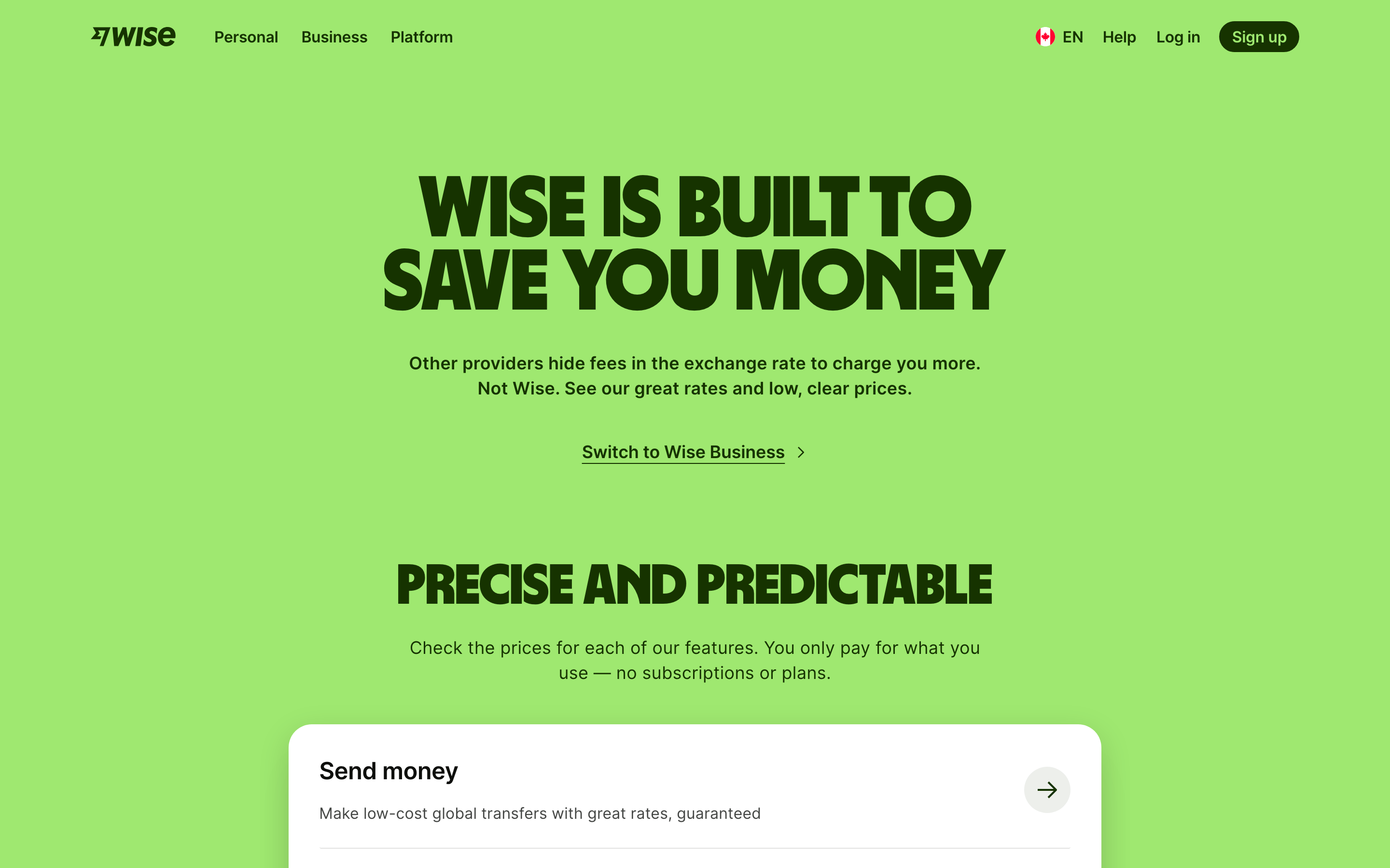
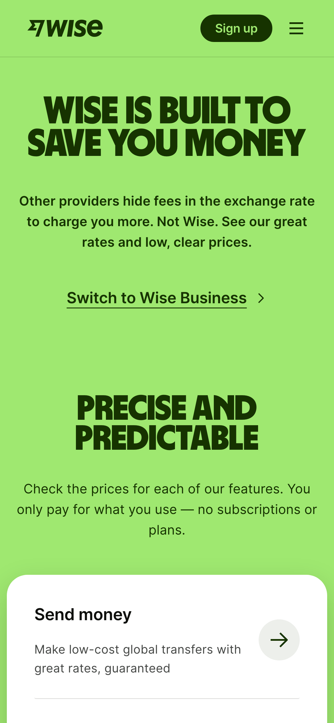
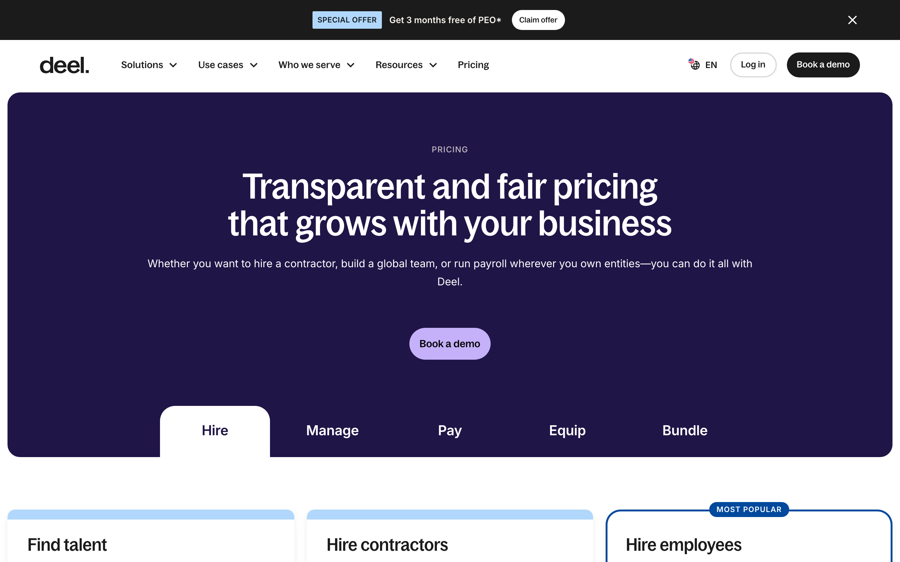
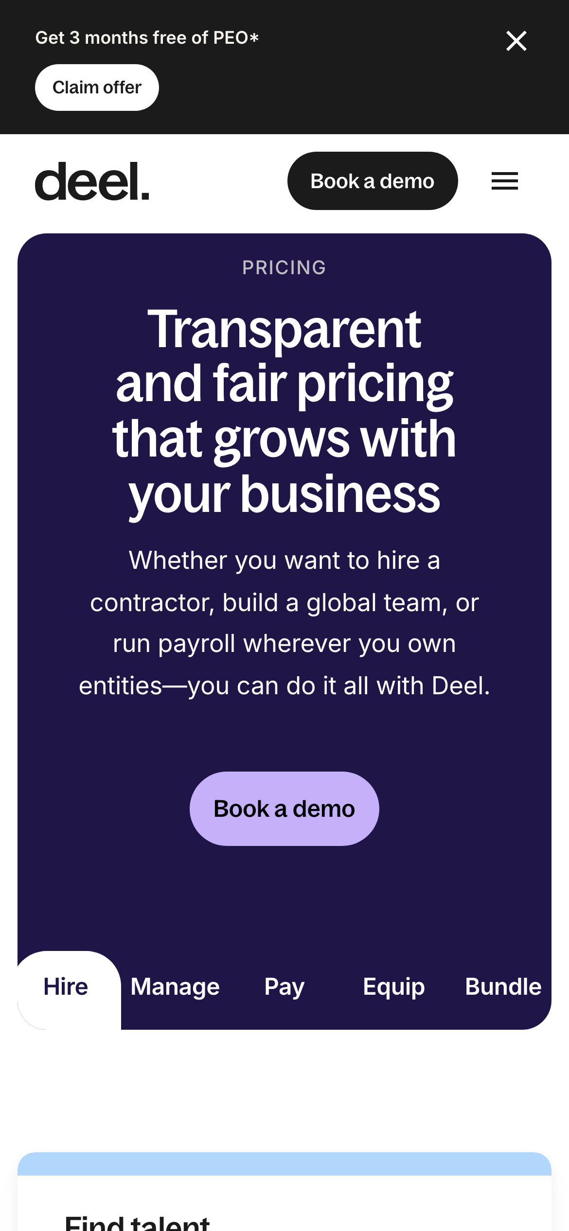
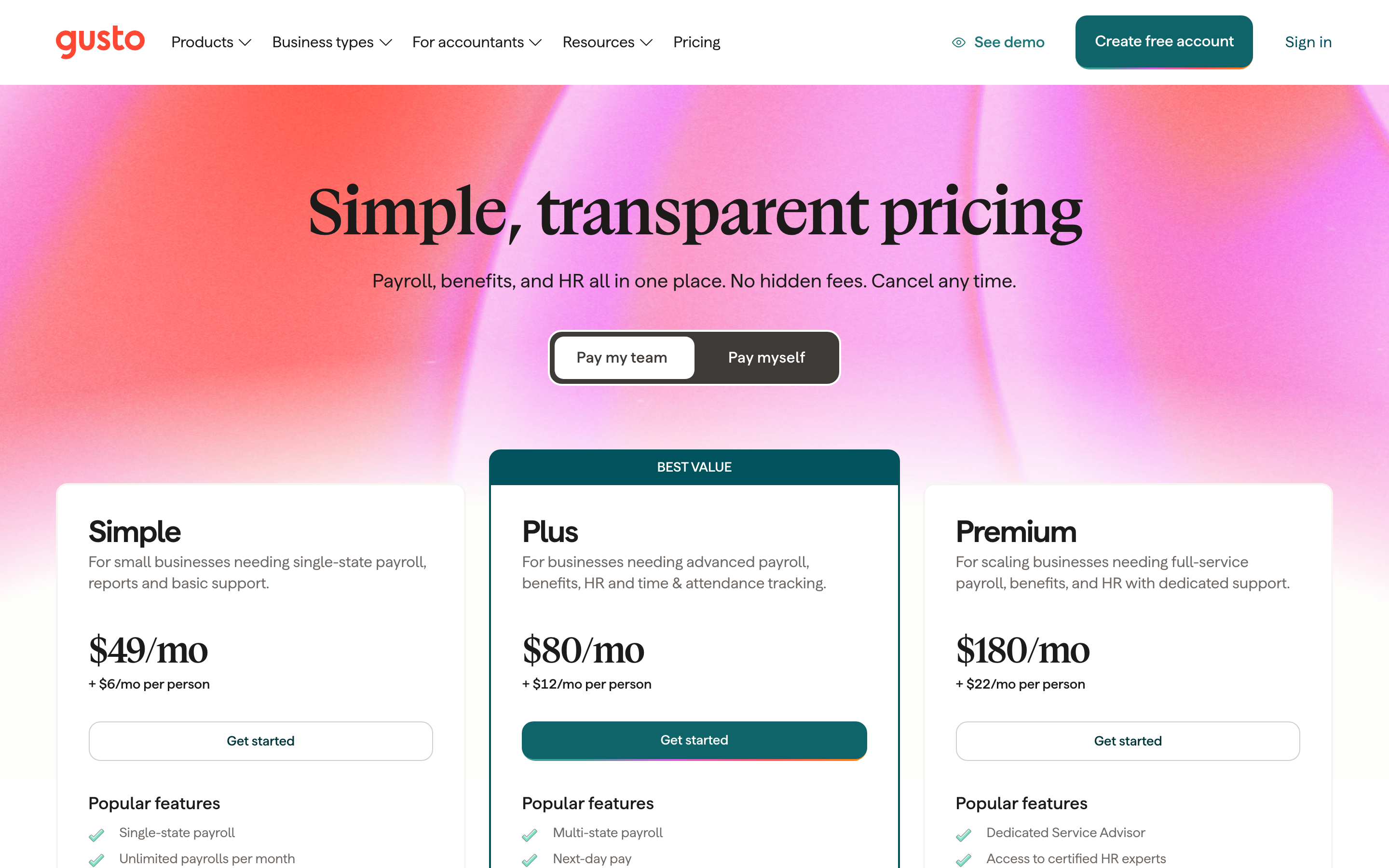
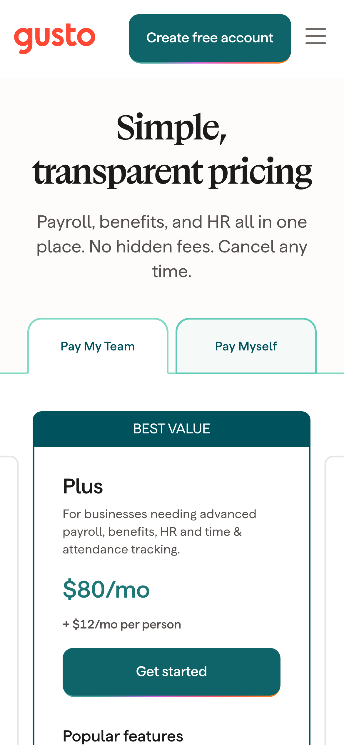
The first screen of each page at desktop size, with the phone view in the corner. Open one to see the whole site, its palette, fonts and sections.

Before you build
A checklist for your pricing page
- Give every plan a distinct audience and one primary action.
- Show the billing unit, annual or monthly state and meaningful limits beside each price.
- Make the recommended plan clear without hiding the free or lower-cost route.
- Give enterprise buyers a direct sales path and explain what is custom.
- Use comparison details and FAQs to answer objections after the first plan decision.
Full SaaS pricing page captures — FAQ
What should a pricing page include?
Clear plan names, prices, billing units, included limits, a primary action for each tier, and a route for enterprise or custom needs. A comparison table and focused FAQs can answer the questions that do not fit in the cards.
How do I design a SaaS pricing page?
Start by naming the job of each plan, put the price next to its unit, highlight one recommended route, and make the free or trial path easy to find. Add usage limits, annual billing context and a sales route before the detailed comparison.
Should a pricing page show monthly and annual prices?
Show both when the billing choice changes the decision. Label the active state, make the saving understandable, and avoid showing an annual price without explaining when the charge occurs.
Related
- Reviewed pricing page and table examples →
- Sign-up page examples →
- Landing page examples →
- Website design inspiration →
Screenshots show third-party pages for reference and remain their owners' work. Observations describe the captured first screens; they are editorial, not measured conversion results.