
22 reviewed pages · Checked
Sign-up page design examples
Real sign-up and create-account pages from software products, finance and creator tools. Study how each page explains value, reduces form effort, handles verification and moves a new account toward its first useful action.
What we saw
4 patterns across 22 pages
- Put the value near the account action
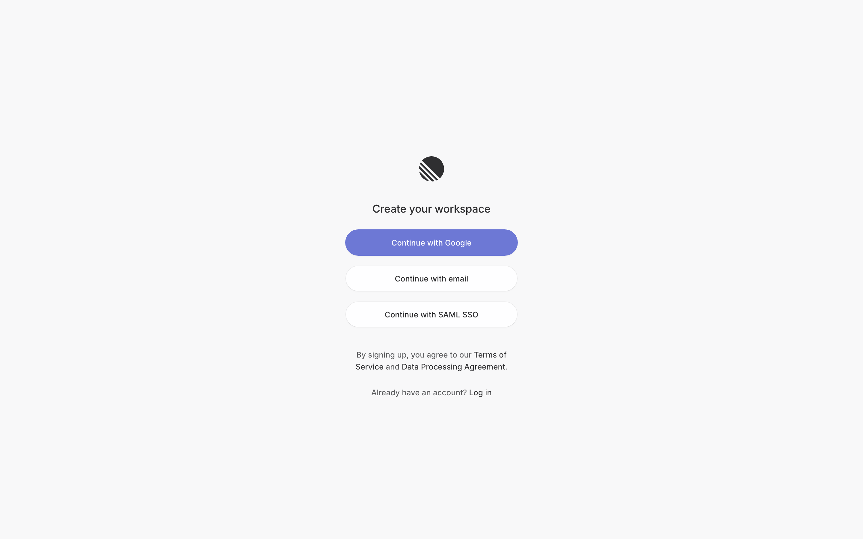
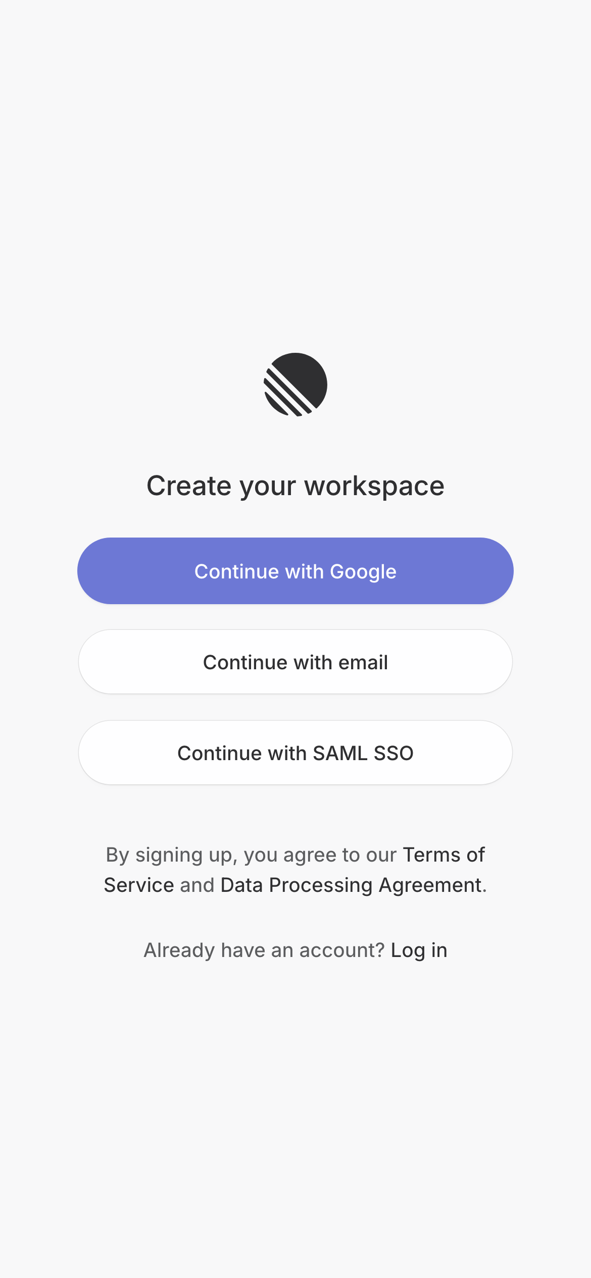
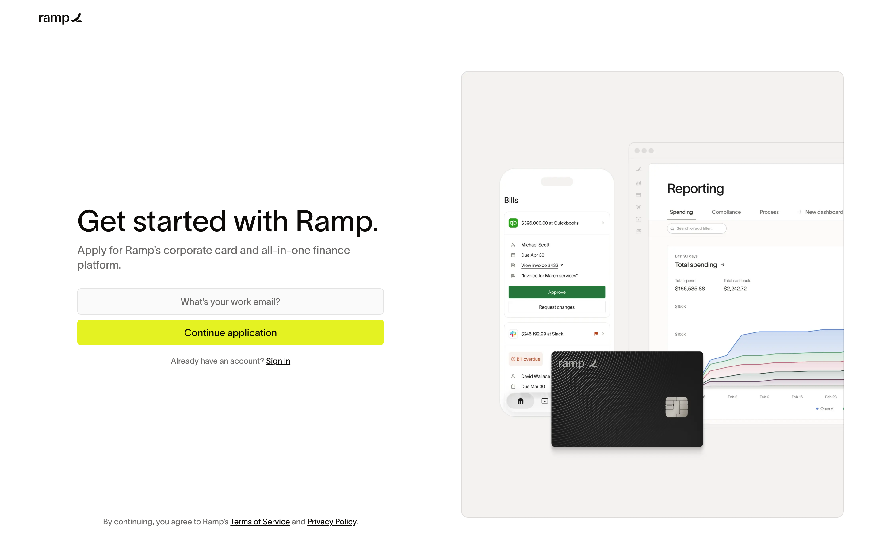
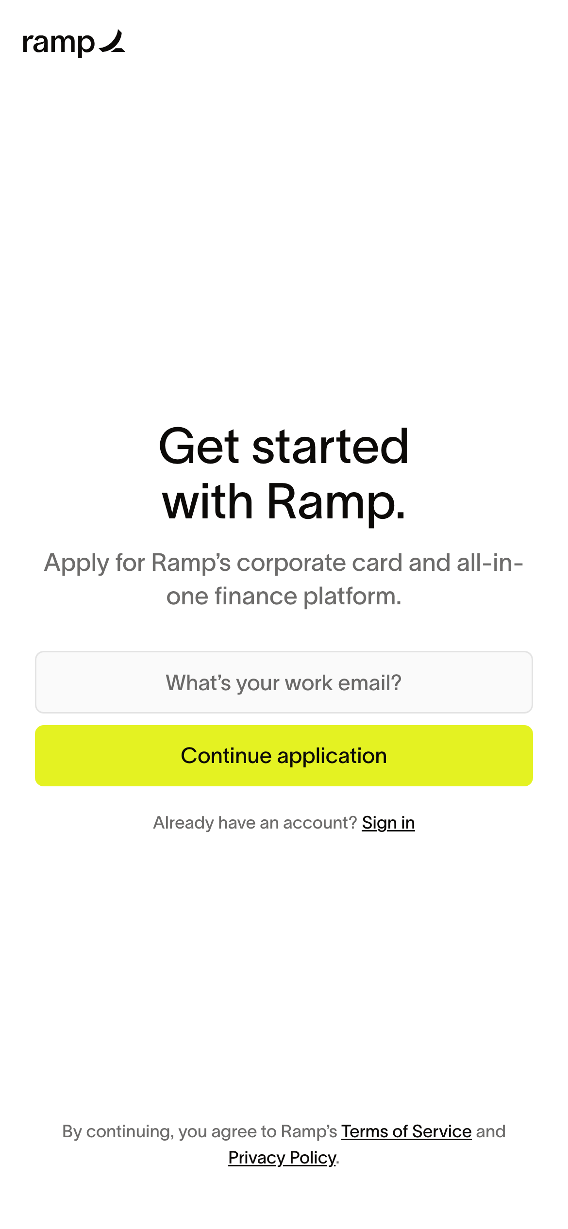
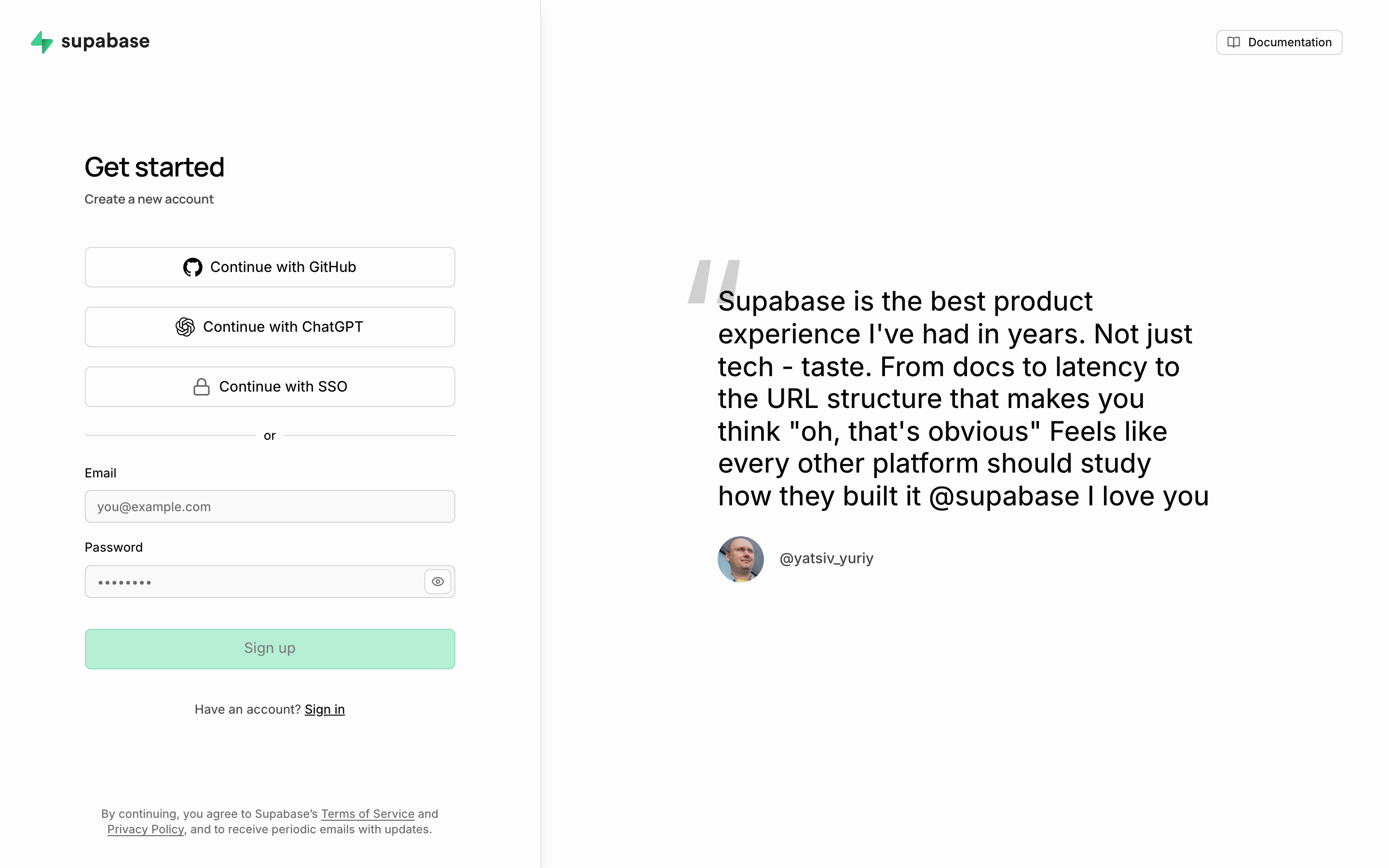
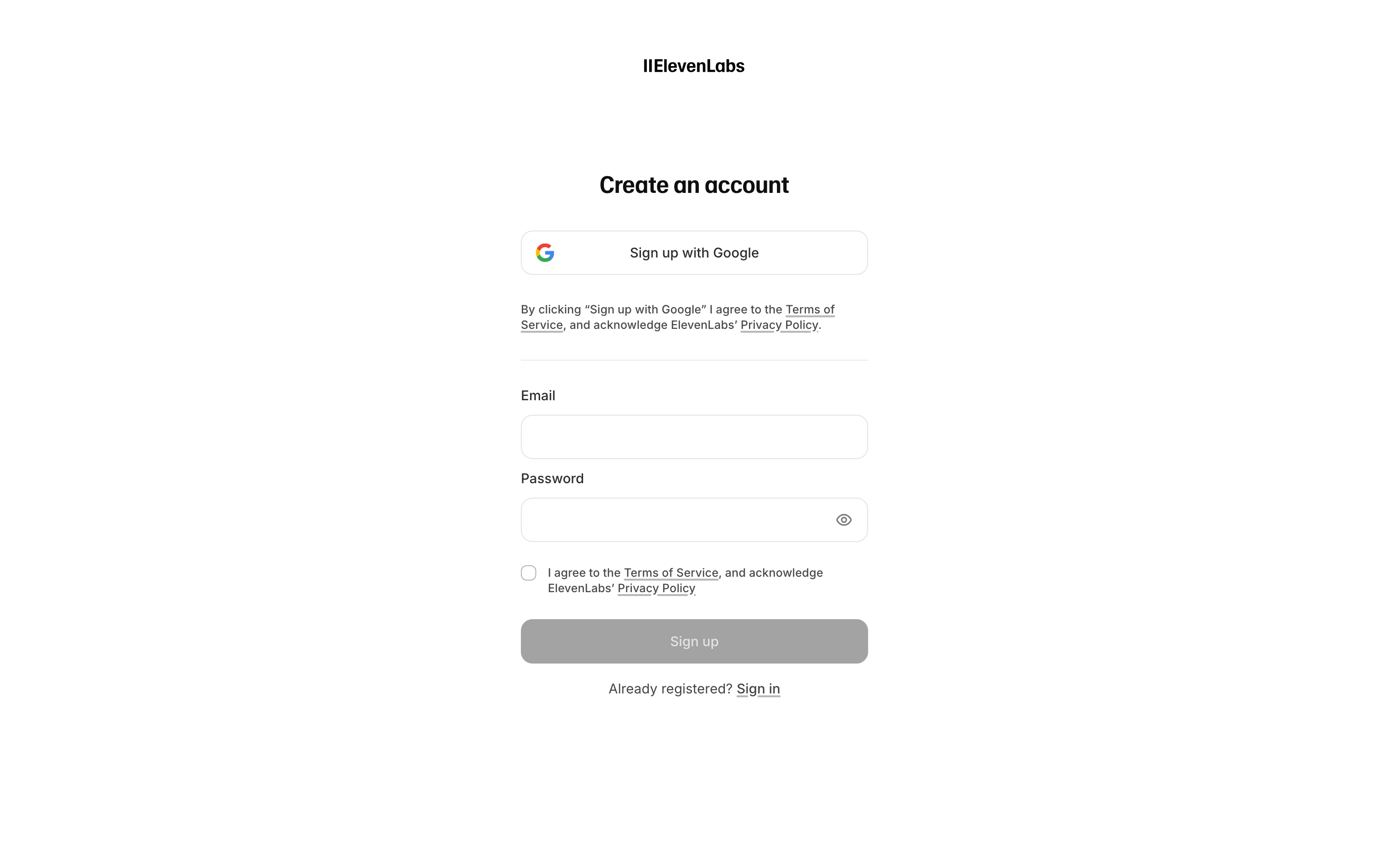
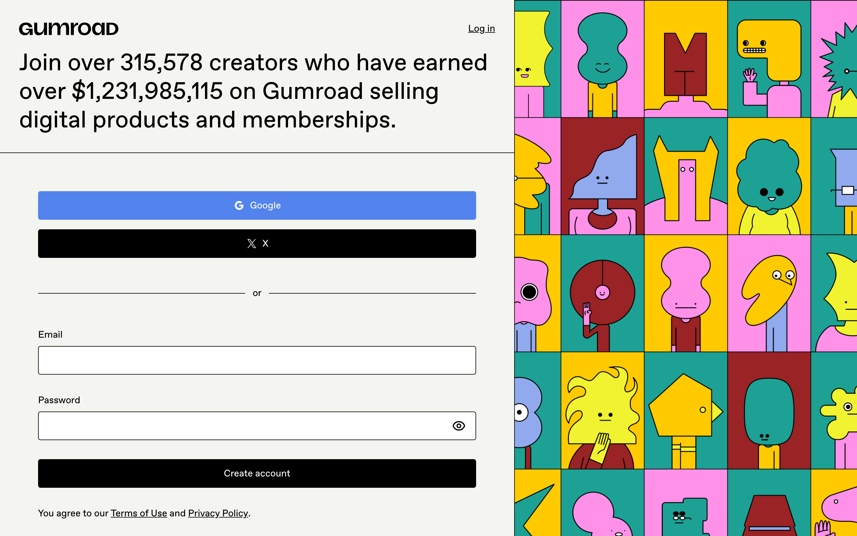
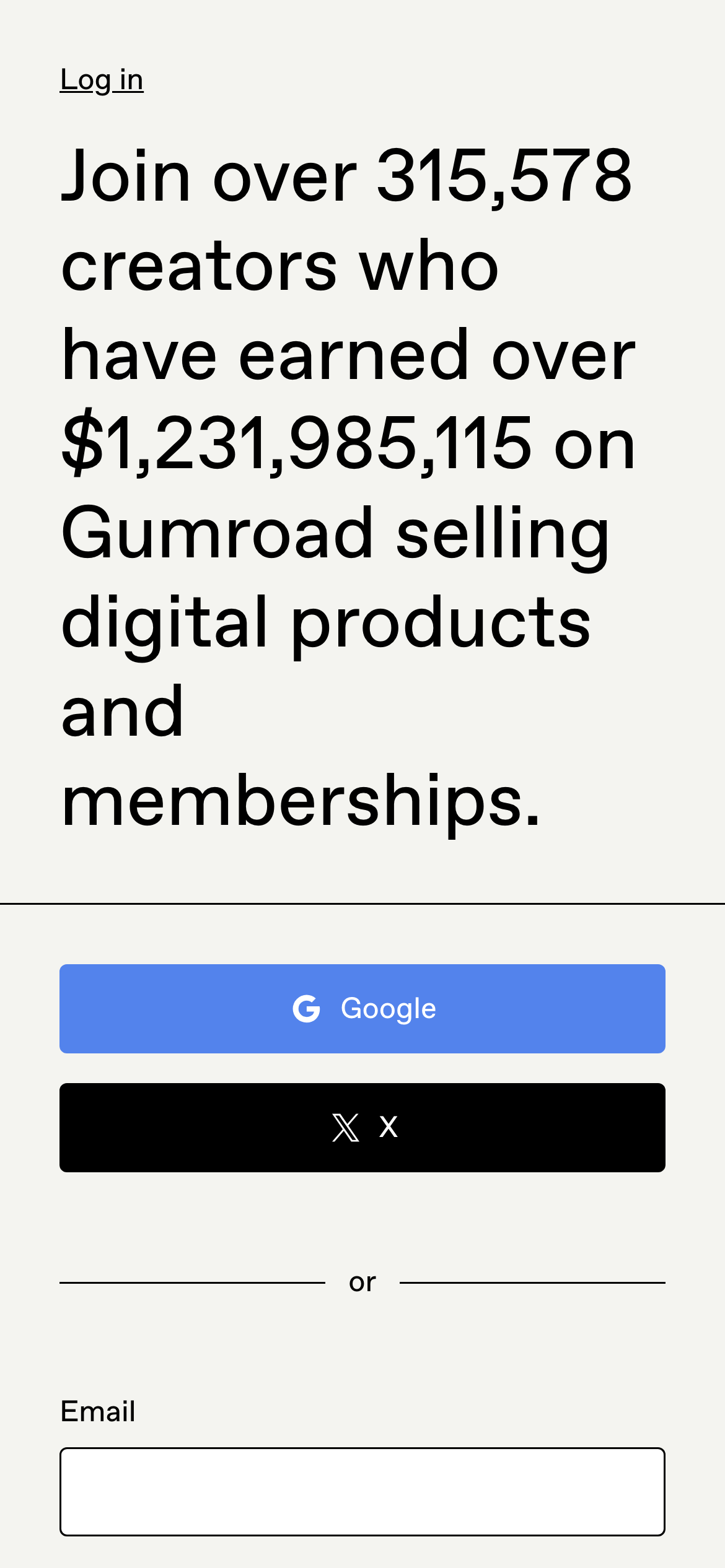
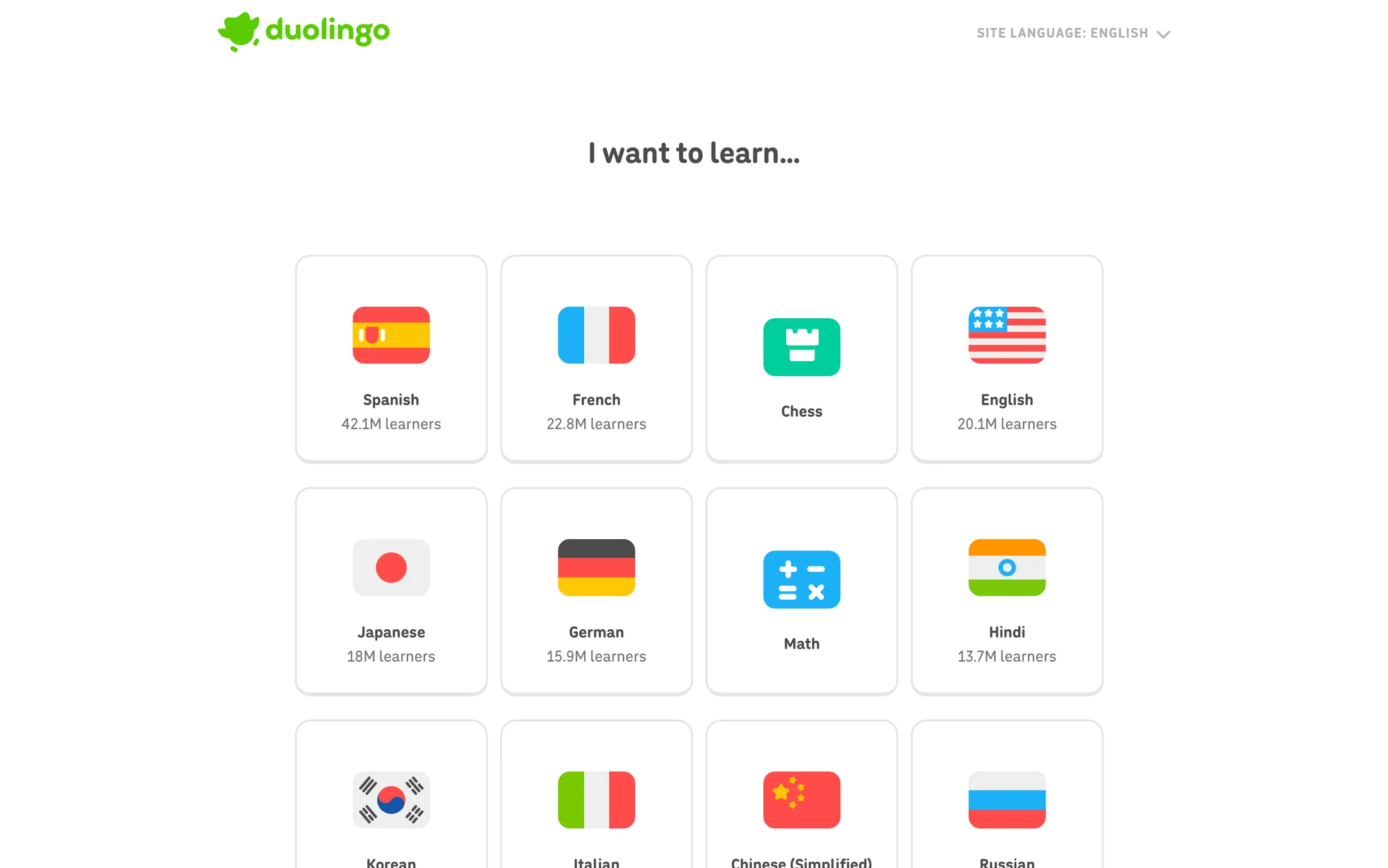
- A sign-up page has to answer why someone should continue before it asks for more information. Product promise, plan context and the first action work best when they share the first view. Examples: Linear, Ramp, Supabase, ElevenLabs, Gumroad, Duolingo.
- Ask for the minimum first
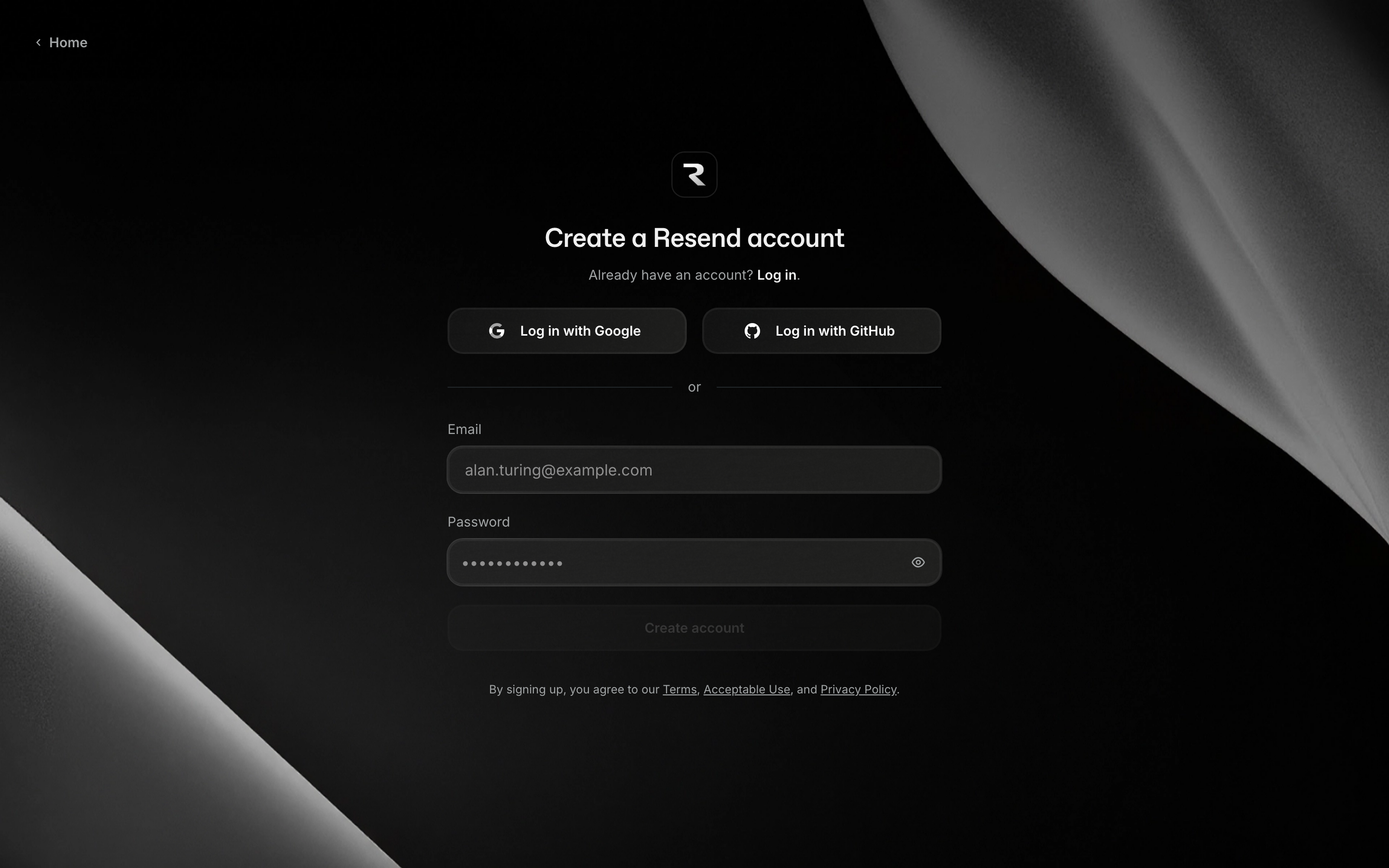
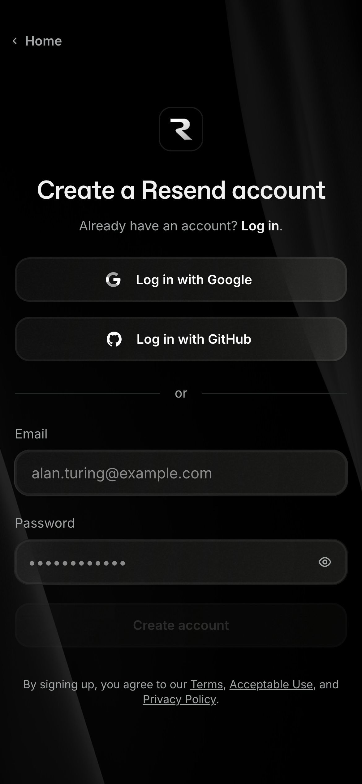
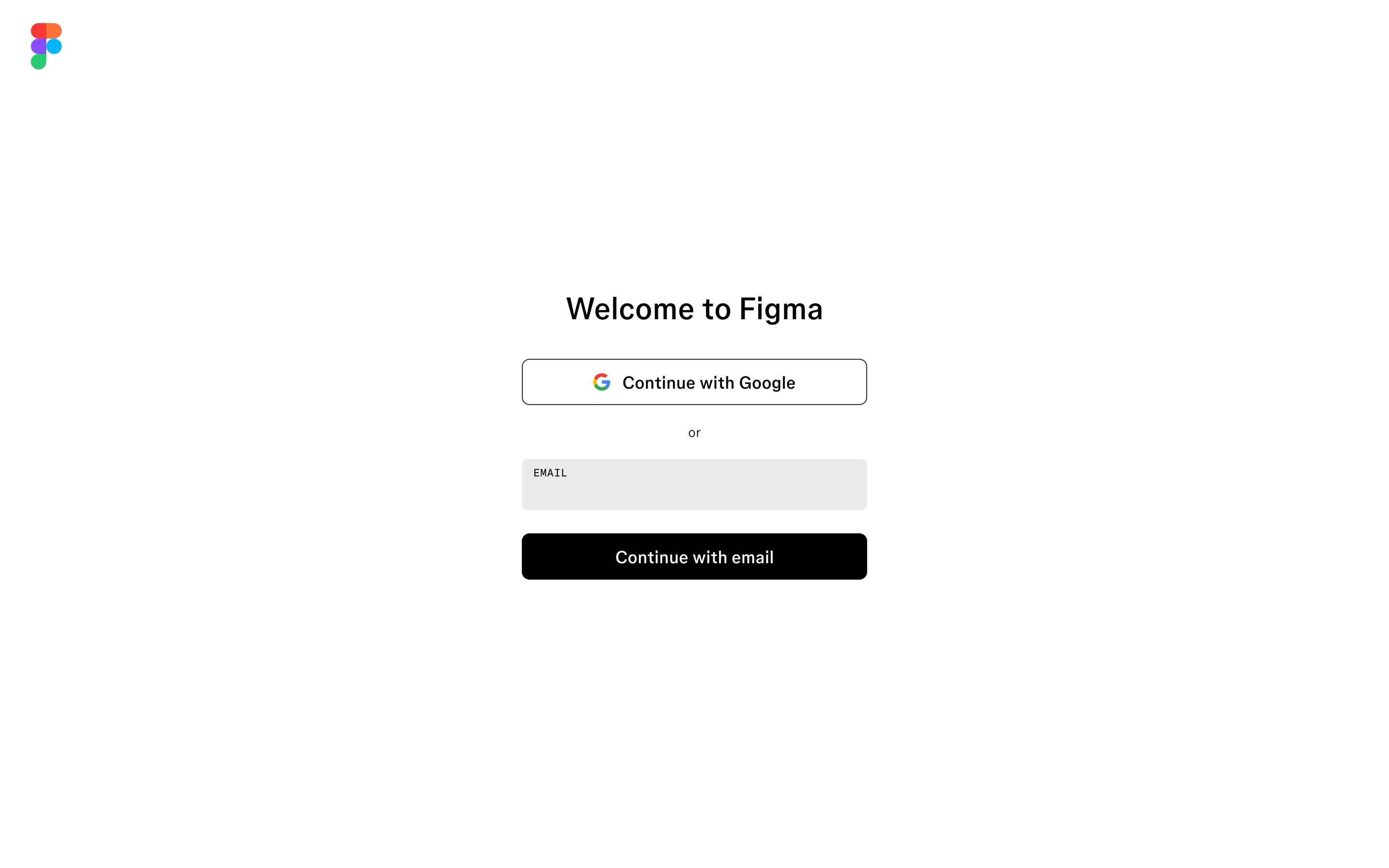
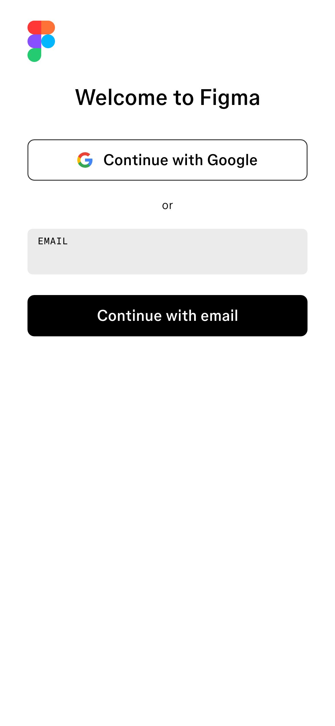
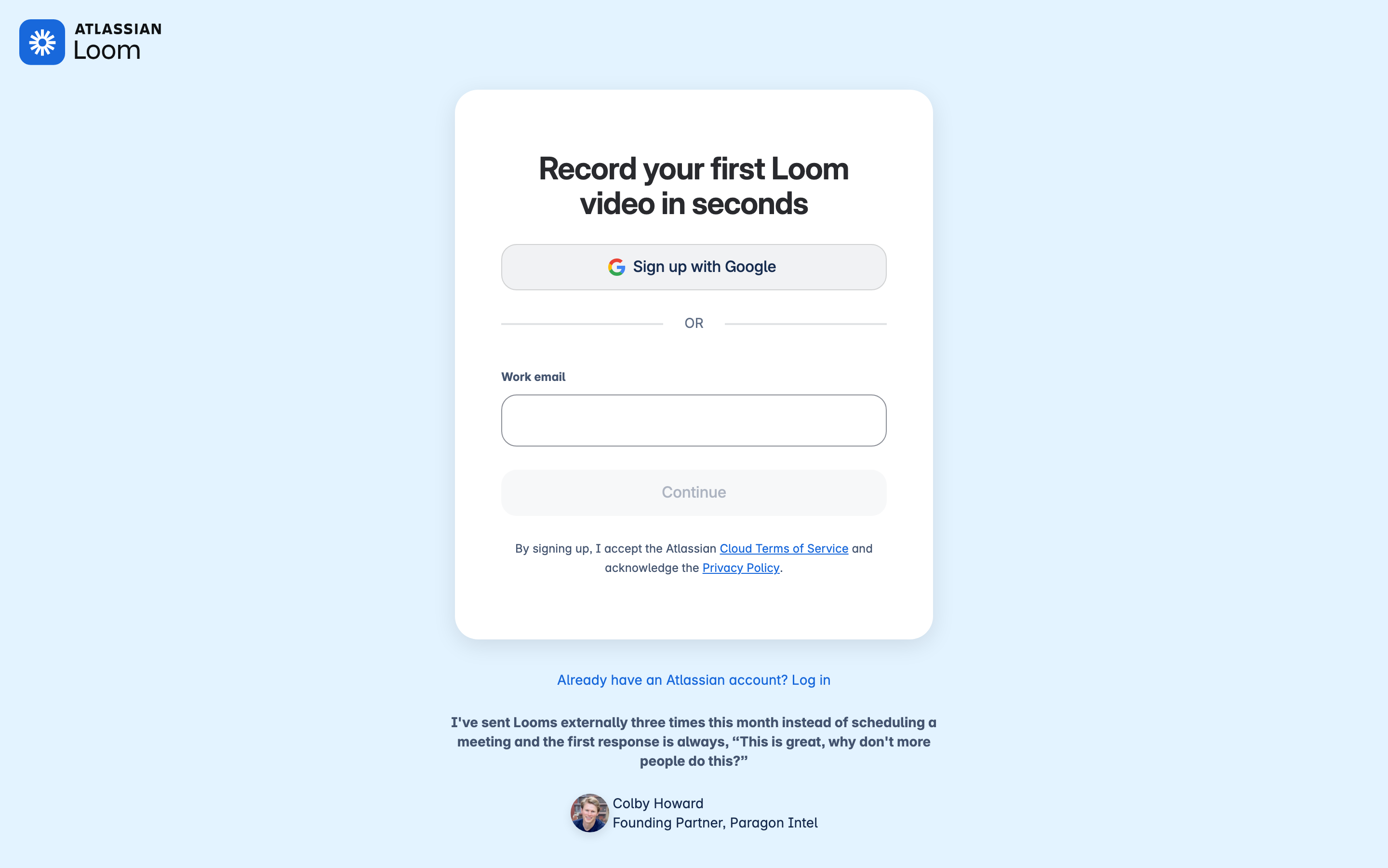
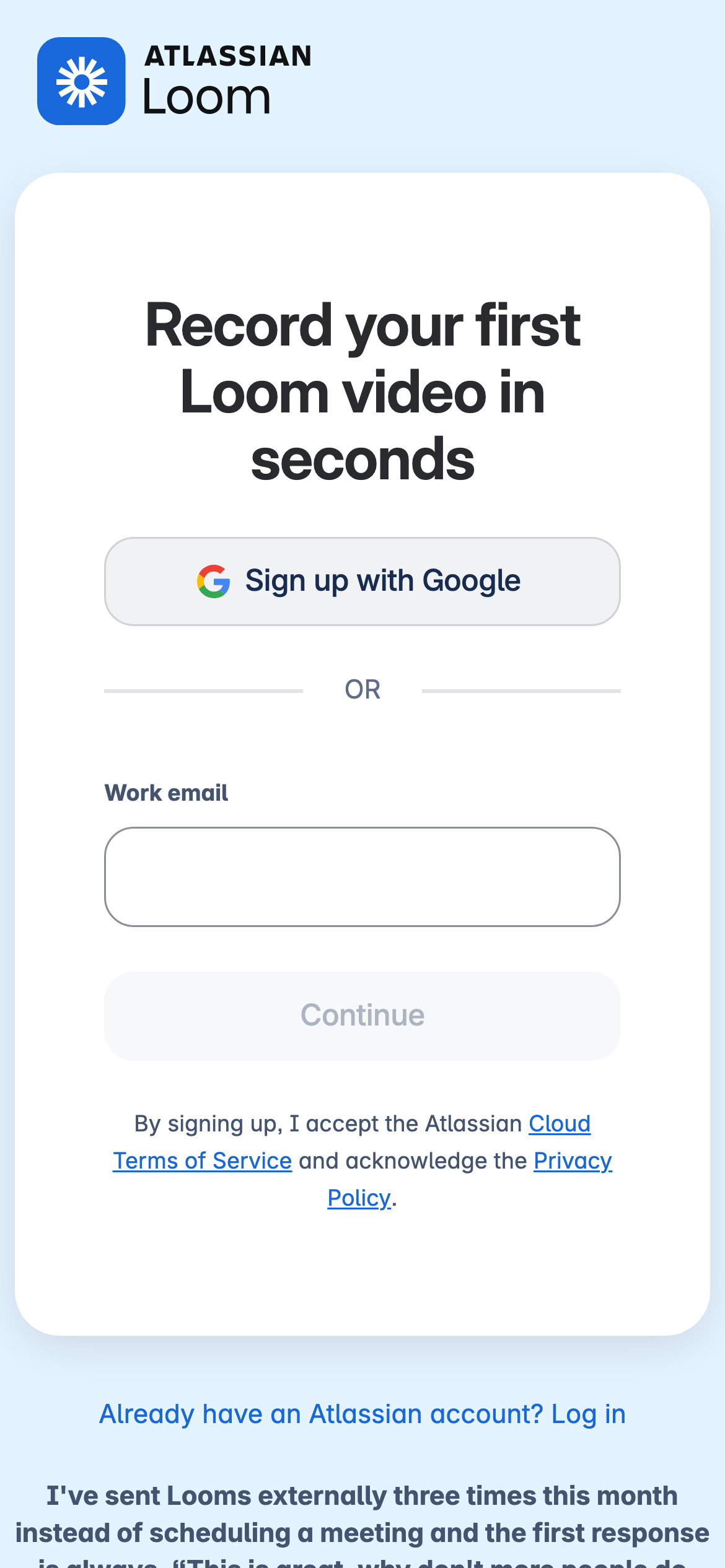
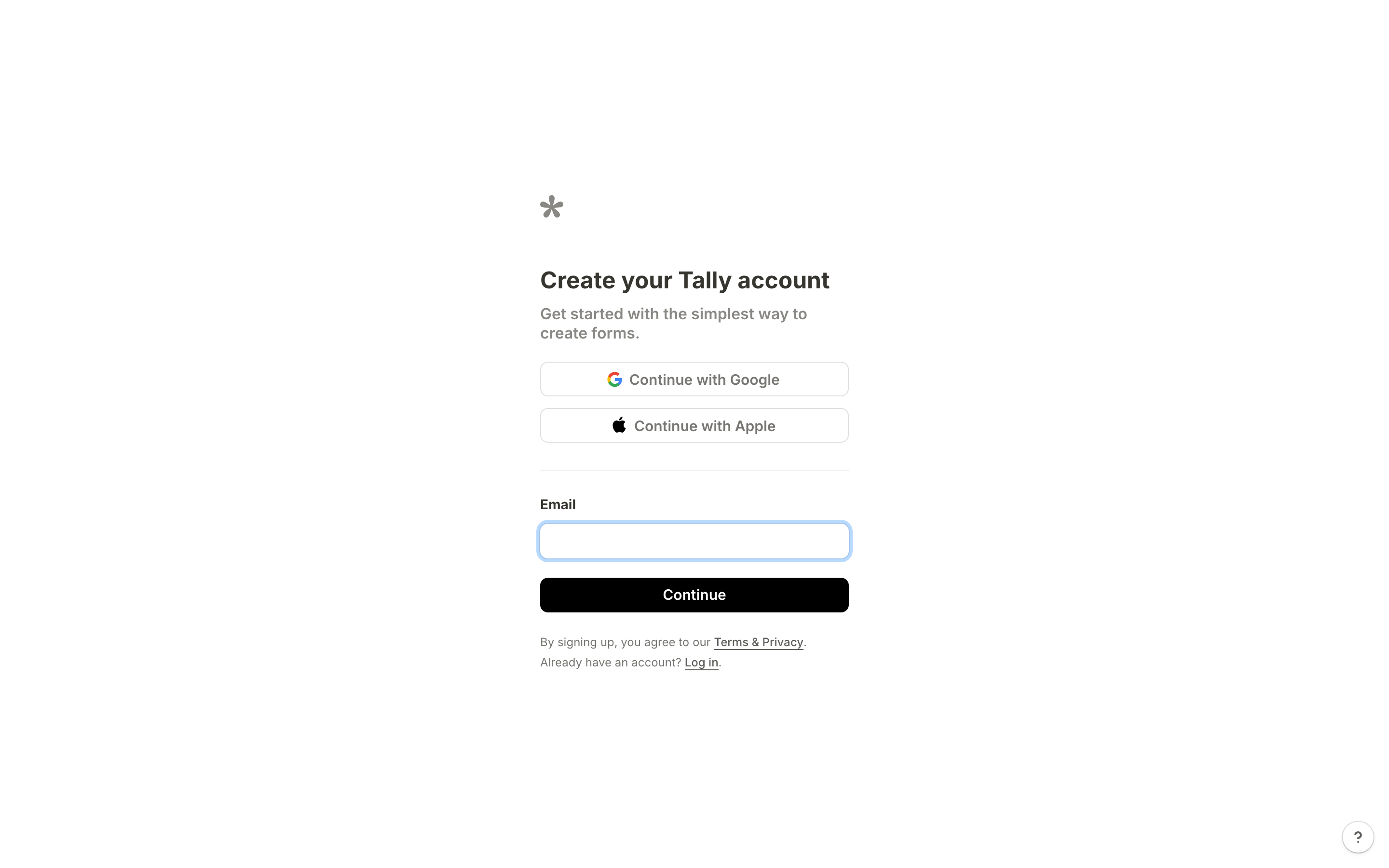
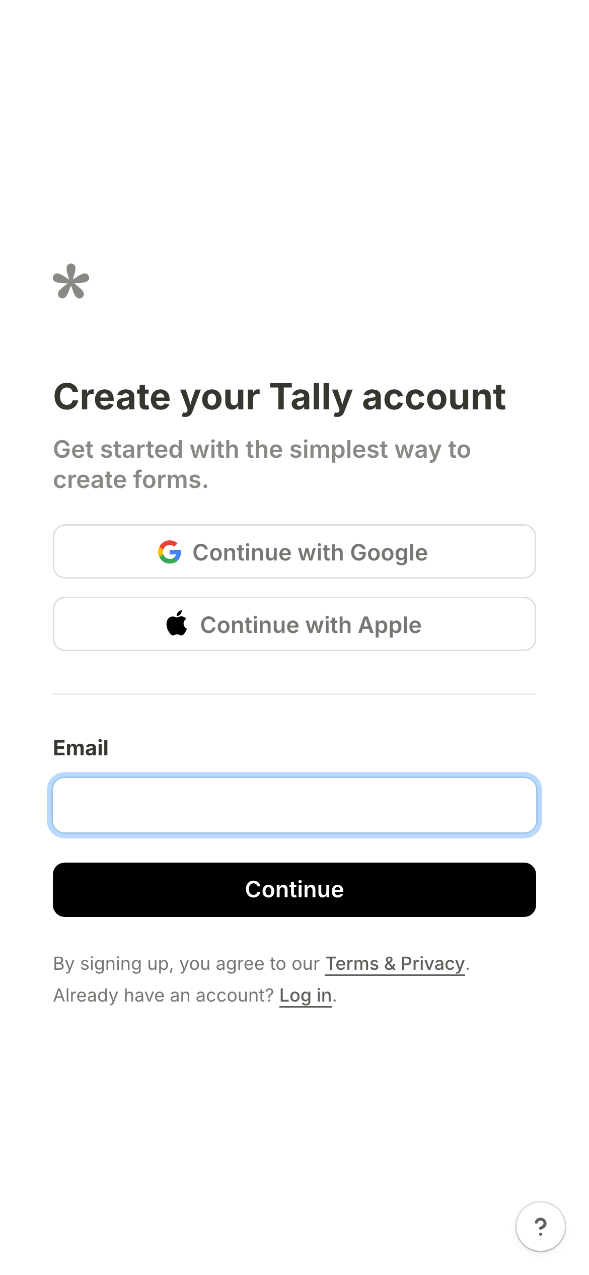
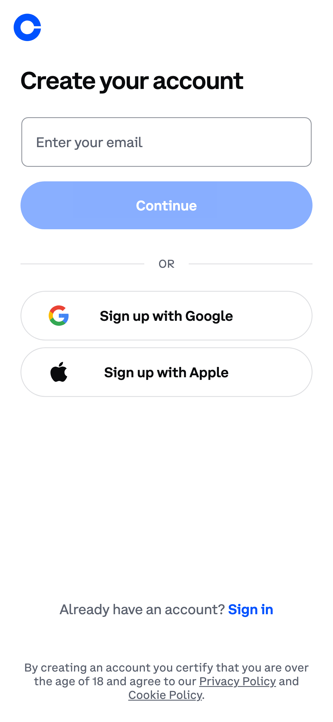
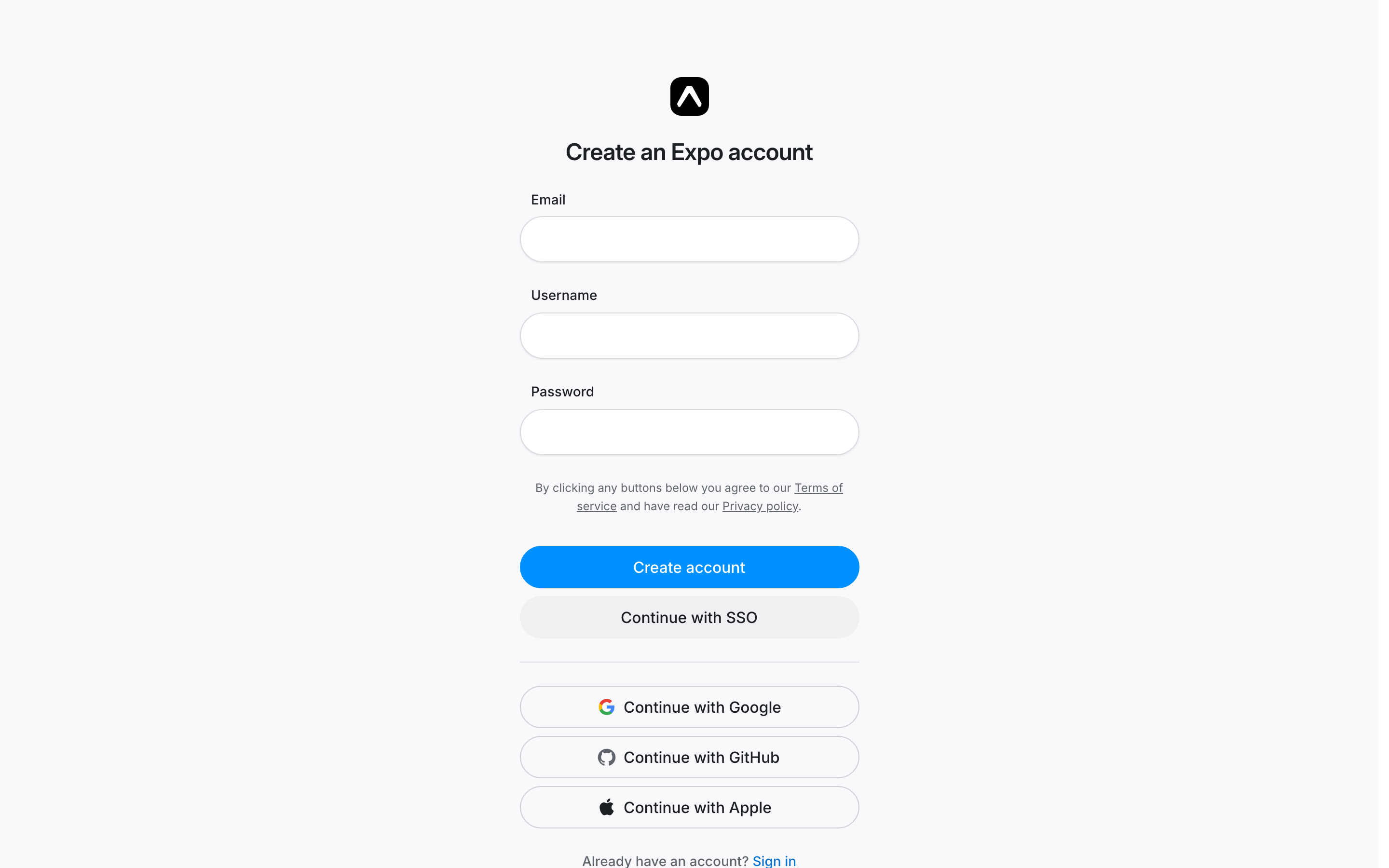
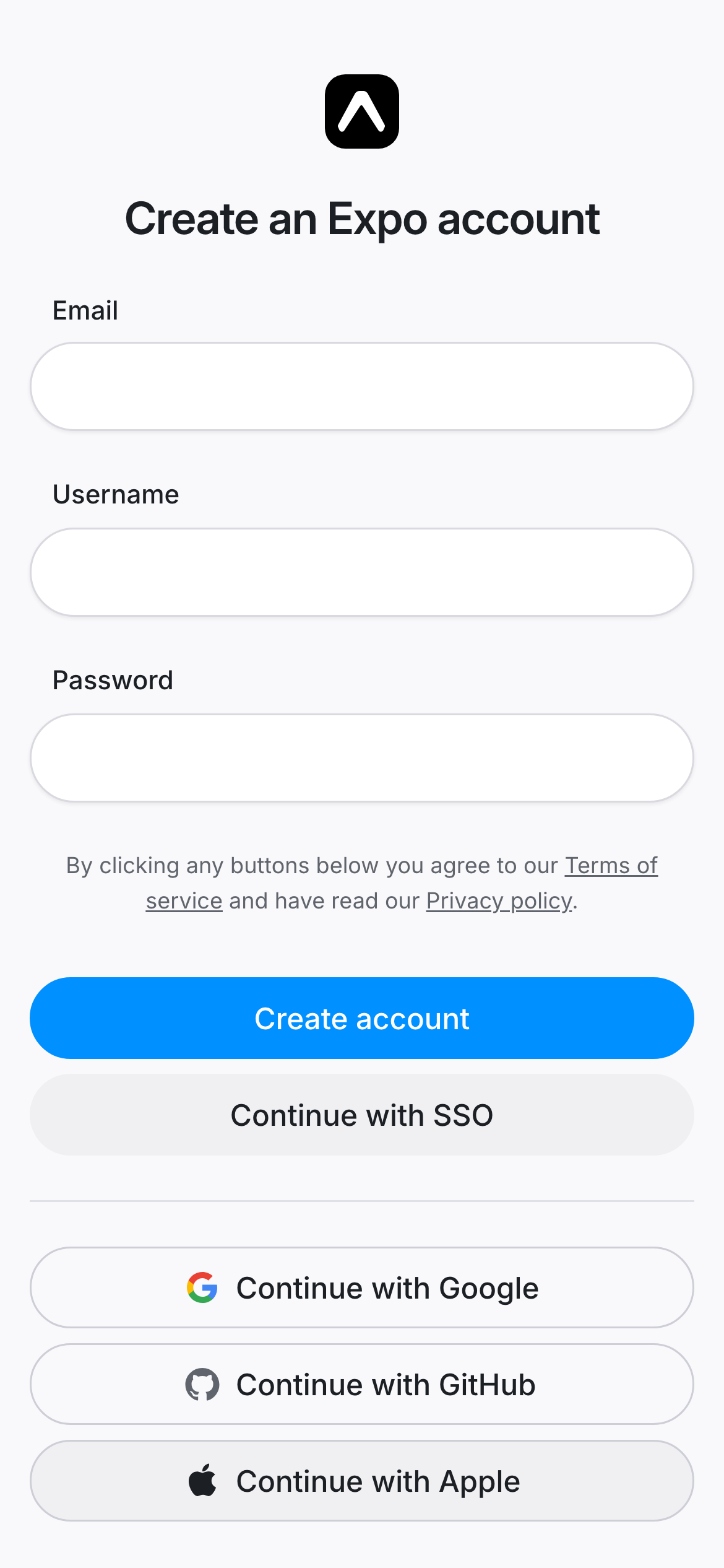
- The most focused forms start with an email or one identity route, then collect workspace, profile or billing details after the account exists. Fewer visible decisions make the first step easier to understand. Examples: Resend, Figma, Loom, Liveblocks, Tally, Expo.
- Use trust where the risk appears
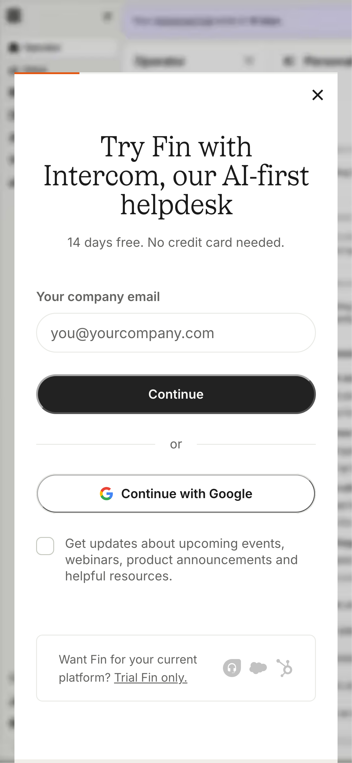
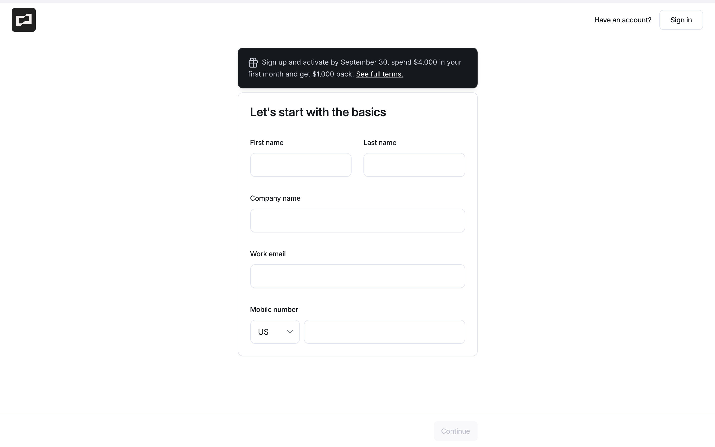
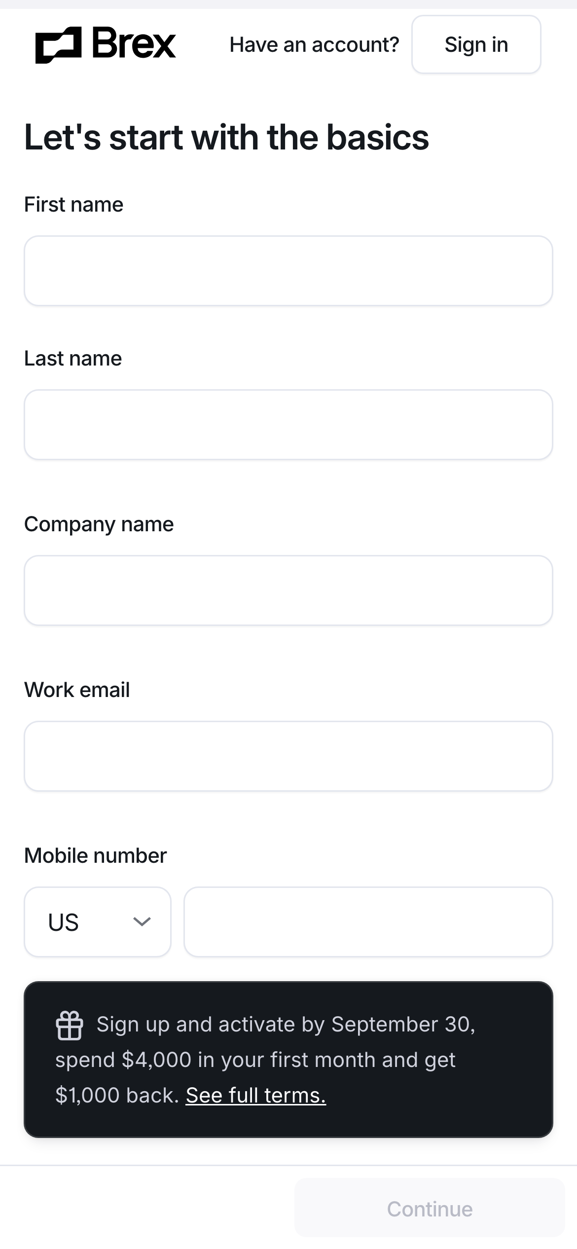
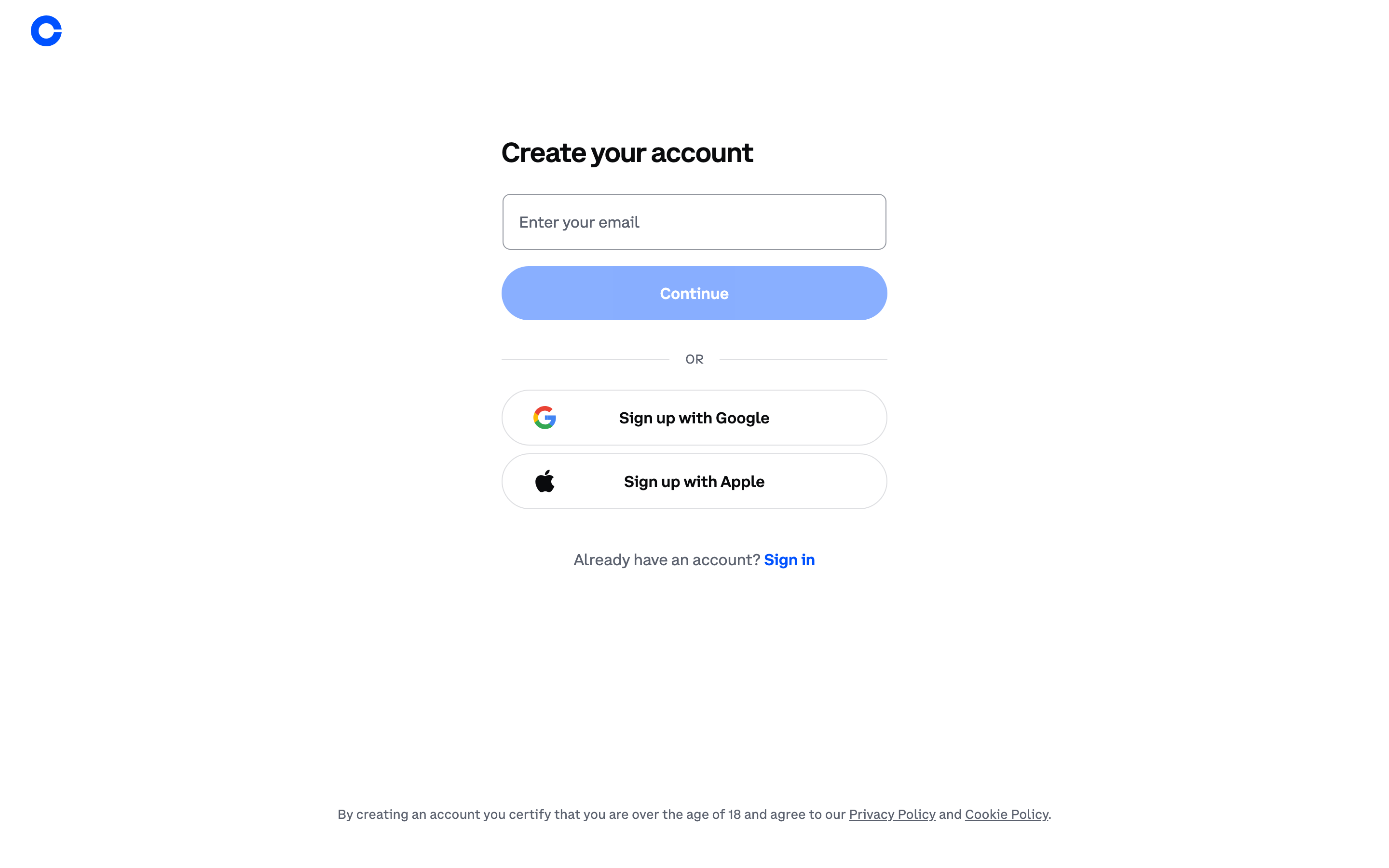
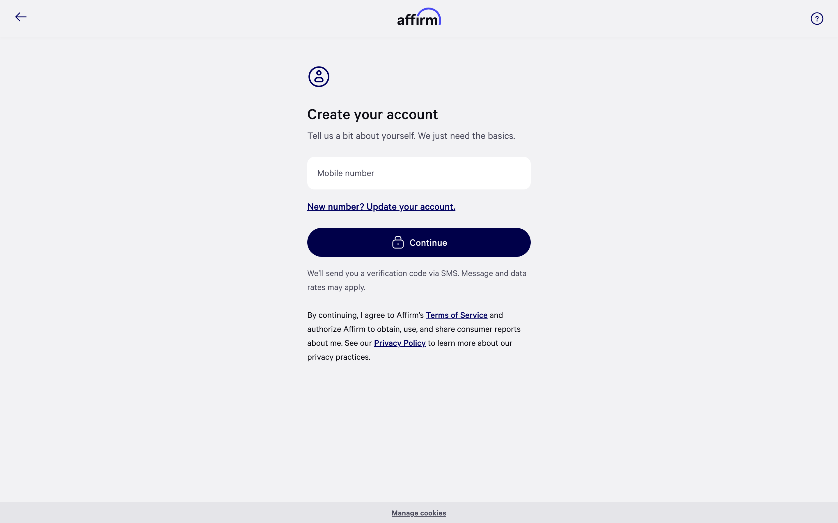
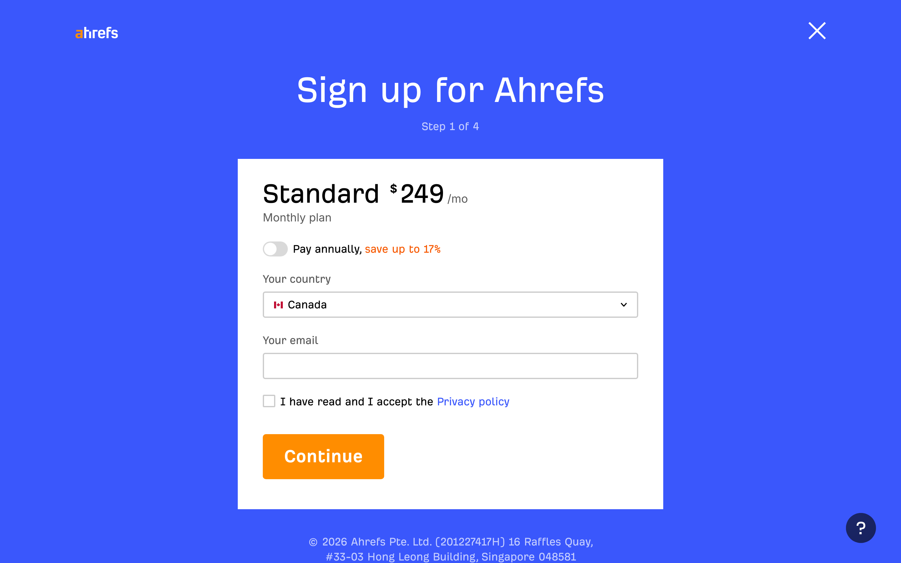
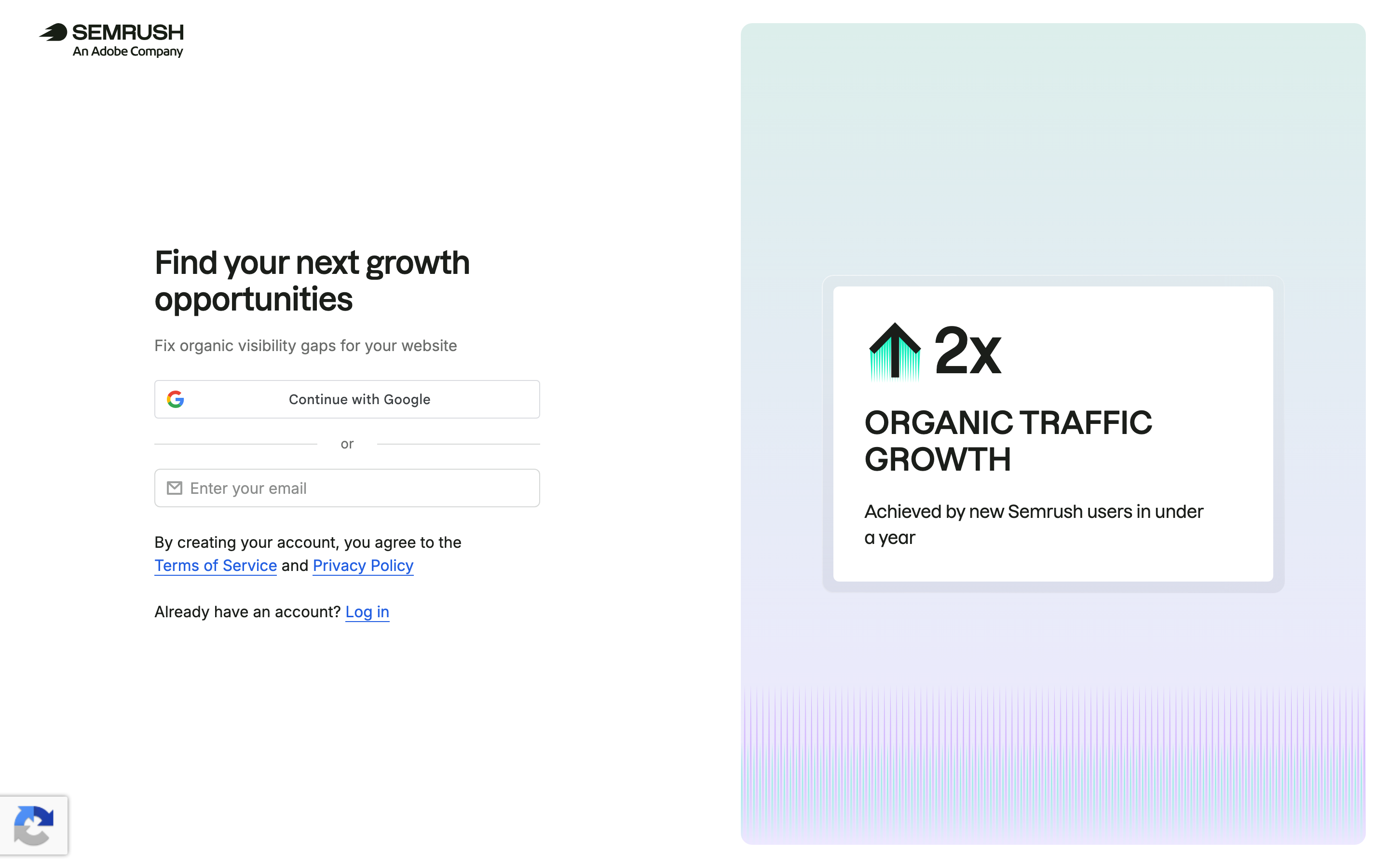
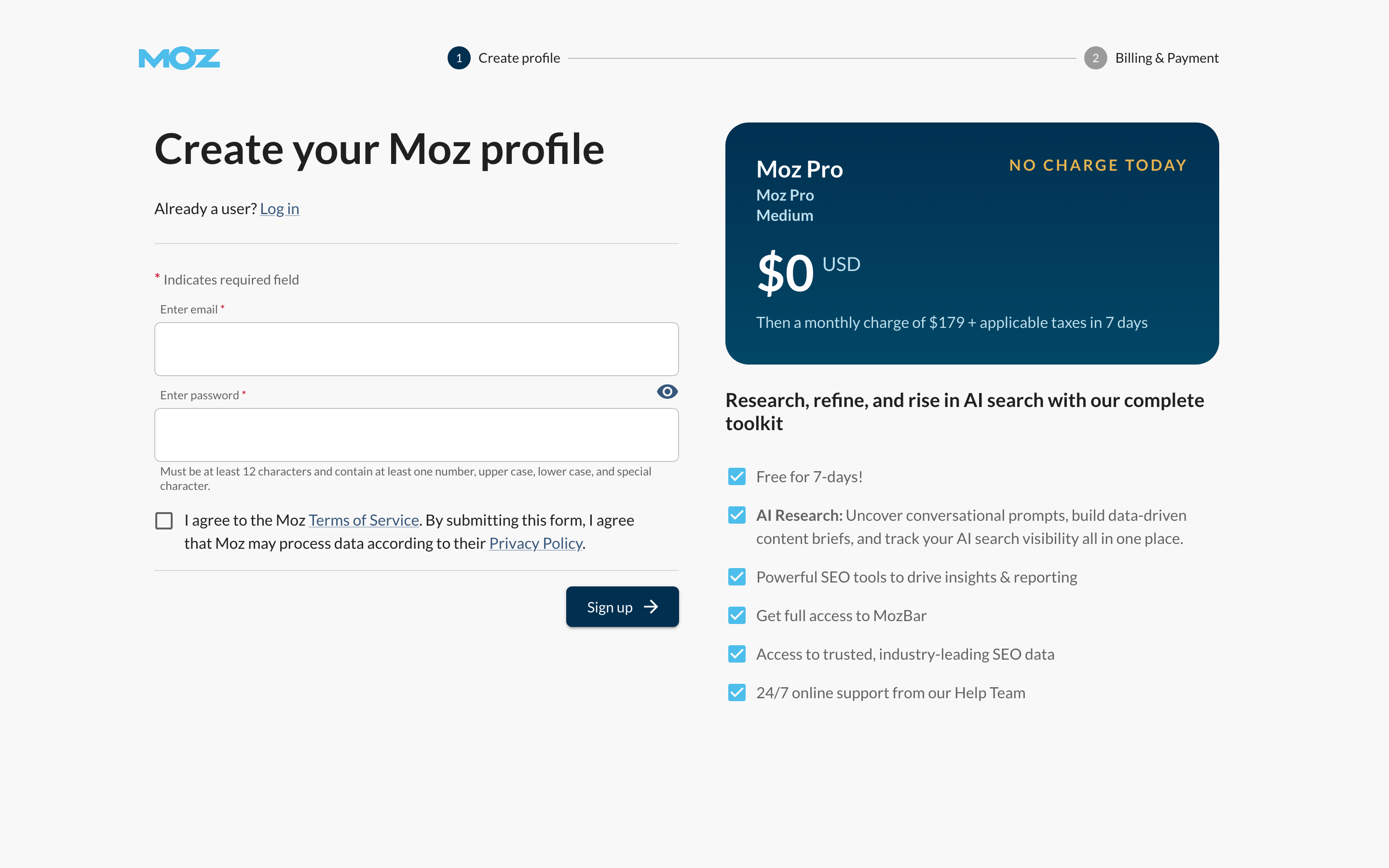
- Security, terms, trial limits and card requirements belong beside the action that creates the account. A short explanation is more useful than burying all conditions below the fold. Examples: Ramp, Brex, Coinbase, Ahrefs, Semrush, Moz.
- Make verification recoverable
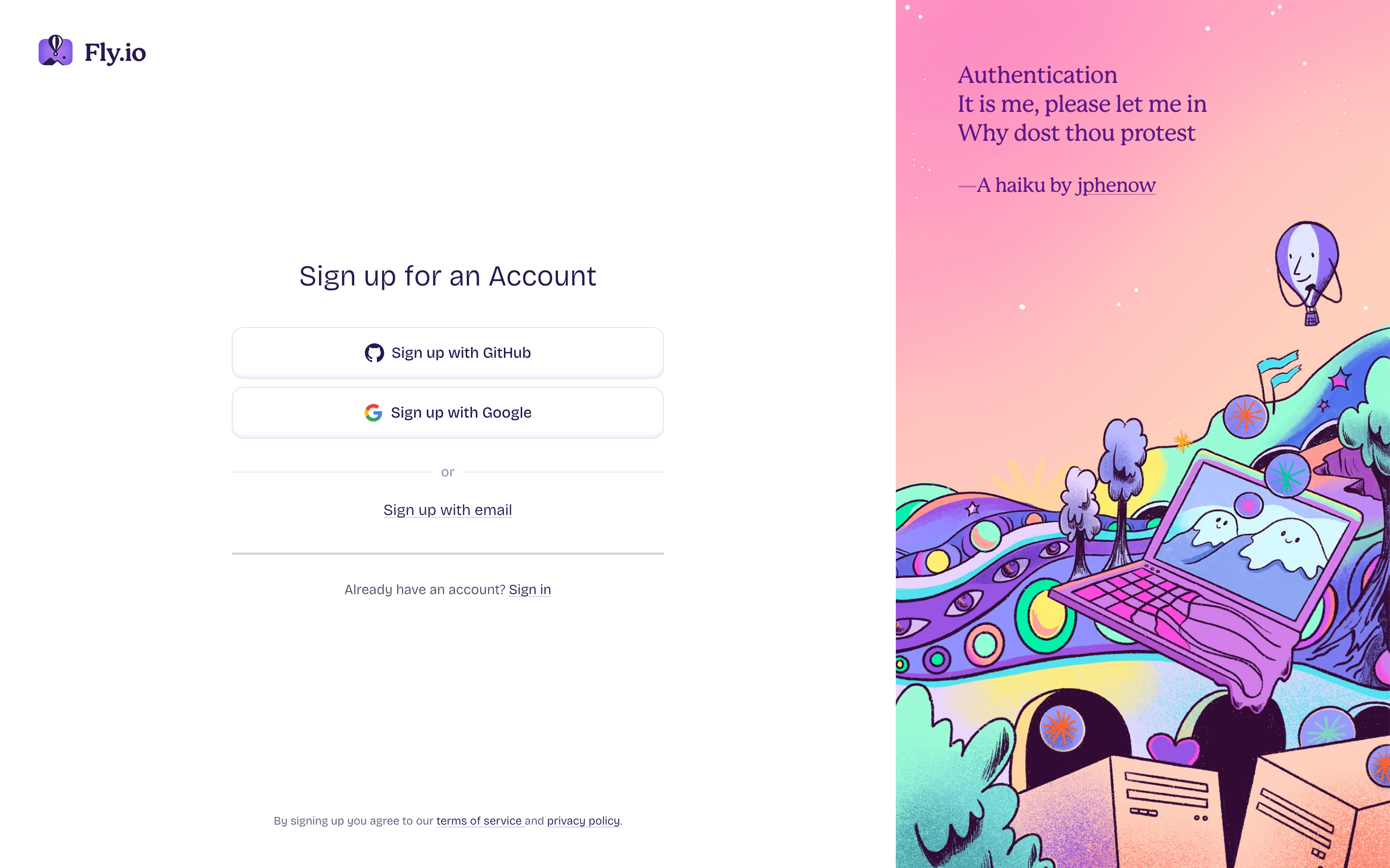
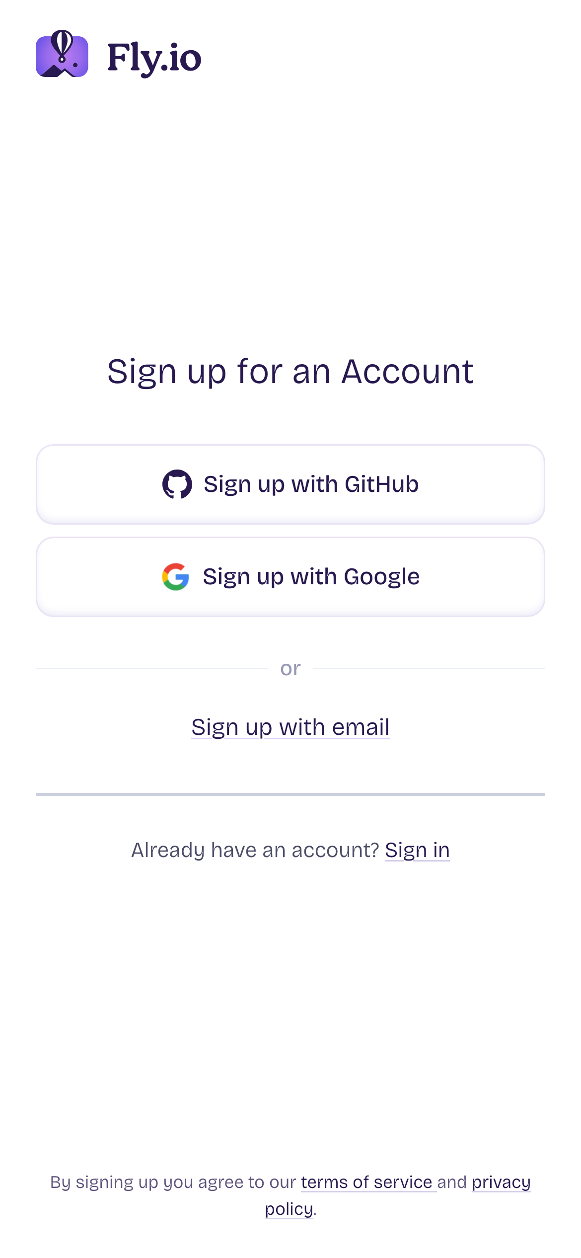
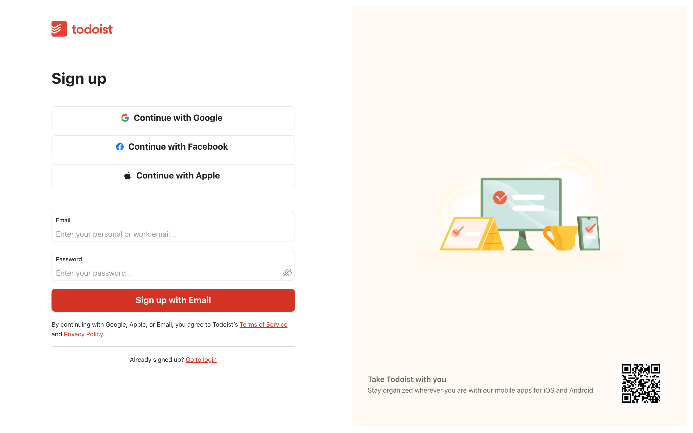
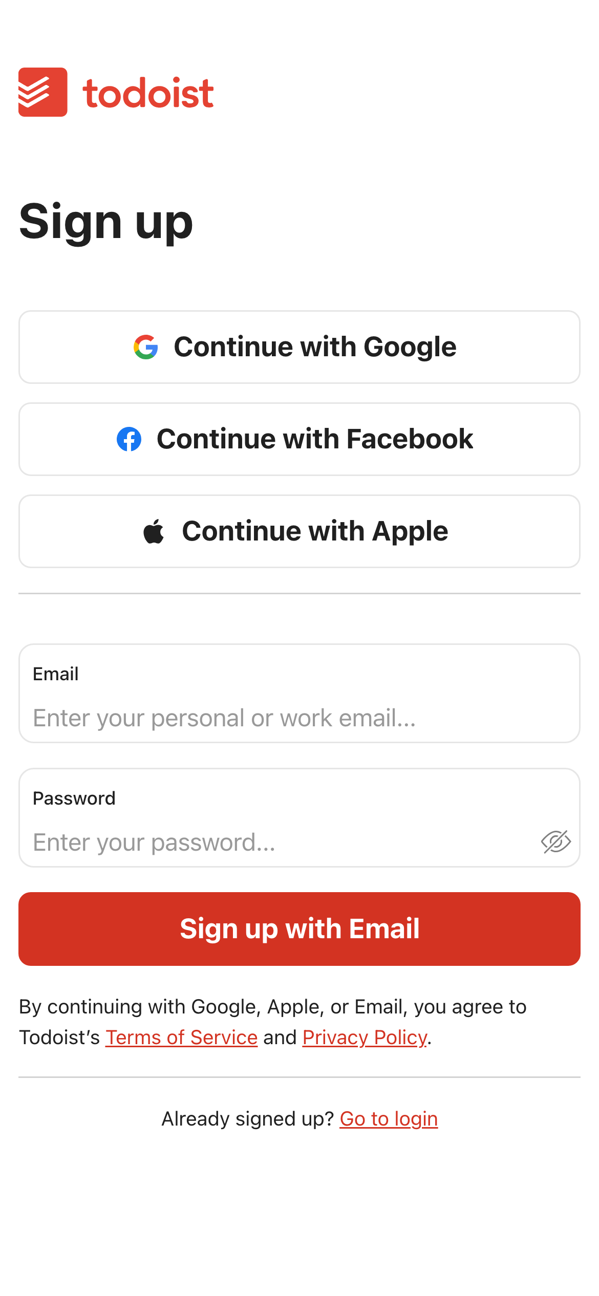
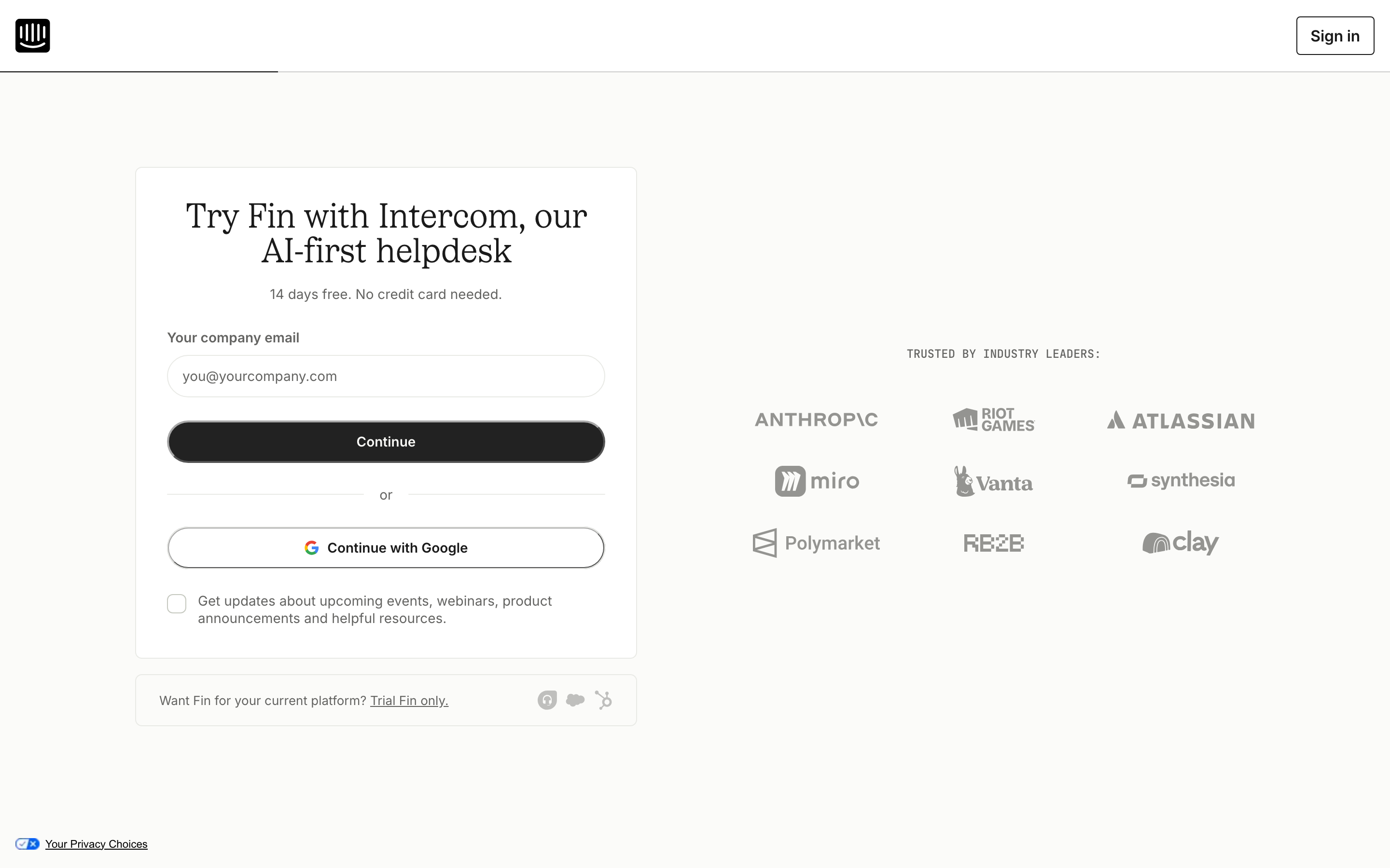
- Email codes, provider handoffs and account confirmation should preserve context and offer resend, change or return actions. A successful sign-up is more than a form that submits. Examples: Supabase, ElevenLabs, Fly.io, Todoist, Intercom.
All 22 examples
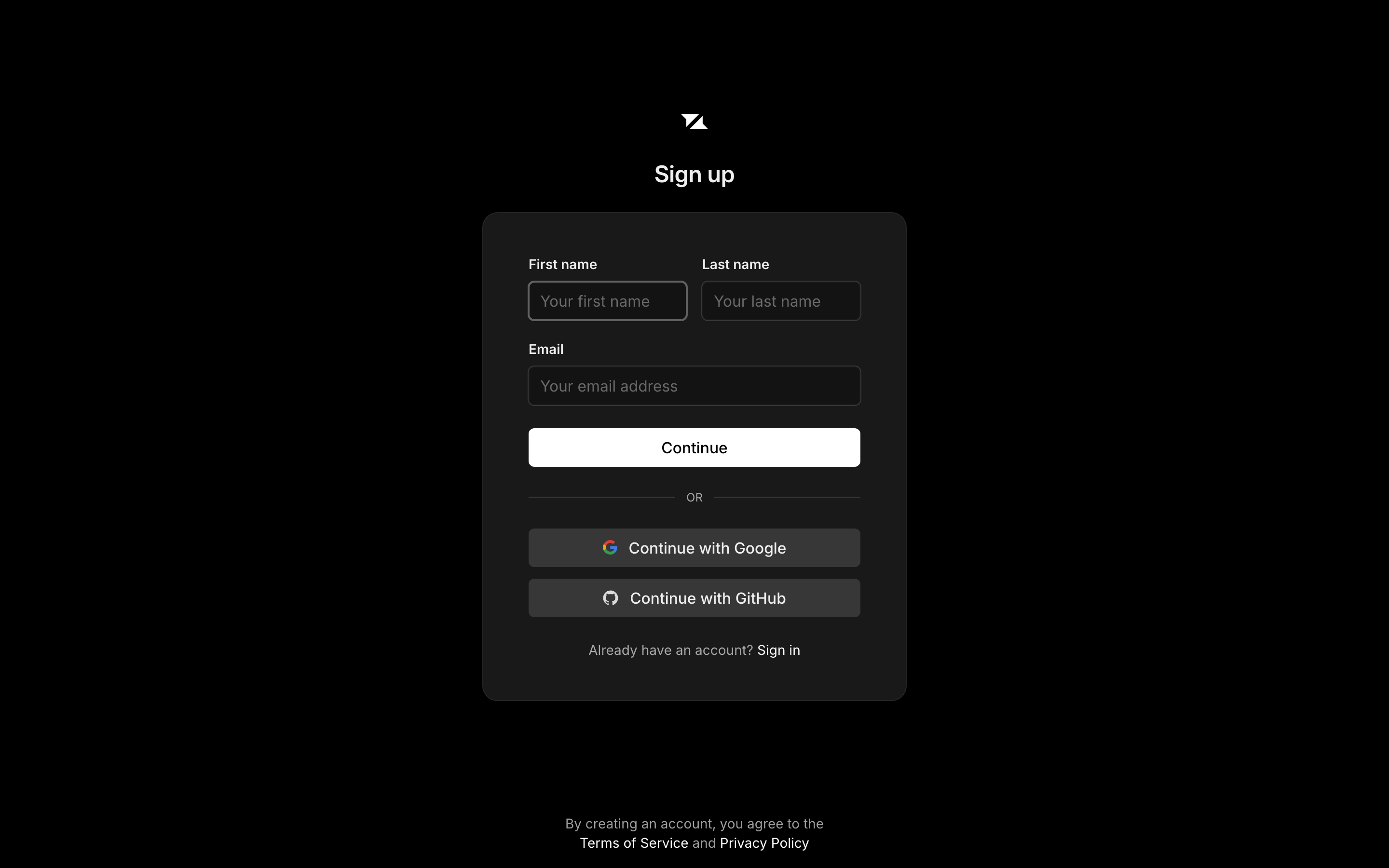
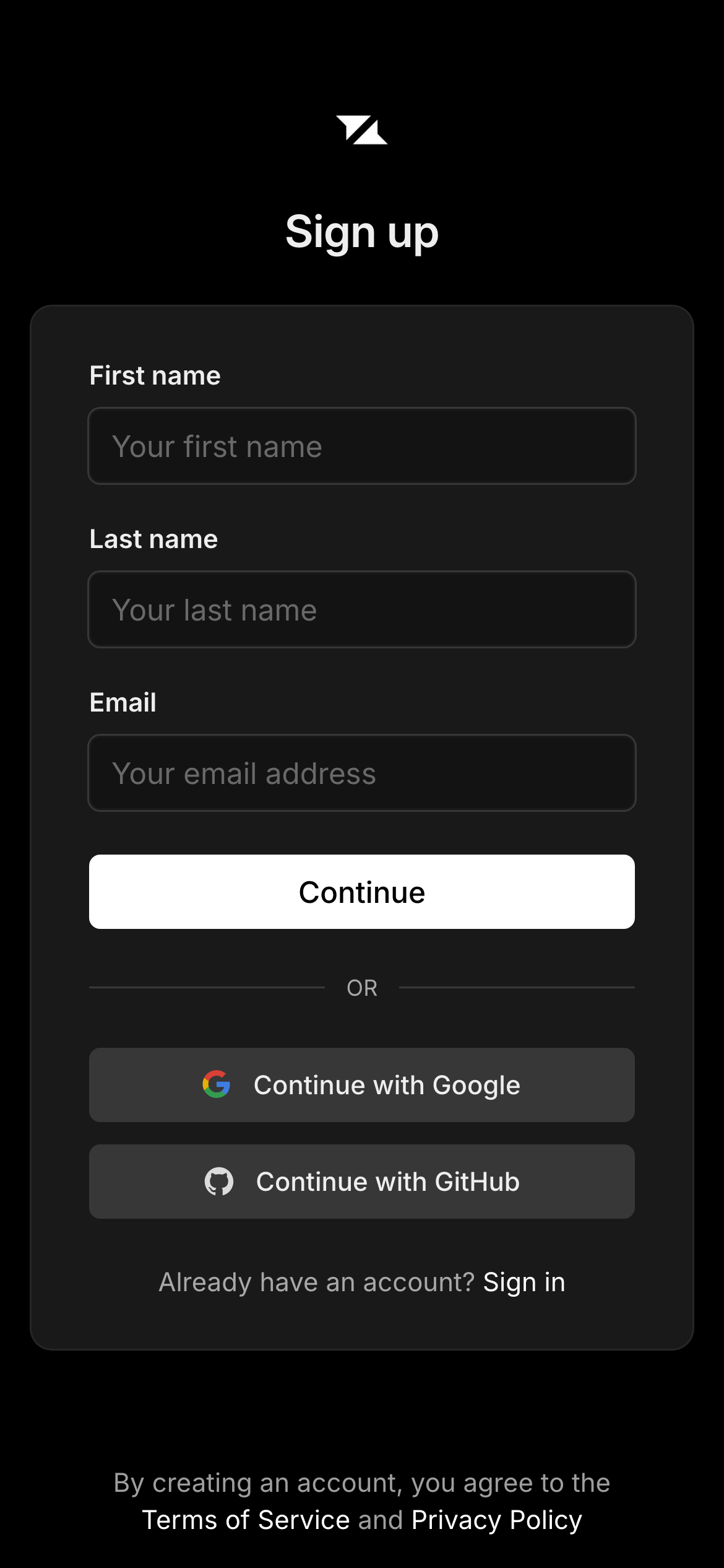
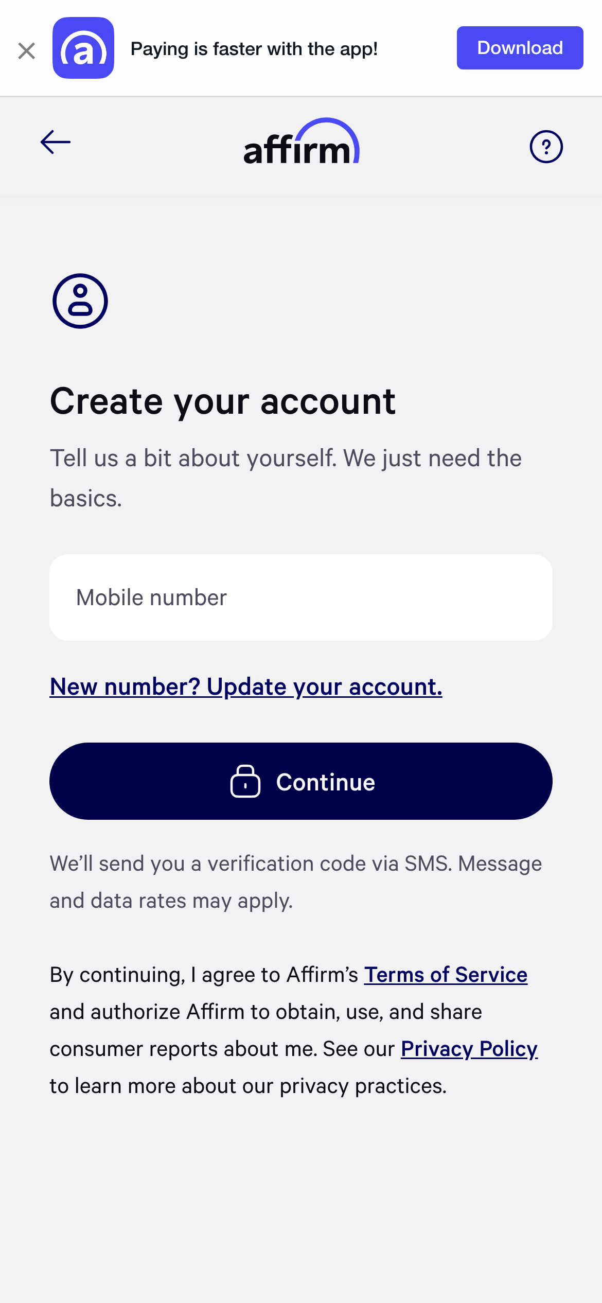
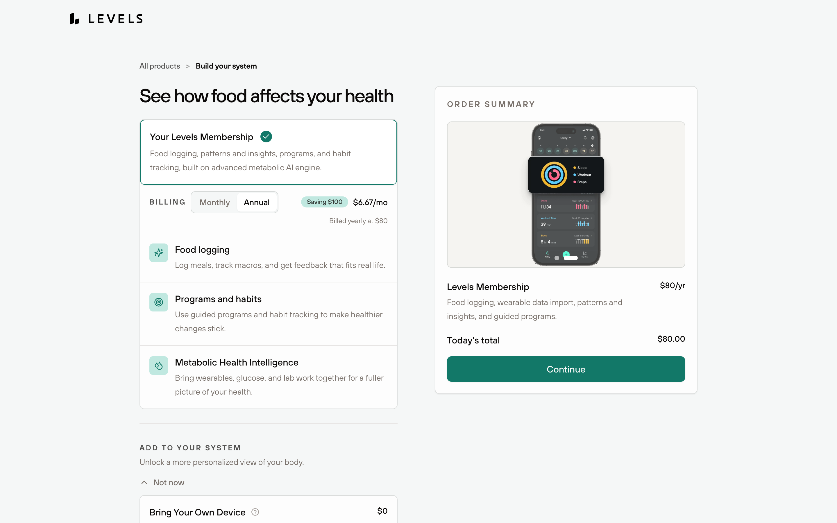
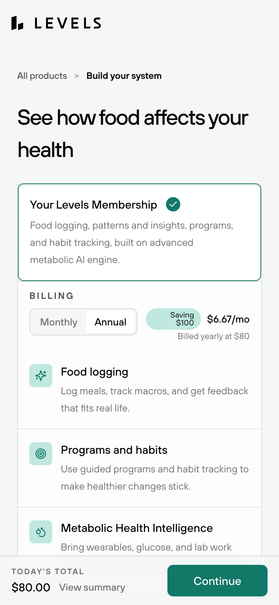
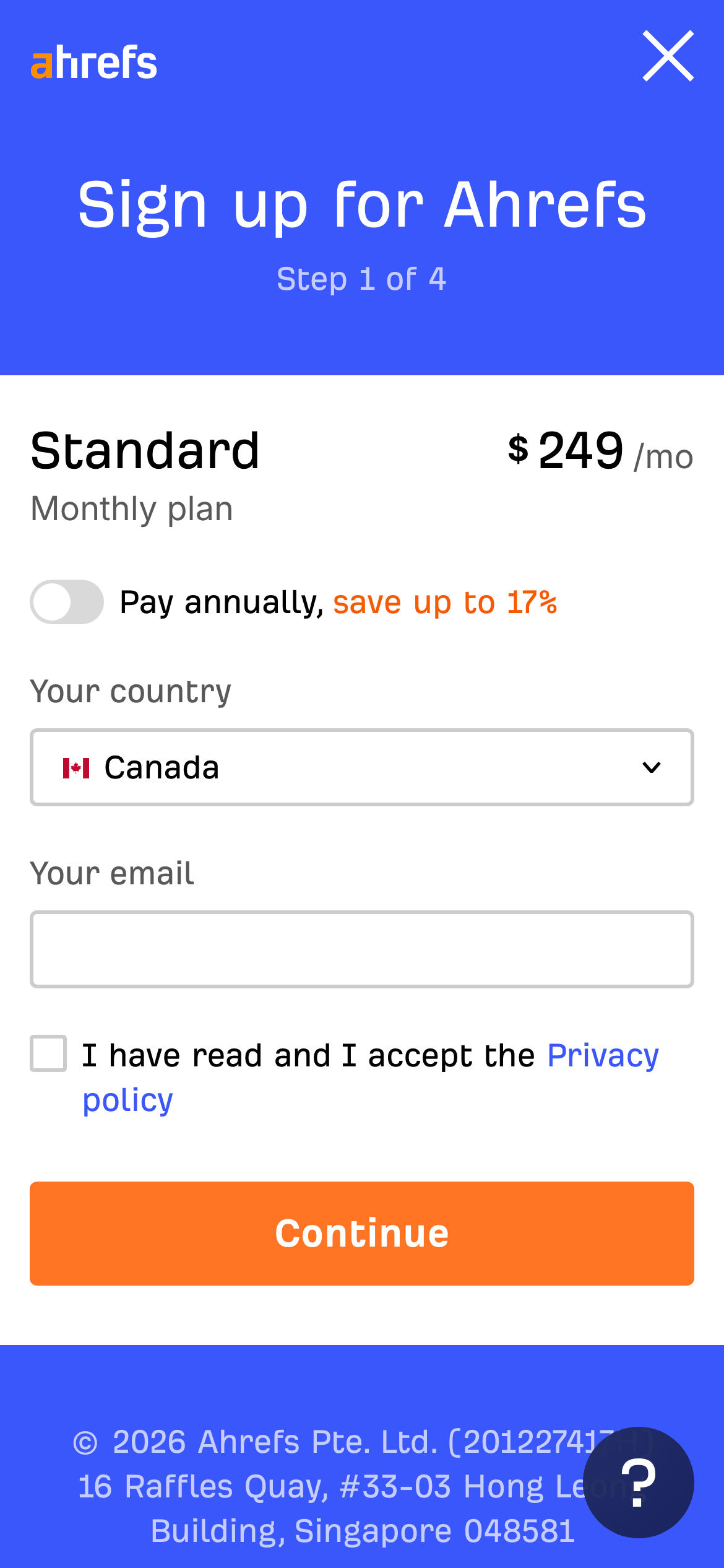
The first screen of each page at desktop size, with the phone view in the corner. Open one to see the whole site, its palette, fonts and sections.

Before you build
A checklist for your sign-up page
- State the product value, plan or trial condition beside the create-account action.
- Start with the smallest useful set of fields and defer profile details where possible.
- Label optional fields, password rules, terms and payment requirements before submission.
- Preserve the email or provider choice through verification and offer resend or change actions.
- After account creation, send the person to one clear first-use action instead of an empty dashboard.
Sign-up page design examples — FAQ
What should a sign-up page include?
Explain the product or offer, show the create-account action, ask only for necessary first-step information, state terms or trial conditions, and make email or provider verification recoverable.
How many fields should a sign-up form have?
Start with the smallest set needed to create and secure the account. Ask for workspace, profile or preference details after the first useful action unless they are genuinely required to provide the service.
How can I make a sign-up flow feel trustworthy?
State what happens next, show security or customer proof where it answers a real concern, make payment requirements explicit, and keep recovery actions visible when verification leaves the page.
Related
Screenshots show third-party pages for reference and remain their owners' work. Observations describe the captured first screens; they are editorial, not measured conversion results.