
21 reviewed pages · Checked
Login page design examples
Real login and sign-in pages from SaaS products, developer tools, finance and commerce. Compare how each page handles identity choice, email handoff, passwords, recovery and the small moments that make account access feel trustworthy.
What we saw
4 patterns across 21 pages
- Make identity choice explicit
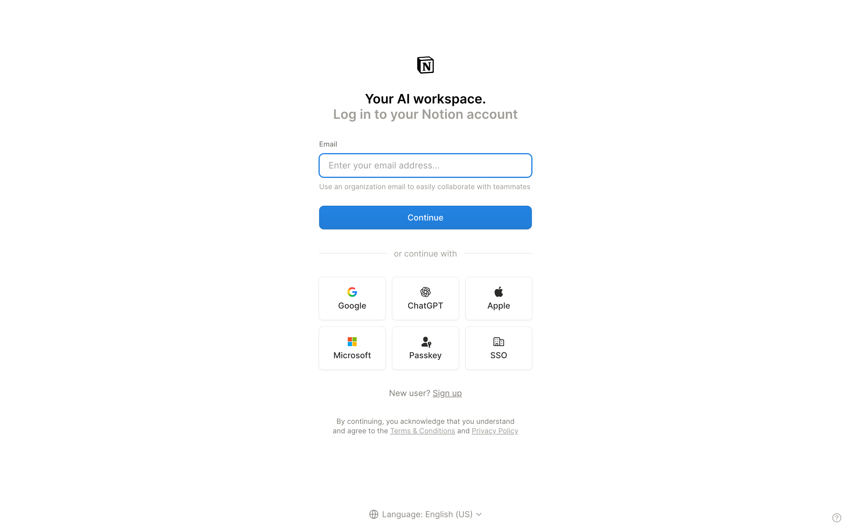
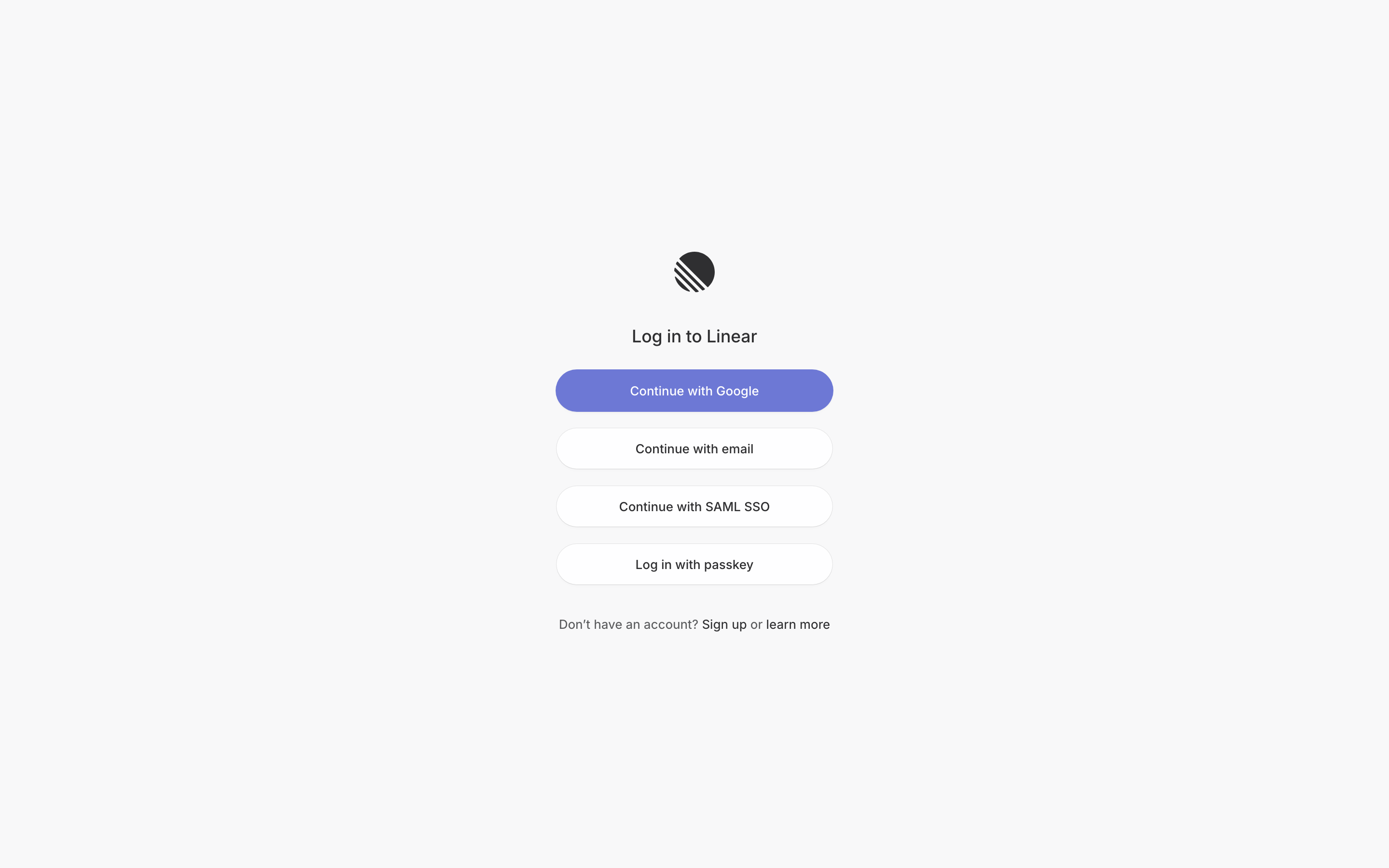
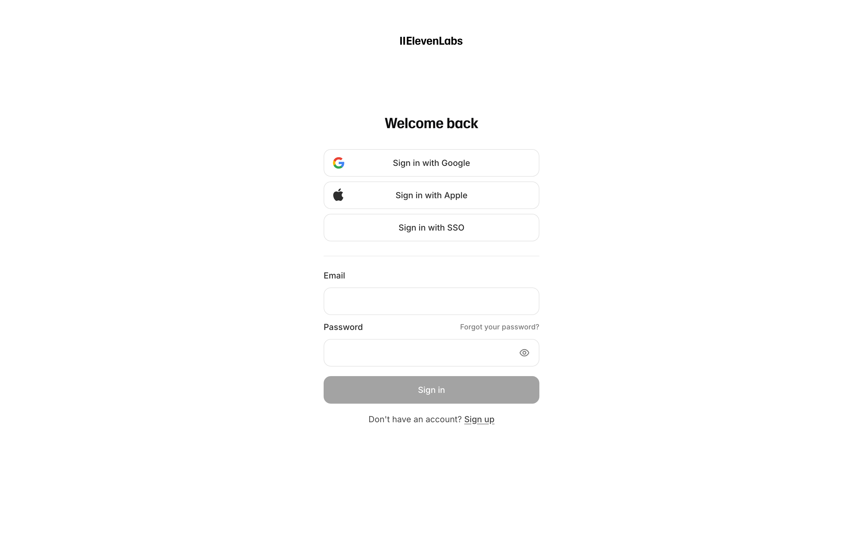
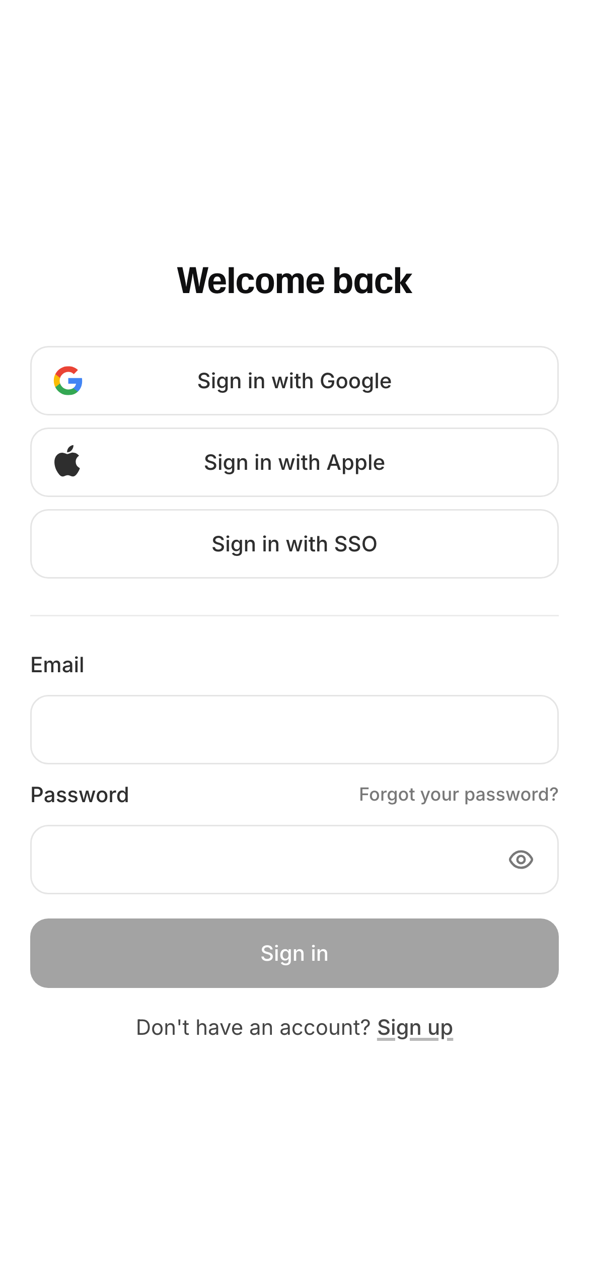
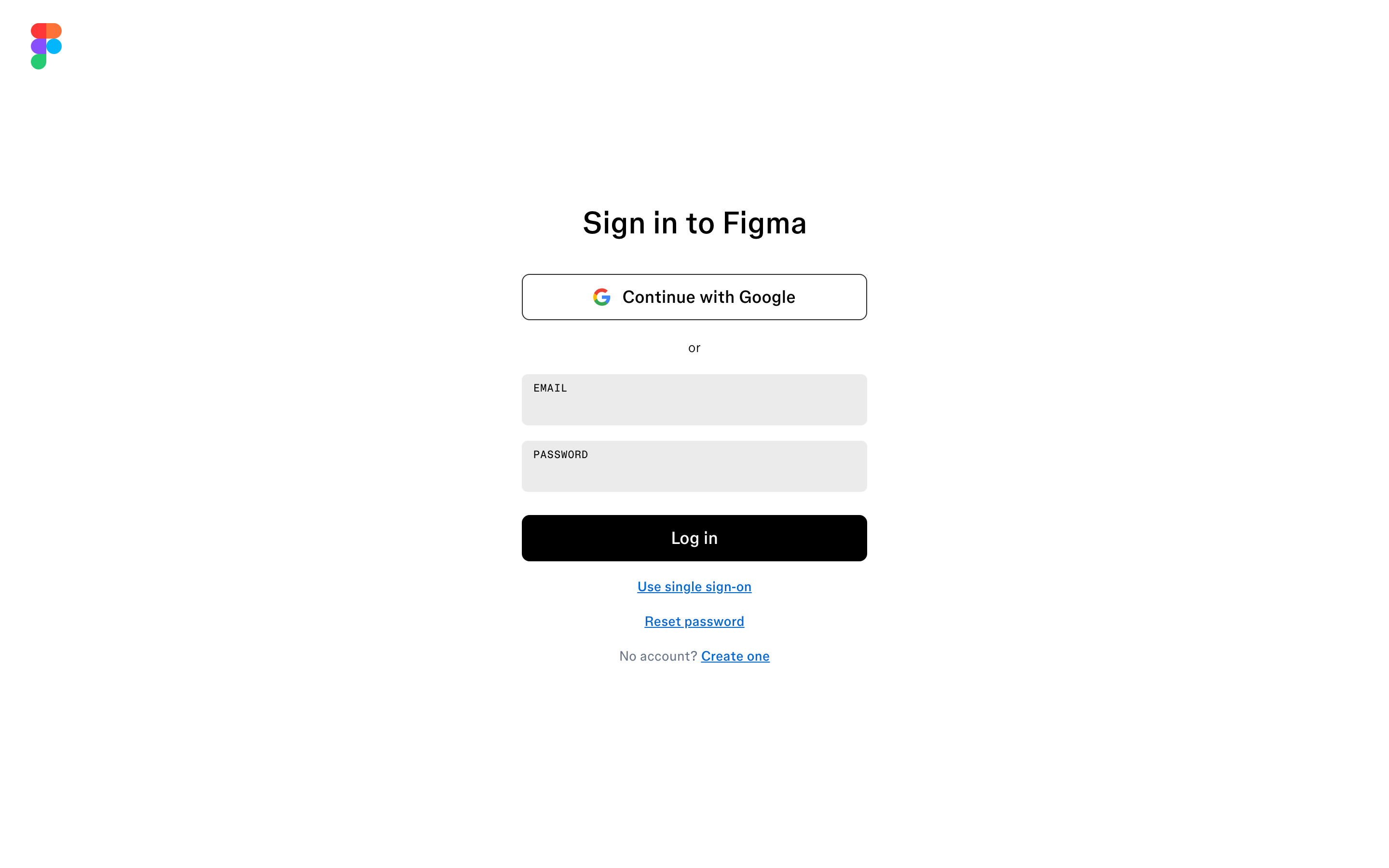
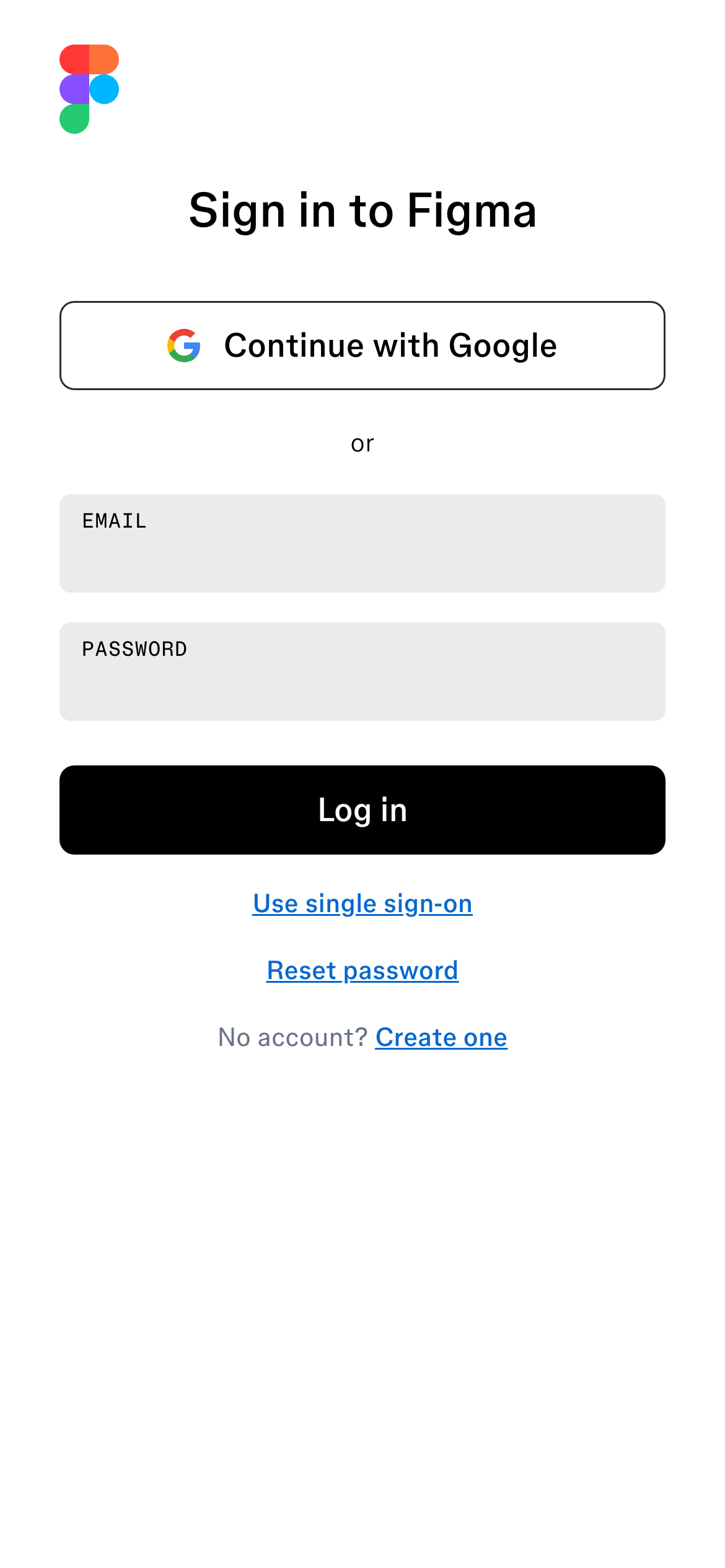
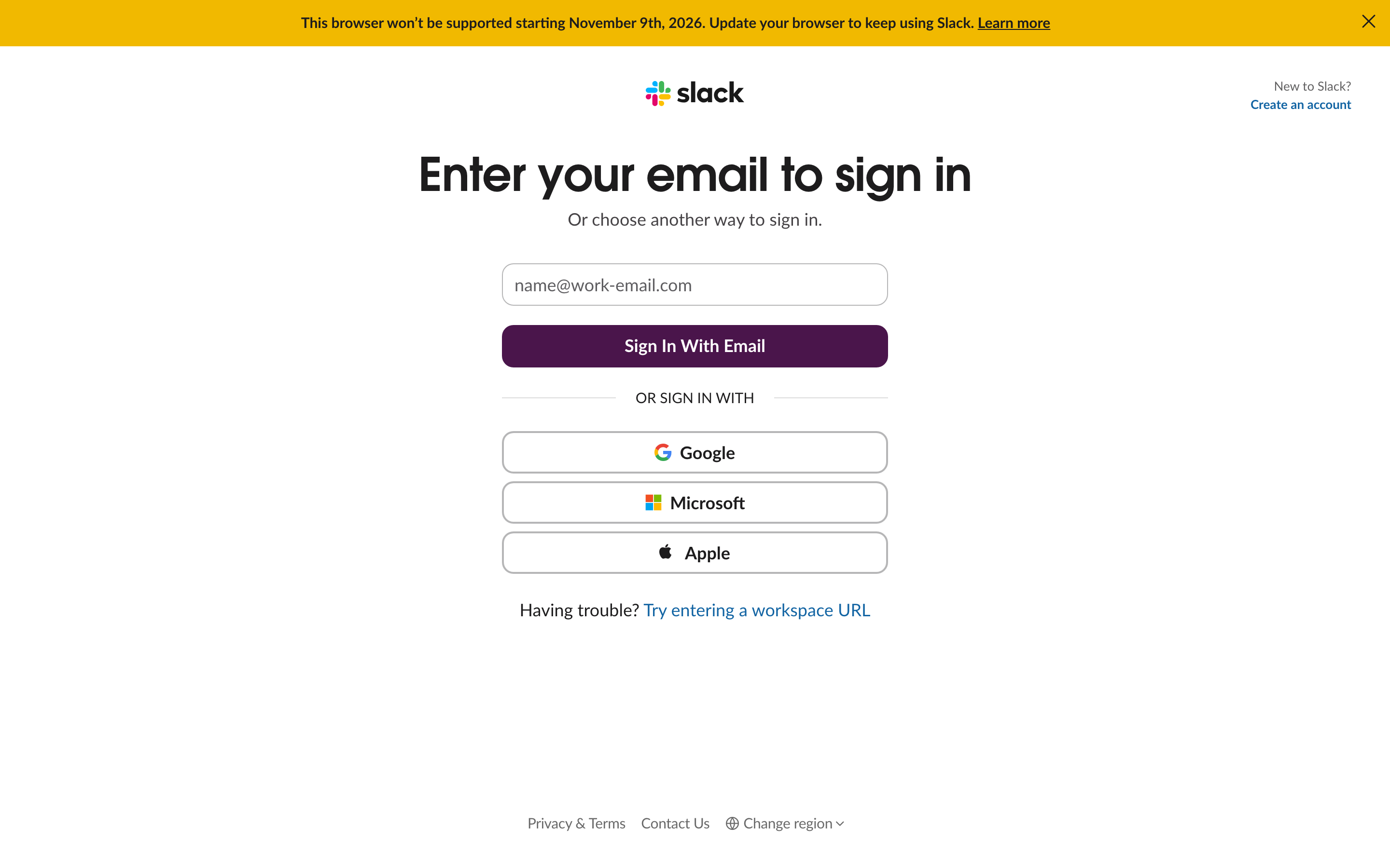
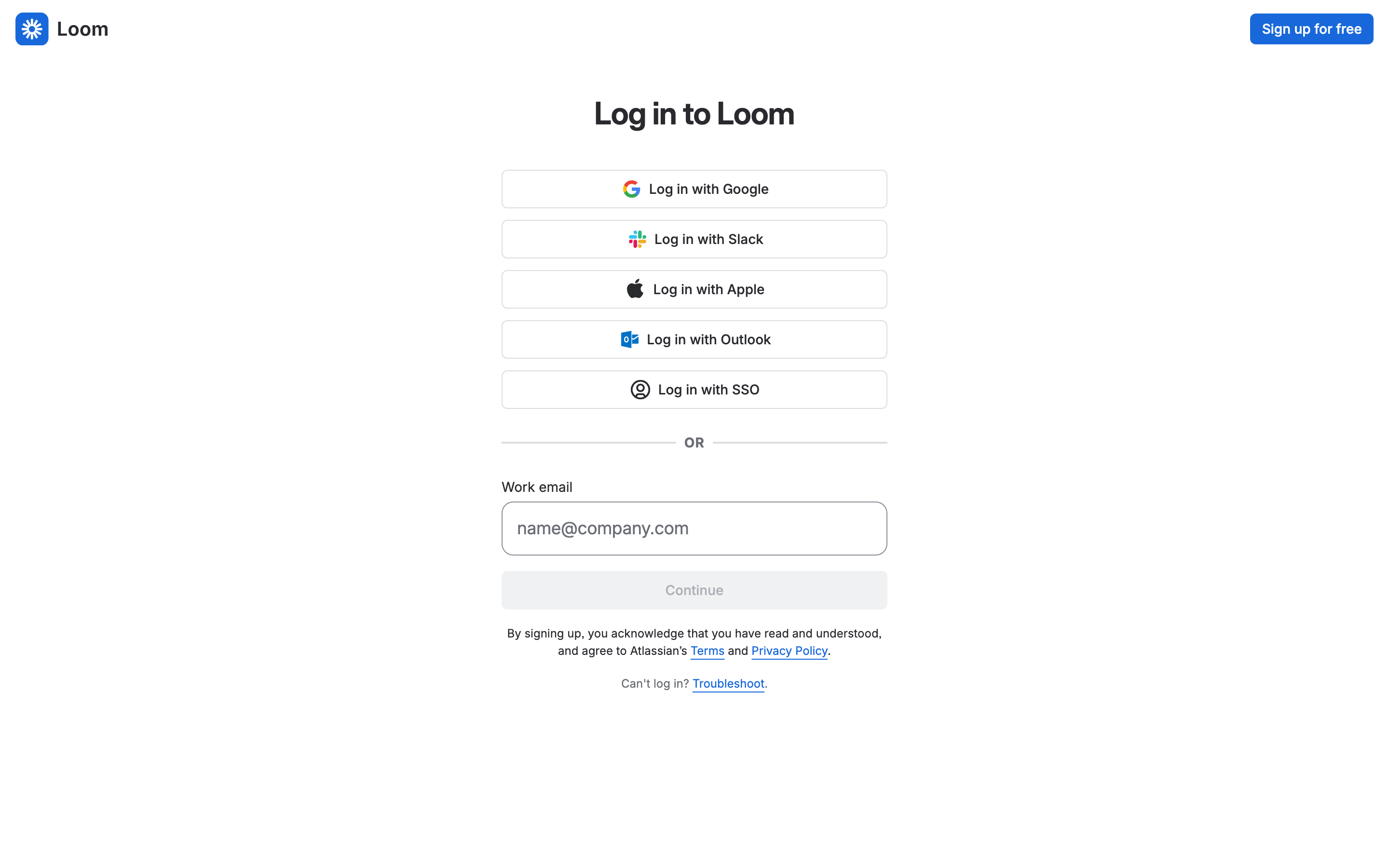
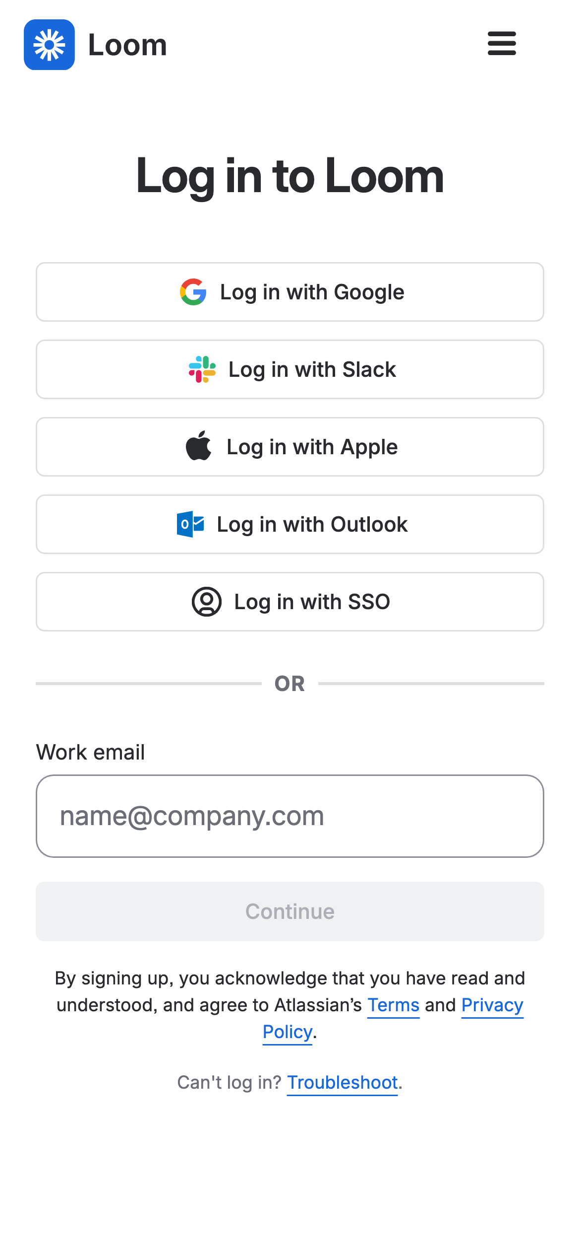
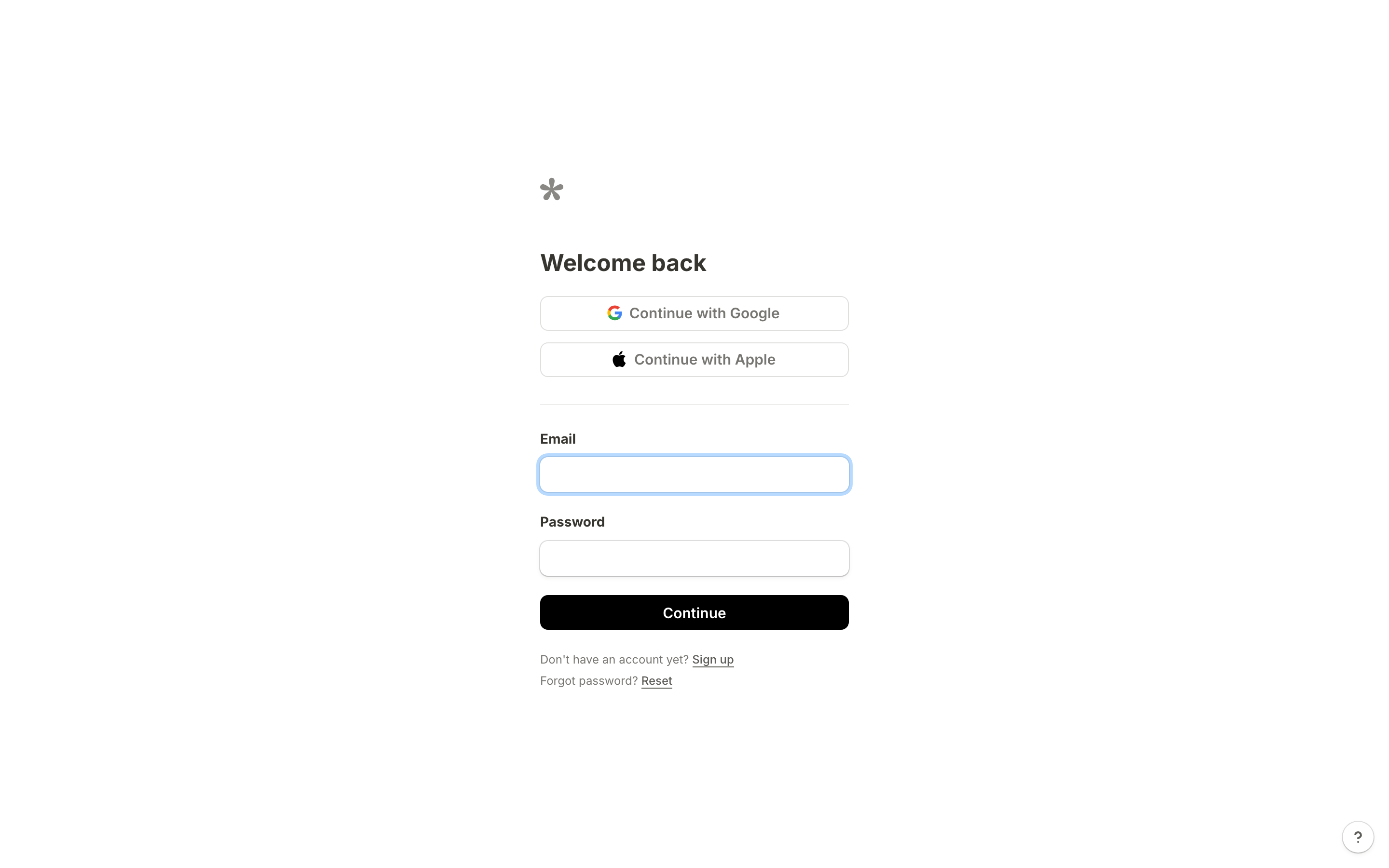
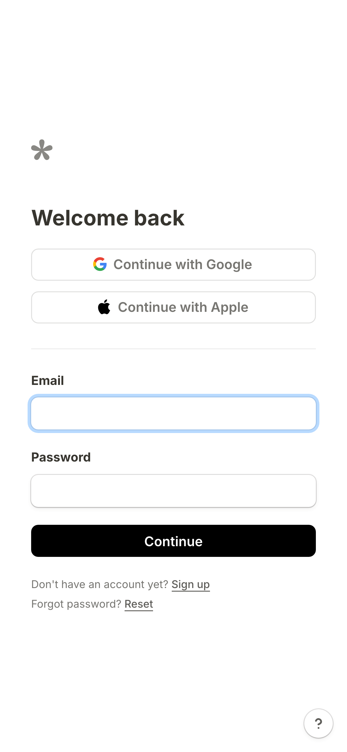
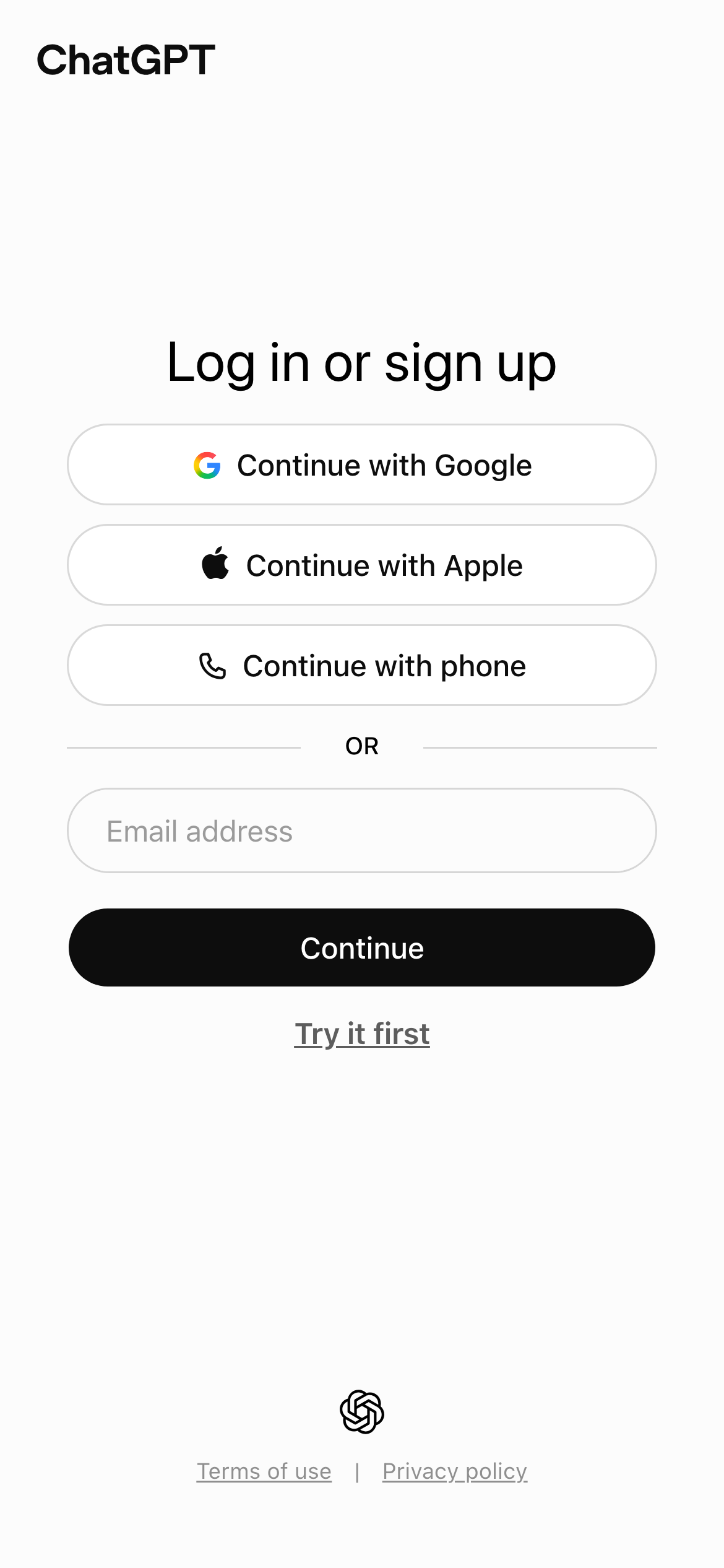
- The clearest pages name each route — Google, Apple, SSO or email — rather than hiding alternatives behind a secondary link. That makes the first decision legible before a person starts typing. Examples: Notion, Linear, ElevenLabs, Figma, Slack, Loom.
- Keep recovery beside the credential
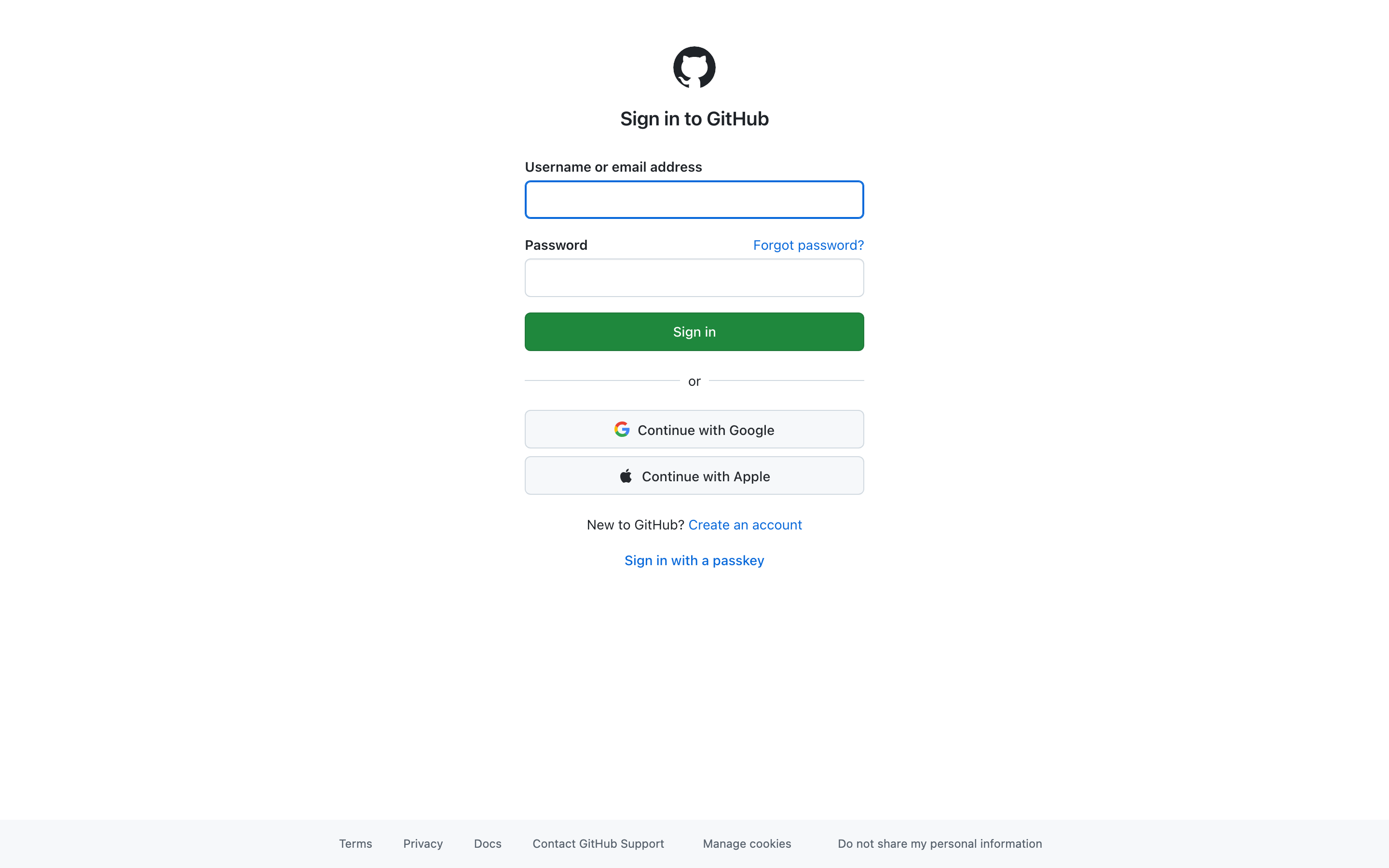
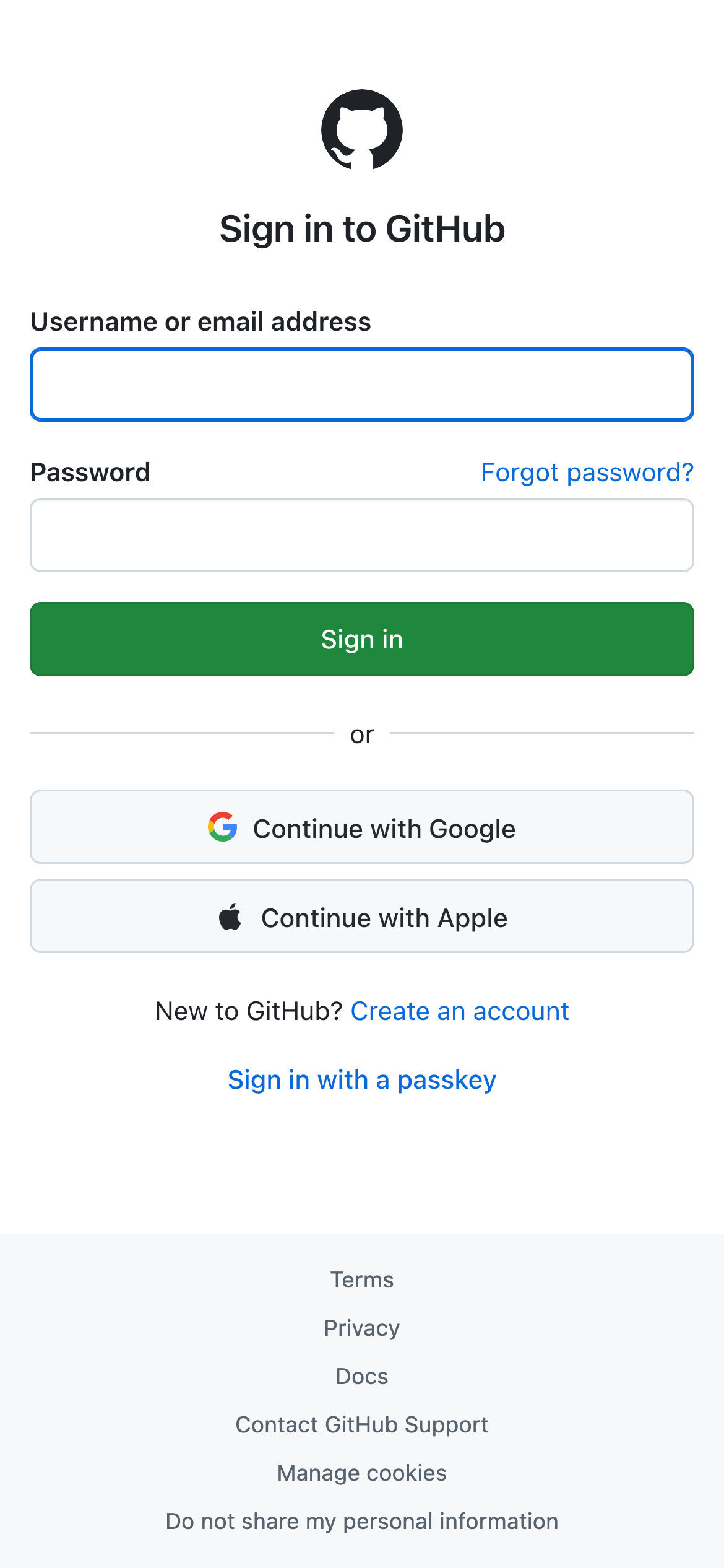
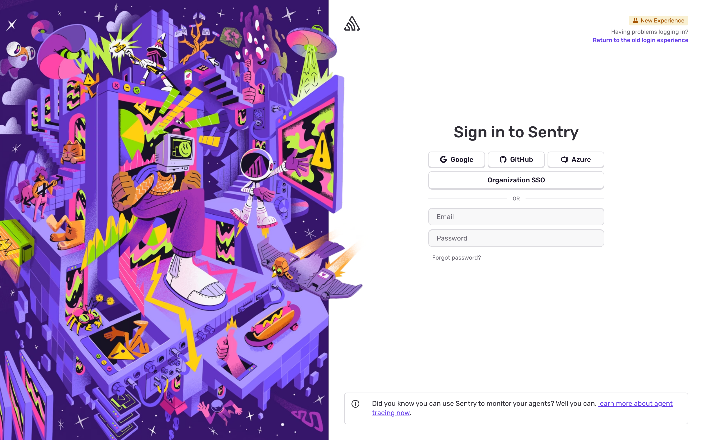
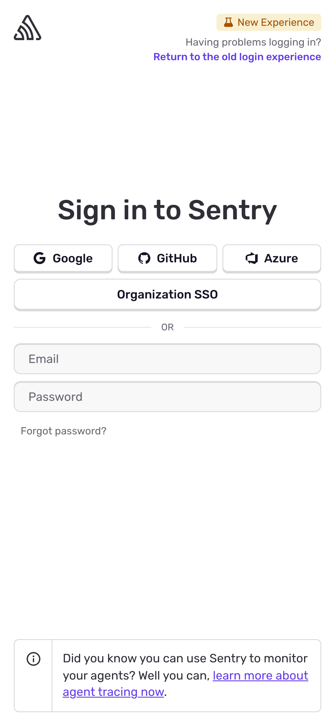
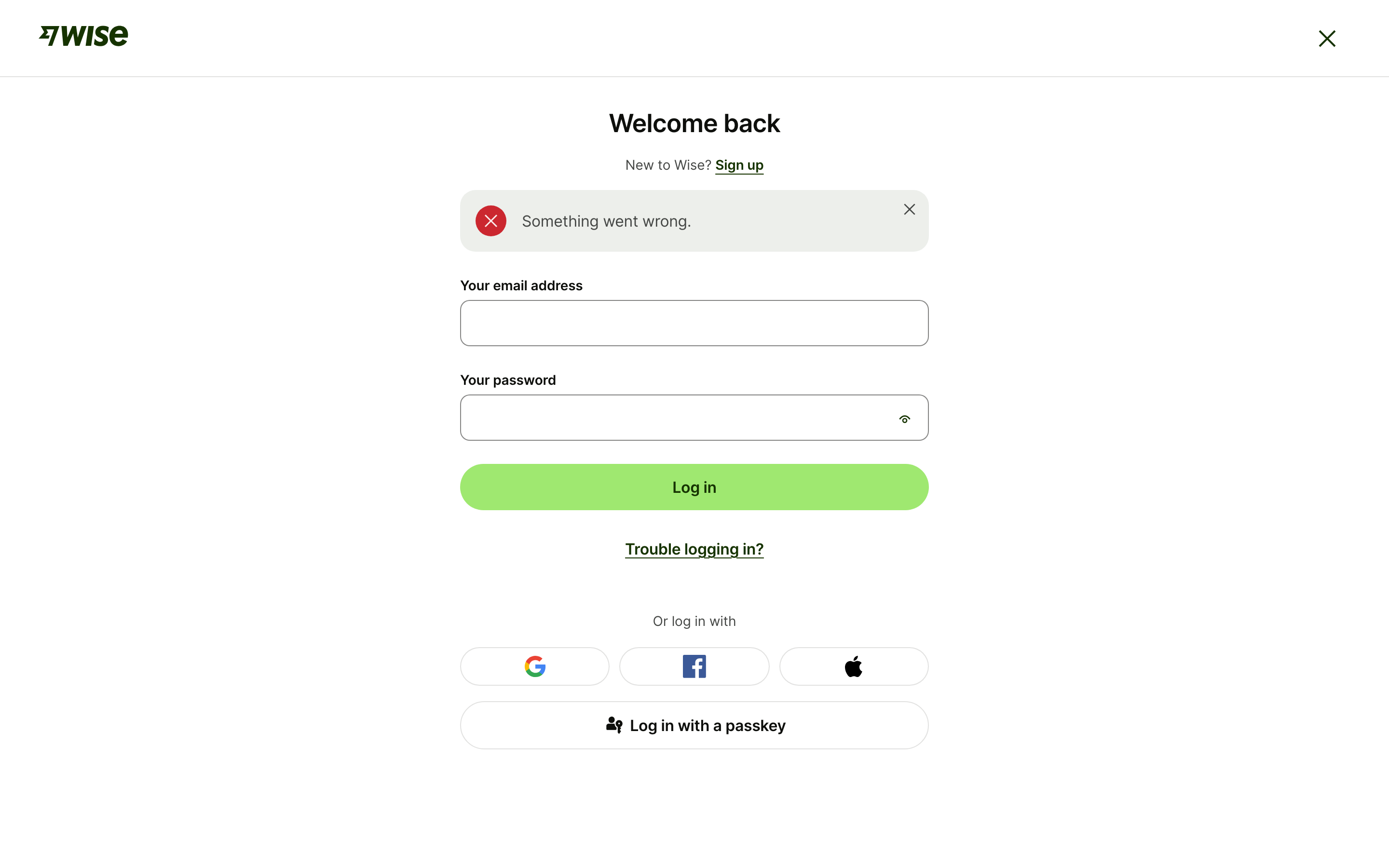
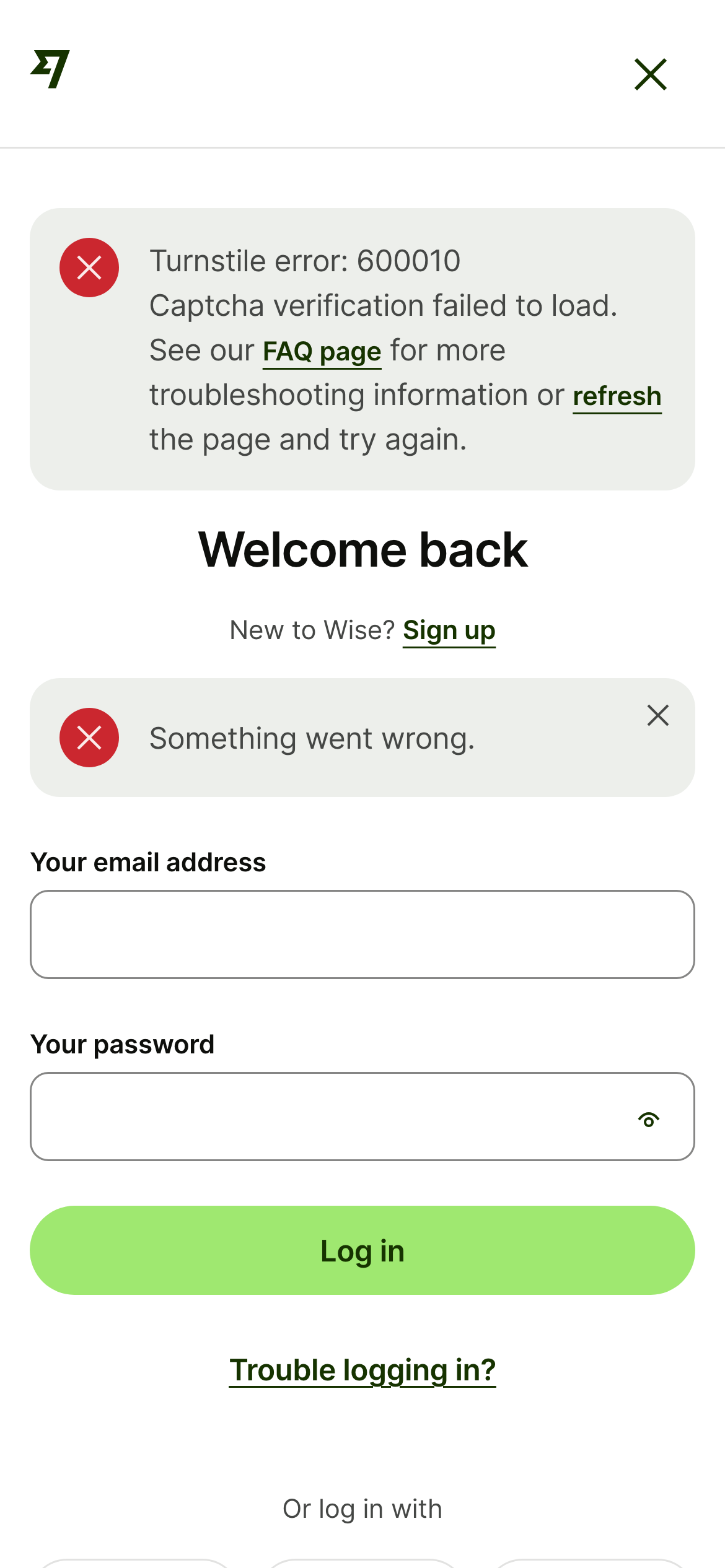
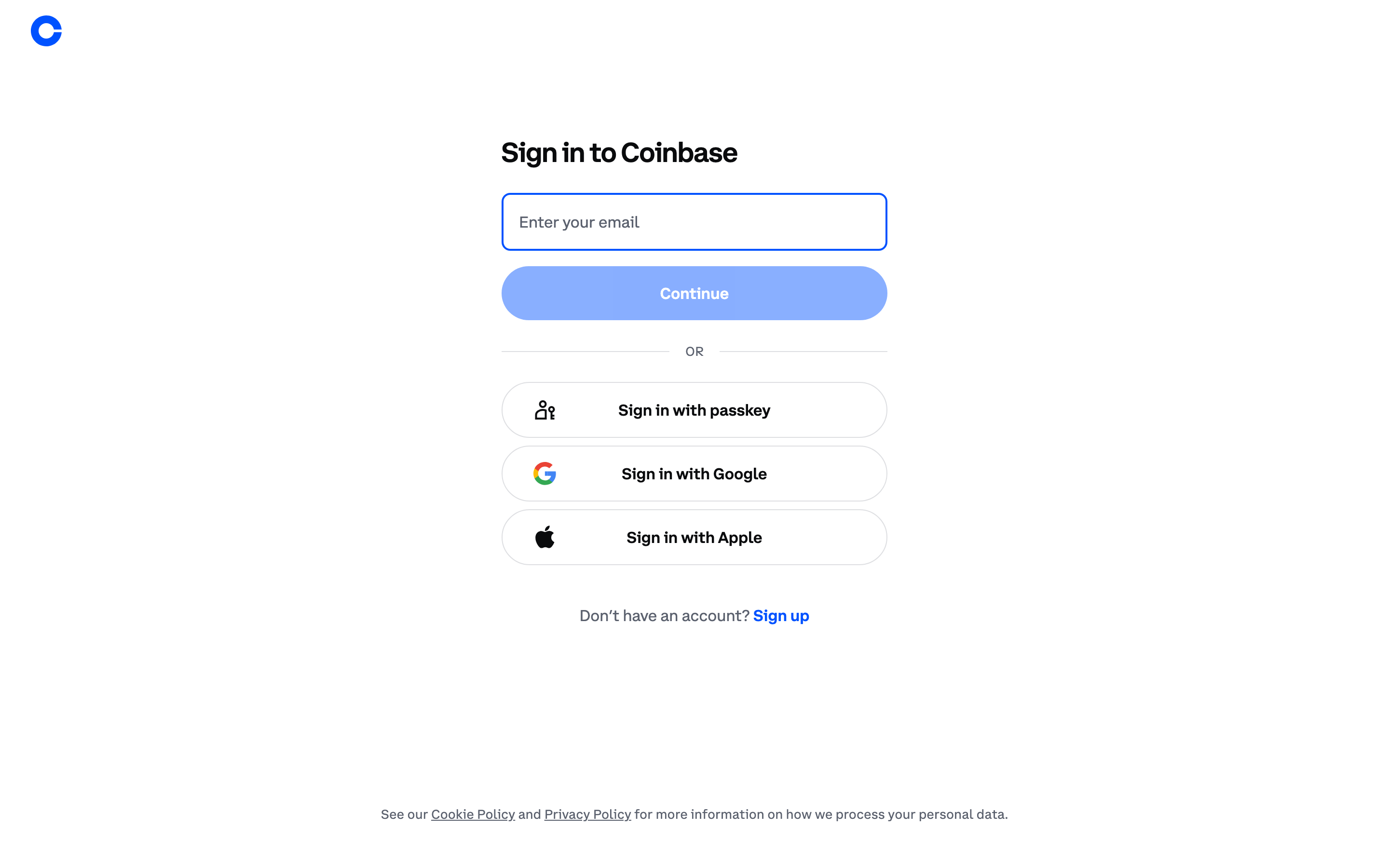
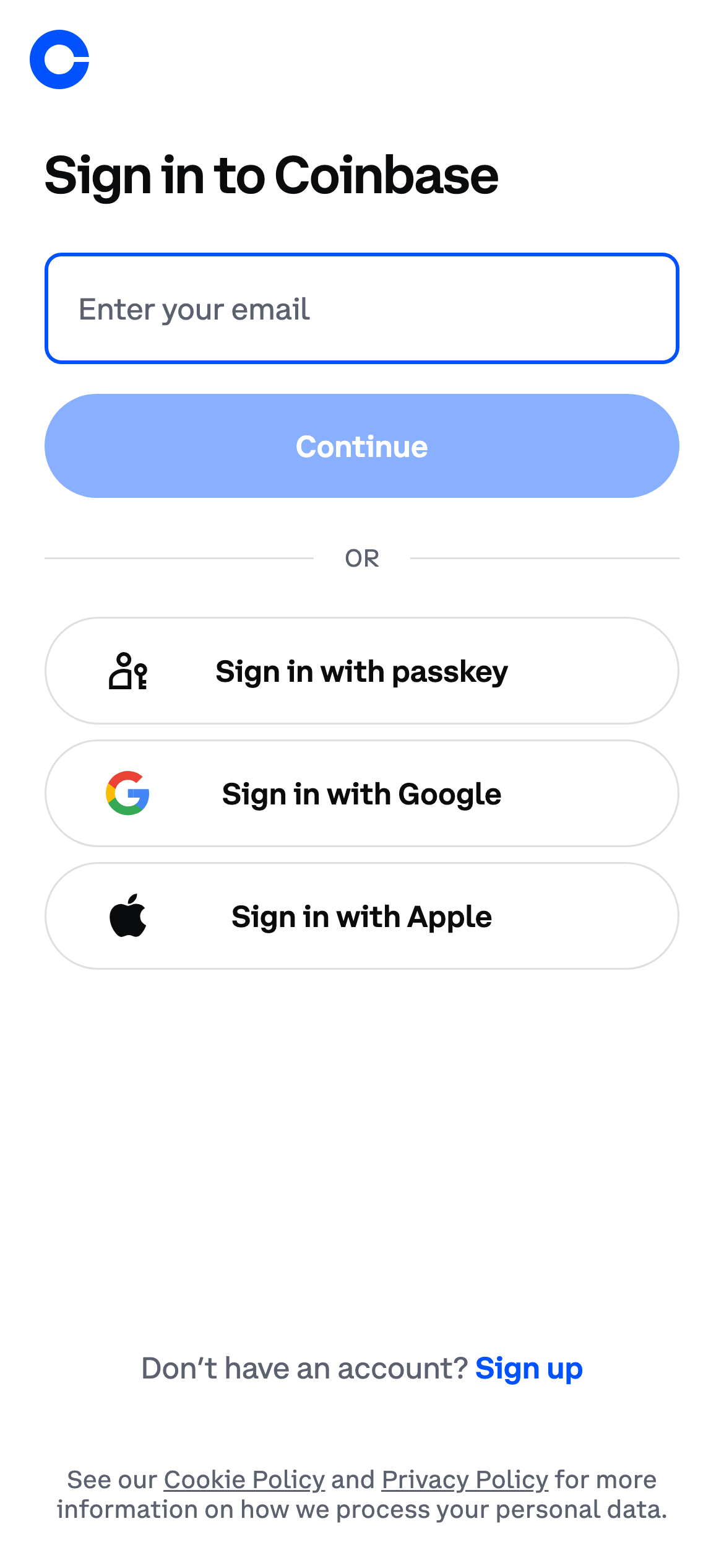
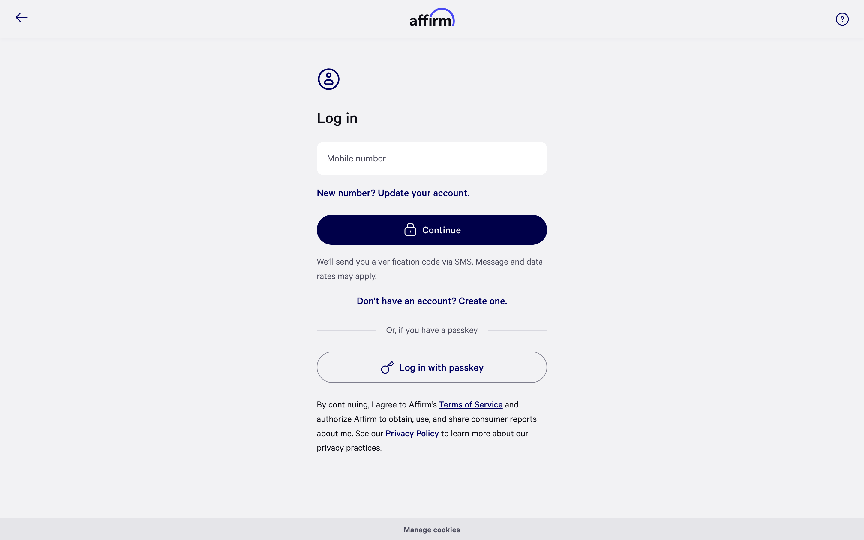
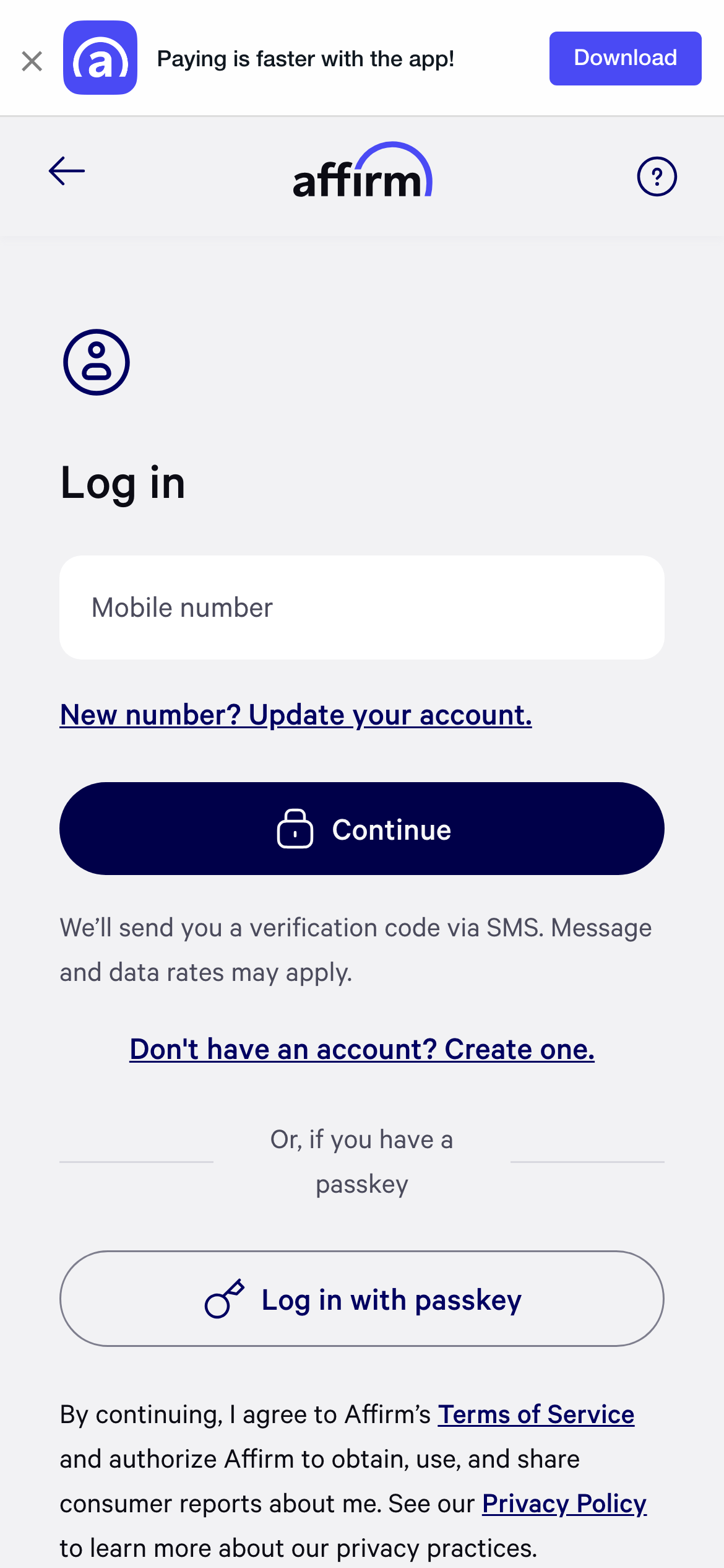
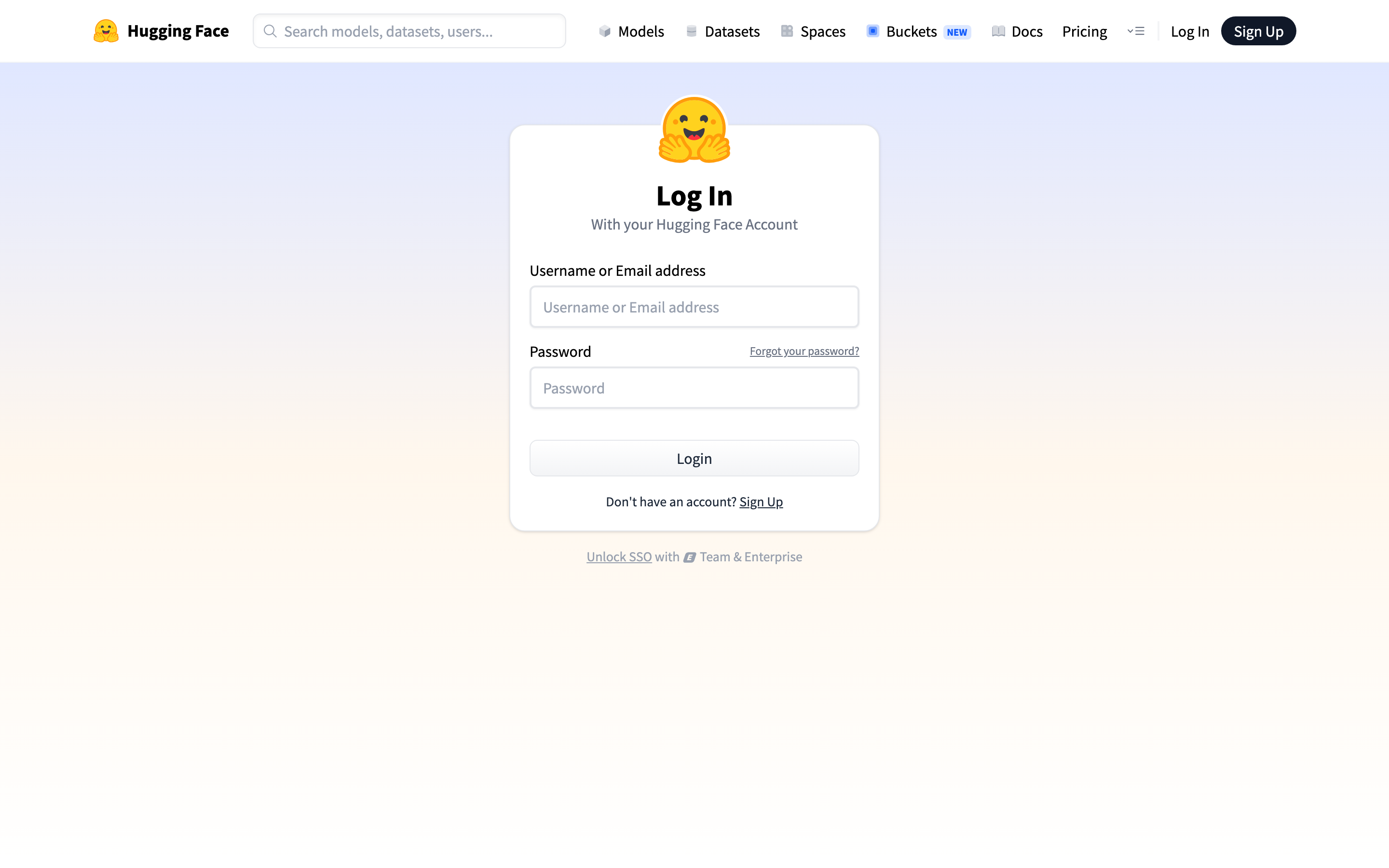
- Forgot-password links, one-time-code help and change-email actions belong next to the field or password step. Recovery is part of the sign-in path, not a footer detail. Examples: GitHub, Sentry, Tally, Wise, Coinbase, Affirm.
- Explain an email handoff
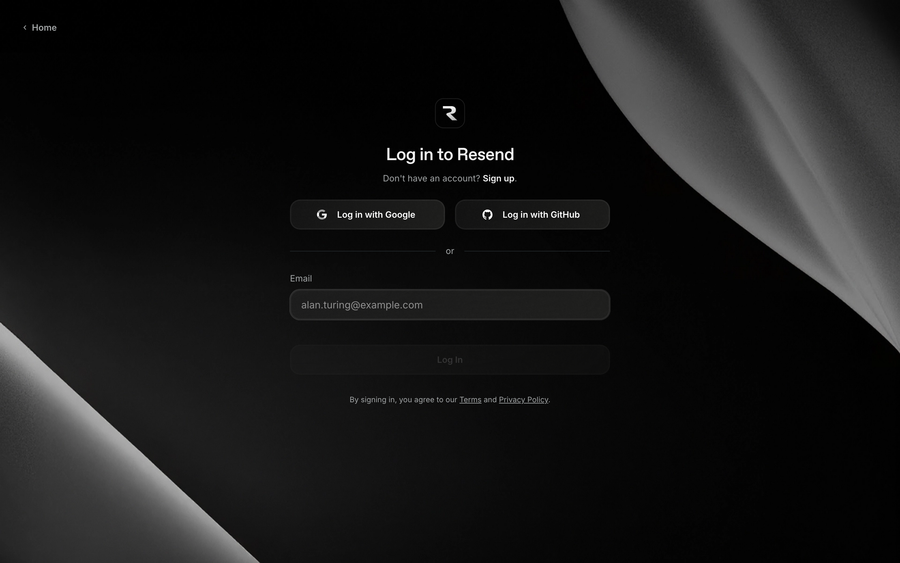
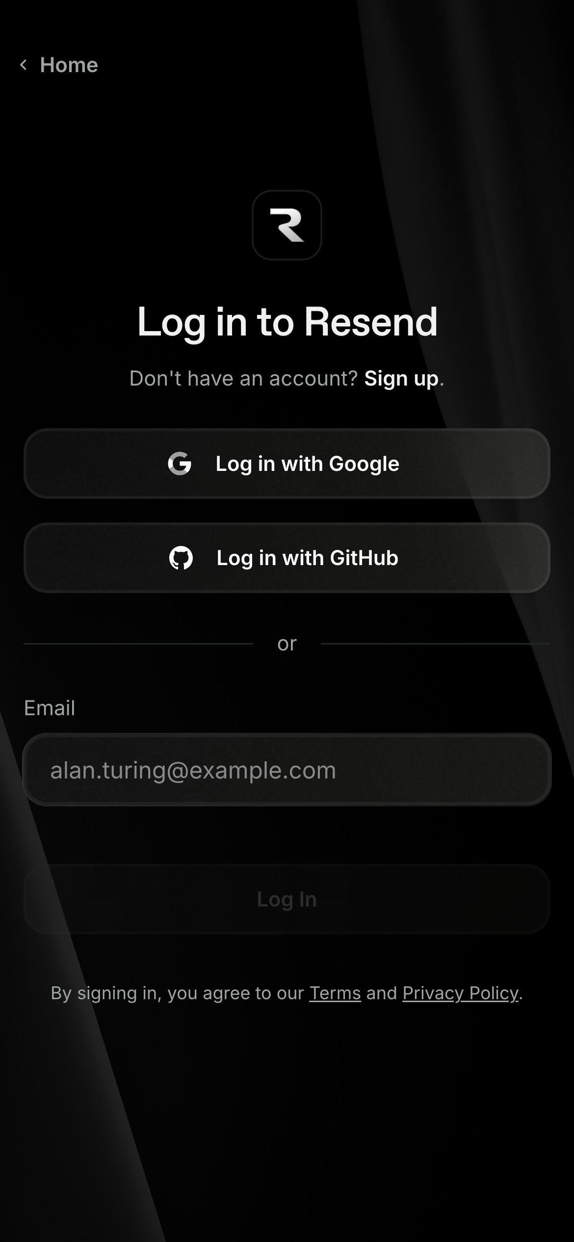
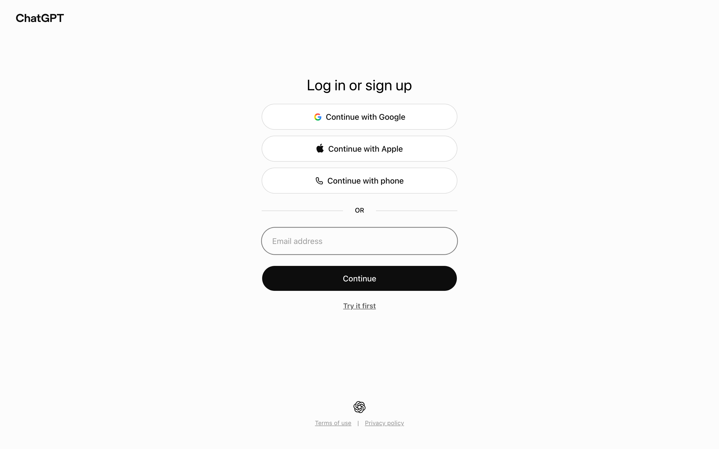
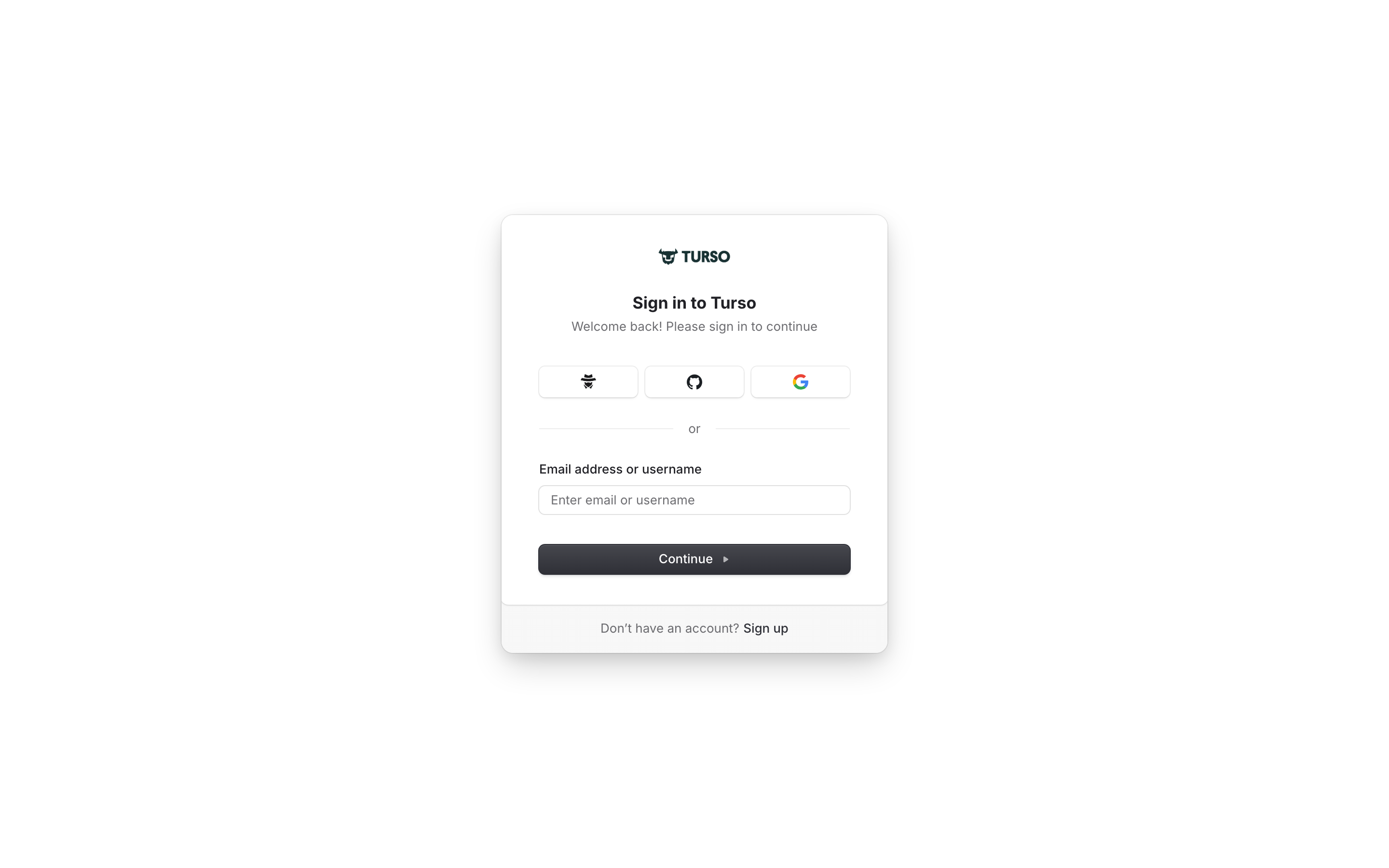
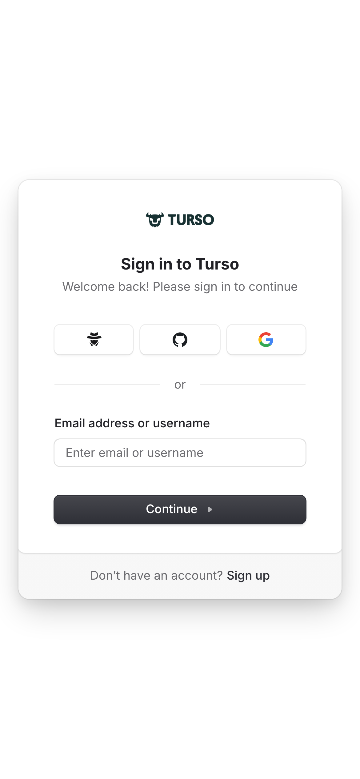
- Passwordless flows need a clear next step: which inbox to check, what happens if the address is wrong, and how to return without restarting the whole journey. Examples: ElevenLabs, Resend, Turso, ChatGPT.
- Let the product stay recognisable
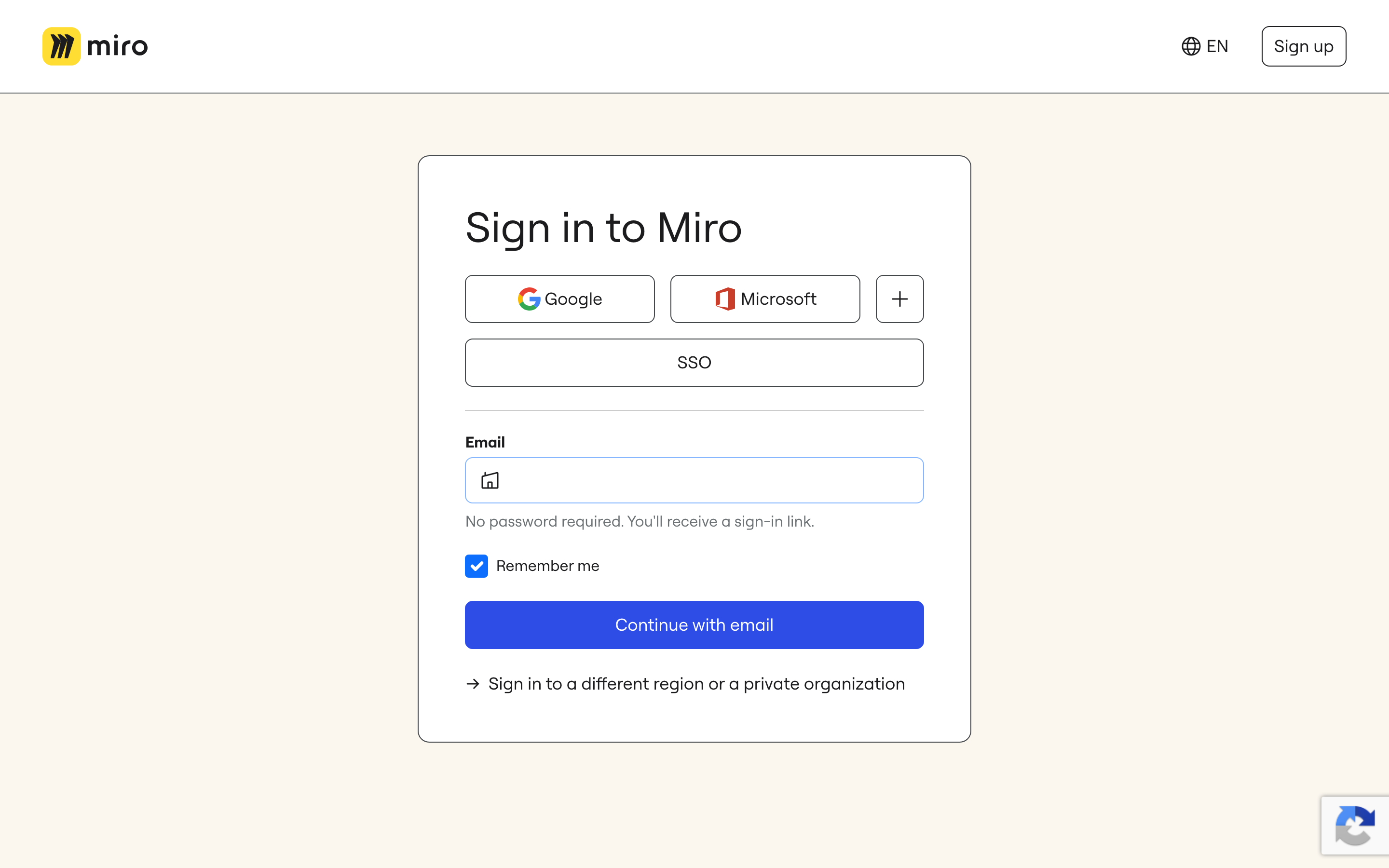
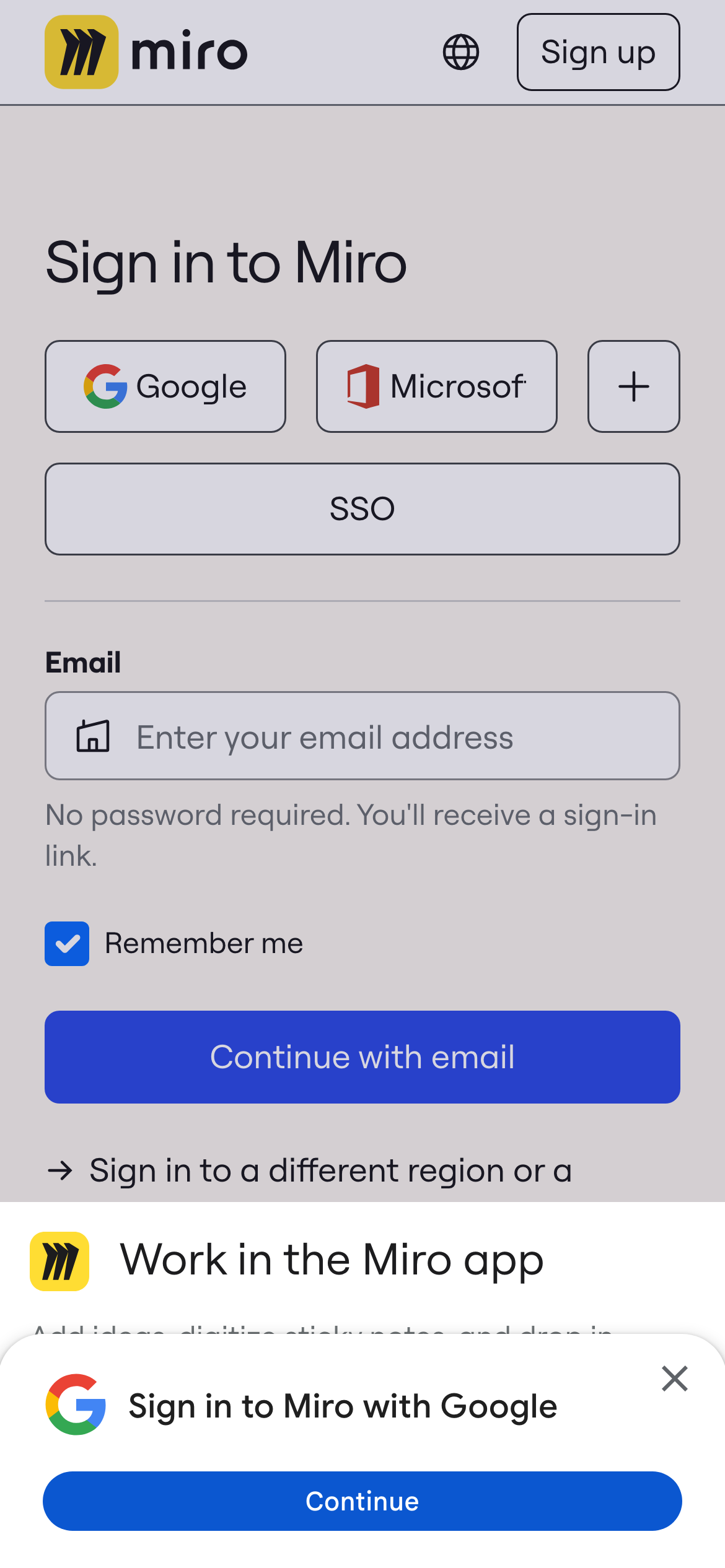
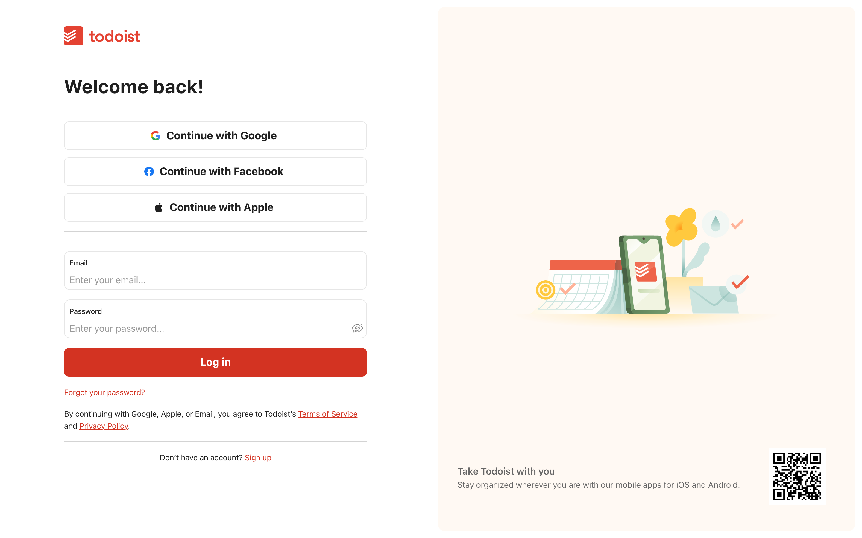
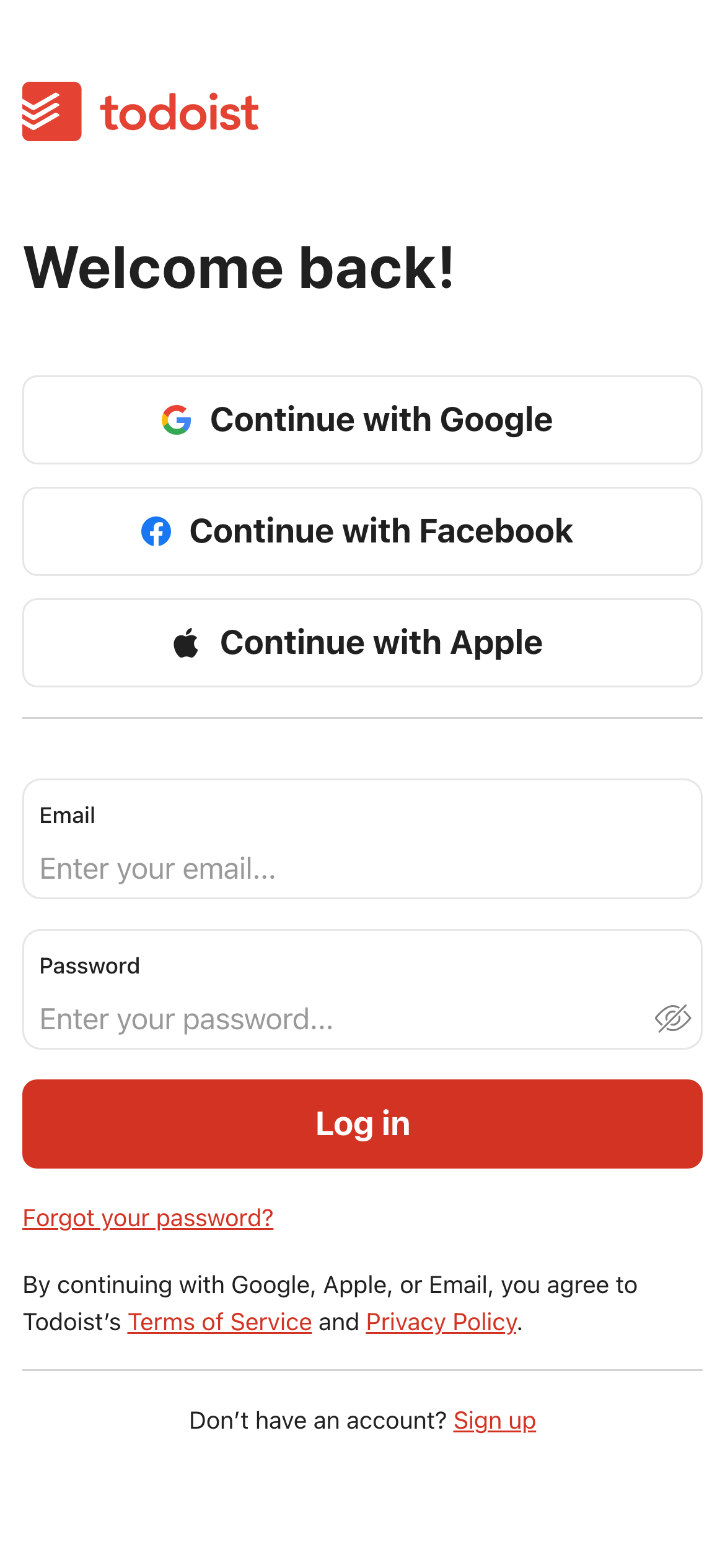
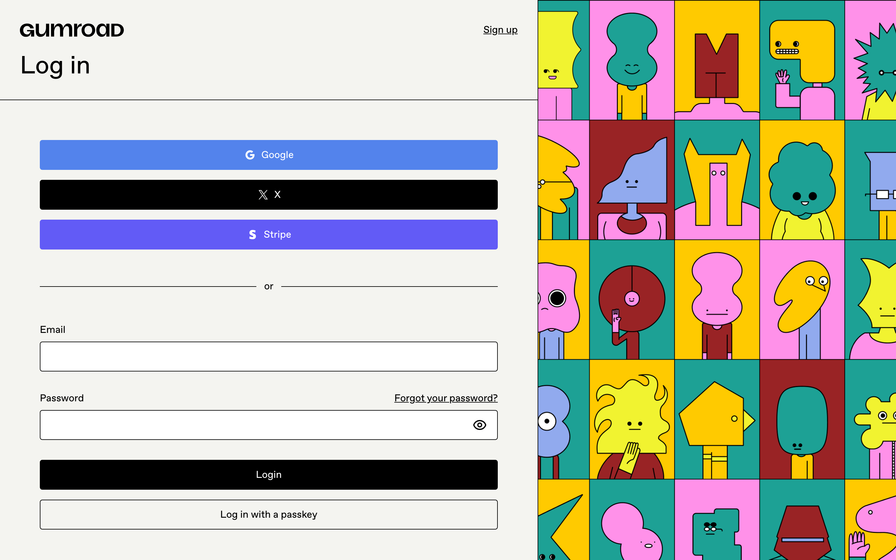
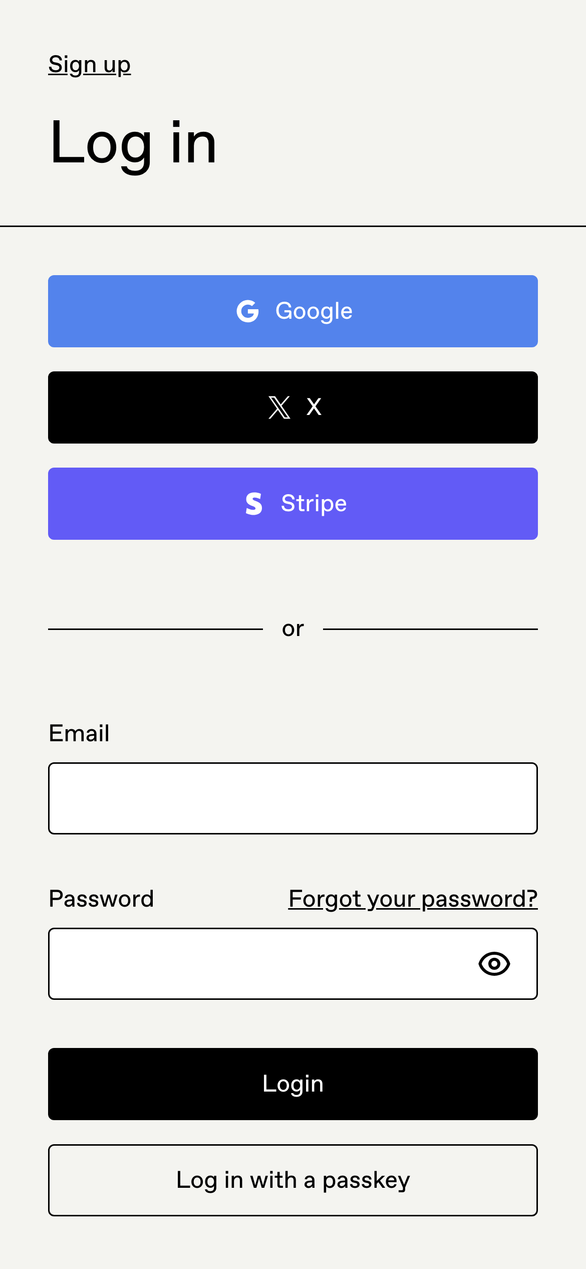
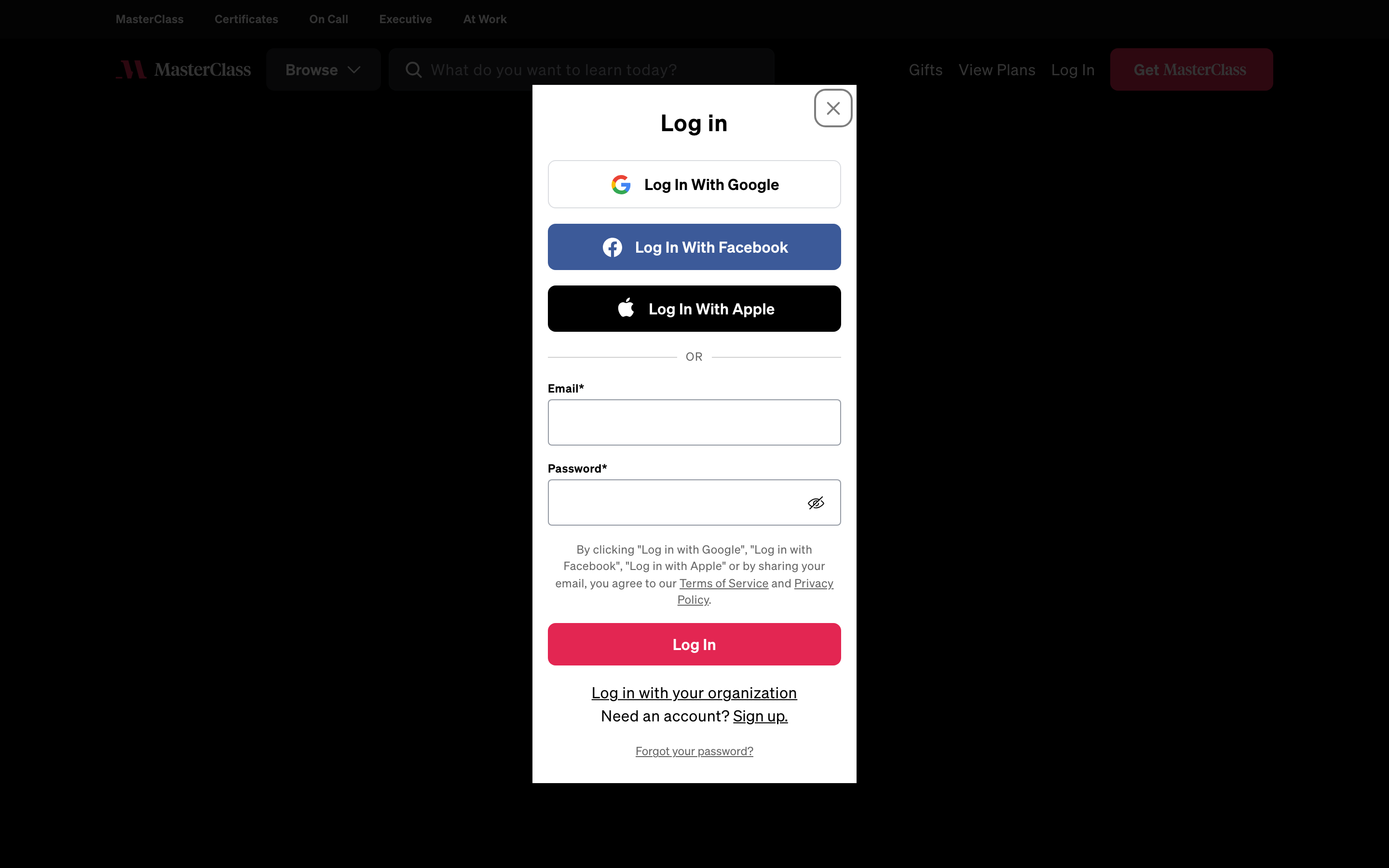
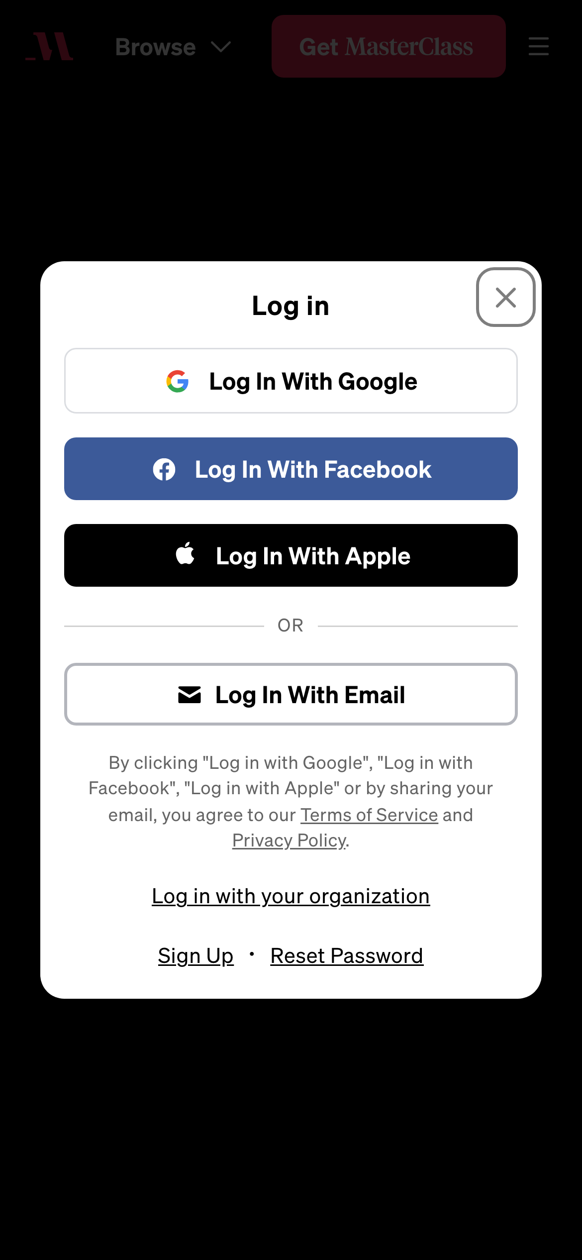
- A focused auth surface can still carry the product's type, colour or illustration system. The strongest examples reduce distraction without making the page feel like an unrelated security gate. Examples: Miro, Todoist, Gumroad, MasterClass.
All 21 examples
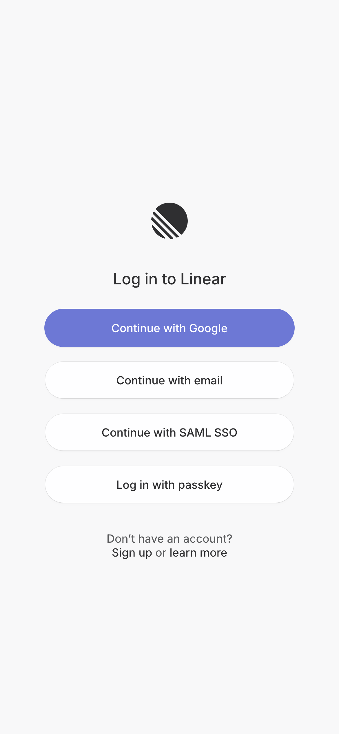
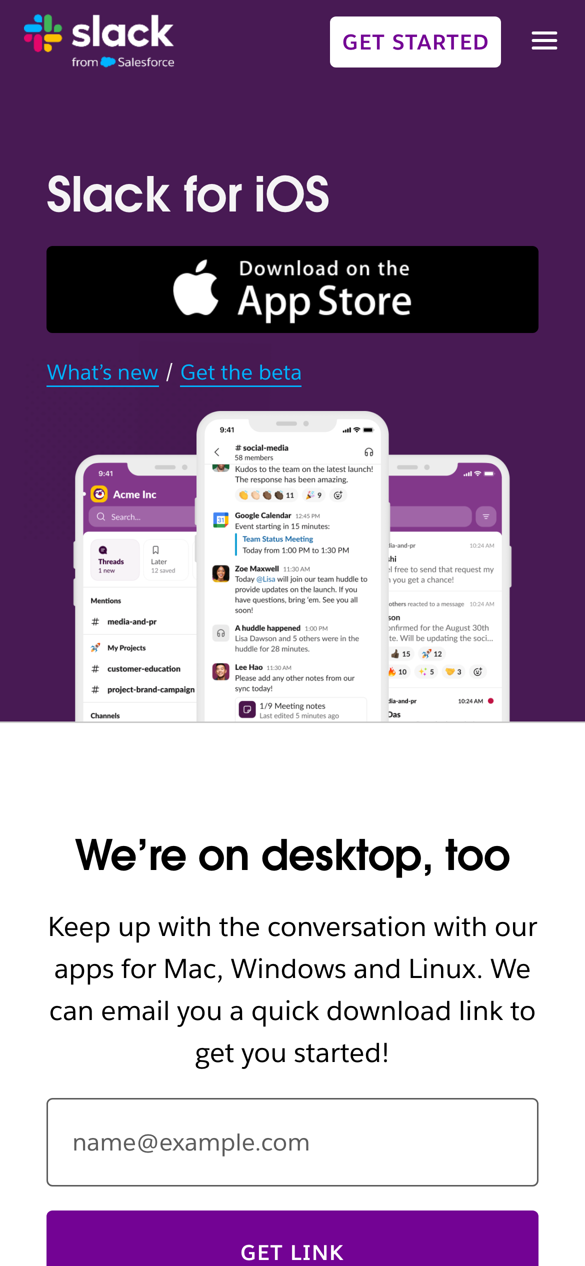
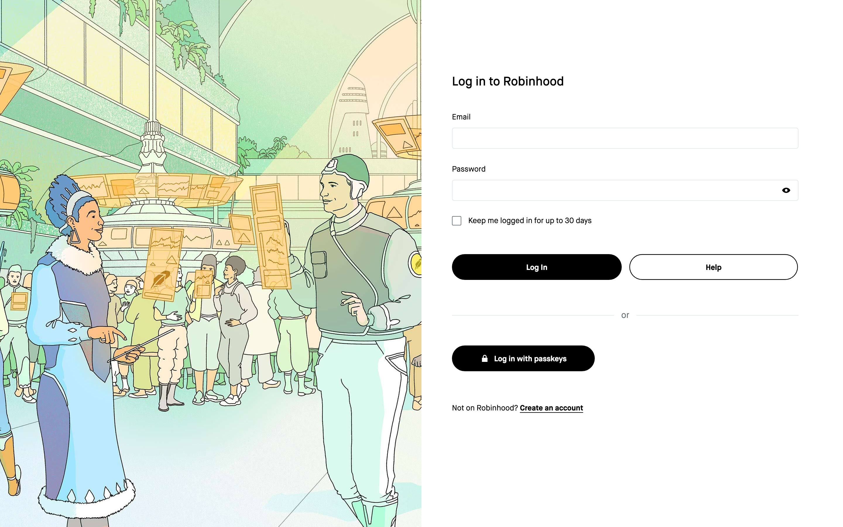
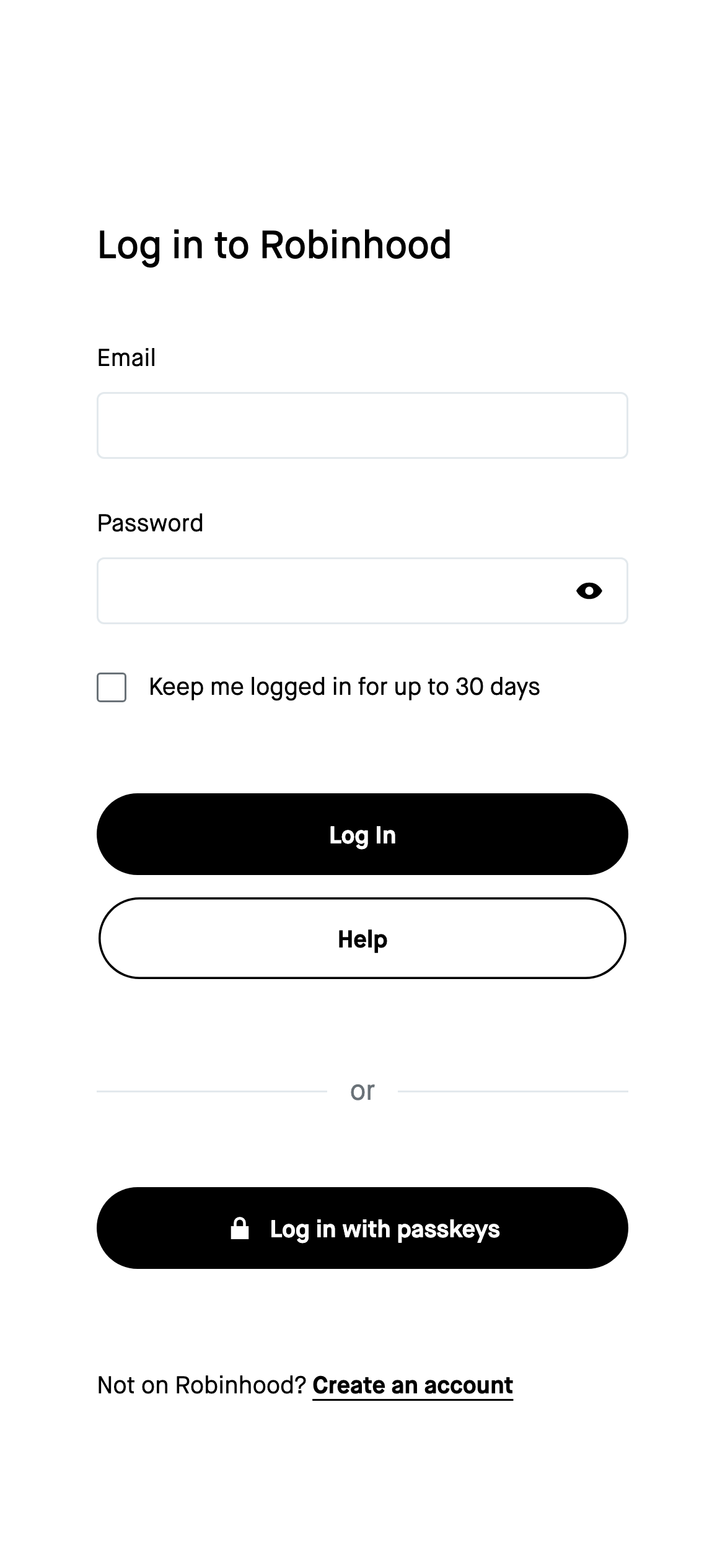
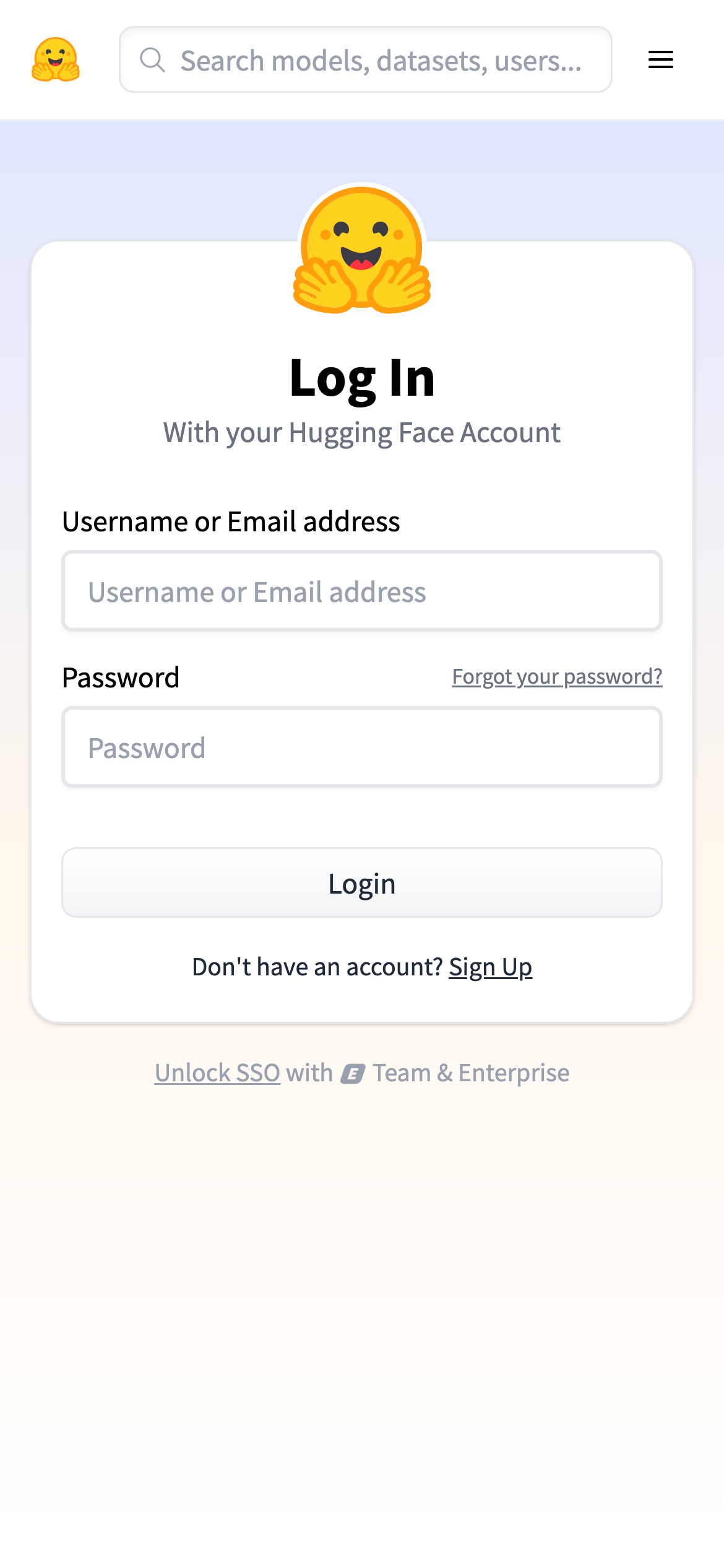
The first screen of each page at desktop size, with the phone view in the corner. Open one to see the whole site, its palette, fonts and sections.
Before you build
A checklist for your login page
- Name the available identity routes and make the primary route obvious.
- Keep the account identifier visible when a person advances to password or code entry.
- Place recovery, change-email and support paths beside the step that needs them.
- Explain email verification, magic links or SSO handoffs before the person leaves the page.
- Show disabled, loading and error states without moving the form or hiding the entered value.
Login page design examples — FAQ
What should a login page include?
A clear sign-in action, the supported identity routes, an email or username field, password or code entry when needed, and recovery options. Explain any SSO or email handoff before the person submits.
Should a login page offer social sign-in?
Offer the providers your audience already uses, but label them clearly and keep an email route available when it is important for account recovery or enterprise access. The examples above show both focused and multi-route approaches.
How do I design a passwordless login flow?
Tell the person which address receives the link or code, preserve the address on the next step, provide a change or resend action, and make the return path obvious if the email arrives late.
Related
- Sign-up page examples →
- Mobile login screen design →
- Onboarding screen examples →
- Form section examples →
Screenshots show third-party pages for reference and remain their owners' work. Observations describe the captured first screens; they are editorial, not measured conversion results.