
Red Website Design Examples
307 real sites · 7,740 sections



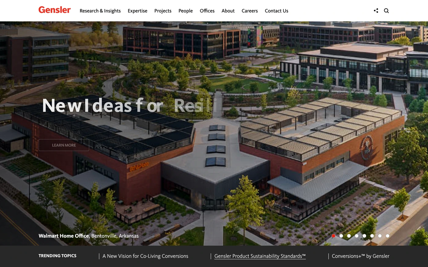
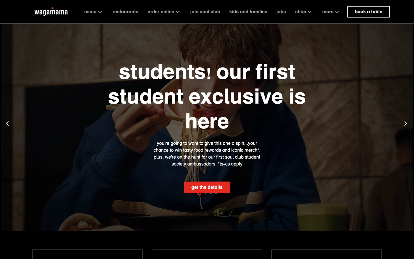
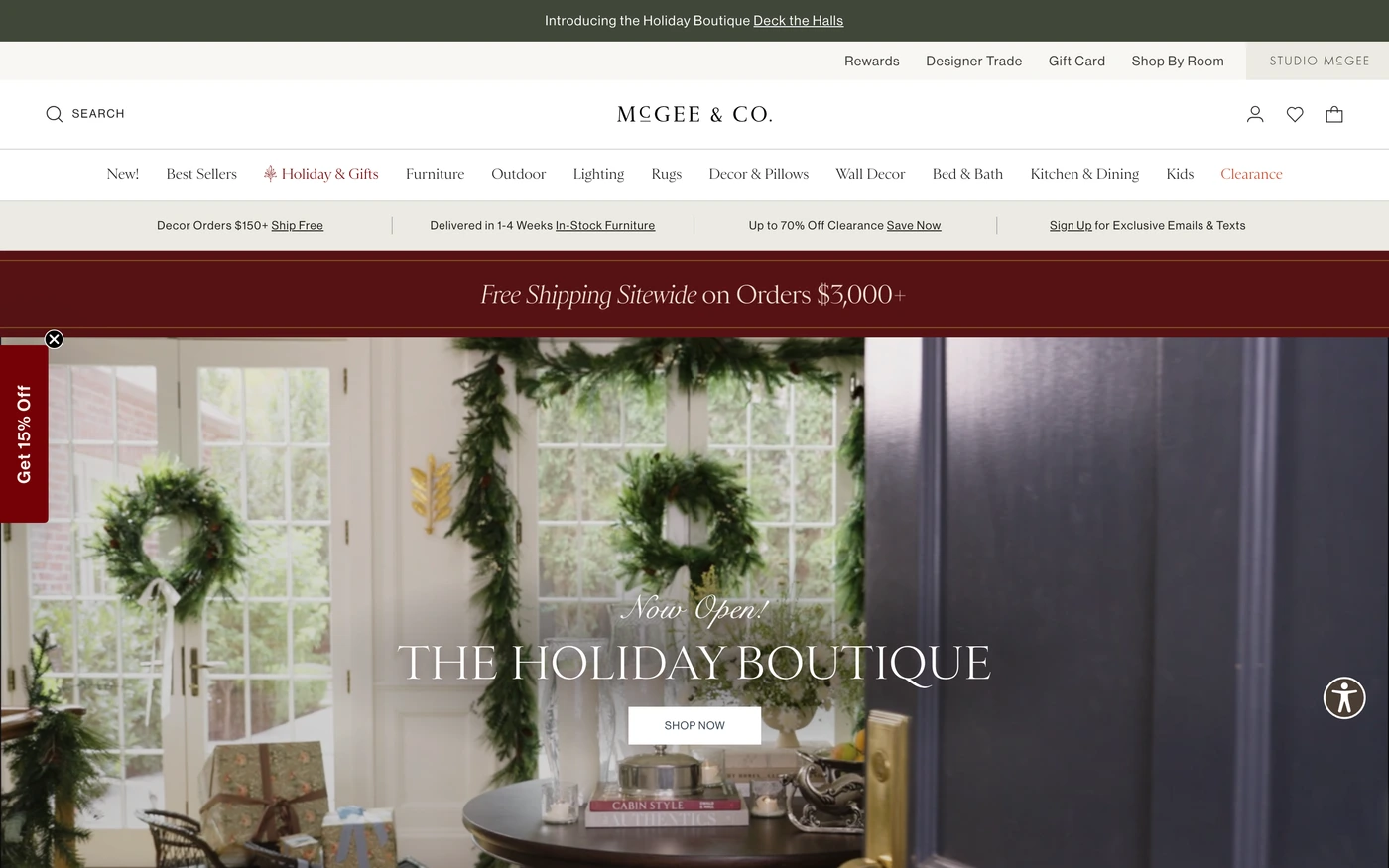
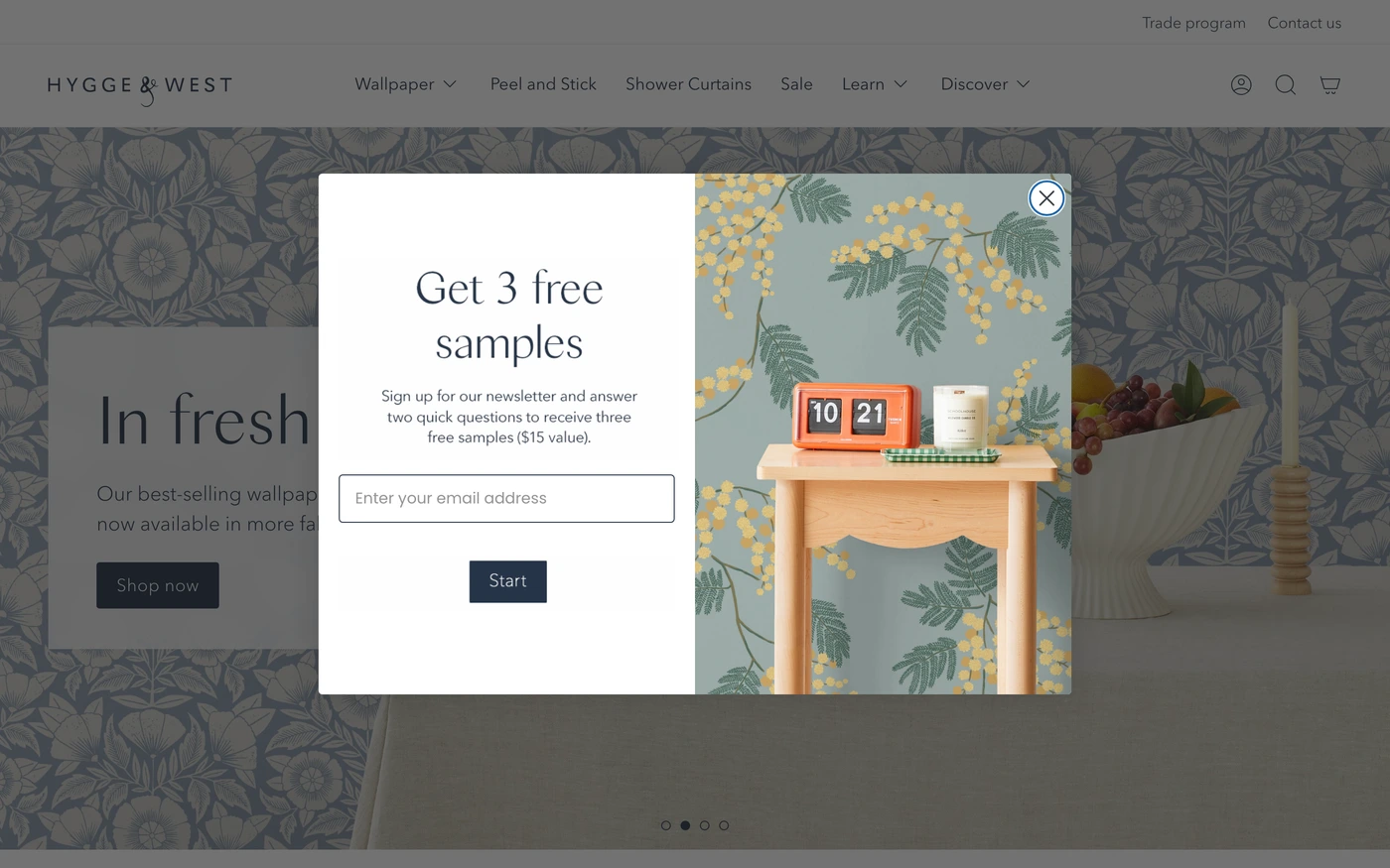
There are 307 red website designs here — live sites that use red as their most saturated brand colour, including Vercel, Ramp, Attio, Replit and Brex — cut into 7,740 sections. 83% use a light theme and 17% a dark one; the most common headline fonts are Inter (9), Montserrat (5) and Inter Tight (4). 188 of 307 open with a hero, 35 show pricing on the homepage and 55 carry testimonials.
At a glance
Live verified metrics- Sites
- 307
- Sections captured
- 7,740
- Light / dark
- 83% light · 17% dark
- Top heading fonts
- Inter (9), Montserrat (5) and Inter Tight (4)
- Accent colours
- red 307
- Most common sections
- features (252), hero (188), statement (155) and call to action (122)
- Top industries
- Food & Drink (38), Design & Agency (35) and Lifestyle (35)
- Award winners
- 56 of 307
Filter
Industry
Exact colour









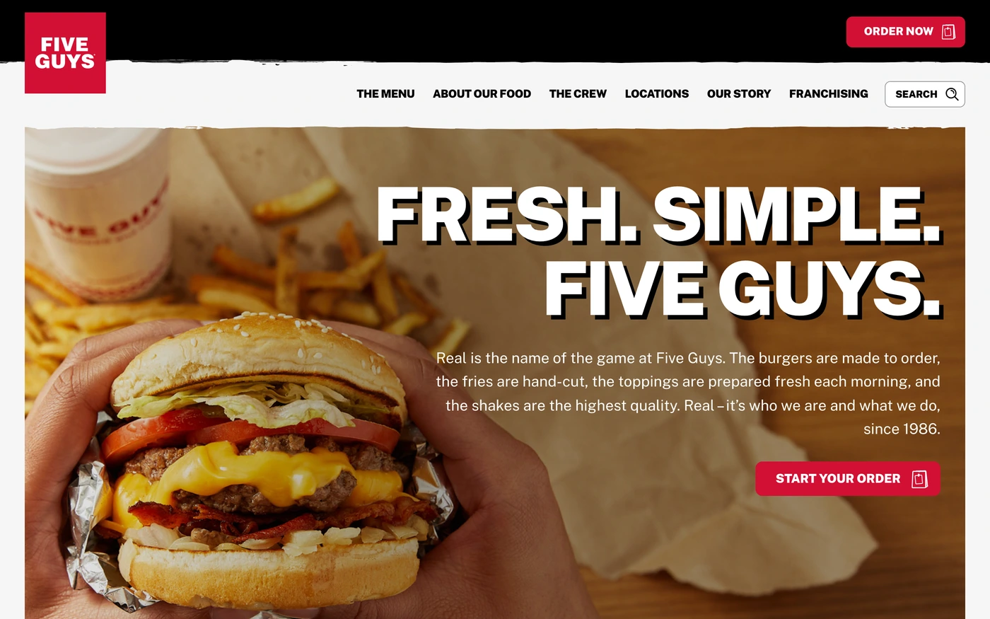

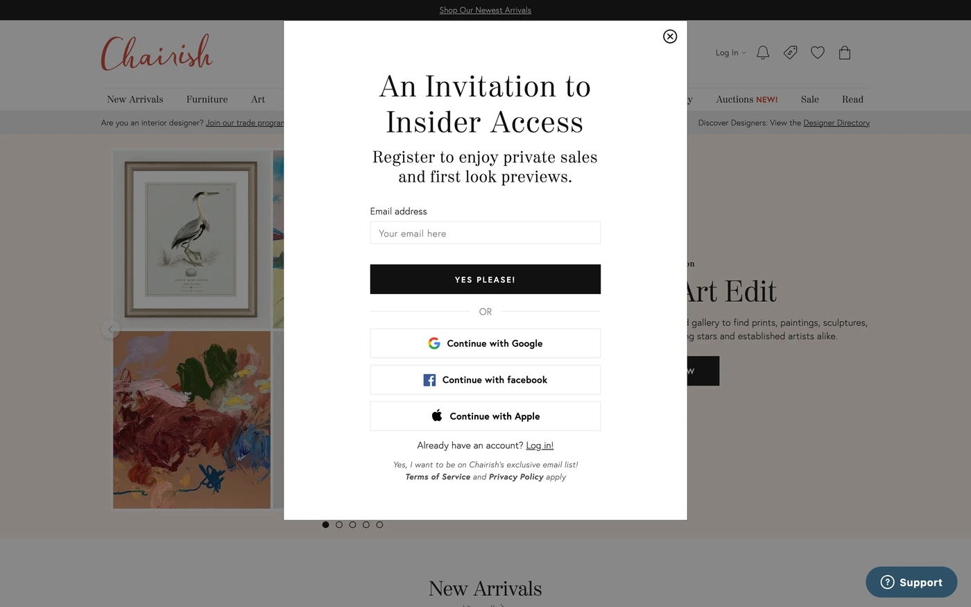

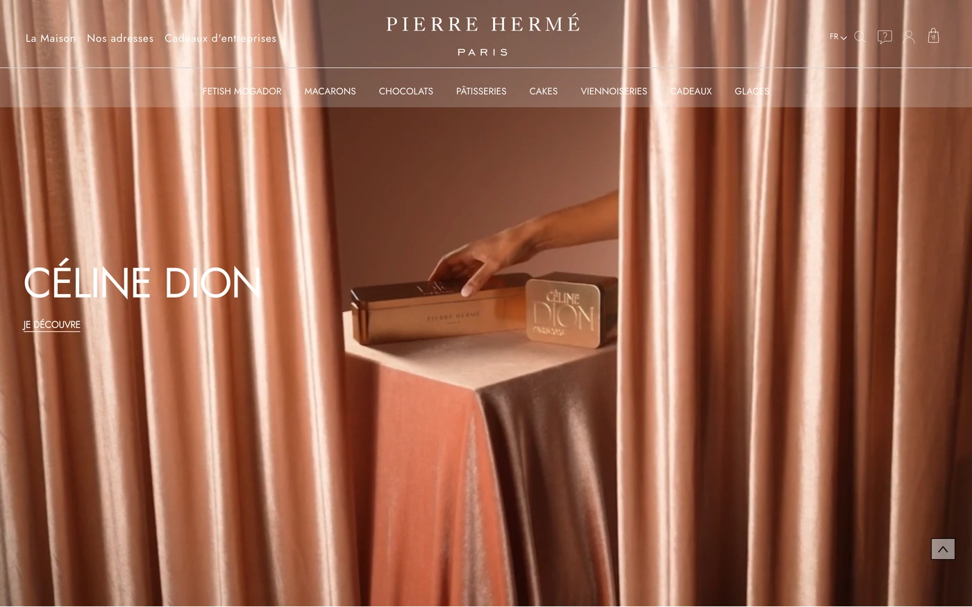
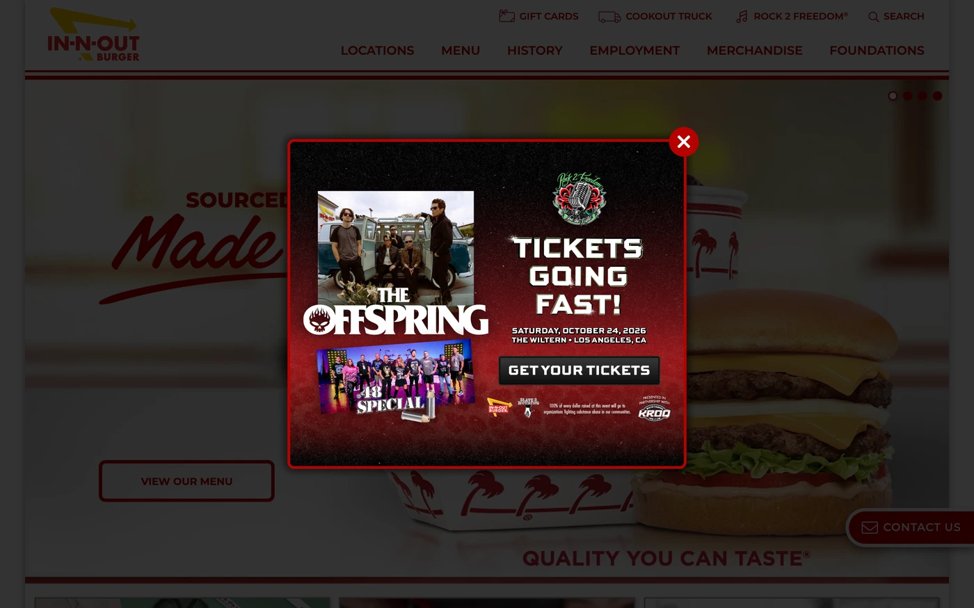
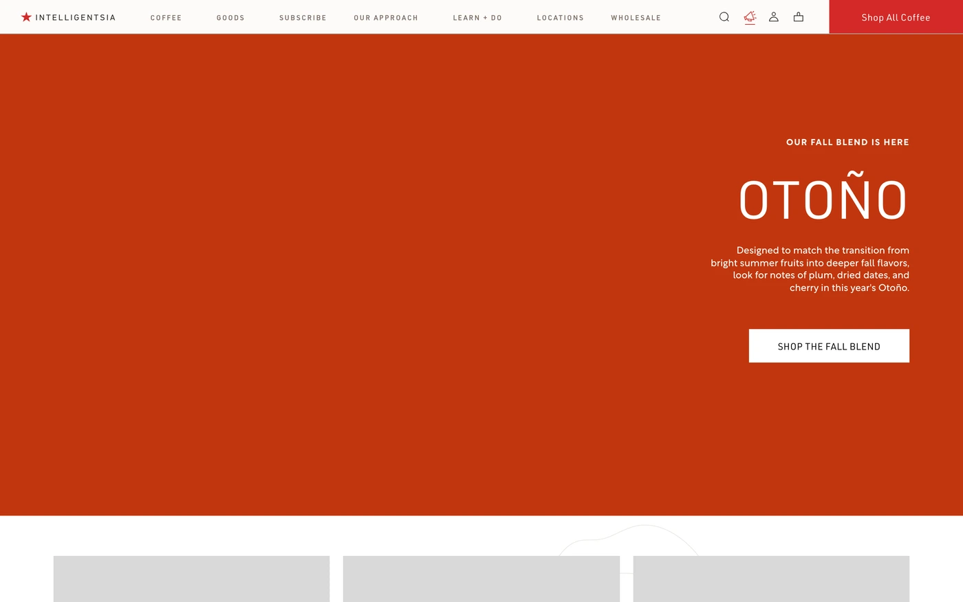
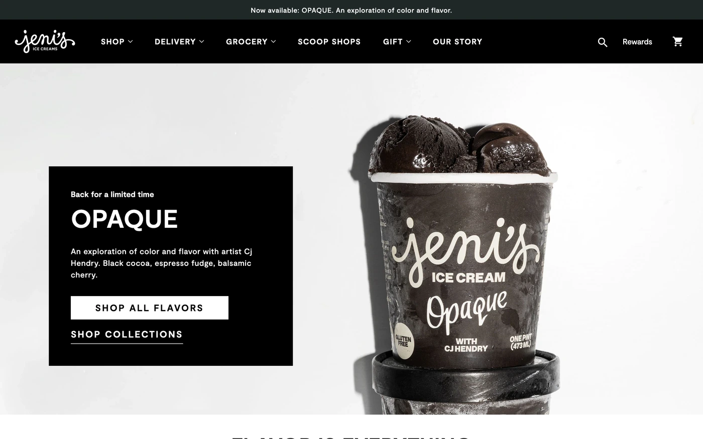

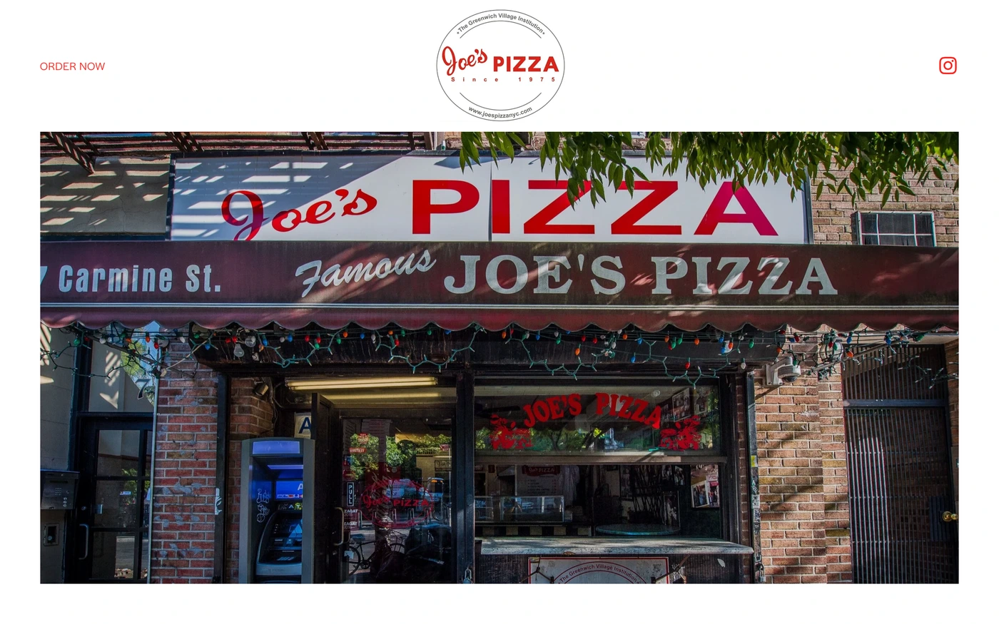



What makes a good red website design
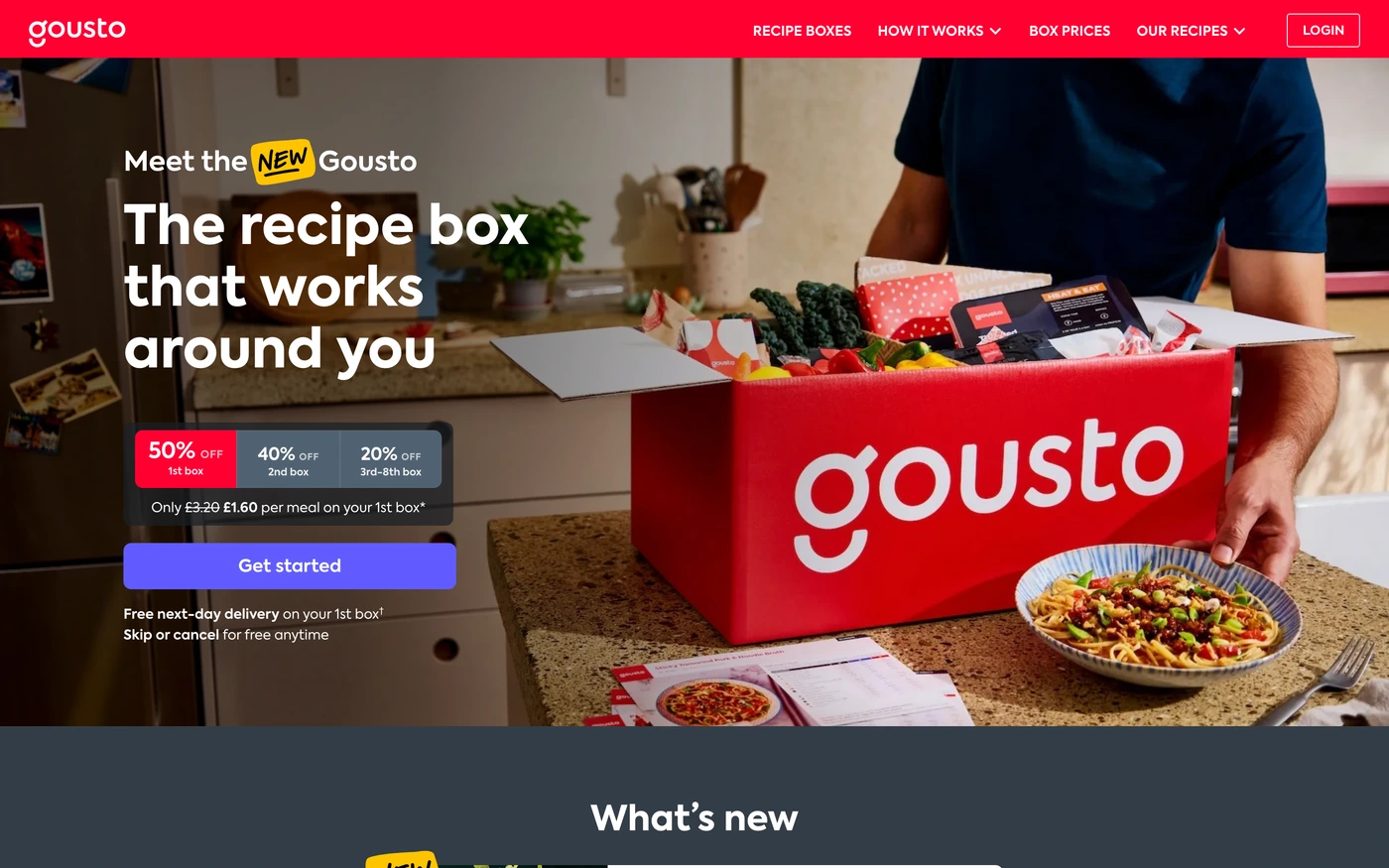
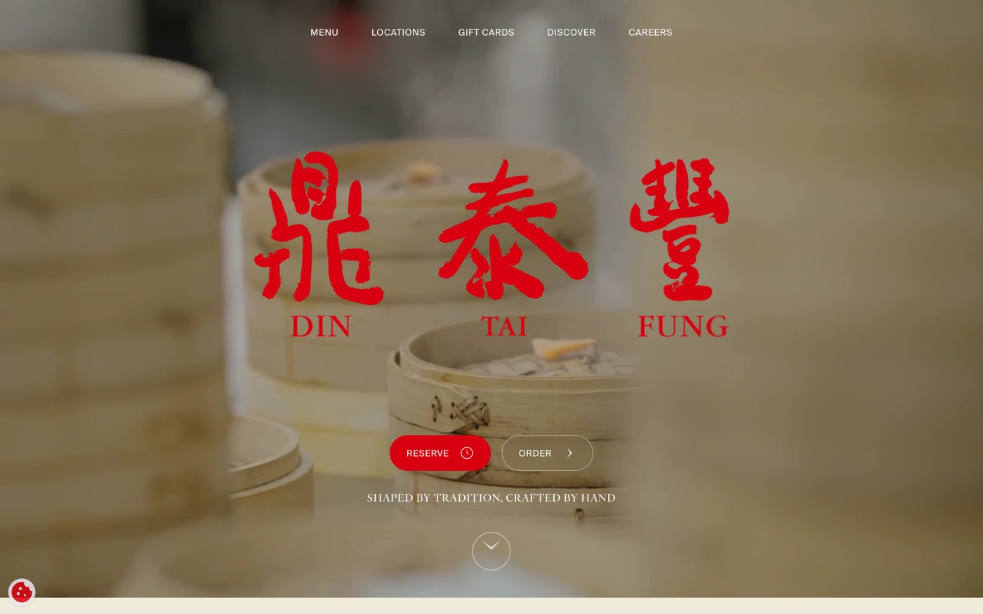
Red brand colours demand attention: energy, urgency and appetite, used by food, entertainment and bold consumer brands.
What these 307 red websites have in common
Measured from the captures, not opinion — use it to plan a red website against what already works.
Sections they use
252 include features, 188 include hero, 155 include statement and 122 include call to action. 71 answer objections with an FAQ and 122 (40%) close with a dedicated call to action. Read top to bottom, the most common running order is hero → features → footer → call to action → statement. Compare them side by side: features section examples, hero section examples, statement section examples.
Type and colour
Light layouts lead (83% vs 17% dark). Headlines are most often set in Inter (9), Montserrat (5) and Inter Tight (4). The most common accent hues are red (307). Every example lists its exact fonts and hex palette on its page.
Page length
The average homepage here is about 7,170px tall at desktop width — roughly 8 screens of scrolling, with Ramp the longest at 11,000px. Open any site to scroll the full-page capture and see where each section falls.
307 red website designs worth studying
- Work & Co — “Work & Co is a digital product agency. We drive tangible business impact through strategy, design, and development of new platforms and experiences.” 14 sections, headlines in Helvetica Now Display, light theme, palette #ffffff and #000000; the homepage runs hero → blog → call to action.
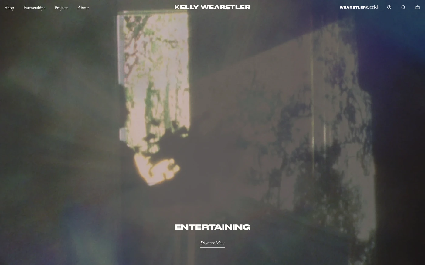
- Mansur Gavriel — “Mansur Gavriel creates luxury products made to love and last.” 23 sections, headlines in Supreme LL, light theme, palette #000000 and #687874.
- Knock — “Knock is customer engagement infrastructure for your product, marketing, and transactional messaging. Activate your data, ship cross-channel messaging, and accelerate growth.” 50 sections, headlines in Pp Neue Montreal, light theme, palette #000000 and #60646c; the homepage runs hero → logo cloud → statement → features.
- Framework — “Meet Framework Laptop 13 Pro & Desktop. Modular hardware built for performance, repairability, and ownership that lasts. Configure yours today.” 11 sections, headlines in Graphik, light theme, palette #ffffff and #1f1f1f; the homepage runs hero → features → call to action → footer.
- Nomad List — “Learn how to become a digital nomad and find the best places to live and work remotely as a location independent remote worker. Explore places based on cost…” 10 sections, light theme, palette #fbfaf8 and #1c1c1c.
- Kettle & Fire — “Kettle & Fire's bone broth is made with all organic ingredients and bones from 100% grass-fed cows. Try our 5-star bone broth and start improving your health.” 50 sections, headlines in Coastal, light theme, palette #fff5db and #221e1e; the homepage runs hero → showcase → features → call to action.
How to use these references for a red website
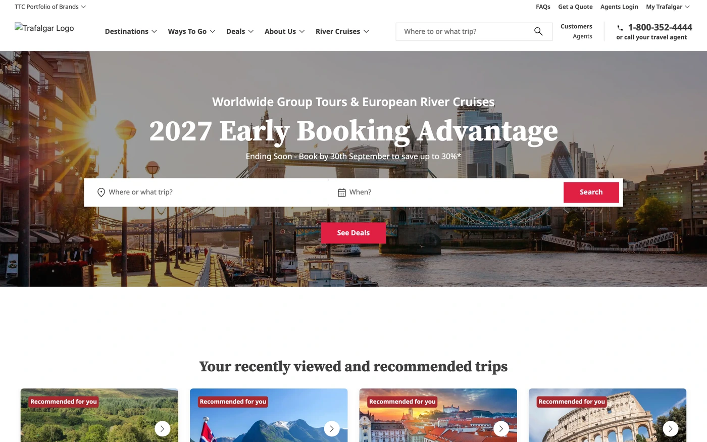
Use red for the brand and primary actions, not for errors and warnings too, and balance it with plenty of neutral space. Start with Vercel, Ramp and Attio, open each site at full size and compare their features and hero sections; every reference carries its palette, fonts and a build prompt you can paste into your editor.
Featured red website examples with their fonts
Related searches
Browse all websites or the full A–Z of popular searches.
How this list is built: 307 sites from the UI Discovery library that use red as their most saturated brand colour, matched on each product's own title, description and headline copy, captured styles, colours and fonts. Ordered by popularity.
Library updated