
Pink Website Design Examples
72 real sites · 2,088 sections



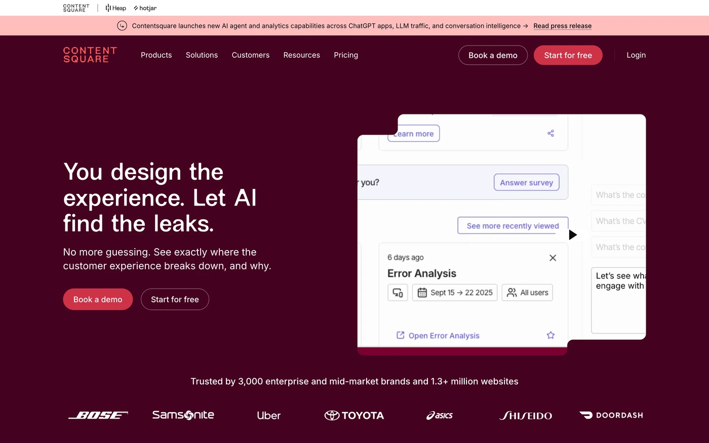
There are 72 pink website designs here — live sites that use pink as their most saturated brand colour, including Sentry, Rippling, Hotjar, Mixpanel and HiBob — cut into 2,088 sections. 92% use a light theme and 8% a dark one; the most common headline fonts are Inter (4), New Edge Rounded (2) and Proxima nova (2). 40 of 72 open with a hero, 10 show pricing on the homepage and 22 carry testimonials.
At a glance
Live verified metrics- Sites
- 72
- Sections captured
- 2,088
- Light / dark
- 92% light · 8% dark
- Top heading fonts
- Inter (4), New Edge Rounded (2) and Proxima nova (2)
- Accent colours
- pink 72
- Most common sections
- features (59), hero (40), statement (39) and call to action (30)
- Top industries
- Fashion & Beauty (10), Health & Fitness (9) and Lifestyle (8)
- Award winners
- 7 of 72
Filter
Industry
Exact colour






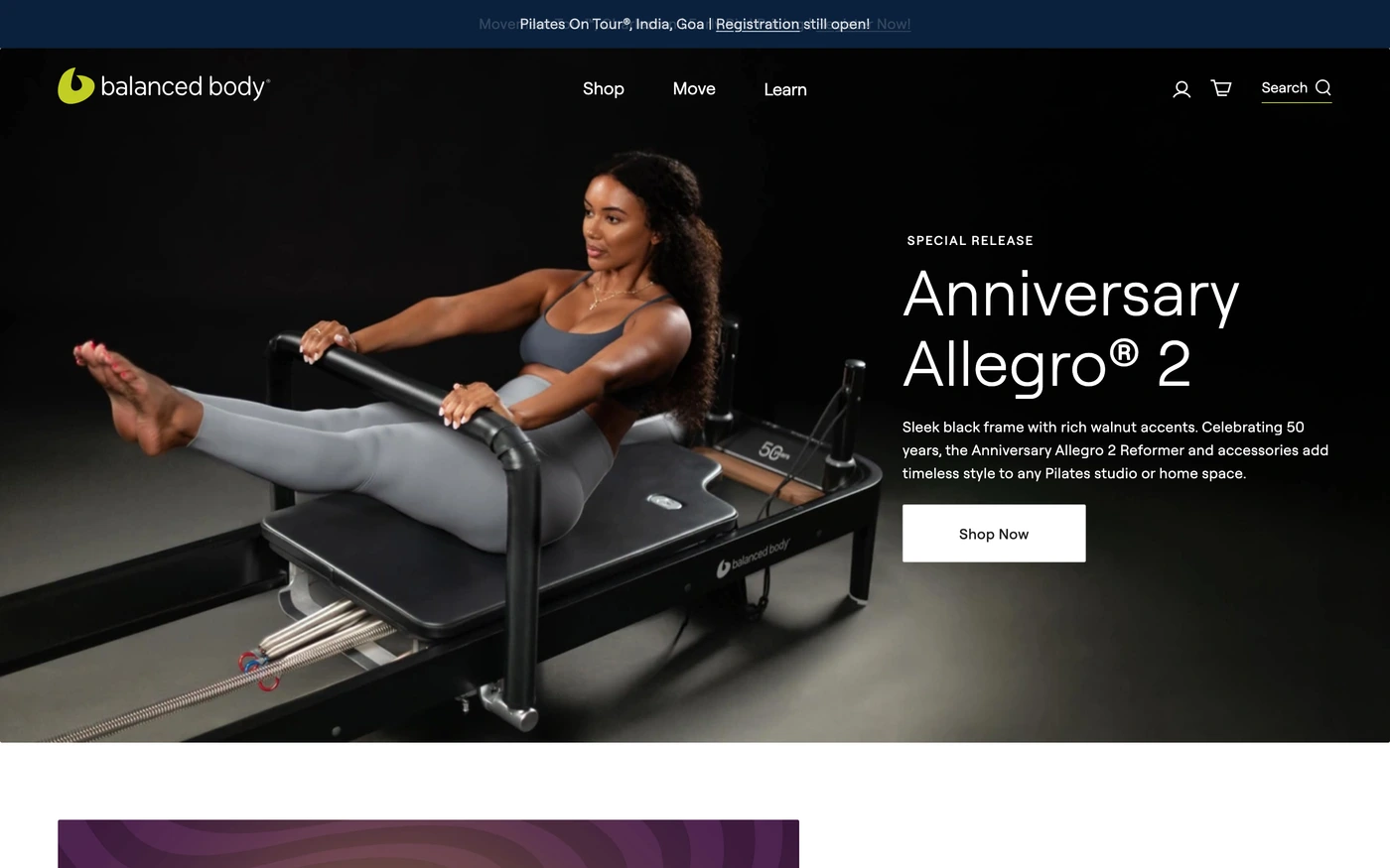

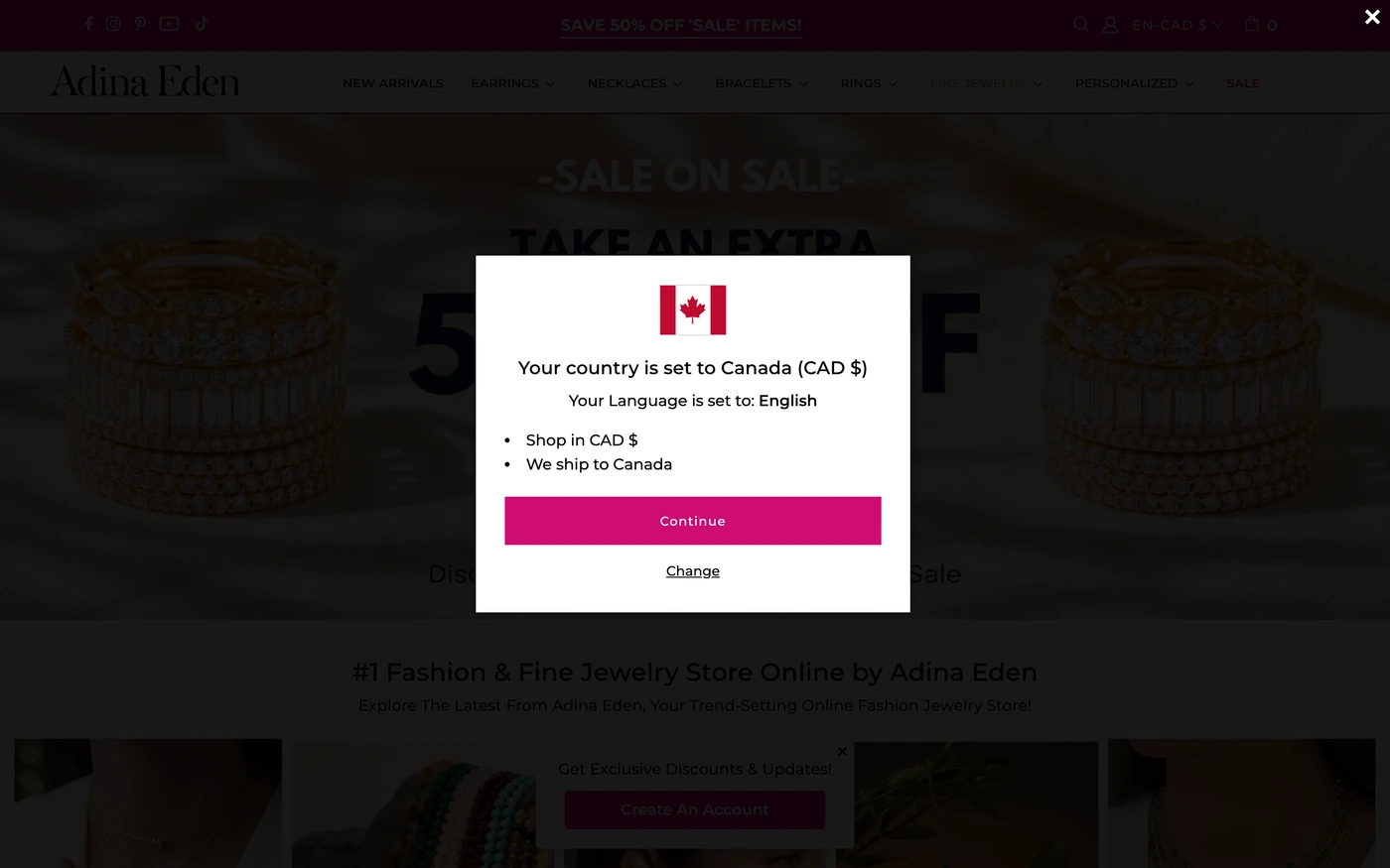



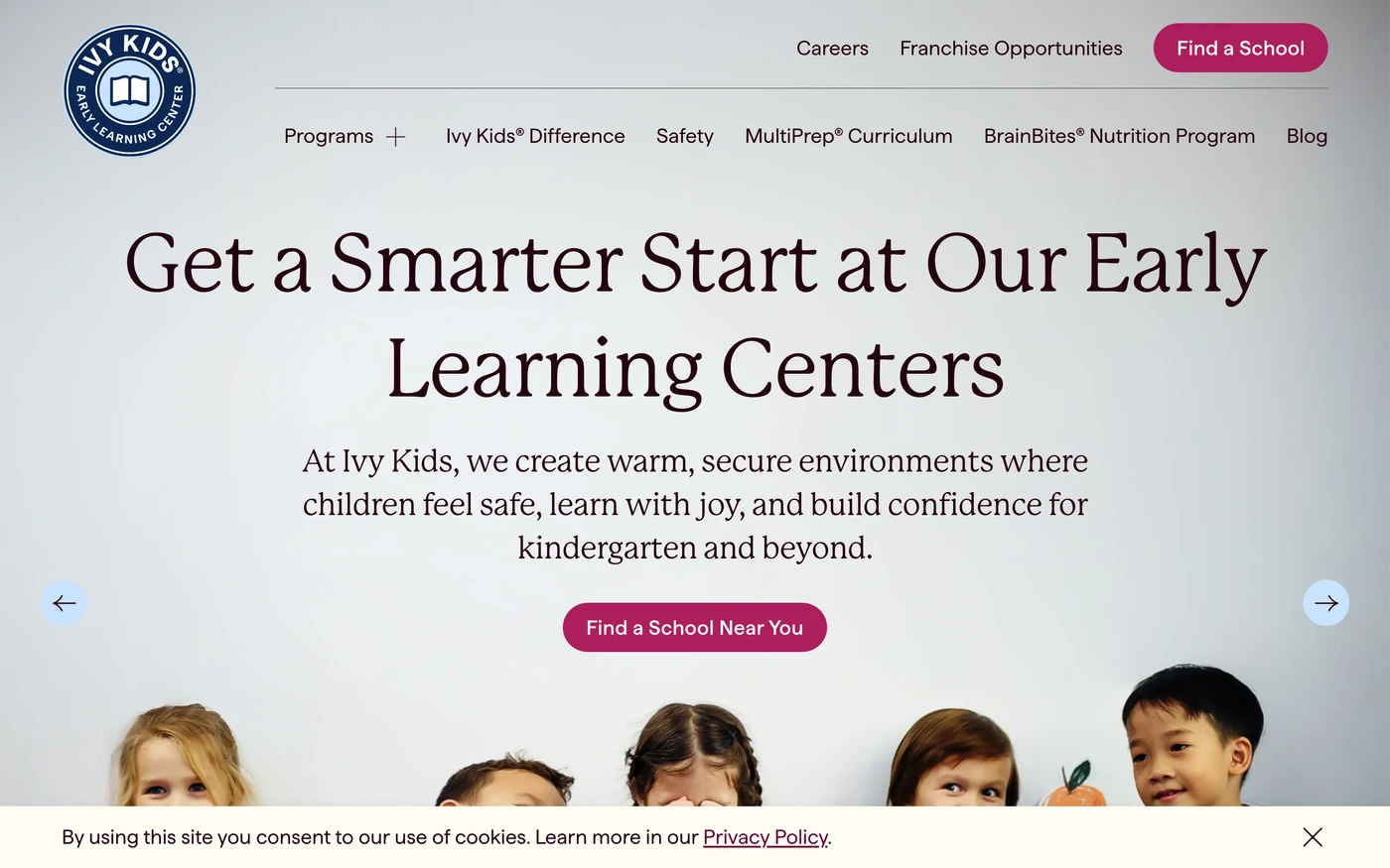

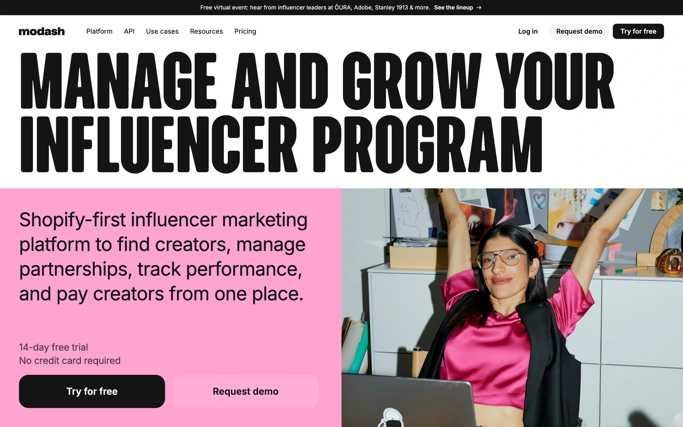



What makes a good pink website design
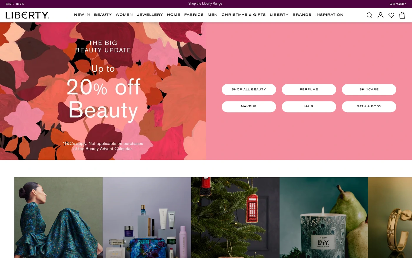
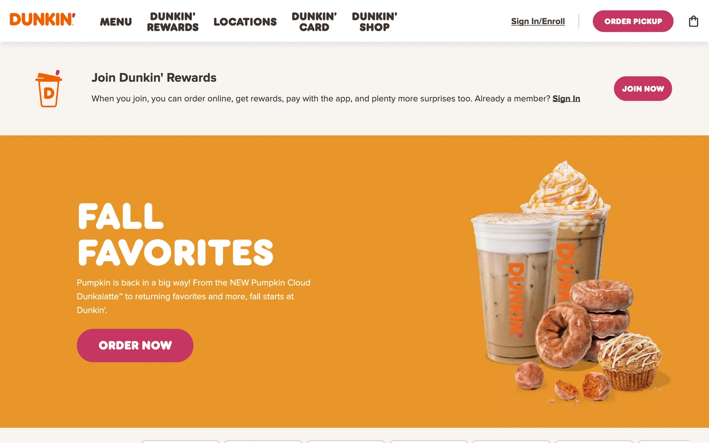
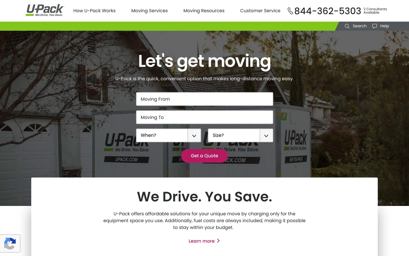
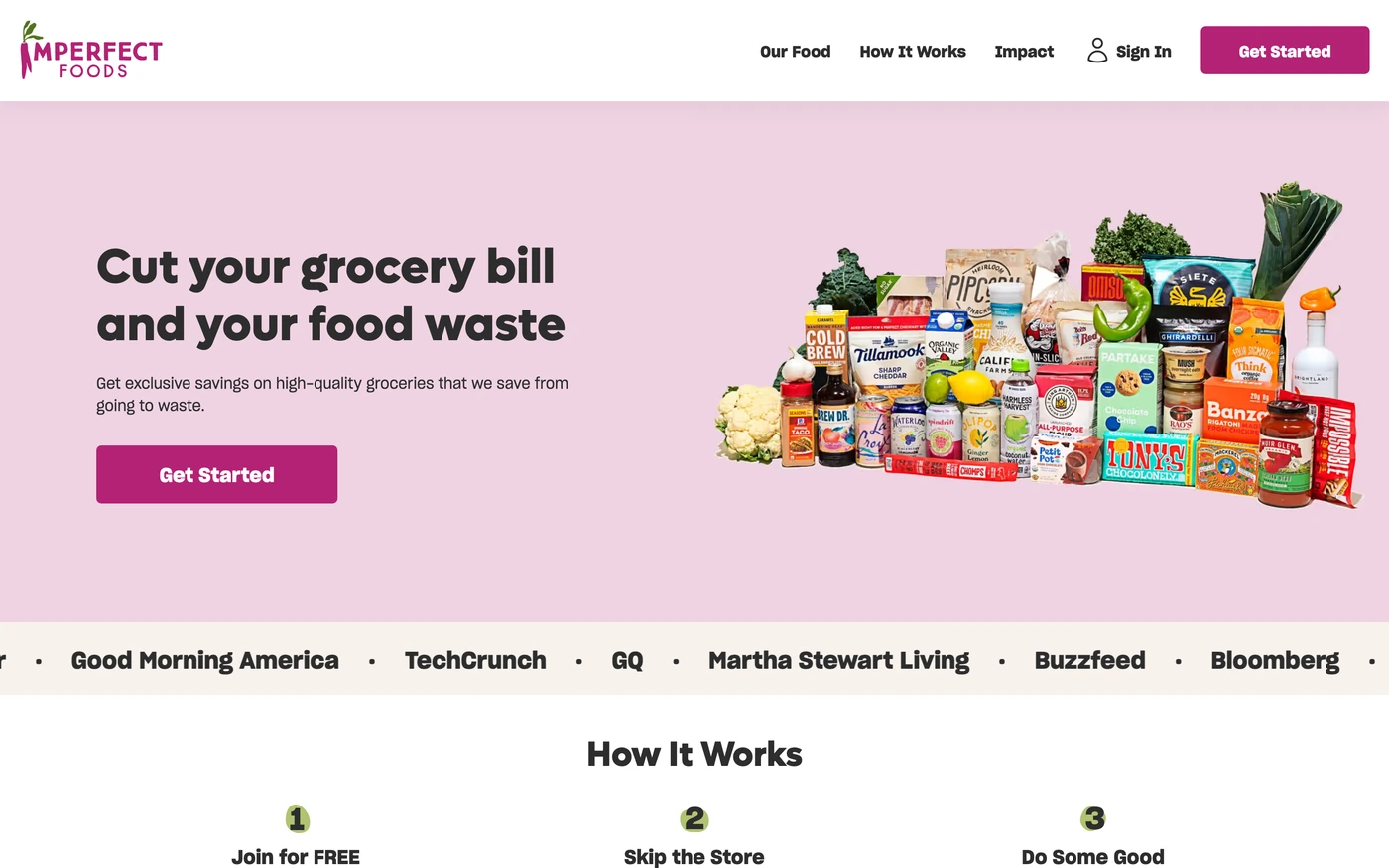
Pink brands are confident and contemporary, used by beauty, fashion and consumer tech to feel approachable and bold.
What these 72 pink websites have in common
Measured from the captures, not opinion — use it to plan a pink website against what already works.
Sections they use
59 include features, 40 include hero, 39 include statement and 30 include call to action. 28 answer objections with an FAQ and 30 (42%) close with a dedicated call to action. Read top to bottom, the most common running order is hero → features → statement → footer → call to action. Compare them side by side: features section examples, hero section examples, statement section examples.
Type and colour
Light layouts lead (92% vs 8% dark). Headlines are most often set in Inter (4), New Edge Rounded (2) and Proxima nova (2). The most common accent hues are pink (72). Every example lists its exact fonts and hex palette on its page.
Page length
The average homepage here is about 6,964px tall at desktop width — roughly 8 screens of scrolling, with Mixpanel the longest at 11,000px. Open any site to scroll the full-page capture and see where each section falls.
72 pink website designs worth studying
- Lyft — “Request a ride whenever you need one. Drivers earn on their own terms. Download the app to get started.” 60 sections, headlines in Rebel Sans Display, light theme, palette #ffffff and #820076; the homepage runs hero → features → call to action → footer.
- Huge — “We’re Huge, a human-first, AI-native design and technology company built for moments when technology and culture are changing faster than businesses.” 58 sections, headlines in Matter, light theme, palette #ffffff and #0d0b0a; the homepage runs hero → statement → call to action → logo cloud.
- Rome2Rio — “Discover how to get anywhere by searching plane, train, bus, car and ferry routes” 32 sections, headlines in Google Sans, light theme, palette #ffffff and #fafaf9; the homepage runs hero → stats → showcase → call to action.
- Natural Cycles — “Natural Cycles birth control is 93% effective with typical use and 98% effective with perfect use. Learn more about hormone-free birth control today.” 35 sections, headlines in Open sauce one, light theme, palette #72035d and #f3eeee; the homepage runs hero → features → stats → features.
- Rippling — “Rippling eliminates the friction from running a business, combining HR, IT, and Finance apps on a unified data platform.” 53 sections, headlines in Basel, light theme, palette #000000 and #ffffff; the homepage runs hero → features → showcase → features.
- Ashby — “Ashby’s all-in-one recruiting software consolidates your ATS, Analytics, Scheduling, and CRM” 60 sections, headlines in TTNorms Pro, light theme, palette #fcfcfe and #141415; the homepage runs hero → features → about → footer.
How to use these references for a pink website
Use pink as a full-bleed statement or a sharp accent, not both, and balance it with deep neutrals for text. Start with Sentry, Rippling and Hotjar, open each site at full size and compare their features and hero sections; every reference carries its palette, fonts and a build prompt you can paste into your editor.
Featured pink website examples with their fonts
- Sentry
Fonts: Dammit Sans / Rubik
- Hotjar
Fonts: New Edge Rounded / Inter
- HiBob
- Descript
Fonts: Brett / Booton
Related searches
Browse all websites or the full A–Z of popular searches.
How this list is built: 72 sites from the UI Discovery library that use pink as their most saturated brand colour, matched on each product's own title, description and headline copy, captured styles, colours and fonts. Ordered by popularity.
Library updated