
Analytics & Data Website Design Examples
25 real sites · 1,104 sections




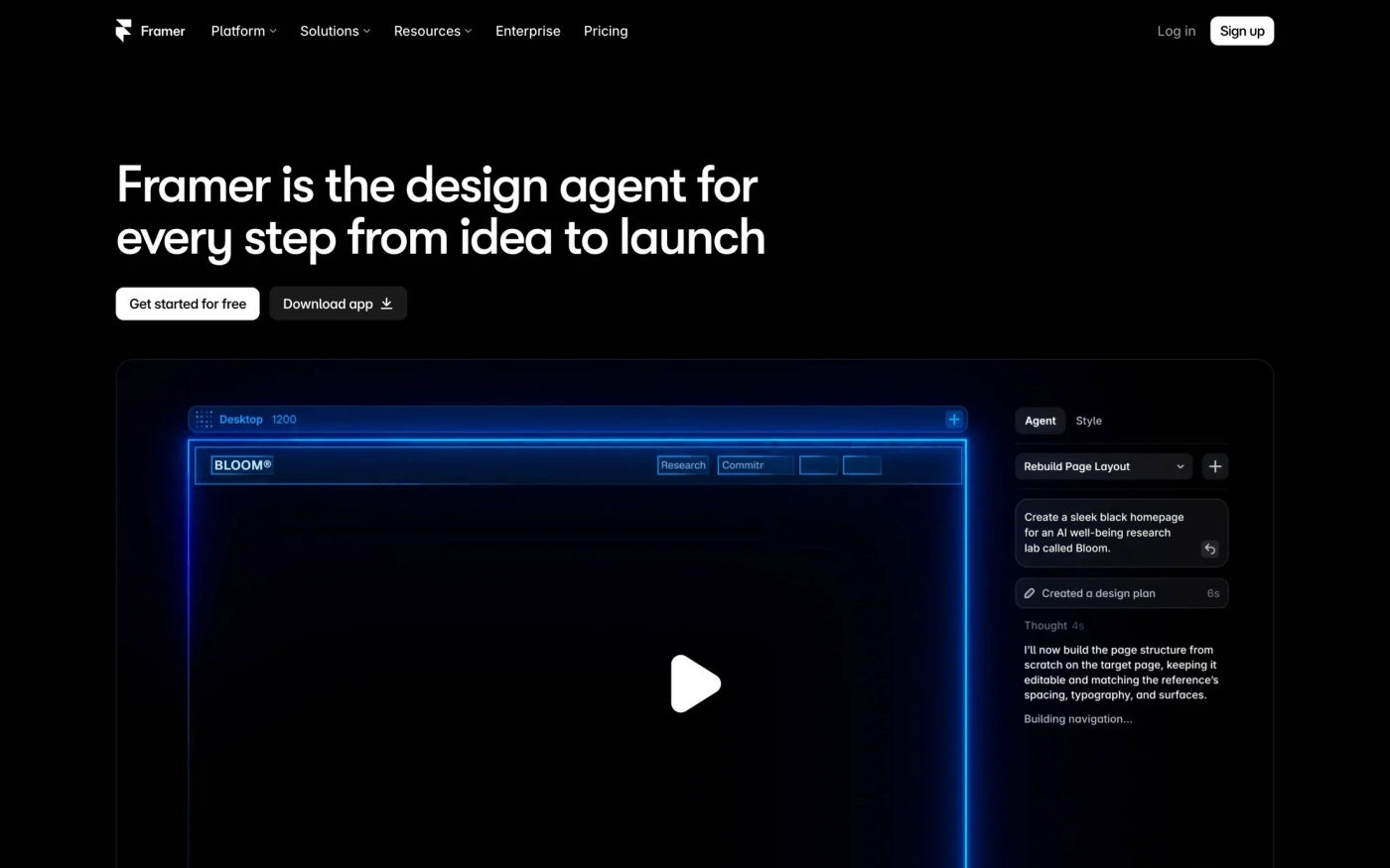
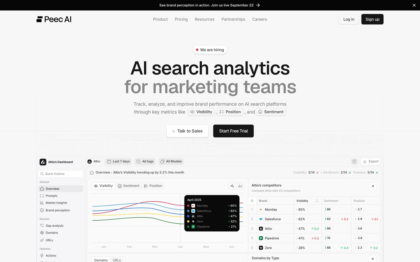
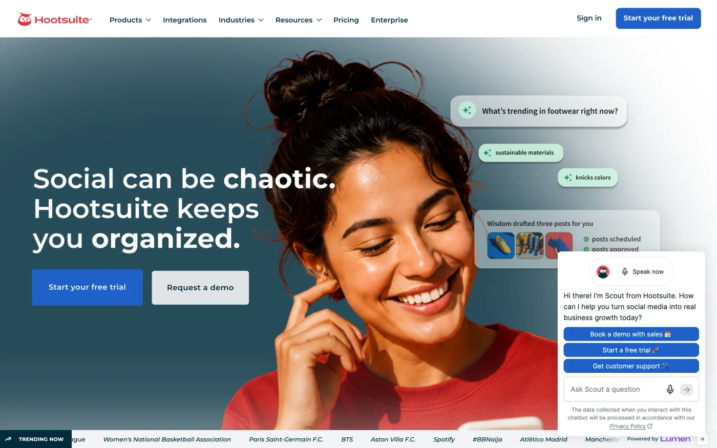
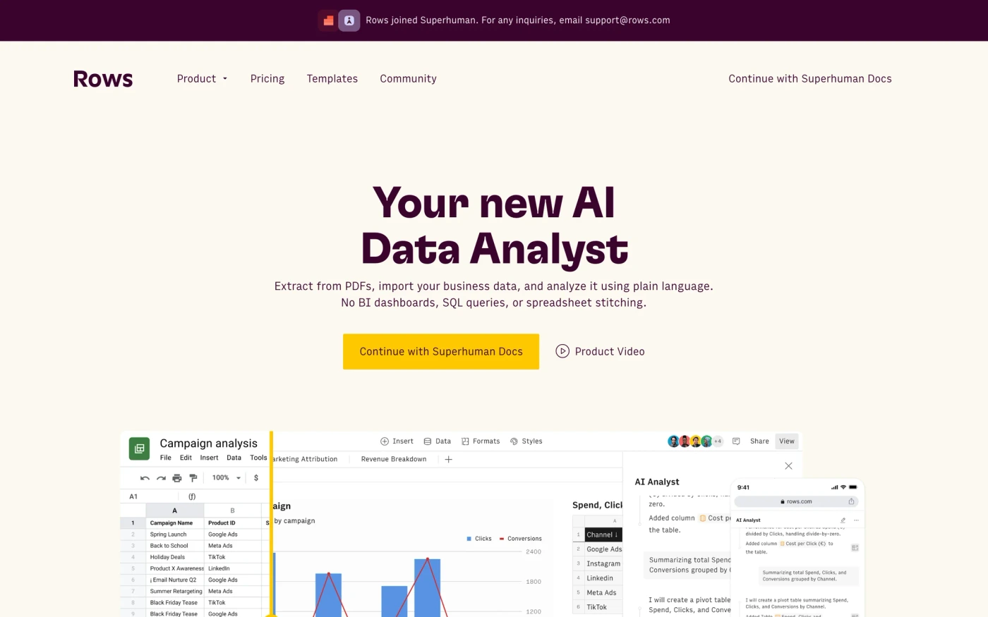
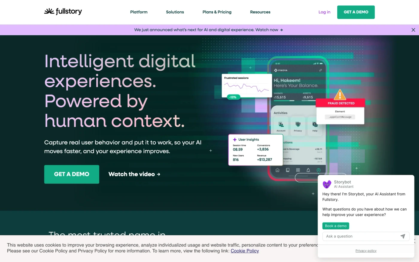
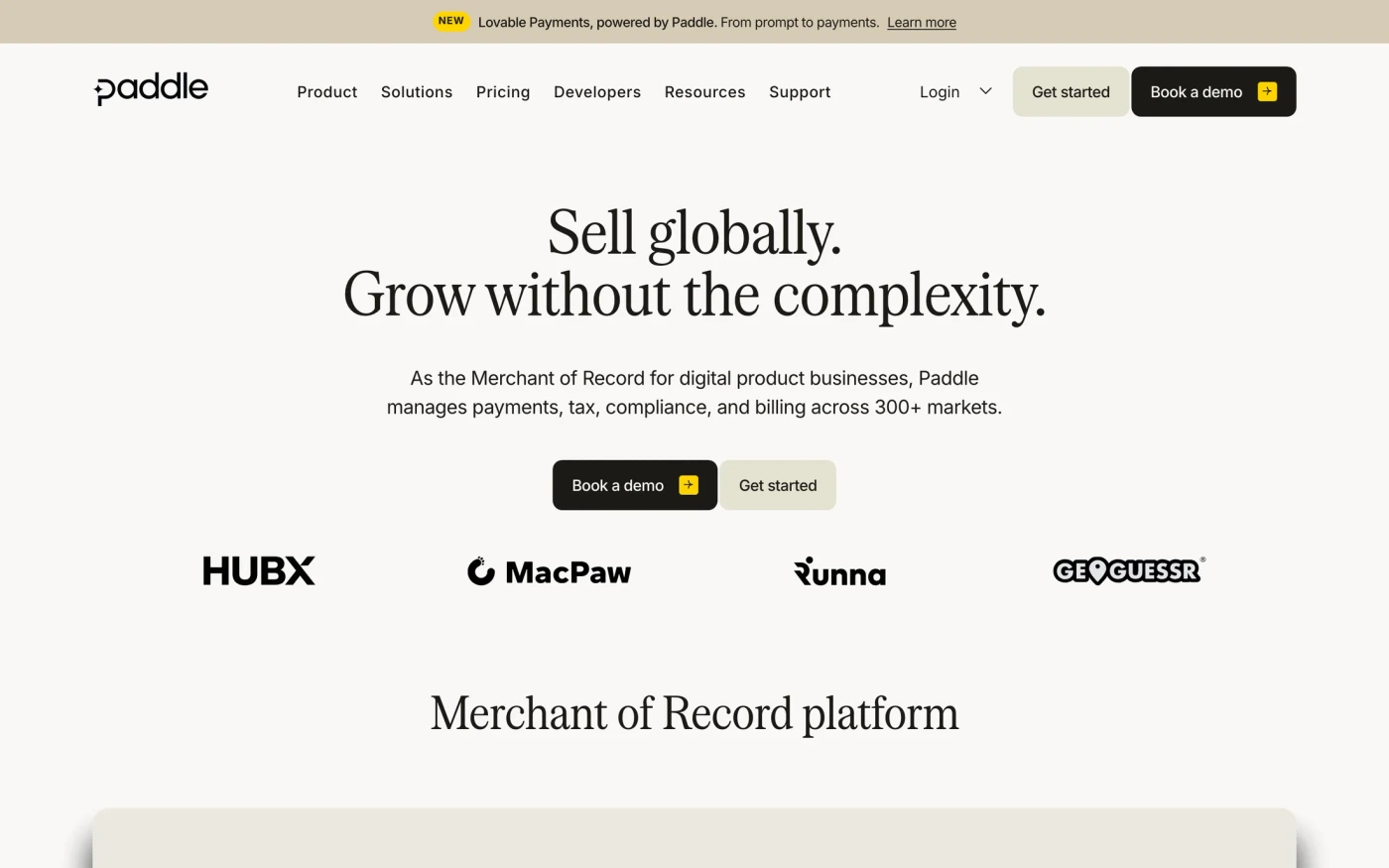
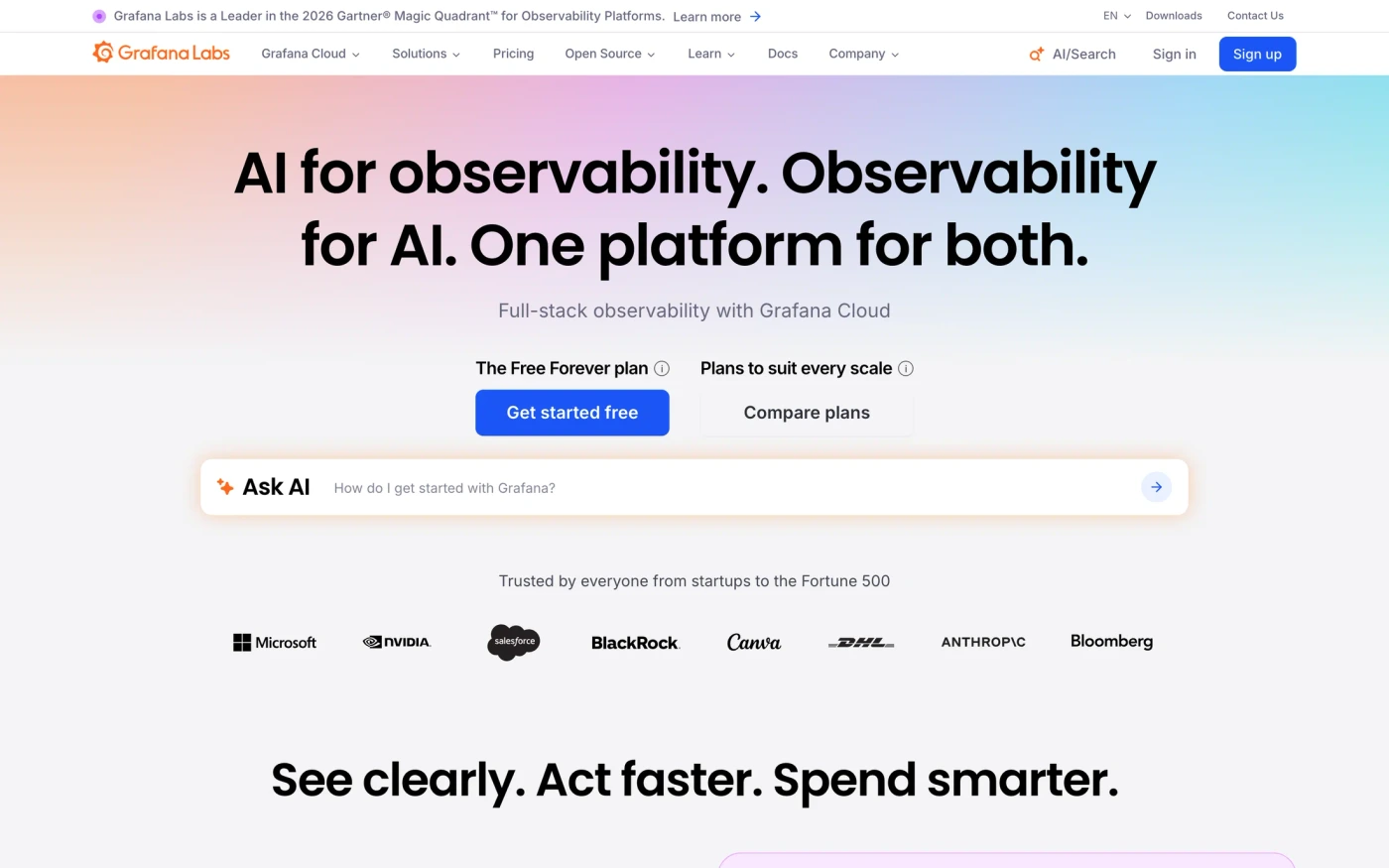
There are 25 analytics & data website designs here — live sites that sell analytics, data or dashboards, including Framer, Rippling, Sprout Social, Hootsuite and Hotjar — cut into 1,104 sections. 80% use a light theme and 20% a dark one; the most common headline fonts are New Edge Rounded (2), Inter (2) and Geist (2). 21 of 25 open with a hero, 10 show pricing on the homepage and 15 carry testimonials.
At a glance
Live verified metrics- Sites
- 25
- Sections captured
- 1,104
- Light / dark
- 80% light · 20% dark
- Top heading fonts
- New Edge Rounded (2), Inter (2) and Geist (2)
- Accent colours
- neutral 7blue 6pink 5
- Most common sections
- features (22), hero (21), blog (16) and testimonials (15)
- Top industries
- Marketing (9), Developer Tools (6) and AI (5)
- Award winners
- 0 of 25
Filter
Exact colour
















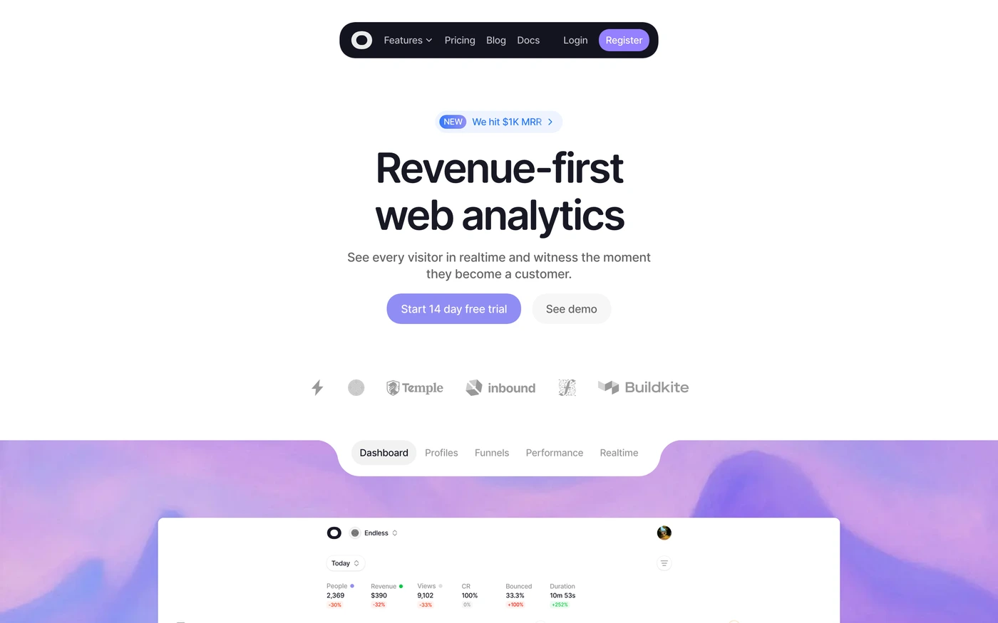



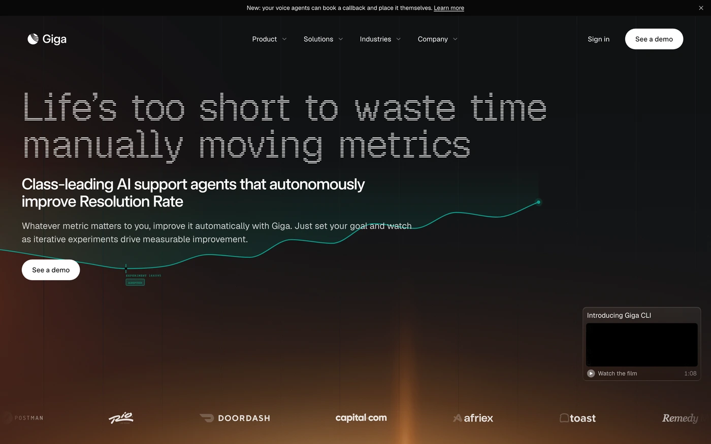

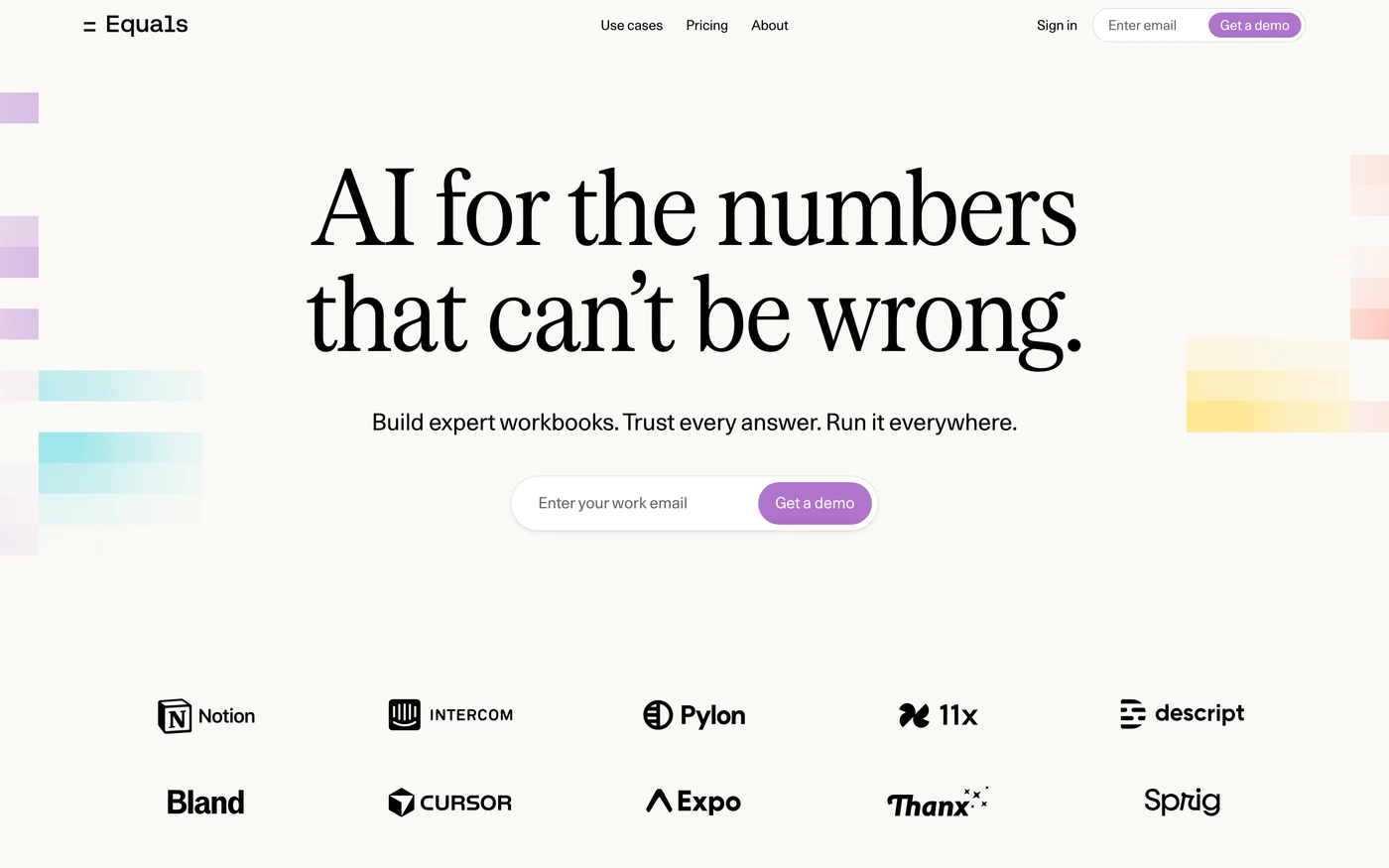

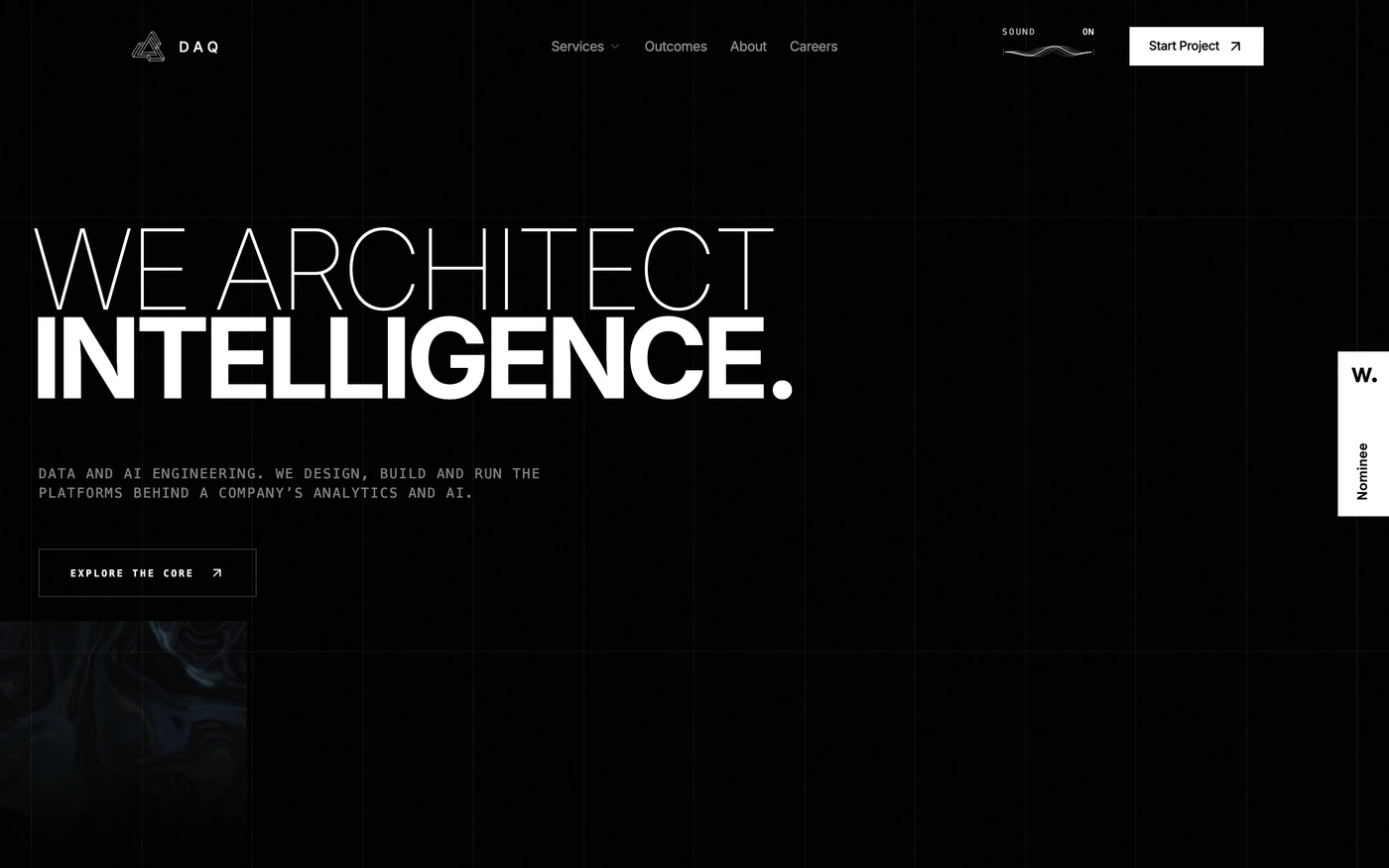

What makes a good analytics & data website design
Analytics products sell answers, not charts: the questions they answer, dashboards on real data, integrations with the stack, and privacy or governance for data teams.
What these 25 analytics & data websites have in common
Measured from the captures, not opinion — use it to plan a analytics & data website against what already works.
Sections they use
22 include features, 21 include hero, 16 include blog and 15 include testimonials. 15 answer objections with an FAQ and 14 (56%) close with a dedicated call to action. Read top to bottom, the most common running order is hero → features → stats → faq → footer. Compare them side by side: features section examples, hero section examples, blog section examples.
Type and colour
Light layouts lead (80% vs 20% dark). Headlines are most often set in New Edge Rounded (2), Inter (2) and Geist (2). The most common accent hues are neutral (7), blue (6) and pink (5). Every example lists its exact fonts and hex palette on its page.
Page length
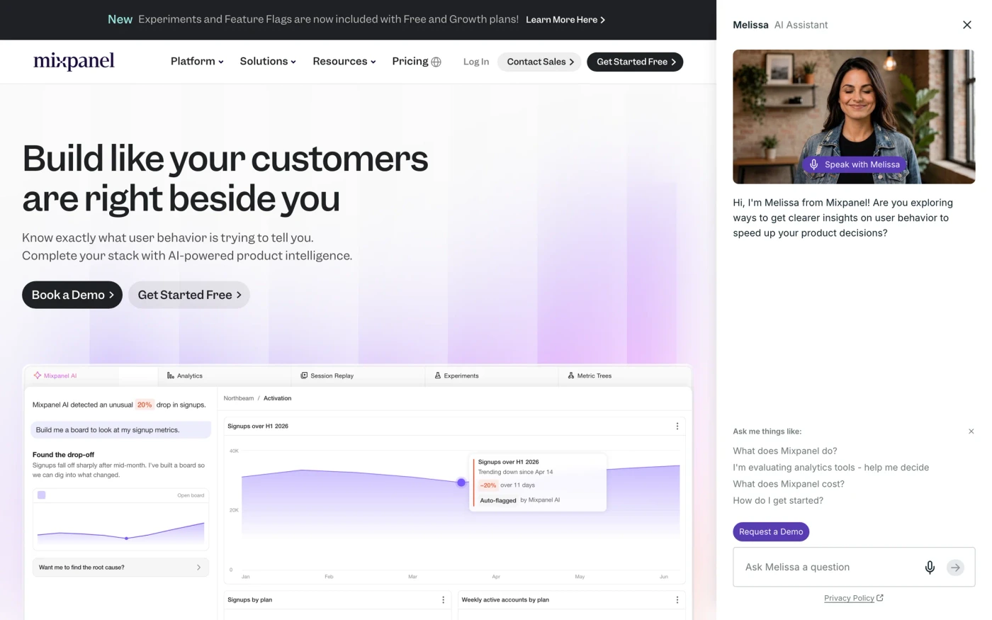
The average homepage here is about 8,202px tall at desktop width — roughly 9 screens of scrolling, with Mixpanel the longest at 11,000px. Open any site to scroll the full-page capture and see where each section falls.
25 analytics & data website designs worth studying
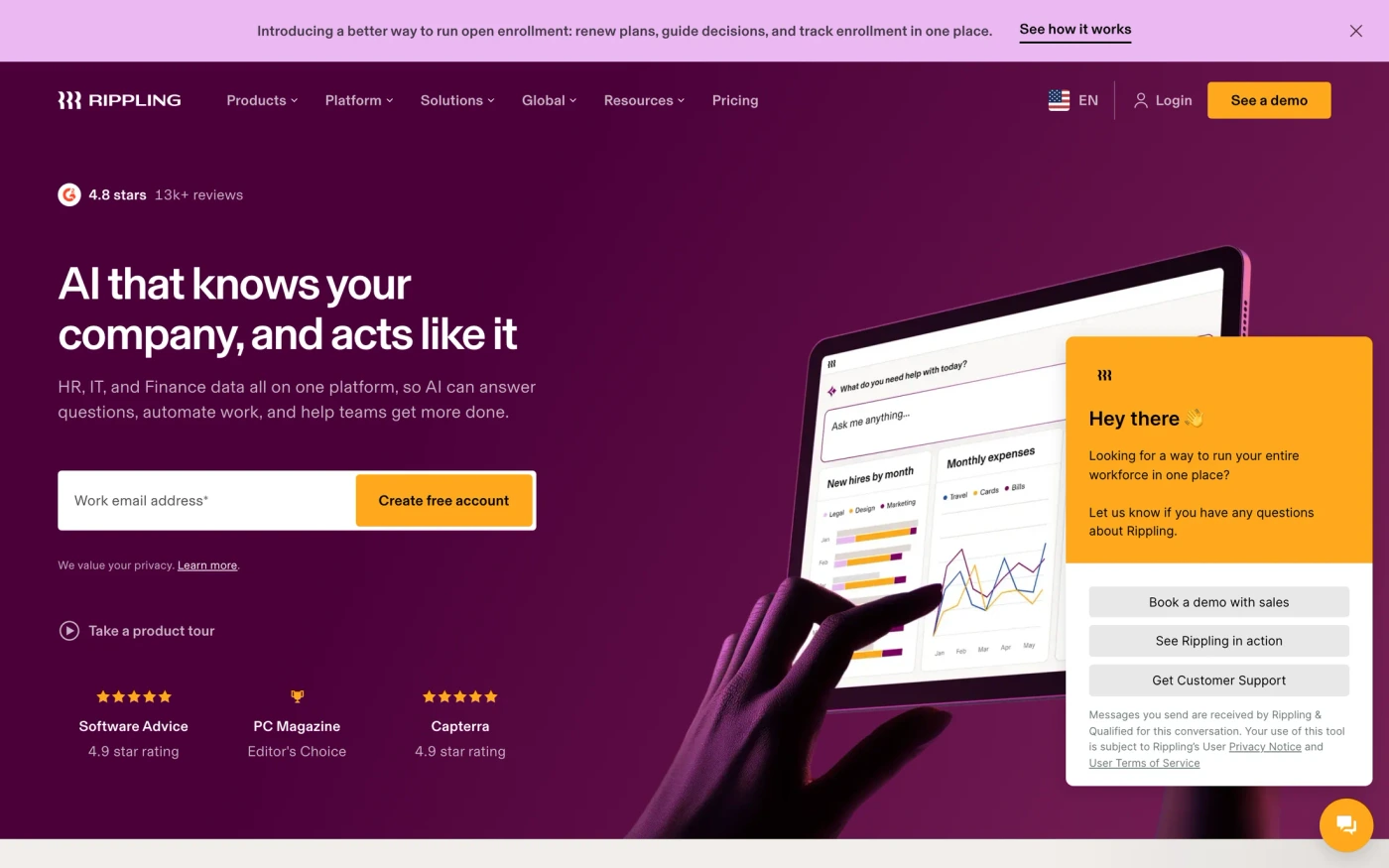
- Rippling — “Rippling eliminates the friction from running a business, combining HR, IT, and Finance apps on a unified data platform.” 53 sections, headlines in Basel, light theme, palette #000000 and #ffffff; the homepage runs hero → features → showcase → features.
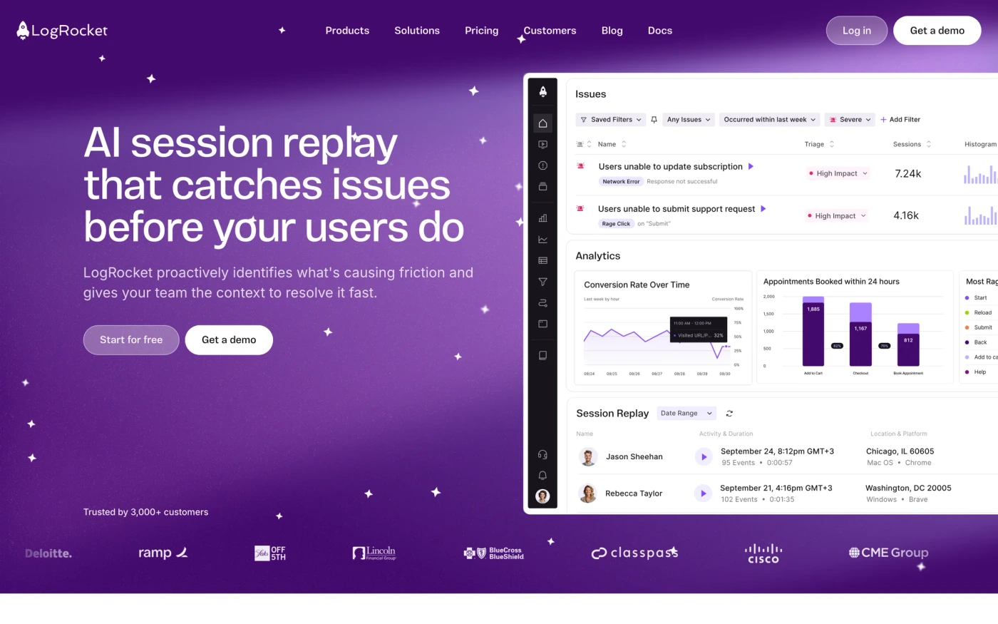
- LogRocket — “LogRocket helps you understand problems affecting your users, so that you can get back to building great software.” 22 sections, headlines in Vinila, light theme, palette #ffffff and #17141b; the homepage runs hero → features → blog → call to action.
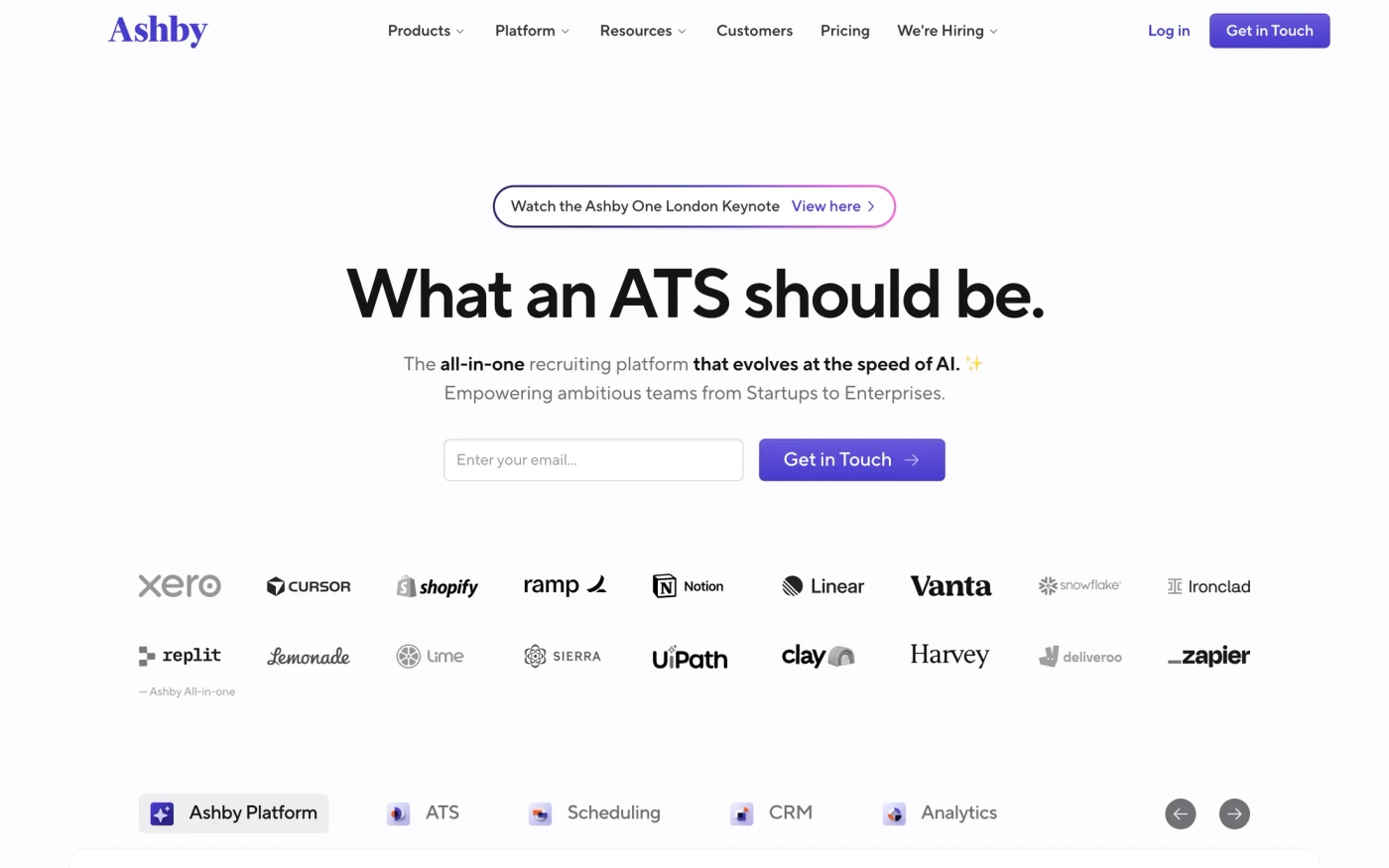
- Ashby — “Ashby’s all-in-one recruiting software consolidates your ATS, Analytics, Scheduling, and CRM” 60 sections, headlines in TTNorms Pro, light theme, palette #fcfcfe and #141415; the homepage runs hero → features → about → footer.
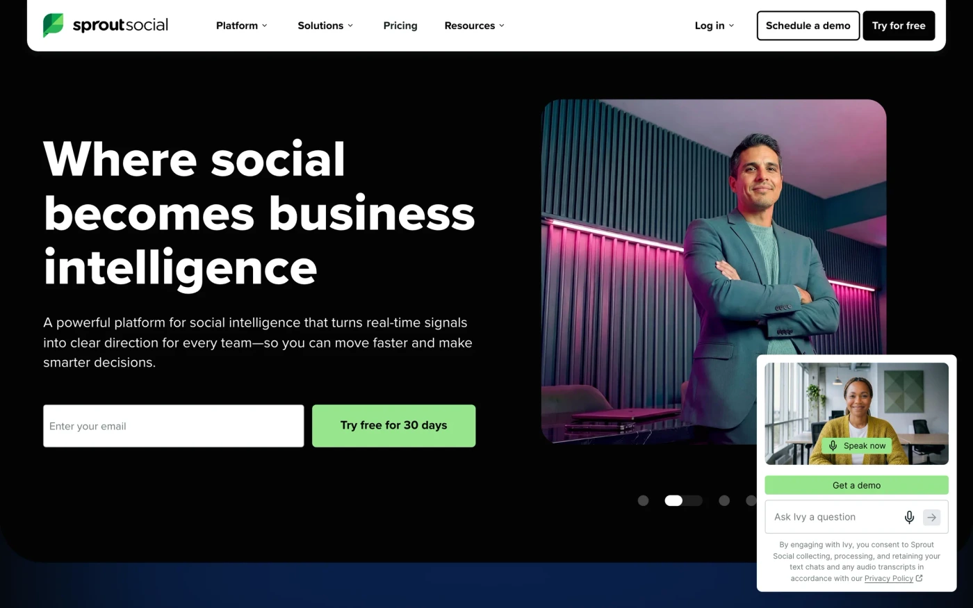
- Sprout Social — “Maximize your social ROI with Sprout Social, trusted by the world's most talked about brands. Power everything from publishing and engagement to analytics and influencer marketing. Try 30…” 71 sections, headlines in Proxima Nova, light theme, palette #ffffff and #040404; the homepage runs hero → statement → logo cloud → features.
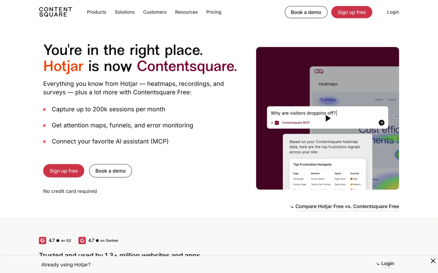
- Hotjar — “Contentsquare, the global leader in digital experience analytics, has joined forces with Hotjar, the leading product experience insights platform in the midsize and SMB market.” 46 sections, headlines in New Edge Rounded, light theme, palette #0d0d0d and #ffffff; the homepage runs features → logo cloud → features → faq.
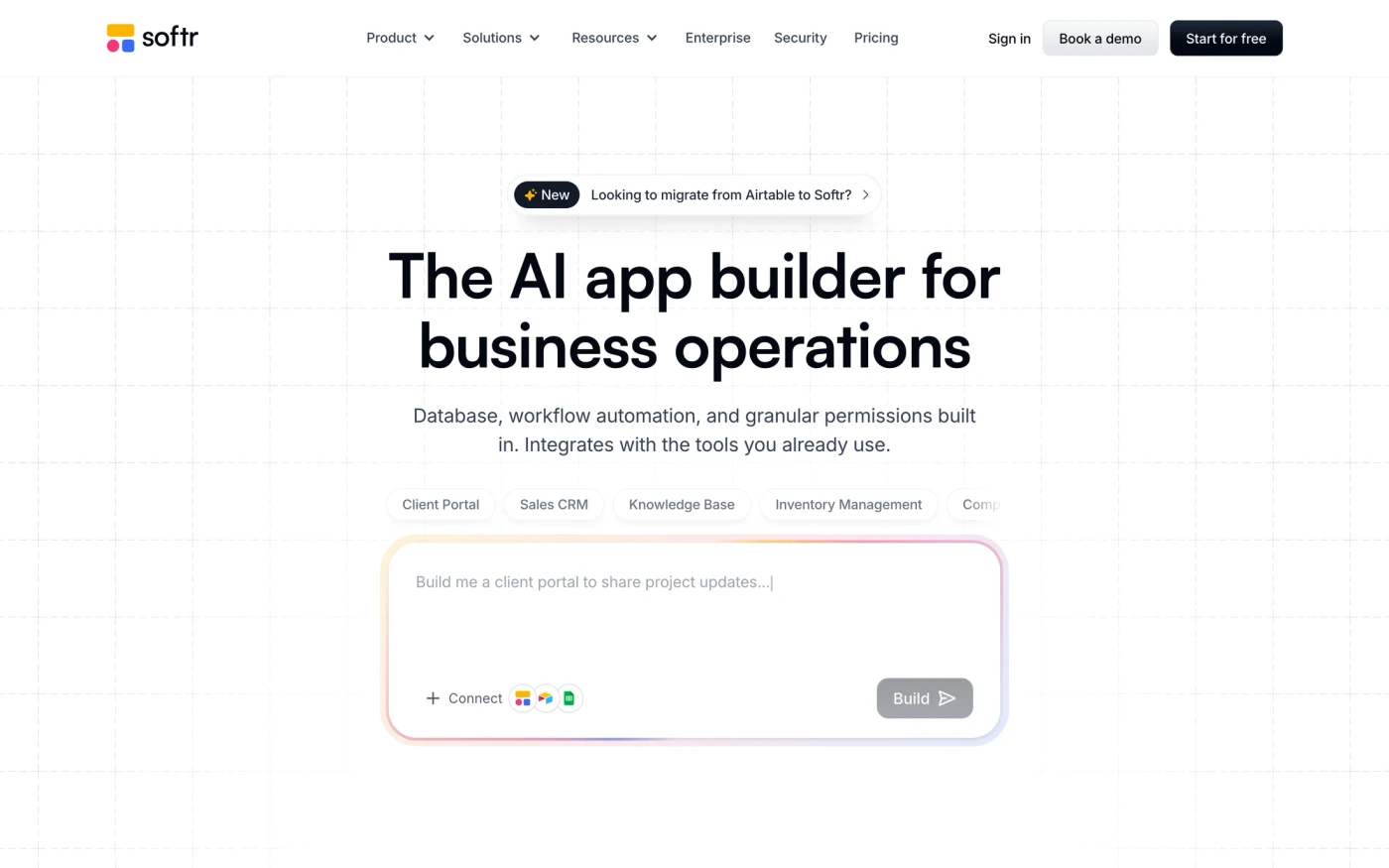
- Softr — “Build and launch custom AI-powered portals and internal tools in minutes, no code required. Drag and drop. Sync with any data source. 100s of ready templates.” 74 sections, headlines in Satoshi, light theme, palette #ffffff and #030712; the homepage runs features → stats → testimonials → faq.
How to use these references for a analytics & data website
Frame features as questions answered, show dashboards with realistic data and list data sources and warehouses up front. Start with Framer, Rippling and Sprout Social, open each site at full size and compare their features and hero sections; every reference carries its palette, fonts and a build prompt you can paste into your editor.
Featured analytics & data website examples with their fonts
Related searches
Browse all websites or the full A–Z of popular searches.
How this list is built: 25 sites from the UI Discovery library that sell analytics, data or dashboards, matched on each product's own title, description and headline copy, captured styles, colours and fonts. Ordered by popularity.
Library updated