
Minimalist Real Estate Website Design Examples
50 real sites · 729 sections




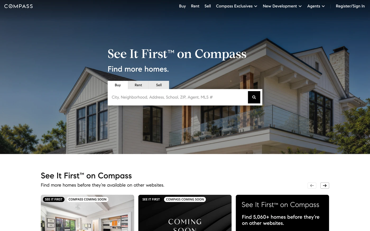
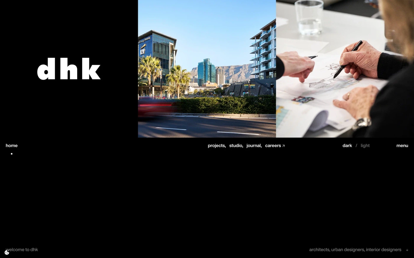
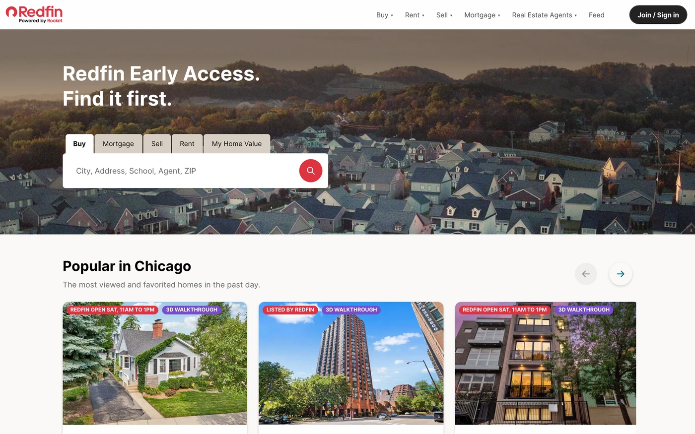
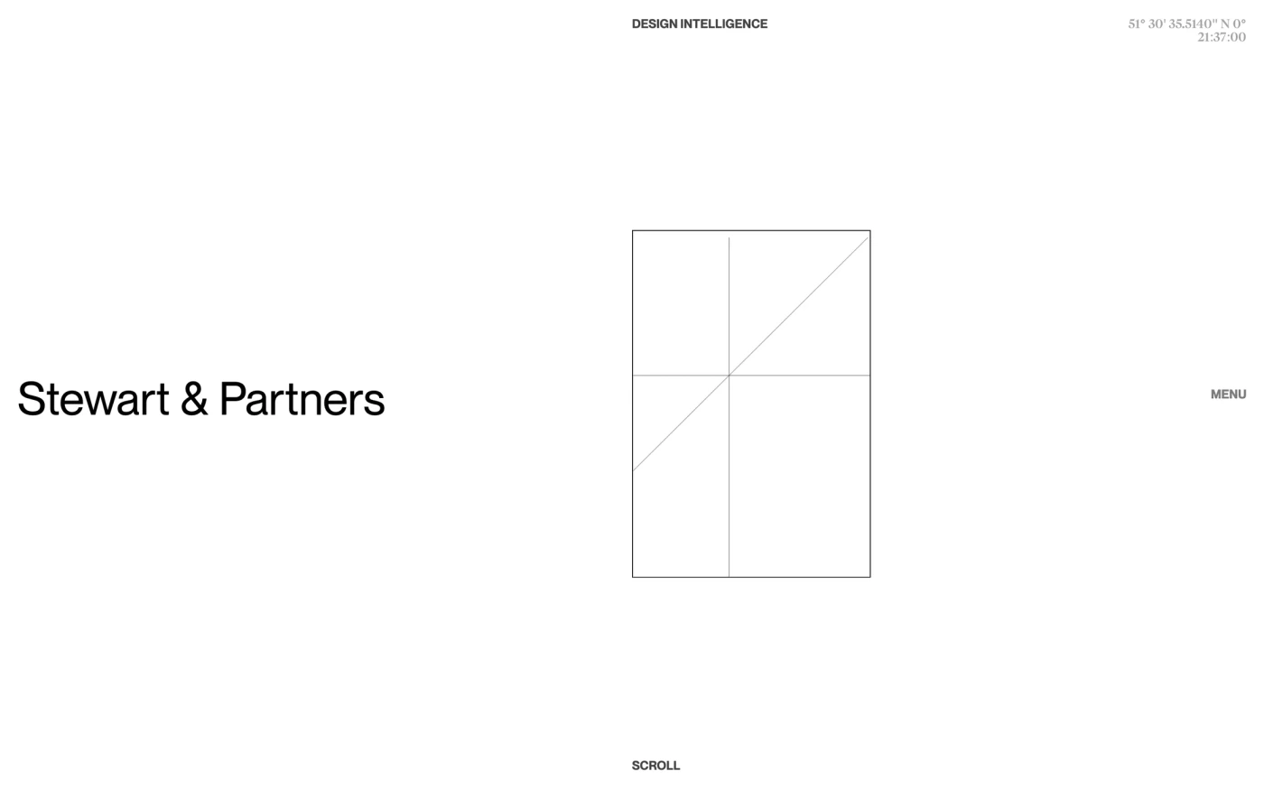
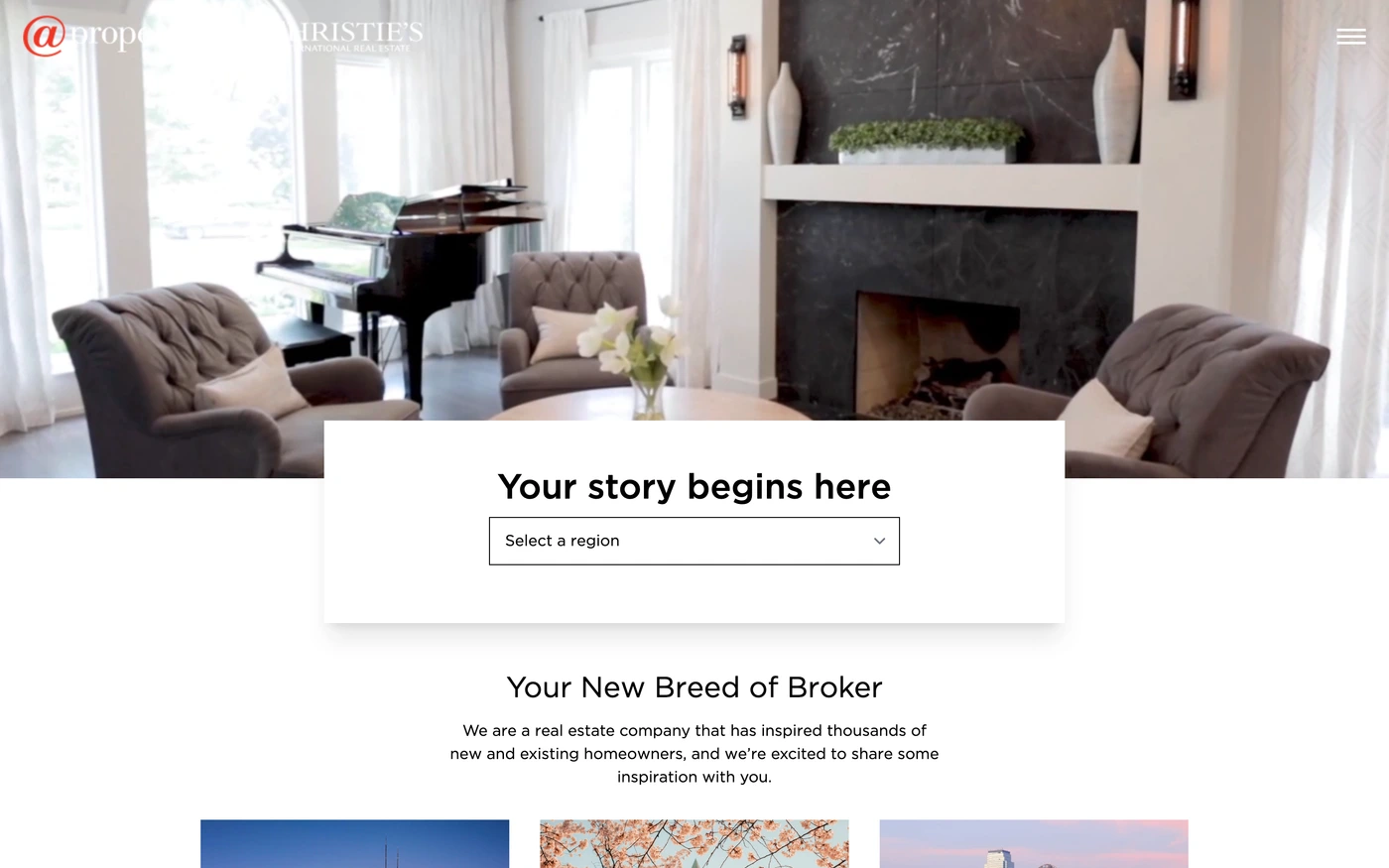
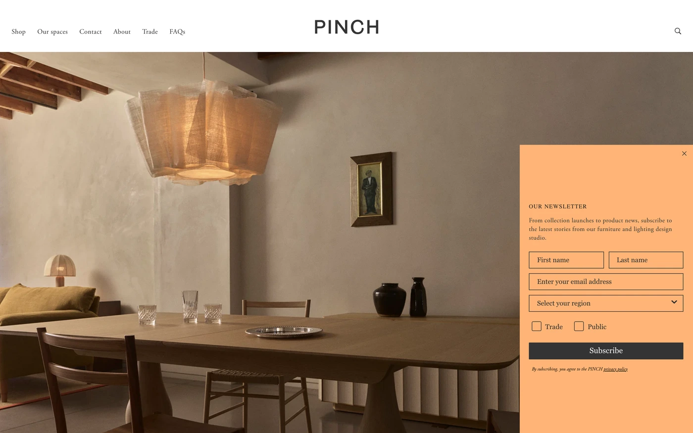
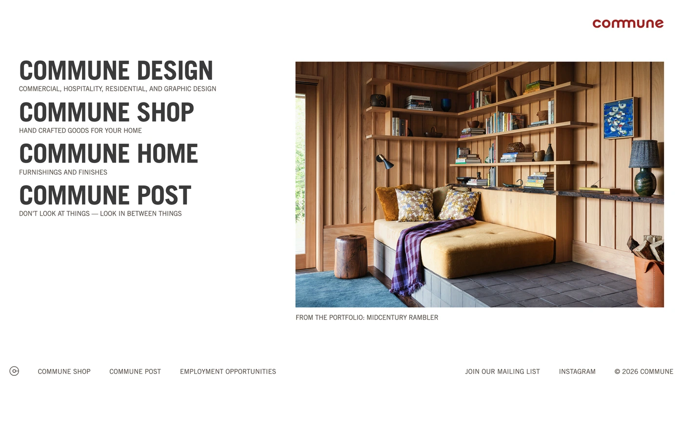
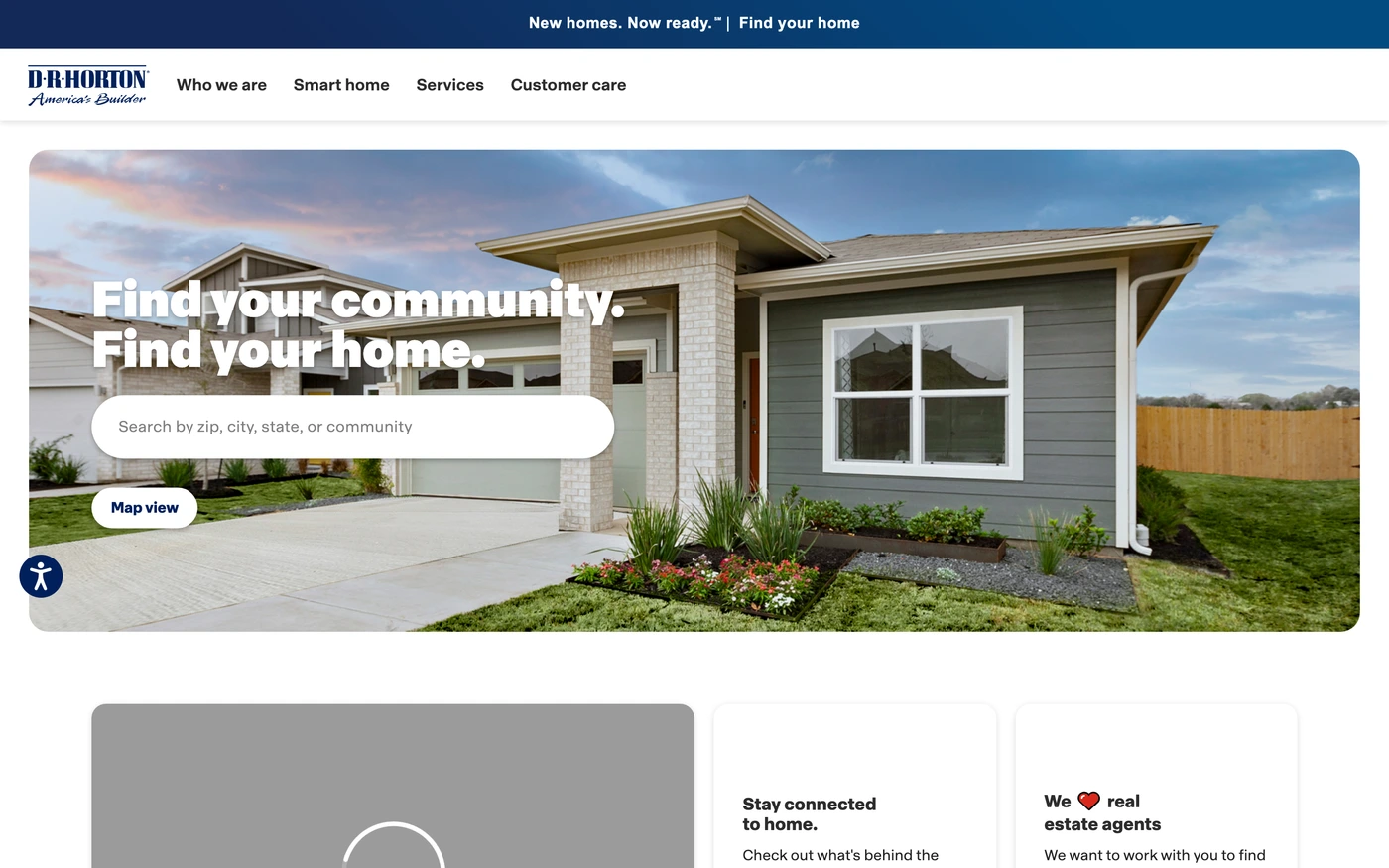
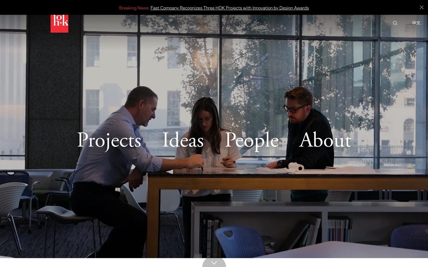
There are 50 minimalist real estate website designs here — live sites that are real estate sites that are tagged minimal from their captured layout and palette, including Dhk, Stewartpartners, Compass, Redfin and Engel & Völkers — cut into 729 sections. 90% use a light theme and 10% a dark one; the most common headline fonts are Ppneuemontreal, Compass Serif and Inter. 23 of 50 open with a hero, 0 show pricing on the homepage and 3 carry testimonials.
At a glance
Live verified metrics- Sites
- 50
- Sections captured
- 729
- Light / dark
- 90% light · 10% dark
- Top heading fonts
- Ppneuemontreal, Compass Serif and Inter
- Accent colours
- neutral 50
- Most common sections
- features (26), hero (23), showcase (21) and statement (19)
- Top industries
- Real Estate (50)
- Award winners
- 7 of 50
Filter
Industry
Exact colour






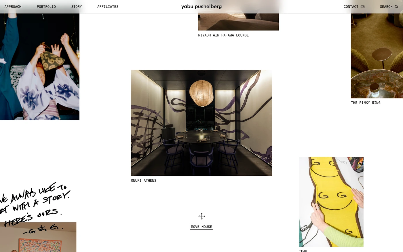

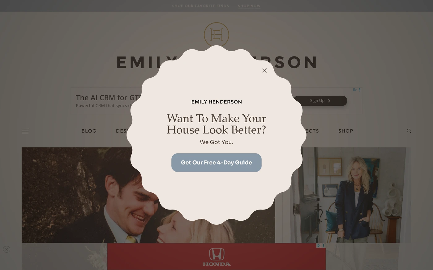

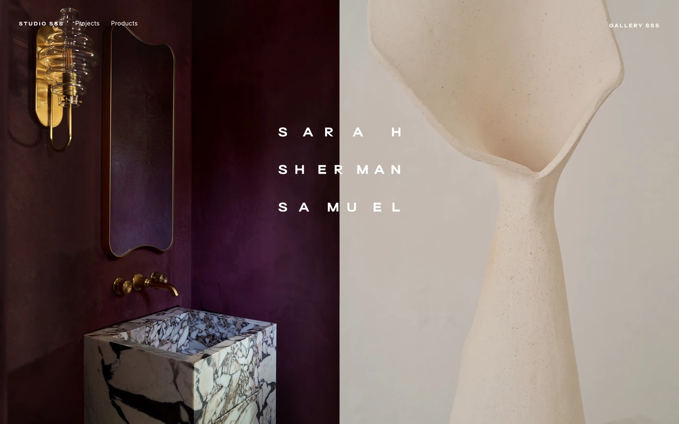



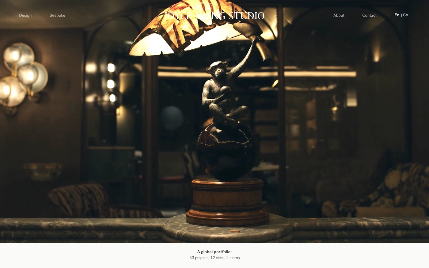

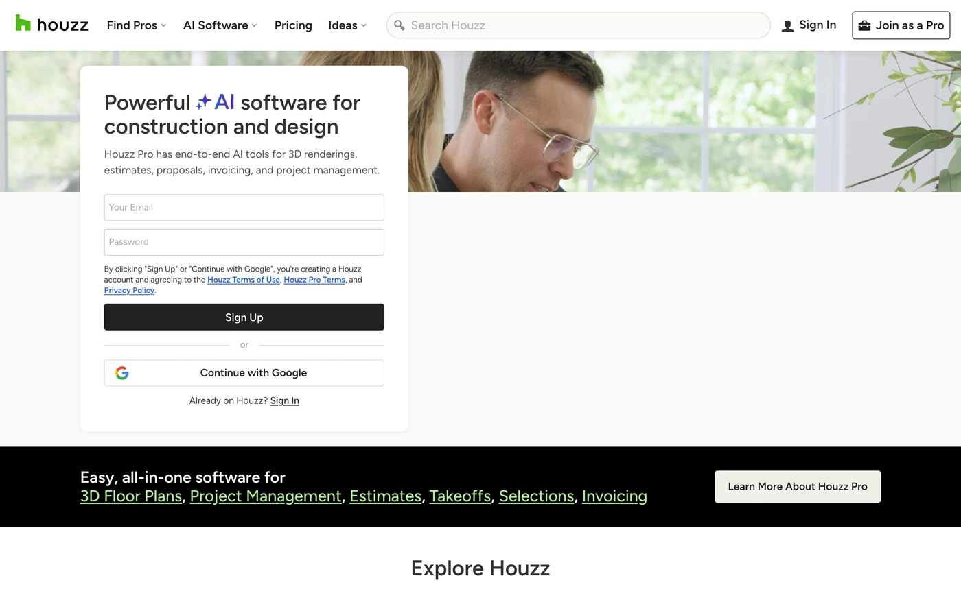

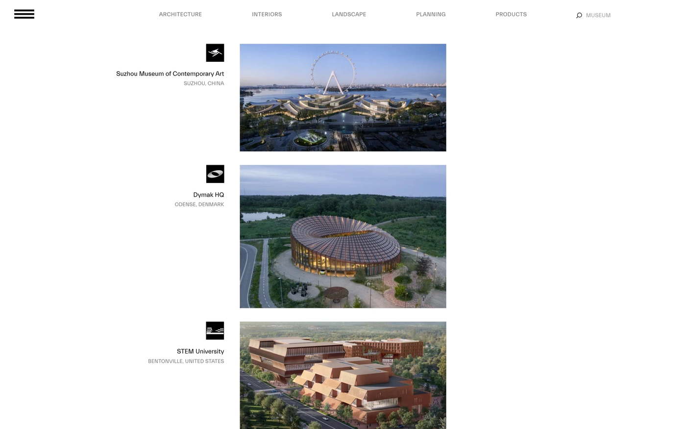
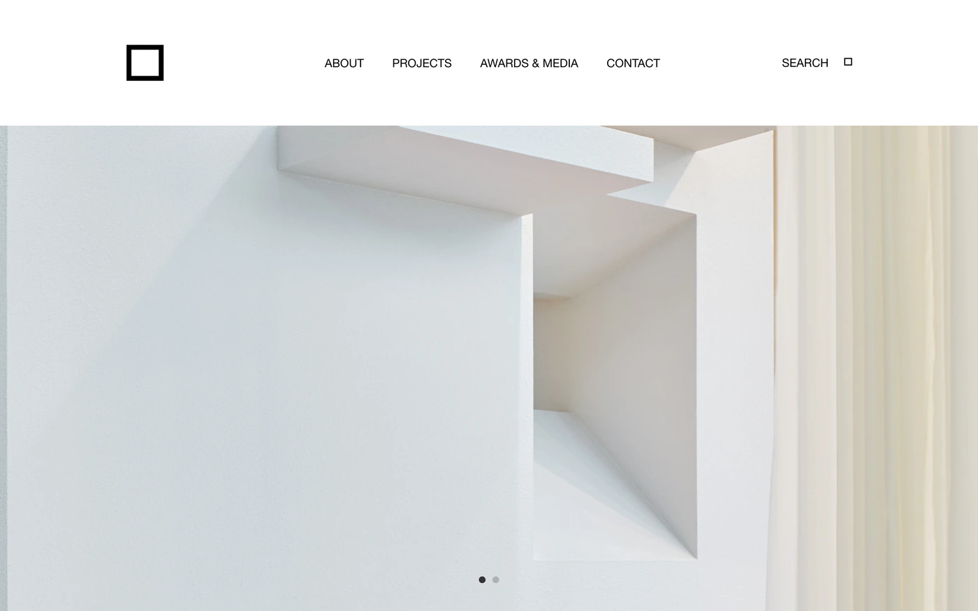










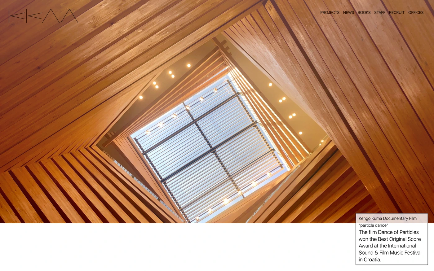
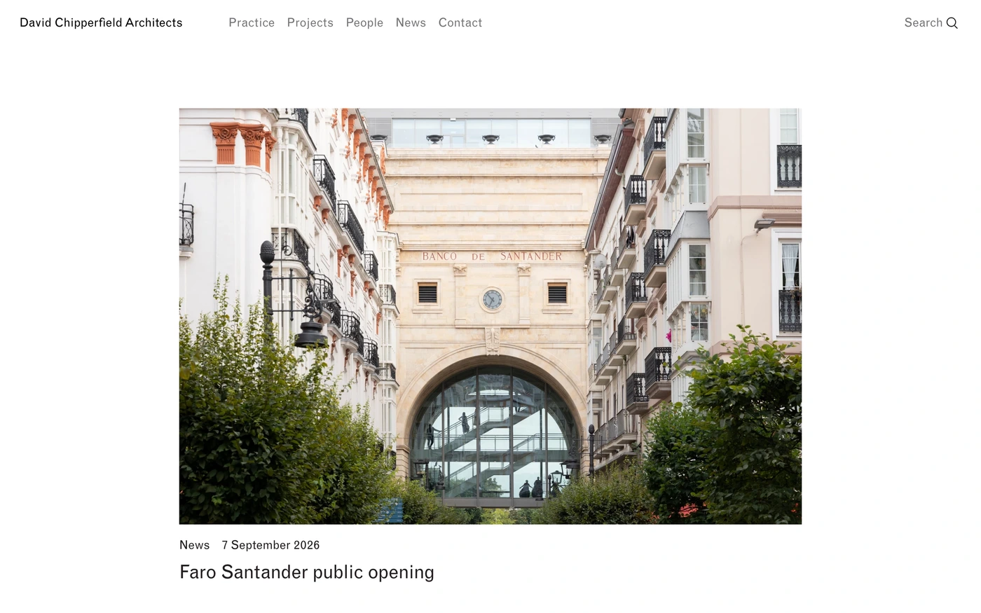

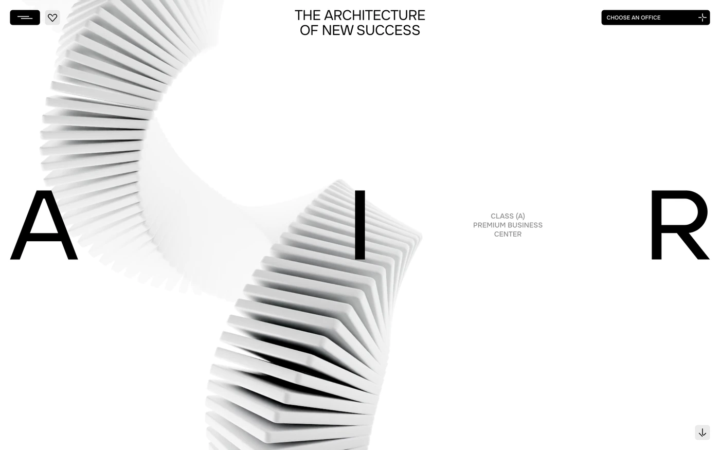







What makes a good minimalist real estate website design
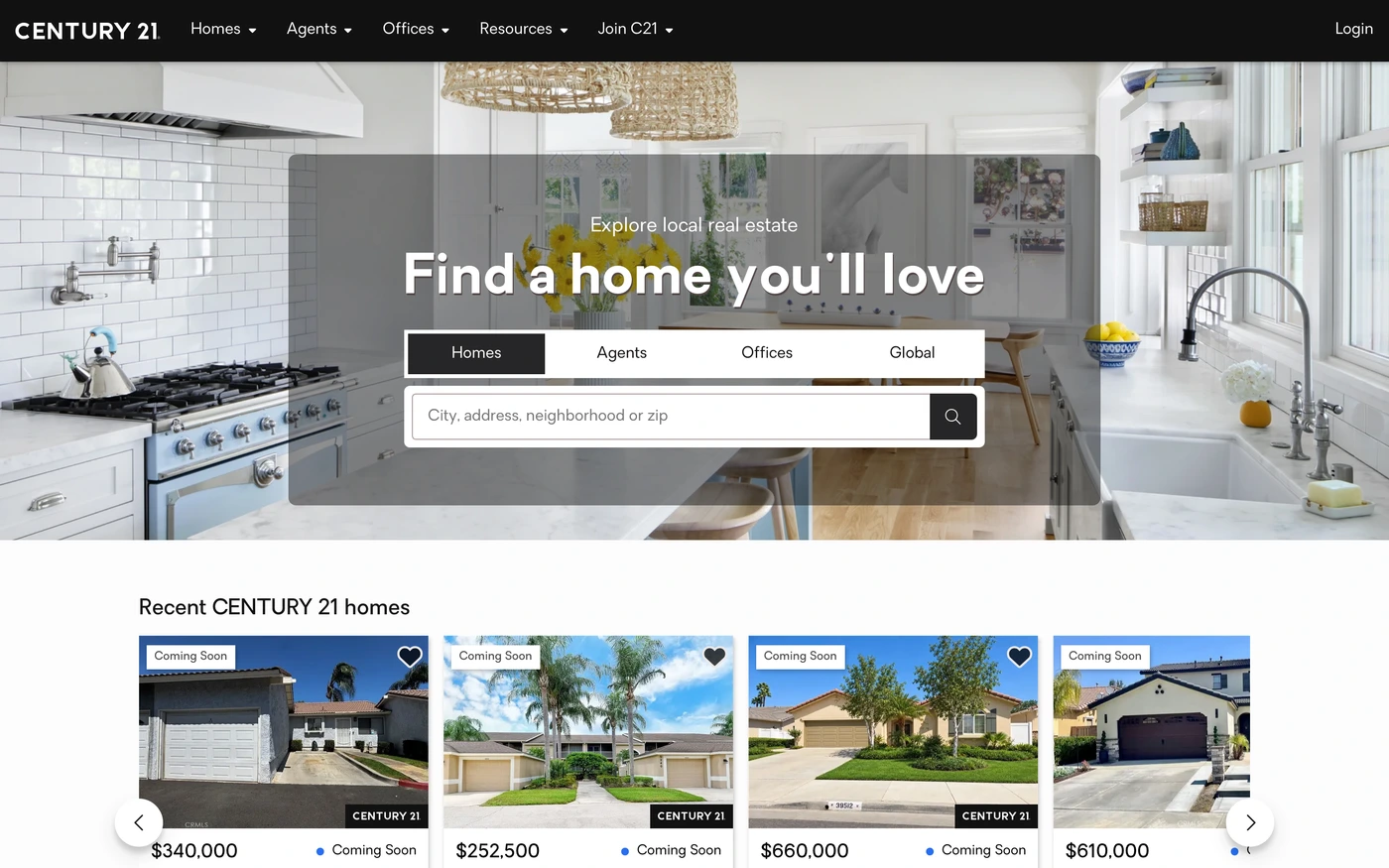
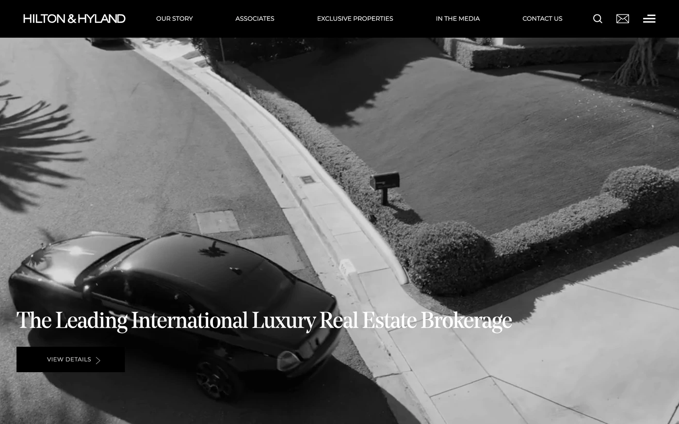
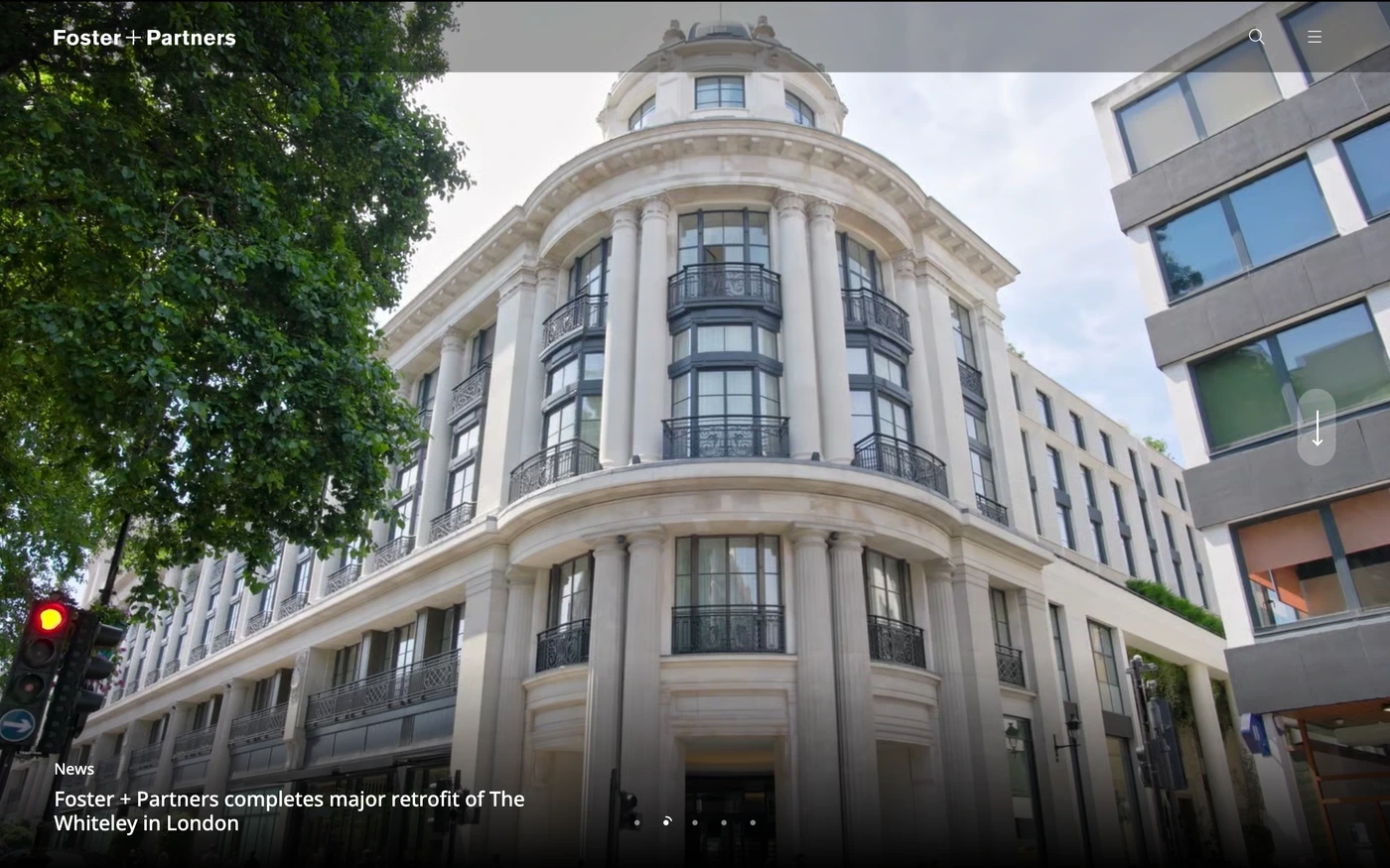
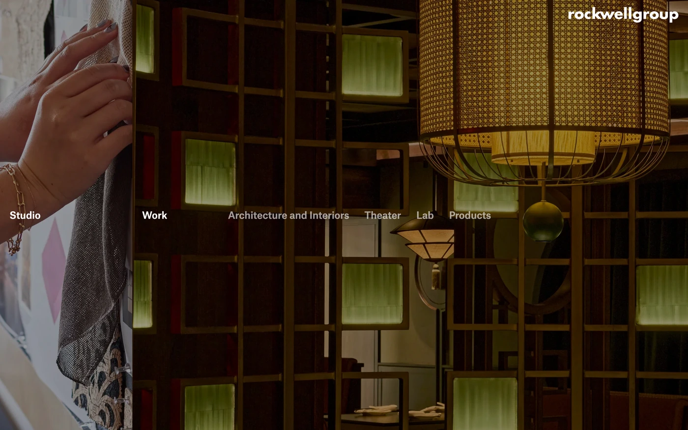
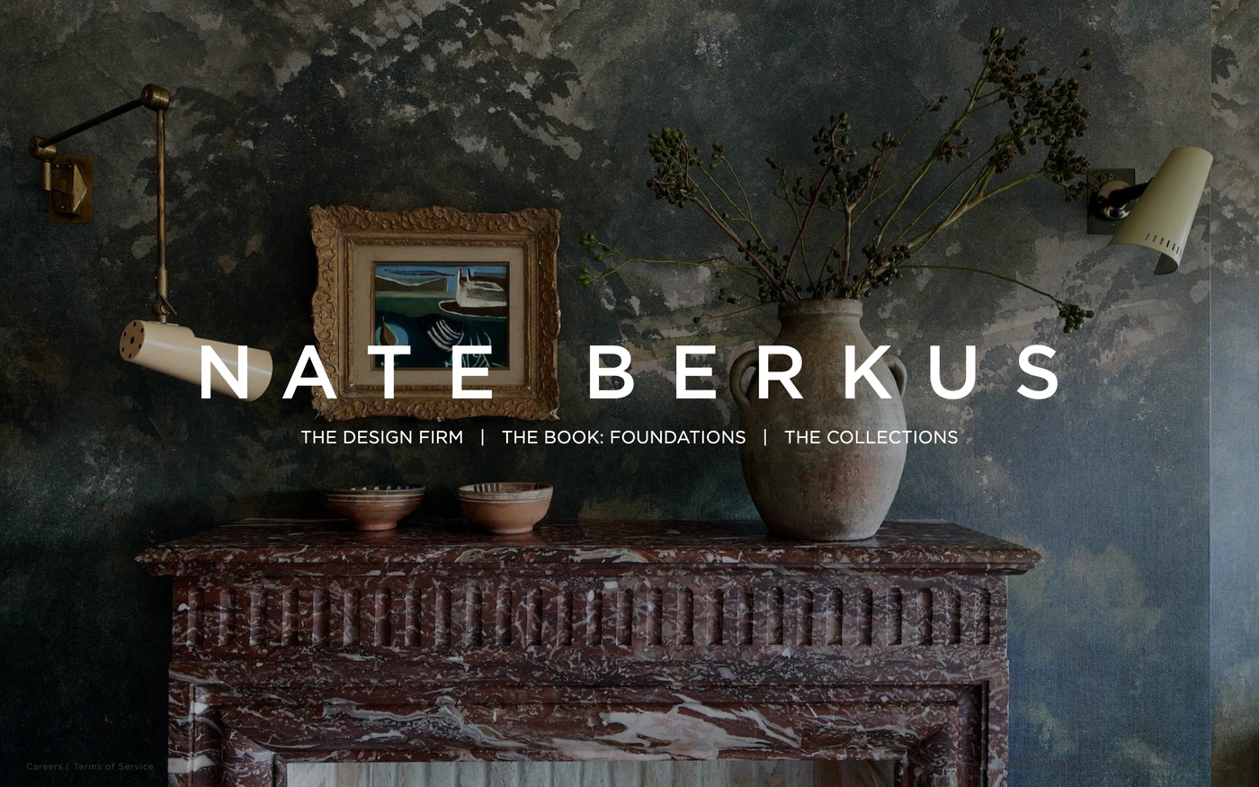
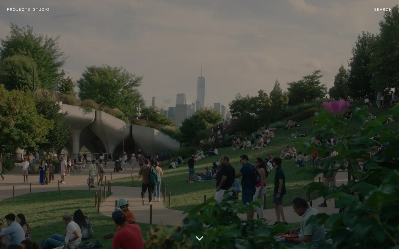
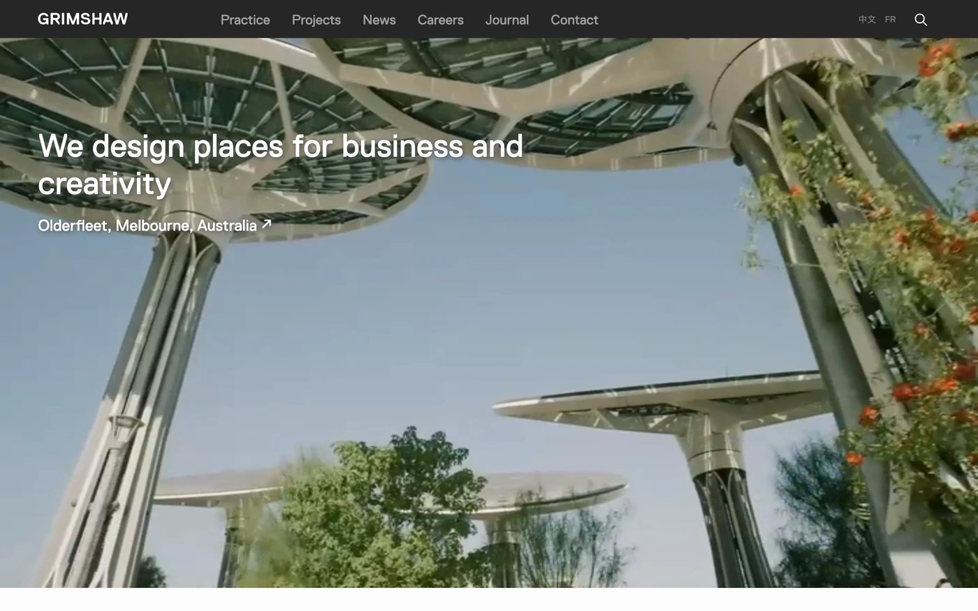
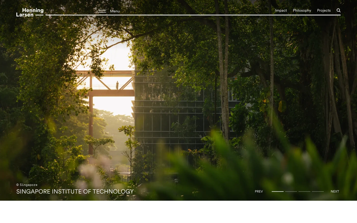
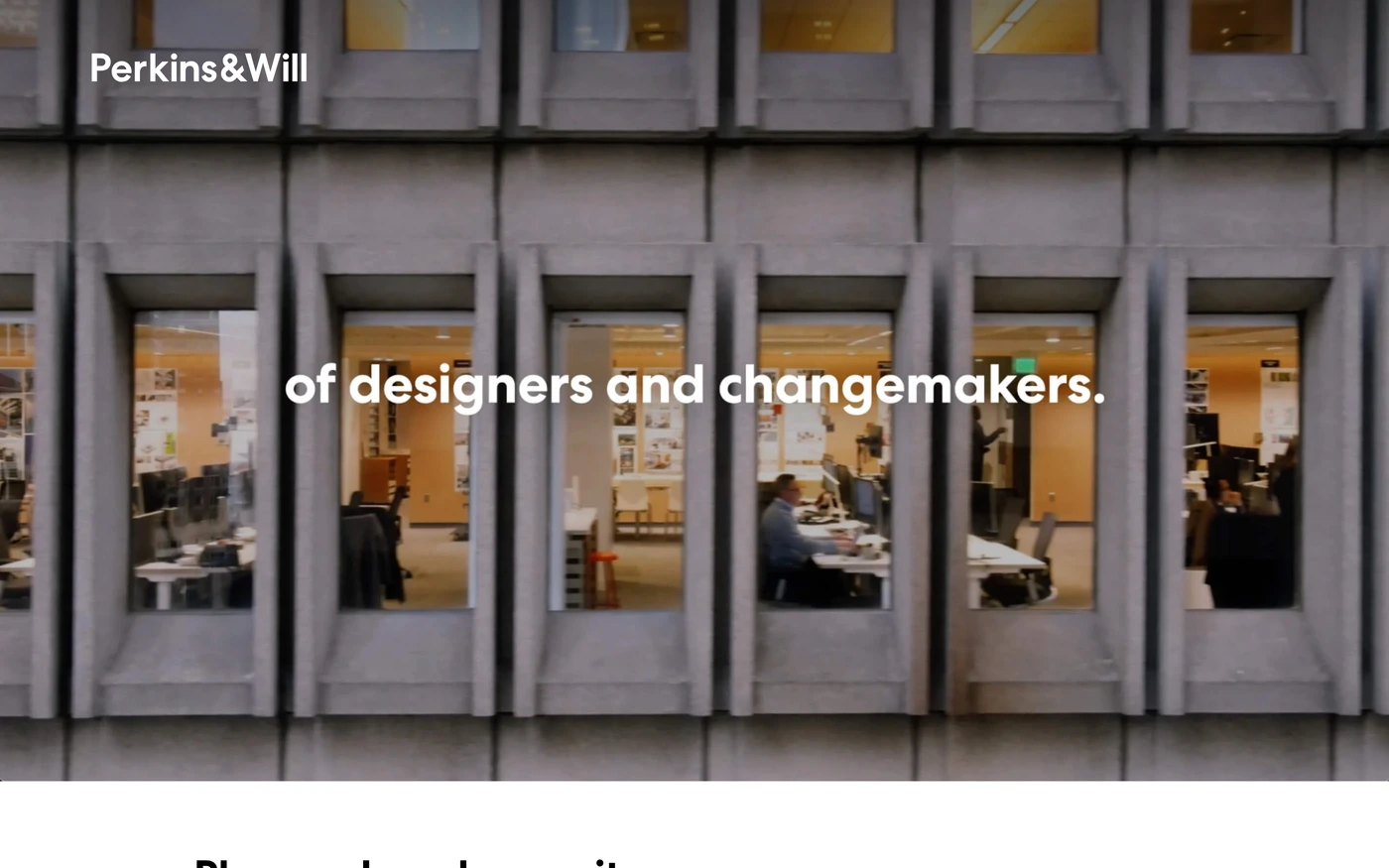
Minimal sites remove everything that doesn't earn its place: generous whitespace, a restrained palette, strong typography and one action per screen. Real estate sites are built around search — listings, maps and filters — wrapped in premium, image-led branding.
What these 50 minimalist real estate websites have in common
Measured from the captures, not opinion — use it to plan a minimalist real estate website against what already works.
Sections they use
26 include features, 23 include hero, 21 include showcase and 19 include statement. 1 answer objections with an FAQ and 8 (16%) close with a dedicated call to action. Read top to bottom, the most common running order is hero → features → footer → statement → showcase. Compare them side by side: features section examples, hero section examples, showcase section examples.
Type and colour
Light layouts lead (90% vs 10% dark). Headlines are most often set in Ppneuemontreal, Compass Serif and Inter. The most common accent hues are neutral (50). Every example lists its exact fonts and hex palette on its page.
Page length
The average homepage here is about 5,244px tall at desktop width — roughly 6 screens of scrolling, with Engel & Völkers the longest at 11,000px. Open any site to scroll the full-page capture and see where each section falls.
50 minimalist real estate website designs worth studying
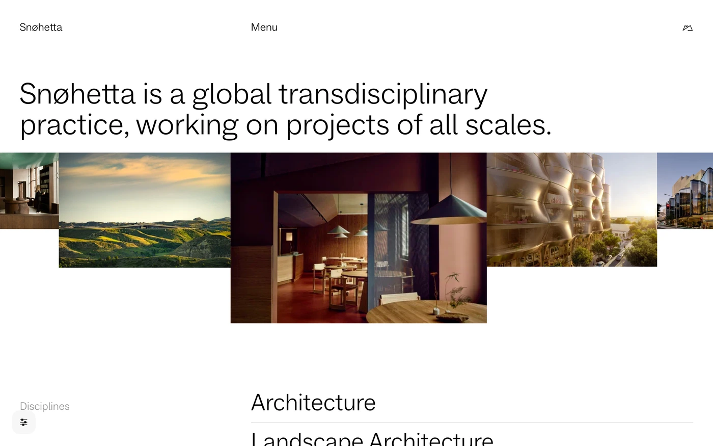
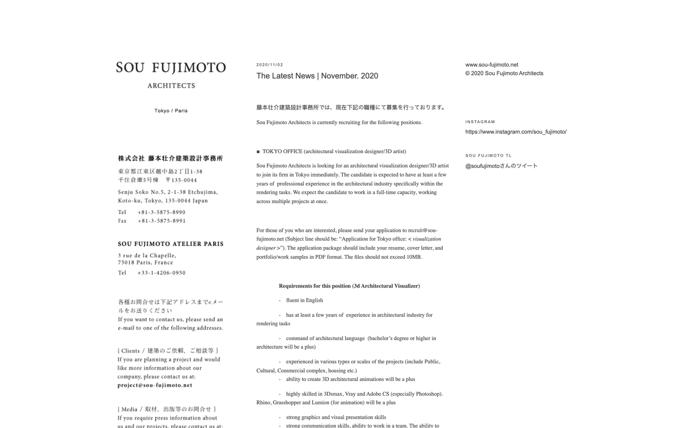
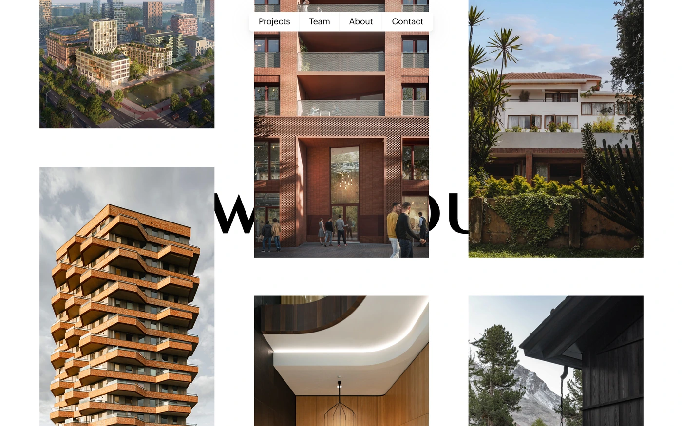
- Powerhouse Company — “Award-winning architecture firm with offices in Rotterdam, Oslo, Munich and Nairobi. We give meaning to space through profound form and function.” 5 sections, light theme, palette #ffffff.
- Kada — “Kada delivers authentic, sustainable and high-quality workplace solutions. Partnering with industry-leading brands, we create considered environments that support the way people work, connect and thrive.” 10 sections, headlines in Circular, light theme, palette #000000 and #ffffff; the homepage runs hero → showcase → features.
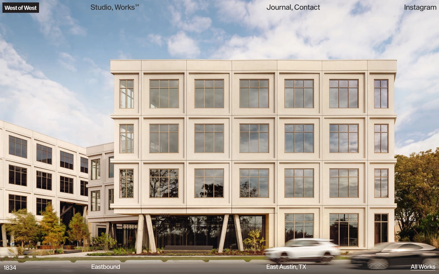
- West of West — “We are an architecture + design studio that creates experience driven buildings and interiors. We have helped partners across industries solve problems.” 6 sections, headlines in Sequel Sans, light theme, palette #ffffff and #333333.
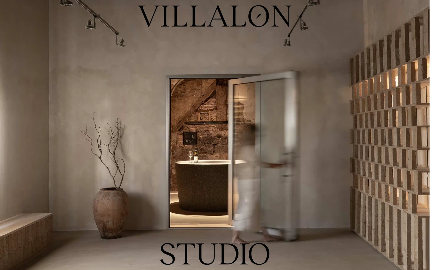
- Villalón Studio — “Villalón Studio somos un estudio de interiorismo con oficina en Madrid liderado por la interiorista María Villalón. En nuestra página web puedes ver fotos y vídeos de nuestros…” 8 sections, headlines in Aktiv Grotesk, light theme, palette #ffffff and #1d1d1d.
- Gras — “An award-winning architecture and design studio based in Edinburgh.” 18 sections, light theme, palette #ffffff and #000000.
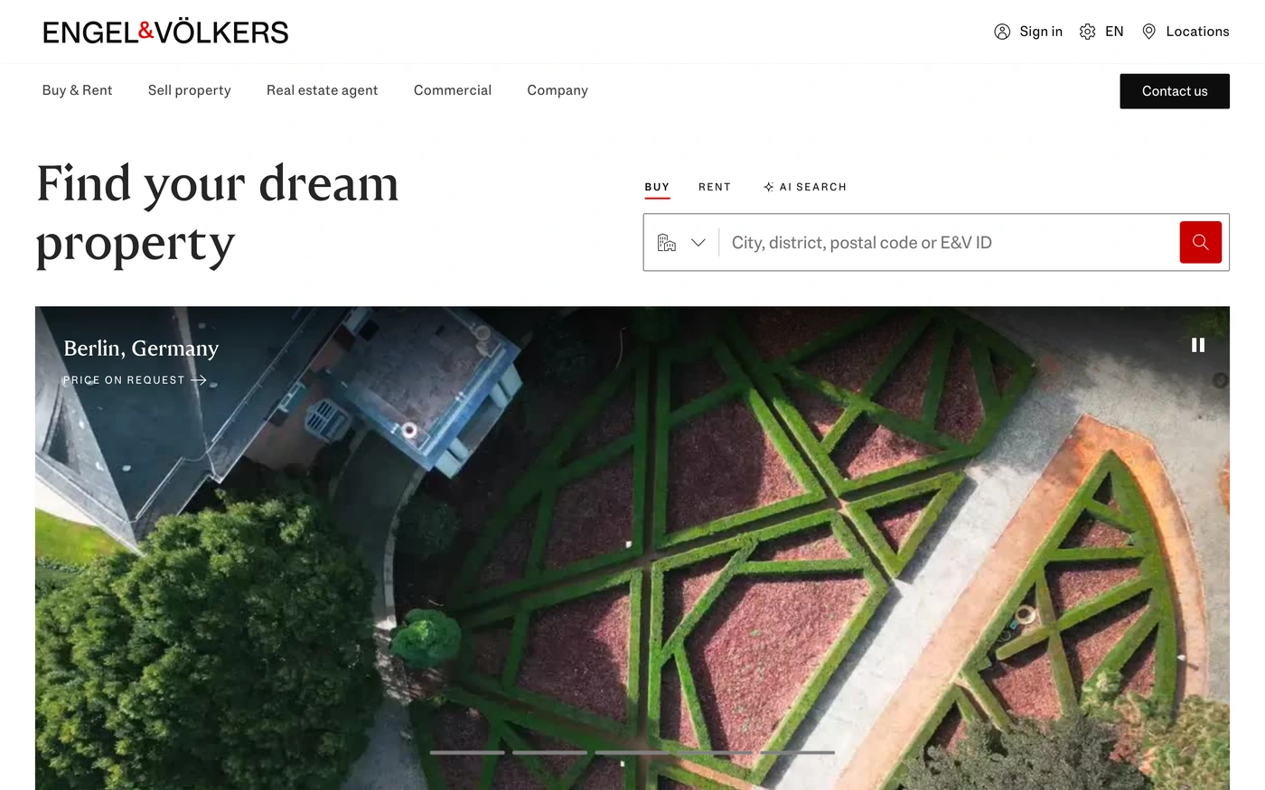
- Engel & Völkers — “Engel & Völkers is one of the world's leading service companies in providing their clients with luxury real estates, properties, yachts and boats.” 17 sections, headlines in Engel Voelkers Head App, light theme, palette #0d0d0d and #404040; the homepage runs hero → statement → features → statement.
How to use these references for a minimalist real estate website
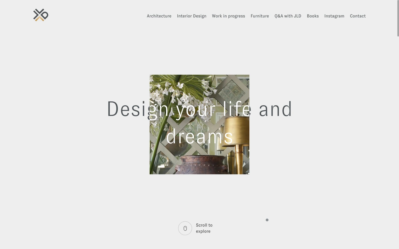
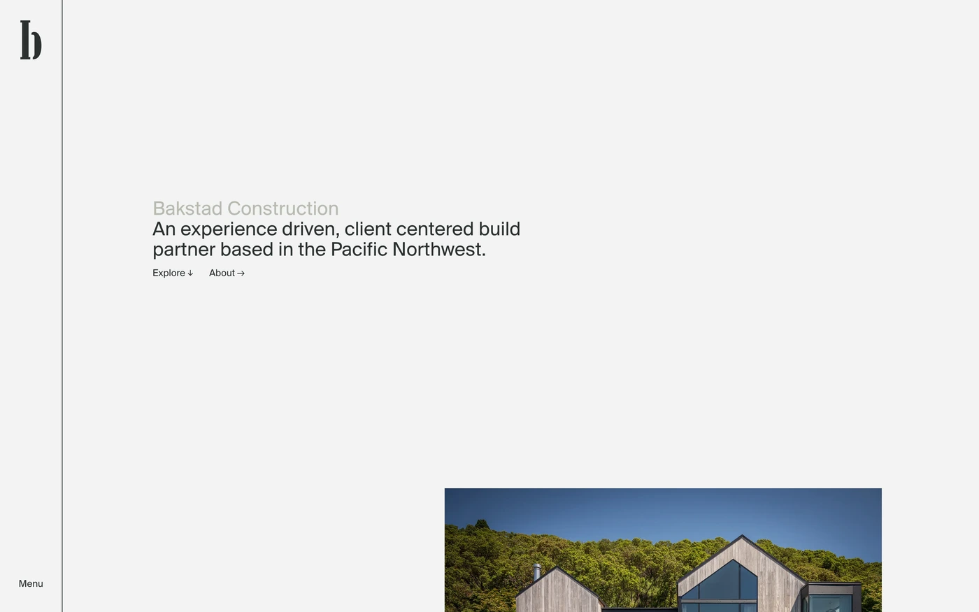
Minimal is not empty — make the type scale and spacing do the work, keep one accent colour, and let a single strong image or product shot carry each section. For real estate, study how search, listings and premium imagery are balanced on one page. Start with Dhk, Stewartpartners and Compass, open each site at full size and compare their features and hero sections; every reference carries its palette, fonts and a build prompt you can paste into your editor.
Featured minimalist real estate website examples with their fonts
Related searches
Browse all websites or the full A–Z of popular searches.
How this list is built: 50 sites from the UI Discovery library that are real estate sites that are tagged minimal from their captured layout and palette, matched on each product's own title, description and headline copy, captured styles, colours and fonts. Ordered by popularity.
Library updated