
Dark Website Design Examples
395 real sites · 7,997 sections



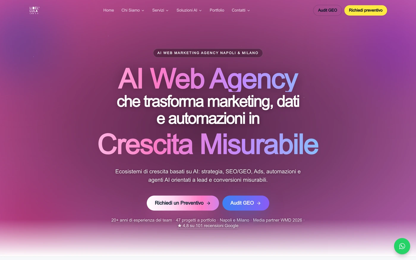
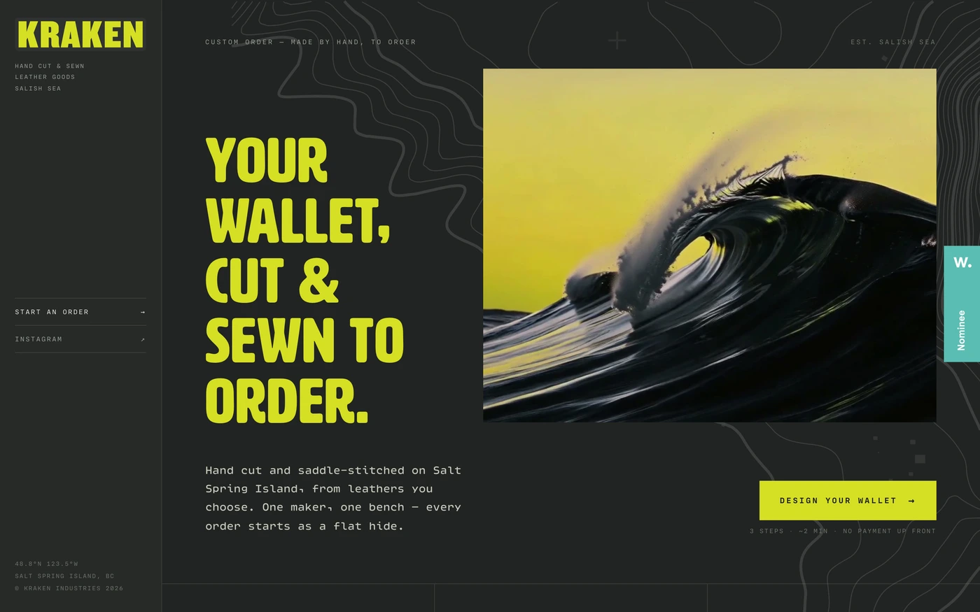
There are 395 dark website designs here — live sites that use a dark theme on their homepage, including Linear, Ramp, Framer, Supabase and Raycast — cut into 7,997 sections. 0% use a light theme and 100% a dark one; the most common headline fonts are Inter (20), Geist (9) and Neue Montreal (5). 250 of 395 open with a hero, 57 show pricing on the homepage and 75 carry testimonials.
At a glance
Live verified metrics- Sites
- 395
- Sections captured
- 7,997
- Light / dark
- 0% light · 100% dark
- Top heading fonts
- Inter (20), Geist (9) and Neue Montreal (5)
- Accent colours
- neutral 203blue 62red 52
- Most common sections
- features (255), hero (250), statement (220) and showcase (160)
- Top industries
- Design & Agency (94), Entertainment (49) and AI (32)
- Award winners
- 168 of 395
Filter
Industry
Exact colour







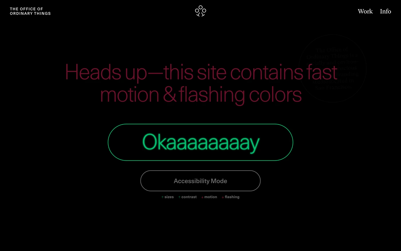
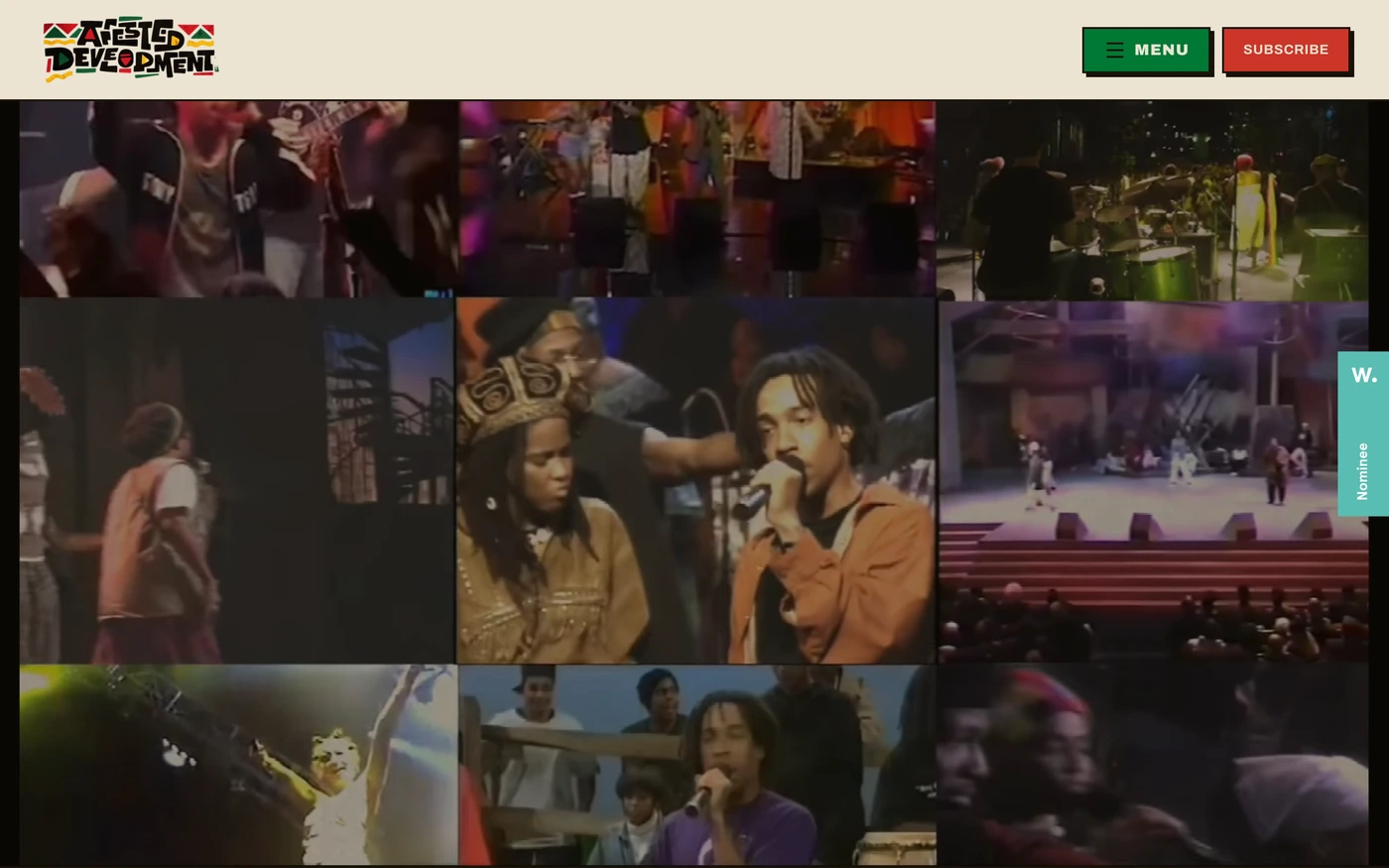
What makes a good dark website design
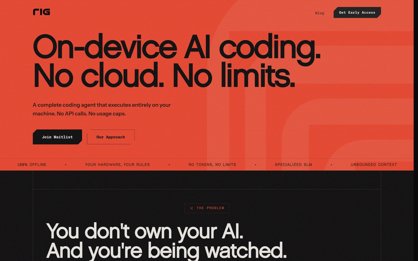
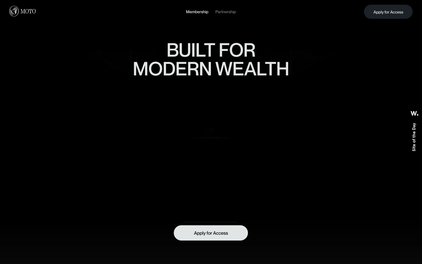
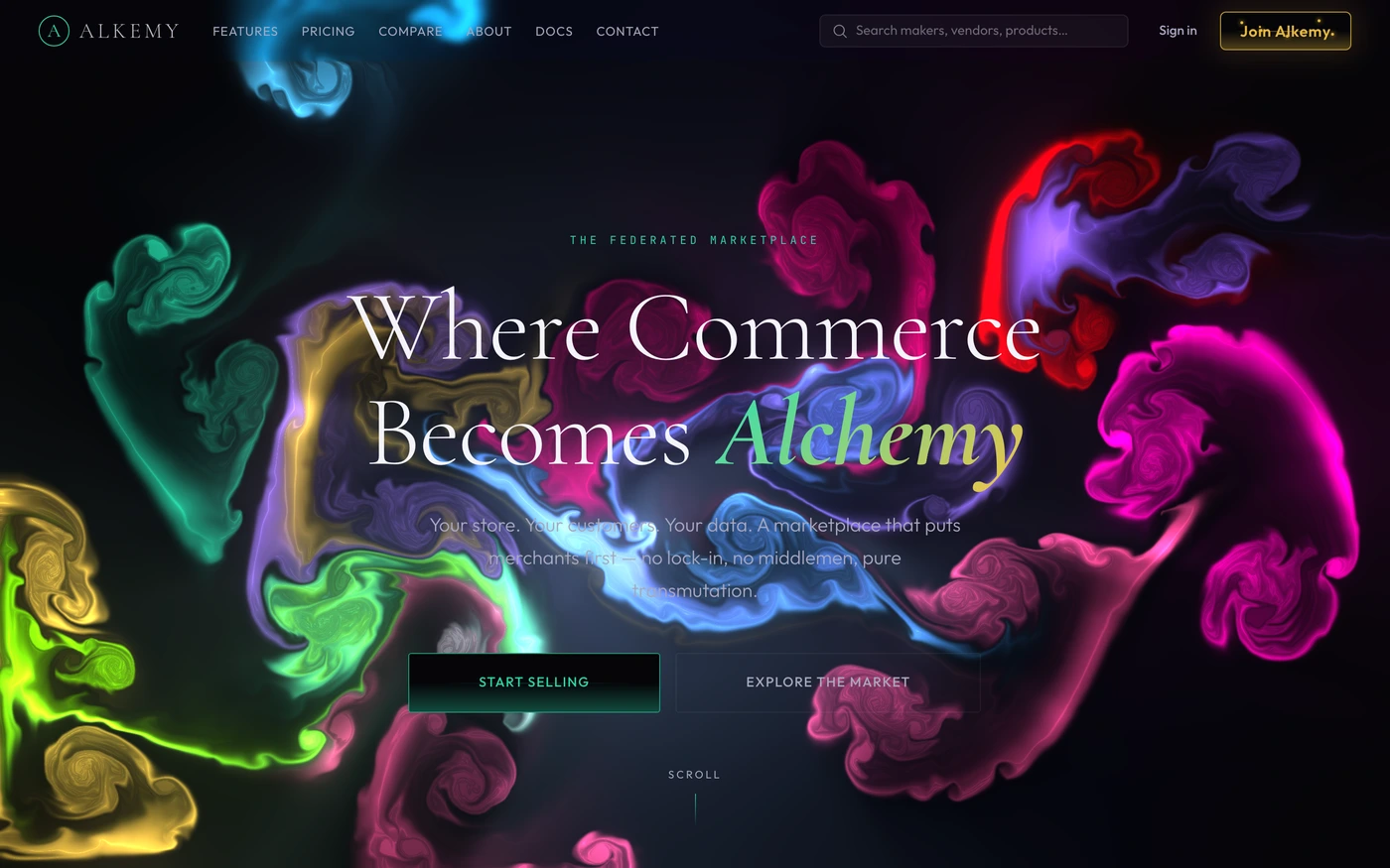
Dark sites feel premium, technical or cinematic: light type on near-black, accent colour used sparingly, and product screenshots or video that glow against the background.
What these 395 dark websites have in common
Measured from the captures, not opinion — use it to plan a dark website against what already works.
Sections they use
255 include features, 250 include hero, 220 include statement and 160 include showcase. 80 answer objections with an FAQ and 120 (30%) close with a dedicated call to action. Read top to bottom, the most common running order is hero → features → statement → showcase → footer. Compare them side by side: features section examples, hero section examples, statement section examples.
Type and colour
Dark layouts lead (100% vs 0% light). Headlines are most often set in Inter (20), Geist (9) and Neue Montreal (5). The most common accent hues are neutral (203), blue (62) and red (52). Every example lists its exact fonts and hex palette on its page.
Page length
The average homepage here is about 7,422px tall at desktop width — roughly 8 screens of scrolling, with Ramp the longest at 11,000px. Open any site to scroll the full-page capture and see where each section falls.
395 dark website designs worth studying
- Supabase — “Build production-grade applications with a Postgres database, Authentication, instant APIs, Realtime, Functions, Storage and Vector embeddings. Start for free.” 20 sections, headlines in Manrope, dark theme, palette #010022 and #000022; the homepage runs hero → call to action → footer.
- Lovable — “Describe what you want in plain language and Lovable builds it: full-stack apps, websites and internal tools. Start free.” 7 sections, headlines in Camera Plain, dark theme, palette #01006b and #010000; the homepage runs hero → how it works → features → logo cloud.
- Sentry — “Application performance monitoring for developers & software teams to see errors clearer, solve issues faster & continue learning continuously. Get started at sentry.io.” 42 sections, headlines in Dammit Sans, dark theme, palette #ffffff and #1f1633; the homepage runs hero → features → testimonials → call to action.
- Todoist — “Trusted by 30 million people and teams. Todoist is the world's favorite task manager and to-do list app. Finally become focused, organized and calm.” 34 sections, headlines in Graphik 1bbd4a4c7a2fb472, dark theme, palette #25221e and #010044; the homepage runs hero → logo cloud → features → showcase.
- Robinhood — “Trade 50+ crypto—all at low costs on Robinhood in Canada. Buy, sell, and hold BTC, ETH, USDC, LTC and more.” 9 sections, headlines in Martina Plantijn, dark theme, palette #000000 and #ccff00; the homepage runs hero → showcase → features → faq.
- Superlist — “From the creators of Wunderlist — the all-in-one task management app for to-do lists, notes, and projects. AI-powered productivity that replaces 5 apps. Free to start, works on…” 25 sections, headlines in Haffer XH, dark theme, palette #ffffff and #181824; the homepage runs hero → statement → footer.
How to use these references for a dark website
Avoid pure black and pure white; keep body text slightly off-white, check contrast on every accent colour and give images a subtle border so they don't dissolve into the page. Start with Linear, Ramp and Framer, open each site at full size and compare their features and hero sections; every reference carries its palette, fonts and a build prompt you can paste into your editor.
Featured dark website examples with their fonts
- Ramp
Fonts: Lausanne / Lausanne
- Supabase
Fonts: Manrope / Inter
- GitHub
Fonts: Mona Sans / Mona Sans
- Railway
Fonts: IBM Plex Serif / Inter
Related searches
Browse all websites or the full A–Z of popular searches.
How this list is built: 395 sites from the UI Discovery library that use a dark theme on their homepage, matched on each product's own title, description and headline copy, captured styles, colours and fonts. Ordered by popularity.
Library updated