

Osmo
WebsitesDev Toolkit Built to Flex
16 sections
Opening…
About this design
Written from the capture data for Osmo.
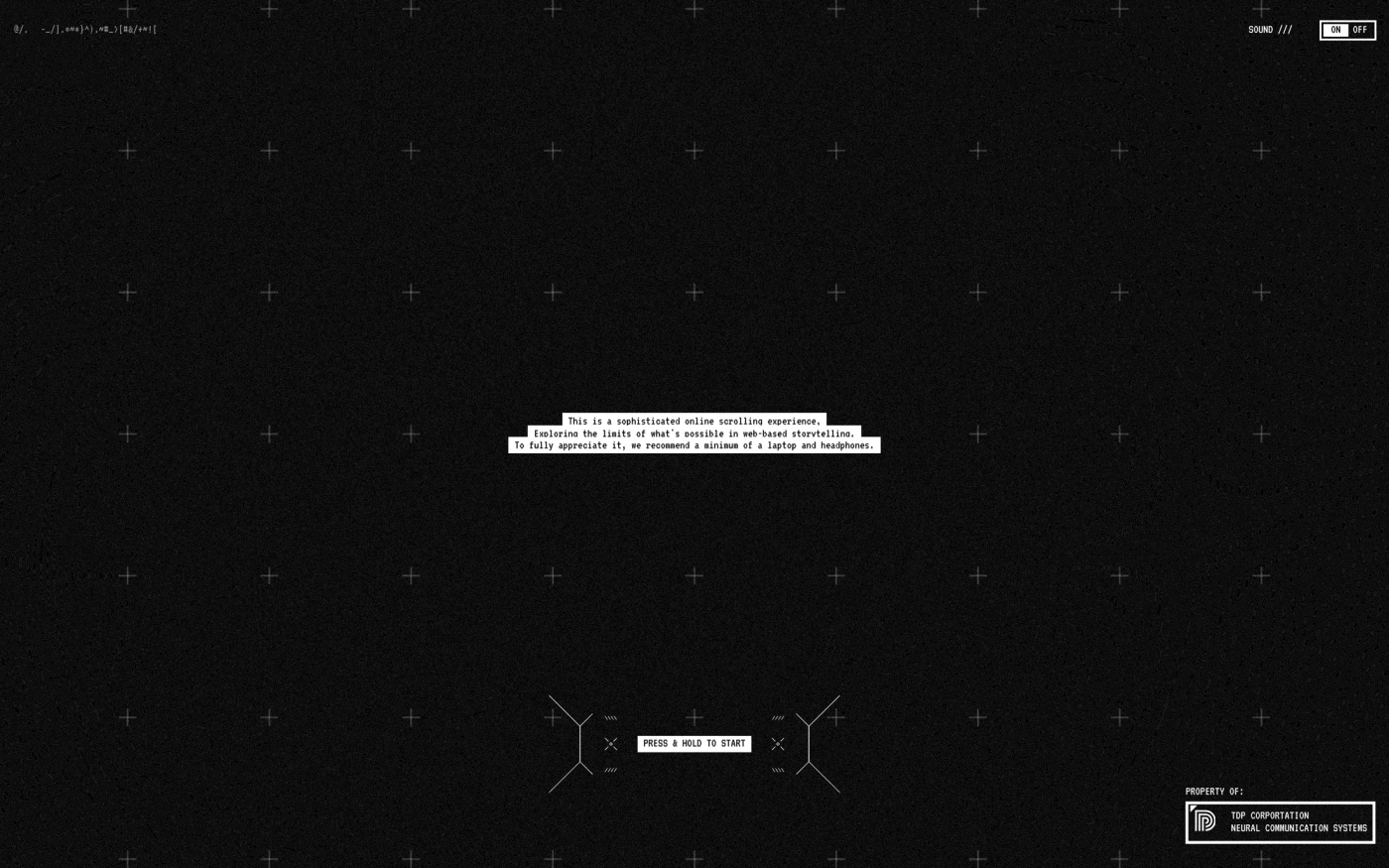
Osmo (osmo.supply) is a website in the Design & Agency category. Its homepage is captured as 12 sections, top to bottom: hero, statement, showcase, content, showcase, features, content, pricing, showcase and 2 more. We also captured its shop and security pages.
The capture records a palette of #f4f4f4, #201d1d, #a1ff62, #f84131 and #151313. The largest share of captured homepage sections uses #f4f4f4 as its CSS background. Suggested token roles are #f4f4f4 for background and #151313 for text; check them against the screenshot. Headings are set in Haffer XH, body copy in Haffer.
Compared with the 289 other Design & Agency sites in the library, Osmo sits with the 68% that stay light, and the group's most common heading face is PP Neue Montreal, where Osmo uses Haffer XH. The average Design & Agency homepage here has 5 sections; this one has 12.
Worth studying here: the hero, for the relationship between imagery, type and navigation, the statement block, for large-type rhythm and the showcase, for image scale, grouping and visual emphasis. Open any section for its palette, fonts and a build prompt you can hand to Claude, Cursor or v0.
More references: browse all websites.
More design & agency sites



Related searches
Sections captured: Hero, Statement, Showcase, Content, Showcase, Features, Features, Content, Pricing, Showcase, Call to action, Footer, Content, Content, Content, Content