
Analytics Dashboard Examples and Metric UI Design
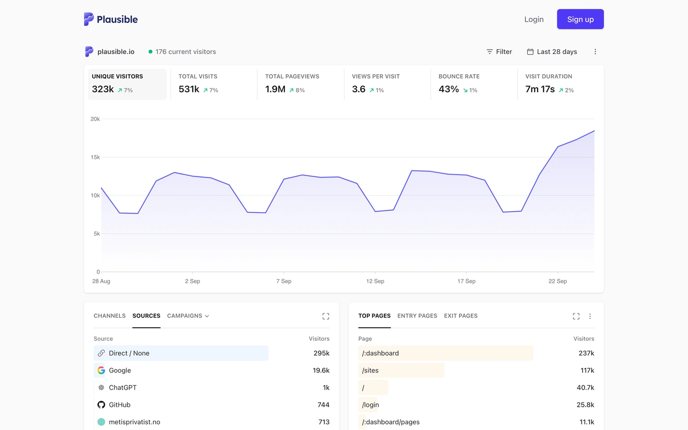
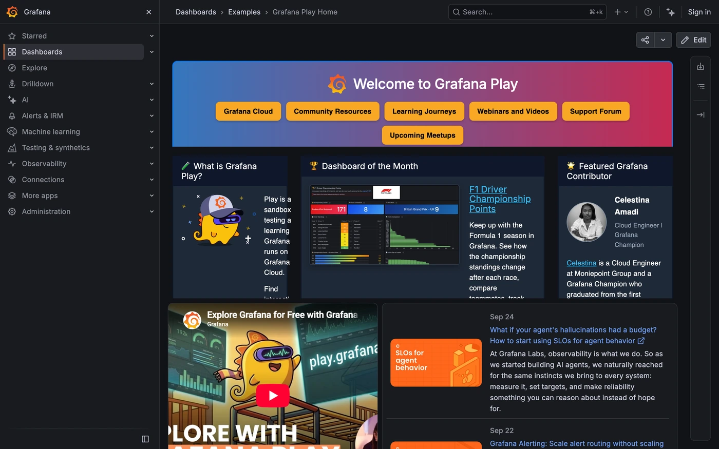
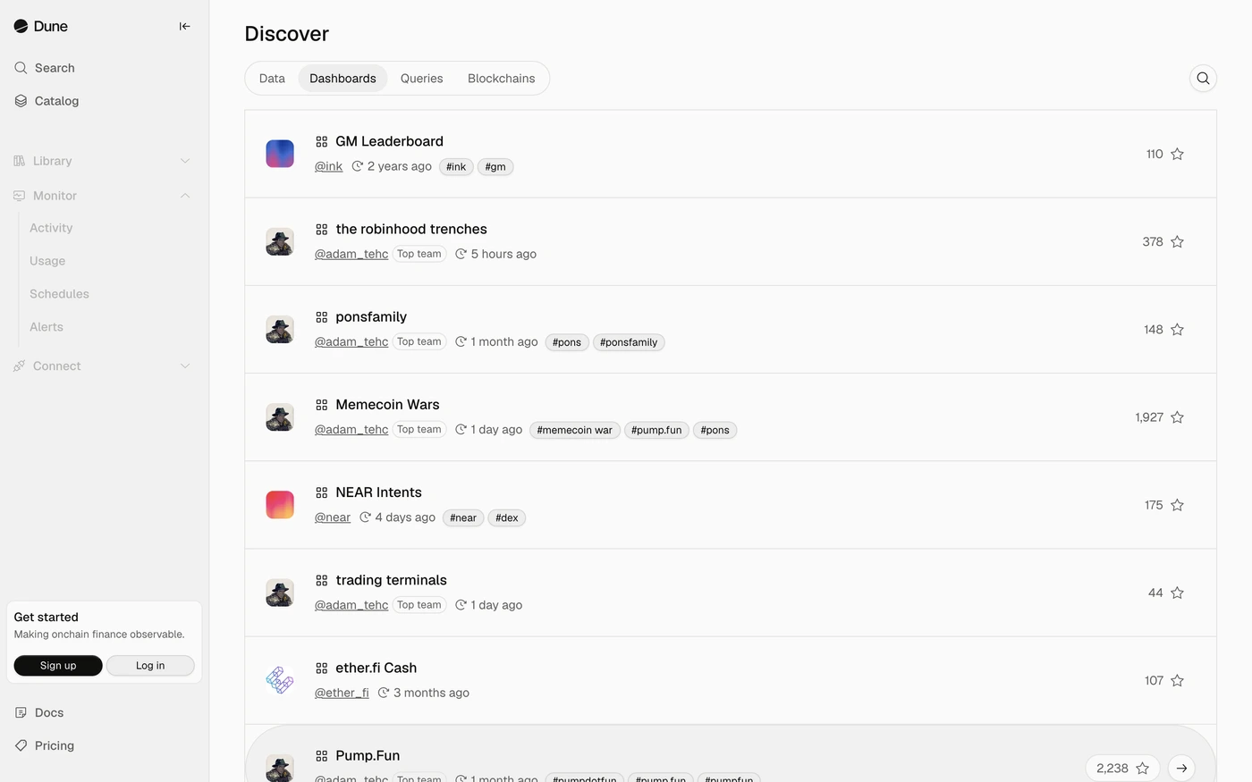
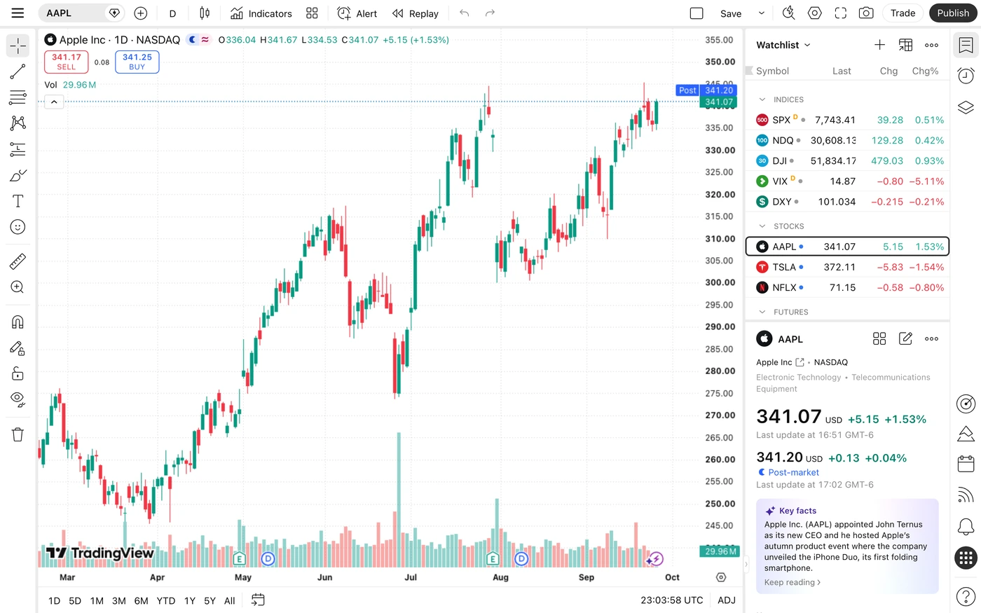
An analytics dashboard should make a question easier to answer. The captured examples below offer different ways to arrange trends, metrics and comparisons; they are visual references, not proof of business outcomes.
UI Discovery editorial · Updated
Captured dashboard references
Open each collection for source context and captured screens. Product dashboards and public demo kits are references, not tested implementations of this guide.
How to use this guide
Make scope visible before the numbers
The same metric can mean very different things across date ranges, segments and time zones. Put active scope near the heading and carry it into exports or drill-down views. Label comparison periods explicitly so a week-over-week change cannot be mistaken for a year-over-year one.
Give charts a readable alternative
Use units, axis labels and meaningful series names. A tooltip should supplement the chart rather than be the only place a value can be read. For important decisions, provide a table or textual summary and do not encode positive and negative outcomes by color alone.
Design for incomplete and delayed data
A blank chart can mean no activity, an unavailable source or a filter with no matches. Identify the cause and expose an appropriate next action. Show the freshness of data when it matters; keep a failed refresh from erasing the user's selected range or previously displayed results.
Review checklist
- Units and active date range are visible beside the metrics.
- Comparisons name their baseline and use a consistent scope.
- Missing data is not silently charted as a measured zero.
Continue with real references
- All dashboard references →
Browse the broader dashboard collection.
- Dashboard prompt →
Specify scope, loading and retry behavior before building.
Common questions
Do these examples prove a design will convert better?
No. References and original demos explain design decisions; they do not establish conversion, performance or accessibility outcomes for your product. Test the implementation with your own users and data.
What should I check before publishing?
Units and active date range are visible beside the metrics. Comparisons name their baseline and use a consistent scope. Missing data is not silently charted as a measured zero.