
Research desk · 10 studies · 128 reviewed screens
Look closer.
Build with a reason.
Real app screens, annotated decisions and practical tradeoffs. Follow the evidence from first choice to next action, then try an original implementation.


Recorded study · 8 annotated moments
Duolingo onboarding: from goals to a starting level
Eight moments show how a learning flow turns a few choices into a concrete starting point.
Read the study →


Screen study · 6 annotated moments
Depop signup: email handoff, validation and first browse
Six screens show the handoffs and recovery details between signing up and browsing.
Read the study →


Pattern comparison · 2 annotated moments
Notification permission UX: reminders versus updates
Two products give different reasons to stay in touch. Compare the request with the job the person came to do.
Read the study →


Screenshot study · 6 annotated moments
Claude sign-in: make the email handoff recoverable
The captured screens keep the submitted address, verification field and change-address route together. Loading indicators reuse the submit area, while the later notification explanation includes a visible decline action.
Read the study →


Screenshot study · 6 annotated moments
Notion Mail: distinguish sign-in from connecting a mailbox
The captured Notion Mail screens first identify a Notion account, then explain connecting a Gmail address. Naming the separate provider and showing its system handoff make the change in responsibility visible.
Read the study →


Cross-app screen study · 6 annotated moments
Starbucks and Deliveroo: when to ask for an account or location
Six July 2026 iOS stills show two different ways to justify setup: Starbucks presents membership benefits before a long form; Deliveroo explains location value and offers a way past account entry.
Read the study →


Screen study · 6 annotated moments
Hulu account entry and genre personalization
The captured screens show separate account routes followed by a two-part interest selection.
Read the study →


Screen study · 6 annotated moments
Structured onboarding for a daily plan
The flow narrows from a planning promise to wake and sleep times, a task, start time and duration.
Read the study →


Screen study · 6 annotated moments
Affirm account creation and identity checks
Distinct screens explain the SMS route, account details, a security check and an app passcode.
Read the study →
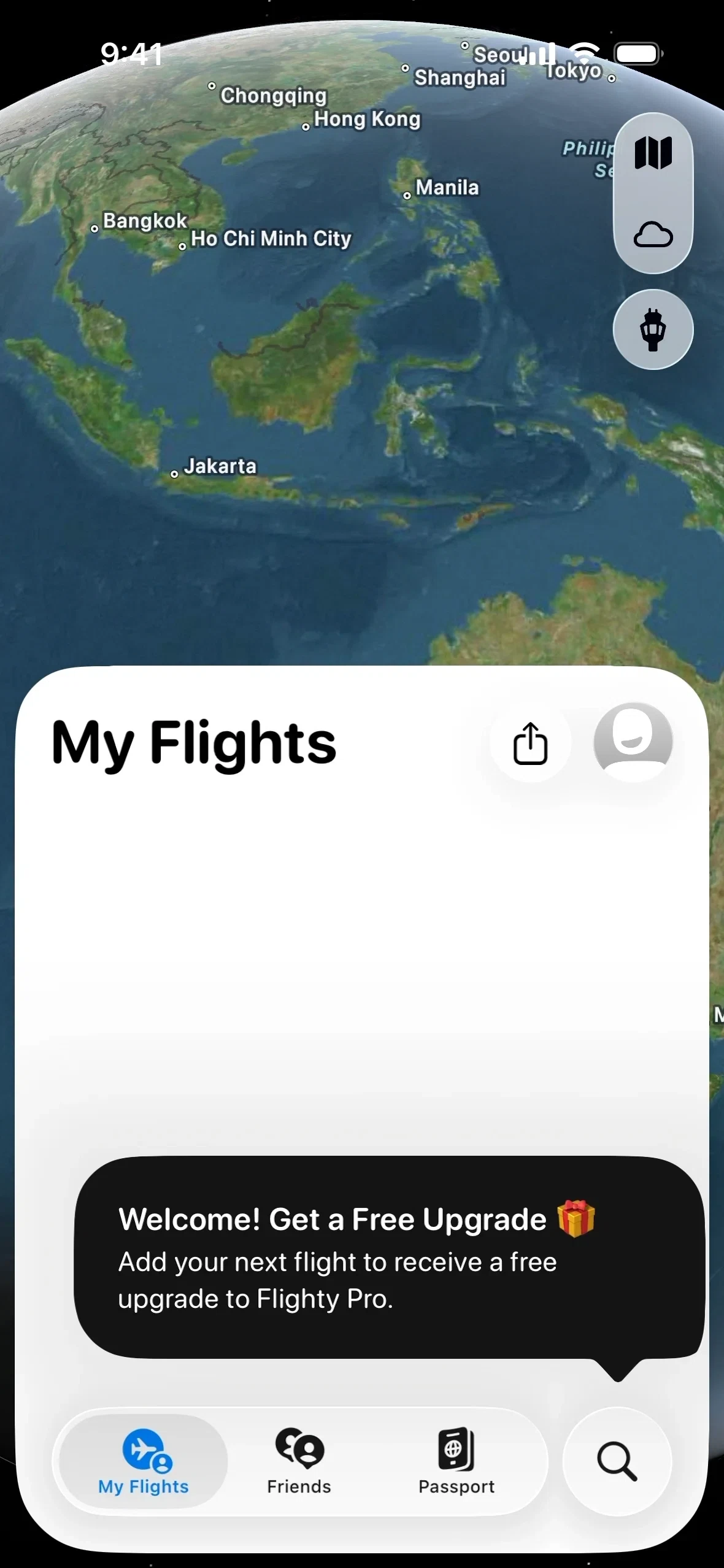

Screen study · 6 annotated moments
Flighty route entry and flight discovery
The screens progress from an empty flight view through airport search, route selection, results and a saved-flight map.
Read the study →
Find a reviewed pattern
A small, inspected set. These links search the annotations, not just app names.
Our analysis describes the supplied versions and visible states. It does not claim access to conversion data, internal experiments or every possible path. Screens remain attributed to their source and product owners.