
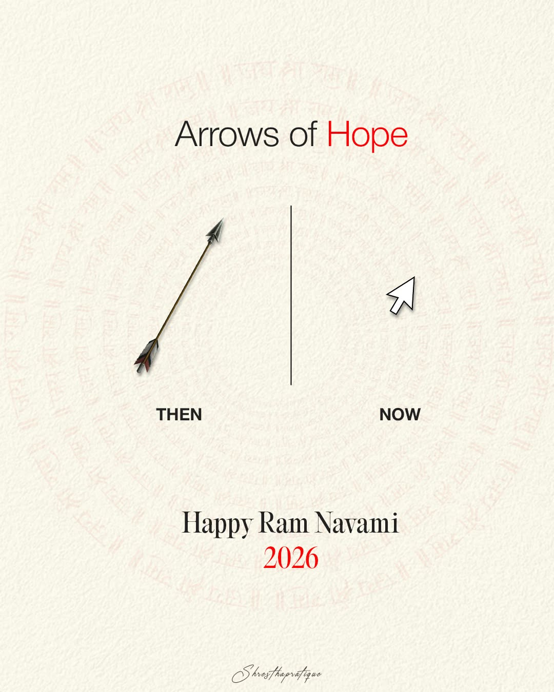
Reference found on Pinterest, saved by Shrestha Pratique. View the original pin The design belongs to its creator: use it for art direction, not as a template. Request removal
other-festival · Instagram post · Reference
Traditional arrow vs computer cursor comparison
Off-white textured paper background with a very faint pinkish circular pattern of Devanagari chant text. A small realistic arrow with dark fletching sits on the left, contrasted by a white pointer cursor icon on the right. Palette is restrained cream, black and a single bright red accent. The concept relies on a then-versus-now visual pun rather than decoration.
Palette
- #f8f5e8
- #e5ddd1
- Layout
- Centred headline at top, then a split panel divided by a thin vertical line: diagonal arrow on the left, cursor on the right, each labelled beneath. Greeting and red year centred lower, with a tiny signature at the bottom; generous negative space.
- Typography
- Clean grotesque sans headline with one red accent word; bold sans caps labels; classic condensed serif for the greeting with red numerals; script signature.
More other-festival designs for marketing agencies
All creative ads for marketing agencies
- minimal
- typographic
- arrow
- mouse cursor
- Devanagari text rings
- paper texture
- witty
- calm
- modern
Make your own version with AI
Add your brand details and pick an AI. The prompt keeps this design's idea and style, and swaps in your brand.
Your logo (optional)
Your logo stays in this browser tab. It's never uploaded to our server.
More other-festival designs
See all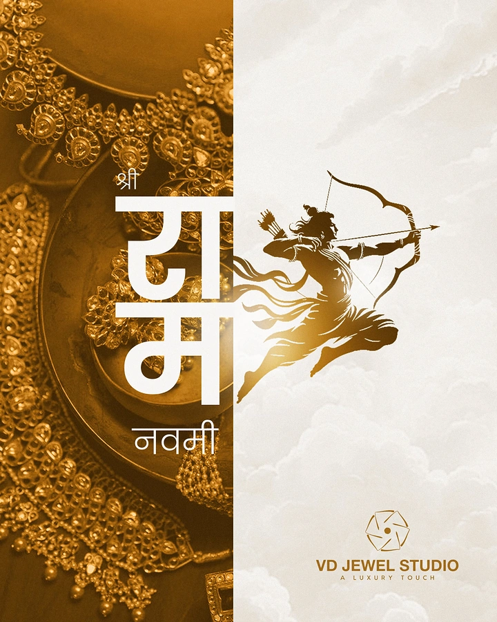
Gold archer silhouette over split jewellery and cloud panels
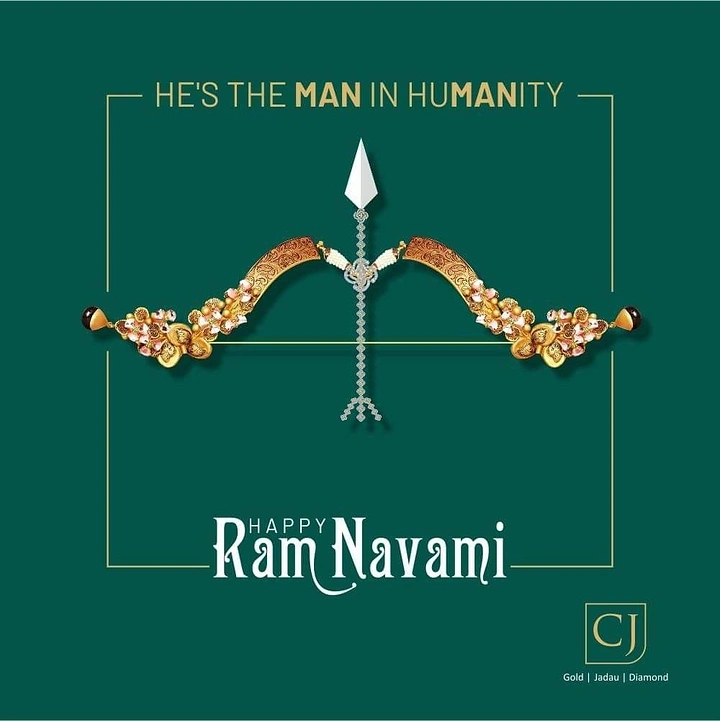
Bow and arrow crafted from gold, jadau and diamond jewellery
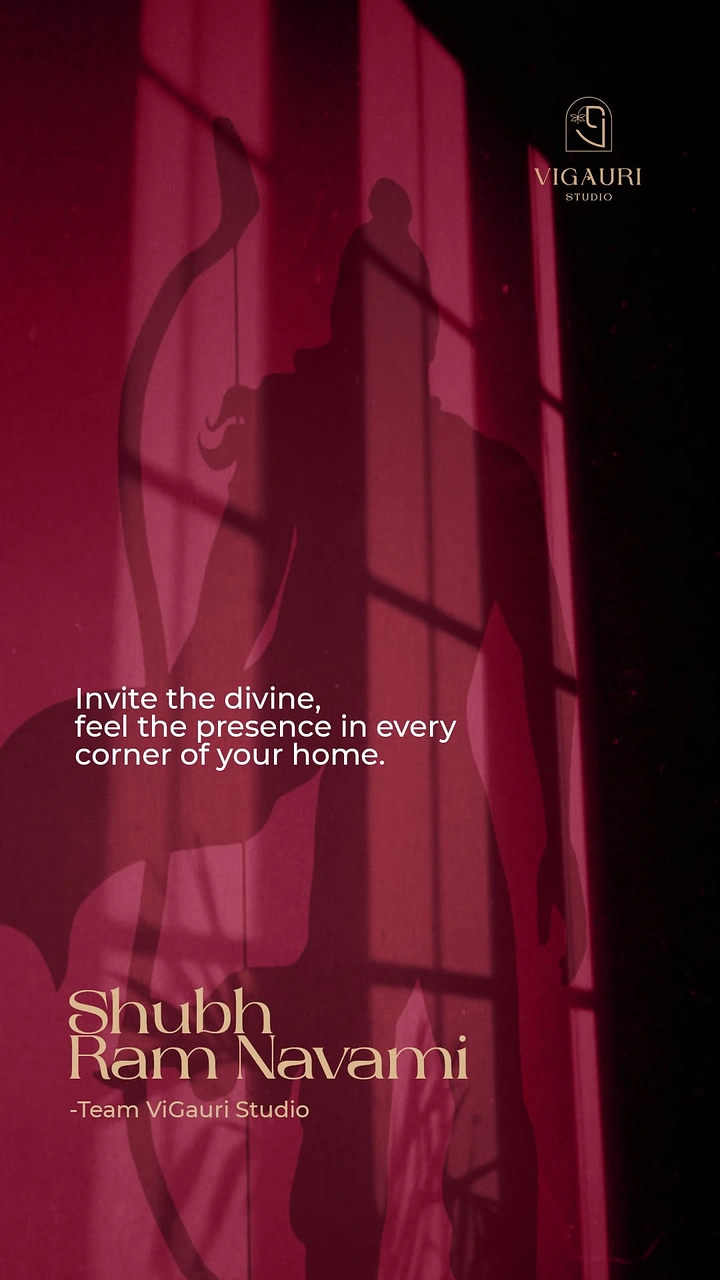
Shadow of an archer deity silhouette cast on a crimson wall with window light
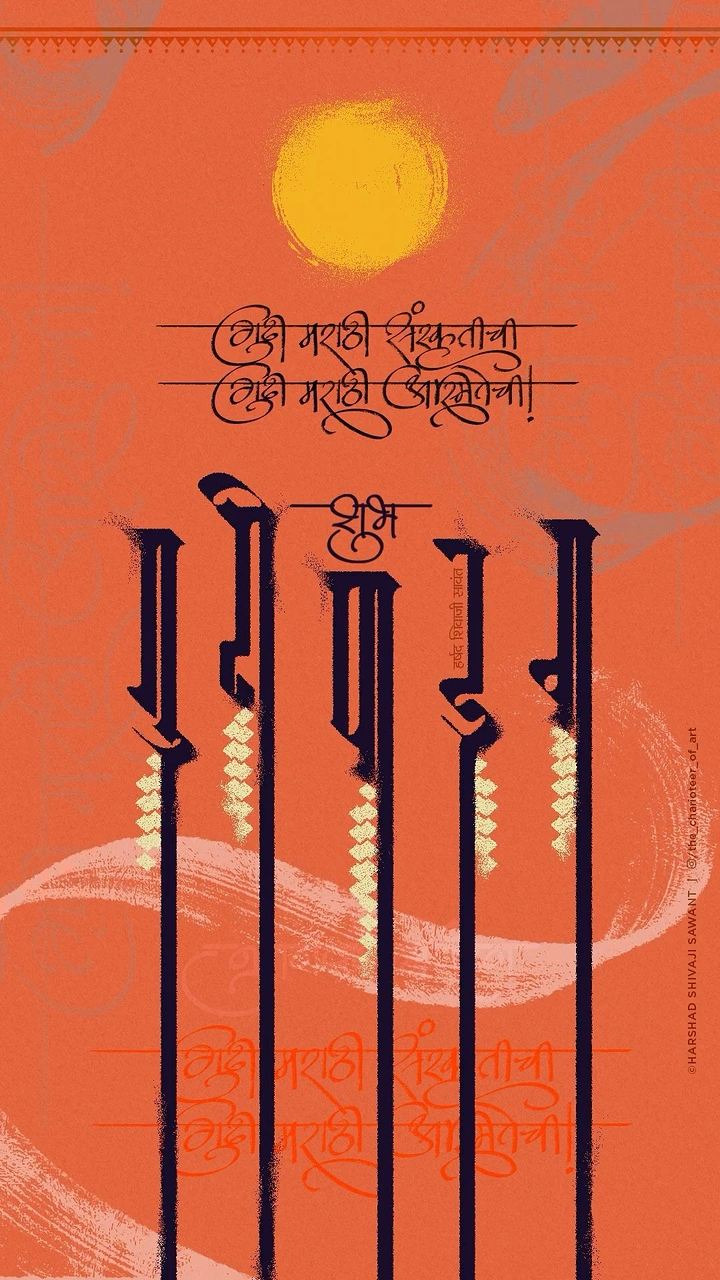
Devanagari calligraphy with strokes stretched into tall gudi poles
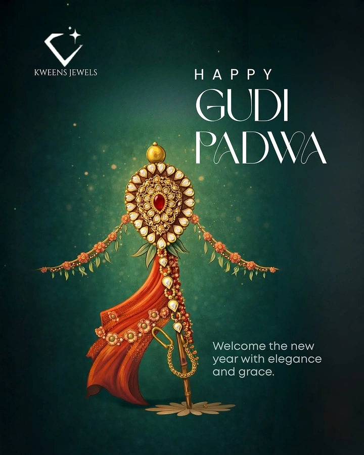
Gudi reimagined as a kundan jewel pendant
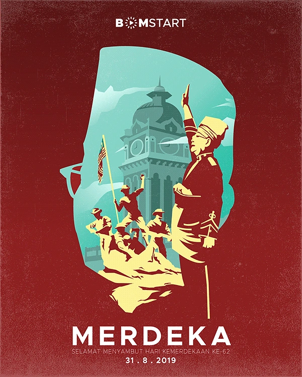
Head-in-profile silhouette filled with historic independence scene
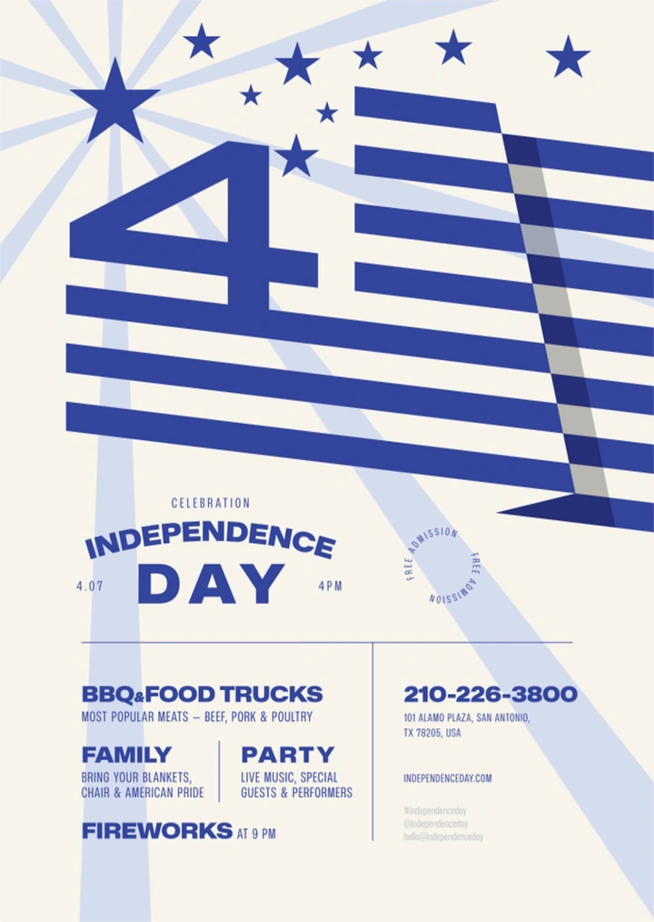
Graphic numeral 4 merged into a waving striped flag with stars
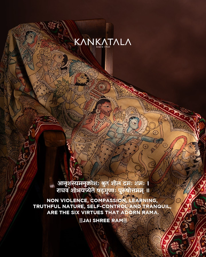
Hand-painted Kalamkari saree showing Rama's bow scene, draped over a wooden chair
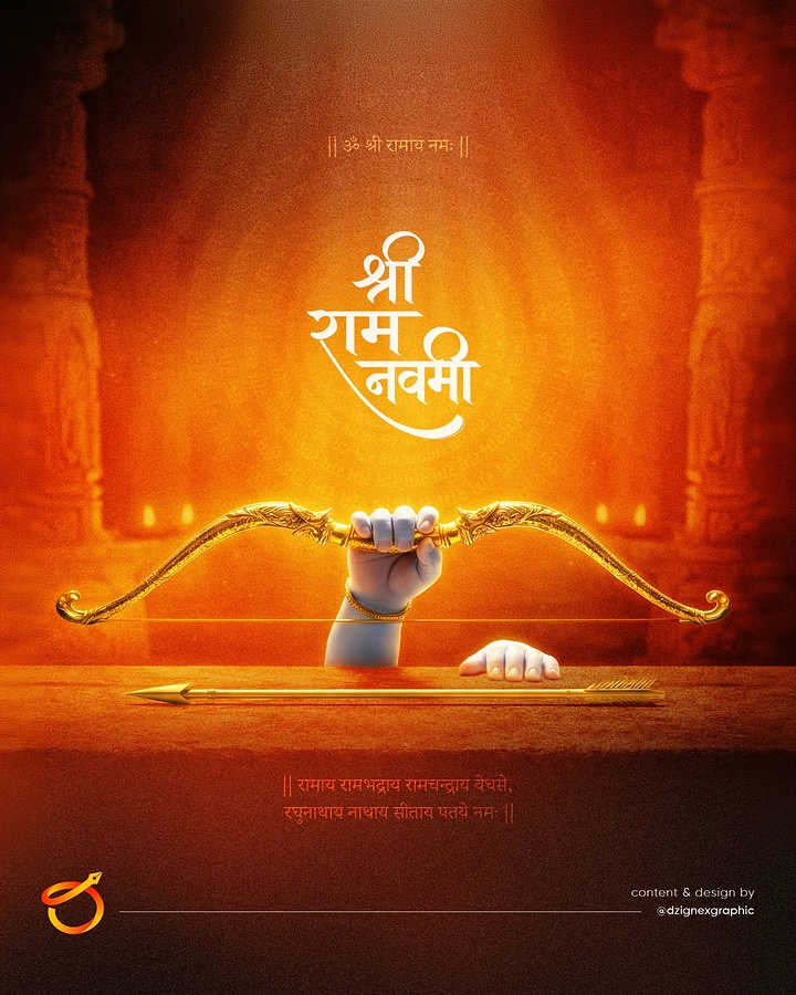
Child Ram's small hand gripping an ornate golden bow in a glowing temple
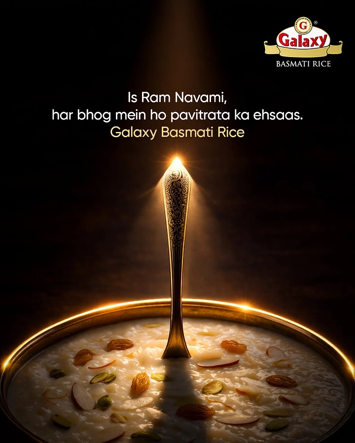
Rice kheer in brass bowl with ornate spoon under a divine light beam
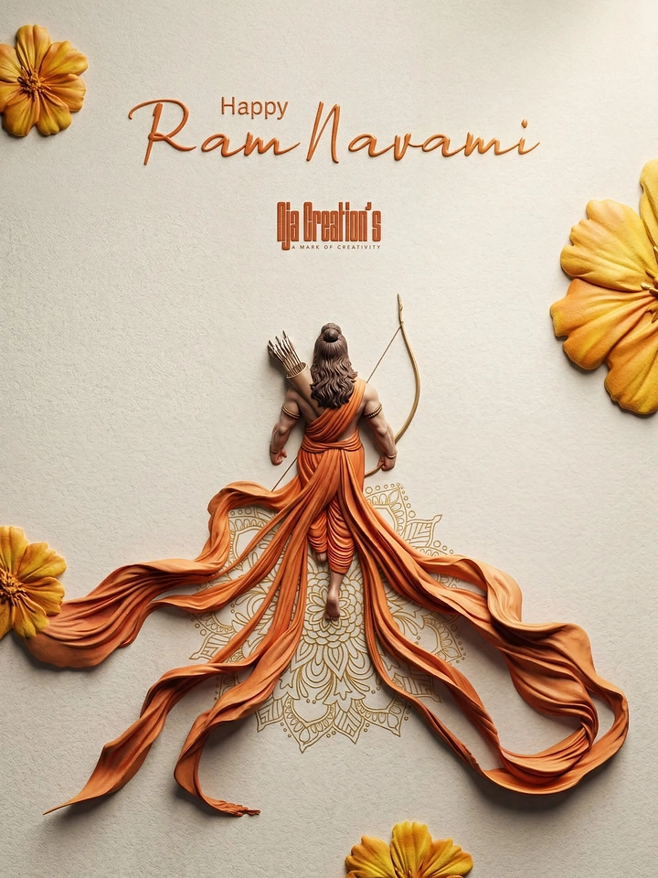
Clay-sculpted archer deity with flowing saffron dhoti
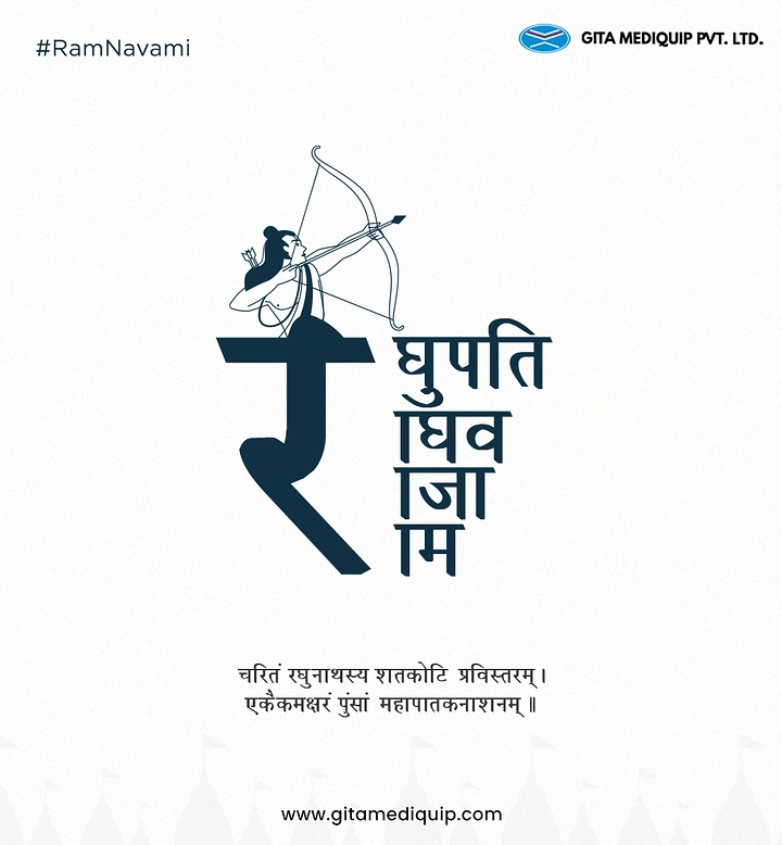
Line-art Rama archer rising from a giant Devanagari 'र' letter