
What fonts does Sucre Restaurant Soho use?
Measured from the captured homepage: Garton for headings and Garton for body copy.
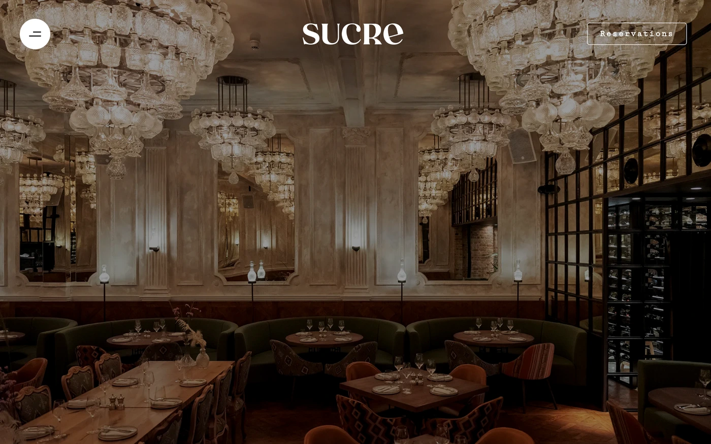 Open full Sucre Restaurant Soho reference →
Observed typography
- Heading font
- Garton
- Body font
- Garton
- System
- One family across both roles
How the page is built
Sucre Restaurant Soho's captured homepage has 4 sections and 3 inner pages.
- 3 content
- 1 features
Other sites that use this pair
No other captured site in this library uses this same pair of fonts.
Captured colors
The captured homepage uses these 2 colors, in capture order.
- #ffffff
- #000000
Styles recorded: Light, Minimal.
Same category, same heading font
0 of the 132 other captured Food & Drink sites in this library use Garton for headings.
Sucre Restaurant Soho's website font choices
Captured September 23, 2026. Read it with the full reference, where the palette, section order and responsive views sit next to the type.
A single family or a two-font system?
Sucre Restaurant Soho sets headings and body in Garton, so the hierarchy comes from scale and weight.
Compare it across the library
See the website font trends and the font pairing examples.
Sucre Restaurant Soho fonts — FAQ
What font does Sucre Restaurant Soho use?
Sucre Restaurant Soho uses Garton for headings and Garton for body copy in the captured homepage.
Is Garton free to use?
Check the foundry license for Garton before shipping it. This page records what appeared on Sucre Restaurant Soho's site and grants no reuse rights.
What colors and sections were captured for Sucre Restaurant Soho?
2 colors (#ffffff, #000000) and 4 homepage sections, with 3 inner pages.
Which other sites use Garton and Garton?
No other captured site in this library uses this same pair of fonts.
Fonts come from the rendered capture and may change when the site does. Library methodology