Opening…
Reference found on Pinterest, saved by 🧿🎀. The design belongs to its creator: use it for art direction, not as a template. Request removal
Poster · Reference
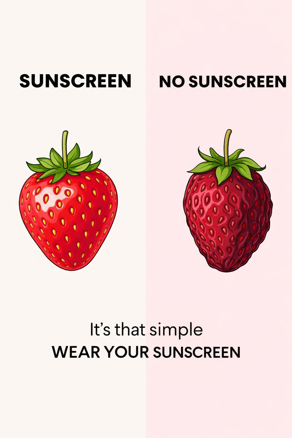
Poster: Healthy versus sun-damaged strawberry comparison
Create a tall two-tone background split exactly down the center, using warm ivory on one side and soft blush pink on the other. Place a bright, healthy red strawberry on the sunscreen side and a darkened, bruised red strawberry on the no-sunscreen side. Use bold black type with generous margins and minimal decoration so the visual contrast carries the message. The finish should feel like a clean illustrated public-service poster.
Reference image for inspiration. Editable source files are not included.
Make your own version with AI
Add your brand details and pick an AI. The prompt keeps this design's idea and style, and swaps in your brand.
Your logo (optional)
Your logo stays in this browser tab. It's never uploaded to our server.