Opening…
Reference found on Pinterest, saved by Tamara Porter. The design belongs to its creator: use it for art direction, not as a template. Request removal
Carousel · Reference
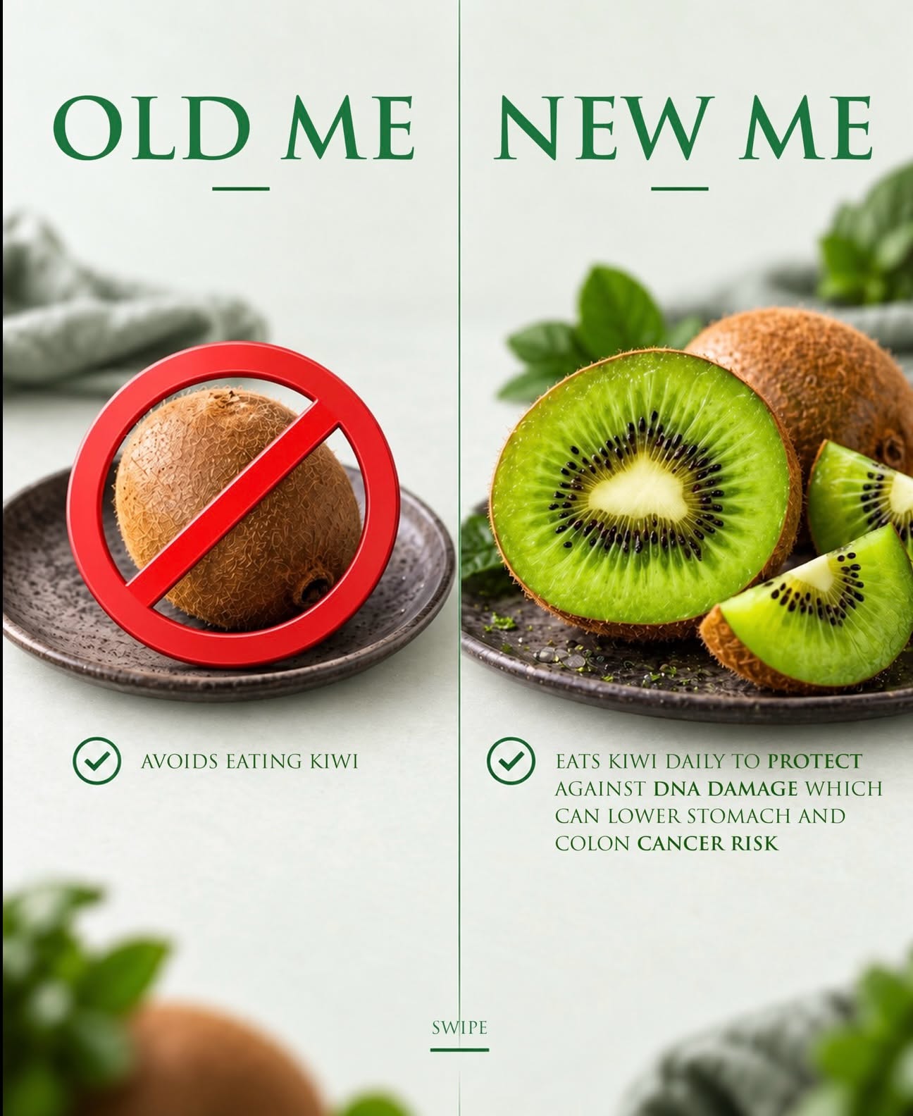
Carousel: A comparison of avoiding kiwi versus eating kiwi daily
A pale, softly textured near-white background supports a clean two-panel comparison. The left panel shows a whole kiwi on a dark ceramic plate with a bold red prohibition sign, while the right shows sliced kiwi with vivid green flesh and shallow depth of field. Muted green typography and accents contrast with the red symbol, and blurred fruit and leaves add depth near the edges. The finish is polished, editorial, and health-focused.
Reference image for inspiration. Editable source files are not included.
Make your own version with AI
Add your brand details and pick an AI. The prompt keeps this design's idea and style, and swaps in your brand.
Your logo (optional)
Your logo stays in this browser tab. It's never uploaded to our server.