Opening…
Reference found on Pinterest, saved by Adfolio. View the original pin The design belongs to its creator: use it for art direction, not as a template. Request removal
Instagram post · Reference
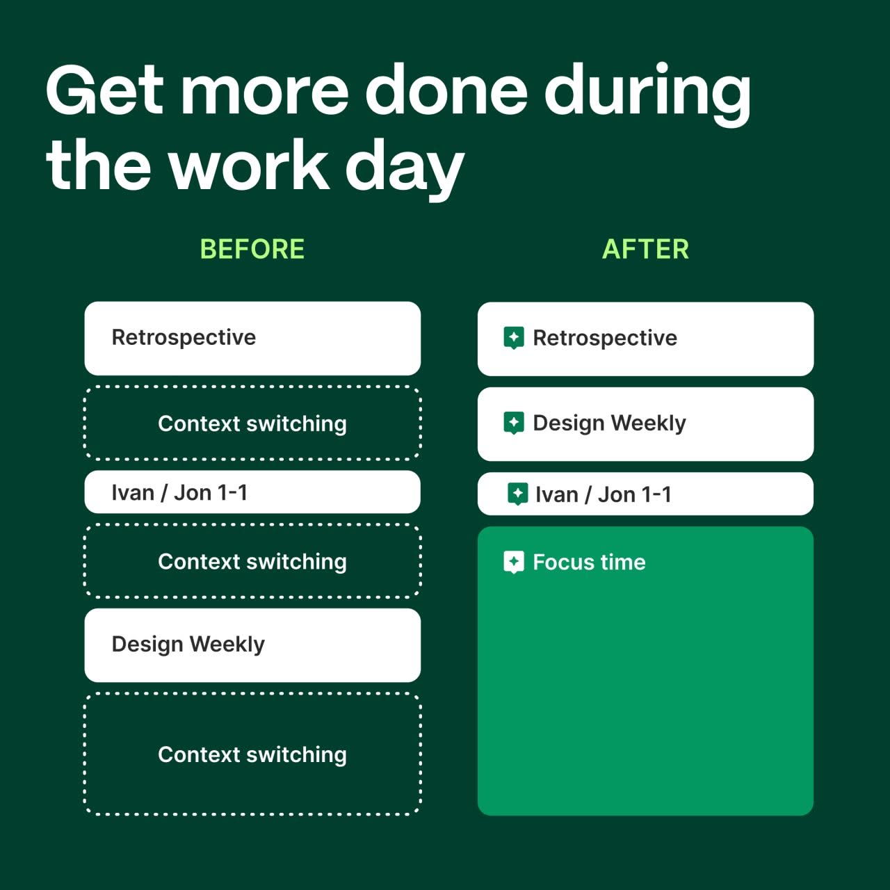
Instagram post: Before/after calendar schedule comparison
The background is a deep forest green, with white rounded-rect cards laid out like a calendar UI. On the left, dashed white outlines stand for wasted time. On the right, a bright emerald block for focus time is the focal point. Small green sparkle badges mark the organised meetings, and the flat vector finish gives it a product-UI feel.
Reference image for inspiration. Editable source files are not included.
Make your own version with AI
Add your brand details and pick an AI. The prompt keeps this design's idea and style, and swaps in your brand.
Your logo (optional)
Your logo stays in this browser tab. It's never uploaded to our server.