
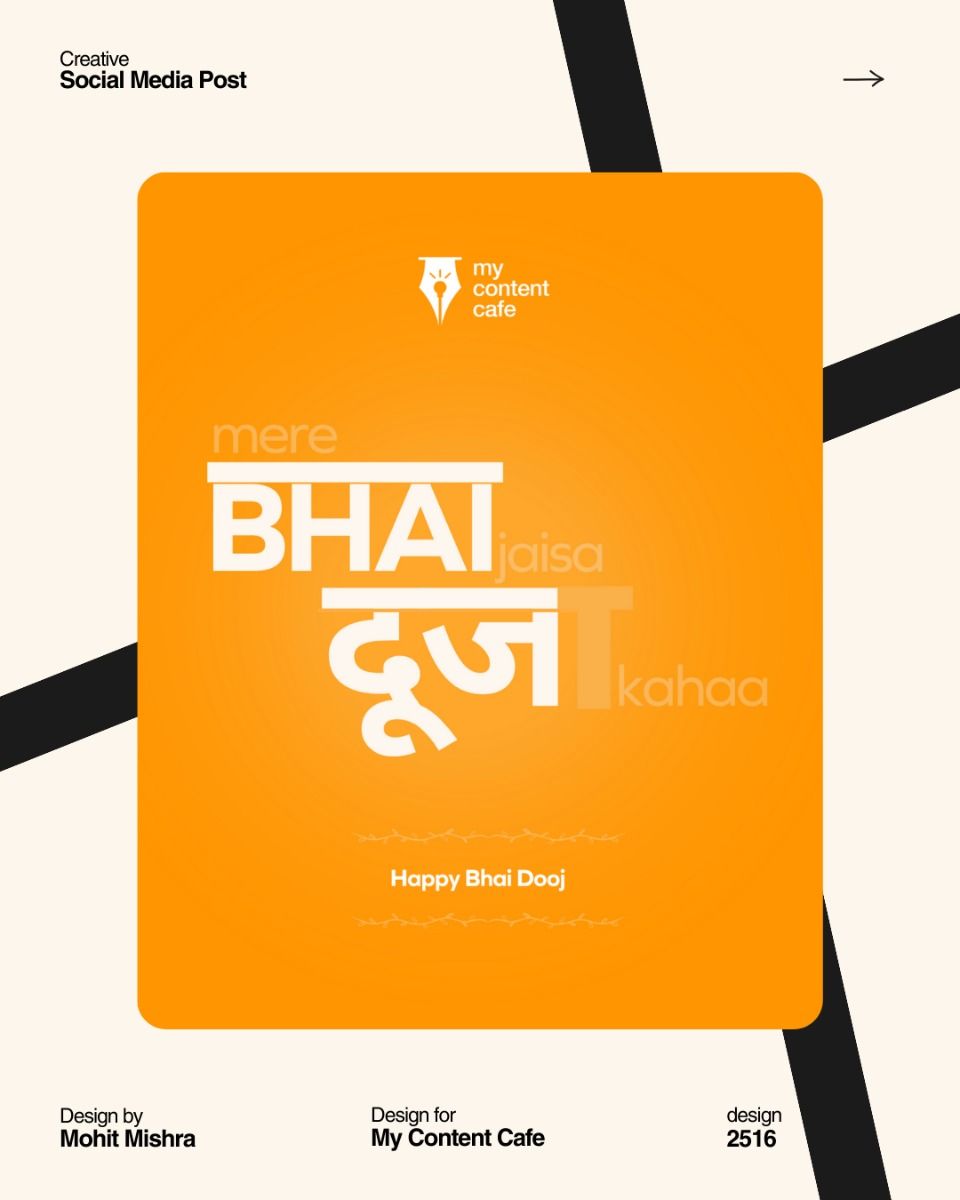
Reference found on Pinterest, saved by Mohit Mishra । Media & Marketing | Video Editing. View the original pin The design belongs to its creator: use it for art direction, not as a template. Request removal
Bhai Dooj · Instagram post · Reference
Bilingual type lockup that turns the festival name into a pun
A saturated orange card with a soft radial glow in the centre, set on a warm cream background with bold black diagonal stripes for contrast. The focal point is the white type lockup: English and Devanagari are fused so a faded letter T completes the Hindi word into a pun. Low-opacity secondary words and delicate line-vine dividers add depth. The finish is flat and clean, with generous negative space.
Palette
- #fe9a13
- #fdf6ec
- #191919
- #f4dfc1
- #fcca82
- Layout
- This is a portfolio presentation: a rounded orange card sits in the centre of a cream canvas crossed by two diagonal black bars, with project credits in small text at the corners. Inside the card are a small centred logo at the top, a large stacked type lockup in the middle, and a small greeting framed by thin vine dividers near the bottom.
- Typography
- Heavy grotesk sans caps for BHAI with a flat bar on top that echoes the Devanagari headline line, bold Devanagari for the Hindi word, and faded light sans for the connecting words; small bold sans for the greeting.
More Bhai Dooj designs for marketing agencies, media brands
All creative ads for marketing agencies, media brands
- typographic
- minimal
- flat
- bilingual wordplay
- pen-nib logo
- thin vine dividers
- diagonal black stripes
- witty
- warm
- modern
Make your own version with AI
Add your brand details and pick an AI. The prompt keeps this design's idea and style, and swaps in your brand.
Your logo (optional)
Your logo stays in this browser tab. It's never uploaded to our server.
More Bhai Dooj designs
See all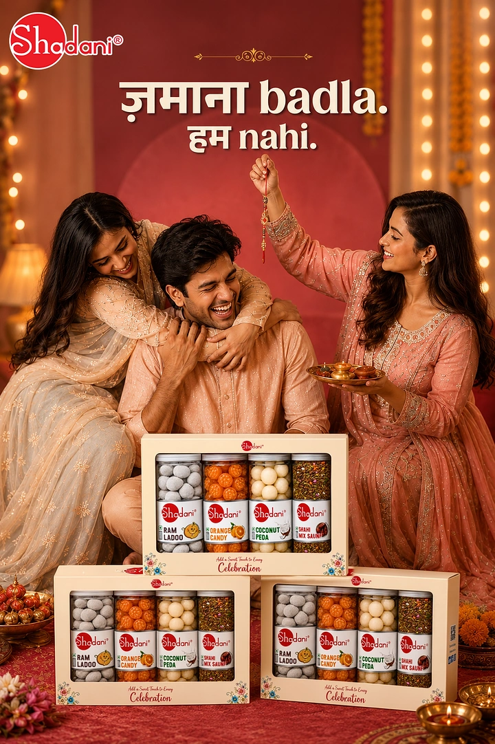
Laughing siblings with stacked sweet gift boxes
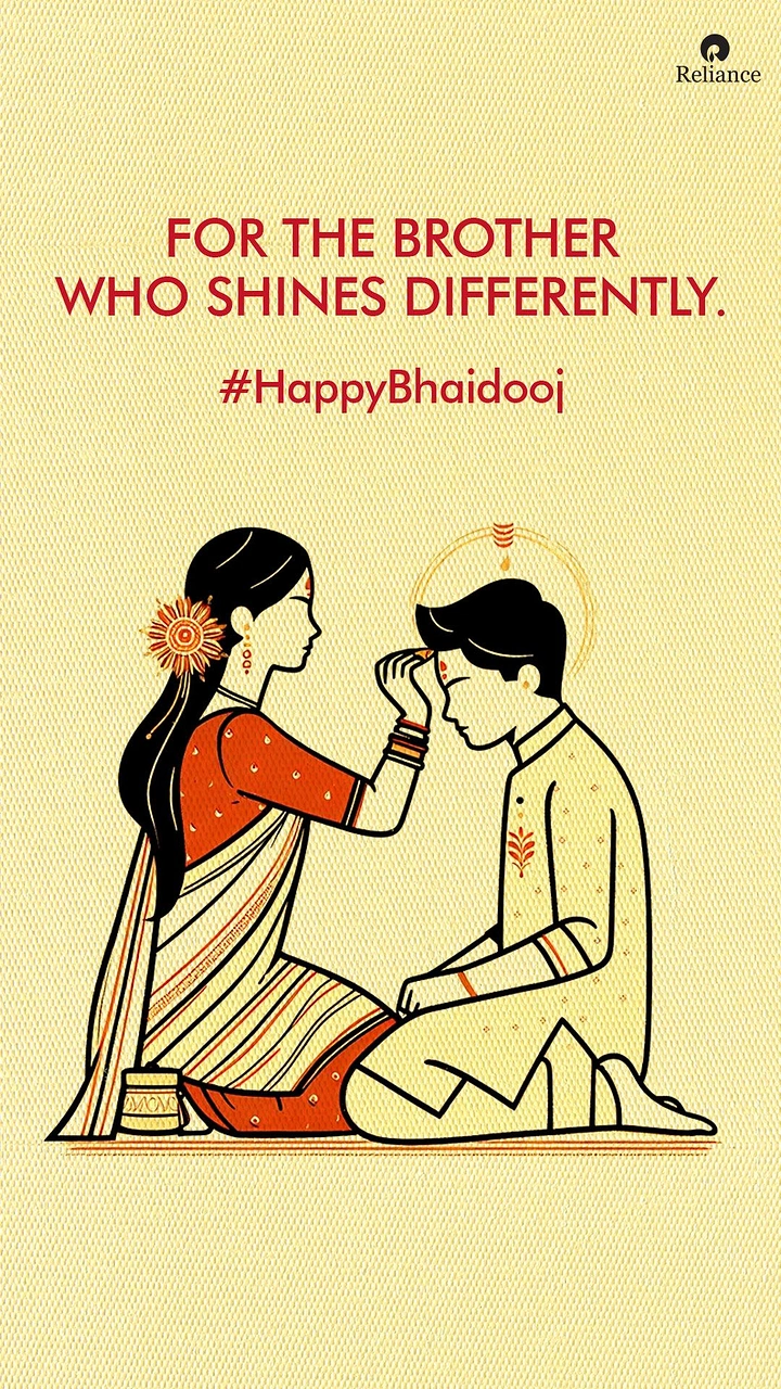
Sister applying tilak to her kneeling brother

Cartoon brother cycling with his little sister
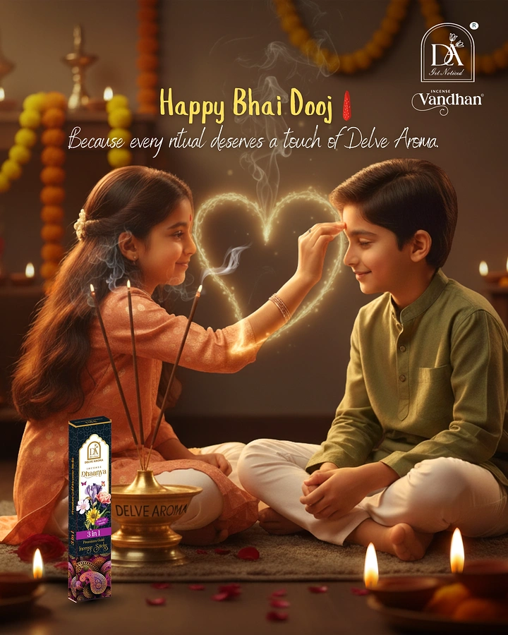
Sister applying tilak to her seated brother, with incense smoke forming a heart
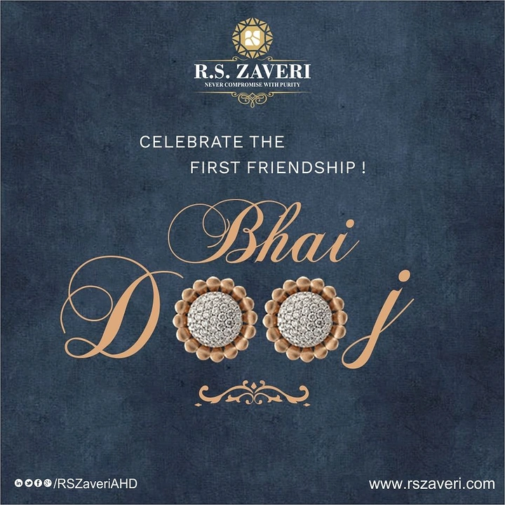
Pair of diamond-pavé flower stud earrings forming the letters of the festival name
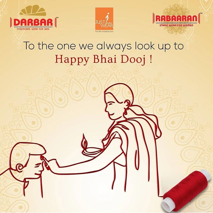
Red single-line drawing of a sister applying tilak to her brother
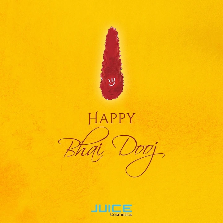
Red vermilion tilak stroke with rice grains
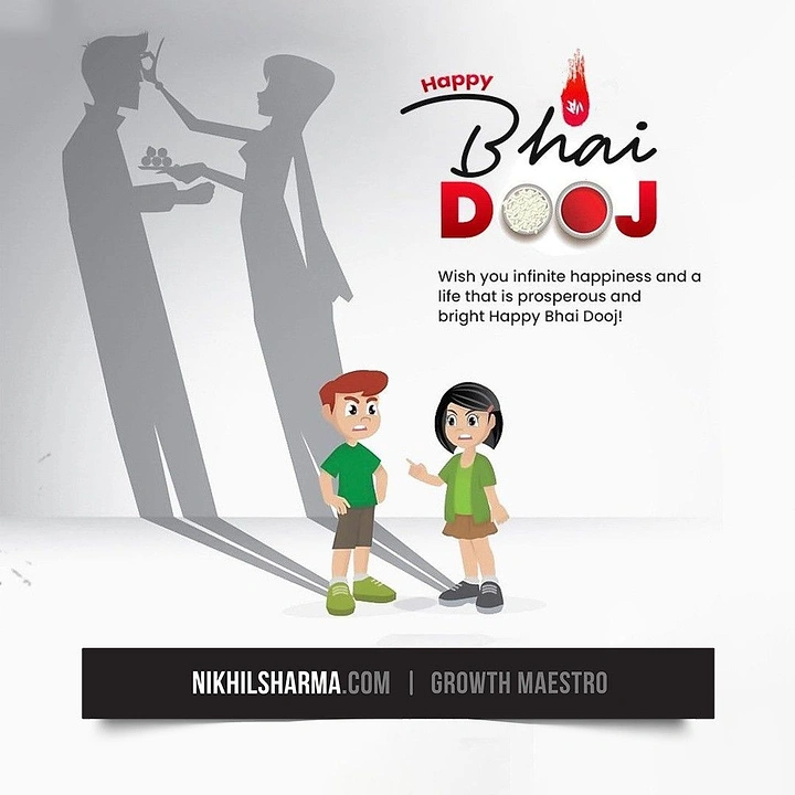
Bickering cartoon siblings casting adult shadows performing tilak ritual
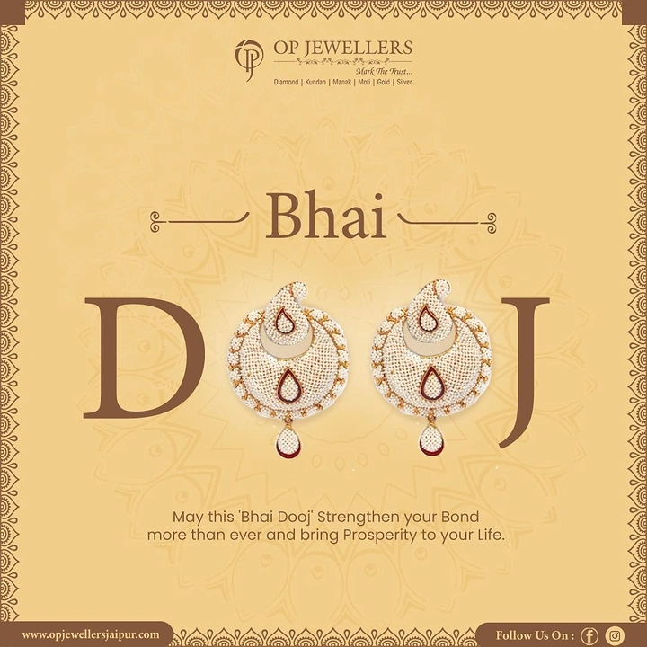
Pair of pearl-and-kundan chandbali earrings replacing the O's in Dooj
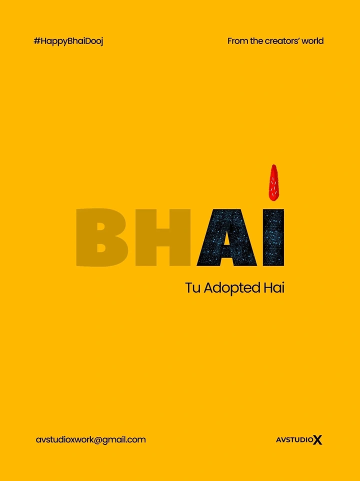
The word BHAI with a red tilak dotting the I
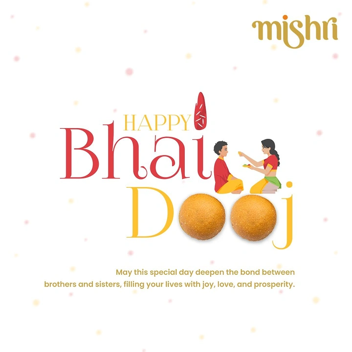
Two laddoos replacing the O's in the word Dooj
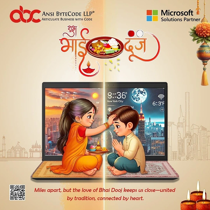
Sister applying tilak to brother across a split laptop screen