
Reference found on Pinterest, saved by Surbhi Chopra. View the original pin The design belongs to its creator: use it for art direction, not as a template. Request removal
Independence Day · Instagram post · Reference
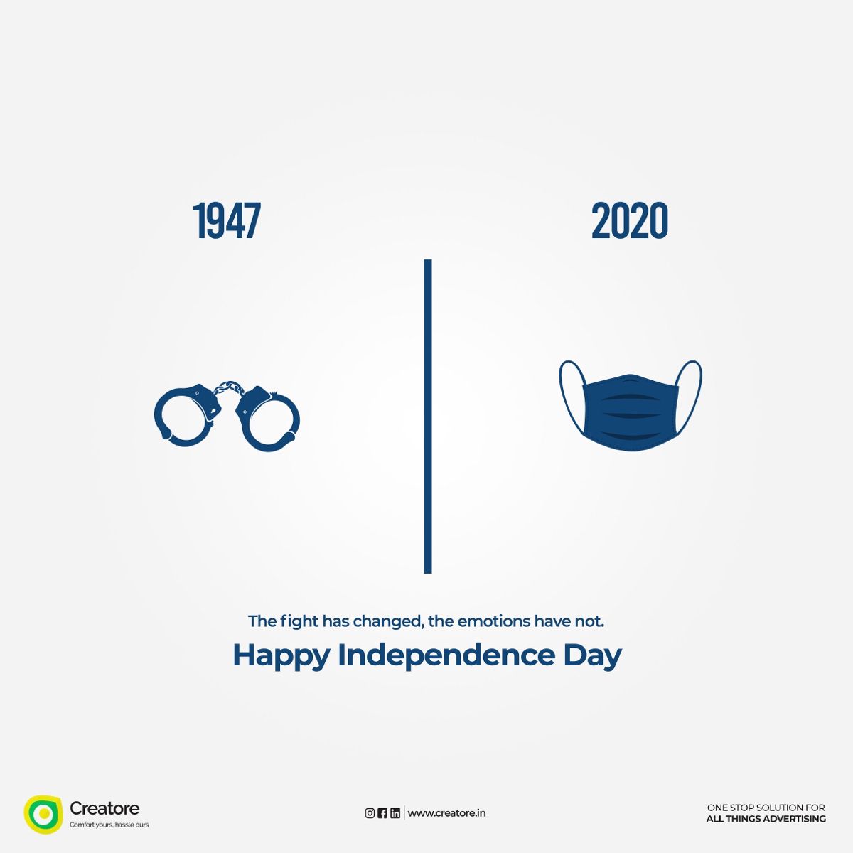
Handcuffs vs face mask split comparison
The background is off-white with a subtle radial grey vignette. Flat navy icons of handcuffs and a pleated face mask create a then-versus-now contrast across a thin vertical divider. The design is monochrome navy with no tricolour, relying on the idea rather than decoration. The finish is clean, flat vector art.
Palette
- #f3f3f3
- #aebdc4
- #cfd7da
- #7893ae
- Layout
- Symmetrical split: a navy vertical line divides the canvas, with a year label above an icon on each side. The centred message and greeting sit below, and a footer bar holds the logo at left, social icons and URL in the centre, and the tagline at right.
- Typography
- Condensed bold sans for the years, a medium geometric sans for the line, a bold geometric sans for the greeting, and small sans text in the footer.
More Independence Day designs for marketing agencies
All creative ads for marketing agencies
- minimal
- flat
- handcuffs
- face mask
- split divider
- years comparison
- thoughtful
- poignant
- clean
Make your own version with AI
Add your brand details and pick an AI. The prompt keeps this design's idea and style, and swaps in your brand.
Your logo (optional)
Your logo stays in this browser tab. It's never uploaded to our server.
More Independence Day designs
See all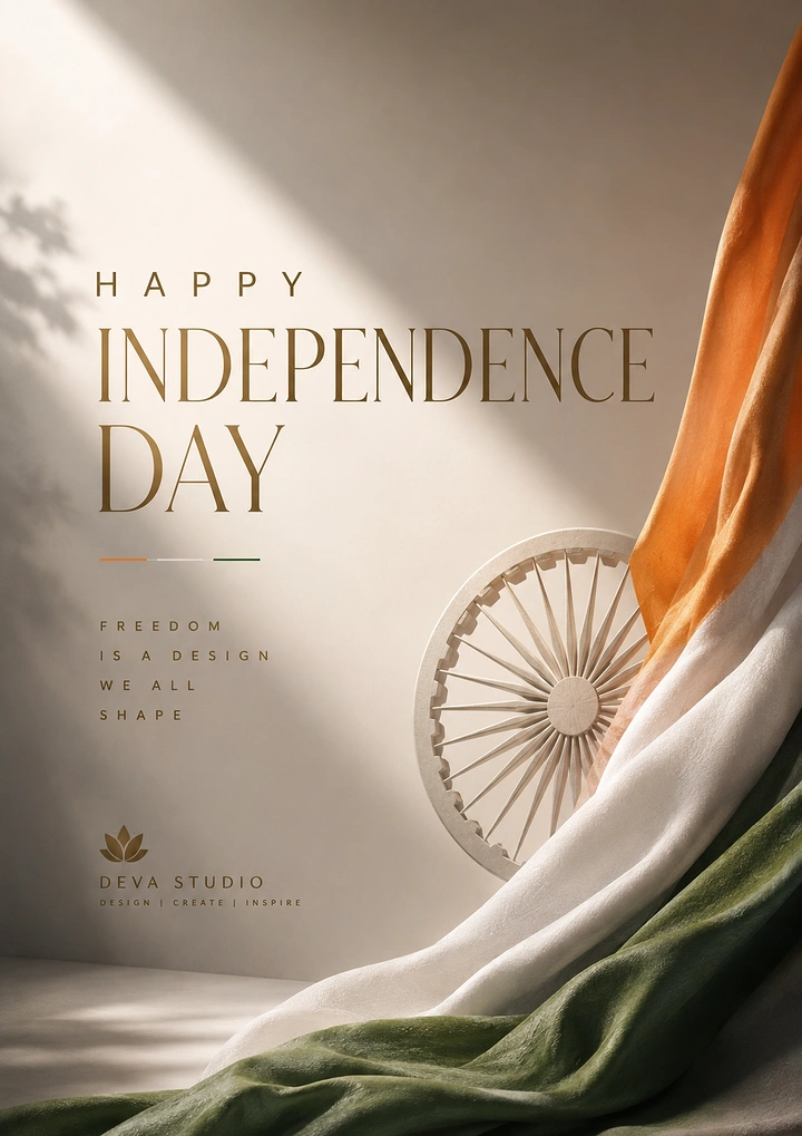
Draped tricolour silk fabric with a sculpted ivory Ashoka Chakra wheel
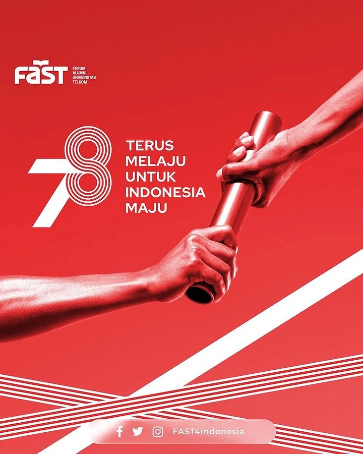
Two hands passing a relay baton, in red duotone
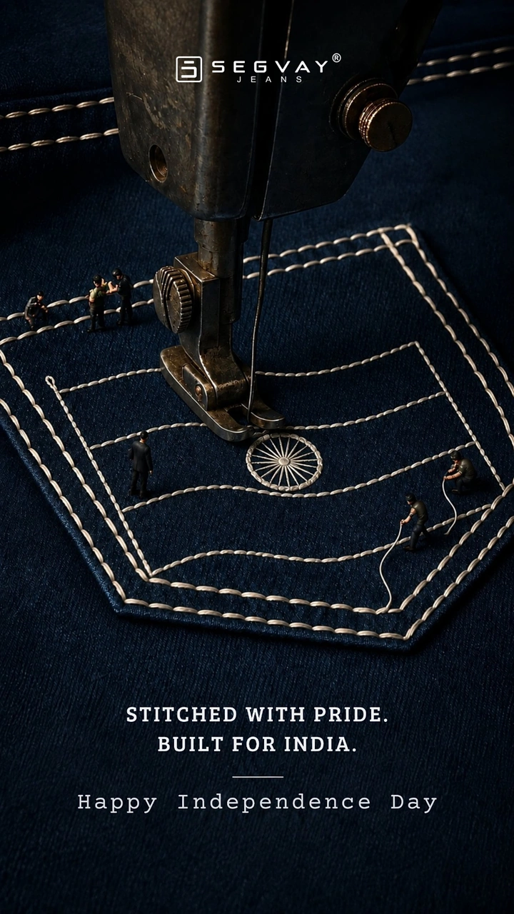
Sewing machine stitching a flag and chakra onto a denim pocket, with miniature workers
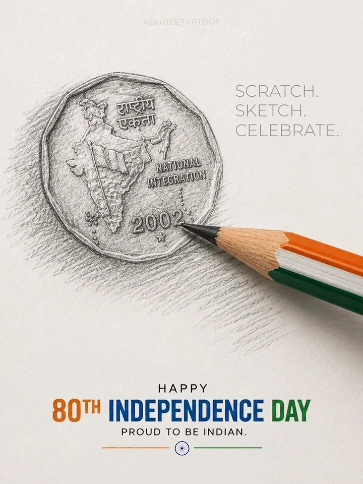
Graphite sketch of a National Integration coin with a tricolour pencil
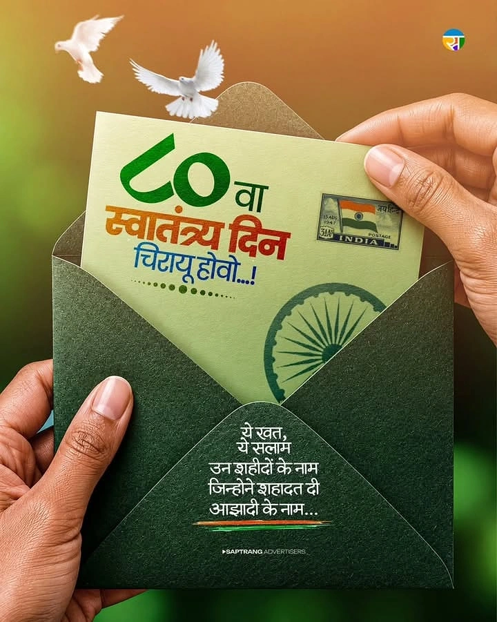
Hands opening a green envelope holding a patriotic letter card
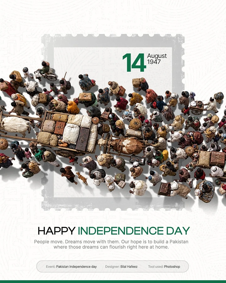
Top-down crowd of 1947 migrants with carts spilling out of a postage stamp
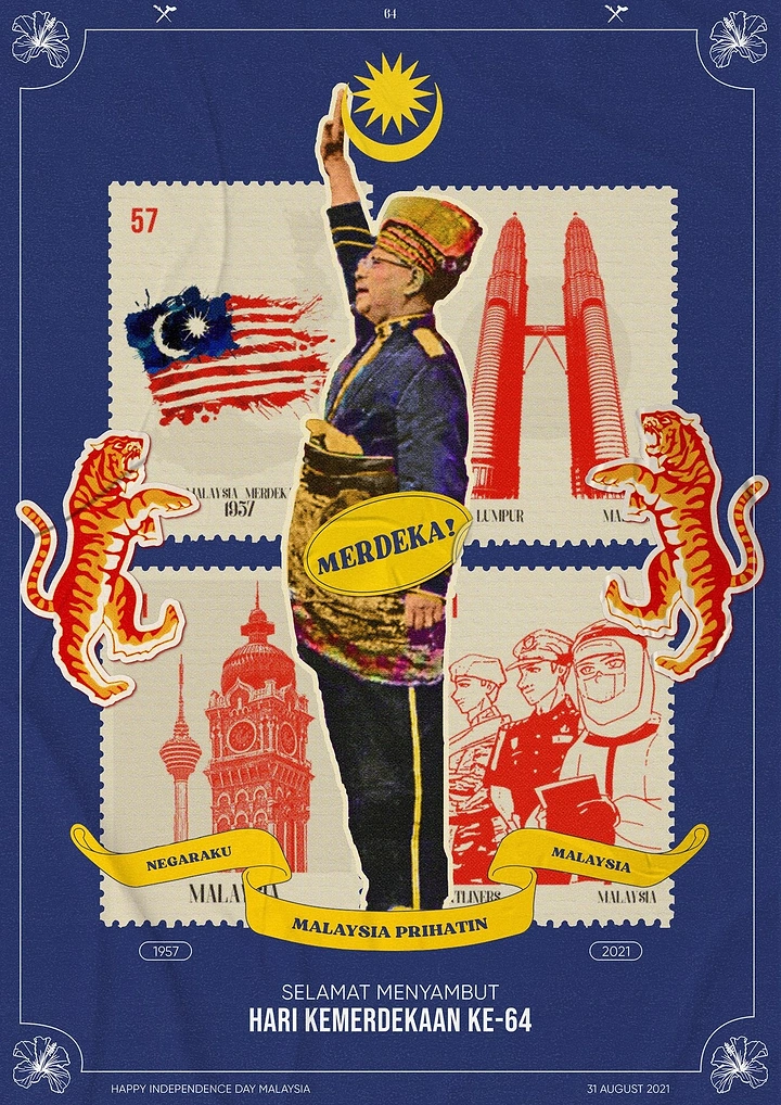
Cut-out statesman saluting over a grid of vintage national stamps
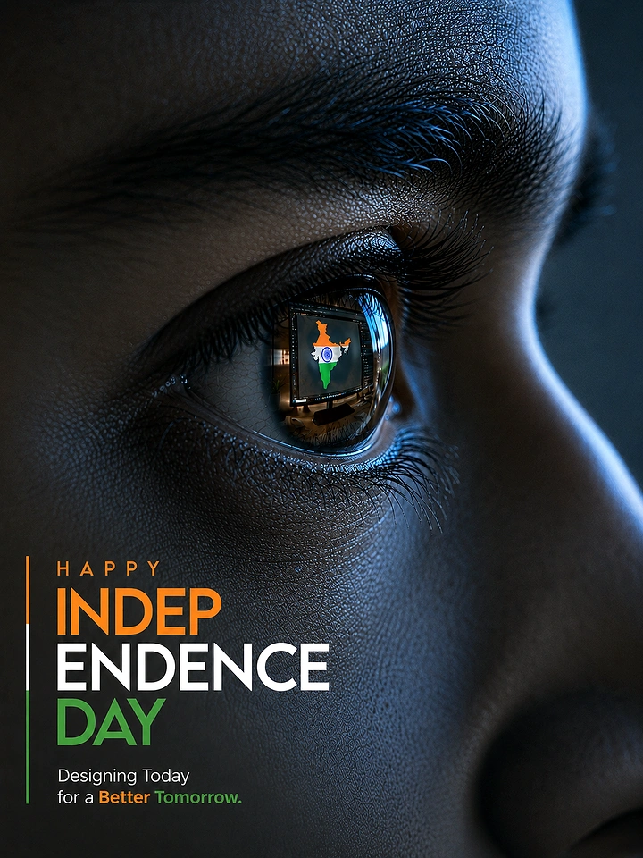
Macro close-up of an eye reflecting a tricolour India map on a screen
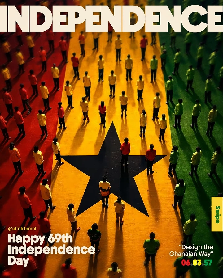
Aerial view of crowds in coloured shirts forming the Ghanaian flag with a black star
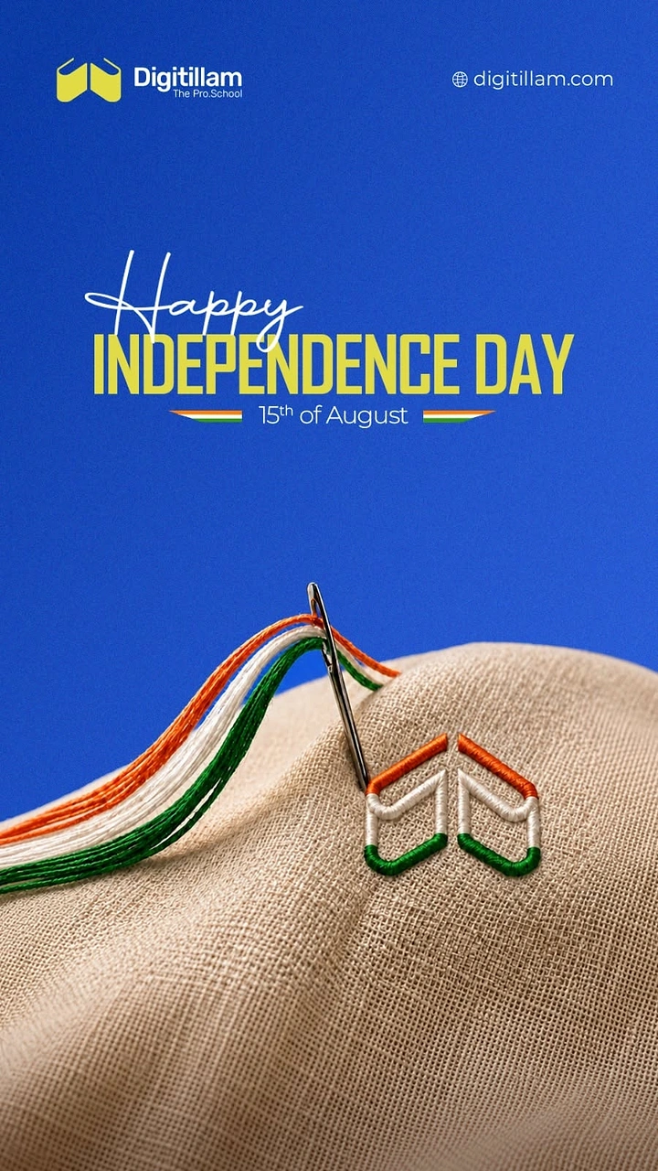
Needle stitching the logo in tricolour thread on beige linen
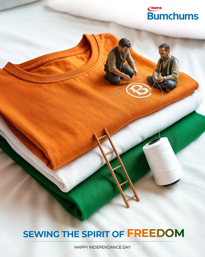
Miniature tailors stitching a logo on stacked saffron, white and green t-shirts
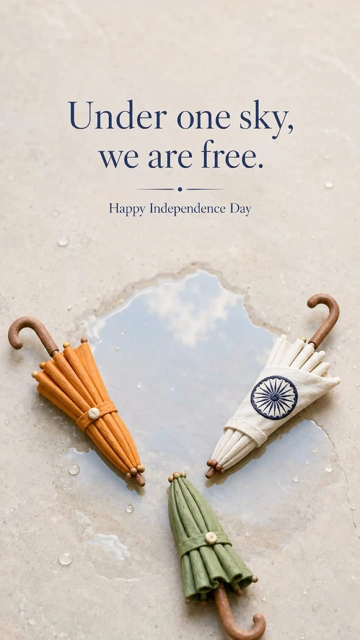
Three tricolour clay umbrellas around a sky-reflecting puddle