Opening…
Reference found on Pinterest, saved by Krix Studio. View the original pin The design belongs to its creator: use it for art direction, not as a template. Request removal
Poster · Reference
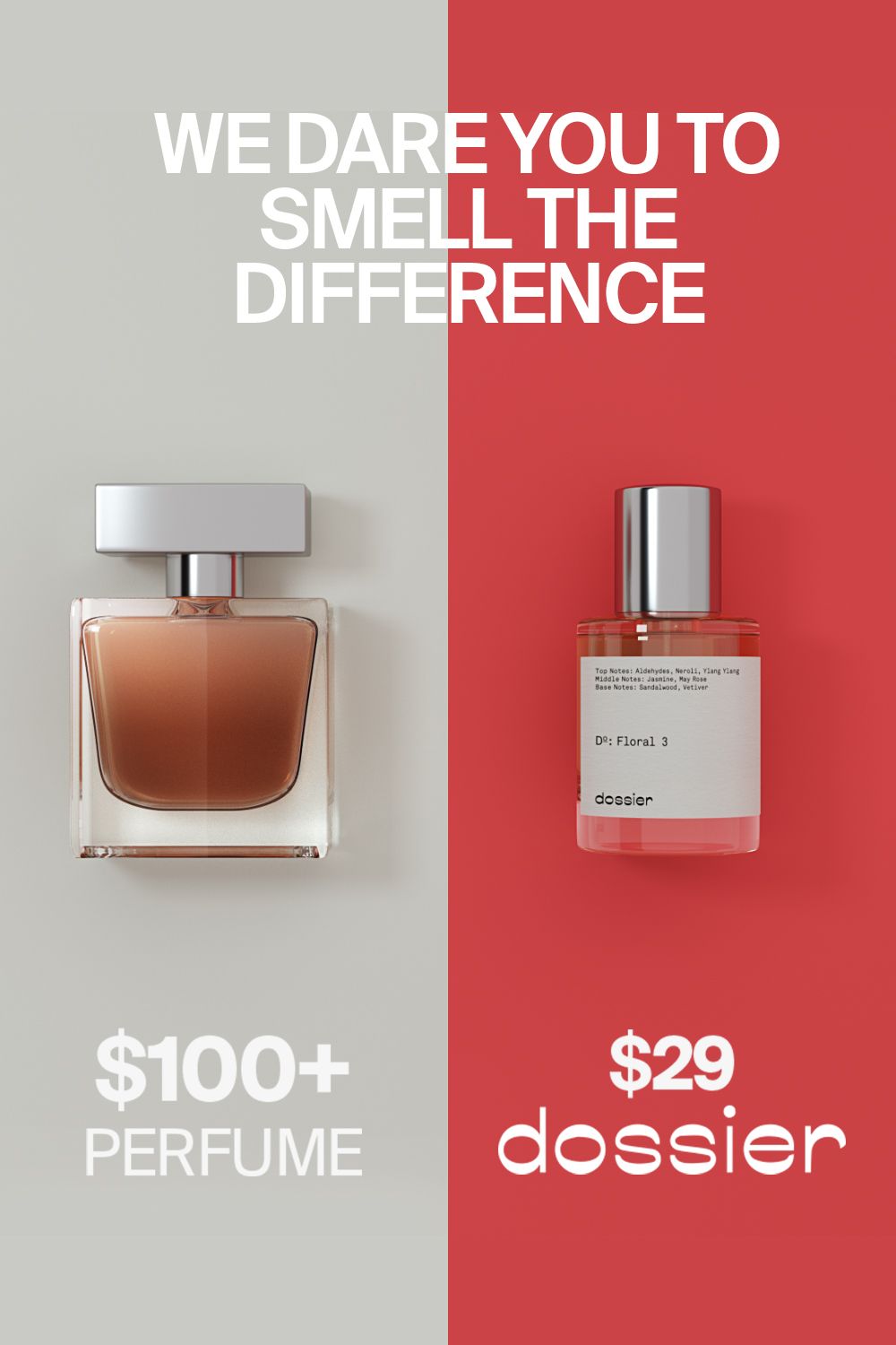
Poster: Side-by-side comparison of a designer perfume and a budget dupe bottle
Two flat colour fields, neutral light grey and a saturated coral-red, create a direct versus comparison. On the grey side, a square amber-liquid bottle with a silver cap represents the luxury original. On the red side, a slim cylindrical bottle with a silver cap and a white label is the challenger. Soft top-down studio lighting casts gentle shadows, and the white type bridges both halves for a clean comparative-ad look.
Reference image for inspiration. Editable source files are not included.
Make your own version with AI
Add your brand details and pick an AI. The prompt keeps this design's idea and style, and swaps in your brand.
Your logo (optional)
Your logo stays in this browser tab. It's never uploaded to our server.