Opening…
Reference found on Pinterest, saved by Patto. View the original pin The design belongs to its creator: use it for art direction, not as a template. Request removal
Instagram post · Reference
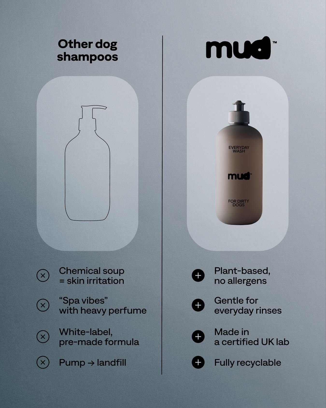
Instagram post: Brand shampoo bottle vs outline generic bottle comparison
Cool grey-blue gradient background with a subtle grainy, misty finish. Two tall pill-shaped translucent white panels frame the comparison: a thin black outline sketch versus a soft-lit matte taupe bottle with grey cap. Monochrome palette with black icons keeps focus on the real product. Premium, restrained us-vs-them infographic.
Reference image for inspiration. Editable source files are not included.
Make your own version with AI
Add your brand details and pick an AI. The prompt keeps this design's idea and style, and swaps in your brand.
Your logo (optional)
Your logo stays in this browser tab. It's never uploaded to our server.